The beauty of data visualization - David McCandless
1.43M просмотров3033 СловКопировать текстПоделиться
TED-Ed
View full lesson: http://ed.ted.com/lessons/david-mccandless-the-beauty-of-data-visualization
David...
Транскрипция видео:
[Music] [Music] [Applause] it feels like we're all suffering from information overload or data glut and the good news is there might be an easy solution to that and that's using our eyes more so visualizing information so that we can see the patterns and connections that matter and then design in that information so it makes more sense or it tells a story or allows us to focus only on the information that's important failing that visualized information can just look really cool so let's see this is the billion dollar a gram and this image arose out of
frustration I had with the reporting a billion dollar amounts in the press that is they're meaningless without context 500 billion for this pipeline 20 billion for this war it doesn't make any sense so the only way to understand it is visually and relatively so I scraped a load of reported figures from various news outlets and then scaled the boxes according to those amounts and the colors here represent the motivation behind the money so purple is uh fighting and red is giving money away and green is profiteering and what you can see straight away is you
start to have a different relationship to the numbers you can literally see them but more importantly you start to see patterns and connections between numbers that would otherwise be scattered across multiple news reports let me point out some that I really like this is opec's revenue this green box here 780 billion a year and this little pixel in the corner 3 billion that's their climate change fund Americans incredibly generous people over 300 billion a year donated to charity every year compared with the amount of foreign aid given by the top 17 industrialized nations at 120
billion and then of course the Iraq War predict icted to cost just 60 billion back in 2003 and the mushroom slightly Afghanistan and Iraq mushroom now to 3,000 billion so now it's great now we have this texture and we can add numbers to it as well so we can say well new figure comes out let's see African debt how much of this diagram do you think might be taken up by the debt that Africa owes to the West let's take a look so there it is 227 billion is what Africa owes and the recent financial
crisis how much of this diagram might that figure take up that what does that cost the world let's take a look at that douche which I think is the appropriate sound effect from that much money 11,900 billion so by visualizing this information we turned it into a landscape that you can explore with your eyes a kind of map really a sort of information map when you're lost in information an information map is kind of useful so I want to show you another landscape now I need to imagine what a landscape of the world's fears might
look like let's take a look this is mountains out of mle Hills a timeline of global media Panic so I'll label this for you in a second but the height here I want to point out is the intensity of certain fears in as reported in the media let me Point them out so this swine flu pink bird flu s brownish here remember that one the millennium bug terrible disaster uh these little green Peaks are asteroid collisions and in summer here killer [Laughter] wasps so these are what our fears look like over time in a media
um but what I love and I'm a journalist and what I love is finding hidden patterns I love being a data detective and there's a very interesting and odd pattern hidden in this data that you can only see when you visualize it let me highlight it for you see this line This is a landscape for violent video games as you can see there's a kind of odd regular pattern in the data Twin Peaks every year if we look closer we see those Peaks occur at the same month every year why well November Christmas video games
come out and there may well be an upsurge and concern about their content but April isn't a particularly massive month for um video games why April well in April 1999 was the Columbine shooting and since then that fear has been remembered by the media and Echoes through the group mind gradually through the year you have retrospectives anniversaries court cases even copycat shootings all pushing that fear into the agenda and there's another pattern here as well can you spot it see that Gap there there's a gap and it affects all the other stor why is there
a Gap there you see where it starts September 2001 when we had something very real to be scared about so I've been working as a data journalist for about a year and I keep hearing a phrase all the time which is this data is the new oil and data is a kind of ubiquitous resource that we can shape to provide new Innovations and new insights and it's all around us and it can be mined very easily and it's not a particular great metaphor in these times especially you live around the Gulf of Mexico but I
would perhaps adapt this metaphor slightly and I would say the data is the new soil because for me it feels like a fertile creative medium you over the years online we've laid down um a huge amount of information and data and we irrigated with networks and connectivity and it's been worked and tilled by unpaid workers and governments and all right I'm kind of milking the metaphor a little bit but it's it's a really first fertile medium and it feels like visualizations infographics data visualizations they feel like flowers blooming from this medium but if you look
at it directly it's just a load of numbers and disconnected facts but if you start working with it and playing with it in a certain way interesting things can appear and and different patterns can be revealed let me show you this can you guess what this data set is what Rises twice a year once in Easter and then two weeks before Christmas has a mini Peak every Monday and then flattens out over the summer I'll take answers chocolate you might want to get some chocolate in any other guesses shopping uh yeah retail therapy might help
sick cleave yeah you'll definitely want to take some time off should we see so uh information Guru Lee Byron and myself we scraped 10,000 status Facebook updates for the phrase break up and broken up and this was the pattern we found people clearing out for spring break uh coming out of very bad weekends on the Monday being single over the summer and then the lowest day of the year of course Christmas Day who would do that so there's a Titanic amount of data out there now unprecedented uh but if you ask the right kind of
question or you work it in the right kind of way interesting things can emerge so um information is beautiful data is beautiful I wonder if I could make my life beautiful and here's my visual CV I'm not quite sure I've succeeded pretty blocky colors aren't that great but I wanted to convey something to you um you know started as a programmer and then I worked as a writer for many years about 20 years in print online and in advertising and only recently have I started designing and uh I've never been to design school I've never
studied arts or anything I just kind of learned through doing U and when I started designing an odd I've discovered an odd thing about myself I already knew how to design but it wasn't like I was imedi amazingly brilliant at it but more like I was sensitive to the um the ideas of grids and space and alignment and typography it's almost like being exposed to all this media over the years had instilled a kind of dormant design literacy in me um and I don't feel like I'm unique I feel like every day all of us
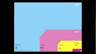
now are being blasted by information design it's being poured into our eyes through the web and we're all visualizers now we're all demanding a visual aspect to our information um and there's something almost quite magical about visual information it's it's effortless it literally pours it in and if you're in navigating a dense information jungle coming across a beautiful graphic or a lovely data visualization it's a relief it's like coming across a clearing in the jungle and I was curious about this so I it led me to the work of a Danish physicist called to nor
tras and he converted the bandwidth of the senses into computer terms so here we go this is your senses pouring into your senses every second your sense of sight is the fastest it has the same bandwidth as a computer network then you have touch which about the speed of a USB key and then you have hearing and smell which is the throughput of a hard disk and then you have poor old taste which is like rarely the throughput of a pocket calculator and that little square in the corner 0.7% that's the amount we're actually aware
of so a lot of your vision is pouring the bulk of it is Visual and it's pouring in it's unconscious and the eye is exquisitly sensitive to patterns in variations in color shapee and pattern it loves them it calls them beautiful it's the language of the eye and if you combine the language of the eye with the language of the mind which is about words and numbers and Concepts you start speaking two languages simultaneously each enhancing the other so you have the I and then you drop in the concepts and that whole thing it's two
languages both working at the same time so we can use this new kind of language if you'd like to alter our perspective or change our views let me ask you a simple question with a really simple simp Le answer who has the biggest military budget it's got to be America right massive 609 billion in 2008 607 rather so massive in fact that it can contain all the other military budgets in the world inside itself gobble gobble gobble gobble gobble now you can see Africa's total debt there and the UK budget deficit for reference so that
might well chime with your view that America is um a sort of warmongering military machine out to overpower the world with its huge Industrial military complex but is it true that America has the biggest military budget because America is incredibly rich country in fact it's so massively Rich that it can contain the four other top industrialized nations economies inside itself it's so vastly rich so its military budget is bound to be enormous so to be fair and to alter our perspective we have to bring in another data set that data set is GDP or what
the country is earning who has the biggest budget as a proportion of GDP let's have a look that changes the picture considerably other countries pop into view that you perhaps weren't considering and America drops into eth and you can also do this with soldiers who has the most soldiers it's got to be China of course 2.1 million again chiming with your view that China has a militarized regime ready to you know mobilize its enormous forces but of course China has enormous population so if we do the same we see a radically different picture China drops
to 124th it actually has a tiny Army when you take other data into consideration so absolute figures like the military budget in a connected World kind of don't give you the whole picture they're not as true as they could be we need relative figures that are connected to other data so that we can see a fuller picture and then that can lead to US changing our perspective as Hans rosling the master my master said um let the data set change your mindset and if they can do that maybe it can also change your behavior take
a look at this one I'm a bit of a health nut I love kind of like taking supplements and being fit but I can never understand what's going on in terms of evidence there's always conflicting evidence should I take vitamin C should we Tak in wheat grass so this is the visualization of all the evidence for nutritional supplements this this kind of diagram is called a balloon race so the higher up the image the more evidence there is for each supplement and the bubbles correspond to popularity as regards to Google hits so you can kind
of immediately apprehend the relationship between efficacy and popularity but you can also if you grade the evidence sort of do a worth it line and so supplements above this line are worth investigating but only for the conditions listed below and then supplements below the line are perhaps not worth investigating now this image constitutes a huge amount of work we scraped uh like 1,000 studies from PubMed the biomedical database and we compiled them and graded them all and it was incredibly frustrating for me because I had a book of 250 visualizations to do for my book
and I spent a month doing this and I'd only filled two pages but what it points to is that visualizing information like this is a is a form of of knowledge compression it's a way of squeezing an enormous amount of information and understanding into a small space and once you've curated that data and once you clean that data and once it's there you can do cool stuff like this so I converted this into to an interactive app so I can now generate this application online this visualization online and I can say yeah brilliant so it's
it spawns itself and then I can say well just show me the stuff that affects heart health so let's filter that out so heart has filled out so I can see if I'm curious about that I think no no I don't want to take any synthetics I just want to see plants and and uh just show me herbs and plants and we go all the natural ingredients now this app is spawning itself from the dat the data is all stored in a Google doc and it's literally generating itself from that data so the data is
now alive this is a living image and I can update in a second new evidence comes out I just changed a row on a spreadsheet douche again this the image re recreates itself so it's cool it's it's kind of living um but it kind of can go beyond data and it can go beyond numbers and I like to apply information visualization to ideas and Concepts this this is a visualization of the political Spectrum an attempt for me to try and understand how it works and how the ideas percolate down from government into society and culture
into families into individuals into their beliefs and then back round again in a cycle what I love about this image is it's it's made up of Concepts it explores our worldviews and it helps us was helps me anyway to see what others think and to see where they're coming from and it feels just incredibly cool to do that and what was most exciting for me designing this was that when I was designing this image I desperately wanted this side the left side to be better than the right side being kind of journalist left leaning person
but I couldn't because I would have created a lopsided biased diagram so in order to really create a full image I had to honor the perspectives on the right hand side and at the same time kind of comfortably recognize how many of those qualities were actually in me which is very very annoying and uncomfortable but not too uncomfortable because there's something unthreatening about seeing a political perspective versus being told or forced to listen to one it's actually you're capable of holding conflicting viewpoints joyously when you can see them it's even fun to engage with them
because it's visual so that's sort exciting for me seeing how data can change my perspective and change my mind Midstream beautiful lovely data so just to wrap up I wanted to say that it feels to me that design is about solving problems and providing elegant Solutions and information design is about solving information problems and it feels like we have a lot of information problems in our society at the moment from the overload and saturation to the breakdown of trust and reliability and Runway skepticism and lack of transparency or even just interestingness I mean I find
information just too interesting it has a magnetic quality that draws me in so visualizing information can give us a very quick solution to those kinds of problems and even when the information is terrible the visual can be quite beautiful and often we can get clarity or the answer to a simple question very quickly like this one the recent Icelandic volcano uh which was emitting the most CO2 was it the plains or the volcano the grounded planes or the volcano so we can have a look we look at the data and we see yep volcano emitted
150,000 tons the ground in plain would emitted 345,000 if they were in the sky so essentially we had our first carbon neutral volcano yeah and that is beautiful thank [Applause] [Music] you
Похожие видео

16:33
Turning Bad Charts into Compelling Data St...
TEDx Talks
99,947 views

17:11
🚨 YOU'RE VISUALIZING YOUR DATA WRONG. And...
Adam Finer - Learn BI Online
95,917 views

16:13
The human insights missing from big data |...
TED
241,336 views

1:00:18
EU DataViz webinar - David McCandless - In...
Publications Office of the European Union
8,273 views

11:21
The Art of Thinking Clearly (Rolf Dobelli,...
DLD Conference
166,848 views
10:45
The Man Who Solved the $1 Million Math Pro...
Newsthink
522,525 views
7:48
The Art of Data Visualization | Off Book |...
PBSoffbook
471,509 views
21:27
The beauty of data visualization | David M...
TED
384,389 views

29:36
How to use color in your data visualization
storytelling with data
74,977 views
20:32
How to avoid death By PowerPoint | David J...
TEDx Talks
5,162,815 views

14:04
Inside the Mind of a Master Procrastinator...
TED
56,771,888 views

53:15
Storytelling with Data | Cole Nussbaumer K...
Talks at Google
396,278 views
4:17
Using Design Techniques for Clear and Appe...
nullQueries
58,916 views

54:00
Mohammad bin Salman: Prince With Two Faces
Show Me the World
5,225,560 views

54:55
The science of data visualization
Tableau
71,196 views
![The moment we stopped understanding AI [AlexNet]](https://img.youtube.com/vi/UZDiGooFs54/mqdefault.jpg)
17:38
The moment we stopped understanding AI [Al...
Welch Labs
971,889 views

14:55
How to be a creative thinker | Carnegie Me...
EO
1,440,283 views

1:02:05
Effective Data Visualisation - with Valent...
The Royal Institution
64,810 views

18:20
Data Visualization: Leveraging Analytics f...
World Governments Summit
1,624 views
16:45
The magical science of storytelling | Davi...
TEDx Talks
5,357,947 views