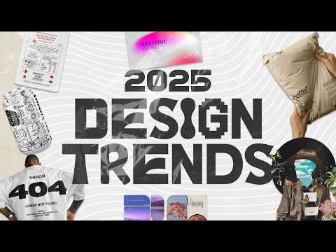
2025 Graphic Design Trends You Should Know
474.32k views3435 WordsCopy TextShare
Kittl
👉 Start Designing In Kittl: https://kit.tl/2025trends
🎥 Trend Tutorial Videos We've Done: https:...
Video Transcript:
in this video we're talking about 10 upand cominging design Trends I think you should keep on your radar before we start this train I know Trends videos come and go and yes some of them are going to be repetitive you might have already seen them in another video or blog and you may be tempted to say something like this is just early 2000s design you're probably right because it's just a a trend it's just a trend right now it's all good we're just having fun researching what graphic designers are up to these days as well
as what the market I.E customers and clients are looking for we're going to be talking about everything from scrapbooking to Ink trp fonts today so you're going to want to stick around for that and hey if you're new to the channel my name is Drew and I run the production Department here at KD where I get to bring you educational content just like this video most of the time I'm just saving cool stuff that I notice on Pinterest or my Instagram especially if I see it repetitively probably like a lot of you let's go through
each one of these and then talk about some use cases where I think they are relevant okay our first trend has been on the scene for actually quite a while and so I've added it here because it's not going anywhere and that is minimal typography especially in streetwear and when I say minimal type what I'm really talking about is pretty much type only designs if you look at some of these references you're noticing a trend within a trend where it's not just the use of clean bold typography but it's actually just typography period you might
have the occasional element or two like a little globe or a little box or a small icon in a circle but the vast majority of designs like these are using type as elements meaning the blocks or boxes of typography are meant to be used as elements within the design and this is such a cool example of hierarchy balance and an excellent use of white space and while Street Wear does come to mind this sort of type Trend lends itself exception well to packaging design web design poster design and branding with a more bold or expensive
luxurious feel to it oftentimes the thick sand serif type are paired with elegant scripts that will create that more luxurious feel and if you want to dive super deep and learn about how to achieve this style we have tons of videos on this which you can check out on the channel where my brother who owns a streetwear brand is dissecting some of the most popular designs and showing you how to create your own now let's stick with typography for just a second and talk about utilitarian design when you see this you're probably thinking of a
packing label right that's what I think of stuff like barcodes and icons inside of boxes and circles are heavily utilized in organizing designs like this you can also think of a plane ticket and how everything from the barcode to individual boxes of type are harmoniously in a grid across the entire piece of paper I like to think about this trend kind of as if maximalism became organized without the use of all the bold colors utilitarian style design has minimal roots in terms of the clean black and white colors but most of the designs actually have
a lot going on it's like adding tons of extra stuff for no real reason other than to keep filling up the grid you can think about it like this having a large rectangle and then going wild with all the different smaller rectangles you can fit inside that one big rectangle at first I really did only see this trend showing up occasionally on street wear clothing like using the little label icons maybe on a sleeve or at the bottom of a shirt or maybe filling in a design with a barcode but now I've seen this trend
reach everything from packaging design for drinks to full merch designs book cover design presentation design poster design I even saw this used as a full menu design at a restaurant I went to recently there's a a lot you can do with this semi minimal semi maximal design style and I would encourage you to give it a try now one design style I continue to see on my feed is this surrealism collage style graphic for those of you who are unfamiliar with this kind of design surrealism takes what is realistic and blends it with what would
be considered unrealistic another more technical way to define it would be meshing the conscious mind with the unconscious mind and the result is often times a dreamlike expression and while the art style first emerged after World War I we're seeing its influence now in graphic design since tools are Advanced enough to get you that clean cut and paste and warped and Mel with different elements together to form this fantasmal collage you're going to notice a lot of elements like butterflies Sparkles galaxies roads where they shouldn't be moons and planets where they shouldn't be mixed with
people's faces and heads to suggest this dreamlike idea or you might notice people's heads within an image being replaced completely with a different graphic like a cloud or a mirror or a TV screen and at first this was just the artistic approach and little by little we've seen more typography enter the scene and designers are utilizing different styles of font whether they be handwritten style or a nostalgic serif looking font and there's this component of an influential qu quot from an author or an artist or otherwise that helps the viewer decipher the overall message now
you might think that this kind of to style has a minimal use case but I actually see this quite a lot in the conference area Church Graphics musical album world there's something about this particular design style that can help you bend two ideas that are so remotely different into one cohesive design things like presentation slides social media Graphics defin definitely poster designs and album covers for sure can benefit from a style like this a design style I've seen primarily popular in web and app design is the use of bentto grids now you probably already guessed
this but the bentto grid is based off the popular lunchbox the Bento Box a vento grid is a popular Japanese grid system that utilizes many boxes to organize content or in most cases food into smaller compartments it's honestly a genius way to share a lot of information in a single space especially if you have multiple things that you need to tell a viewer or multiple ctas where you might want to share and lead a viewer to a different place it's kind of like utilitarian design in that the overall design is a large rectangle with smaller
boxes and rectangles inside of it except in the bentto grid the smaller components have their own border so they can remain independent of the overall information design now again I've mostly seen this utilized in web design and app design but you can still use this grided system to influence your own creative projects whether that be something like a t-shirt design a flyer maybe even a menu for a restaurant or cocktail bar that could be really cool or just any other variety of information that you want to share just get creative with how you set up
the boxes and use a variety of lengths and widths to catch the viewers attention and what's really cool is with KD's rounded Corner feature this style is actually pretty easy to achieve by adding some simple box shapes and arranging them around and then using that corner tool now this next Trend I am calling gradient shapes and grain I know you might be thinking oh no another gradient Trend but this one is a bit different and more subtle and it has its roots in a much older nostalgic 9s kind of design see what I'm talking about
here is the use of organic wobbly shapes with a slight and some noise added to it which gives it a subtle grain effect and it's reminiscent like I said of that 90 style poster design now you could say this trend is seriously just for the coolness of it there's no other purpose except to have a cool looking gradient shape in the background but I think the placement of the shape and the gradient is actually what helps pull the reader eye to where they're supposed to look in the design it's almost like trying to provide or
show motion without having any Motion Graphics in evolved and I think that's pretty cool and this style lends itself really well to a variety of other styles and use cases with different typographic elements I've seen it used on websites posters packaging hey I even used it on my own book cover design you can see right here and I published this book well before I made this video or researched these Trends my purpose here was blending two symbolic colors together the sand serif type isn't really competing or distracting from the major visual component in the middle
I'll admit there was a time period where I think gradients were extremely overdone and just looked super dated but what's cool about this trend is that it takes those gradient designs and it pushes them into the background of your design and truly makes it a more subtle piece of the overall canvas so keep that in mind especially in projects where you need to add that spot of color that maybe looks like it's moving we've all seen and felt that 3D graphics and motion design has been used a lot more over the past several years I
mean the things you can do with these video tools and the templates at your disposal and now with AI video editing a lot of Motion Graphics are all over the scene but what I'm going to talk about here is more of the 3D product shot style graphic that I've seen used a lot to make it look like there's motion and no one probably does this better than Apple right I mean maybe the major headphone companies like beats or Sony because they also commonly utilize this falling looking Style in their marketing but we've seen this hyper
3D product shot graphic pop up everywhere whether that's advertising for ice cream or a coffee shop or some new shoe and what this trend is is more than just having a product photo with some type at the top or the bottom this style takes the product or the object and blends it into the design itself as in it becomes a component in the design you've got text going around it through it you've got other components and shapes interacting with the product or the object itself it's a much more Dynamic and interesting looking design and I
do mainly see this in advertising and that makes sense because as things move more video more into animation this style lends itself to that so when in Dow always think about that slightly angled floating Edge to the product as if it's just slightly falling out of the sky and it's been frozen in midair maybe give it a try with something random like a lamp I don't know so sustainable and ecos style design is a trend I've talked about in the past but when I was talking about it then it was more focused on the actual
logo and branding design itself and what I'm going to talk about here is the actual rugged or textured component of the packaging itself in a way it's kind of like we're going back to basics and by proxy of the sustainable movement itself designers have found a way to make beautiful packaging and designs with not a lot with as little as possible really where at least as little color as possible we're already seeing a ton of simple cardboard style box design with minimal type and illustration and if there's color it's usually baked in it's not an
individual wrapper or an extra piece of glossy paper we're seeing a lot more recycled material come as inserts or advertising or business cards with the packaging and it has its own character and charm due to that very specific texture of the material and then you add the use of very very smart typographic placement and you have a beautiful even luxurious looking design and in terms of use case this one is pretty obvious but it doesn't have to be limited to eco-friendly focused Brands I've had everything from soap to Coffee to t-shirts come in packaging just
like what you're seeing so I would just experiment and see if a project or a client you're working with fits this type of aesthetic and the Recycled packaging might actually save you some money in the long run might be something to look into all right let's get a little Whimsical for a moment and talk about digital scrapbook design I think collage design in general has been a trend for some time because it allows you to put components together that don't normally belong similar to my point about the surrealism design but with scrapbook design it takes
on a much more linear and personal timeline story approach because when you're scrapbooking it's usually topical it could be your favorite band TV show of vacation you had future business goals anything and the analog pen paper glue scissors approach makes this a really cool and relatable downto Earth design style now we actually did a video with this you can check it out here with some tips on how to achieve this style and a few things we picked up on were of course the use of cutouts as if you did it with scissors handwritten fonts or
writing your own messages and doodles and then vectorizing them the use of ripped papered pieces and textures and and then using vibrant colors throughout your overall design like surrealism you might be tempted to think that this style does not have a lot of use cases but I think you'd be surprised not to mention that this style definitely captures attention in presentations title slides thumbnails social media Graphics imagine putting together a whole Carousel where the Scrapbook follows along and connects each slide as you swipe one Trend I am super excited to see is the wide use
of what we call Ink trap fonts and an ink trap font for those of you who don't know is a tyght face where small gaps are intentionally cut into the letter forms usually at Junctions or corners of those letters now the technique was originally developed for printed type when printing on rough or absorbent paper because the extra bleed from that ink would fill those traps so to speak and you were left with a full letter and it's so neat to see how they have been adapted as a sty istic element in design today but getting
back to the trend we're seeing these fonts along with wobbly and organic looking fonts used in designs all over the place from presentations to packaging to merch design and what I love about this design style is that by nature of how the typography looks it retains this professional and serious look but with a playful charm to it I don't know how else to describe it maybe you can help me out in the comments but I think we're going to to see a lot more of these types of fonts used in branding oh and by the
way if you just want to play around and experiment with some of those ink trap fonts we've uploaded a variety of them to KD for you like Mary Cherry Getty grotesque rage grotesque murmur and many others and I'm sure that's only the start because as they become more popular we're definitely going to upload more so feel free to play around with those you can use the link down in the description to get into KD all right our last trend for this video is what I'm calling doodle or naive style design and no I am not
talking about those kinds of Doodles that look like they were drawn by professionals because those Doodles are almost so good that they become like actually hard to achieve and I'm saying this as an illustrator myself no what I'm talking about is the actual naive wonky flatl looking illustrations that are drawn the way they are on purpose to fit a design or product on purpose I don't know about you but for me this design Trend seems really empowering like who didn't doodle in their notebook in class when they were younger or Draw on their iPad I
guess I'm not really sure what kids are using in elementary school these days probably a MacBook Air or something anyway there's an endless number of vectorizing tools today including K where you can upload your drawn Doodles you can vectorize them even change the color and you can utilize them on whatever kind of product or project you won here's another cool thing the Doodles and illustrations are being used with a variety of TP type from handwritten and Scratchy type to clean bold sand serif type to elegant script type and somehow it all seems to work and
now I I I don't mean that you can just randomly doodle something and it fits with everything but if it fits with the brief of the project or the product then I would say give it a try it's kind of like hand drawing a pattern with a library of illustrations that you can pull and use at any point now I am seeing this doodle Trend paired with packaging design primarily that doesn't mean that it won't work for Merch or posters or other digital graphicss I think this style is also being paired rightly so with the
sustainable or eco-friendly Trend because it is that organic or natural analog looking doodle kind of makes sense depending on what that brand is selling and I would love to hear what you think about this trend or any of the other trends that we've talked about so far in this video again Trends do come and go they get recycled they morph they evolve and I think you're an exceptional designer for at least staying up to dat and keeping an open mind with regards to the yearly design Trends you never know how you might stumble upon and
be inspired by something and Pull and combine and make something new and hey you might be the one that makes the next new design Trend and now if you're looking for a design tool at least to play with I mentioned KD a few times already but we would love for you to give it a try I'm not asking you to buy anything right now but you can truly test out these design Styles those fonts like I said or any other creative project in KD and you can sign up using the link down in the description
get yourself on a free trial test it out see what you think and if it does fit your fancy come back grab the discount code to get a nice little discount on your first subscription I mean why not I've already kept you for a long time so I won't go into detail on every single feature in K here but we have over 700 videos on our YouTube channel for you to check out if you really want to go deep into what KD can do don't forget to like and comment down below and please please subscribe
so you don't miss other educational videos just like this one everyone who subscribes truly helps us out a ton thanks so much for watching and we will see you in the next video [Music]
Related Videos