How to Make the BEST Gantt Chart in Excel (looks like Microsoft Project!)
1.61M views3179 WordsCopy TextShare

David McLachlan
⭐️⭐️⭐️ GET THIS TEMPLATE PLUS 52 MORE here: https://www.etsy.com/listing/1199800561/50-project-manag...
Video Transcript:
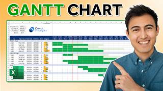
[Music] hi everyone have you ever needed to track a schedule in your project or track the tasks that you're working on well one of the best ways to do that is with a gantt chart and this is the absolute best gantt chart that i have ever come across and the template that i've created that people ask me for all the time and there are many reasons for this first of all it's created in excel but it actually looks like it's created in microsoft project so you don't have to go and buy microsoft project you can
actually create this particular template here and it will look almost exactly like it is and actually function even a little bit better than the one in microsoft project anyway the second thing you'll see is it's got a nice line here for the current date so you can always see where you are and you can also change the date so if we say the 2nd of february 22 then it will update the calendar for us and that calendar we can can move you know left and right very easily also it will update our gantt chart bars
if we just change the details on the left here so if we say the 20th of february 20 2022 then that will change that particular one also a little bit more if we say it's in progress then it will uh it will change the look of the bar and if we change the percentage done then it will it will update that on our bar as well now if we change that back to complete it will give us a nice golden golden thing at the end there it also shows us this beautiful diamond for our complete
date so that's really really cool it shows the total work days that we're working on the item for and lastly as well if we say that we're blocked it will actually change the color of these items so that so that we can really clearly see that those items are blocked and call those out all in all like i said this is the best gantt chart that i've ever come across and people ask me for it all the time let's delve into this and create this in excel it's going to be a whole bunch of fun
now the first thing we're going to do is just do the general coloring and framing of our gantt chart and we're going to speed that up ever so slightly just so we can get into the really good stuff all the formulas and the the formatting that will create the gantt chart itself for you we will be using this particular date as an input to all of our calendar items over here and of course we'll have our number we'll have our activity we'll have who it's assigned to we'll have our start and end dates we'll have
the work days that we've been working on it for we'll have the status so is it blocked or is it complete or is it in progress and we'll have our percentage done now the first part we're going to create is the actual calendar so the days the weeks the months and the years and that will feed into everything else that we do now there's a few different ways that you can do this first of all we could just say equals equals this particular date and then that will be correct and we want to format that
cell and just make sure that that's the way that we want it so if we go to custom we can actually just have one day and three months and if we do that that will come up quite nicely for us and we can carry that across all the way through now that's one way to do it and if you want to get a little bit more fancy there is another way and what i've done here is i've just used month and weekday so this way it will always start at the beginning of the month for
us and our formatting will be really really nice so that's the formula there but you can use the other way if that is simpler for you now once we've done that our next one we just want to add seven days so this one plus seven every time seven days if we take that bar and drag that across then that will keep adding those seven days for us and we can keep going until we've got a full year's worth and you can go beyond that even more if you do want to now when we're actually creating
the months that's a different story what we need to do is as we know there's around four weeks in every month but every so often there are five weeks in a month so what we want to do is just merge and center these four four weeks and we'll do that again so now we've got two four weeks and one five week and we're just going to copy that and paste that all the way across so that that does that's ex that carries across for the rest of our year but we also want to take this
whole row and we want to just lift that up so that matches matches up above as well in the years now for our months what we want to do is say we want to equal the second week that we're looking at just so that it doesn't get it doesn't get thrown out by any weeks that flow over so if we say that and what we want to do is format ourselves and we actually want that to be custom just the three months so mmm and if we say okay that's going to give us the month
every time now we can carry that across and as you see that will be taking it from the second week again now we can copy all those across for the rest of the year now lastly we want to do the years and we can do the same thing so if we say this equals the the second one again and it's saying january so what we want to do is format that and we actually just want to say these are years so four years and if we say yes to that now that can continue all the
way across now you may want to take some of these out or you may want to actually color these a little bit differently and that is completely up to you and now we've got our beautiful calendar and if we go to view and take off the grid lines we'll see that that's looking quite good but we actually want to put some some of those lines back in so for our purposes we're going to select all of this and we want to just go to more borders so for more borders what we can actually do is
maybe some nice light lines and we can make them all the way through and now that's starting to look really really good let's do the same for the other parts of our table really quickly again using the more borders tool now that we've got that let's do our incremental borders for inside our gantt chart as well and we'll just make those a little bit lighter we'll put some of our activities in and some of our numbering and when we do that we want that to be over to the right so we'll make all of these
over to the right and we just want to increase the indent just a little bit so that looks really really nice let's do it for the other one too make sure that that's good now we've got our dates so we can place our dates in here but we want to format these cells so that they are you know so that they look in the right way that we want them to and we just got one d three m's and two y's so day month and year or you can change this if if it's an american
date for you you can obviously do month to day and then you know year now we want to figure out the exact number of working days that we're going to be working on these particular items so let's color this first of all just a nice we've got a normal color let's make it a darker color for us here maybe with the text a little bit white but the formula that we want is going to be this so we're going to use network days to figure out just the number of working days between the start and
the end date and also if that area is blank then we don't want to return anything at all so that's just another little trick so that we you know so that it still looks nice at the end of the day we can copy that all the way down and as you can see the ones without anything in them don't show up at all and that's exactly what we want now we actually want to use a drop down for our statuses so what we want to do here is first of all just put the status list
down the bottom of our gantt chart so we've got not started in progress blocked and complete now for these particular sections we'll select the whole the whole column and we want to go to data and we want to say data validation so i'll just go there again drop down and its data validation is what we want we want to allow a list and the source of that list we actually want between these these areas here select those areas that we've put our list items and click ok now that we've done that we should be able
to select from in progress to blocked to complete and any of those that we want for our particular gantt chart now one other thing we want for this is just to do some conditional formatting for our blocked statuses so when we say conditional formatting we'll say a new rule and we want our format only cells that contain specific text and we'll say that they are blocked now when we format that we want the fill we can make that maybe just a nice orange so that it does stand out and if we say ok and ok
then when we say that our item is blocked it should change there we go that's looking really really good and that will stand out for all of us so that we can see when something is blocked and we need to swarm around it and problem solve next we're going to put in some percentages and as you can see a percentage is between 0 and 1 so 0.9 0.4 and we just want to format that correctly as well so if we if we just click on the percentage button up here then that's going to change it
for us and now we've got beautiful percentages for the percentage complete now that's going to impact our gantt chart and it's time for us to get into that gantt chart now first of all we're going to select the the top left one and what we're actually going to do is say if the end date so if the end date matches the current date here then what we want to return is a u and if there's nothing so if it doesn't match then we just want to return nothing so blank blank text and we want to
return a u for a very very important reason and that is we're going to select the wingdings font now a u in wind wingdings is that beautiful diamond shape that we saw so if we select this and uh and put this all the way across there we have it now we can see that's the actual end date so that's the date that we're expecting and it shows up nicely on our gantt chart let's just select the whole area and put that in the middle and the center maybe reduce the size ever so slightly but not
too much and now we can see that beautiful diamond shape let's select all of these and drag them down as well and now we have all of the different end dates for our particular items so how cool is that that's the first step now let's get to putting our gantt bars in first of all let's put the let's put the actual today's bar in so what we're actually looking for is um basically whether today equals this particular bar and so once we've got that that's going to be our conditional formatting so let's take that let's
select all of our area we'll say new rule and we'll say use a formula to determine so here is that formula again just starting with the top top left and k4 is that first state that we're looking for so we actually want this border we want a border nice left hand side border and the color can be a nice deep green i think so that we know that that is our day and if we select ok and ok then now as you can see the day that i'm filming this or the week that i'm filming
this so how cool is that that's our first step now let's do the bars and the first bar again let's just showcase how we will do this this is the formula here and what we're looking at here is if we've got our start date and our end date and if that actually matches up to one of these weeks then we want to color that particular bar so that particular bar here so we're going to use this formula and we're going to use it for our conditional formatting again we'll select the whole area we'll go to
conditional formatting new rule use a formula to determine and put that particular one with with and and weekdays in it we want to format this maybe to what sort of fill should we have maybe a more colors maybe a nice light blue you can choose any color you like of course but if we click ok and ok again then now we have our bars automatically filled out according to the dates that we've selected on the left hand side here how cool is that but we're not finished yet because we want to see the percentage done
so we want that to be accurate as well now for our percentage complete it's a little bit more complicated and we're going to use the and function and the weekday function and we're going to multiply that by the percentage done so between the start and the end and then multiply that by the percentage done so 40 40 percent and that will give us the colored the amount of bars that we want to according to that percentage complete let's turn that into our conditional formatting now we'll make this a little bit darker so it does stand
out and if we select ok now we can see and you can change that to be any color you like as well so we might change that color just a tiny little bit but we also want to see when an item is complete so let's look at our complete formula here so we're going to use the and function as well and basically if it's if it equals that date and the status also equals complete as we've got here then we're going to color it that nice golden color so we'll take that formula and let's use
that for our conditional formatting this is the formula that will that we'll put in here and we'll put like a nice there's that nice golden color here so if we click ok now as we can see the ones that are complete have got that beautiful end date for us and we can change that to in progress and it changes back or we can change this to complete oh that one won't show up maybe this one is not blocked anymore and now it's complete instead and we'll put that to 100 complete and now we can clearly
see it isn't this great it's starting to look so so good but there is one last thing and that is our blocked uh status here so let's quickly do that and for our blocked formula we're actually only going to do the sections that are complete so we're just going to change the color only for the for the percentage that has been done so it's a little bit more complicated but as you can see we're looking for the word blocked in our status and if that's the case then we're going to match it up with the
between the start and end date and see if that matches the date on here and if it does then we're going to color in between the percentage done from start to the to the end of the percentage done so using this particular formula again we select that and go to our conditional formatting and what we want is maybe we want that to be that orange color as well now if we click ok and apply now we can see the one that is blocked here it is very nicely so that's great that shows us very very
clearly if we change that to be in progress that changes back for us now let's say this one is now blocked that's going to change it to be blocked and we can clearly see it and everyone can see that it's blocked and we need to get around there and really try and figure it out one last thing let's select k6 go to view and let's freeze the panes and now when we scroll down we can scroll down as much as we want and we can also scroll across as much as we want and now you
and i have created this amazing gantt chart something that will really really impress your team impress your bosses and basically will have everyone asking you where can i get this so that i can use it for myself i hope you take it and create something amazing in your own organization in your startup in your business or your company i've really enjoyed spending the time with you and i'll see you in the next video [Music] you
Related Videos

17:13
Make This Awesome Gantt Chart in Excel (fo...
Kenji Explains
462,835 views

31:38
How to Make This MONTHLY Gantt Chart in Ex...
David McLachlan
9,337 views

43:02
How to make a SIMPLE PROJECT SCHEDULE/PLAN...
Pitol In Motion
174,946 views

32:30
How to Make a Daily Gantt Chart with Diffe...
David McLachlan
11,382 views

16:10
How to Make a Risk Assessment Matrix in Excel
David McLachlan
542,324 views

32:06
How To Make This AGILE Gantt Chart in Excel!
David McLachlan
6,140 views

52:43
How to Make a Project Management Plan (Com...
David McLachlan
49,880 views

9:36
TECH-005 - Create a quick and simple Time ...
The Excel Challenge
3,285,849 views

7:16
How To Create A Gantt Chart With A Progres...
The Excel Hub
339,420 views

42:59
Cómo Crear un DIAGRAMA DE GANTT Interactiv...
Excel Hecho Fácil
1,126,578 views

14:37
How to Make a Prioritization Matrix in Exc...
David McLachlan
31,894 views

30:38
How to use Power Pivot in Excel | Full Tut...
Kevin Stratvert
1,552,319 views

3:18:01
How to create Ultimate Excel Gantt Chart f...
The Office Lab
2,860,243 views

12:54
How to Make a Gantt Chart in Excel
Vertex42
3,827,808 views

18:02
3 Essential Excel skills for the data analyst
Access Analytic
1,619,390 views

14:34
MS Project-Setting up a Baseline.mp4
whitebirchman
189,841 views

24:54
🔆 Cómo crear un cronograma DIAGRAMA de GA...
El Inge Francisco
242,545 views

15:56
Project Plan in Excel with Gantt Chart (Pl...
Leila Gharani
458,922 views

38:46
How to use Power Pivot - Microsoft Excel T...
Teacher's Tech
89,301 views