How SIMPSON'S PARADOX explains weird COVID19 statistics
58.92k views1582 WordsCopy TextShare

Dr. Trefor Bazett
Simpson's Paradox is a statistical paradox and ecological fallacy that can sometimes give very stran...
Video Transcript:
in this video we're gonna talk about Simpsons paradox this is a fascinating statistical paradox that causes a lot of problems in the ways we think about and report on all sorts of statistics and society for example the survivability of Cova 19 so let me illustrate this with an example I'm gonna compare China and Italy Italy was one of the initial countries in the Cova 19 pandemic they have a huge spike in cases after it left China and I'm gonna focus on something called this CF r or case fatality rate basically this says if you have
kovat 19 what are your chances of surviving this particular disease now it turns out that when you look at all the cases that I'm going to focus on a period between early March and late May we look at all the cases in China and all the cases in Italy is a clear pattern you are more likely to survive in China than you are in Italy and you can wonder why that might be the case or even question the reliability of that data but nevertheless let's take that as a fact for this video you're more likely
to survive in China than you are in Italy however it turns out that if you dig a little bit deeper a very different type of relationship appears in this chart I am breaking down the CFR rate based on different age groups so I'm looking at 20 year olds 30 year olds four year olds 50 year olds and so on every 10 years and if you look at any one of those age range takes a 60 year olds it turns out that 60 year olds in Italy who have Cova 19 or more likely survive than 60
year olds in China who have Cova 19 same for seven year olds same for 80 year olds same for 20 year olds in every different age bucket you're more likely to survive if you get the disease in Italy than you are in China and yet overall when you put the total here when you aggregate it all up it's better off to be in China than it is in Italy so how can that be how can in every possible age bucket it'd be better in Italy yet overall and be better in China so I actually encourage
you to pause the video and see if you can figure out what a reason for that might be alright if you've got that wonderful you're an excellent statistician but if you're just here to enjoy show then the answer is about age demographics this chart shows the breakdown in terms of age it shows the percentage of the total patients who are in any different age range and what we see here is that in Italy there is a higher proportion of older patients patients in their 80s and 70s than there are younger patients patients and say their
30s or 40s and this matters a lot because one of the key features of kovat 19 is that it is much easier to survive if you are younger than if you are older so the fact that Italy has this higher proportion of older patients who have gotten Cova 19 means their survivability rates are pulled down because of this phenomena so even though they're doing a relatively good job among any individual age group that they have more of the higher risk age groups in their overall profile causes a problem and that's the core idea of Simpsons
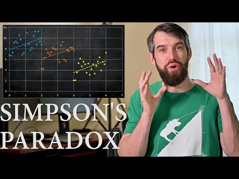
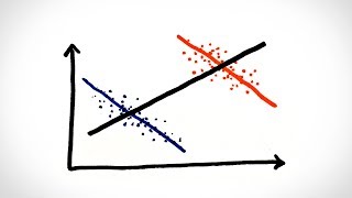
paradox since this paradox is when the trend for aggregate data when you put everything together is different from the trend when you go in so divided into different categories and you look within each category and that's exactly what's happened here now I actually just made up some data just to illustrate the point even more clearly this is just some arbitrary made-up horizontal axis some made up vertical axis and if you just looked at this data well what do you think the trend is if I wasn't thinking about Simpsons paradox at all I might just look
at this and think well it's too generally a downward trend as you increase in the horizontal you go down in the vertical I could plot a trend line here it looks like a somewhat decent trend line is kind of convincing but this data actually comes from three different categories and I'll just color code it to illustrate those different categories well that looks very different in each of these three colors it looks like an upwards trend and we have these upward trend lines these three categories would be like for example three different countries or three different
states depends on what it is they're actually measuring but nevertheless the key message here is when you aggregate data over a lot of different categories the trend can appear to be one thing but that when you divide it into categories that trend is actually something very different this is a very important thing to keep in mind whenever you see statistics about pretty much any phenomenon for example right now I'm recording in early July but when you look back a few weeks into June of 2020 and the Kouga 19 pandemic particularly in the United States if
you just looked at the countrywide statistics you might think that actually things are just kind of flatlining they're not getting much worse or much better but if you look at the level of individual states there's big states like New York and New Jersey where the cases were going down well other states like Arizona or Texas had their cases going up and so you might think okay everything's sort of stable but not realizing that when you zoom in on individual states it's a very different picture and then now in early July we see that the answer
has been there's been massive growth in it now a wide swath of states that are seeing a little bit earlier but only if you look at the state level not the country level and indeed in statistics this is a very common problem what level of aggregation do you want to focus on if you put everything together on one bundle you may miss the true story for example with FinCEN's paradox as I've Illustrated in this video but if you zoom in too much and don't aggregate at all for example maybe you look at individual counties not
staged or have individual people well you can't really say anything the data becomes too messy so let's toothpicks you're always wanting to aggregate to some degree so you can make some more meaningful trend lines appear but at the same time not aggregate so much that you lose the story you have to be very careful about what are the actual causal relationships to know where in that picture is appropriate to aggregate or not I once experienced a similar phenomenon in my own research in mathematics education I was doing this study where we had 23 different classes
and about half of them were using active learning techniques where the students people to work together in groups and collaborate and in the other half the students were mainly just doing passive learning techniques like listening to an instructor lecture kind of like what you're doing right now and we looked at everything the general trend was that the active learning classes were doing better than the passive learning classes this is with the research and mathematics education in general order to be really convinced that that was the case I had to explore a particular confounding variable because
turned out that students were not being randomly assigned into the different classrooms the way that it worked at the institution that I was doing this study was that an individual classroom was often highly populated based on the way that students registered by one particular program like one particular branch of engineering would all fit into one class because different branches within engineering had different competitiveness therefore the caliber of the student going into that work different it might mean that a classroom was doing better not because of the pedagogical techniques used but because it happened to be
composed of students who generally had higher test scores this is the way the registration works it wasn't a random sampling and so what I had to do was make sure that even when you did this when you accounted for the different categorizations by different types of programs that there was still nevertheless a net positive benefit and indeed Simpsons paradox is most likely to occur in scenarios like that where there's not a randomized experiment there were structural difference between Italy and China there were structural differences between different states there are structural differences between the students in
one classroom and the students in another classroom they're not just completely random variables and as a result of that those different categories can make big differences to the phenomenon that's being studied all right I hope you've enjoyed that video if you did please give a like because YouTube's place algorithm just as much as us mathematicians do a question about this video leave it down in the comments below and we're gonna do some more math in the next video
Related Videos

13:11
Defining Numbers & Functions Using SET THE...
Dr. Trefor Bazett
38,057 views

11:22
The Unbelievable Reality of Simpson's Paradox
ritvikmath
6,147 views

13:58
The Fastest Multiplication Algorithm
Dr. Trefor Bazett
114,484 views

12:05
Zeno's Paradox - Numberphile
Numberphile
3,411,080 views

18:55
This is How Easy It Is to Lie With Statistics
Zach Star
6,226,573 views

12:03
Why 7 is Weird - Numberphile
Numberphile
1,889,741 views

13:39
What Is A Paradox?
Vsauce2
7,307,776 views

7:06
A New Theory of Everything Just Dropped!
Sabine Hossenfelder
640,787 views

14:12
Why people believe weird things | Michael ...
TED
3,033,893 views

11:43
ChatGPT is destroying my math exams
Dr. Trefor Bazett
84,832 views

4:40
Simpson's Paradox
minutephysics
3,875,750 views

12:22
Is Most Published Research Wrong?
Veritasium
5,888,413 views

21:44
The weirdest paradox in statistics (and ma...
Mathemaniac
1,060,691 views

19:37
Why this puzzle is impossible
3Blue1Brown
3,150,528 views

17:35
Bell's Theorem: The Quantum Venn Diagram P...
minutephysics
7,765,995 views

13:26
IS CHESS A GAME OF CHANCE? Classical vs Fr...
Dr. Trefor Bazett
102,587 views

7:18
Simpson’s Paradox (with Examples)
RichardOnData
3,106 views

15:36
Running Changes Your Brain, let me explain.
Dr Jack Close
73,402 views

16:18
How to write your homework using LaTeX
Dr. Trefor Bazett
116,081 views

14:29
Kill the Mathematical Hydra | Infinite Series
PBS Infinite Series
285,276 views