Nominal vs. Real GDP
1.22M views932 WordsCopy TextShare
Marginal Revolution University
"Are you better off today than you were 4 years ago? What about 40 years ago?"
These sorts of ques...
Video Transcript:
♪ [music] ♪ - [Alex] Is the economy growing? Are people better off today than they were four years ago? What about 40 years ago?
The GDP statistic can help us to answer all of these questions. But first, we do need to make some modifications. As we discussed in our first video, GDP sums up the prices of all finished goods and services.
So that means that there are two ways the GDP can increase. First, prices can increase. In this case, the GDP number goes up, but the economy isn't actually producing more goods and services.
It's inflation which is driving the higher GDP. The increase in GDP -- it might look good on paper -- but it's a mirage, a nominal increase only. The other way that GDP can increase is if we DO produce more valuable goods and services.
That could mean simply more goods and services, or better goods and services, more highly-valued goods and services. It's this second type of increase in GDP that we want. This isn't a mirage, this is a real increase in GDP.
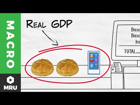
Real GDP measures the second type of growth. And the Real GDP statistic -- it controls for inflation by adding up all the goods and services produced in an economy using the same set of prices over time. The same set of prices.
Real GDP tells us -- if, if the prices of goods and services hadn't changed, how much would GDP have increased, or decreased? Real GDP -- it's typically what we really care about. Let's give an example.
We'll be using a fantastic tool called the St. Louis Federal Reserve Economic Database, or FRED. FRED is every economist's best friend.
So let's Google "US nominal GDP Fred. " Here's what we get. We can see that we've grown from a GDP in 1950 of $320 billion, to a GDP in 2015 of over $17 trillion.
Wow! That suggests that our economy has gotten 55 times bigger. But hold on, hold on, wait a moment, you might say.
My grandmother told me that a loaf of bread used to cost a dime. And now it costs a couple of dollars. That's right.
If we want to compare our economy over time, we need to control for changes in prices. So we don't want to look at Nominal GDP. We're more interested in Real GDP.
So let's Google "Real US GDP Fred. " Here's what we get. This graph measures Real GDP in 2009 dollars.
That means using 2009 prices. This graph tells us that using 2009 prices consistently, that in 1950, all the goods and services produced at that time were worth about $2 trillion. In comparison, in 2015, all the goods and services produced at that time were worth about $16 trillion.
So while Nominal GDP says that the economy is 55 times bigger in 2015 than in 1950, Real GDP shows us that it's 8 times bigger. That's still pretty good, but a big difference between Nominal GDP and Real GDP. Okay.
So now we've controlled for prices, but there's another big difference in the US economy in 1950 compared to today. Right - there's a lot more people today. We can control for the population size by using Real GDP per capita, or per person.
By dividing Real GDP by a country's population, we get a good, albeit imperfect, measure of the average standard of living in a county. So once again, let's Google, "Real GDP per capita FRED. " Here's what we get.
In 1950, Real GDP per capita, measured in constant prices, was about $14,000. In 2015, Real GDP per capita is about $50,000. So on average, people in 2015 have a standard of living that's four times higher than the people in 1950.
That's a pretty big and a remarkable increase in the standard of living. By the way, since Real GDP increased by eight times, and Real GDP per capita increased by four times, we know immediately that the population approximately doubled between 1950 and 2015. Now let's take a closer look at this graph.
We can see another reason why we're interested in the GDP statistic. Real GDP per capita declines during recessions. In fact, a decline in Real GDP is part of what defines a recession.
Declines in Real GDP also tend to be accompanied by increases in unemployment. You can see here that when Real GDP dips, the unemployment rate spikes. Now here's another nice feature of the FRED database.
On the Real GDP per capita graph, click "Edit data series" and then switch to percent annual changes. So now we can see immediately the annual changes in Real GDP. You can see, for example, the big recession in 2008 and 2009.
In 2009, for example, the economy shrank by 3. 6% compared to the year before. That's a very big and a very unpleasant decline.
Okay. So now you've got your hands around Real GDP as a way of measuring the health of our economy. And I said that Real GDP per capita is a good, albeit imperfect measure of the average standard of living in a country.
But is that really true? Does an increase in Real GDP per capita mean that we're better off? That's the view that I'm going to defend in the next video.
- [Narrator] If you want to test yourself, click "Practice Questions. " Or, if you're ready to move on, you can click "Go to the next video. " You can also visit MRUniversity.
com to see our entire library of videos and resources.
Related Videos
5:14
Real GDP Per Capita and the Standard of Li...
Marginal Revolution University
601,888 views

8:04
Real GDP and nominal GDP | GDP: Measuring ...
Khan Academy
878,530 views
8:14
How does raising interest rates control in...
The Economist
2,904,503 views

4:36
What is Gross Domestic Product (GDP)?
Marginal Revolution University
1,605,793 views

7:10
The Solow Model and the Steady State
Marginal Revolution University
692,830 views

7:03
Are you Bayesian or Frequentist?
Cassie Kozyrkov
252,363 views
11:28
Why The U.S. Won’t Pay Down Its Debt
CNBC
1,407,779 views

3:41
Real vs Nominal GDP
Federal Reserve Bank of St. Louis
42,612 views

7:31
Why can’t prices just stay the same?
Vox
1,640,819 views

29:58
Macroeconomics- Everything You Need to Know
Jacob Clifford
3,431,415 views
4:11
What is GDP? | CNBC Explains
CNBC International
1,490,239 views

6:56
The Money Multiplier
Marginal Revolution University
484,073 views

34:47
1. Introduction and Supply & Demand
MIT OpenCourseWare
2,439,267 views

17:28
GDP & PPP
Marginal Revolution University
97,142 views
12:29
Taxes: Crash Course Economics #31
CrashCourse
1,442,407 views
7:00
Gross Domestic Product (GDP)
Professor Dave Explains
143,226 views

8:33
Puzzle of Growth: Rich Countries and Poor ...
Marginal Revolution University
364,247 views

16:31
CPI and Inflation- Macro 2.4
Jacob Clifford
636,304 views

11:26
Real GDP and the GDP Deflator
Jason Welker
412,506 views

8:01
What is Inflation?
The School of Life
1,922,928 views