Swiss web design: simple, but it works. Here's why
335.09k views1537 WordsCopy TextShare

Phoebe Yu
Swiss web design is simple, even abstract. But, it works. Many successful websites and companies use...
Video Transcript:
Swiss web design it's simple minimal and sometimes a little abstract but it works here's why some of the most successful websites and companies adopt at least one of three key principles of Swiss design did you know that helvetica actually means Swiss in Latin and was created in you guessed it Switzerland it has become one of the most widely used fonts for minimalism but the impct of Swiss design doesn't stop there the Swiss don't just make good watches how do they also make great websites this video covers the three principles of Swiss web design looking at
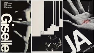
its history culture and psychology why Swiss design works for users designers and developers and how it underlies today's most successful websites imagine this you're a starving artist in 1890 in Paris and you head to a bar to drink away your student loans next to the bartender you see some artwork they might look something like this art Nuvo is a popular style in 1900's Paris that features elegant curves ornamental design and female figures fast forward to 1920s your art career is getting better and you travel to Germany where things start to get a little abstract the
bow house movement in Germany featuring geometric shapes in red yellow and blue emphasizes utility function and gets rid of unnecessary ornamentation after World War II we see the emergence of order and rationality this directly translated into design where we see the move away from Art Deco to a more structured simple design at the same time these other styles became popular constructivism in Russia and the style in the Netherlands and from this we see the birth of the Swiss style POV you're at a baby shower oh what a cute baby I'll teach him how to drw
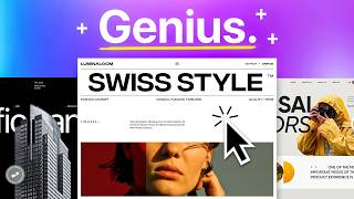
squares uh are you joking he obviously first has to learn how to use red yellow and blue no but cubes are important honey no colors have to come first stop stop stop can you guys just stop fighting and let the kid do [Music] both so what are the three principles of Swiss web design number one simple lay out under Swiss design lies undeniably good user experience a key feature is the grid system a method to effectively categorize content take a look at this this methodical arrangement of elements is especially important in complex layouts such as
magazines brochures and websites where Clarity and readability are Paramount one of the key advantages to using a grid system is that it allows for flexibility within a structured framework designers can experiment with different alignments and placements while ensuring that the overall design remains cohesive this balance between structure and flexibility is a Hallmark of Swiss design and to enhance the sense of Simplicity Swiss design is very particular with its typography again helvetica among many other sensor fonts are used to make sure that content is legible allowing space to emphasize what matters then we see the use
of geometric shapes which convey messages in both an abstract and clear kind of way the second principle of Swiss web design is what I like to call the no BS navigation don't let your users dig for information the grid system divides content into rows and columns which makes navigation extremely intuitive you can almost divide things without using lines Swiss design can be encapsulated in two phrases less is more and form follows function include only what is necessary on the web page this could be having fewer layers in your information hierarchy or simply using an already
expanded menu opposed to a hamburger menu if you don't have too many pages of course and guess what this Simplicity is backed up by psychological research a 2022 study analyzed up to 13,000 web pages to find what's most aesthetic and they do this with this fancy algorithm from the results there were are two interesting findings number one the t-shaped regions of the web page are key regions in the web page design and number two this is the big guy web pages with relatively little information are more likely to be favored by users of course as
we know culture impacts this and we cannot generalize the findings of this study to all cultures but this does kind of explain why Swiss web design works so well the third principle is the efficient Swiss culture let me explain the Swiss style is extremely efficient why to find out let's fly out to Switzerland this efficiency started with their transportation system the Swiss live in mountains wide lands and environments that no other country experience yet it has one of the best road and Railway networks in the world partly because they figured out a way to get
energy from nature if you want a deep dive into into this I cited the video Source below essentially they made great use of their existing resources and it's genius why is efficiency so ingrained in Swiss culture well it began with their education system vocational training is deeply entrenched in the Swiss culture what this means is that as part of their education the students from an early age assume responsibilities and are faced with practical problems in a work environment this is part of the reason why the Swiss vocational training system is widely regarded as one of
the best in the world uh tell me why I should care why does Swiss web design work for users designers and developers well for users let's say one day you got very hungry and you go to Panda Express hi how can I help you yeah so the other day five pandas came here and ate all of our menus but we do have the online copy on our website you go on Google type in Panda Express click on the first link go to their website extra dollars for Hungry Scholars you don't care because you're hungry so
you scroll down see the food click on food pick a random location because you just want to see the darn menu Panda rewards again you don't care because your stomach is growling you exit the popup sign up later at this point you're not even hungry anymore and you finally see the names of the menu items a Swiss web designer on the other hand would get rid of all the fluff and put the menu front and center on the page because half the time that's what visitors of this website are doing trying to find the menu
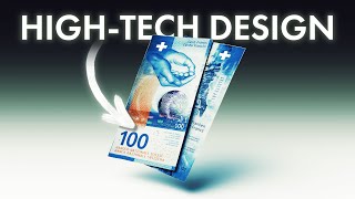
of course it's not to say that these other pages of pandaexpress.com are not valuable but Swiss web design would urge them to start with what matters most and go from there in this case the hungry user would be happy because finding the menu was quick and a good user experience and this focus on a good user experience is not just in website design check out Swiss money Swiss money doesn't obey the rules first of all it's vertical most currencies like the dollar euro and Yen opt for a landscape design but Switzerland is the exception Swiss
money expands vertically because a New York Times study showed that most people exchange bills while standing so it's intuitively easier to hold and read a bill vertically this is also good for visually impaired people people because different sizes make it easier to sort through and this translates into website design the Swiss would ask what is the most legible the most clear and straightforward way to present content let's emphasize readability to make things more accessible and with simpler designs it's often times easier to develop less information means fewer databases having a simple website architecture means a
simple backend structure which could mean simpler code here are some websites that employ Swiss design first Apple known for chucking their products on the page front and center but for the Nerds who want to learn more Apple employs a grid system layout to make sure that info is presented clearly using sanser font and lots of white space speaking of grids notion loves grids the table view is one of their most popular features that users use to organize their life and finally how does Google use Swiss design remember remember the no BS navigation principle there's a
reason why Google has kept the same search layout all those years the last thing they would do is hide all of these links behind expandable menus and make the user's life miserable finally we see Swiss design in the everyday take for instance New York City metro signs the iconic font and symbols make it easy for New Yorkers to get around in the bustling city as famous producer Rick ruin says it's helpful to view currents in the culture culture without feeling obligated to follow the direction of their flow Swiss web design shines with the principles that
it follows but what matters more are the rules it breaks back when it differed from the art newvo style people were skeptical but now we love it so which design rule shall you break next [Music]
Related Videos

20:11
Swiss Design: Iconic & Influential (Origin...
Design Smith
195,751 views

9:44
Snow White - It's Even Worse Than I Expected
The Critical Drinker
3,525,366 views
17:01
Minimalism in Web Design: Lessons from Swi...
Hostinger Academy
1,863 views
32:29
Coding, creativity and becoming your own b...
It's Nice That
24,400 views

23:29
Talking About Swiss Style: Wim Crouwel
Museum für Gestaltung Zürich
59,933 views

43:00
why is social media not fun anymore?
Mina Le
976,067 views

12:51
How culture made Japanese Internet design ...
cynzy
1,058,320 views

9:40
The Secret Science of Perfect Spacing
Chainlift
500,708 views
40:26
How Brands Use Design & Marketing to Contr...
Design Theory
2,719,101 views

11:49
Japanese web design: weird, but it works. ...
Phoebe Yu
715,581 views
9:23
Inspiration Weekly: Swiss Design
Flux Academy
92,360 views
11:07
The 5 Design Principles (But in Web Design)
The Website Architect
93,897 views

16:33
9 Web Design Trends 2025 to Spruce Up Your...
Showit
173,359 views
21:38
8 advanced rules of minimal Web Design
BONT
11,950 views
33:03
Why Some Designs Are Impossible to Improve...
Design Theory
2,440,580 views

7:15
Give Me 7 Minutes & Your Web Design Skills...
Self-Made Web Designer
56,722 views
17:44
Why Swiss Money Looks Weird
IMPERIAL
867,175 views

10:51
Chinese app design: weird, but it works. H...
Phoebe Yu
660,831 views

19:18
Graphic Design Course: How to Stand Out in...
Satori Graphics
19,074 views

28:37
Step-by-step web design process to delight...
Danbee Shin
7,976 views