- Today, I'm building a website in just 10 minutes from start to finish. I'm gonna be showing you how to build a simple landing page on the cheap in minutes. (chill rhythmic music) So for this challenge, we're gonna be using Carrd, and it's my favorite website builder to make simple one-pager websites.
I haven't found anything that's easier and more intuitive for basic websites. You can look through what they call their "starting points", or basically, templates. Now, some of them are gonna be restricted to the Pro plans, but that's okay.
I actually would recommend upgrading to a Pro plan. They start at $9 a year. And for $19 a year, you can get a plan that lets you connect a custom domain and have up to 10 websites, which, for 20 bucks a year, effectively, that is a really reasonable price for what you're getting.
So I'm gonna identify which template I want, and then I'm gonna get 10 minutes on the clock. I've identified the template that I want to use, and I've got 10 minutes on the clock, and we're gonna be starting right now. All right, I'm gonna select the template.
I like the challenge. We can do this, we can do this. Okay, got a little tutorial, but I'm already familiar with Carrd, so I'm gonna say "OK, got it".
Now, the first thing that I'm going to do is obviously swap out our copy. We'll make one for me. Why not?
So I will replace the heading. I'll just put a little description about myself. One thing I like about Carrd is they have this whole markdown thing going on down here.
So for bold, you can use two asterisks, and then they have obviously italics, all sorts of things, superscript, subscript. I think it's kind of cool. It takes some of the intimidation factor away because you're not having to do HTML or anything like that for styling.
Next thing I'm gonna do is take care of these buttons. I don't want all of these buttons, so I'll just click into this little section and get rid of the ones I know I'm not gonna use. And I think I'm gonna have to add some buttons as well.
Instagram, Twitter, those are good. I like to get YouTube and TikTok. And now would be a good time to point out that I don't use Carrd regularly.
I've used Carrd in the past, I've experimented with it, but I'm not super familiar with Carrd. So I thought this would be a fun video just to demonstrate how easy it is to use 'cause I'm certainly no Carrd expert. I just think it's a really intuitive and simple platform that allows you to make these pages without too much effort or knowledge.
Okay, one thing I'd like to do is change the color of these buttons. And I think that's, yeah, I think that's under Appearance here. Here we go.
Icon. Making great progress. I want to pick like a nice purple.
Probably something like that is good. Okay, I'm gonna go ahead and drop in an image of myself in this placeholder. And lucky for me, I already have an image picked out.
I don't want to crop it. I figured out, if you click this button a couple times, it eventually gets rid of the crop. I wish that it would default to not having a crop.
Another thing that you may want to do when you upload an image is work on how it's aligned. I like to do Position: Top, which. .
. Hm, that didn't do what I wanted. - [Matthew] Oh, center it.
Hang on. We're not in mobile. Go up.
- Oh, Position: Top. - Position. - There we go.
There we go. - We're not in the mobile. .
. - Note on Carrd: There is the desktop appearance, and then there's a mobile appearance. And you can click this little phone icon here to switch to the mobile view, and then you can determine how it's going to look on mobile.
But I think Top is gonna be a good fit for desktop and mobile. I'll switch back to the desktop view. And honestly, the page is mostly done, but one thing that I wanted to do is add a logo up here that's centered, kind of as a header.
We've got four minutes and 20 seconds left on the clock, so I think we can do this. I'm going to add a new image, and right now, it's massive. We're gonna have to figure out how to get it where we want it.
Let me upload my logo. I do really like that Carrd can take SVG files. That is cool.
If you are familiar with an SVG, you know that that can be kind of rare sometimes. So it's cool to see that Carrd does that. Now, I'm gonna figure out how to get it on top.
There we go. The logo is on top. I don't want it to be this huge.
Ah, there we go. Height needs to be Auto, and then we can adjust our width, and we should be able to center this. Now, one thing you definitely want to do when you add an image is check the mobile view, see how it looks, 'cause right now, we're not doing the best on mobile.
Maybe I should just do Auto for mobile. Ah, I think I want it to be a little bit smaller. So I'd adjust the width and set our height to Auto.
Maybe something like that, and then maybe I'll add just a little bit of margin to create some padding. Let me see how we're doing on desktop. I think I need some margin on desktop as well.
Okay. - What's margin? - Margin essentially adds dead space below and above the element.
So when I drag this, you can see the space increasing and decreasing. I think that looks pretty good. Let's see if we can publish this page and make it live.
Oh, I gotta log in with my account. Okay, let's see here. "Christian Taylor Business Card", "My digital business card".
Yeah, for now, we'll just publish to a Carrd domain. "craylorbusinesscard". How about that?
Publish. This is it. Two minutes to spare on the clock.
All right, View Site. Look at that! In eight minutes, we created this landing page.
Links out to all my social media, links out to my email. I mean it's got everything you need as a digital business card. Eight minutes, and for 19 bucks a year, I could connect a custom domain to this.
I honestly think it looks pretty clean, and it was really easy to add this image. And if you wanted to add other buttons or elements, it would be really simple. So that's a basic digital business card with Carrd.
Next, I'm gonna try making a one-pager website for a software startup in Carrd. And you saw how quickly we were able to create that last site. I don't think we're gonna be able to make this one in 10 minutes, but I am going to start a stopwatch just to see how long it takes me because I think we're still gonna be able to do this pretty quickly.
I've already identified the template I want to use, I picked out some images, so it shouldn't take too long to customize, but I'm gonna show you how Carrd works and give you a bit of a feel for the interface. So I'm gonna go ahead and start the stopwatch now and go and select my template. Some of the templates are restricted for the Pro version, which I have.
We'll talk more about the Pro version as we're building the website. Now, the first thing I want to do is add an image to this placeholder. And whenever you're in Carrd, you're gonna be able to hover over elements to see them, and when you click something, the sidebar comes up.
And the sidebar is where you upload your image or change the appearance, customize, anything like that. You can always close this sidebar if you need to get back to the main view of the website. So I'm gonna upload my image right here.
And then I'll just start by changing out these headings. So this is gonna say "Expert Navigation". Add a little paragraph here.
And I'm gonna switch this button to say "Learn More" on the label. One thing that's cool about this template is it's linked to go to the start section, which is right here. So when you click this button, it's actually gonna scroll you down to the next section.
And speaking of the next section, I might as well change this heading out. I gotta say, Carrd really reminds me of Elementor. If you've ever used WordPress, it's a similar sort of UI with the sidebar and the drag-and-drop experience, but I think Carrd is easier to use.
I'm really pleased with how simple it is. And honestly, I don't use Carrd regularly. So don't take this to mean that I'm like some expert and know exactly what I'm doing here.
I just tinker, you know? I'm playing around with the UI, figuring out how to make different changes. And let me tell you, it's much easier than WordPress.
There's no HTML code involved or anything like that. So we're seven minutes in, and I've finished the hero section and the Location At-A-Glance section. And next, I wanna delete this section underneath that came with the demo 'cause I know I'm not going to use it.
And one thing I noticed with Carrd templates is there's no easy way to delete an entire section, but you can delete these containers. So as you're hovering over, you're gonna see sort of the page and then you might see containers, and then within that, you're gonna see each element. So you could delete each element one by one, but to make life easier, look for a container, click the container, delete that.
And then, this is important, when it says "Preserve contents? ", say No, because if you click Yes, it'll delete the container, but you'll still have to delete all those elements one by one. So delete, no, I don't want to preserve contents, and that deletes that little section right there.
So I'm gonna do that for this section as well. This container, delete that. I don't want to preserve the contents.
And then I also need to delete this divider 'cause now we have a second one. And effectively, we've removed that section. So we have Location At-A-Glance, and next we have what is going to be our Pricing section.
I'd say the biggest benefit to Carrd is its simplicity, but the greatest drawback to Carrd is also its simplicity. Like, for this little list, you just create new items by pressing enter. So I can say, when I'm creating my pricing table, what the feature is, and then I just press enter, and that's gonna create another bullet point.
It's nice, but it's also very basic. And sometimes, it feels limiting, but I think sometimes I'd rather have simple, straightforward, easy to use, rather than a complicated system, like WordPress or other website builders can inevitably be. So we're exactly at 10 minutes, and we've created our hero section, our Location At-A-Glance section.
We've customized the icons, we did the pricing table. The only thing left to do is work on the email list opt-in form. And that's another thing that I like about the Pro plan in Carrd is they let you create interactive contact forms and email list opt-in forms.
This was already here with the template, and if I click it, you can see that it's set to be an email list signup. And you can pick from all these different providers to automatically add the emails to the email list. I'm a Mailchimp user, so all I would have to do is log into the Mailchimp panel, get my API key, get my audience ID, paste it in here.
I'm not gonna do that in this video, but it's really straightforward, very simple. And I like that Carrd allows advanced features like that on their websites in the Pro plan. And speaking of the Pro plan, it's only $19 a year to be able to connect a custom domain and make up to 10 websites.
So I could literally do this 10 times on 10 different domains for basically 20 bucks a year. And I don't have to pay for web hosting. Carrd as a hosted platform.
You know, platforms like Wix and Squarespace are around 16 bucks a month per website. $16 a month, not a year. This is $20 a year.
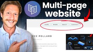
That's another reason why I'm a big fan. An important note when you're working with Carrd is that they actually don't allow you to create multiple pages. It is truly a one-pager system.
And sometimes how they get around that or make it feel like there's multiple pages is by creating these hidden sections that appear when certain actions are taken. So this #done section, you may be wondering what that is. It seems kind of weird being under the footer, but that's actually because it's a hidden section that's gonna show up when the Sign Up button is clicked.
So when you click that, we see it says "Redirect to a URL", #done. So they'll click Sign Up, then it'll say, "Thank you! " I'm just gonna switch out the demo text here for something else.
And I think our website is looking pretty good, a nice one-pager that we've got. I'm going to go ahead and publish it. And I'm going to stop the stopwatch.
13 minutes and 30 seconds, just a couple minutes longer than that last template that we worked on. I can view the site, and you'll see, if we click Learn More, it automatically scrolls down, and we have a pretty decent-looking, basic one-pager that we made in 13 and a half minutes with a functioning email list opt-in. Now, technically, I would have to put in my API key for MailChimp.
If I click Sign Up now, it's gonna give an error, saying the form hasn't been configured yet. But once I go through that basic step, the email list opt-in would be functioning, and everything is pretty much good to go on this website. So as you can see, Carrd is super straightforward, and I made this video because I wanted to show you that if you're considering building a website for your business or your brand, it does not have to be intimidating.
If Wix or Squarespace is a bit too expensive for you, or if WordPress is too complicated, give something like Carrd a try. You don't have to be intimidated and feel like you can't build a website because you're not tech savvy. I'm honestly really impressed with this platform.
This is not a sponsored video. I just think it's cool, and I wanted to share it with you guys. Another cool use case for Carrd is to create one of these link in bio pages for your social media.
But there are other apps that I prefer to use for link in bios. So if you're wondering which apps I recommend for that use case, be sure to check out this video here.