How Bright Should Things Be?
51.23k views4434 WordsCopy TextShare
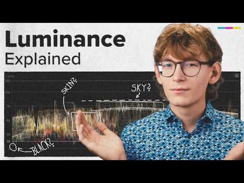
Eric Lenz
🎯 Level Up Your Colour Grading: https://ericlenz.photography/colour-for-creators
🎬 All Plugins: ht...
Video Transcript:
maybe you have a background in photography and you have edited hundreds maybe thousands of images before yet you have never asked yourself the question how bright should things [Music] be when trying to research this question you may have learned that everything above a value of 100 and everything below a value of zero is considered lost information and you should avoid it at all cost I mean it seems to make sense your camera can record however many stops of dynamic range so if you can capture all of that precious information you don't want to discard anything
along the way right but when you start color grading it won't be long until you start doubting yourself and your abilities you made your Sky no brighter than 80 and your skin tones full between 40 and 65 re just as recommended in the YouTube tutorial you watched the other day though when reviewing your grade nothing seems to work out your is flat it seems lacking and in general it just doesn't feel right this is one of the issues with learning color grading of YouTube you might understand the how because there are plenty of tutorials but
nobody has ever talked about the why this is like knowing how an engine works but if you've never learned to drive you're in bad luck so today I'd like to offer a different perspective on the topic and share a strategy that ends this struggle once and for all though before we can go there we we need to address the things that you need to know and equally important we also need to address the things that you need to forget first what actually is luminance and what is brightness are they the same thing or are they
different and if they're different what do they have to do with each other what I'm about to show you is an oversimplification but in my opinion what I will show you is everything you need to know to get going luminance is the actual light that a light source emits for us that are the devices we're grading for a screen emits light and luminance defines exactly how much of it though if you have a look at your waveform it usually says something like Luma scientifically speaking Luma is something different because it is defined as the relative
luminance calculation of the gamma compressed video signal but I promise an oversimplification so you only need to know that these two things aren't exactly the same but they are close enough that we can put them in the same category this category is rather Technical and objective on the other hand we have brightness brightness is this objective part how dim or bright something looks to certain individuals let's put this knowledge into context which of these gray squares is brighter if you said the left one then this is correct it is subjectively brighter and I would agree
with that however technically speaking both squares have the same luminance again I like to think about Luma and luminance as the technicalities you need to understand of course but on the other hand brightness may be entirely subjective and is heavily context dependent what often happens is that people at the technicalities lead them way too much when after all our work is meant to be seen by humans if we don't let our creative intention lead the way then we are a Creator who can and will be replaced by AI however if we lean into our creator
intent we enable ourselves to take control of our visuals after all what we're doing is visual storytelling to liberate us from these limitations we impose on ourselves let's address the things we need to forget there are many examples for this kind of reasoning driven by the technicalities but let's talk about the most common one I call it the Lost information fallacy in YouTube tutorials you will hear more often than not that everything above a value of 100 and everything below zero is considered lost information so far this is technically correct but then people assume that
you need to avoid it at all cost and this is where things go wrong also it's not the entire Truth for starters losing information doesn't necessarily mean going below zero or above 100 let's have a look on this clip I just apply an instance of color wheels go in here and I will push the offset way up you can see everything here goes above 100 and if we export our file as a re 79 deliverable this will be clipped so yes of course this information is indeed lost however as I just said losing information doesn't
necessarily mean going above 100 or below zero I apply an instance of color curves and I will show you that I can lose information like this or I can also lose information like this and if you pay attention to the waveform everything is well within the bounds of 0 to 100 but still we are not able to see any structure in our scene so let's define lost information as any structure that might has been recorded by our camera but that we cannot identify anymore to put it into simple words we can ask ourselves can I
see what's going on or not so let's just use the waveform in an informative way have a look at this still from the proposition all of the detail in the sky is gone in the waveform we can see that the sky is just a flat line though we don't know if there ever was any information in the sky to begin with so let's have a look at this still from Michael Clayton the edges of the composition fall into deep black and any information that might has been there is not recognizable anymore in this scene in
take shelter we're seeing a sky without any noticeable information again and in Christopher Nolan The Dark Knight Rises the entire foreground becomes a silhouette without any recognizable information either in this scene from which I was here we're also thrown into scene where we cannot see any structure on the sofa or pretty much anything in the background as you can see in all of these cases we are dealing with lost information in some form or another the question is does it matter well of course it matters but not for the reason you may think so it's
time to address the elephant in the room our Visionary system is is estimated to produce experiences close to 20 to 50 stops of dynamic range though the estimates vary from source to Source from that our cameras can record 12 to 14 stops maybe close to 15 stops of dynamic range if you're lucky now re 79 deliverables are estimated to have a dynamic range of about five to six stops though take that with a grain of s because this also depends on the capabilities of the monitor in question and in general there are just many moving
parts so let's just say our re 79 deliverable allows for significantly less dynamic range what I'd like to emphasize is that this is an act of active decision-making you're always confronted with a question of what to keep and what to lose you can expose for your highlights but at the cost of your Shadow information or you can expose for your shadows but you will probably blow out your highlights during color grading we need to make these decisions one more time what's more important highlights or Shadows of course we can try to keep both but as
a result result our image will look dull and flat because this comes at the cost of contrast instead of seeing this as a technical shortcoming however i' like to offer a different perspective knowing what to show is as important as knowing what to hide if you argue for unlimited dynamic range you might as well argue for 360° cameras because the mere Act of framing a shot is a decision about what to show and what to hide so instead of seeing these limits as something that we need to overcome we should embrace them and make educated
decisions based on our overarching goal at the end of the day we are visual storytellers so our visuals need to be crafted in a way so they carry meaning intentionally losing detail can introduce a sense of mystery like in The Dark Knight Rises the viewer is supposed to care about the subject in the foreground but fundamentally speaking the viewer may only care about this object in the foreground because it is obscure and seems unknown or we can intentionally lose detail to create negative space as a subframe so the viewer pays more attention to the action
in the scene there are various reasons why you may want to reduce the elements in your composition letting things fall into the Shadows is just one of many tools to achieve a certain creative intent with that in mind we can finally answer the question how bright should things be the only correct answer to this question is what is our narrative Focus what is our overarching goal in films this goal might be enhancing the storytelling or to evoke a specific emotion to do that I need to know how to communicate visually meaning asking questions like what
does the viewer need to see and then how do I achieve that how do I guide the viewer's eye in commercials experts also try to trigger our emotions through visuals the overwatching goal here is to sell a lifestyle make you or the product they're selling feel special Sleek minimalist whatever only on YouTube We grade our images so that our skin tones fall between 40 and 65 re because some random dude in a tutorial said it we throw our intentions out of the window because God forbid if my waveforms show anything below zero okay I want
to clarify that I'm not saying don't rely on best practices I just want to say instead of relying on random numbers without any context whatsoever I'd like to encourage you to just take a screenshot of Whatever video film or photograph you like and study it analyze it using the waveform but be aware of the context in the scene because remember how bright or dark something seems does not necessarily correspond with what the waveform shows so again being able to read and understand the waveform is a great skill to have but don't let the numbers overpower
your creative intent and your intuition analyzing images will help you develop an understanding of the light and the relationship of elements in your composition with that understanding you will create better grades over time I know I know I know all of this is well and good but in order to give yourself that room to set exposion contrast according to your creative intent you need to applo a framework that allows for this degree of Freedom the framework for setting exposion contrast I'd like to share with you is very simple as it consists only of two steps
first we want to make sure that we work scene referred and color managed this just means that we let the color space transformation be handled with the proper mathematics and that we perform all our adjustments before the color space transformation if you work in resolve there are plenty of resources out there on working color managed and scen referred the best channels for resolve and especially for color managed workflows I can recommend are Colin Kelly's and Darren won's channels if you work in Premiere you can just adapt the workflow I'm about to show here in my
timeline I have a couple of red raw clips and I will select all of them and go into the red raw settings in the red raw settings I will choose the color space red white gamut RGB and I will choose the gamma log 3 G10 okay here we go apply and now the footage in my timeline is just a bunch of ordinary log footage to work color managed in Final Cut Pro I will just grab an adjustment layer and place it on top of all of the Clips in my timeline then I select my adjustment
layer and apply a custom lot effect here I will load the proper color bace transformation lot remember we chose red log 3 G10 with the red white gamut RGB as our color space so I will choose the correct lot and as you can see we have a proper Rec 79 result for our Clips to rate working color managed means we let the color space transformation be handled by the proper tool which in this case is a color space transformation lot next to work scene referred I will perform all of my adjustments on the actual Clips
as you can see if I select this clip and apply an instance of color wheels these adjustments will get processed before the color space transformation to re 79 therefore every adjustment I make will correctly be transformed to rec 79 as well and at the same time I can still utilize the larger color space because again I'm performing all of the adjustments on my actual footage before it gets transformed to Rex 79 now let's have a look what that means I just reset this pay attention to what happens if I adjust the global wheel in your
application this might be called the offset if I push it around you can see in the waveforms that my image doesn't behave linearly it behaves a bit more like adjusting exposure in camera I reset this I apply another adjustment layer on top of that and I will perform the same adjustment up here so again I will start to push my offset around and as you can see everything behaves linearly so this is not what we want we want to make our adjustments feel as natural as possible so therefore we employ a color managed and scene
referred workflow because again if I do the same thing on the actual clip before the color space transformation to re 79 it behaves much more like adjusting exposure in camera all of this means I can feel my way into the grade because everything I do behaves in more of a kind of photographic way getting this setup right is absolutely crucial because this is the backbone of everything I will show you the second part of my framework is what I call the three-steps rule so if a shot doesn't have any severe issues I try to force
myself to get there in three steps or less and if I find myself fiddling around more than should be necessary I will reset and start over additionally if a shot doesn't require otherwise I will always stop using the global wheel or the offset because this shifts the entire image which gives me an idea of the relationship of the different tonalities in my scene so again instead of trying to take control over every bit in my scene from the get-go I try to feel my way into the grade by going with the broadest adjustment first this
gives me a good feeling of the relationship of the tonal values in the scene okay let's delete the adjustment I just did another thing I will do but this is entirely up to you I will apply the check layer which is a plugin I made for Final Cut and I will drag this over everything here and inside the check layer we have many handy tools such as getting rid of all of the color information or we can flip our image so we get a new perspective and it has some other handy tools but I'm only
concerned with exposure and contrast so I will get rid of all of the color information because I don't need it since I don't need the color information for now I will just switch my Scopes to show only the Luma waveform okay with that out of the way let's have a look at our actual timeline to see what's going on so a group of people goes into these old arches and finds a room then they look out of the window and they might see a meadow and afterwards they start to have a good time on that
Meadow to set exposure and contrast for this little sequence I will first start by picking a hero shot and I think I will go with this one because this feels like the main part of the story here so the first thing I do is try to get exposure and contrast right for this shot because everything else in my timeline will be within the context of this shot so if we have a look at the lighting in our scene we can see it's kind of golden hour Sunset wipe and I associate these situations usually with a
high level of contrast so I will just start to feel my way into the grade by using my Global wheel or again the offset and I think I want to make it very very bright so I push it up just around here and as you can see if I get my pen here I do not care in the slightest about any lost information in the highlights because what I associate with sunsets and golden hour is the dark contrast of bright lights and Deep Shadows so I will just try to achieve that so I will put
my Shadows down by the way this is step two and I think I will park it around here this feels a little bit too bright for my taste so I will just come into my midtones or gamma it may be called in your application and lower that just a tad and maybe we can go back to the global wheel and boost it up just a little bit if we have a look at the before and after this is what we started with and this is where we are now I think for the sake of this
tutorial this is a rather convincing golden hour look and as you can see I only took three okay three and a half steps so I adjusted the global wheel I adjusted my shadows and I adjusted my midtones and then I went back to tweak the global wheel just a little bit so yeah not really three steps more like three and a half but I will let that slide as just discussed this is my hero frame so what I will do now is open another workspace I have saved and I will choose color grading with comparison
viewer I will get rid of the other scopes for now because we are only concerned with the brightness information and now I will save a frame because again everything I do from here on forward is with this hero shot in mind okay the next shot I need to take care of is this one and I will continue with this one because this is the closest one to our actual hero shot I selected and apply an instance of color wheels now this is where our Scopes become rather handy we can see where our skin tones lie
just around here and we can also see where our Sky information is just about here and just about here so I can read that just shy of 100 is where my sky information or where the brightest part of my sky sits in this hero shot so I know it shouldn't be brighter in this shot because this shot is facing the other direction and the sun is coming from here or the sun is here and goes in this direction as it seems so the sky here will be a little bit darker I will rely on the
waveform just in an informative way I will still follow my intention when it comes to the question how bright does this scene feel okay so let's get started I get rid of my fancy drawing here and I will grab the offset and move it around so first I will park the entire image about here I think this gives us a good starting point then just as in the other shot I will grab my lift or my shadow wheel and push it a little bit down until the contrast feels equally Stark now this shot feels still
a little bit bright to me so I would just take my gamma and bring that down and this brings out a little bit of contrast again so I want to be careful might back off just a tad let's have a look we went from here to here and compared to our hero shot I think we can let that slide again for the sake of this tutorial the next shot that is contextually close to these two shots is this shot here because we're still outside and let's take care of this um shot inside afterwards okay so
we start with this they are inside a forest I think and here they are on a meadow so on the meadow it will be significantly brighter than in the forest and this is the first thing I do I play an instance of color whe and again I will grab my offset and just pull it down maybe set it around here and again as you can see there is plenty of lost information here already underneath these arches but I do not care in this slightest because for one we don't need to see what's going on in
these arches and secondly it's dark there so I want it to feel dark in this shot I'm quite satisfied with where my highlights are at the moment the only thing I find a little bit too strong is the contrast in the scene and one way to combat this is just grab my midtones or my gamma and lift that up just just a touch so it shouldn't feel too bright so I might have gone too far and maybe I can push the offset down just a touch more something like this and combat contrast just a little
bit with the midtones again okay let's have a look this is where we started and this is where we are now in the context of our hero shot this actually feels like a darker place let's leave it at that and let's have a look at this shot inside of these arches or underneath these arches okay so this is where I would and this is entirely subjective but this is where I would break continuity in this shot here I took care that the sky does not exceed the sky from the hero shot because the hero shot
is facing the Sun and this is facing away from the sun with this shot however this is where I want to push it a bit I want to make the window feel very bright because it's gold now and they decide to go on the meadow afterwards now I will just grab my offset and push the entire image up until it feels right to me then I will just take my lift or my shadows and pull it down increasing the contrast also helps making the window feel a little bit brighter but the contrast now is a
little bit too Stark so I want to reduce what I did with the lift and use my midtones instead something like this okay I might want to save a still from this scene because this is where they go inside of these arches and I just want to match the VIP and I think what I did just from the top of my head works out really well I might want to refine the darkest Parts just a little bit more and yeah that's pretty much it if we now go back to my other workspace so workspaces color
grading and have a look at the sequence just pay attention to the continuity I think we can call it a day here now let's able to check layer and have a look at how it feels so even with color information it doesn't seem too pushed then they go underneath these arches the light is wonderful here as it as it catches his shirt there so this looks good and the light feels very warm and bright so I'm satisfied with that on the meadow yeah I think we could have introduced a little bit more contrast but I
don't want to go back now and as far as continuity goes I think these shots now work together and kind of tell a story how bright Everything feels I know this was a lot so let's recap the key insights luminance and Luma are objective measures of how much light our monitors emit brightness on the other hand is very subjective and context dependent remember the two gray squares losing information in the highlights or the Shadows is nothing you should be afraid of because your color grading should always be in line with the story you want to
tell removing information from an image can be a powerful tool and is is not something that should be avoided at all cost be informed by the waveform but don't grade for the numbers when color grading employ a scene referred in color managed workflow so your adjustments feel as natural as possible when making adjustments always start with the broadest adjustment to get a feel for the shot and try to find the path of least resistance maybe you even remember my three steps rule when you're struggling with your next shot if you want to level up your
color grading I have a link in the video description for you and if you want to learn why avoiding Lots is probably doing more harm than good you should watch this video next
Related Videos

19:12
What Nobody Told You About Colour Grading
Eric Lenz
26,870 views

21:53
Grading Log-Footage is easy, actually.
Eric Lenz
55,328 views

12:35
how to create natural ‘cinematic’ lighting
Mark Bone
151,694 views
![Watch these 25 mins to FULLY Understand Color Management [Beginners Guide]](https://img.youtube.com/vi/AAeZKZ5feGA/mqdefault.jpg)
25:42
Watch these 25 mins to FULLY Understand Co...
Darren Mostyn
46,607 views

20:03
I’m 40. If You’re a Filmmaker in Your 20’s...
Luc Forsyth
79,268 views

12:50
Master Skin Tones in DaVinci Resolve: Secr...
Ibrahim (ilker) Er, PhD
1,323 views
20:13
Two Things in Lightroom You Should Conside...
Anthony Morganti
17,969 views

19:41
Lefties losing it: MSNBC host spreads ‘dis...
Sky News Australia
329,669 views

9:38
Most RIDICULOUS Moments In Women Snooker..
SNOOKR
8,312,617 views

11:19
Mastering Color Temperature in 3 Steps
Rob Ellis
65,964 views

18:34
The Ultimate CONTRAST Masterclass for Colo...
Waqas Qazi
22,534 views
16:13
This is why your photos are boring.
Mads Peter Iversen
42,441 views
19:58
Film Color School (Part 1) - Senior colori...
Colorist Foundry
16,743 views

8:27
Final Cut Pro 11 - The Small Things No One...
Serge Morgotch
24,310 views
28:25
The BEST Settings for HLG, Log & Raw in Fi...
Eric Lenz
1,705 views

1:06:33
You don't know middle gray like this (but ...
Cullen Kelly
13,259 views

11:37
You don't understand Exposure – Adjusting ...
Eric Lenz
3,366 views
22:29
3 Grading Lessons I Learned the Hard Way
Waqas Qazi
20,120 views
14:22
How to Use Lightrooms MOST POWERFUL Masks!
Christian Möhrle - The Phlog Photography
60,147 views

12:49
Your Color Grading Sucks, Not Your Footage!
Sightseeing Stan
77,815 views