How I Actually Make Viral Thumbnails
543.55k views2382 WordsCopy TextShare
Isaac
I made only 3 videos on my channel and all of them went viral. One of the main reasons for that is o...
Video Transcript:
I made only 3 videos on this channel and all of them got over 100,000 views believe it or not it all comes down to these 4 steps I already explained how I use storytelling to get more retention now it's time for step 2. . .
you ready? if no one clicks on the video they don't watch point of the thumbnail is to create a journey from the thumbnail to even the high quality images are crucial add some intrique and make people want to know what happens next doesn't make any sense does it? we need to make better thumbnails.
. . I don't mean these guys are wrong but let's be real you already know all these basics even if you don't they're just common sense do you really need to be told to keep your thumbnail simple 5 different times in 5 different videos from 5 different gurus?
I guess not so here's the full guide on how to actually make a thumbnail that gets clicks we will go from the design rules I use to thumbnail types getting inspiration branding word choice visual effects testing and. . .
the first rule is pretty simple but it takes your design from a mess to a piece of art just take any popular youtuber's thumbnail and and draw 4 lines like that do you see what's going on there? almost all of them even my thumbnails follow these lines at the core well you might know the rule of thirds from photography which basically says put the objects over these lines to get a nice shot that's why almost every channel has a thumbnail like this because it works so just add those lines to guide you throughout the entire design trust me it's a game changer we'll come back to the layout but before that you need to choose a color. .
. you probably heard people talking about the color wheel the idea is to get enough contrast in your thumbnail you should choose two opposite colors from this circle and if you dive deeper you would see there are more techniques that's used to get fancy combinations but here's the plot. .
. I don't use them there's a much easier way to find a color for your thumbnail and for your entire channel so here's what I do take any color you like as your main color I chose yellow for mine then add three more one black one white and one in the middle you can slightly tweak these to match your main color but I like to keep it simple and finally add another color to highlight things there we go go a color palette that's actually useful even though my sister says it looks like a Minecraft house made from diamond and gold I like it you can use it in your editing too but that's for another video now you might ask wouldn't that be too repetitive if I use the same colors in all my thumbnails? that's right!
the solution is simple just change the highlight color that way you can keep the fresh vibes while still being recognizable by your viewers it's simple just pick a basic font that isn't overused and you're good to go for those those who are asking the fwn I use is called "eastman" and it looks pretty good all right we talked about the rule of thirds and how to make a good layout it's nice but you can't just invent something new in this square for every single video right? well you don't have to if you paid attention while browsing on the homepage you may already have catched some thumbnail types that most youtubers are using shout out to this legend for breaking them down into 21 categories but here's the best 10 that will work for 99% of the time youtubers like Airrack and Mreast use that style all the time but even if you're not an entertainment channel you can still use this type of thumbnail take a look at this hey what's he doing? !
dude put that chicken down! oh this is how airplane engines are tested. .
. they test it with chickens? !
see that's the target emotion of these thumbnails just shock the viewer while scrolling on the homepage and make them clip it's easier to say but think about what you have in your video that would shock the viewers of course big things always get more attention don't take this out of context people are curious to know what a $50 million house looks like or how this dude earns $900 just by listening to music until they realize he doesn't among all those over edited and screaming thumbnails another way to stand out is keeping it really simple just an interesting chat from discord a chair a red button or this thing whatever this is may get more attention it's usually just a screenshot shot from the video and a simple question that makes you curious to know what's going on channels like DrInsanity or Zack are doing it so good that it makes it impossible to skip if you're a small channel and a popular niche social hacking is probably the best way to gain the first traction basically take the face of a famous person in your Niche and slap it into your thumbnail oh the video must be about that person though otherwise it's called clickbait all the videos you see with Mreast's face are using this strategy and it works pretty well even dream used in his first videos so don't underestimate the power of a popular face all right let's speed things up this is the style you see all over youtube just the creator next to something bigger yeah the one I use in this channel basically an interesting text at the top to give more context about the video it can be anything to compare to before and after something cheap versus expensive iPhone versus Android fin versus AI you got the point blurring the main character or the final result so people have to click to find out I don't know if you realize but all of those viral thumbnails that I showed in this video and even all the ones that you saw on your homepage have one thing in common they're not just using one of these formulas they're combining them look at Mrhosetheboss' series where he buys every release of a tech like iPhone or Playstation I showed you this in big numbers but if you look closer you would see that he also uses header comparison and even social hacking formulas all at once or take a look at this chair which types could you spot it's branded because of their logo right here it's simple because well there's nothing else than a chair and it's using social hacking because everyone saw this chair at least once we can even include it as a weird object if you think chairs are weird? . .
. even I used big numbers and header styles in my first video on this channel I wouldn't say it's very creative but it worked for sure I can go on with all the thumbnails that I showed but the idea is choose two or three styles combine them and try to stick to it for around five videos it will make your audience understand it's your style but don't stick to it for too long because using the same formula 100 times would probably make the viewers feel like you just keep repeating yourself and it will lower the chances of click unless you're a reaction channel. .
. well it's one of the most popular advice that you can hear from youtube gurus just look what other youtubers in your niche are doing and try to replicate but I completely disagree with that and I have evidence to support my opinion take my first video as an example trying youtube shorts is definitely not a unique video idea what about the thumbnail that style seems to work for many people well in that case you're a smart guy just copy what works right the problem is you're not the only one that is the worst thing to do if you see many similar thumbnails from different channels about the same topic hopping on that train is probably not a good idea if so many channels are already doing that it's the cliche thumbnail now and your audiences are basically the same so there's no reason for people to click on your zero view video instead of their 100k even worse people will probably notice they're too similar and you might become just a copycat of your competitor so what should you do then you can't reinvent the wheel for each new video right? well.
. . just kidding of course it's not really possible to do that if you're posting consistently sooner or later you'll run out of thumbnail ideas and when that happens you should just look at channels outside your niche for that video I went through the channels I follow in completely different niches and came up with this thumbnail same thing applies to almost all of them so get inspiration from the channels with different niches that will make your video stand out from the crowd because your audience with those channels are different but it's the same with all these other channels so when it appears alongside those yours will be much more likely to get more attention experimenting with new things is always good but just try to keep the core elements like colors fonts and style consistent that makes your audience notice your video on the home screen way faster and with enough time boosts the CTR this is where you got to be creative you can use a big number if that suits your video a bold statement opposite of a common belief or just a title that represents your video if nothing fits well leaving it blank is always an option congratulations you just learned how to make a viral thumbnail right I don't think so look you learned the theory which is really important but it doesn't mean anything if you don't know how to use them most people will probably close the video at this point take all that information and go make a thumbnail like this but if you stick around you'll learn how I turn this into this hey Finn what do you call it?
Photoshop baby! ! PhOtOsHOp BaByYy how you say it like that.
. . with just a few simple effects and some ancient Photoshop sorcery that I learned from this guy yeah hey everyone I'm still here here got stuck in this timeline dude you need to work on your jokes PHOTOSHOP.
. . after choosing your concept and sketching a detailed draft on paper open Photoshop create a new project get your lines add your character text a nice background and other elements it already looks better than that make the text fancier by double clicking here then change the color add inner glow outer glow and whatever this is just tweak the settings to make the unique effect you want here are the adjustments that I usually do if you want to get a similar style after you're happy with the look save it as a new style to use it next time you can do that for other elements too it's the effect that I used in this thumbnail to bend this chart you can bend anything by just clicking the corner of an image and choosing this button now you can warp it however you want looks good but they seem too distracting in the background let's add some blur select the image filter blur gaussian blur that might work work but we can do even better let's try again select image filter pixelate mosaic oh we made it worse again again that's it even though these blurs might not suit this thumbnail they work very well in some cases so it's nice to know how to use them all right let's move on we fixed these images but the background is too shiny it's almost hard to read the text so we need to make it darker take the brush wo wow calm down you don't have to be a Bob Ross to use this okay just try to keep up make your brush big and soft reduce the flow to something like 5% and increase smoothing now open a new layer on top of your background and start painting behind text character and things like that okay we're getting somewhere that background image looks nice but I don't really like the color I said but I don't really like the color how' to change it glad you asked select the background click image adjustments hue and saturation here you can choose a specific color to change or tweak the entire image noise we're almost done but I'm looking so unnatural over there I mean the text above my head is shiny there should be some light reflections in reality right?
pick the selection tool select the thing create a new layer take the brush make it smaller pick a nice color and brush over where the light is coming from oh don't forget to change the layer blending style to overlay if it doesn't work for your image try other styles and colors too after everything's done I like to send it to my phone and play around with the colors in Lightroom so it goes from this to this before publishing the video you need to test how it looks on youtube homepage to do that go to thumbs up. tv add your title and thumbnail and see if it looks good if it does you're good if not go back to the drawing board again but hopefully it does here it is I know it's probably not the best way to make a thumbnail but that's just how I do it at the moment it will definitely change with time but for now this is all I do and it works for me so may work for you as well. .
.
Related Videos
14:07
How To Make THE BEST Thumbnails on YouTube...
finzar
1,183,324 views

20:44
I Tried Making a Viral AI Video!
Isaac
93,829 views

24:21
How to Make VIRAL THUMBNAILS like celebrit...
Nour Art
269,504 views

15:33
Thumbnail Hacks YouTubers Use To Hook You
Film Booth
197,176 views

1:11:21
How To Win The Game of YouTube (YouTube Co...
MagnatesMedia
400,519 views
3:07
FREE Websites That Will Make Your Thumbnai...
fraziel
2,605 views
12:17
How I Actually Make Viral Shorts
Isaac
1,871,867 views
15:51
This intense AI anger is exactly what expe...
Digital Engine
8,366,137 views

10:44
How to Get Out of Small Channel H3LL, Forever
Nate Black
263,449 views
16:09
This is the dangerous AI that got Sam Altm...
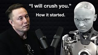
Digital Engine
2,494,956 views
5:54
How I Broke Youtube with 1 Video
Isaac
477,194 views

30:07
how to make a killer thumbnail (for the 20...
Aprilynne Alter
318,844 views

17:28
How I Make Viral MONETIZABLE Faceless Yout...
AI Guy
440,324 views
14:38
How to Start a Gaming Channel in 2024
vidIQ
903,830 views
16:29
I Bought a $1,500 Youtube Channel and Earn...
JackSucksAtLife
4,239,510 views

8:01
I Remade MagnatesMedia THUMBNAIL in Photos...
Badis Designs
21,804 views
18:03
I Made 700 Monetizable YouTube Shorts for ...
AI Genesis
3,835,203 views
12:04
6 Audience Retention Tactics Genius YouTub...
Creator Talk
130,919 views

11:23
How to make VIRAL THUMBNAILS for your face...
InVideo For Content Creators
11,244 views
14:32
How to edit SO good your viewers get addic...
Learn By Leo
1,608,950 views