FULL 1 Hour Logo Design Course (Everything You Need To Know)
114.95k views9524 WordsCopy TextShare

Satori Graphics
This is a 1 hour full course on logo design, and it is jam-packed with tips and tricks for you and y...
Video Transcript:
[Music] why did Nike choose this as their logo font and what does the Aston Martin logo type say about its brand how do these font choices communicate and possibly trick consumers what is the OG font used on the Nike logo three points to you if you know the exact font choice for this logo design so the design used is futurer and to be more specific futurer condensed extra black if you want to truly level up in logo design or just as a graphic designer in general you need to start understanding why certain fonts are used
and then translate that knowledge into your workflow but going back to that question why have Nike chosen future condensed as their brand asset well let's ask this question what does Nike want to communicate as a brand to the audience it's a sports brand so sending out a message of strength stability power a kind of Modern cutand Edge Vibe and maybe a sense of motion would be a great start the logo symbol itself the swoosh does half of the work in communicating the message to the audience the style of the type face does the other half
future condensed extra black is very bold and very hard-hitting it looks robust it looks strong and and it looks somewhat modern even to this day the modern look is in part due to it being a sansera font and when it's used in italics we get that kind of sense of forward motion that works really well for sports type Brands this font wasn't drawn out of a hat or chosen because the designer simply liked it it was a wellth thought out decision that works even to this day let's try the next logo font and that's for
Aston Martin first we should consider what this brand sells which of course is fairly expensive cars who do they sell these fairly expensive cars too well professionals business owners Millionaires and so on with all of that in mind what does Aston Martin want to convey to their target audience well they probably want to show they are superior have a sophisticated sense of class and are somewhat serious in nature if we look deeper into ason Martin's brain message from their own website they suggest that the winged logo is meant to represent Elegance freedom refinement and Elite
Performance so with that in mind would a lowercase Sans serif font Choice such as avatard Gothic work for this logo well probably not because it's too bold it's too personal and it's too informal instead they utilize Optima Roman this choice of type face works really really well because it looks professional and formal however it also looks elegant and light because it's not so bold and it's not so loud in nature it's really quite refined but let's take a look at a third example let's run the sequence through once more think to yourself what is this
brand selling who are they selling it to and what sort of emotions or feelings do they want to communicate to their target audience if you continually think like this guys you will go a lot further in your Design Careers than most other people out there so ammani is situated in the middle of a very prestigious and very stylish Niche sector that being the world of fashion it's positioned at the somewhat high end of the spectrum relatively speaking so you can probably come up with words such as luxury Elegance style and Prestige taking a look at
psychology of tip faces serif font tend to fall right in line with these kind of words so you can see how it's simply just a case of knowing exactly what you want to say to an audience and of course finding out who the audience is and then tailoring the style of the tight face to the audience it's such a simple concept and yet it is so easy to mess up without the right knowledge and execution the first type of logo we're going to talk about today is the letter Mark or as some might say the
monogram logo these logos are comprised of just texts but they do use the initials of a company or brand the main reason for this kind of logo is where a brand name is too long to be well brandable and so the name is abbreviated into single letters for example the National Aeronautics and Space Administration or as we commonly know NASA now if you have a client who has an extra long brand name and as a designer you think it's not going to work as a logo then you might try suggesting a monogram logo but they're
often tricky to work with because you need to find a way to make a handful of letters become iconic and to stand out from the crowd however it can be done of course next up another strictly topographic logo the word Mark some examples that exist are Disney Google Coca-Cola and FedEx but when would you possibly consider this kind of logo iation for your clients now a word Mark is often good for startups or new businesses and this is because it literally gets their name out there in the open world they are simple and communicate to
the target audience easily because the logo is exactly what it says however you need to use your knowledge of design and marketing to convey the right message and the tone with the topography Disney has a very elaborate and decorative font because it's based around a sense of fantasy and magical entertainment for children also it's quite important to keep the word Mark logo short nothing too long in terms of the number of characters you use word marks are also good for showing a Brand's confidence you'll notice a lot of fashion brands have word mark logos or
at least they heavily use the word Mark versions but how about the brandmark or as others might say the pictorial Mark logo these are often added into a logo design package but there are some brands that exclusively just use a brandmark for their logo the advantage of doing this is they're simple and easy to recognize globally that's because there are no specific languages used so basically they're just Universal the tricky part is actually designing a brandmark that is solely related to the brand itself very few Brands Venture down this route in the modern era Brands
like Twitter and targets are brands that most of the time only use their brand Mark when it comes to representing their self in society they do have versions of the logo that is complimentary with logo type but they rarely use them when done correctly the brandmark logo is great for forming that psychological bond between brand and target audience and also when it is done correctly the bond runs pretty deep now the combination logo Mark uses both a logotype and a brand Mark these are the most commonly seen types of logo out there and in my
honest opinion they're likely the easiest to work with as a designer these are good for clients who don't have lengthy brand names and also when you want to offer flexibility like I said earlier these days a lot of designers including myself will package a logo in the forms of just a brand Mark just a topography and then also a version of them both together as a combination Mark you want to make sure that your typ face style matches the style of the message or the brandmark and that's so the overall designer comes together and also
conveys the intended message if you're client is looking for intense Simplicity then you might want to just focus on the brandmark or World Mark emblem logos are quite Niche the most notorious of course is the Starbucks logo by appearance they seem very traditional and some might even say outdated however these types of logos do suggest Authority authenticity and demand respect they're often used for organizations or government entities and also any kind of group or team as well this is mainly due to the roundness of the design which psychologically speaking suggests togetherness mascot logos are again
quite Niche they come across as sort of entertaining and fun they are there to give the brand a face or character to remember and possibly even to appeal to a lot of restaurants and food type brands do use mascots for the logo designs that's because they are fun and also that their clients should feel the same way when engaging with the brands that being said using a mascot as a logo can easily go wrong and it's hard to pinpoint the right type of mascot for a brand that can stand the test of time it is
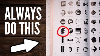
possible but it's also not easy grids are insanely helpful in logo designing but they're often misunderstood we will for sure get to the circular magic and the Beautiful lines but firstly just remember this one crucial thing logo design grids for the most part are used in the later stages of a logo design project you first need to go through the design process of research developing Concepts and all that good stuff the logo grid itself is used to neaten up and perfect the logo in the latter stages now that's out of the way and said and
done let's get to the juicy stuff the first thing you should know about logo grids is that as a general rule circular and ubal grids are awesome for making organic and natural kind of logos you know like this chilled polar bear logo design right here or this kangaroo if this kangaroo is an actual brandable logo is another matter but as a general rule if you want something natural then a lot of circular grids will help that fact on the flip side you then have the more man-made and rigid designs these logos heavily use straight lines
for the grids and I find on my Lego designs depending on the shape pychology of course 45° lines do work really well for neat designs like this more about that later so this first point is just a general rule and it's not a setting Stone kind of thing but let's look at the next aspect of L design grids that I think you agree does make a lot of sense now a lot of reasoning behind the use of grids is to keep your logo designs precise let's take a look at this vest bua design a little
bit closer the micro white space within the symbol is the same width throughout the entire design and that's because I used a grid however we can call this space 1 X or just one times if I ever want to increase a part of the design that has a width of 2x or two times I can use a grid to 100% precisely do that it's one obvious but truly powerful reason for using a grid on your logos using grids with a set spacing that is precise and shown on a grid is also a great way to
send clients a logo version so they can see how well mapped out it is but it also helps any future designers who will end up working on this design and speaking of width let's take the Coco Chanel logo to demonstrate the next tip for using grids on your logos because here it's a toy Graphics we look at the how to do something but also the why anyway when using grids on your logos you can use circles to measure or show a width of the part of a design but then show how that width is maintained
in different areas of the design this keeps things precise and clean and it's one of those techniques that shows professionalism here's a mock logo to show you the next use for logo design grids and this one again demonstrates a precise nature you want to aim for precision when you're finishing your logos so let's add some lines to represent a grid and we will look at actual grids later in the video guys but let's take our design and we can measure the angle degrees from the logo to the logo grid line and that's 72° however being
precise and using grids to design things we can show and be assured that our design shares the same angle in many other locations too but the last tip before we look at an actual logo design grid is about micro white space so here's another mock design but let's slap that onto a grid now I can be really precise with the distance between the logo symbol and the logo type I could also go in and K the lettering to fit the grid but in this instance my grid is just a bit too wide grids really help
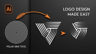
in being precise with micro white space around the logo symbol the logo type and between each other but hey what do you say let's look at the fixed Grid in illustrator and how to actually properly use it so in Adobe Illustrator we want to come up to view and then show grid but importantly also check the snap to grid option this is going to prove to be essential when you're designing your logos and you can see that here because anything I create will fix itself to the GD lines this helps to make sure everything you
make is neat and flush on your vector logos so I'm going to start off with a circle using ellipse tool and I'm going to hold down both the alt option key and shift again for an actual logo project you should know what the design is going to look like before you bring it to the grid and you want to go through the design process and all that good stuff now I'm going to copy this and then paste it in place with command or crlf notice how nicely my circles are touching the grid and snapping to
it now I'm going to use the pencil next and you don't even need to hold down shift when you're drawing things out simply because the snap to grid option is activated it makes drawing so much easier guys now can you envision what sort of quick mock logo I'm going to make from this here but next I'm going to use that technique by using a circle to measure a width of my design but I want the circle to be a Standalone circle at the same width as my other part of the logo so after finishing up
with one more line it's time to grab the shape Builder tool which you can find right here with your design highlighted just click around it like so and if you want to remove things just use the alt option key and hey that's a very quick mock logo symbol just made using a grid and like I said to keep Unity on a logo design or even a type face for that matter you can take parts of your design copy it over and you will keep the angles the same degrees as we looked at earlier so here
are some reasons for using a grid on your logos and how to go about it when you embark on the design and if you really want to get to grips with the logo design process be sure to check out my EGU Linked In the description box below [Music] the first sign that your logo designs are perhaps not up to scratch often results in the logo design looking gimmicky unprofessional and even outdated now this often happens when a logo designer is eager to impress and decides to throw a bunch of effects and software filters onto their
logo design this ultimately reled to an over Alliance on software effects and software functions so we're talking about the use of excess gradients crazy or complex typography drop shadows bevels and just unnecessary effects that really have no place now if you take a good logo it allows its form it shape psychology and composition to do all the Talking not bells and whistles that look like well pretty much '90s clip art a mature and really professional logo designer can actually move past these gimmicky effects and they can make logos that are truly iconic and stand the
test of [Music] time now the next sign that your logo design doesn't necessarily cut the mustard is something I was personally guilty of for quite a long time now it comes from a lack of attention to detail little to no technical proficiency and simply a designer who is rushing this sign is sloppy or poor execution where the designer may have a great idea or concept but doesn't pay enough attention to the quality of the finished design now here are some Hallmarks that are very classic and very normal for a logo that is guilty of this
pixelation or blurriness which is often a result of a raster design and not a vector another cause of poor quality output is uneven spacing and poor alignment and this stands out like a saw thumb and automatically looks like Amateur hour inconsistent line thickness unless of course it's actually intentional on say a more organic or handdrawn esque design and then also a weird or complex composition that doesn't make any sense so you always look at your logo and scrutinize and think is it up to scratch is it neat enough you should never skimp on the final
execution of your design here's something that is so important that if you're exhibiting this warning sign you really need to flip and reverse it right [Music] away let's say a small business owner let's call her Sophie is launching a new bakery and is in need of a logo to represent her brand now she decides to hire a freelance graphic designer Alex Alex promises her four things a quick turnaround a quality and successful logo due to his past projects unlimited revisions and a beast spoke design instead of this Sophie gets poor communication missed deadlines a somewhat
unoriginal logo that looks like it's been pulled up from canva and one revision Alex sounds like a terrible person but anyway this is an extreme example of course but the message here is of over promising and underd delivering what you should aim to do is to overd deliver on your promises and just wow or surprise your clients if if you promise 14 days turnaround try and send in 10 if you promise three Design Concepts send four solid concept designs and that is how you grow a career and connections with [Music] clients there are likely a
very small percentage of beginner logo designers who aren't guilty of this next sign and it points to their logos and their workflows just not being quote unquote good if a logo designer is tasked to design something for a save the world charity they might simply jump onto their computer and just start designing that's a no no this directly ignores something called strategic design thinking without strategic thinking the designer might totally ignore target audience analysis which would result in a logo that doesn't speak the language of the people the brand intends to reach now this could
also result in a logo that looks good now but it doesn't stand a test of time and has a very short lifespan the designer might also assume that any visually appealing design will work without aligning with the organization's missions and the goals or the brand identity when designing a logo you need to plan and to think in a methodical way you need to do research and approach it from a problem solving mindset this is how good and functional designs are created over and over again now as a bonus tip I'm going to share three aspects
that you should explore when thinking about strategic logo design target audience who are they what do they like what do they dislike and just what makes them tick shape color and type face psychology how can your logo Express a message and a tone via these three things memorability how are you going to ensure the logo sticks in the mind of the target audience like a permanent but welcomed hook [Music] now the fifth warning sign that your logo isn't that good is probably most probably one of the worst on this list if not the worst but
at the same rate it's the easiest to fix so let's have a look if you are a logo designer who is exhibiting this warning sign you can expect some of your logos to represent this unfinished and rushed designs that look unprofessional a competitive advantage against other similar client Brands doesn't match the brand or client identity missed opportunities for good concept creation and execution now what can actually cause your logo or a logo to have these negative traits is simply but it's a lack of iteration and revision on the designer's part it's so easy to make
a design and to just settle on that first design but this is such a killer to a logo design career it's unreal all it takes is to give things a bit more time and to evolve your first designs while of course referring to the brief and the research now 99% of the time your second design or second iteration of a design will be better than the very first design you make that is if you approach the iteration with design thinking and a problem solving mentality in the logo design project the next sign that your logo
design approach isn't as good as it could be refers to the latter stages of our project now providing clients with l logo files that are not properly formatted or optimized for various different applications is something you want to avoid and examples here might be missing Vector files incorrect color modes poorly named files and so on now this can lead to compatibility issues and hinder the logo's usability or usage at the other end for the client to increase your chances of getting more work from the client you're working with do not rush or mismanage the end
stages of the project we're talking about the packaging and the presentation don't underestimate this whatsoever you can technically build a career and earn money from logo designs that show these negative signs in today's video but it's a lot more difficult than if you just fix and address these signs now my career and my logo designs really grew to greater things when I started to implement shape psychology into my projects and that's why it's the first tip today's video now I'm not going to go into huge detail about the psychological meaning for each kind of shape
because I have done that multiple times on this channel and there are loads of websites out there that talk about it but briefly squares and rectangles are strong and reliable circular or oval shapes represent Community friendship and love angle straight lines are linked back to motion and a dynamic sense of speed and the list just goes on but the important thing is to understand that our subconscious mind responds in different ways to to different logo shapes straight lines circles curves Jagged edges they all imply a different meaning and so a skilled logo designer can use
shapes to evoke a specific emotion to the target market or to make the target market think a certain way and remember graphic design is just a visual communication so shape psychology is a huge part of logo designing or it should be a very good example of shape psychology is the cat logo now cat is short for Caterpillar and they're a business that leads the way in Rec construction Machinery production and sales triangles from a shape psychology point of view show strength and stability which obviously is something you want to evoke when talking about Machinery used
in construction now we would look into why yellow or orange is used for this logo but that's another story for a different video but if you do think you know comment below the second tip is to experiment with placing your logo design shapes in real life situations to see how they look sometimes we can kind of get tunnel vision when crafting our logo shapes on paper or design software and that can lead us to where we forget about the actual practical use of the logo design so before you send designs to a client or settle
on a specific logo shape try mocking it up on a business card a letterhead a banner or wherever the logo might end up in real life and see how it functions in that situation you might find that your logo on screen looks very very different when it's used in a real life application and that might change the whole course of your project tip number three is to know your client and the target market yeah I've said this many many times but you should be doing things like compiling a list of the corporate values of your
client or take a close look at the goals the business wants to achieve if you conduct the research needed you can then start to formulate Concepts that turn into logo design shapes so basically here tip number three is a quick reminder to know your client and also their customers the fourth tip helps with getting the ideas for logo shapes from your research you can marry together word pairs in couples so an example could be that Adidas had two words such as motion and progress which would lead to the logo shape being born as angle straight
lines do evoke a sense of forward motion and the steps up could be seen as progress or you can take my truth art logo project where I use the initials for TNA for truth art and then I also turned that into an easel which of course relates back to Art combining word pair or words can lead to the best logo shapes when carefully thought out of course the fifth tip for excellent logo design shapes is to really focus on memorability now it's one of the Core Concepts of a great logo design and if you do
focus on the logo being memorable throughout a project you will likely end up with something halfway to being acceptable and often an easy way to make a logo design memorable is to keep it simple think of the most popular Lego designs out there we're talking about Nike Apple McDonald's m Microsoft all of these logos have shapes that are very very simple and they stick in your mind and that's the main key to their success really of course alongside branding techniques and such tip number six is to use a grids there are many grids at your
disposal as a logo designer using a grid will ensure that your shapes are precise and crafted with care sure you can start off with a sketch or an idea but when it comes to finishing that shape using a grid is almost always going to be a great idea now you may have watched videos on the shape Builder tool before you know the ones where you're told the alt option key removes areas and how to make interesting shapes with that tool what today's video goes way beyond that as I share some really useful and crucial tips
for using the shape Builder tool in logo designing the first tip today seems a little bit weird but it's vastly important and I've seen designers getting this totally wrong before when designing a logo don't start with the shape board at all don't even give it a few clicks now there is a good reason for this and that is that a good quality logo design requires the logo design process this means you should be researching the brand developing an overall image of the project and creating Concepts once you have all of those bases covered you can
then begin to incorporate your digital designing and the use of a shape build at all so don't rush in with 300 circles on your artboard trying to make some interesting logo design shapes with the shap bu at all so tip number two with the shap but tool is that it's always a great idea to import some sketches for your legal Concepts right into illustrator and you can use them as guides when you're using the sheap bit at all also you could make some sketches using a drawing tablet directly into illustrator and then lock these down
as a guide for you creating the logo itself of course it's whichever best suits you and your workflow and to import sketches either scan them or just simply take a picture on a camera or smartphone and then upload that to illustrator having your ideas and Concepts right there on screen does vastly help the workflow especially when using the shape Builder tool the third tip is a quick and a simple one and that is to change the keyboard shortcut for the shape Builder tool Now by default it's probably shift and M on your keyboard and if
you don't use a keyboard shortcut for this tool already you probably should and that's because you first need to select all of the shapes and then access the tool afterwards and this can be annoying but also the standard shortcut is annoying of shift and M and so trust me just having a very simple and very easy shortcut will make your workflow that much more smoother in the long run so the fourth tip for using this shape Builder tool in logo designing is to check for gaps sometimes we might have gaps in our shape orientations and
this will mess up the workflow with the shape build at all all so if you actually select or double click the tool in the tool bar you'll bring up a settings menu and then you can just click the box to check for gaps and then set the size setting having this Gap detection activate means illustrator will actively search for any gaps and then just ignore them so you can use the tool as normal it's just one of these things that can be very handy and sometimes people do have gaps without realizing and don't understand why
the shape bu tool is not working tip number five today is that you want to have your snapping settings correct and this is so that we can align things and position things EX exactly where we want to have them we don't want illustrator to be stubborn and to snap objects to places we don't want them being and so firstly do not have the aligned to pixel grid options selected and then also make sure you're snapping options on smart guides and also just in general are well suited for this kind of workflow so you probably want
to have quite a low tolerance on these snapping options and tip number six for using the shape bu tool is to make use of outline mode now this is command or control y on your keyboard and it's a highly effective function for making sure everything is precise and flush with your shape orientation so sometimes we have a thick stroke or a filled shape or some other stuff going on and if you just come into outline mode everything is really precise and Crystal Clear to work with and we can align things really really perfectly of course
you don't want extra bits hanging off of your designs when making a logo so what is the the offset path function in illustrator and how can it be effectively used for logo designing now there are two key offset path functions in illustrator and today we're going to be looking at just one of them but I'm going to show you how it works and then some tips or some tricks for applying that function to logo designing to demonstrate the offset path function I'm going to make a circle using the ellipse tool which is L on your
keyboard and then I'm going to duplicate the circle by holding down the alt option key and then just clicking and dragging and we can create the illusion that these circles are overlapping simply by using the offset path function and so first I'm going to outline the stroke of the circles to Vector [Music] shapes then in the same drop drop down menu you will find the offset path function which you can see right here do make sure to check the preview box so you can see your actions in real time and as you can see I'm
adding an extra shape around the existing shape of my design now we can change the style of the offset path but for this design it doesn't really matter because it's totally round we can look at this in later videos if you do want to see that but also we can control the amount of offset here and pressing up and down on the arrow keys on your keyboard will increase or decrease that amount now if you hold down shift it will increase this by increments of 10 and if you hold down the command or the control
key it's going to do so in decimals now after adding the offset path you can change the color of it by clicking the color palet or using the Ider tool so now the circles look like they're overlapping however this isn't the end of the story because if we drag the design off to the side of the artboard we can see the white outlines which isn't ideal for a logo design so what we can do is to select the design and then choose the shape Builder tool now you will notice that when you hold down the
alt option key you have a minus icon above the cursor and this is going to allow you to remove the white areas of your design now once this has been completed you will have a design worthy of sending to a client simply because those white outlines are no longer [Music] visible so just the heads up of course this luga design is not related to a brief and it's not incredibly well thought out it's just a simple demonstration of the power of the offset path function in illustrator but as we did earlier create a circle but
this time you only want to use a single Circle increase the stroke weights and then press C for the scissors tool you're going to want to click the bottom Anchor Point and then also the left hand side Anchor Point and you will notice that you were left with a 3/4 of the circle highlighted which you can then delete now press P for the pen tool then click the bottom Anchor Point and hold down shift to move the cursor upwards shift is going to ensure that you're following a completely straight path now the smart guides are
telling me when I'm in line with the left Anchor Point so I'm then going to move the penil over still holding down shift so we now have this shape right here but go ahead and press M for the rectangle tool and create a perfect square by holding an shift and drag your design to a corner of the square and increase the design size so it meets the edges of the square like so send it to the back of all design assets but just to make sure that the design is perfectly within the square you can
press command or control y to enter into outline mode and as you can see mine is a little bit off so I'm going to adjust that really really quickly pressing command or control y again will bring you right back out of outline mode so now it's time to use the offset path function one more time and of course the measurements you use are up to you and on your design that you're working on but when you're happy with the amount of offset we can actually change the offset path to White so we can visualize the
design more efficiently and then select everything and as we did before use the shaber Builder tool to remove the areas that you didn't want to use if you do make a mistake while editing this design just press command or contrl Z so you're going to be left with a neat design and the beauty of the offset path is that the curvature of the design here perfectly reflects the curvature of the shape in the bottom left however things are not as clean as they could be cuz if we go into the layers panel you will notice
something that's not quite right there was a layer hidden here below the black design shapes taking the design off of the rboard it becomes obvious to see but this is not an issue however because we can just easily drag it into the trash like so this important video is going to make your log design process so much easier and way more efficient for example right here I've got a logo design that I've made but there's one crucial thing every logo design should do so head up to window and then open up the actions panel Okay
cool so now create a new action and call it something like scale test and once you hit record you're now recording every single action that we do in illustrator and I'm going to duplicate my logo with the alt option key and then use the scale tool to bring down the scale to 75% of the original you just hit enter when you have the scale to tool and I'm going to keep doing this several more times all while illustrator is a recording my process over in the actions panel we want to do this as a logo
designer because even if our logo looks really neat and it does actually apply to the brief it may not perform well at small scales or sometimes even at large scales okay so once you're finished just click stop in the actions panel now you have yourself a very quick way to scale test any logo design you just highlight your design and then you click play here and boom scaled designs really really fast and of course this does work on pretty much anything in the DU illustrator so here's a handy artboard hack that very few design is
know about and this really helps for exporting designs and then sending them to the clients so I'm going to drag my logo off to the artboard for a moment and make sure it's still highlighted then come and grab the artboard tool here if you hold down shift you'll notice the cursor icon changes as you can see right here and then if you click the logo illustrator will make a perfect artboard that touches the edges precisely on your design and you can then select the original artboard and delete it by pressing backspace if you want to
and this will leave the new artboard as a dominant one on your project again this does help if you want a precise artboard and want to export the design in this way way perhaps for your client to say wo great job or maybe something along lines of nah please make it pop this next logo process is great for those creative typographic logo design projects that you might actually have now here's some pretty neat logo type and if you're wondering this type face is Pacifico okay so with your logotype selected come to the free transform tool
hold down a click and then navigate to the puppet warp tool and we're going to use this tool in combination with another one for a perfect match in illustrator but with this puppet warp tool you will have some anchors already set up on your topography but we can click to add new nodes or anchors like so adding nodes would allow your logo type to remain locked in position in that area while you make edits in other areas and this can be a lot of fun and you can take somewhat generic and regimented typography and really
add some character to it however in doing so you might notice some unwanted effects as seen right here for these I like to press a for the direct selection tool and then grab the smooth tool you might want to actually double click the tool in the tool bar and adjust the smooth settings but yeah when you use these two tools in combination in unison you can create some original and interesting logotype when designing a logo people often gravitate to the pen tool for some reason and sure this is a valid method but an easy and
a clean way to design logos is to make use of preset shapes as an example here I'm working with a rectangle but what logo do you think this is going to end up to be but yeah using shapes is not only quick it allows a designer to ensure the logo is clean and precise and there is sort of a golden rule or good tip to remember which we will briefly talk about now and yeah of course this is the Mitsubishi logo so as a general rule brands that are based around man-made products or a logo
that wants to appear man-made needs to use straight edged geometric shapes and lines as a good choice for designs that want to appear natural and organic or depict living beings curvy and smooth lines or shapes are a better option this is an absolutely essential part of my logo design process and so I must mention in today's video using the Illustrated mirror option saves so much time is actually ridiculous it allows me to make sure my symmetrical designs are 100% precise and Ultra Clean I originally designed this logo before Adobe added the mirror function to illustrator
but now it's there I always always use it another part of my process that is so essential but which I have spoken about before is the multiple screens process in illustrator just open up your document in two more windows and then arrange it however you want yeah yeah I know I've mentioned this before but I want to show my current process for Designing logos in 2023 in illustrator and this is a crucial part of the process for [Music] me now I'm sure that many of you know about global colors but we can use them in
interesting and valuable ways when designing a logo so I have my design here and with it selected I can create a new color group now give this group a name relevant to your logo or your branding project that you are currently working on and also have both of these lower boxes checked so as you can see in the swatches panel we now have a new group with the color swatch you can quickly pull up some information on your Swatch right here and also you can adjust things in relation to the different color modes however guys
the first really cool thing about this feature is that we can create various different tints of the same logo due to the fact we have a global Swatch so in the color panel you will notice the T icon stating we are changing the tints and that means that we can just increase or decrease the lightness of our original color and this is awesome for monochrome designs but also just nice to grab a variation of the with the starting logo color I can easily add my new option to the color group like so and this is
useful because we can share it or we can come back to it later at any stage and for those of you who work on Logo designing or branding projects you are for sure going to want to stay tuned to the very end of today's video as the last tip is a real doozy but first let's take a look at adding color themes to the library I have here the main swatch for my logo and also then a Swatch for my logo type now if I click the add to library button I've then applied that color
theme into the Creative Cloud Library and that's with my branding project name so the handy and the obvious upshot of this is that I can share it to fellow designers or even clients and Export it to my computer so let's look at some quick modifications that we can make within the swatches panel to our branding Color Group now you will notice the color wheel here and clicking this icon brings us into the edit color mode for this specific Color Group we can edit the Hue saturation and brightness which is quite useful but also we do
have two swatches in this color group if you remember the dark circle in the middle is my logo type Swatch and so I can edit that as well independently of the other [Music] one so let's say say I want this color change here I can then go ahead and save it but the neat thing is that illustrator is going to create an entirely new group in the swatches panel I can then go ahead and apply these changes to a newer version of my logo design and just test it out on screen to see how it
looks so yeah the next part of today's video is truly truly powerful I have here some new logo type to my original logo Mark but let's go ahead and open up the libraries panel once again in the top right fly down menu create a new library and then give it a title relevant to your project that you're working on I can then drag and drop the logo symbol itself into here as well as the text to I can also come and make sure I have the relevant Swatch selected in the color palette and then I
can actually add that swatch into the library as well essentially building up a kind of brand catalog for the materials used on my project the way is even more I can even add the character style used for the logo type so you will be able to share this to your clients fellow designers and because it's interwoven into the Creative Cloud it can be opened on any device you log into so I hope you can see how this will be beneficial to your workflow as a logo designer or just in general in adob illustrator of all
the logo designs that I've ever made in the past this one is the design I'm most proud of so how do I get from point A to point B with a real life logo design project the most important part in any logo design project is arguably the first few phases and in case you're wondering Lon for the Topography is a strong presence in today's video I know you guys love to know which fonts I'm using so discussing the project with the client early on is really really essential you need to know everything about the client
their business their goals and their pain points and also their target audience so let's get to know the client for this project and let's travel along that journey of the Lo design process the client for this specific Lo design project reach out to me and describe the situation in full they were a new brand planning to launch in the Jiu-Jitsu world and had no logo or even a brand name and that was their main fundamental problem I had to solve this initial message is only one section of course but the first main action I did
was to pull up some keywords of interest that would really help me later down the line you might be asking how a keywords is going to help you how far can that actually go well they simply helped to better understand the project and the direction of the brand and the logo so obviously Jiu-Jitsu is going to be one keyword and then I had things like teaching people team strong and Community these words all describe the business and the overall feeling of the brand but trying to think of the project in this way early on really
will help you later down the line in your Lego design projects so in case you guys didn't actually know here's a brief description of what Jiu-Jitsu is it's the martial art my logo and brand needed to relate to and of course also the Jiu-Jitsu Community had to jive with my logo design and brand name one of the first methods I used for research here was to actually make mood boards and I often find them pretty useful they can help to build a picture or a Vibe of the business and the client as well as the
project Direction this was just one part of my mood board and as you can see Topography is mainly a bold sansera font in other existing designs and also there's quite a strong sense of geometry in a lot of these designs now as I conducted more and more research it became obvious to me that a serap font would not work for this brand seraps are way too formal and traditional and they wouldn't fit the narrative for a martial art studio or any kind of sporting logo one huge part of my logo design process and something I
mentioned in the logo design process is key guide is the use of keywords I actually asked the client in the initial stages to send over some keywords that relate to their brand and the message of the company and these are some of the important ones that I pulled out from that list I added to the list myself as well but these keywords did help me build up Concepts later in the Lo design process and you yourself should aim to get these keywords from your clients as early on as possible but one crucial thing to keep
in mind is that these keywords they should resonate with the target audience of your client's brand so as an example in this specific project that would be people who potentially would sign up to Jiu-Jitsu school or class and these people would likely want to have a sense of community togetherness and a desire to become stronger and skilled in martial arts a strong and robust expression is something that a martial arts school might want to give out in their brand image and Logo so always think about the keywords and then how they relate back to the
target audience when you're designing a logo now I didn't know much or anything about Jiu-Jitsu before this project so I made sure that I studied I researched and I knew pretty much everything there is to know about it I even got to know the terminologies and the lingo in this actual industry sector I feel like the better you understand your client's industry sector or Niche the far more Superior your logo design will actually end up being the keywords and body of research then lead onto the actual designing so here I generated other keywords around my
initial ones so for example I have some words for the keywords strong that I felt would actually relate back to the brand and the concept I'd suggest trying this out for each of your original keywords you won't regret it these keywords have a true power and place in the lalign process and you'll see how they can actually help generate several really good Concepts and to do that you're going to need to bring the keywords together into Pairs and of course in this project it actually helped me make that brand name so here are some of
the word pairs that I generated and as you can see each pair relates back to the brand and they utilize those words those very keywords from the previous phase and here's a useful trick when making these word pairs try to think about things in a visual way and how you might actually demonstrate those words or those pairs in a concept visually speaking so for example grip might be a fist in some way and this is where the creative side of things start to come into play in the process yeah I wanted to add Jiu-Jitsu at
the very end of the brand name to incorporate that into the logo itself so once I decided on the crucial brand name thanks to the keywords and the word pairs which was iron grip I again generated words around that pair to come up with my logo Concepts I tried to think about things visually again and what words might communicate the message effectively One initial idea that came to mind was a fist due to the word grip and grip is a huge part of Jiu-Jitsu I know a fist is quite cliche but this was just an
initial starting point to be honest the fist was also way too detailed so I started to make up simple shapes that could maybe resemble a fist in some way as you can see here I also consider shape psycology and how that relates back to martial arts and sports stability and strength are communicated by straight edge shapes and straight lines I thought this was a really good choice to pursue and I learned this from my research earlier and like I said a sarap font was never on the cards for this L design but I finally went
for a bold sand serif type face with this logo and this would fit in line with the brand a lot better than a serif another concept that I wanted to explore was that of using G in grip I simplified things from a g into somewhat side view of a fist but added a hook section here that would actually give a metallic kind of feel which again just relates back to the iron part of that brand name it's often things like this these small details that do leverage your logo and give you some good talking points
and some kind of legs to stand on in the pitch to the client now I went on and applied more shape psychology and made sure to include straight edges so the logo does conform to a strong robust nature however some of the important keywords were team and togetherness if you remember and so to incorporate that I referred back to my shape psychology and added a circular shape which is conforming to that I was now headed in the final direction for the logo and I felt that there was just too much negative space right here if
the logo was set on top of typography it would just look a bit odd having this much space right here so I came up with several design solutions to resolve that issue and these are the three Lego design Solutions I really really like this design and I thought this was a strong iconic and it just simply worked however here's the plot twist the client want to design finally a scene here the triangle Edition and I personally don't prefer this design but hey client always wins right and which design do you prefer and do you like
this design process let me know in the comment down below and of course until next time guys design your future today peace [Music]
Related Videos

10:35
2 Minute, 10 Minute, 1 Hour Logo Design Co...
Satori Graphics
14,634 views
9:55
10 MIND BLOWING Logo Design Tips ✍️ 2024
Will Paterson
125,030 views

1:01:51
1 HOUR Of The BEST Graphic Design Hacks & ...
Satori Graphics
97,359 views

17:13
The ONLY Video On Visual Hierarchy ANY Gra...
Satori Graphics
21,387 views
15:03
Logo Design Process: Expert Tips and Trick...
Tutify
24,229 views

16:47
Master Adobe Illustrator: 17 Pro Tips For ...
Dansky
148,895 views

13:35
Redesigning Your Logos! (Most Common Mista...
Will Paterson
135,926 views

31:46
🔸 The ONLY Colour Theory Video You Ever N...
Satori Graphics
636,834 views

9:53
2024 Design Trends
Yes I'm a Designer
614,690 views

24:52
25 Minutes Of The BEST Graphic Design Hack...
Satori Graphics
26,400 views

2:51:49
How to Design a Logo - Full Identity Desig...
DesignCourse
2,908,872 views

6:25
From Boring to Iconic: Designing With Pers...
The Futur
82,652 views
18:03
The ONLY Logo Design Tutorial You'll Ever ...
Satori Graphics
264,835 views

56:07
Designing a Conceptual Brand | Graphic Des...
Flux Academy
192,461 views
1:03:05
Graphic Design Basics | FREE COURSE
Envato Tuts+
1,624,806 views

12:27
How To Design A Logo Using The Grid Method
Will Paterson
439,452 views

2:51:41
Graphic Design Essentials: Free Course
Flux Academy
89,071 views

7:48
Illustrator's Pen Tool is Holding You Back...
Dansky
74,330 views
3:17:15
Adobe Illustrator for Beginners | FREE COURSE
Envato Tuts+
10,397,228 views

12:55
9 Hacks for Adobe Illustrator That Changed...
Dansky
171,053 views