Hans Rosling's 200 Countries, 200 Years, 4 Minutes - The Joy of Stats - BBC
11M views680 WordsCopy TextShare

BBC
Subscribe and 🔔 to the BBC 👉 https://bit.ly/BBCYouTubeSub
Watch the BBC first on iPlayer 👉 https:...
Video Transcript:
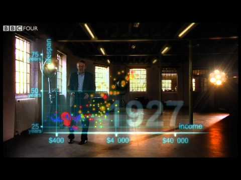
Visualization is right at the heart of my own work - I teach global health And I know having the data is not enough. I have to show it in ways people both enjoy and understand Now, I'm going to try something I've never done before Now, I'm going to try something I've never done before animating the data in real space With a bit of technical assistance from the crew So here we go first an axis for health life Expectancy from 25 years to 75 years and down here an axis for wealth income per person four hundred
four thousand and $40,000 so down here is poor and sick and up here is rich and healthy Now I'm going to show you the world 200 years ago in 1810 here come over countries Europe Brown Asia Red Middle East Queens Africa south of sahara blue and the americas yellow And the size of the country bubbles showed the size of the population and in 1810 It was pretty crowded down there wasn't it all countries were sick and poor life Expectancy were below 40 in all countries and only the UK and the Netherlands were slightly better off
But not much, and now I start the world The Industrial Revolution makes countries in Europe and elsewhere Move away from the rest, but the colonized countries in Asia and Africa. They are stuck down there and eventually the Western countries get healthier and healthier And now we slow down to show the impact of the First World War and the Spanish flu epidemic What a catastrophe? and now I speed up through the 1920s and the 1930s and in spite of the Great Depression Western countries forge on towards greater wealth and health Japan and some others try to
follow But most countries stay down here now After the tragedies of the Second World War we stop a bit to look at the world in 1948 1948 was a great year the war was over Sweden topped the medal table at the Winter Olympics, and I was born But the differences between the countries of the world was wider than ever The United States was in the front Japan was catching up Brazil was way behind Iran was getting a little richer from oil, but still had short lives and the Asian giants China India Pakistan Bangladesh and Indonesia
they were still poor and sick down here But look what is about to happen here. We go again in my lifetime former colonies gained independence, and then finally they started to get healthier and healthier and healthier and in the 1970s then countries in Asia Latin America started to catch up with the Western countries they became the Emerging economies some in Africa follows some Africans were stuck in civil war and others hit by HIV And now we can see the world today in the most up-to-date statistics Most people today live in the middle But there are
huge difference at the same time between the best of countries and the worst of countries and there are also huge Inequalities within countries these bubbles show country averages, but I can split them take China I can split it into provinces There goes Shanghai It has the same wealth and health as Italy today, and there is the poor in line problems Why show it is like Pakistan, and if I split it further the rural parts are like Ghana in Africa and Yet despite the enormous disparities today. We have seen 200 years of remarkable progress That huge
historical gap between the west and the rest is now closing we have become an entirely new Converging world and I see a clear trend into the future with aid trade green technology and peace It's fully possible that everyone can make it to the healthy wealthy corner Well what you have seen in the last few minutes is a story of two hundred countries shown over two hundred years and Beyond it involves plotting a 120,000 numbers pretty neat
Related Videos

9:31
Hans Rosling on why most of the world is b...
Channel 4 News
150,095 views

20:36
The best stats you've ever seen | Hans Ros...
TED
4,057,942 views

15:36
How the UK is becoming a ‘third-world’ eco...
CaspianReport
3,065,888 views

19:00
Optical illusions show how we see | Beau L...
TED
3,220,608 views

11:14
The Man Who Solved the World’s Most Famous...
Newsthink
1,129,754 views

4:36
Harvard negotiator explains how to argue |...
Big Think
6,455,819 views

16:40
I never understood why you can't go faster...
FloatHeadPhysics
4,604,654 views

6:01
Evolution of Dance
Judson Laipply
313,912,127 views

11:57:33
Mind your language (1977) High Quality All...
Infected Us
9,072,377 views

6:24
Wealth Inequality in America
politizane
25,284,856 views

1:00:34
#BackToSchool with CBeebies Cartoons and M...
CBeebies
1,500,211 views

16:06
The Greatest Mathematician Who Ever Lived
Newsthink
477,984 views

13:07
Why Humans Are Vanishing
Kurzgesagt – In a Nutshell
11,145,963 views

29:20
Why are some people bad at maths? - CrowdS...
BBC World Service
404,883 views

14:36
Einstein's grades 👀
Tibees
5,310,733 views

58:46
BBC Magic Numbers Mysterious World of Math...
oscar m
950,328 views

5:10
JK Wedding Entrance Dance
TheKheinz
106,153,527 views

19:54
The best stats you've ever seen - Hans Ros...
TED-Ed
432,178 views

5:10
A simple guide to chaos theory - BBC World...
BBC World Service
1,066,412 views

12:01
Better and better? A comment on Hans Rosling
Critical Statistics
91,834 views