Let's Build a Project Management Power App
3.76k views17739 WordsCopy TextShare
The Analyst Nik
Let's build a fully responsive Project Management app using Power Apps and SharePoint Lists. Build i...
Video Transcript:
welcome to today's video I want to do a deep dive in some of my approaches on How I build power apps and you'll see from the very beginning to the very end of how uh you can build a fully functional app using SharePoint and we're going to do it for a project management app we're going to call it task key and we're going to be using two SharePoint lists one of them will be storing the project details and the other one will be storing the task details and they're all going to be related to each
of the projects and we're going to make it fully functional all in this video so you're going to see from the very beginning to the very end and we're going to do it in a way where it's very stylish and modern so you'll see some navigation menus that are expandable we're going to use custom SVG icons we're going to create headers we're going to create cool Galleries and it's going to be all fully responsive all the way from like a desktop monitor to an app either on the tablet or a phone whatever it is landscape
portrait mode doesn't matter it's going to all look great and it's going to look very modern and you can follow along and hopefully learn some things along the way I will say it's not going to be perfectly edited I'll have to go back and forth a few times to change some things but for the most part hopefully it's easy enough to follow or if you're not following at least you're picking up some different tricks that you can Implement into your own apps and make you a better power Apper so let's just dive [Music] in so
in my SharePoint site I've created a tasks and a projects SharePoint list and we'll go over the tasks first so they they each have ID this is the default ID column in SharePoint uh so that's totally fine we have the title which is just the default text column we have a project ID which I've created a column and is just a number column called a project ID um that's all that is and we're going to plug in the different projects from our project SharePoint list but I'll show you how that all works throughout the length
of this video the description is just the multi- text column is just a multiple lines of text column called description we have a start date which is just the date and time same with the due date status we have a choice column and we have to-do in progress ready for QA and completed statuses so you can definitely choose whatever you like but those are the ones I've chosen to go with we have a priority column which is also a choice column it has low medium and high choices and assign two is just going to be
a a personal or group column we show profile photos although it doesn't really matter in the SharePoint list and under more options you want to make sure you select allow multiple selections or if you don't you can definitely turn that off but I've chosen to give multiple selections and so that's our task list I've pre-populated the data manually using um chat GPT for some data just so these are just some random tasks that I've up inputed here it's going to help us with the build of the app when we start to put it into gallery
will'll be able to visualize what the data will look like and throughout the build we're going to eventually be able to create these lists and delete these SharePoint lists using only our power app and so the projects list again I've created a separate list and these are this is where the project ID is coming in it's automatically generated by SharePoint this is just the ID and we have our title column description start date due date status in this one I've done a choice column and it's also just in progress and completed and assign two again
is a person column and it allows for multiple selections and this is the ID number that we're going to plug into the tasks project ID so this is just an empty number field and I've manually inputed these for now uh but again when we build the app we'll eventually be able to do it all within power apps and we won't ever have to really come in here to to change any data all right so let's go ahead and create our canvas app so we're going to do app name let's call it it's a project management
app so let's maybe call it tasky and we'll do a tablet and so right now we just have one screen we do want the app to be responsive so what we have to do is go to the settings and go to the display and we're going to turn off scale to fit and that's going to disable the lock aspect ratio and everything else so it'll be fully responsive but we do have to to use containers to make sure that we set the right properties and make it behave the way we want it to as the
shrinks expand or or they shrink down to the mobile size so once we do that we're going to go into our app and let's go up to the formulas bar and just set up some theming concepts for our app so I would say let's first Define the colors that we want to use it'll be easier to just reference them throughout the app and then uh if we ever change our mind we can just quickly just change them up and make it much easier to change those color values so I'm going to say my theme and
we're going to set that equal to and we're going to set up a few records here so we Define the records within our curly braces and it's going to have different properties so it's going to have our primary color and we can go to Google I guess and we can just search um for a color picker and we can just sort of play around maybe we can use this as our primary color we'll go ahead and copy that hex code go back into power apps and let's go ahead and put that under the color value
property and we'll do that within the quotation and I'm going to do the same for all the other colors we're just going to do some light variations of gray green purple blue and orange we'll see how we use them we can always play around and come back and change these up but for now I think that's a good start and we also want to connect to our data sources so what we can do is go to data add data we're going to look up SharePoint and we're going to find our SharePoint site in my case
it's this one and here we can see the projects and the tasks that we created those SharePoint lists we're going to just check both of those and connect so now those are in another data source that I like to connect to is Office 365 users uh this will allow us to get information about the current user and potentially other people within the organization so I'm going to connect to that and we'll see how we use it down the road and actually the first way we're going to use this is to get the current users details
so I'm just going to store it in this formulas bar here and let's call it current user and this is going to equal office 365 users dot user profile V2 and we're going to you put in user. email and a semicolon so this is going to pull all the properties for this for the current user of your app and we'll also use that in different places in the app I also want to set up some records for my icons because we're going to use some custom SVG icons within our app especially around our navigation menu
and if you don't know how to get them or how to sort of implement them uh please check out my other videos I have I have done some navigation menus in the past so I'm just going to say my icons and that's also going to equal within a squiggly bracket to symbolize our records I'll put our first icon as home and this is the code for the house that we're going to use I'm going to also add a comma and include another icon and it's going to be home fill so the home fill is going
to be the colored version of this icon so uh I'll show you what that looks like later but we're going to play around in and switch between the two based on if the particular navigation menu is selected I'm also going to have a folder for the projects so I'm going to do very similar thing here uh we'll have a folder icon and as well a filled version of that icon and then we're also going to have a list icon which is going to be for our task so I'm just going to go here I also
want to get a hamburger icon so I'm just going to set that in here as well and then we're just going to close it off with our curly brace and a semicolon and the last thing we want to set up on our formulas bar is a table to store the details of our navigation menu so I'm going to call it menu items equals and for this I'm going to create a table so you can either write table bracket or you could just do a square bracket and then within that do a squiggly bracket to symbolize
each record and then each of those pieces is going to have an ID and I'm going to start with one I'm also going to have a name and for this one I'm going to have it's a home I'm also going to have an icon and as you remember we created our icons here so I'm going to actually reference my icons and then the name of the icon that we gave it so it's going to be my icons. home and I also want to have the filled version of my icons so I'm going to say icon
fill and again my icons. home fill and then lastly I also wanted to have it go to a screen so right now I'm going to have it say app. active screen so this will will change once we get to cre our different screens and we can close this record off do a comma and add a couple more items I'm just going to copy and paste this uh let's take two more times CU we're going to I think scoot have three records close off the table add a semicolon and we'll just change these up here so
it's going to be id2 and the next one will be tasks and the icon will be the list and the filled version will be list fill and we'll leave the screen as is and then the third navigation menu item is going to be our projects and the icon will be folder and folder fill and that'll wrap up the beginning sort of setup of our app within the formulas bar but the next thing we can do is create our navigation menu and I'm thinking we'll do a left navigation menu That's expandable so depending on what the
users need they can have it collapsed or expanded uh we'll utilize some of the icons that we have and and do all of that so we can create it within the components section and we're going to do create new component and let's call this the left nav we definitely want to turn on app scope access app scope so that you can sort of pass along variables from the app to the component and vice versa uh the width let's for now just set it to 200 but we will come back to the width and um make
it variable for the height property I'm going to make it app. height and so now we're going to utilize some containers so let's go and insert a vertical container and we're going to set its X to Zero and sometimes it shows zero here but it's 40 here not sure why but make sure you set it to zero up here uh the Y property also we want it to be zero and we're going to set the width to parent. width and height to parent. height and we're going to remove the Border radius so make that zero
and remove the drop shadow and So within this container let's go ahead and insert another container but this time a horizontal one and this is going to be sort of our title and our hamburger icon so what we want to do is turn off flexible height and maybe let's set it at to 60 so it's going to be fixed at that height we're going to set the minimum width to zero remove the Border radius and remove the drop shadow and here we're going to actually go ahead and insert our image which is going which we're
going to use to store the icon we're going to set the height to stretch and we're going to set the minimum height to zero width we can do maybe to like a 70 another thing another thing to add actually about the the colors uh we have them in a color value because that's what some of the properties require uh but whenever we're repl but we're going to actually want to store the text value of this hex color because we're going to replace it in some of these places here where it says current color we're going
to want to be able to to replace it with a text and we can't do that we can't reference the primary color when it's stored inside a color value so what we can do is just copy each of these and let's continue on here and we're just going to say primary text and gray text and this is going to be the text version of the the color and we're just going to delete the color value in the bracket and so now when we go back into our component within the image we can and go ahead
and place in this code which is going to add our hamburger icon so in order to add the SVG code you need to put this in here and encode URL and this is our icons here and this is the hamburger that we're referencing and we're using the substitute function to replace that current color with the color from my theme gray text and so you see the result here in our menu now this is a little too big so what we're going to do is add some padding left and right so I'm just going to do
a 25 on each side that might be too small actually so maybe let's do 20 that looks pretty good and within this container we also want to add in the title of our app so I'm going to add just the text label and we're going to say task key that'll be the name of our app we're going to have lto black as our font and font size maybe we can do it as a 16 we're going to keep everything the same except we're going to do a stretch in the container and minimum height we're going
to set to zero and the flexible width will be on and again minimum width will also be zero for the font color I do want to change that to that of my theme do primary and there you go so that's our nice purple color now we want to make this image functional right cuz it's because it's not a button it doesn't have an on Select Property so what we need to do is actually put it in a container and put a button an invisible button over top of it so what we can do is click
on this container insert uh container this time it'll just be the regular one and we're going to take this image command X or control X and paste it into the Container uh it's X property will be zero and this container actually the minimum height will be zero and the the stretch flexible width will be off it will be 70 and this image here we're going to change the width to parent. width and parent. height so now it's just going to follow whatever that container is and within this container now we can insert a button I
want to use the an invisible button so what we can do is just insert yeah like a regular button uh we'll move it so that X and Y properties are zero the width will be parent. width and height will be parent. height we're going to delete the text and we're going to make it invisible so what we have to do actually is go to Advanced I like to just go to the fill property and the fill we're just going to make that transparent and the hover fill let's make the hover fill transparent as well and
press fill will be transparent and then border radius I'll make that zero border I'm going to also set it to none and one thing for this container we do want to make sure we turn off the drop shadow and turn the Border radius to zero and there you go so now we have an invisible button over top of our hamburger icon and it's all within this container so this button now I want to set up its on Select Property and this will actually toggle our menu to go from 70 pixels to 200 pixels so we're
going to do set VAR menu open to not VAR menu open so this is sort of going to Loop through the value true or false um and just set it to whatever it's not so um now that we've done that what we can do to make it functional is go back to our left nav so the main main menu here and on the width property we can set its width to if VAR menu open is true um so you don't have to actually say is equals True by default if it's far menu open then it's
going to be 200 else 70 and close the bracket so you can see here if we hold the option key and we can click through and we can see it's doing the open close every time we click and there you go so that's our top section of our menu now we can go ahead and build out the three items that we built through the forms so we're going to select container one this is our root container and I'm going to insert a gallery and it's going to be a blank vertical gallery and the data the
items property is going to be menu items and we've already defined this table you see here it has our icons it has our icon fills the name so home tasks projects and the screen right now it's set to app. active screen but we're going to change those after and so what we have to do first is update the template size I'm going to set it equal to 40 so this is going to make them not be so tall and we're going to turn off flexible height and I'm going to set the height to this formula
here uh it's going to be self. all items count so so all the items which is currently three times self. template height which we set to 40 um and we're going to wrap it within this if error statement um and that does sometimes uh trigger a notification because it hasn't loaded yet so uh this will take care of that I'm going to remove the template padding so we're going to make it zero WP count will stay at uh one the minimum width I'm going to set to zero show scroll bar I'm going to turn off
order I'm going to just set to none and one other thing I'm going to go to delay item loading and turn that to false so that's going to remove some of the load when we put it in onto the screen and so now we're ready to edit inside of the gallery so I'm just going to hit this pencil button to edit the gallery so each item and I'm going to insert a container and it's going to be this manual container here and we're going to again go to the X property make sure it's a zero
up here we're also going to do the Y property make sure that's zero width is going to be parent. template width and height is going to be parent. template height we're going to turn off the drop shadow and delete the Border radius I'll remove the the Border as well border radius actually all set to five width I'm going to do parent. template width minus 20 and height I'm going to be I'm going to do parent. template height minus 6 the X property we're actually going to set to parent. template width minus self. width divided two
and that's going to center it and we're going to do a similar approach to the Y property and we're going to do par template height minus self. height / two so you can see it's going to center it within that template and so now within this container we're going to insert another container and this is going to be the horizontal one and this is going to be housing our icons and our text labels so uh position wise we're going to change the X to Zero change the Y to zero we're going to remove the border
border radius will be zero drop shadow will be none the width is going to be parent. width and height will be parent. height the justify will be at the start and the line vertical will be at the center and then next we can start to put in our image which is going to be our icons so again we're going to use an image we're going to set its height to stretch with a minimum height of zero the width is going to be 50 and the code for our image is going to be again that for
the svgs we're going to you add this text here we're going to encode URL and we're going to do a conditional statement here so if the app's active screen equals this item do screen then we're going to have the icon fill otherwise we're going to have our regular icon and we're going to substitute um the color the current color of that um icon with a very with a color that's going to depend on whether the apps active screen is this item screen uh then we're going to use the primary text from our theme otherwise we're
going to use the gray text from our theme so right now because all of our screens have are navigating to the app. active screen they're all going to be that dark or primary color um but once we update some of our screen names um it will adjust so only one of them will be filled in the other ones will be outlined so for now that's working well and I'm actually going to set the height in the center here we're going to align in the center and we're going to limit the height to to 25 and
we're going to keep the width that 50 and everything else should be good to go we could add some padding from the top and bottom but I think that's good for now and so now so next for the text label we're going to do container five uh we're just going to select that and we're going to insert a text label we're going to set the text property to this item. name so let's make it lato and then font weight is going to be bold with the font size 10 we're going to turn on flexible width
and we're going to turn minimum width to zero height will be stretch with a minimum height of zero and one thing we're going to do is set the visible property and we're going to make it dependent on VAR menu open being true so when we close it it's going to hide it and we're only going to see the icons and then for the color we're going to go to the font color and we're going to paste in this formula here so if the app. active screen equals this item screen then we're going to use our
primary theme otherwise we're going to use the gray color and again same same thing with the icons all of our menu items are leading to the apps. screen active screen so they're all going to be purple but when we make the change later it will be the others will be grayed out and only one of them will be purple and so now the reason we put this all under this container for uh uh we want to add an invisible button over top so we can make this functional so what we're going to do again we're
going to insert a button it's going to sort of live over top of everything we're going to move it over here or manually set the x property the Y property to zero I'm going to delete the border border radius will be zero we're going to delete the text we're going to set the width to parent width height to parent. height and we're going to update some of its fill properties so we're going to do fill fill will be transparent the hover fill we're actually going to do rgba 190 190 240 0.1 and that's going to
make it a very light transparent purple and then the Pressed fill will be a color fade of self. hover fill minus 30% make sure you spell it correctly and there you go so when you hover and then when you press it'll become a little bit darker and of course we want it to be functional so we're going to select its on Select Property and we're going to do navigate to this item do screen and we're going to do it in a fade transition so right now that looks pretty good to me and one other thing
that we can do um totally optional uh I think I like I would like to do it if we go to the left nav and we insert a rectangle uh I just want to do like a like a small line uh to separate the edge of the of the component here so I'm going to give it a one width and the position for X I'm going to do parent. width minus self. width and that's going to place it right at the edge here for the height we're going to do parent. height and that's it so
it's going to go all the way down and then the color I'm just going to do my theme. light gray so it's going to not very visible here but when we place it onto our screens it should be pretty uh visible here to see some separation with that gray uh color and then that's pretty good I think we can go ahead and insert it and see how it looks at least set up our screens but right now so screen one let's just call it home and we can insert some containers I'm going to do a
horizontal container first and we're going to do x 0 y0 width is going to be parent. width WID height is going to be parent. height and it's going to take up the full uh width there so now here we can go ahead and insert our new custom container so we're going to expand custom and our left nav and there we go um one thing that we also want to make an adjustment to is the height right now it's for app height um but I'm going to make it parent. height so is just going to stay
referenced within the container here and you can see you can very slight you can see the the line slightly I might actually just go back and let's update that rectangle here maybe let's make it just the gray color make it a little bit darker uh uh that's actually too dark um maybe let's go ahead and do a custom one here Let's do rgba let's do 220 220 220 and one there you go I like that better all right so we have our navigation menu the next thing I want to do is build up a top
header here so I think we'll just go ahead and build out a new component so we can go create a new component and we can rename it top header and make sure to turn on access app app scope uh the width will be app. width the height I'm going to change it to 60 and the width actually let's make it a Max of app. width or 300 so when the app shrinks down uh this header will not shrink more than 300 pixels and I'm actually going to copy this rectangle that we had as a separator
here and I'm going to paste it into this one here and I'm just going to change up its X property to be zero the width is going to be parent. width and the height is going to be one and the Y property actually will be parent. height minus self. height and that's going to put it right at the bottom again hard to see right now but uh it will be visible uh later on and so we're going to do insert a new container and it's going to be a horizontal container we'll make sure its X
property is zero we're going to make sure the Y property is also zero width is going to be parent. width height will be parent. height we're going to Vertical align everything in the center border radius will be zero with no drop shadow I am going to do some padding so we're going to do 20 on the left and 20 on the right so that's going to give us some space on the both on both sides and I'm going to make the justify horizontal to space between so this is going to put our new button here
and then put our user information on the very right hand side so let's go ahead and do that I'm going to insert a button and the text I'm just going to do plus create width let's make it 100 the font let's go with lato font size will be 10 The Fill color we're going to go with my theme. primary I'm going to search up all the fill properties and we're going to change it so we already updated the fill the hover fill we're going to actually do a color fade of self. fill minus 10% and
then the Pressed fill will be self. fill minus 20% and then we're going to update the color properties so the the Border color I'm actually and I'm actually going to turn off the border so we're going to set that To None maybe border radius we can set to five and we do want to actually change the color property for the hover the hover color I'm going to change this to self. color and then the and then the Pressed color will be self. color so we're just going to keep keep it to whatever it is in
this case it's white so there I'm happy with that button next thing we can do is insert within this container we can insert another container and it's going to be a horizontal one and this is going to store the image and name of the current user of our app so what we can do is change it to WR a line on the horizontal vertical line we can keep it at the center minimum height will be zero and then minimum width can be zero as well we're going to turn off border radius and turn off the
drop shadow and so first we can insert a label we're going to do a text label and we're going to use the font of lato we're again going to use font size 10 the text will be current user that's where we stored the information of our current user and I'm just going to use given name so that's going to be the first name there it is I'm going to make it write Al line I'm going to make it semi bold and that should be good for that and we're going to also insert an image and
this image is going to be user. image and we're going to set the height to 30 and the width to 30 we're going to set the Border radius to 15 which is half of our height and width uh which is going to make it into a perfect circle I'm going to increase the Border thickness to one and I'm going to change the Border color to my theme. gray and I think that looks pretty good and so we'll we'll make sure to update the onselect property of this create button for now it's just false but um
once we get deeper into setting up our app we're going to update the onselect property here as well but for now we'll just keep it as is so let's go ahead and insert this into our app and so we have a horizontal container um but what we want to do next to this uh left navigation is do a vertical container because we want things to now stack going downwards otherwise if we keep adding stuff it's going to stack horizontally so we need to change that and go ahead into insert and it's going to be a
container of the vertical variety and there you go you can see it's now taking up the space that's not taken up by our navigation menu and we're going to make sure that it is of type stretch so minimum height will be zero and the minimum width will be zero as well uh but they will all be flexible so we're also going to remove the Border radius and the drop shadow and So within here now we can insert our custom top header and there you go but one thing you'll notice that it's going way off the
screen is it's all it's too wide and that's because we're using the width of app width so what we need to do is just change this to instead of app width this will be parent. width and there you go that's going to bring it within the container and that should all be good and the great thing here if we hold the ALT key or the option key uh and we click this you'll see it's all fully uh Dynamic and if we click the play button you'll see it stretches out all the way to my screen
if we go into the mobile version let's say iPhone Pro Max there you go you can see it's all fully Dynamic and flexible and if we go to orientation it's all looking good and so I think that's pretty good and this will actually serve as the base template for uh all three of our screens because we've already inputed the navigation menu the top header it's just a matter of updating some of the content inside here but we can do that independently of each other so what we can do now actually is go duplicate screen and
duplicate screen again and we can rename this task and actually we can't rename it to that because our data source is already called tasks uh we also can't use project so what we actually can do is just call it my tasks and this this screen we can see my projects and so having done that now we can go to our app here and in our formulas bar we can actually go ahead and reference those screens in the the appropriate way so our home screen we can just reference our home screen the tasks will be my
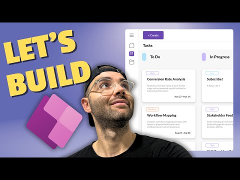
tasks and for projects will be my projects and there you go so now all our screens are referenced within our menu items and if we look at our navigation menu we can see that the icons here are no longer filled and they're gray so and if we click on the tasks it's going to navigate us through the various screens that we have and it works both expanded and collapsed and what I want to start out to do first is build out the tasks screen uh and this is where we're going to have a gallery with
all of our items for our tasks along with uh a breakdown of what category that they're in or what their status is and so let's go ahead and do that um first I want to add a bit of a header here just below this create button so let's go ahead and insert a text label and let's just call this tasks and we're going to make this latal black maybe let's yeah let's make it size 14 give a little bit a bit of a left padding of 20 and the width will be stretch with no minimum
width and flexible height no so we're going to keep flexible height off and 40 I think is totally fine for the height and so beneath that we're going to insert our gallery and it's going to be a uh blank horizontal Gallery so we're starting with a horizontal Gallery uh and then we're going to insert a vertical Gallery within that and that's where our tasks are going to stack on top of each other but first we're going to set our items to choices of our tasks do status so it's going to create a ver a horizontal
gallery of all of the choices that we have in our status column within SharePoint which if you recall is too in progress ready for QA and completed so this is our template here but let's go ahead and update some of this some of the gallery properties the width I'm actually going to set to zero height will be flexible and I'm going to say zero for the minimum height the background fill of the gallery I'm just going to go to my theme. light gray and the template size I'm just going to make it to 290 I'll
also remove the template padding and I'm also going to change the delay item loading to false and now we can go ahead and within each template enter the edit mode and we're going to insert a text label and I can sort of drag and drop this wherever I wherever we like um I'm going to set its X property let's do X at 30 and y let's do it at 15 width I'm going to do parent do template width minus self.x so that's going to go from where it begins to the end of the template uh
Gallery here here and maybe actually let's set it to 50 let's set the x to 50 and then we're going to change it to lat to Black let's make it size 14 and everything else looks good to me now again within this template let's go ahead and insert a button and I'm just going to drag it over here and make it a bit narrower and I'm going to use this as a bit of a color indication of what each status is going to represent and I'm going to delete the text let's set the x to
15 y to 15 as well is good width let's make it 20 and we want to change the fill property and we're going to use this switch function so if this item. value is equal to to-do then we're going to use the light blue in progress will be light purple light orange light green for completed and if it's none of those it'll be transparent so um that's going to look something like this we're also going to remove the Border I'm going to say none and you can see kind of the hover uh is doing that
so I'm actually going to display mode as disabled or I'm going to change it to display mode as view so that if they hover over top of it it's not going to actually change anything so now that we have our gallery for each sort of status I want to set up a gallery to show the the to display each task associated with each status so what we're going to do is insert a gallery and it's going to be a blank vertical gallery and I'm going to just drag it down or actually I could just manually
set it here the Y property let's maybe set it to 80 that seems pretty reasonable I'm going to change the template size to maybe let's say 160 I'm going to have template padding and I'm going to increase that to 15 show scroll bar I'm going to disable that for now width I'm going to have it set as parent. template width and the height property I'm going to say parent. height minus self.y so that's going to bring it all the way to the bottom subtracting where it's starting from and for this I'm also going to change
the delay item loading to false and then we're going to hit the little edit button here and within here we're going to in start inserting some of the details for each of our tasks and I'm going to insert a container and it's going to be a vertical container make sure that your X and Y properties are zero width I'm going to say parent. width actually know parent. template width and height will be parent. template height I'm going to have some padding so at the top and bottom I'm going to put it as 10 and on
the left and right I'm going to do 20 Border will be none border radius I'm going to set to 10 and I'm going to keep it at a regular drop shadow and of course I don't actually have any data here so I think we forgot to add a data source so our data source for this Gallery is actually going to be a filter on our tasks list and we're going to do status. value equals to this item. value and there we go so this is where um we're matching up based on the top Gallery the
parent gallery's uh status value so to-do we'll match up to all of the task that have the status to do and so on so now let's go back to our container uh that's looking pretty good and we can start to insert some of our uh pieces here so I'm going to do I'm going to insert a button just to show our priority whether it's low high or medium um and I'm going to use the classic button and this is going to be text and I'm going to say this item dot priority do value there we
go so you can see it uh puts it in there but of course we want to make this a little bit nicer to look at so the width I'm going to actually set it uh manually here to 60 the height I'm going to set it to 18 we're going to change the font so it's going to be uh font size 8 I think that's as small as it goes we're also going to change it to lato um we're going to make the fill transparent the color of the font we're going to change to this formula
here and it's a switch function based on the priority and if it's low it's going to be light blue medium will be light orange high will be light purple otherwise it'll be transparent and then the Border we're going to change to self. color so it's going to just match whatever the color is of the font and actually we this container I want it to be the background to be white so I'm just going to go ahead and select the white uh and you can see it's kind of not fully centered um so what I'm going
to do is add a padding on the bottom or actually I'll remove all the padding and at the bottom I'll set it equal to maybe a two or maybe a one yeah one and then it it becomes a little bit more centered in the Border radius I think I'll just change it to a five so there you go and so next up we're going to do let's insert a new text label we're going to set it to this [Music] itemtitle so that's going to be the title of each of our tasks I'm going to set
it equal to lato black we're going to do font size 12 I'm going to make the height 30 width will be stretch and I'm going to turn off wrap and minimum width will be zero so that's pretty good and then next up we're going to do another text label and this time it's going to be this item description and it's going to be lato we're going to do size eight over the vertical line we'll keep it at the top width we're going to set to stretch minimum width we're going to set to zero and the
height maybe let's set it to 50 there so we can get at least three three lines and the font the color the font color we're going to set to my theme do light gray let's see oh that's too light so let's do gray there you go and then one more thing we're going to add is another text label and we're going to use this to show the start and end dates and so we're going to have this is the text so it's going to be this item. start date and we're using wrapping it inside the
text function and mapping it so it shows the month and the day dash and then this item due date again month month and the date so this is what it looks like we just need to change some of its properties so the font we're going to change it to lato we're going to go to8 and we're going to do semi bold and maybe we set it to align on to the very right and then we're also going to set the font to align to the right as well and actually I think we can better space
these out so this is our description we have it set as a height 50 but what happens if we just evenly distribute make this a flexible height with a zero minimum height and we make this a flexible height as well with zero minimum height so that's going to push it down a little bit and so that's looking pretty good to me what we can do now is layer uh button an invisible button over top of it uh and we can actually go back to our component and steal that invisible button that we used on our
left navigation menu and that is this one right here it was just over each of the items so I'm going to copy that one and we're going to go into our Gallery here click that edit button and over top of everything we're going to paste this button and of course uh it's on Select Property let's just uh set it to false for now uh but but you can see when we hover over it it will do a bit of a shadow over top which is nice and so that's looking pretty good to me and we
you can see it does work on a mobile so it is responsive you can slide through scroll up and down left and right if you expand this you can still see some of these tasks um so yeah it's looking good so now that we have the task Gallery we can do something very similar with the projects I'm going to copy both of these and we're we're going to go to our other screen which is going to be my projects within this container under our top header we're going to do paste and it's going to paste
everything in uh except we're going to change of course a few things instead of tasks it's going to say projects this right here instead of the our our the main Gallery instead of task statuses we're going to do projects. status and this Gallery we're going to actually filter projects where status equals this item. value so these are the projects that I have currently entered and we're going to make some adjustments of course it's not all the same uh let's see the test we don't have priorities so we actually can probably just delete this button Al
together for the we can keep the title so the title is going to be this item. tile um the label this is going to be the description so that's fine um and then the date the start date and due dates are all the same so we can keep that as well um now you can see it kind of cuts off here this description so maybe we can make this a little bit shorter maybe like a 45 yeah 45 and you can see it looks a little bit better with uh without seeing half of the next
lines and we and you can see we have some space to play around with here so I'm going to actually show how many tasks are associated within each project in a sort of like a slider so you can see the progress at a at a quick glance we can do this using the slider input and we can set the default to count if tasks project ID equals this item. ID and status. value equals completed and then the maximum is going to be account if on the task where the project ID equals this item. ID and
you can see that you know this project has I guess two completed um and all the rest of them don't have any so we can style this a little bit better as well what we can do is turn the show value off the handle size we can decrease to like a seven so that it's uh much smaller uh display mode edit is fine the width will be stretch and with a minimum width of zero height I'm going to change it and decrease it to 10 the rail I'm going to make it a little bit thicker
to maybe five the color I'm going to set it to my theme. gray or maybe light gray the value fill I'm going to set it to primary and that looks pretty good to me um another thing I'm going to do is just set set set a little text label to show how many tasks are completed so it's going to give some additional context and the text value here I'm going to say slider one. Val and I'm going to give a slash slider 1. Max tasks complete so here it is but I will change some of
its properties here on the font so it's going to be lato I'm going to make it as small as possible so I'm going to do the eight um we'll make this in to semi bold I'm going to change its width property to stretch and it's going to be minimum width of zero the height I'm going to set change it to a little bit smaller I'm going to set it to 30 and I'm going to change its color property to gray so from my theme dot do we want primary maybe let's keep it at the primary
that's fine I'm just going to make this lighter a little bit shorter so maybe like a an eight um and yeah the label I'm also going to change the vertical line to top just to get it as close as possible up there I think that looks pretty good and there you go so we have our tasks we have our projects um we haven't built out the homepage yet but um I think the tasks and the projects looks pretty good so far and now in order to actually make all of this functional right so this is
all good it looks good but uh we need to also make it functional so I'm going to create a new screen and it's going to be a blank screen and let's call this task form so this is what we're going to use to view and edit our tasks um and we're going to set this up first and then once we're done that we're going to sort of uh do the same for projects but uh this is good for now we'll we'll also set up this form we'll do a a container and we're going to do
a vertical container we're going to make sure it's X and Y properties are zero the width will be parent. width and the height will be parent. height I'm going to make sure it's uh vertical justify to the start and a line horizontal will be in the center um border radius I'm going to say zero drop shadow will be none and within here we can go ahead and insert an edit form it's going to be form one uh and I'm going to set its data source to tasks so that's our task data source I'm also going
to edit fields and I'm going to add um some of the pieces that we want which is uh we definitely want assigned to uh we want attachments we want the description the due date priority we want the start date we want the project ID we want the status and the title so that's all good we're going to go ahead and add those and I'm also going to change the description to a edit multi-line text and we can close that off and of course this isn't very pretty and I'm going to change the width to in
the to be in the center and the width I do want to make it in order to make it Dynamic I'm going to set it to the minimum of 800 or the parent. width so as soon as the app gets less than 800 pixels it's going to start to shrink to whatever it is um so but when it's really big or really wide I don't want it to do go wa like super stretchy so we'll keep it here in the center uh and one thing I will do I'm just going to go edit field and
um just rearrange some of these I'm just going to minimize them so it's easier we're going to put title up at the top we're going to put attachments way at the bottom description will be right after the title um I want the project maybe just under tile actually the project ID um we have the start date the due date status priority and attach attachments I think that's pretty good and the height we'll keep it as flexible with no minimum height I'm also going to change the Border To None number of columns I'm going to set
it to two and I'm going to keep snap to columns on um but I will make some adjustments so the title I'm actually going to stretch it out to be all the way to the front to the right project I'm going to keep it all into one row as well description will be all one row um assign two I'm actually going to move sort of near the bottom here uh start date due date I'm going to keep uh together status and priority will be together assigned to I'm going to move it to the very end
here and attachments I will also have it occupy a whole field and we don't need this to be too long so maybe just down here like this so there you go um we have oh maybe this needs to be a little smaller okay so I kind of like that that seems to be like a good uh a good format to aim for um I will actually add a heading so we're going to do an a text label and I'll move it up so I'm going to reorder move to the top and we're going to say
this is going to be task it's going to be latal black and maybe we can do like a like an 18 and we're going to keep it centered and we're going to set the width to stretch with no minimum width and the height at 40 that seems to be fine so if we preview this app it's not going to have anything cuz we don't have any items currently stored inside of it um what we want to do to make this functional is we're going to go to our tasks gallery and on the button that we
have sort of hovering over top that gives us that hover effect we're going to update its on Select Property so we're going to set our this current task into a variable so I'm going to call this VAR task and I'm going to call it this item and we're also going to we're also going to navigate to our screen so task form and I'm going to do a fade transition you don't you can do whatever you like though it doesn't have to be that um but yeah you just want to make sure you navigate to the
task form and if we you can preview the app or hold the option or or ALT key um you can click on it and it'll take you to this next page nothing's on the form yet cuz we haven't told the form what data source it needs to reference so we're going to select our our form and go to Advanced and under the item property we're going to store our variable so VAR task you can see here this is our uh form and all the data populated that was already part of this task which is great
and we can see now when we preview the app uh you can see once it gets to a certain point so here this is 800 pixels but as soon as it starts to get under it's going to now snap and go take the full width of the screen and as it as it gets smaller uh it will continue to follow uh but you'll notice that size of the data cards doesn't follow so we actually have to change each of those individually um so we're going to select each data card and we're going to update the
width so we're going to do width of parent do width we're going to change this one to parent do width so anything that's taking the full width of the form we just want it to equal parent. width the ones that take up you know half of the form we we we actually just wanted to say parent. width ID two and again for this one parent. width / two and for status and priority uh so depending on how much space these are going to take um you might want when the form gets really small and narrow
you might want this to occupy a full length of the screen but when it's you know a bit wider maybe you just want it in two rows uh in those scenarios what you'll need to do is set it to this formula here so we'll update its width property to if the parent. width / 2 is less than a certain number I'm going to say 400 then I want it to be the parent width otherwise will be the parent. width divided by two and I'm going to do the same for priority so we're going to change
that here and then assign to I'll keep that always as uh parent. width and attachments as well whoa okay so now when we click play and this might actually be a good example if I use my canvas size or actually window size and if I make this smaller you'll see it starts to snap and then at some point the priority and the status they start to go one under each other the start date and the due date remain uh side by side and here it is on the on the on a phone screen in addition
to this we want to add a um a section for the button so save and cancel buttons so what we're going to do is inside of our container we're going to insert another container and it's going to be horizontal and this one I'm going to make it equal to a nonflexible height and it's going to be uh let's say 50 and the minimum width will be zero we're going to have it justify in the center a line vertical in the center as well and a gap of let's say 30 and within each of these here
the bord Border radius I'm going to set to zero drop shadow [Music] none and within each of these we're going to set uh some buttons here and I kind of like the button that I created here into the top header so I'm actually just going to copy this and go back into my form into this this container and just paste it in I'm going to paste it in twice so this one I'm actually going to change to cancel so this is going to be a cancel button and this one will be the save button but
one thing here that we'll do we're going to actually enable the Border here and we're going to take the fill and just make it transparent the color will be my theme. gray and the Border color will also be my theme. gray and I'm actually going to increase this I'm going to decrease the height of these to maybe let's do a 30 or 35 oops let's say 35 and I'm going to increase the container height to let's say 60 just to give it some more space yeah no let's keep it the the height at 40 and
maybe let's just increase this even more let's do 70 yeah that that looks better and let's make this 70 as well to match and there you go so now we can see what it looks like okay and we can see actually um by default based on the theme of the app it's all uh in this blue drop down colors um I can actually just change this to be a little bit more neutral if we go to themes here um I'm going to make it into this gray office color it's a bit more neutral it'll update
um all the default sort of selections into a gray so that looks better and I just noticed this button here when it's selected I need to update the focused border thickness I'll keep it at two Focus border color will be self. border color and then hover the hover border color will be self. border color and we'll do a color fade on that minus 20 20% and the hover color will be self. color but we're also going to do a color fade of minus 20% that looks pretty good and on cancel here I want to update
it on Select Property we're going to go um we're going to reset form form one and we're going to just go back we're going to set VAR task to blank and there we go and on the save button on select we're going to submit form form one and on the forms on success property we're going to set VAR task to blank and navigate or and then also go back and we're going to notify task saved and we're going to do notification type success okay and there you go so this uh is looking good so far
and some minor things that we can do to update the uh you know the look and feel of these um I'm not going to do go too crazy but basically what you what you can do is just unlock these properties you do have to click through each one unfortunately and what we can do is just update some of their [Music] um just update some of their properties so um I'm going to do the font weight semi bold font size will be 12 and the titles here I'm going to just change their color to my theme.
gray so yeah let's change the title colors here for all of them and then I'm going to also yeah just make all of these semi bold the actual values inside and again I'm going to make it 12 cuz one one thing when when you get into an app um doesn't really matter on desktop but when you start typing into a an app or I think especially on the I particularly on the iPhones uh it will zoom into the app and uh it's hard to zoom back out so um it's good to yeah set the input
uh to size 12 all right so that looks pretty good and and another minor change that you can do uh is just around the Border colors so um if we do border color so this has some error handling logic um but if we change the from the par parent border color and just make it my theme do gray is just the lighter my theme. light gray I find that that looks a little bit better and I also want to change the focus border color to my theme do primary and the hover border color will be
my theme do primary and the focus thickness I would change it to maybe like a three there you go and we would want to do that same thing for all of them now for the dropdowns we're going to do my theme do primary the Pressed border color again my theme. primary and there you go that's looking a little bit better I would say and and for the project ID I want to actually display a combo box here so instead of this number this number is going to live in the background it's going to be the
ID of the SharePoint list of the project but I want users to be able to select a project change even the project um search and um it'll automatically update that number in the back end so in order to do this we have to first just note the data card value 7 uh that's the name of the existing default sort of number input here uh we're going to delete this so it's data card value 7 and we're going to you can insert a regular combo box because we already made some adjustments to these here just as
far as the color and things I'm just going to select that go back to our and cop I'm just going to copy that and go back into our project ID and I'm going to paste it in there and I'm going to go to the display here the X I'm going to change to 30 um and I'm going to actually change this this uh data card value 7 it's that was the name of the old field and that's going to take care of some of the errors here uh because it's going to be positioning uh based
on the error if there is an error like if it's a required field it will um make sure to to be there but let's see what the um errors are here so the default selected items um well first before we fix the errors let's update the the choices or the items property so instead of task. Stack status I actually want projects I want the whole list of the projects and that's uh some Records who it's assign to the ID and uh the description and then the title and basically everything about it um we could even
just limit it to show columns just so we don't have you know bringing too much data in there I just want the projects and I just want the title column and I also want the ID column there you go so we have the ID and the title I want the default selected items instead of parent. default we're going to have to do something uh different here so we're going to change the default selected items to this we're going to do a look up against the projects table where the ID equals this item which is the
tasks project ID and you can see it autop populated that particular um uh project and the other piece here that we have to update is the update property of the data card so once a user selects one of these they could change it that means it's going to have a different ID and we need to push that value back into the update property of the task and we need to say instead of D data card value 7. text because it's now a combo box it's going to be selected do ID so I want to put
that value that number um um so if right now it's four but let's say we change this to sales funnel and you can see now it's actually id2 and that's going to push it back into the project and the other piece I want to change is the text here I don't want it to be the project ID I just wanted to say project and there you go so now you can actually see the project and change it if if necessary so now that we have the task form um what we can do is duplicate this
we're and we're going to basically do some similar things but it's going to be for project so project form and of course we're going to update this here instead of text it's the task it's going to be project and I will update some of these things um we're going to change actually before we do that we might as well go copy sort of our logic here and go back to the projects and on the buttons on Select Property we're going to change it to this except instead of storing the this in VAR task we're going
to store it in VAR project and it's going to be this item and instead of navigating to the task form we're going to go to the project form so if we click that here we are but of course we need to make some adjustments here the data source will be project we're going to we're going to update the item property instead of VAR task it's going to be VAR project and you'll see uh some of the items that we didn't have in this we can just delete so that's the project ID and the priority but
everything else I can also delete the I guess the status didn't carry over but we can just add that so not to worry um so we can go ahead and under the fields we're going to look for status and add that in so we'll have to make just a few adjustments there but not not too bad and some of and you can see we also lost some of the width properties that we had so I'm just going to make this turn it off and on and we're going to do the same thing we did last
time just sort of draging drag some of the columns that we want to take up the full space start date due date is fine assign two we'll take up the full space attachments will take up a full line and Status will take a full line I suppose and then if you remember so the width here we're going to change to parent. width and again same here parent. width this one will be parent. width / two same with this one divide by two status will just be parent. width parent. width and parent. width okay so yeah
so it's all looking good just the status we need to make some updates like we did to the other data cards here I'm just going to go into unlock and border and the Border color will be my theme. light gray the focus border will be three Focus border color will be my theme. primary hover border color will be again my theme. primary and press border color will be my theme. primary okay and we're also want to change some of the text Fields here we're going to change it to 12 we're going to do semi bold
and that should do it oh and this here we're going to change to uh the color of my theme. gray something cool that we can have is display the related tasks so for this one we have uh flexible height on but we want to actually set the minimum height to something maybe like 400 because we're going to insert some related tasks and the way we can do this we don't have to reinvent the wheel we can select this Gallery here so this is the one that only contains our tasks and we can just copy this
and go back into our project form and within the primary here container we can just paste it in and then we can also just move it up one so just move up so it's above the buttons the save and cancel button and we're just need to make some adjustments here so this is going to filter the tasks where the project ID oh maybe project ID equals this item equals VAR project. ID and I also want to sort them so sort by columns and let's sort this by the do date in descending order I'm actually going
to Center the width and I'm going to do the minimum of 800 or the parent. width and to make it a bit smaller I'm going to do the minimum height of zero and actually on the cancel button I want to set the VAR project to blank and same with after the save on the forms on success property I want to change it set the VAR project to blank and notify project saved and this whole container from for the project form I actually want to display in vertical overflow I want it to scroll and let's look
at a project that has more tasks so in this case there's a few more here so that looks pretty good if we do this we can see all the tasks here but you can see it takes up quite a bit of space so I'm gonna change this up a little bit and I'm gonna delete the uh medium uh container here and I'm also going to delete the description and I'm going to change the gallery's template height the template size to maybe half of what it is so I'm going to set it to 80 and I'm
going to move this so I'm going to text align to the left and I'm going to align it to the left and I'm also going to turn on flexible height and turn on flexible height as well with minimum Heights of zero so that way it's always going to be perfectly centered but another thing I want to do is show the color of the status of the task so what I can do is if we go on the gallery and I click the edit button I can insert a container and maybe do a horizontal container we're
going to set it it's X to Zero and Y to zero width is going to be parent do width or no parent. template width sorry and height will be parent. template height we're going to go back to our tasks Gallery here and this right here oh border radius this should be maybe like a 10 there you go so it's like a nice round shape I'm going to take this uh button here and I'm going to go back to our uh container and I'm going to paste it in there I'm going to click edit on select
I'm going to say false check the other error here so this item do status do value and if it's Tod do we're going to use that same coloring and I'm also going to set it to Center align and I'm going to change the height so yeah here the Border radius I'm going to set to zero and drop shadow none and this button I'm going to set the height to parent. height and I'm also going to set some padding on this container I'm going to do 10 on the left 10 on the right button the height
I'm going to turn Center the height will be parent. height minus 20 and then this container Z 0 make sure it's all stretched let's give a gap of maybe 20 maybe 10 and then move the button that's going to hover over top all the way to the bottom so reorder this to bre to the front and the width for some reason didn't carry over so we want it to be parent. width or parent. template width and we also want the height to be parent do template height and of course the container I'm going to do
some border radius so I'm going to do five with a drop shadow of regular there you go so that looks better and I also want to add a title just above this so I'm going to maybe I'll take this and paste it into this main container I'm going to move it over right above we'll set the text to related tasks maybe we can make this more of a 12 change the height to 40 instead of flexible I can keep it in the center and the width I can just reference my gallery uh Gallery 32. width
so that's just the Gallery right here and I can also then move it over move this title over here and maybe I can also actually change the height to maybe 80 and instead of Middle Line I'll move it to the bottom and I can maybe change the color to the primary color so my theme do primary so that's looking pretty good and I can probably just incre show the scroll bar there you go and so that's still going to navigate us it's going to set the VAR task to this we're going to navigate over to
the next screen let's say this one and we can see this is showing here now another cool thing that we can do so you see when it's when we have the real estate there's uh these cards are too long so what we can do on this Gallery if we go to the wp count by default it's one but if we do if app. width is less than 900 only then it's one otherwise it's two then uh this does fit a lot more tasks and then if we go into a smaller screen let's say like the
phone then it'll go back to one wrap count this is one way to make it more dynamic all right so next we need to actually make a functional create button so we want to be able to create projects we want to create tasks um right now we have just one create button up here but we want to be able to once we click on it create a popup and it's going to give us the option to select whether we want to create a new project or a new task so we'll have to do this by
creating another component and we can sort of hide these and go to a new component maybe let's call it add popup up or popup ad because we want to add a new um a new item so we're going to call it popup ad we're going to turn access app scope on the width will be parent do or actually it'll be app. width and the height will be app. height I'm just going to zoom out a little bit and we're going to add a fill property here and let's just make it 0 maybe 1 one something
like that or 0.1 is fine um so it'll be a bit of a transparent layer over top of the background and now we can go ahead and insert our new container and I'm going to do a just a basic container here and I'm going to set its X and Y properties to zero the width will be parent. width and parent. height and that's going to cover the whole page we're going to do border radius zero and drop shadow none and then within this one we're going to insert another container that's going to be a vertical
container and this is the one where we're going to place and dynamically set it so it's always going to be sitting in the center here so um we're also going to make the background white but um we're going to keep the Border radius let's make it 10 we'll give it a bold drop shadow we're going to have the Align horizontal be right at the center the Gap we're going to do a 20 Gap and we're going to set its x x property so it so it stays Center we're going to do in Brackets parent do
width minus self. width divided by two and we're going to do a similar code for the height or for the for the Y property we're going to just take this and instead of width we're going to replace that with height and there you go it'll be dynamically always centered in the in the middle and the as far as the width and the height goes um I'm going to do something like this so we're going to do a width of the minimum app width times 80% or 800 so as soon as it drops below 800 it's
going to do 80% of the apps width and for the height we're going to do something similar it's going to be basically the same but instead of width it's going to be height and we're going to instead of and instead of 800 it's going to be 400 and maybe let's make it 70% there you go I'm also going to add some padding to the top bottom uh left and right so we'll do 20 for all of them and that should do it for our container here and So within here we're going to add a little
X icon so that we can close the popup and we're going to add some buttons here that's going to be for a new task or a new project so that's where the user can choose what they want to create and so I'm going to insert another container and it's going to be a horizontal one and I'm going to set the justify horizontal to the right um we're going to change the width we're going to keep it at flexible but we're going to set the minimum width to zero and we're going to turn off flexible height
and we'll just set it to something like 100 and we're going to turn off the Border radius and drop shadow and then went in here we're going to insert an icon it's going to be a a cancel icon so it's going to live right up there I am just going to change the height I'll just make it a bit smaller where going I'm going to do 30 and 30 I'm going to change the color to our primary color so it's going to be my theme. primary and on select of this button we're going to set
a variable and it's going to be VAR popup add and we're just going to set that to false so anytime it's selected that variable will return to false later we're when we actually add this whole component into our screens we're going to set its visible property to this property and that's how we're going to control that and so now that we have that we can now add our buttons the new task and new project buttons I am going to utilize the button from our top header so again I'm just going to go here and copy
this button cuz we've already styled it um I think we'll stick with that same formatting and we're going to select this container and we're going to paste it in there and we're going to do one more paste so there's our two buttons they're going to live right underneath that container that we just created for this X and there's going to be a gap of 20 so we're going to do instead of create it will be let's do new task and this bottom one here will be new project and we could probably just adjust the width
of these um maybe instead of 100 let's make it 200 the height maybe we can increase to 50 and that looks pretty good and for the onselect property of the new task we're going to just navigate to our task form screen and it's going to be screen transition fade and we're going to copy that and just go to the other button the new project and it's on Select Property we're going to paste that in but instead of task form it's going to be the project form and also for both buttons uh we need to make
sure we set the form so for the new task we're going to do new form and it's called form one and for the new project our form is called well new form form 1core 1 and some sometimes it's better if you do some naming convention s renamed them properly it's going to be easier to reference but um that's how we set that up and so now if we go back to our screens and maybe let's do it on the tasks and then we're going to insert our custom popup ad there it is and we're going
to update its property for visible to VAR popup ad and by default it's false and when you click the create button because we've set oh actually we have haven't so we actually need to go back into the components and we're going to go to the top header and on this button this onselect property we're going to set VAR popup ad to true and okay now we when we go back to our screen so now when we hit the create button there it is you can close it and now when we hit the new task there
it is and when we hit new project it navigates us to the project uh form everything's blank except these related tasks uh there are some blank values here and we can see if we go to the tasks project there are some empty uh items here so we actually need to account for that and the on this so on this galleries items property we need to filter out any blanks so we're going to have to do pro so project ID has to equal of our project ID we also want to make it so the project ID
is not blank and when we hold the ALT key or option key uh you can see there are no related tasks and there you go and when we hit the back button um or the cancel button we actually want to hide this so actually in our component when we go into the popup and the buttons we're actually going to add an additional property which is set VAR popup ad to false and we're going to copy that into the other button as well and there you go so now when we click create new task do your
thing when it goes back it's not going to be visible until you click create again and so we've added this popup to this screen but we need to actually now copy it so we're going to do controll c go to my projects and we're going to paste it right over top of everything so now when we click create it's also on here as well and you'll want to do it on the home screen as well so it's over top of everything now once you're in a in a certain project you'll want to have the ability
to create a new task that's automatically related to that project so I think we can add a little icon or a button right here so that we can add more related tasks so right now we just have a label control here but in order to add a dynamic button that's going going to resize with our app we need to put this inside of a container so what we're going to do is insert a new container and it's going to be horizontal it'll automatically get placed in the bottom here uh we're going to make it not
not a flexible height and we're going to fix that maybe to 50 I think 50 should be fine and we're going to set the Border radius to zero drop shadow to none and minimum width will be zero and we're going to have a vertical alignment of Center and uh we're going to have a space between as the justify horizontal because we'll want the text to be on one side and the button to be on the very end so now we can just move this up you can either rightclick uh reorder move up move up a
couple times or you can press the command button and the left square bracket and it'll just move up a couple times so let's leave it there I'm also going to take this label the related task and control X and we're going to paste that into our container and we're going to adjust this we're going to set the height to be uh you know stretch the the width I'm going to change so that it's flexible and the container itself I'm going to actually instead of stretch we're going to make it be Center Center and we're going
to apply that same width that we have to this and so we're going to go back into the container and set its width property to the minimum either 800 or the parent. width so now it'll adjust accordingly and so we have our label but now I want to add a button or an icon maybe I'll just add a button I'll copy the save button and go back into our container and paste it in there so you'll see it uh all the way on the right and then I'm going to change this to be a little
bit shorter so the height I'll set it to 30 and I'm going to the title is going to be let's say add task and on the container I'm going to give some padding on the left and right I'll just do 10 on each side just to give it just to have it be more aligned and I'm going to change this label instead of bottom I'm going to set it to the middle and I only want this this container the related tasks to be visible if there is an actual project I'm going to update the visible
property to not is blank of our project so right now we do have a project but if we go cancel and go create and a new project you'll see it's no longer visible um and that's perfect and we'll actually do the same for the task Gallery so I'm going to go again visible property not is blank VAR project and then that's kind of good it it stretches out it gives us more for more space in real estate to work with since we're not actually adding um you know we're not adding tasks until we actually have
a project to add the tasks to so there you go but once we do have a project these will be visible which is great that's what we want and for add task we're actually going to change the onselect property and we're going to do a new form form one that's on the our that's our task form and we're going to the navigate to my T the task form screen with a fade transition and let's see what that does so we're going to go add task and there we are now it'll give us the ability to
fill in a new form for a new project but because we're already inside of this enhancing customer engagement strategy project when I click add task I want this to pre-populate with that so we don't have to manually select it because we're we already working within the context of that project and if we go here the items property is just the projects it's basically going to show us all of them uh if we do the default selected items we're doing a lookup on the project where the ID equals this item. project ID and we're actually going
to so we're going to actually adjust this so it'll autop populate that so we're going to add some condition here so um we're going to do if it's not blank if not is blank VAR task then we're going to do this right we're going to look up that particular item that particular task and its ID and match it up to the projects but if it is blank then we want to do a lookup of the projects where ID equals VAR project. ID and we're going to close out these brackets and you'll see it autop populates
now with the previous project that we were a part of and if you go back it's the enhancing customer engagement strategy so add task there you go but if that task if it does contain values it's going to look up based on what it is for that particular uh task and we can do other cool things too like for example a priority low medium high let's say we want to by default set it to low the thing what you can do is go to the default selected items and if it's not blank VAR task then
I want the parent. default otherwise I want in a record we're going to do value in double quotes is going to be low so that's a way you can do the set the default here so anytime it's a new form and there's no task created it'll be a defaulting too so they don't actually even have to select it if uh if they don't need to so there's cool things you can do like that but I think that's pretty good for now if we go cancel that's totally fine and maybe let's test it out actually I'm
just going to change the size to the pro there we go and let's do new task we'll keep the project tests let's start date today do date whenever status let's put it into to do assign to Let's search for me no attachments is fine and then we'll hit the save and there you go so the task was saved we go back into our previous screen the project and we can now see the new task now I also want to add a delete Buton buttons let's say I want to delete this project I want to add
a little trash bin right there and in order to do this right now it's just a text label um but we'll want to put it into container similarly how we did here so I'm actually just going to copy this I'm going to delete this and we're going to go into our container and paste that in there so it's going to be another one of these containers and I'm going to just move it up all the way to the beginning and I'm just going to change this to projects and maybe we can just make it I
think what did we have it's 16 maybe that's that's fine oh we'll call it project and we'll just make this uh a little bit taller let's maybe make it 60 or maybe even 70 and I'm just going to change this text here we're going to keep it like a stretch and we're going to set a minimum height to zero but the vertical line we're going to instead of middle it's going to be at the bottom just to give some space from the top of the screen and this button here I'm actually just going to delete
that and we're going to insert a trash bin there you go and it's going to be uh aligned at the bottom I'm going to make it 30 by3 just to make it a little bit smaller and we'll make this color maybe like a red I don't have a a theme for red but I'll just pick one of these maybe like that and we're going to copy this whole container right here we're going to copy that and go into the task screen so I can just go to the add tasks we're going to go here and
we're going to replace do the same thing up here so that it matches I'm going to paste it in and move it over to the very top and we're going to change this label to task there you go and it's going to have the delete button as well and so that's good so that's how it's going to look on mobile um now we need we do need to make it functional so for the task we could just do a remove just remove this task Al together but I also want to add a confirmation like basically
a yes or no or like are you sure you want to delete so we can actually go create a new popup and so the way we're going to do this we're going to add a we're going to duplicate this component I'm going to rename it popup delete and I'm just going to expand all the content here and we're going to keep everything the same uh I'm just going to delete the new project button and I'm going to rename this one instead of new task it's going to be delete and I'm going to add within this
container I'm going to insert a text label and I'm going to going to move it up above the button and I'm going to say are you sure you want to delete and maybe set the width make it a stretch and we're going to Center the text alignment and maybe change this font maybe to a lat to Black and maybe a little bit bigger this this cancel button here will be VAR popup delete to false and the delete we're going to change all of these properties so I'm going to delete these navigations here I'm going to
do VAR popup delete to false and we want to make this dynamic or like we want to be able to and we'll we'll make sure that if there is a if there is a variable for a task we're GNA do a check here so and we're going to check where it's not is blank VAR task then I want to remove from the tasks list my VAR task if it is blank then I want to remove the projects our project there's a number of different ways you could do this this is just one of them um
and maybe I'll set this visible property to the very end to be after it does that check and the logic and the delete and all of that and then we're going to go back we're going so it's going to navigate to the screen that it was previously so we actually want to also set VAR we're going to remove VAR task and we're going to set VAR task to blank that's very important and then again if if it is a project and we're also going to set VAR project to blank there you go so that's the
so if it's not blank if the if VAR task if if we do have data in our VAR task then we're going to remove that task and we're going to set VAR task to blank but if it doesn't contain any values then we're going to remove the project that's stored in VAR project and then we're going to REM and then we're going to set VAR project to blank and then we're going to set the pop the popup delete to false and then go back to the previous screen so let's go ahead and go to our
screens we're going to on our task form we're going to insert our custom popup delete we're going to going to set it's visible property to VAR popup delete and this button the trash bin we're going to do VAR we're going to set VAR popup delete to true and this is only going to be visible if is not blank VAR task we're going to do the same thing up here we're going to set VAR popup delete to true and its visible property will be not is blank VAR project and on this screen we're going to click
the project form screen and we're going to also insert that popup delete and again set its visible property to VAR popup delete so let's go so let's try that one more time I'm going to add a task again test test I won't worry about all of these save I'm going to add another one test two save and so now we can go into test two and we can delete this there we go and if we remove the project are you sure you want to delete we're going to delete that project and I'm not going to
really bother with the homepage right now um it's blank right now but you can do some counts on the number of projects that you've completed or the number of tasks um that are currently assigned that are due at a certain point maybe we can save that for a future video how to improve on this app but the core function it is here um you know you can create new tasks you can create new projects you can relate them to each other and all while making it look really good so uh some stylish galleries here we
have navigation menus we have popups you know confirmations a nice looking form that's Dynamic and it's fully responsive so I hope you found this useful thanks so much for watching and we'll see you in the next one
Related Videos
25:30
Let's Convert an Excel to Power Apps with ...
Andrew Hess
1,891 views

24:33
How to Manage Projects Like a Pro in Micro...
Bulb Digital
97,426 views

3:49:50
Build a Realtime Chat App in React Native ...
notJust․dev
1,950,258 views

1:59:33
SharePoint Full Course Tutorial
Learnit Training
5,378 views

13:34
Create a Modern People Picker Experience i...
Reza Dorrani
7,567 views
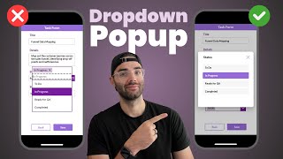
29:47
Modern Dropdown Popup in Power Apps
The Analyst Nik
7,310 views

3:59:26
Google Cloud Platform Full Course 2024 | G...
Simplilearn
1,006,459 views

13:20
I Made an iOS App in MINUTES with This AI ...
Creator Magic
420,171 views
14:02
How to Create Loading Animations in Power ...
Reza Dorrani
13,332 views

21:47
Master Copilot Agents for Microsoft 365 - ...
Collaboration Simplified
33,756 views

22:50
Expandable Navigation Menu in Power Apps
The Analyst Nik
28,917 views

12:36
Learn 80% of NotebookLM in Under 13 Minutes!
Jeff Su
41,103 views

3:50:19
Data Analytics for Beginners | Data Analyt...
Intellipaat
2,232,801 views
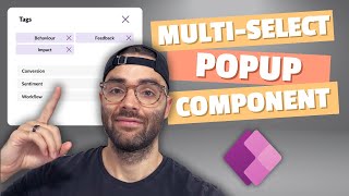
30:58
Multi-Select Popup Component in Power Apps
The Analyst Nik
3,292 views

1:32:30
Jira for Beginners (FREE COURSE!)
Alvin the PM - Become a Certified Project Manager
103,677 views

1:00:01
How to use Asana in 2024: A Must-watch Gui...
Marquis Murray
61,336 views
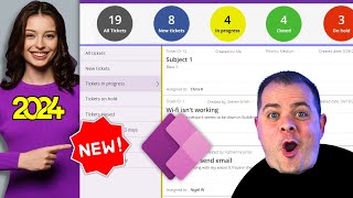
2:34:41
Service Desk Ticket Power App Template - D...
PowerApps Tutorial
5,416 views

3:25:56
Portfolio Website Tutorial – Frontend Deve...
freeCodeCamp.org
1,158,096 views

42:09
How to Design and Build a Data Model in Mi...
Lisa Crosbie
101,596 views

3:23:34
Power Apps Model Driven Apps FULL COURSE f...
Lisa Crosbie
555,325 views