This CHANGED My Editing... Learn Lightroom Curves In 20 Minutes
604.9k views5423 WordsCopy TextShare
Signature Edits
Lightroom tone curves will finally MAKE SENSE after watching this video tutorial. Here's everything ...
Video Transcript:
inside this Lightroom tutorial we are going to demystify the tone curve once and for all we're going to make it super simple super basic and super practical so that even if this tone curve is intimidating to you confusing and reminds you of your grade eight math homework I got you we're going to make it basic simple practical and you're going to be so excited to use this tool by the end you ready let's hit that intro so let's hop into Lightroom together and get started editing in front of me you can see that I've got
an image and it's got some basic tone curves applied and these curves are affecting the image in different ways and we're going to explain exactly how to use this but first let's talk about the different tools inside the tone curve and why we have so many of these different Windows what they do what they're for so let's reset everything here and explain first we've got our two gray curves right here those represent all the tones in the image you can adjust different parts of the image without actually affecting any of the colors and then we've
got red green and blue curves now in school you were taught that the primary colors probably were red blue and yellow and that was kind of true because when it comes comes to mixing paints and inks and you're painting on a picture with your fingers as a kindergartner those are the primary colors kind of you sit on a throne of Lies now when it comes to digital photography we actually use different primary colors you might be saying why I understand you it's because the way that the human eye works is we don't see in red
blue and yellow we actually see in red green and blue those are the photo receptors in our eyes and those are the main wavelengths we pick up and then our eyes kind of combine those to make every conceivable color that you can see I get it so that's why we use that in digital photography so our cameras capture red green and blue light and then our screens display different combinations of red green and blue pixels to make all the colors that you see in an image so with that mystery out of the way let's actually
check out how this tone curve works one step at a time because even though this seems intimidating it seems like your grade eight math homework it's really not that hard and once you learn to use one of these because they're all pretty much the same you'll be able to figure out the rest so let's start here on a plain black and white image with a plain tone curve just affecting all the colors at once and if you want to follow along I'm going to leave download links to these in the description so you can actually
figure this out on your own and practice on these images with me we're going to start with the far left which represents the blacks in our image and then on the far right is the whites in the image and we've got this line that represents all the tones in your image without adjusting them at all now if we add points along this line anywhere and we drag those up or down along that point it's going to start adjusting the brightness of our image just in that area so if we take our blacks and we grab
this little point we take it up up up up up you're going to see it gets brighter and brighter and brighter until we have an all-white image because everything along this line is now set to 100% brightness if I take the white Channel over here on the far right and I click it and I drag it down down down down down you're going to see everything eventually becomes black because everything along this line is now set to 0% brightness so that's how this works we've got 0% brightness at the bottom 100% brightness at the top
then we've got this weird diagonal line which is obviously confusing why is it is it a diagonal line blank I don't I don't understand I got you it's because our midtones are right here in the image they're at 50% that's kind of the 50% brightness Mark right and our blacks are at 0% brightness now blacks can't get any Darker Than Black so they have to be all the way down and you can't adjust them any further down whites have to be at 100% because you can't adjust them any more bright and you can only adjust
them down so that's why we've got this weird diagonal line it's just the way that color and tones and brightness works you can't make something brighter than white you can't make it darker than black so now let's look at how we can adjust different things other than just the Black Point and the white point in our image the easiest way is to grab this little tool right here it's a little Point clicker tool you click it once and then you can grab any part of your image and you can see this line is adding little
points here and if I click it's going to add different points as I click these different sections of light this is really handy because we can go into our Image Grab A specific spot and say okay this spot here these gray tones I want to just make them darker perfect easy and then let's say I want to make these highlights just less bright so let's make those darker all the way down if you want to and then let's take our shadows over here and let's make them brighter and then let's take our blacks make make
those kind of like a gray so by doing this we can adjust very specific parts of the image and we can dial them in exactly where we want and so you might have the question or been asking before why would I use the tone curve when I can just do everything I want to up here with the highlights and the Shadows the whites the blacks it's kind of the same isn't it Ryan well sort of in the way that a chainsaw and a chisel are the same because with these tones up here it's like we're
painting with a really broad brush whereas if we go down here into the tone curve we can grab a very specific shade of gray and adjust that up or down and then this shade right next to it we can make that a little bit darker and the shade right next to that we can adjust in its own way so we can really dial things in and get super specific about what we're doing so the last question you might have is Ryan why are two gray curves here why not just one and the reason is this
first one on the far left has some pre-assigned points that that just make it really easy to adjust the basics in our tone curve that we're going to be using all the time so our highlights our lights our darks we can adjust those really quickly and really simply using these different sliders and we can still go in here with the point tool and it will tell us oh that's part of the lights and you can drag that up or down so we can do that with our images and adjust them and get them dialed in
and then our Point curve right here lets us add super specific adjustments to specific areas so if I grab that same point curve and I click on different parts of the image you're going to see I can adjust any part of the image that I want to rather than just those broad areas so again this is a broader brush this is a more specific brush and you can combine them together to get more options and tools in your tool belt okay so now you kind of understand that but it's sort of like I just put
your mouth up to a fire hose and just let it all out so let's look at some real life examples and kind of let you play and figure this out for yourself so let's start here and let's just work with our basic tones for starters and then we'll go into our color tones and show you some different techniques the first thing we're going to do is just adjust this image overall as it just showed you so let's grab our highlights because cuz those are a little bit too bright and bring those back let's just say
we want to recover some contrast in the highlights then let's grab our darks they're looking pretty dark so I'm going to bring those darks up somewhere around there that's feeling much better and now we can add some lights cuz we maybe want a little more contrast in the waterfall and we can grab our shadows and make those just a little bit darker and that'll add some pop to our image so what we've done here is make things brighter and also add some contrast back to the image now why would you do that instead of just
adding contrast to the image as we said before if I add contrast to the image like this is going to make the brights brighter and the darks darker and in this case in this image you can see it worked in the brights the highlights look okay but the darks we've completely lost them they've become pure black whereas if we go into our tone curve we can choose to just make the highlights brighter and then leave the darks alone so we've added contrast without kind of messing things up so we can get really specific about where
we're adding contrast rather than just adding it to the entire image so let's hop over here into the point curve and do something similar so grab this little Point curve tool let's select our subject and say we want this area of the image to be brighter so let's brighten up this area and then the waterfall itself maybe I want that to be a little bit brighter as well so that's probably around here so I'll click it and drag it up now you can also just do this by clicking on the tone curve and dragging it
around it's just a little more intuitive to grab the part of the image you want to adjust and Lightroom will tell you where you need to adjust now let's make our darks a little bit brighter because that's feeling slightly too dark and now that we've done that let's find the blackest part of our image like the ultra Ultra Shadows probably over on this Rock Let's make that just a little bit darker you're going to see we've added so much pop to our image while also brightening it at the same time recovering a lot of detail
that wasn't there before it looks great now that was all just with the tone curve we didn't have to do anything else let's hop over into another image and show you another way you might use the tone curve which is to selectively correct things so here's a nice photo on the Oregon coast you can see there's a little person standing here on this natural arch really cool so I can grab my point selector I can go up here to the brightest part the whites up here in the sky and I can grab it and bring
it down and recover that sky right oh that looks horrible why does it look horrible and you might find this when you're practicing the tone curve is one a little goes a long way so you never want to try and adjust it like that first you would start by using your master adjustments up here recover your highlights like that it's easier it's preset and then I would grab my Shadows make those lighter cuz I know I'm going to have to make that adjustment then probably dial back on the contrast overall and now the image looks
good in terms of I haven't lost any detail but obviously it looks really flat we've lost so much contrast Ah that's another thing we can use the tone curve for so we can go in here and I'm going to grab kind of the Darks of the image like the darkest point so find those Shadows right there and I'm going to bring that down voila and then I'm going to grab kind of the brightest point of the image let's say this sky right here is looking bright because it's Sunset I'm going to grab this and I'm
going to make it brighter voila so we've added contrast back into our image but we've still made these Shadows brighter we're slowly adding contrast back in but really selectively exactly where we want it to be so let's say we still want to make this kind of area a little bit darker we can add another Point bring that down okay we've added some and let's say I want to recover these highlights up here bring that down just a little bit and if you're finding that it's really hard to make small adjustments just hold the option or
ALT key on your keyboard and that should allow you to make smaller adjustments or you can actually go over here to this little point now that we've added it just hover on top and when you hover on top you can actually use your arrow keys up and down and that will let you manually dial this in because the one thing about using the tone curve that can be really tricky is that finding a specific adjustment and grabbing it sometimes you'll accidentally add a point right next to it so let's reset this here's our before things
here's our after we've recovered a lot of detail so again if you want to practice for yourself grab the description link below and you can download these images to play okay let's look at one more example here's Mr Monkey and I'm going to grab him he's kind of a midton kind of guy so we'll grab his fur here on this one sec perfect and I've brightened that up I've added some contrast without blowing out our whites too bad but we've also sort of made our brights too bright so I'm going to go into this section
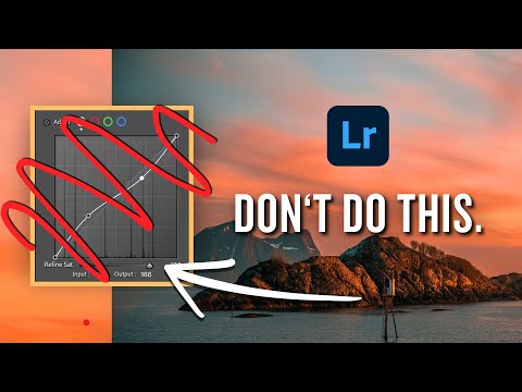
here and I'm just going to select it and make it a little bit darker and you can't push it too far because as this line gets kind of wonky it's a sure sign that you've gone too far and that things are going to look weird so you always want that line to stay left to right kind of diagonal you can just adjust it along this line so I'm going to add that point just like that and this time I'll work just here on the tone curve panel instead of on the overall image and then probably
I could make the Shadows a little bit darker so I'll grab a shadow Point go in here and then very last of all I'm maybe going to add a little bit of a fade to this image let's say I want to make more of a vintage look well I can grab the white point at this photo and take it down down down you're going to see that the whites over here are going from more of a pure white to a nice bright gray and in this case it actually looks pretty good because our whites don't
really look very nice we've got this weird banding it's kind of blown out but as I grab that bring it down it kind of makes them buttery and smooth so this is a technique if you ever a blown out sky it'll make it much much more smooth and just feel better we can use this later on in our our skin tones and you're going to see it's an amazing trick for recovering skin tones and smoothing them out especially when you have really harsh lighting and I can do the same thing here with our black point
I can grab the blacks make them brighter brighter brighter and now we've added a fade to the image kind of more like a vintagey Vibe and we can dial that in to exactly where we want it say around there so here's tone curve before and after that's all we've used in this image and I can keep messing things around until I'm happy with where the image is at but hopefully by now you're kind of getting a handle on okay that's how I use this main tone curve here now Ryan what's the point of the red
the green and the blue well it's just spefic specific colors in our image so I've got my different colored curves here I can actually go in here and just selectively add color to different tones in the image so instead of adjusting the greens overall like I would with the saturation slider here in the hsl panel which is going to adjust the highlights the shadows and midtones all the same amount I can go here I can grab my green Channel I can just go in here and select say just the darkest part of the greens so
like this part right here and I want to maybe make them a little bit more green just in the darkest parts so I can add that Channel drag it just a little bit up you can see if I go really hard I'm going to add green everywhere but just a little bit we're going to get a bump of green just in the darkest parts of the Shadows whereas if I don't want green in the highlights maybe I want them to be a little bit more magenta I want to take green out I can click on
the Highlight greens let's say right here grab those make them a little bit more magenta and you can do the same thing by hopping Into the Blue Channel and say you know what I want really warm buttery yellow highlights okay good go in here grab a highlight part of the Blues and drag that down you're going to see that's going to get a warmer and warmer kind of color to it till it looks absolutely ridiculous but you can go as far as you want so let's go right in there and what's so cool about the
tone curve is let's say I want this kind of the same curve the same adjustment in different parts of the image different parts of the curve I can go in here right click and go copy channel settings go over to the greens and say you know what I want the same tone curve in the Blues and the greens I can right click and go paste channel settings okay now that doesn't seem super hand handy does it well it turns out that this is really handy once we use a basic curve so if I go in
here and I take my Shadows down and I take my highlights up you're going to see that our tone curve is adding a lot of contrast and if you look at this shape of the tone curve that's actually shaped a little bit like a sideways s which is why we would call this an S curve that's what you do to add contrast to your image you take the Shadows down and you take the highlights up then the midtones you can kind of figure out what you want to do in between in this case I'd probably
lift the midtones and Mr Monkey just pops right out so here's before and here's after we've added contrast with an S curve now this is cool and all but what if I want to adjust a specific part of this image now with our main curve ah well we can actually rightclick this channel go copy channel settings and reset the channel then I'm going to select each of these the red Channel and go paste channel settings the green Channel go paste channel settings and at this point the image looks really weird but if I paste the
exact same channel across the red the green and the blue because all those together make white they're the primary colors we should have an image that is is adding the exact same tone curve without making any adjustments to the independent colors and what's so cool about this is now that I have this exact same S curve across each of these channels I can go in and make some tweaks so let's say I want the highlights to be a little bit cooler let's just grab this little dot right here drag it up just a little bit
now if you hover over this again you can actually use your up and down arrow keys and that will make that adjustment a little bit easier for you so I'm going to hover over make them just a little bit colder and then let's say I want the Shadows to be nice and warm I'm going to hover over the shadow point in the Blues make them just a a little bit warmer and you can see Lightroom is actually added blue on this side and Yellow on this side so you can see what you're doing you're either
adding blue when you adjust this Channel or you're taking blue away which is going to result in yellow so that's what's happening when you're making these adjustments so that's trick number one when it comes to using these guys is to actually use them like an scurve but make sure you just copy paste and then make specific adjustments based on that overall curve let's make some basic edits with our Master tone curve maybe raise our shadows lower our highlights a little bit okay so we've made those adjustments and I'm still feeling pretty dark in this section
of the image so we'll brighten that up we've definitely made some progress and then we can go in here and maybe add some color toning to the image so let's say we want to make the sunset pop a little bit more a little bit more vibrant well probably the way to do that would be by grabbing our mountains add a point right here and just add some blue right to that part of the mountains then the sky here is kind of more of a yellowish orange so we could actually take some blue out of the
highlights that will give us some more yellow in the sky then we can do the same thing in our greens probably we take some green out of the sky that'll give us a richer red so this is an extreme example I would never take it quite that far however you can see how we can really dial in and add color selectively using these red green and blue channels so again you might be wondering why would I use these curves when I actually have a color mixer Channel and I have a color grading Channel why wouldn't
I just use those to affect the midtones and the highlights and the shadows and the reason is once again control it's just having more Tools in your tool chest you can go in here you can add some selective color grading using your grading but if I want to add say BL Glu to just part of the highlights and take it out of the Shadows I can't really dial that in the same way as when I have my tone curves so that's why you would sometimes use the tone curves over the color grading and the hsl
panel and vice versa just because you can do something in the tone curve doesn't always mean it's the best recipe It's just sometimes a very handy tool so let's look at one of these situations where using the tone curve might make more sense than using Color grading or the color mixer so one favorite tweak I have when using the red the green and the blue channels in our tone curves is to go in here and just make our highlights a little bit more blue just like that and make our shadows a little bit more green
so I'm going to take the green Channel grab the blacks and raise it up and then I can go into the red Channel and I can mess around maybe make the Shadows more of a teal color and that's how you can get that orange and teal look without using the color grading panel but by doing this we've added a very subtle kind of grade to our image and I like to just have that as a default sometimes so I'm going to grab my image maybe make the Shadows a little bit brighter the whites a little
bit darker give us a nice creamy highlight up here in the corner if I grab that white Point down and here's before and after we've added some color dial in our contrast and voila all with the tone curve that's all we had to use so can you see how handy this tool can be in certain situations it's not the go-to for everything when it comes to Lightroom still using your main adjustments panel could be helpful and handy and a lot faster but when it comes to specific adjustments making very specific changes to your colors very
very handy let me show you one more trick with the tone curve that I think is more of an advanced move that will definitely make a massive difference in your photos now the lighting you can see not so beautiful in fact I'd say it's terrible we've got really bright highlights on the skin really dark shadows it just does not look good so let's start by just dialing in the basic settings we'll get our white balance right we'll drop the contrast down lower the highlights that's looking better but not perfect here's an amazing trick you can
use the tone curve for to fix skin tones I'm going to grab a mask up here I'm going to go select people Lightroom is going to think for a little bit it's going to find all the people in the image and then I don't want to select the entire person I just want to select their skin because that's the area I'm having an issue with in this photo I'm going to go create mask and I've got a nice skin mask and I've got my my tone curve here and I can actually go in here and
adjust the contrast on this image because what's going on when you think about it we've got hot spots on the photo on his forehead on her face and then we've got Dark Shadows under the eyes it's really harsh light but if we bring the Shadows up and we bring those highlights down you're going to see we get kind of this gray tone we're losing contrast in the image and we can actually use that strategically if we don't push it too too far to really smooth things out in the skin and get nice rich buttery skin
tones without absolutely ruining the image overall so I'm going to dial this in taking my midtones up a little bit my Shadows up a little bit and then we can actually grab this white point and bring it down and see what happens to the hot spots on their foreheads as I'm doing that it's making it darker and it looks a little bit almost bluish green so we're going to add some color in a second but first we'll just dial in the skin just like that so here's the curve before and after so we've really smoothed
out the skin we've raised up the Shadows a little bit we can probably push those a little bit further we can do the same thing with the blacks if we wanted just a little bit so you want to be be subtle with this I've probably gone too far but I'm just showing you the technique right so now that we've smoothed out the skin let's add some color back in because it's looking pretty washed out we lost that nice glow to their skin that skin should have if it's alive and healthy so let's go in here
to our red point we're going to use our little adjustment slider grab this point here maybe a highlight I'm going to just increase the red slightly go into our Blues we can decrease the blues just a little bit add magenta go to the greens same thing just take the greens down just a little bit and now we've made their skin nice and saturated so I've gone too far intentionally to just show you what we can do so we've added color back to the skin we've smoothed it out and it's a much less harsh effect than
beforehand so we've added too much color we've gone too far and that's okay because what's amazing is we have this little Mount slider and we can drag that up to make that effect more intense or drag it down to make it absolutely zero we can kind of find The Sweet Spot so we can adjust our skin just like that and here's before and here's after we've basically smoothed out the skin with one little fader and the coolest part about this whole thing is this tone curve we just spent all this time creating which took kind
of a while to dial our settings in we can make that into a preset so go up here to your presets go create preset we're going to call this tone curve skin save make sure nothing is checked except for your mask you might want to name your mask first so it makes more sense in the future but save that to whatever folder you want go create and voila you can now do this with one click and I've actually gone ahead and done this with my AI engine toolkit so if you look in here and scroll
down I've created all of these presets that will use AI to select the skin select the hair and I've made one down here which I've spent a lot of time on called creamy skin hit that and voila I've got the slider right here I can dial it in so I'd encourage you the tone curve is so much more capable than you thought it was especially when it comes to making really specific adjustments like this like that is not something that I could do by just adjusting the highlights and the Shadows of the image right because
by doing that I'd be adjusting the entire image by combining a mask with the tone curve or the tone curve with the hsl or the tone curve with color grading by mixing these tools together we get infinitely more options and more power when it comes to our Creations as editors also if you want to grab these AI engine toolkit presets you can grab those in the description I'll leave a link and if you want to practice along with these files grab those in the description as well all right I hope this video served you if
it did give me a thumbs up and I'll see you in the next video in the meantime create something awesome [Music] peace
Related Videos

1:45:35
Learn Lightroom Classic in ONE VIDEO (This...
Signature Edits
93,268 views

22:58
Master Curves from Start to Finish in Phot...
PiXimperfect
1,757,849 views

7:58
TPU tubes - 2 season follow up
Cycling Odds and Ends
707 views
27:13
10 Essential Color Editing Techniques in L...
Todd Dominey
144,998 views

15:58
The Editing Mistakes Ruining Good Photos.
James Popsys
112,953 views

8:09
STOP USING S-CURVES, do THIS instead: (Lig...
Anthony Gugliotta
338,025 views

19:12
What Nobody Told You About Colour Grading
Eric Lenz
85,222 views

14:14
This Lightroom Color Tool Just Blows Me Away!
Jim Nix
15,295 views

22:32
TOP 3 PRO LIGHTROOM techniques to rescue d...
Simon d'Entremont
701,940 views

12:31
REAL difference clarity, Texture + Dehaze ...
photoshopCAFE
151,727 views

13:22
WTF is Midtone Contrast? (MAJOR Upgrade)
Signature Edits
100,518 views

16:09
DON'T BE THIS GUY editing your photos with...
Peter McKinnon
1,214,034 views

20:56
MASTER Lightroom Classic | How To Use The ...
Photo Feaver
33,824 views

15:32
Use Lightroom Masks Like A Pro! The Secret...
TKNORTH
93,087 views

16:24
10 Secret Lightroom Tricks the Pros Won't ...
THAT ICELANDIC GUY.
620,320 views

14:04
Create THIS DARK BLUE Style using ONLY LIG...
Christian Möhrle - The Phlog Photography
49,957 views

18:37
Curves in Photoshop – The BEST editing too...
The School of Photography
31,176 views

21:29
How to take CREATIVE LONG EXPOSURE photos
Jamie Windsor
1,595,233 views

39:10
How to use the Tone Curve in Lightroom: Ba...
Michael Rung Photography
13,867 views

2:15:43
The Ultimate Beginner Course to Master Lig...
Bring Your Own Laptop
288,226 views