Get Perfect Color and Skin Tones With This Chart!
378.25k views2802 WordsCopy TextShare

DSLR Video Shooter
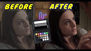
This little color chart can save your shot! Getting correct skin tones and white balance is a breeze...
Video Transcript:
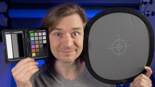
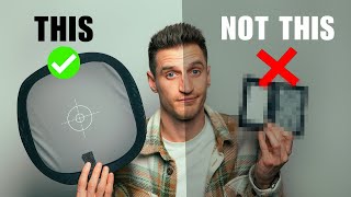
hey guys caleb here if you've ever had issues with color and video you gotta get this thing i'm not normally that type of guy who's gonna tell you you have to buy this camera you have to buy this lens but when it comes to this little color chart i really think everyone should try to pick one up so what is it this is the color checker video passport it is a tiny little color chart that can go anywhere with you stick in your back pockets thinner than a phone it's wonderful and it can get you
out of a lot of binds for example this video i purposefully screwed up my white balance so i'm using a daylight balance led fixture and my camera is set to tungsten so it should look terribly blue if i remove all of my grading and color correction and we're going to use this guy right here to go ahead and solve our color and fix it so again if you're going to match cameras if you just want perfect color or if you want to save your bacon in that one instance where something gets messed up you have
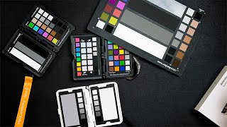
to pick one of these up this thing is the x right color checker passport video model so there is one for stills and it's very small it's pocket size on one side you have white gray and black as well as a row of color chips a row of skin tone chips and then two more rows of black through white including a bunch of grays and you'll notice if i hold this in front of my face and kind of rotate it around that black actually kind of is reflective it actually has kind of a gel surface
so that it sucks up color so what you want to do when you position this is tilt it away so that you don't have a reflection on the black you'll notice it goes jet black giving you a very accurate black measurement if i close it it's actually double-sided so it looks like i just did a magic trick even though i'm not peter mckinnon and we've got a white balance card and a focus chart that i absolutely never use and now i want to go over actually using this thing on set so what you want to
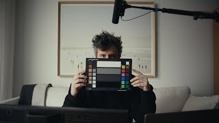
do is figure out where your subject is and where your main light source is so in this case i'm the subject and i've got a key light just off of camera here what i want to be doing is placing this thing right in front of my face or where the subject's primary focus is going to be so i'll go ahead and do that now sorry about the audio and what you want to do or at least what i do is get a clip of this either at the beginning of your shoot or in a different
clip and then i recommend you have your subject or yourself tilt it back and forth up and down and that's it so i'll sit down to shoot a video like this and i'll just go bam [Music] all right close it up put it away now i know i've captured all that chart information that i can pull up and post if there's any issues i can use that to correct the image so with all that out of the way let's head over to the computer sit down take a look at a clip where i messed up
the white balance and fix it right guys let's correct some messed up shots this first one we're going to look at here was shot on the gh5 at 10 bit i'll be at a lower data rate and the light i used here was a daylight balance light whereas in the camera i set my white balance to 3200 kelvin or tungsten and that's why things look really blue but luckily we got this chart in the shot so we can go ahead and fix it now i'm going to be doing this correction in final cut but you
can do this in pretty much any software i would also note that in a lot of software there is often a tool that will actually interface with this color checker so in final cut you could use color finale which gives you the option to overlay a chart onto the chart and correct your colors same thing in resolve and i'm sure there's something like that for premiere but i personally found that doing a manual correction is the best way to go because you can personally control your exposure and your color whereas those tools often will correct
everything which gives you a little less control in some cases so let's go ahead and correct this shot and the very first step is to correct your exposure so if i pull up the inspector here in final cut you'll notice i've already done a couple things to my image here's what it looked like straight out of camera i added a lut and then i made a correction so i'm happy with the exposure here now we're going to move on to actually correcting the color the reason it's important to do exposure first is that when you
change brightness values you're actually going to be affecting what happens to color so get your exposure correct first then moving on to correcting color so let's start by turning on our scopes and i'm actually in final cut going to do a setup like this where i have my vectorscope on the left in my waveform on the right i'll switch it to luma for now if you want to learn more about these tools let me know and maybe i'll do a full tutorial because they're super powerful and really really handy but in short the vectorscope on
the left tells us what's happening with color so in the center of this circle here is zero saturation all the way to the edge is maximum saturation and then you'll notice we have a color wheel with all the primary colors we can see there's a big spike from the center over to blue which makes sense because our image is overly blue and there's a couple little dots here which represent the colors on this chart so we'll actually be not only correcting our white balance but also making sure all these colors are landing where they're supposed
to on the right i have my waveform which measures exposure and sometimes color so zero we have black essentially and at white we have a hundred that's a very simplified version we're working in rec 709 but again that's a another conversation for another day but we can also use it to check our color so we're going to be heavily using this in the first step of correcting this image so to do that i'm going to hit command 5 which will bring up our effects here and what you'll want to do search for mask in all
of your effects there you'll find the draw mask i'm going to drag the effect onto our clip and i'm going to use this little picker to click on all four corners of this a little three uh chip chart so now we have it selected you'll notice it's now only showing the information uh from what we've selected in our scopes i'm also going to go ahead and blow this up so it fills our screen so i'll transform it until it looks something like that and now we can see on our scopes we have some problems look
at that huge spike over to blue on our vector scope that should be a little dot in the middle because white gray and black have zero color in them but here there's a lot of blue so we have some work to do next i'm going to change the way i'm viewing the information on the waveform by clicking on this little button right here currently it's set to luma we're going to switch that to rgb overlay and right away we can see what should be three distinct lines is a whole bunch of different lines you'll see
we have red green blue and they should be on top of each other but right now they're all separated and you can see blue and green is higher than red that's why we're getting this blue ish green cast next i'm going to go into the color tab in final cut and i'm going to add a color curves correction here in short all the way down here on the lower left is black and all the way on the top right here is white and we're going to adjust the colors for the red green and blue so
i'm going to start with blue and i'm going to bring it down now all the blue across the image will come down but we're mainly focusing on the highlights over here on the left so i'm going to bring it down line it up with green to start that looks pretty good next we're going to deal with the middle or the gray so you see there's a kind of a blue spike and it's not really overlaid on green so i'm going to go kind of below halfway here which roughly represents if i move this little line
over here you'll notice it's around 39 ire so i'm going to bring that down until it matches green that kind of affected our highlight so i'll go back to that and i'll boost blue a little bit and now blue on white and blue on the gray are pretty much lined up with each other and it's pretty close when it comes to this black so i'm going to move on to the red channel and we're going to start by boosting our reds we want to bring that up to match green and blue that right there looks
pretty close you'll notice it's now kind of white that's what we want and notice as i'm making all these changes over in the vector scope we're getting closer to being in the center which is exactly what we want so now let's deal with the gray and you'll notice that red is way too low so we'll boost that i'll just grab it and raise it up it's about right that moved up our highlight so i'll bring that down when it comes to red and we'll kind of fine tune them until they're pretty much lined up and
now you can see pretty much all three are lined up and if we look at the vector scope you'll also notice we have a nice tidy dot right in the middle of our vector scope which is exactly what we want to see so at this point we'll go back to the main screen of the inspector here and i'm going to turn off the draw mask and i'm going to reset my transform and that ladies and gentlemen looks pretty great i'll go ahead and toggle off our color curves this is what we started with and this
is the corrected image and it looks pretty amazing now we've been using this left side of the chart so white gray black if we were dealing with a shot like this beast over here you would probably want to use all the little gray black and white chips on the right side so instead of these three big ones use all the little ones if i throw a mask on this and blow it up this is what you would be working with and you'll notice in the left here on our waveform we have a lot more points
that we can line up and when you're dealing with really messed up shots you want to deal with more than just you know the shadows midtones and highlights you want a range of grays to work with so that's the first step the next thing is to deal with color shifts and i'm going to reset my draw mask this time i'm going to go around all these colors on the right side of this color checker and the last thing i'll do is bring up the saturation so we can clearly see on the vector scope where all
these colors are landing so you'll notice a couple things first and foremost we have yellow red magenta blue cyan and green in a spiral here that is this first row or column rather of colors next column is skin tones of the second column here and we can see that here is all these little dots running along guess what the skin tone line on our vector scope so what we want to do with this setup is make sure that blue is where blue is supposed to be and you'll notice actually that it's fairly off we're actually
more towards cyan than blue so to correct this you can use any tool that lets you change the hue of one color so we don't want to change the hue of the whole shot just green and all these other colors here so to do that in final cut a simple way is to add a new hue saturation curves correction once that's in place we can grab the little eyedropper next to hue vs hue now i'll bring that onto our shot and i'm just going to click all these primary colors so if i click green you'll
notice it gives us a little point in the hue versus hue that will be able to shift so now we have all these little dots here that we can adjust so let's start with the one that looks the most off to me which is blue so i'll go up here grab blue i'll hold down the shift button which will make sure that we're not going left to right and we're only adjusting the hue up and down and notice as i move this up and down we're seeing just blue swing all over the place so this
will allow us to dial it in until it points directly that little square next to blue so now we know blue is correct and from here you can go all the way around so we'll go to cyan i'll grab that get that lined up just right next is green so i'll snag him right about there yellow is a little off so we'll do that one now red is a little off so we'll bring it closer to yellow and magenta also is a little off so we'll correct that so now i can go back and i
can reset my mask reset my ridiculous saturation and reset my transformation and this is the after if i toggle back and forth it's a very subtle change but what's nice is we know for a fact that everything is correct here and blue was the main offender when it came to this color chart in this shot from here now that we know our image is absolutely perfect you could continue on and do whatever you need to with grading i have found that my skin always is on the red side of the skin tone lines you'll notice
it's not landing right on the line so then for me personally i would go in here grab my red and adjust it you can see i can go green or purple but i'm going to bring it over until it's just to the right of the skin tone line that is usually going to work well for me if you wanted a more blockbuster style look you could take your blues and push them over to cyan there's all kinds of different ways you know you can customize the image but that's getting into grading which is beyond this
tutorial i mainly just wanted to show you how to use a color chart to take a messed up image and get it back to corrected so that's gonna do it for me guys the passport video color chart is amazing i really think everyone should try to pick it up this video wasn't sponsored no one paid me to say this i've bought this thing multiple times myself and i absolutely love it so hopefully you picked something up in this video stay tuned for more stuff here at dslr video shooter thank you for watching we'll see [Music]
[Music] you
Related Videos
13:33
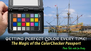
Perfect Color in Your Photos - with the Co...
Joe Brady
13,575 views
33:22
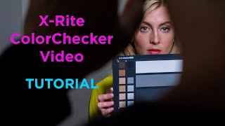
X-Rite (Calibrite) ColorChecker Video Tuto...
Korro Films
30,925 views
26:35
How to Color Match Cameras & Grade Log Foo...
Gerald Undone
210,522 views
11:09
My TINY Custom Cinema Camera!
DSLR Video Shooter
895,960 views
20:26
Perfect Colors, Perfect Shots: How to Use ...
Justin Phillip
7,706 views

13:12
Better Skin Tones With ANY CAMERA!
DSLR Video Shooter
218,984 views
4:56
How to White Balance and Set Exposure for ...
Mark Bennett's Camera Crisis
80,240 views
11:22
White Balance vs Color Checker: Ask David ...
Adorama
97,845 views
8:10
MATCH Cameras with COLOR CHARTS (X-Rite Da...
Team 2 Films
30,262 views
11:22
Videographers AVOID these 7 Exposure Mista...
Sam Holland
35,052 views

13:20
How Cinematographers Set Their Exposure
In Depth Cine
280,947 views
34:34
How to Use a Color Checker Passport Photo ...
Mark Wallace
26,016 views

15:43
Why EVERYONE Should Use Video Scopes for C...
DSLR Video Shooter
101,403 views
8:50
Perfect exposure and colors every time.
Blaine Westropp
68,548 views
18:56
How To Use a Color Checker Chart
pal2tech
27,893 views

8:51
Expose Perfectly Using False Color + GIVEAWAY
Brady Bessette
113,757 views
1:01:13
Webinar: How to Use the Calibrite ColorChe...
Calibrite
5,451 views
4:38
FIlmmakers: DO NOT BUY THIS - SpyderCheckr
Humcrush Productions
68,647 views
7:32
How to get accurate colours out of your ca...
PIXEL VIILAGE
390,223 views
13:43
How to use a grey card - so simple it's li...
Plugged-in AV
17,919 views