10 MIND BLOWING Logo Design Tips ✍️ 2024
123.16k views1768 WordsCopy TextShare

Will Paterson
Learn the art of bespoke Logotype Design: https://bit.ly/designacad
So over the past 10 years, I've...
Video Transcript:
hi I'm will Patterson I've been designing brand identities for over a decade now both large and small in this video I'm going to give you 10 logo design tips that will blow your mind number one your eyes are lying to you okay so which logo looks larger the white one or the black one if you said the white one then you're correct but you're also incorrect In fact any object that is white shown on a dark background looks slightly larger than if it was black on a white background this is because of the way a
bright object seems to Glow making the whole object look slightly larger Galileo found that viewing directly with the naked eye Venus appeared to have a radiant Crown which made it look 8 to 10 times larger than Jupiter even though Jupiter is four times larger when seen from Earth so when we're designing logos we sometimes have to make sure that this illusion is countered an easy way is to add a stroke to the inside of your logo expanding it and cutting it out using the shape Builder tool this way your logo looks the same size in
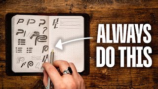
both black and white tip number two have you ever heard of the boning effect it sounds a bit weird and it really is there are lines with a ball or a circle at the end which gives a nice playful look there's nothing wrong with this sort of shape however we could make it look even better and more natural by a just a simple trick so the problem starts when the round part meets the straight line line this gives a straight curve that gives the illusion of the line to bend in it looks like the humorous
bone to counter this problem and to make it more natural and professional we need to change the curve more gently when it attaches to the line start by splitting the shape into quarters then add an anchor point between the two already there then simply pull down the Anchor Point and make some slight changes to the gradient of the curve copy the shape over and voila now you're designed to look more natural at smaller scales without looking rough tip number three the noun method the name for this technique is taken from my good friend and incredible
logo designer Alan Peters in his book logos that last the noun technique is all about mashing up simple ideas into one logo take a company called bone and bread it's a cafe looking to franchise from the name alone we can get many logo design ideas however we could look further into the name and the mission of the company to come up with unique symbols that could be used we do this by either asking or working with bone and bread for the nouns that best describe their business and Mission so for example it could be bread
bone coffee tea mascot now take two of the best nouns I'm going to take bone and bread and draw them in their simplest form if you're struggling to draw them simply you can search Google for simple bone icon or simple bread icon and this will show you the basic form of the bone and bread and give you inspiration for those simplistic drawings from here we take these simple drawings and masch them together finding shapes that work well with each other in a form that is appropriate for the audience in the end you'll have so many
logo design ideas you can play around with and finalize this method is great for creating distinguished logos that help the audience remember the brand okay next tip if you struggle to create clear space or padding around your logo that invisible force Shield there's a really cool method to be able to do this easily simply take your logo OR Logo type and find the common shape for this logo type that is the exite or the cap height simply duplicate this all around your logo type add some guides in create a square around it and convert that
square to an artboard and now whenever you export that artboard with the logo on it you have good clear space that matches proportionally to the design another great tip is struggling with logo types generally speaking logotypes should be cerned tighter than they are wide logotypes aren't like reading on paper and the curing values that we have in Adobe Illustrator suggest that we should have metrics turned on the metric value for tracking is essentially the curing values or the SPAC in between each letter form that the type designer wants you to use Optical is Adobe illustrators
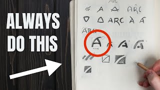
or whatever platform you're using it's its own algorithm so sometimes when we're creating logotypes it's beneficial to go ahead and go to Optical and change your king values to whatever you think is appropriate for that word that might mean just tightening up each letter form to be a bit nicer a bit tighter all the way through the logotype but it could also mean tracking it a bit wider as well perfect shapes don't mean perfect shapes do not use perfect shapes so many have used perfect circles in our logos however this can make the end result
appear a amateur instead of using perfect circles try and use slightly imperfect ones the reason we do this is because of how humans see shapes we've evolved to be able to perceive width quite well however we haven't evolved to judge and perceive height all too well because of this humans tend to see wider shapes more accurately than narrower ones whether you're working on an illustration or logo design use a slightly imperfect shape by manipulating the handles don't go overboard just move them a little bit and the end result will be more more natural looking form
and design 20 quick drawings if you struggle to come up with ideas for your logos it could be because you're being too precious about your ideas you might be subconsciously thinking that every idea you have should be amazing and groundbreaking but this is never the case for every good idea there's hundreds of bad ideas it's our job to find the best idea and execute on the idea in a way that gives the results that we want a way to stop being so precious about your ideas is to grab some scrap paper and spend 20 minutes
drawing 20 ideas no one has to see these ideas so don't worry if any of these ideas make you look bad this is just the process also don't use an eraser own your mistakes spend one minute on one idea and try and find some happy accidents along the way don't let your conscious mind sway your subconscious creativity a big problem every creative has is thinking they have to create in a vacuum without inspiration or the ability to f you'll find the whole process so tiring and unpleasant something I like to do is think of everything
I'm creating as an experiment if you know an idea doesn't work you don't have to show it to your client you can just move on tip number six reflect your logotypes to test them this sounds weird but hear me out when designing logotypes or word marks you have to take special care to the legibility and readability of the type finding small mistakes in typography can be difficult because we're actively reading when proofing our work a simple fix for this is to Simply reflect the logo type and print it when you flip typography you no longer
read you start studying the shapes I do this every time I'm designing a logotype and even abstract minimal icons it's a great practice in doing this I'm able to spot mistakes I would never have seen if the logo was the right way around mistakes in curing consistency in line weights optical illusions and balance you can find all of them by by just flipping it and printing it if you'd like to learn more about the art of bespoke logo type design check out my new course over on Design Academy called logol launch in this course SL
masterclass I show you in incredible detail how to design logo types I walk you through a real client project and show you the entire process logo launch is for graphic designers who want to charge more for the services and learn a skill that isn't easily replicated by AI so click the link below to check out a few sample lessons Okay next here we've all been in this situation we've designed what we thought is a unique logo but your friend shows you a logo that looks exactly the same as the one you've created Annoying a free
and really easy method to check whether your logo has been used or created before is a simple Google image reverse search export or screenshot your logo and simply drag it in this will crawl the internet and find images similar or identical to the one you've uploaded this next tip is so underrated mind mapping when designing a logo for a company it's easy to just start creating without doing any preparations beforehand without preparing you risk missing key information and inspiration for your designs I use an app called my node and my map nouns and visual descriptions
and Concepts in words connecting everything together that makes sense to me doing this forces my brain to come up with more nuanced connections leading to a more intelligent design this is literally how you can think outside of the box and not only is this great for gener generating ideas it also shows the client how your mind works on paper these connections are Pathways to your creativity having a way of showing this to your client in a presentation is live changing for you and them if you enjoyed this video then please press that subscribe button down
below it means a lot and if you want to take the plunge and learn logo type design then click the Design Academy Link in the description and in the pinned comment you can watch a few of the lessons for completely free to see if it's for you so go ahead check it out learn logo type design today and don't get replaced thanks for watching [Music]
Related Videos

18:31
Pro Logo Designer VS Fiverr Designers 🤔
Will Paterson
269,521 views

57:46
FULL 1 Hour Logo Design Course (Everything...
Satori Graphics
113,088 views

7:48
Illustrator's Pen Tool is Holding You Back...
Dansky
73,246 views

19:37
65 Design Terms You Should Know | FREE COURSE
Envato Tuts+
1,483,156 views

7:40
Glassmorphic Packaging Design | Design vlog 8
Roshan Bharti
2,168 views

13:35
Redesigning Your Logos! (Most Common Mista...
Will Paterson
135,586 views

9:53
2024 Design Trends
Yes I'm a Designer
613,303 views

16:45
Easy Grid Logo Design Process On Same Line...
Graphic Hunters
213,676 views
10:04
3 Advanced Logo Design Techniques 🔥
Will Paterson
45,043 views

11:56
I Transformed Modern Logos into Retro 80's...
Will Paterson
42,318 views
8:26
6 GOLDEN Rules Of Logo Design (Logotype) —...
Satori Graphics
532,469 views

18:36
9 Types Of Logos For Brand Design & Strate...
Brand Master Academy
145,623 views
8:29
7 MIND BLOWING Logo Design Tips ✍
Will Paterson
1,124,731 views

16:47
Master Adobe Illustrator: 17 Pro Tips For ...
Dansky
148,388 views
18:03
The ONLY Logo Design Tutorial You'll Ever ...
Satori Graphics
264,015 views

12:09
Combining MORE Famous Competing Brands Logos
Brendy Boy
682,926 views

16:42
Creating a Brand Identity: From Start to F...
Abi Connick
394,649 views
7:46
How To Balance Your Logo Designs: A Step-b...
Will Paterson
7,952 views

21:12
The Logo Design Process From Start To Finish
Mohamed Achraf
6,389,898 views
11:16
7 Must-Know Pro Tips for Logo Design
Dansky
42,919 views