The Best Homepage Layout In Web Design (Supported by UX)
292.25k views1084 WordsCopy TextShare
The Website Architect
The best homepage layout that optimizes both user experience and conversion.
Support me on Patreon ...
Video Transcript:
i have come up with one of the best home page layouts that optimizes both user experience and conversion now effective home page layouts can differ from the type of website like how amazon's home page is just products and facebook's is a news feed this is the best layout for brick and mortar businesses like bakeries lawyers contractors and any other service based businesses in this video we're first going to talk about three things that make for bad homepage layouts three things that make for good home page layouts and lastly putting all that information together making the
best home page layout first what makes for shitty homepage layouts one homepage layout i unfortunately see more and more is what i call the powerpoint layout this is where people think it's fun and creative to make a scroll-less home page with a full screen slider and that's just it this is just bad for so many different reasons first homepages need content and you can only fit so much content in a couple of slides secondly sliders have horrible click-through rates and the data just isn't in their favor they just aren't effective a website is a website
so stop trying to make it a powerpoint presentation the next commonly made homepage layout mistake is when people rely on using sliders to lay out their content i just mentioned this but sliders have horrible click-through rates if your content is important enough to go on the homepage then why is it hidden behind a slider where the majority of people aren't even going to see it your website isn't tinder so stop trying to make people swipe for content the last homepage layout mistake i see is when people barely have a home page you'd be surprised to
see how many websites home pages just lack content entirely you'll go to the home page of a website and it'll say something like we believe in creating the best experience for you with a stock image of a sunset meanwhile the website's both carpentry and home renovation your home page isn't a movie teaser so stop trying to make it one next what makes for good homepage layouts first your websites above the fold should be able to answer these three questions who are you what do you do and how can you help me if without scrolling your
website can answer those three questions you're well on your way to creating a very intuitive and positive user experience when those questions are answered a new visitor will have the confidence they need to start scrolling and browsing through your other website's pages the second thing that makes for good homepage layouts is having a customer journey a home page should funnel users into contacting you or converting in some way to do this your content should be ordered in such a way that first introduces who you are and what you do then transitions to how great you
are and why they should consider you then finally leading them into a call to action to make the conversion or purchase the third thing that makes for good home page layouts is consistency so many people try to stand out with their websites that they end up alienating every one of its users nowadays when you go to a website there are just things that you expect like you expect to have a logo in the top left you expect the navigation to be at the top you expect to have to scroll for information you expect there to
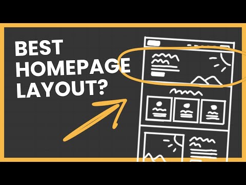
be a footer at the bottom if your website doesn't follow these expectations you're doing it wrong you're creating an experience that users aren't familiar with and making it harder and harder for them to use your website so if you put all that together what do you get well here it is let's go over the layout from top to bottom and explain why it's the best starting with the top this above the fold layout makes it very easy for you to answer the three questions who are you what do you do and how can you help
me make sure the navigation is always visible and that there's a logo in the top left you should also have a cta button in the top right for the chance of an easy conversion scrolling down you have the three most important products or services the reason why your products or services come first after the hero is because if you don't have what they're looking for then you're not helping them this is just better for user experience when users scroll down and see you have what they need they're more inclined to continue through your website after
you show them what you offer it's time to show the users who you are this is the opportunity to bring some life into your website making you stand out from your competition which is why it's so high up in the layout after you show them what you do and who you are now's the time to persuade the user to go with your business there are many ways to go about this but some of the most common ways are testimonials reviews case studies portfolios or a list of brands that you've worked with personally when i make
a homepage i like to do at least two of these but a good range is one to four lastly at the bottom is your call to action i see a lot of call to actions on websites have text saying something like get a quote now with a button leading to the contact page i think this is stupid because you might as well put the form right there at the bottom of the page for more convenience which is why you should always put the form directly on the page so that's a layout i like it because
it avoids common web design mistakes like sliders and scrollless layouts it's designed to provide a great user experience it has customer journey that guides users into conversions and it follows a sales funnel where you start with awareness which leads to consideration and finally ending with the purchase when designing your own homepage try to think about the way you order and layout your content this layout can be used as a guide or starting point to make your own effective homepage layout
Related Videos
14:50
How to Properly Layout A Website (For Begi...
The Website Architect
628,538 views

9:25
A Practical Guide To Website Page Layouts ...
The Website Architect
31,386 views

16:20
Everything About Website Navigations
The Website Architect
101,614 views
5:23
I made the best way to choose colors for U...
Juxtopposed
619,921 views

9:28
Why Is THIS the PERFECT Website Layout?
Wes McDowell
80,454 views

7:01
5 laws of design layout & composition *gol...
Shapes By Sean
548,935 views

11:11
6 UI Hacks I Wish I Knew As A Beginner
Tim Gabe
832,185 views

21:04
Complete Course On Layout Design (MASTER L...
Satori Graphics
714,590 views

17:04
Everything About Above The Folds
The Website Architect
52,346 views
11:07
The 5 Design Principles (But in Web Design)
The Website Architect
74,045 views

25:15
How to start a website layout (for complet...
Flux Academy
40,038 views
13:42
11 Section layouts to make your website ul...
Payton Clark Smith
494,048 views
16:02
Perfect Homepage Design Explained (in 15 m...
Payton Clark Smith
263,366 views

8:51
How I make UI color palettes
UX Tools
425,087 views
11:59
Complete Layout Guide
Flux Academy
804,622 views

17:59
Easily Improve Your Web Design (With Example)
Flux Academy
120,401 views

20:44
I redesigned YOUR websites
DesignSpo
57,834 views

45:56
Landing Pages That Convert: A Framework fo...
Social Media Examiner
13,918 views

5:18
Why Your Awwwards Website Sucks
The Website Architect
16,201 views