The Disturbing Story Behind The Starbucks Logo
3.15M views607 WordsCopy TextShare
Zack D. Films
The Starbucks logo is so much more than just a mermaid.
In fact... it's not even a mermaid.
If you...
Video Transcript:
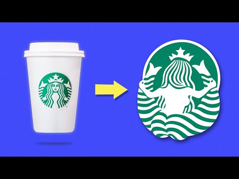
this is what the starbucks logo would look like from behind this is her tail and it is spread wide open now it's important for you to understand that this design was intentional and kind of creepy as you'll see throughout this video in order to understand why starbucks chose such an odd image to represent the company we need to go back to the beginning it was 1971 and the founders inspired by moby dick chose the name starbucks with seattle being a port city and their coffee coming in on ships they wanted their brand to be related
to the sea next on their list was to find a logo according to the company's website while they were studying old marine books a mysterious nautical figure called to them they had discovered a 16th century depiction of a twin-tailed mermaid later to be identified as a siren and almost immediately they knew they found their logo you might assume that they chose the siren because it looked like a mermaid and lived in the sea but there's actually a deeper and darker reason behind their decision you see the siren has its own history that's sort of troubling
and the original founders knew this in greek mythology the siren was first interpreted as a bird with a woman's head later they were pictured as a woman with wings and bird feet they continued to evolve into a dragon type beast until finally being interpreted as the mermaid creature we see today regardless of the different variations the characteristics of the siren remained consistent they were seductive and violent they used their beauty to seduce sailors to come with them in the water typically a siren would sing and the sailors would be unable to keep themselves from her
they would literally jump into the water and to their deaths you might remember sirens from the tale of odysseus when he tied himself to a mast to avoid being drawn in by their beauty and singing but wait what does this have to do with starbucks didn't they just choose the siren because it looked like a mermaid well look at the first logo the siren's chest was bare and her split tail was seductively spread wide open this depiction was no accident the owners expected people to see starbucks smell starbucks and desire starbucks just like the sailors
couldn't deny the seduction of the sirens the founders of starbucks wanted to make you unable to resist their coffee and this isn't speculation former chairman and ceo howard schultz wrote that early siren bare-breasted in rubenesque was supposed to be as seductive as coffee itself as the company started to grow they ran into a problem this seductive bare-breasted creature was a little too risque when it was scaled up in size by changing the artwork to make her more appropriate starbucks was able to put the image on their trucks without backlash and over the next 20 years
the logo became even more tame however through all these variations one thing has remained consistent the siren has always been the focal point in fact the company loves this creature so much that in 2008 they went back to the original bare-breasted logo this was an immediate flop with the public and it was quickly discontinued starbucks doesn't even mention this in their logo evolution page on their website but it goes to show how dedicated they are to this creature and you might think that seduction and irresistibility make for a creepy marketing strategy but at the end
of the day it is working [Music]
Related Videos

11:28
Worst Punishments in History Explained Usi...
Dayum
1,573,695 views

20:23
this video should not have this many views...
Sotsuma
9,391,679 views

5:24
The Pepsi Contest That Killed 5 People
Zack D. Films
7,334,797 views
25:06
A Missing Plane Landed After 37 Years In I...
BE AMAZED
15,888,496 views

6:33
Toyota's $2,300,000,000 Mistake
Zack D. Films
8,474,707 views

29:39
I Exposed the World’s Most EVIL 10 Year Old!
Brent Rivera
28,235,194 views

12:03
I Made Famous Logos ULTRA Realistic
Brandon Shepherd
10,495,682 views

21:28
Funny Moments of Gumball and Darwin TRY N...
Mr. GUS
628,748 views

26:12
Famous Logos With HIDDEN Meanings!
BE AMAZED
5,696,139 views
10:13
People Who Somehow Survived Freak Accidents
Doctor Mike
19,111,058 views

17:27
You Laugh You Restart, Extreme Challenge
Man I'm Dead
3,354,134 views

15:20
I Survived the Most Dangerous Airbnb
Nico Grigg
405,190 views

10:08
Hidden Meanings in Logos
Sambucha
762,151 views

5:26
Ohio's 1986 Balloon Disaster
Zack D. Films
7,674,795 views

12:49
Zootopia Characters As Their Opposites
Bless
172,394 views

1:05:57
I'm A Hole
iShoya
85,138 views

11:16
Guess Correct Logo ✅ - Logo Challenge | 30...
QUIZ CAKE
5,606,117 views

22:42
I Exposed The Worst Rated Waterparks!
Jeremy Hutchins
8,411,623 views

12:16
I BROKE Lego Super Mario
brickstudios
1,056,486 views

10:34
We Helped Save Kids From Toxic Landfills
Beast Philanthropy
1,371,880 views