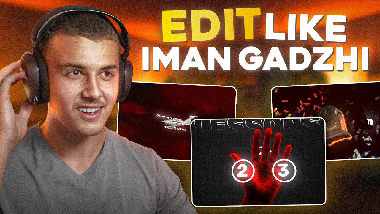
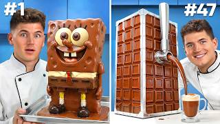
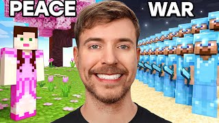
imong gaji is a controversial name to say the least lavish Lifestyles expensive cars big yachts and huge mansions his brand is built around luxury and one of the main reasons his brand is so luxurious is because of the way he presents his videos so as a video editor watching this how do you make use of this well you need to understand that clients are now paying thousands of dollars for video editors that can edit the Iman gaji editing style why do you ask because it also makes their brand feel extremely luxurious that's why in today's
video I'm going to be teaching you guys how you can take this raw video and turn it into this amazing Iman gaji editing Style just inside of After Effects except this time we're doing things a bit different we're going to break this process down into three phases in the first phase we're going to analyze and break down how we can achieve the same look as imang gaji in the second phase we're going to set up the fundamentals to this editing style the fonts the backgrounds the color Petes and the text animations and in the third
phase we're going to break down four of his best animations and recreate them step by step from scratch inside of After Effects this video is about to be packed with value and if you guys want to follow along you can download the raw footage and the project files used in this video inside of my free community linked down below and everything that we're about to cover in this video is just a fraction of the imaji editing master class at ultimate editors but more on that later on the video with this all in mind we've got
a lot to cover so let's get straight into it before we recreate this editing style we're first going to need to understand it so let's take a look at these four scenes the most obvious thing is that Iman sticks to one color for each video for this one for example he used a red and black color pette and for this one he used a blue and purple colorway so that's the first thing that we're going to note down we need to make sure that we're using complimentary colors but nothing too flashy for example in this
scene he uses dark red in the background and lighter red on the graphic to make the pyamid stand out so the first factor in creating the imaji editing style is using complimentary colors another thing that we can easily see is the art style it's these AI generated images that incorporate realism but still look very artistic this art style is a key part in making a video look like imachi and to achieve this we can simply head over to Firefly or mid journey and use the keywords that we're about to mention later on the video so
number two is going to be realistic and artistic image Styles but let's take a look at his text style starting with his fonts he likes to use two opposite fonts to complement each other he uses this minimal clean font for the advanced animations and an old traditional font for other animations and he combines a mix of bold and thin fonts to create clean Graphics which once again complements his clean editing style even if we analyze his text animations they're always clean smooth popups that's why in number three we're going to be using a clean font
and a traditional font combined with minimal popups now quick question if we look at the graphics that he's using what can we notice about the shapes the first thing we notice is he uses thin lines to emphasize the cleanliness of this style he then uses dotted lines to keep things minimal he also uses rounded Corners to keep things looking clean and when it comes to icons they're always clean thin and minimal never over complicated so number four will be clean graphics thin lines and minimal shapes all right so far we understand that we need a
complimentary color pette realistic and artistic AI images clean and traditional fonts and minimal animations and clean Graphics simple lines and minimal shapes but what about the editing if we look at an overview of the video this is what iman's video kind of looks like the red is where Iman uses animations and the blue is just aoll of his face as you can see roughly 30% of the video is animations meaning we're going to be incorporating high-end animations every now and then to further explain the points which he is saying all right perfect so now if
we were to take a look at a timeline of a-roll just on its own we know exactly how often we should have the animations we know what the color pallette for those animations is going to look like we know how to add the right realistic and artistic images and we know how to use complimentary fonts and clean animations and we understand how the graphics clean lines and simple shapes are going to look we basically understand the factors which we need to include to make the video look like imangi so let's go and get started on
setting up the fundamentals from what we've just learned the concept here is to set up some assets that fit the imang gaji editing style and save them as presets so we can use them later so here's what we're going to set up a color theme two backgrounds a bolt Tex stle with animations a thin Tex stle with animations a pack of minimalistic icons and a few settings for our AI image generation and the first thing that we can set up is the color theme as we noticed Ean uses consistent colors throughout the entire video so
let's decide which color theme we want to use inside of our edit here's a few solid examples examples of color themes this red and black color theme was used in this video this gives us access to darker red or brown colors for the backgrounds and lighter red or orange colors for the Highlight objects and here's another color them this allows us to use dark purple and blue as background colors and colors like light blue and cyan to highlight objects here's one more color theme this is a simple black and yellow color theme I've never seen
this being used before but it would look amazing using something like gray or black as the background and yellow as the highlight color now for this video I'm going to be going with the red and black color theme and I think this is going to give us some cool results using dark red or brown as a background and highlighting objects using a bright red or orange color all right so the colors are now done and now that we've set up our colors let's get started to work on the background it's a good idea to have
one or two backgrounds that are used consistently throughout the video and because we're going to be creating tons of animations for our imang gaji edit we're going to use this background a lot and since I'm going with the red and black colorway let's go ahead and create these two simple backgrounds let's start with this one in After Effects I'll right click and add a solid then I'll add the gradient ramp effect I'll change the type to radial ramp and then change the origin to the center of the solid then change the end to some point
on the left side and lastly I'll change this Center color to something like a gray color then change the end color to Black and this is going to give us this cool background finally I'm going to add this grid effect make the grids smaller and make sure to keep them as Square as possible then change the width to three and lastly change the mode to Overlay and as a final touch I'll even change the opacity to 30 and one final thing that we can do to bring this to life we can add a turbulent display
to the background and make sure we use small values to keep this a light and basic effect and this is going to do for our first background and now to make the second background it's going to be much easier delete the grid and change the color in the center to a dark red all right backgrounds are now done let's get into text animations we're going to be creating these three simple and effective text animations very quickly we're going to right click add a text layer then write out text but now we're going to need to
choose our font as we mentioned we're going to need a clean and advanced font for this animation style so head over to the font and choose whichever font suits you best just make sure that it looks modern and clean and while you're at it just pick a traditional font as well so that you end up with two opposite fonts now back into After Effects we're going to change our text font to the font we downloaded and make sure to Center align everything then make sure the Anchor Point is at the center and we're going to
open up our text layer add the animator tool then we're going to add the position tool move the position of the text then go down to Advanced and change this to ramp up and as you guys can see when we change the start Val the text flows in or out now change this from percent to pixels and change this to words now all you have to do is write out a sentence and then key frame your start at zero in the beginning go to the end and increase the start value to a number high enough
until the whole text is strict easy EAS these and this is what you're going to get as for the other two text stes all that we have to do now is just duplicate it twice and make the second duplicate bold then make the third duplicate the artistic and traditional font and there you go three easy text Styles animated now this all looks great now so let's go ahead and find ourselves a pack of clean minimalistic icons that we can use in our edit as we mentioned we are looking for clean icons and minimal Graphics we're
also going to want to collect Vector images so that we can upscale them as much as we want without losing any quality now two things to mention here when you do go and choose icons just make sure that they are in the same style because as you can see these two over here are in the same style whereas these two don't look like they fit each other and number two the problem that I faced when searching for icons was that all the websites claimed that they were free but they were all paid so I'll go
ahead save you guys some time I've collected a list of 10 different websites that are going to give you Vector icons completely for free I'll have the list pop up on screen right now and you can check them out whenever you want and now that I've saved you guys so much time and effort all that I ask in return is for you guys to just click that beautiful red subscribe button down below but with this all in mind this is how you're going to be getting Vector icons and clean high quality icons for your animations
and the final setup that we're going to need to take a look at is these settings for the stylized AI image generation as you can see in the reference we want to achieve this artistic but hyper realistic look so we're going to hop into Firefly and I'll write out a prompt like a man walking in a futuristic city and as you can see this is what we get so how do we make this image look more artistic and realistic first let's go ahead and make it 16x9 then we're going to select this reference over here
I'll scroll down a bit and then select synth wve and Hyper realistic and this is going to give us this cool look lastly just choose Studio light and vibrant colors click generate and this is what you're going to end up with all right so by now we've broken down the Iman gaji editing style and understood the factors that need to be in place to make a video look like imachi and we've also set up our color themes two high quality backgrounds three minimum text Styles and animations we've sourced out our highquality clean icons and understood
how we can generate the same images as he has so we've set up the fundamentals but now it's finally time to recreate these four animations now to make sure that you guys fully understand these we're first going to break them down so that you guys understand how they were made then we're going to go ahead and recreate them step by step inside of After Effects and I promise you by the end of this video you're going to know how you can recreate all four of these animations but real quick before we get into this big
part of the video I got to tell you guys something and if you guys who are watching this are video editors then you're most likely going to relate to this one of my biggest dreams as I started out with video editing was making one to 2,000 a month from anywhere in the world being able to travel around the world and working remotely from a random island in the middle of nowhere I'm here to tell you guys that I have achieved this dream and much more and all that you need to make $1 to $2,000 as
a video editor is just the correct path all you need is a correct plan to master the high paying editing Styles in 2024 and then make one1 to2 th000 and this just happens to be the exact same plan that I taught Charles and Charles was a complete beginner but using this plan that I taught him he was able to master Premier Pro the Devon jatho editing style the Ali abdal editing style the Isaac editing style and even my own editing style within only 30 days just 7 days later he started Landing three new editing clients
every single day and he's not the only one who did it Bruce also used used this exact same plan to master video editing and landed his first client within 23 days only Panos also used this exact same plan to master video editing and started making $11,000 a month in just 30 days well used this exact same plan to master video editing in Just 2 months and the plan that editors are using to master the high paying video editing Styles in 2024 and make $1 to $2,000 in less than 30 days is the ultimate editor's plan
so now that you understand that there is a plan out there to master video editing and make one to two $1,000 a month in just 30 days as an editor are you going to take this new opportunity to make money online as a video editor or are you going to sit back and let the rest of the editors use this plan to overtake you and take your clients click the link down below to master video editing and make $1 to $22,000 a month in just 30 days as an editor all right with this being said
let's get straight into breaking down these four animations and recreating them from scratch we're going to get started with this hand animation over here so what we have here is a four-part animation and the first thing that we see is this image of a hand popping up then we added the background that we literally just set up the third part is the text that comes down from above the fourth part is these number animations over here which are clearly made up of a circle that draws out and a number that pops up and of course
we can see some cool 3D movement in here too and now that we understand how this animation is made let's go ahead and recreate it first I'm going to drag in one of the backgrounds I just made I made this a bright color just so that I can see everything clearly but we're going to be changing this afterwards the first thing I'm going to need is an image of a hand so I'm hopping into Firefly and generating this hand image by typing a prompt like an open hand holding up five fingers then I'm selecting the
settings we discussed 16x9 image reference synth wve hyper realistic and Studio light and this is what I end up with I believe this fits the video theme and more importantly it works out with our red and black colorway so let's get this image into Photoshop then we're going to use this image select tool to separate the hand from the background and then delete the background and save this image as a PNG all right so we have the hand PNG now I'll go ahead and drag this into after effects and would you look at that it
looks absolutely amazing the first thing I want to do is add some movement to the hand so I'm going to click on the puppet tool add some points along the fingers make sure to open their position and then move forward 2 seconds and animate the fingers closing up just make sure to keep the movements as minimal and as small as possible and then with that done let's go ahead and animate the hand popping into frame so we're going to click P to pull out our position Factor then key frame the current position move this key
frame forward a few seconds then with the play head at the beginning we're going to move our hand to the bottom until it is out of screen the final step is to head into the graph editor select both key frames and easy ease them then just make our animation a bit smoother and this is a simple popup that you're going to end up with now for the text in the background let's add in a text layer write out the word lessons make sure to check the stroke and uncheck the fill and then once again click
P add a key frame for the position then with this play hat at the beginning we'll move it to the top and now we're just going to need to make this animation a bit smoother and to finish things off let's add in our number animation the first thing we're going to add in is a text layer layer write out the number one then make sure to add a shape layer select the circle mask and by holding down shift we're going to draw out this perfect circle around the one then we're just going to add some
white stroke to it once again make sure to keep it light and clean and lastly click this play icon here and add the trim paths function and then we're going to key frame the start at 100 move forward a bit and change the value to zero once again make sure to smoothen it out now the circle animation is done so let's go ahead and get to work on the one we're going to start by creating a popup with our position as we've just done and don't for you get to click t for opacity and key
frame the value going from 0 to 100 with the animation and at the end this is what you're going to end up with a clean animation that showcases number and a circle if this looks good then let's go ahead and parent the number layer to the shape layer select both of them and duplicate them let's move it to the left a bit and change the number to two then let's go ahead and do that one more time and change the number to three now make sure to pre-compose these layers individually and let's make sure to
have them start sequentially after each other all right so now that we have everything set up let's go ahead and create a 3 scene I'll add in this second view so that I can see things a bit better now and first things first we're going to go ahead and move this hand image out a lot more this is to create a parallx effect when we animate our camera let's then move our background all the way back and then change the scale to fit the screen make sure to move the three number animations somewhere in between
both the hand and the background then let's create a camera and set the point of interest on the hand then we're going to go ahead and create a cool 3d effect using the numbers that we made we're going to start by adding the one behind the hand and making sure that the two and three are in front of the hand things are now looking much better let's go ahead and create the smooth camera movement we'll create a key frame for the current position and place it somewhere towards the end of the clip now let's go
to the start and move the camera to the top of our hand it's just going to make it so that it has to drop and focus on the hand as it comes select both key frames and as usual in the graph editor let's smooth out all the different positions all right the animation is fully finished now let's go ahead and just precompose this layer and we're going to go ahead and stack a few effects to make it look really appealing I'll start with a simple glow and increase the threshold to 90 and the radius to
89 and play around with the intensity until I get this cool look now to make this animation look a lot more in- depth I'm going to right click and create an adjustment layer then let's add in a gajam blur and set it to 40 then add a brightness and contrast effect and drop the brightness a bit then lastly finish it off with a chromatic aberration select the circle mask draw out a circle like this invert the circle and feather out the edges now this looks amazing but one final idea I had was to go into
the background and change this background into the gray and black background we made then just add a colorama effect to the hand and change it to ramp red and this is going to give us a really cool effect and finally to transition into this animation we're going to go ahead and add in an ink Splash overlay and track mat the animation layer to the ink Splash now make sure that these two are ticked on and this is what we end up with for the hand animation now although this animation took us a while to make
it turned out super cool and with this now done we're a lot more familiar with the techniques required to finish the rest of the animations once again if you do feel like this is a bit overwhelming and there's like too much to learn we've developed a whole course to teach you guys the basics of After Effects Advanced After Effects and the Iman gaji editing style it's all going to be linked down below let's go ahead and move on to the next animation launching a business is a lot like taking off a plane on takeoff you're
going to need a lot of effort to get in the sky but once you're in the sky then it's a lot easier to maintain your speed and the exact same concept applies for business as you can see this animation is split into two main parts let's start working on the first one the first thing that we can see is this Runway which is a flat layer that's made into a 3D object and rotate it so that it looks like a Runway then we see this text right out on the runway then we see this plane
pop down from the right side which is obviously a 3D object with some more text on it then we see this dotted line appearing in a curved shape and lastly we have this red box that outlines this section in the path and finally the plane flies along the path and goes off the screen seems simple enough so let's go ahead and get straight into it first we need to make the runway so we're going to create a shape layer and use our rectangle mask to draw a rectangle then just add a stroke around the edges
and lastly use the pen tool to add a line down the middle then just add a stroke to it and turn it into dashes and with this done we have a Runway let's first start by turning this into a 3D object and let's rotate it along the x-axis by 90° to have it laying flat now we're going to need a plane model so let's go ahead and head over to sketch Fab search for a plane model and this one looks really cool so we're going to download the glb model and import it into After Effects
now with this plane here now we're going to basically want it to pop down from the top so let's press p on our keyboard key frame the current position and move it for forward a bit then go to the beginning and change the y-v value to something high as always we're going to go back in the graph and smooth it out and now let's drag in our text animation that we made earlier in the video and write out launching a business We'll add this text animation on the runway then we'll duplicate the text and right
out taking off a plane then make sure to animate the opacity fading out as the second text comes in and cut them both around here all right so this is what we have so far now it's time to add in the path animation so we're going to add a shape layer select the pen tool draw out the path like this add a stroke to it and convert this into a 3D layer let's go ahead and reposition it a bit and make it a bit higher then obviously make this stroke a lot thinner and finally add
in the dashes just make sure that the dashes aren't too short now as usual to make a draw out we're going to go ahead and add in the trim paaths function and key frame the start at 100 move forward a bit and drop it down to zero smoothening out this whole animation and we now basically have a path animation that's drawing out behind the plane all right so next up we're going to need this plane to fly along the path so let's go ahead and start by key framing the position of the plane we're going
to go ahead and have it start right after both texts have disappeared then we're going to move forward around 2 seconds and let's move our plane all the way to the left side over here and then raise it up till the end of the path and this is where it gets a bit tricky we now want to manipulate the graph so that we end up with a path that follows the same one that we drew out and this is where I spent most of the time the last thing that I settled on was selecting the
position and by using the value graph I manipulated the X and Y positions to end up with this path and I also made sure to start slow and speed up at the end this is because eventually we're going to be using this plane to transition into the next animation now with this finally done it was getting a bit hard to see what's happening so I added in one of our backgrounds and then after effects crashed but you already know how it is we booted it back up and got straight to work I first started by
adding a camera and since I wanted the camera to move around the scene freely I added the null object and added the transform effect to it then I parented the camera to the null object and now let's go ahead and animate the camera movement I first went to the part where the text starts writing out on the runway and I started the camera a bit further out from the text and added the key frame for it then I added a second key frame and brought the camera closer then I went into the graph editor and
made them start quick and slow down then I wanted the camera to move to the right side so I added another null object add a key frame to the camera position before the first set of the key frames were finished then just move forward a bit and move the camera over to the plane then once again smooth it out inside the graph editor and now I just wanted the camera to pan out and reveal the entire path so we added key frames for the position now then we moved all the way to the end of
the video brought the camera to the left and all the way back and back at the graph editor I smoothed out these key frames and made the end really really fast so that we can transition into the next frame really quickly I then changed the background color to red and it was time to create the rectangle animation and this was really easy I just added a shape layer used the rectangle mask to create a rectangle added some Red Stroke then I made it a 3D object oriented it like so then I added the trim path
function and key frame the start from 100 to zero as usual so that I end up with the rectangle that draws out after that I duplicate the text from the beginning and wrote out a lot of effort then simply changed the color to red and with this animation looking nice and smooth it was finally time to do the post- production so I started with a glow tuned up the radius and turned the threshold up and played with the intensity until I got this result and after all this this is what we end up with and
it's time to finally move on to part two of this animation but now on part two it's going to be a lot easier all that we have is a transition of clouds passing over then we have the same exact background we've got some red clouds layered on there and the plane model in the center as usual we then have some text on top of the plane and below the plane and the camera so much rotates 3D around the plane this is going to be much simpler than both of the animations we just made so let's
go ahead and get straight into it we're first going to need to start by creating the environment so I imported this Red Cloud PNG and just spread them around while changing some of their sizes and positions then I added in the plane model as before and plac the plane in the center then once again I just layered on some more clouds on top of each other and once everything looked good I converted all the layers to 3D layers then I placed the clouds at different depths so that we can get a cool parallx effect then
dragged in our text animation wrote out the words once you're in the sky then duplicated the text and wrote out the words it's a lot easier once everything was set up I added the 3D camera and got straight into anime the first thing I did was make the point of interest on the camera on the plane itself I then started the camera all the way off to the right side of the plane and even added some height to it and after I created the key frame for that I then move forward a bit and move
the camera back to the bottom left of the frame then I selected both of them and smoothed out the animation so that it was buttery smooth but as you can see the background is cutting out in the scene and since the movement is just too dramatic to increase its size I just made it a 2d layer behind the animation now I didn't like the fact that this side felt a bit empty in the animation so I layered on even more clouds and resized them to blend in and with this animation finally done I precomposed it
and copied on it the same glow effect from the previous animation now to finish things off I needed a transition between both those scenes so this was a bit more complex but I basically layered out a bunch of the clouds and changed their sizes and positions then I animated them moving from the left side to the right side played around with the graph a little bit and after all that the animations and the transition was completely done and this is the final animation that we end up [Music] with now this turned out very very nice
and you can even layer out even more effects things like posterized time and Etc to make it look even nicer all right so if you're still following through with me at this time it might be time to basically go for a walk or a quick jog cuz you've been editing for way too long but if you're ready for more then let's go ahead and get straight into animation number three nothing is free it's always an equal transaction free education for example trades in your time in return for a skill therefore it's not technically free but
in this case the currency is just time now I'll be honest with you this one is a lot easier but as usual let's start by breaking it down we start off with this scene where it's just three of our text animation one with an orange glow a human icon in the bottom left and a money icon in the top right nice and simple but in this next section things get a bit more complex we've got this title in the center three big icons that rotate and pop up then the entire scene shatters and at the
same time we have a 3D clock pop up from the center it also pops up with a cool rotation and then the scene comes down with a path that leads to the word skill and then in this last section there's just a text and a pop-up of a dollar bill that rotates with clock I think you guys see how this is made by now but let's go ahead and recreate it either way we're going to start off with our first animation I added in my background and to transition it in I decided to create this
expanding effect I started by adding the roughen edges effect and increasing the Border while increasing the complexity then I selected my pen tool and Drew out this weird shape I added the key frame for the mask path and mask expansion and made sure that the background starts off tiny then move forward a bit and expanded the background change the shape and finally smooth it out in the graph editor and this is what we end up with now I started by adding in our text animation and writing out nothing is free then I duplicated and wrote
out it's always n then once again duplicated it and wrote out equal transaction but this time I changed the color to Orange I added the glow then I used the cool trick to mimic the Deep glow effect by adding a glow decreasing its radius then duplicating that glow and increasing the radius way bigger then just decreasing its intensity and lastly I just copied and pasted this same effect on the other two texts now this already looks very very cool but let's go ahead and add in some more icons I added this icon of a human
and tinted it red then I added a rough drop shadow around the edge edges and made the drop shadow a darker red on top of that I added a roughen edges effect and just played around with the border and complexity topped it off with a very nice glow and even for that extra Touch of detail I key framed the current position moved forward then created a key frame for the icon starting off a bit lower smoothed out the animation and then created an opacity in animation as for the money icon I added a picture of
a dollar bill then once again added a drop shadow roughing edges and the colorama effect to change it to red and as always I added the usual gajin blur chromatic ation and brightness and contrast effect on top of it and this is what we end up with for the first animation now getting into the second animation I started by duplicating the background added the text animation and wrote out free education then I imported this free icon to show things being free and I added a drop shadow and made it darker vet then added the roughen
edges effect once again and lastly I wanted to create an animation of the icon popping in and rotating so I key framed the rotation and the opacity and moved the key frames further then I made the scale zero then rotated the I on and after smoothening out the graph so that it starts off quick and then slows down this is what we end up with so then I precomposed it duplicated it three times and place them all around and now to create that clock popup animation I downloaded a 3D model of an old clock in
glb form but before I import it I need to make sure that the background first shatters and this is where I literally spent over 20 minutes trying to figure out how this effect works but here's how I eventually made it I precomposed all three icons together then added an adjustment layer on top of it and added the shatter effect to that I changed the pattern to Glass played around with a few settings to get this and at the end I precomposed the adjustment layer with the icon layers under it then I just copied the exact
same adjustment layer and pasted it on top of the free education text and just played around with the details a little bit more and now it was time to finally add in the 3D clock so I resized it and I wanted to make sure that it starts off with a cool 3D rotation so I rotated it on the xaxis Y AIS and even the Z axis to get this school tilt and knowing I wanted to start off rotating from behind I added a key frame for it then went back back and rotated it even further
to the back back in the graphic editor I smoothed out the rotation with this Spike then added a key frame for the scale and another one for when the rotation finishes I changed the scale in the beginning to zero and smoothed it out in the graphic editor and this is what we end up with I then precomposed this 3D animation and added the drop shadow and made the color a light orange once again with the roughing edges effect and lered it with a glow effect now it was finally time to create the path animation so
I made everything 3D added the text animation we made and wrote out skill and Chang it to a yellow color then I added a shape layer and used it to paint a path that curves towards the skill and as usual added a stroke added some dashes and using the trim path effect made it draw out and then animated the camera paning down from the clock to the word skill but we're not done we've got one final scene so let's go ahead and go through this really quickly I once again added in our background then added
our text animation and wrote out in this case then to animate the dollar bill popping up with the clock I dragged in this dollar bill also dragged in the clock made sure that they were both 3D l layers and I place them back to back in this manner so that the dollar bill almost covers the back of the clock and then I just link the dollar bill to the clock's transformation and this is so that when I rotate the clock the bill rotates with it now this is where the animation begins I added a key
frame for the clock rotation with the dollar bill facing the camera then I moved forward and rotated it so that the clock now is facing the camera then I hopped into the graph editor and made the animation Spike on the rotation like this and the last step was to prompose and add a drop shadow roughen edges and a glow as usual then to finish things off I duplicate the text behind it three times change the second time to the phrase currency and change the third text to time and made it orange and after all this
heavy animating this is what our second animation looks like from beginning to end nothing is free it's always an equal transaction free education for example trades in your time in return for a skill therefore it's not technically free but in this case the currency is just time now this looks absolutely insane and I know that all of us are getting exhausted but there's one final animation that we have to go through before we can enjoy the final video and this is the Cinematic 3D pyramid animation this one's quick simple and effective so let's get straight
into it to break this down it's basically a pyramid that's made up of three individual shapes they're all geometric shapes with numbers tied to the front of them then we have a path that comes out and a text animation that reveals the text we duplicate that three times and top it off with a camera animation that pans around I just wonder why we left the most simple one to the end but let's go ahead and get straight into recreating it we started with our simple background but this time I added the grid and by adding
the grid effect effect I changed the border to three and the mode to Overlay and the opacity to 30 then it was on to creating the pyramid shapes and I needed three geometric shapes that could come together to make a pyramid the easiest way for me to do that was to First add a shape layer then use the pen tool to draw out a triangle then inside the same layer I drew another shape corresponding but slightly larger and finally one more for the base then I simply duplicated the layer three times and in layer one
I delete the base and the middle piece so I was only left with the top shape in Layer Two I left the middle piece alone and in layer three I left the base alone so now we basically have three layers with three different shapes that come together to make a pyrmid this is where it gets really fun because it's all about using colors so I added a nice bright red stroke to the top piece a darker stroke to the mid piece and a really dark stroke to the bottom piece then I filled the bottom piece
with a bright red the mid piece with a darker color and the top piece with a really dark red so notice how the colors oppose each other but still kind of complement each other in the pyramid now the shapes were complete it was time to make it 3D so I made all three of them into 3D layers then I went into the base layer went into the geometry and bumed up the Extrusion a bit then I went into the middle piece and made its Extrusion slightly smaller then lastly made the top piece's Extrusion the smallest
finally I changed to the top view and aligned all three pieces to the center and with this all done we finally have a cool pyramid now we just need to add in the numbers path animation and animator I'll get started by adding in a text layer and typing out one then I'm going to make it 3D and place it right on the face of the top pyramid then I simply duplicated it three times and placed it on the face of the other two shapes then I changed it to the numbers two and three now just
as an extra Touch of detail I added in the word level and also placed it under each number so now take a look at my panel I have a shape layer a number and the word level for each layer of the pyramid so what I'm going to do is I'm going to link the word level to the one so that the word level and the one are now both one piece then I'm going to link the one to the top piece so that all of this is just one piece so the shape layer the one
and the word level Are All One Piece then I'm going to go ahead and do the same thing for the other two I do this so that now when I move the pieces the numbers move with them now it's time to animate the pyramid falling into place since everything was linked to the shape layers that's all I needed to worry about so I move a few seconds in select my three- shaped layers and click P for position then I add a key frame for the final position then I went back and moved each shape to
the top of the screen and with this done I hopped into the graph editor smoothed out these animations so that they can actually start off slow and also end slow our final piece was to add the paths and the texts so let's go ahead and quickly do that so I added another shape layer used the pen tool to draw out this path as usual I decided to add a thin stroke and added the dashes and made the layer 3D and looking from the top view I aligned it with the middle of the bottom layer and
then I resized it until it looks good lastly I used the start function to animate it being drawn out and with one path done I basically just duplicated it and changed the shape for the other second layer and once again duplicated it and changed the shape once again for the third layer and I made sure that each path starts after one another so that they all look like they're following each other and to finish things off we're going to need to add in our text which was simply using our text animation and setting the layer
to 3D then aligning it with the path then I just delayed the second text a little bit so that it's more realistic and duplicated both texts three times for the other two layers now you can write out absolutely anything in these texts just make sure that they are synced up with the path writing out now with this all done we had one final step and it was to add in the camera movement so I added in a 3D camera and the first thing that I did was align the point of Interest with the center of
the pyramid then it was time to make the animations so I started with the camera on the bottom left of the frame and key frame that position then I had it come up to the pyramid to show it coming together and this was where I needed to start using null objects so we added a null object added transform effect and parented the camera to the null object now we started off our key frame right before the first movement was finished just so that we can make it smoother and we animated a movement from the center
to the free using both the rotation of the camera and the position and as usual head into the graph editor and make it a lot smoother now once again to transition into the next word we used another null object with the transform effect create another pair of key frames as the first set was being finished and also animated a movement from the free to the mid ticket using both rotation and position hop into the graph and make sure it's nice and smooth and lastly we added yet another null object transform effect and also animated another
movement to the high ticket offer and smoothed it out and that's how the PID camera animation was created I then pre-composed everything and started by adding in a glow as usual then layered on the usual effects gajam blur brightness chromatic aberration and the mask and to top it all off I finished with a posterized time effect at 12 frames and this ladies and gentlemen marks the end of the video the four animations were complete the hand animation plane animation clock animation and pyramid animation and by this time we finally mastered the Iman gaji editing style
and after over 6 hours of pure editing I believe that this was a complete success and I'm going to be revealing the full video to you guys in just a bit but once again real quick before I finish the video I'm not sure if you're still watching but if some of you guys are just comment down the phrase fire animations just so I know who the ogs who stick around till the end are and thanks so much for sticking through I really hope you guys found this extremely useful and I love helping you guys Master
video editing and edit viral Styles God bless all of you guys make sure you join ultimate editors to master video editing like me and make $1 to $2,000 in the next 30 days and here's the video as I promised I'll see you guys in the next video so you want to build a business that generates $10,000 a month here are five lessons that you're going to learn along the way first and foremost you need to understand that launching a business is a lot like taking off a plane on takeoff you're going to need a lot
of effort to get in the sky but once you're in the sky then it's a lot easier to maintain your speed and the exact same concept applies for business second nothing is free it's always an equal transaction free education for example trades in your time in return for a skill therefore it's not technically free but in this case the currency is just time third your funnel is a value ladder often times you'll find that the first stage is free to attract potential buyers the next stage is a mid- TI product and the final stage will
will always be your expensive offer this is just a fraction of the knowledge that you can get access to in Ultimate editors but as you can see but but but but price increasing soon and this is where I started to need and this is where I needed and this is where I needed to use and this is where I started and this is where I need