How websites convert into sales?
35.73k views1738 WordsCopy TextShare
Malewicz
And then go practice web design for 30 days!
https://square.one
Or get my Web Design courses at 25...
Video Transcript:
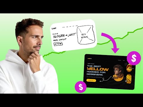
people are naturally going to notice that button a lot more I'll also show you how to get from this to [Music] this people aren't really completely sure what a good landing page is many think that a great landing page is a lot of animations and crazy transition and scroll hijacking because this is what social media tells you but this is not the truth so you spend all that time learning all that and then it turns out it's completely useless a good example is the linear website which used to be copied by almost everybody back in
the day and then they realized that all the animations Transitions and extra things just don't contribute to conversion which is the most important thing about landing page so they dialed it back this is how it looked like before and this is how it looks like now it's still beautiful it's still welld designed but it's way more minimal the idea behind the landing page is to get as many people as possible to perform a specific action like clicking a button or buying a product and most designers have no idea how to make great landing pages except
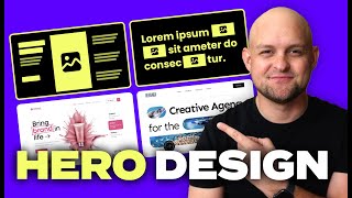
for maybe following a tutorial with smart anime to create some crazy header transitions that's not the way today's video is just the starting point for you it's a necessary one but it's just a tip of the iceberg let me know in the comments if you want me to do more videos on landing pages on the channel this year I have a better way and I'm going to show you a very quick tutorial on how I use mid journey to generate some assets and then put together a landing page header because most landing page headers follow
a formula that formula requires a little bit of text that's going to tell you why you should eat even click the button an action button which is the most important part and a key visual that will enforce the message it can have a logo and some navigation up top as well so let's quickly typ frame it for a fictional brand I created a quick logo some menu navigation and then for the kicker we're going to add a little bit of text that leads to the main slogun the main slogun is going to be the best
yellow hoodies ever and then there is a little bit of extra context underneath that and a button and then we'll reserve the space on the right side for our key Visual and right after this I'm going to show you the ey tracking conversion trick then you can look into some stock photo sites or create some Custom Graphics but since we're doing yellow hoodies I'm going to type that into mid Journey The Prompt is going to be in the description and then after a while we come up with a couple of options so I'm going to
pick one paste it to pixelmator Pro and then remove the background then I can copy it into my Vector editing tool we already have some stuff in there based on the type frame so first thing I'm doing I'm pasting the image and then changing the color of the button to match the shirt then let's modify the text on the button and the arrow to be darker so it's going to be visible on that background and now we also need to tweak the copy a little bit and group The Arrow to group them together with the
text we can also use our primary color to highlight one of the words in this casee the word yellow because obviously and make this whole copy part a little bit interesting and more eye-catching now it's time for the masking so I'm going to create a rounded rectangle mask the character with it and it cuts off his head so what you do is you make a copy of this entire photo outside of the mask and then just crop the top part of the head which is the hair in this case so it can stick out of
that little rectangle mask now there are multiple ways to do this there can be completely different key visuals there can be background photos there can be animations and we're going to get to all that but remember that the landing page is all about the stuff on the left side the button and the copy and that's going to be Universal throughout all the landing pages that we're going to go through today now let's talk about some landing page elements and psychology and then I'll show you at the end of the video how to trans for this
landing page to be even better and one cool way for a key visual is to use people but you need to use them in you know what a smart way and the smart way is not just cramming some people into the header it needs to make sense for it to make sense you need to understand one thing see what happens when I look here to my left you naturally follow my gaze you look that way you want to see what's there now use that to your advant AG pick a character that's looking right at your
call to action button and smiling maybe and then people are naturally going to notice that button a lot more but of course there is more about landing pages that you should know one thing is that not every business needs a mobile app because they're expensive to code and they're not really that useful for most companies but every business needs some sort of a landing page and sadly people don't know how to make them so we decided to do something about it I did something about it a few years ago now with my landing page course
which has helped thousands of people to get better at landing pages and you can get it cheaper in the description below but that's not all because whether you finished that course and that's good for you or not now you can go on our platform and participate in a special Pro user only 30-day landing page design challenge we give you 30 different landing page headers to design and to get full guides and explanations and information on how to best approach it you can either do it completely your way just use ours as inspiration or what we
recommend for beginners you can just copy them one to one and then in V2 after 10 days you can try changing things up this kind of copying directly trying to recreate something exactly as it was is one of the best ways to learn if you're just starting if you're more confident just try changing things and making it your own right away at the end of this challenge you will have 30 unique landing page headers this for a portfolio especially if you're freelancing is invaluable because what you can also do is use those headers for your
own professional landing pages you can tweak them a little bit and then sell them to a client okay now let's make this better we already established that just adding random dancing people in yellow hoodies is not going to work because that creates vertical chaos and our Focus just goes up and down and really away from the btom let's use the Gaze following principle to position our main key visual hero person in a way that he's looking at the button or at the slogun so we end up with this initial version now let's make it better
if your product is high rated it's really good to add the five-star rating instead of the kicker you can write something like best in class or best reviewed and that gives that extra context next to the slogun that confirms that it's the best yellow hoodies for designers then I changed the copy at the bottom to say you can charge your clients double because this is the main incentive that kind of happens right before the CTA button this is what gets people interested in clicking the button instead of one single pill with the character we now
have three and what many people do is add a lot more people in there but if you want to keep it minimal and simpler it's actually best to show more of the product unless you sell completely different products that way you can just show different people wearing them for example but in this case since it's just yellow hoodies let's show the material let's show that it's org IC cotton and we can add a little bit of overlays but really small ones as decorations and the final thing is following the arrow from the character it's looking
at the slogun right towards our main CTA button I also added a simple background behind everything to make it sit in space a little bit more but that's not necessary now you can use tools like hot jar or be usable to test your coded landing page to see see how many people click the button and then adjust tweak and modify because a good landing page is never done and it's truly based on Research so focus on the skills that actually matter of course the better way to starting this is to taking my web design courses
first and then going into the challenge but if you don't have the courses and you just want to go straight away into the daily work do that as well also since it's a pro challenge everybody gets feedback every single day on this Challenge and our AI bought is giving you feedback within minutes of posting so the idea is that we should start making some really useful things in the industry not focusing on mobile apps that almost nobody needs and they don't hire Junior people to make mobile apps in companies anyway but they do hire Junior
people to make landing pages and a lot of them so learn landing pages all right oh yeah and all the links are obviously in the description and that way we're both going to have a beautiful day
Related Videos

10:51
How We 3X this Website's Conversion
Malewicz
30,045 views

12:57
Why Beautiful Websites Don’t Convert
Malewicz
259,086 views

10:00
Only 3 Design Trends for 2025 That Matter
Malewicz
24,592 views

12:08
ALL Design Tools I Use Working for Clients
Malewicz
19,266 views

16:33
9 Web Design Trends 2025 to Spruce Up Your...
Showit
71,126 views
19:26
5 High-Converting Elements For Your Landin...
Alisha Conlin-Hurd
4,033 views

11:05
Your brain HATES these websites
Malewicz
154,988 views

17:59
Easily Improve Your Web Design (With Example)
Flux Academy
153,562 views
11:49
You won’t believe their official websites…
Malewicz
19,211 views

14:52
Design Better Than 99% of UI Designers
Tim Gabe
223,786 views
10:28
Are you at least level 4?
Malewicz
15,491 views
19:31
I tried every website builder. This is the...
Steve Builds Websites
252,903 views
10:57
Are You At Least at Level 4 of UI?
Malewicz
109,831 views

14:17
The 7 laws of good Web Design
BONT
50,830 views
15:27
Copy This Perfect Landing Page To Double Y...
Wes McDowell
228,712 views

16:11
9 advanced tips of layout & composition in...
BONT
169,128 views
12:10
Master Web Design Layout in 10 Minutes
Jesse Showalter
22,850 views
11:45
18 Hero Section Designs You Can Steal
Payton Clark Smith
707,186 views

11:22
The 5 Levels of Web Design - Worst to BEST...
DesignCourse
74,932 views

16:42
This Video Will Take You From Junior to Se...
uxpeak
119,572 views