Principal Component Analysis (PCA) clearly explained (2015)
1.03M views3175 WordsCopy TextShare
StatQuest with Josh Starmer
NOTE: On April 2, 2018 I updated this video with a new video that goes, step-by-step, through PCA an...
Video Transcript:
step Quest step Quest stack Quest hello and welcome to stat Quest stack Quest is brought to you by the friendly folks in the genetics department at the University of North Carolina at Chapel Hill today we're going to be talking about principal component analysis or PCA for short let's start off with an example of principal component analysis in action here's an example PCA plot that I got from an article that I was just reading it shows clusters of cell types this graph was drawn from single cell RNA sequencing data there were about 10,000 transcribed genes in
each cell and each dot in this graph represents a single cell and its transcription profile the general idea is that cells with similar transcription profiles should cluster and we sort of see that in this graph we see that blood cells form one cluster that's different from plur potent cells which is different from neuronal cells and dermal or epidermal cells so the big question is how does transcription from 10,000 genes get compressed into a single dot on a graph the answer is PCA PCA is a method for compressing a lot of data into something that captures
the essence of the original data in this stat Quest we're going to learn all about how PCA does this compression also we're going to find out what these access labels refer to before we dive into the nitty-gritty of PCA we're going to cover a little background material we're going to have an introduction to Dimensions just to warn you this is going to seem very very simple but just hang in there you'll be glad we did this it'll keep your head from exploding if you can remember all the way back to first or second grade you'll
remember that one dimension equals a number line now imagine we had a pretend RNA seek data set for a single cell here I've labeled the genes just a b and c and the read counts are 10 0 and 14 for those genes we can plot these values on the number on just like we did in first or second grade a with 10 reads gets a DOT at 10 Gene B with zero reads gets a DOT at zero and lastly Gan C with 14 reads gets a DOT at 14 if we plotted all genes we might
see something like this a uniform distribution of transcript counts or we might get a non-uniform distribution of transcript counts some genes might not be transcribed very much and they'd be on the left side of our number line and some genes might get transcribed a lot and they'd be on the right side of our number line even though our number line is a very simple graph we can get some useful information out of it now let's fast forward to fifth or sixth grade when we learned about two dimensional graphs now we have two axes instead of
just one and now we can plot data from two different cells instead of just one here's a pretend to RNA sequencing data set for two single cells just like before we have the same genes but now we have read counts for two separate cells if you can remember from fifth or sixth grade the way we plot the data for Gene a is we go over to 10 for cell one and we go up to eight for cell two and we put a point there for Gene B we go over zero for cell one so we
don't move it all and we go up two for cell two and for Gene C we go over 14 and up 10 if we plotted all of the genes we might see something that looks like this here we see that the expression in the two cells is correlated meaning genes that are highly transcribed in cell one are also highly transcribed in cell two and genes that are lowly transcribed in cell one are also lowly transcribed in cell two or we might see that the expression in the two cells is not correlated meaning if a gene
is highly transcribed in cell one that doesn't tell us anything about whether it's highly or lowly transcribed in cell two okay so maybe sometime when we took calculus we started drawing three-dimensional graphs that's just a fancy graph that has depth with three separate axes we can now plot data from three separate cells so now now our pretend RNA sequencing data set has data for three single cells and just like before if we wanted to plot the data for Gene a we would go over to 10 for cell one up to eight for cell two and
then back eight for cell three we then draw lines perpendicular to each axis to figure out where they all meet and then we put a dot there I'm not going to do too many examples of this because you get the idea so this is what we know about Dimensions so far if we have one cell's worth of data we only need to have a one-dimensional graph which is just a number line if we have data from two cells then we need a two-dimensional graph which is just an XY graph that we learned about in fifth
grade if we have data from three cells then we need a three-dimensional graph that's a fancy graph with depth what happens if we of data from four separate cells you guessed it we need a four-dimensional graph the problem is we can't draw that on paper and if we had data from 200 individual cells we'd need a 200 dimensional graph and there's no way we can draw that so the question is are all of those Dimensions super important or are some more important than others to answer that question we're going to go back to a data
set that just has two cells and two dimensions hypothetically speaking what if we had two cell data that look like this here we see that almost all of the variation in the data is from left to right that is to say cell one has some genes that are lowly transcribed and some genes that are highly transcribed but it looks like all of cell 2 genes are all transcribed at the same level if we flatten the data that is removed the up and down variation our graph wouldn't look look much different from what it looked like
before and if we flatten the data we could just graph it with a single number line in this case we can take two-dimensional data and display it on a one-dimensional graph without too much loss of information both graphs say the important variation is left to right here's another example of how some dimensions are more important than others TV and movies TV and movies are almost always 2D that is they're shown on flat screens at home or in the movie theater and we don't usually have fancy 3D goggles on when we watch them so they're 2D
even though the subjects in the movie are 3D this is okay the third dimension usually doesn't add that much to the story This Is Why when we cough up the extra three or four dollars to watch a movie in 3D we're usually disappointed anyways people look like people things look like things even when they have no depth and are flattened on a screen basically a movie camera takes 3D information and flattens it to 2D without too much loss of information to summarize what we know so far we know that each cell that we sequence adds
another dimension and we also know that some dimensions are more important than others so what does all this have to do with PCA well PCA takes a data set with a lot of Dimensions I.E of cells and flattens it to just two or three dimensions so we can look at it it tries to find a meaningful way to flatten the data by focusing on the things that are different between the cells we're going to talk a lot more about this later for any biologists out there this is sort of like flattening a zstack of microscope
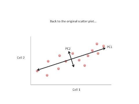
images to make a single two-dimensional image for publication so let's start with an example again we'll just start with two cells here's the the data like before the genes are imaginary so I've just listed them from a to I and here's a 2d plot from the data from two cells generally speaking the dots are spread out along a diagonal line another way to think about this is that the maximum variation in the data is between the two end points of this line and generally speaking the dots are also spread out a little above and a
little below the first line that we drew another way to think about this is that the second largest amount of variation is at the end points of this new line that we just drew if we rotate the whole graph the two lines that we drew make new X and Y axes this makes the left right above and below variation easier to see we don't have to tilt our head anymore and like we saw before the data varies a lot to the left and the right and and the data varies a little up and down note
all of the points can be drawn in terms of left and right and up and down just like any other 2D graph that is to say we don't need another line to describe diagonal variation we've already captured the two directions we can have variation with these two lines these two new or rotated axes that describe the variation in the data are principal components principal component one or pc1 the first principal component is the access that spans the most variation in the data PC2 or principal component number two is the access that spans the second most
variation so these are the general ideas we've covered so far for each gene we plotted a point based on how many reads were from each cell principal component one captures the direction where most of the variation is principal component two captures the direction of the second most variation what if we had three cells just like before principal component one would span the direction of the most variation and principal component two would span the direction of the second most variation however since we have another direction we can have variation we need another principal component component that's
principal component number three it spans the direction of the third most variation what if we had four cells principal component one would span the direction of the most variation principal component two would span the direction of the second most variation principal component three would span the direction of the third most variation and you guessed it principal component four would span the direction of the fourth most variation there's a principal component for each Dimension or each cell in the data if we had 200 cells we would have 200 principal components principal component 200 would span the
direction of the 200th most variation hooray now that we know what pc1 and PC2 are we know what the X and Y axes are in this figure pc1 is the direction of the most variation in gene expression and PC2 is the second most variation in gene expression but I bet just right now you're asking yourself this question this is a plot of cells not genes how do we plot cells so far all we've talked about is how to plot genes to answer your question we're going to go back to the original scatter plot for two
cells for now let's focus on principal component one the length and direction of pc1 is mostly determined by the circle genes the genes on the end points or the extreme genes now we're just going to move the graph over to the left side of the screen so we can put other interesting things on the right side if we wanted to we could score genes based on how much they influenced principal component number one and here's a list of qualitative scores that we might give each gene genes close to the ends of the line like a
and F would have high scores because they highly influence pc1 the genes in the middle like B and C would have low scores we could also use quantitative scores for each gene so genes with little influence on principal component one would get values close to zero and genes with more influence would get numbers further from zero genes on opposite ends of the line we get similarly large numbers but with different signs so a might get a positive number like positive 10 and F because it's all the way at the other end of the line might
get a negative number like -14 similarly we could also rank genes and how they influence principal component number two now we have two tables of genes and the influence they have on the principal components one is for principal component one and the other table is for principal component number number two now that we have these two tables for the first two principal components we can use them to plot cells and not just genes we do that by combining the read counts for all genes in a cell to get a single value here's how to do
that first we return to the original read counts for each cell we can then calculate a score for cell one by taking the read count for Gene a and multiplying it by Gene A's influence on the principal component and adding that to the read count for Gene B multiplied by the influence of Gene B and doing that for all genes here's a concrete example for cell one gene a we have 10 read counts and the influence Gene a has is 10 so the first part of this summation is 10 * 10 the second part of
the summation is the read count for Gene B which is zero multip IED by the influence Gene B has which is 05 we just continue to multiply and sum and multiply and sum until we've done it for each gene in the cell for this example we might end up with a number like 12 that would be our value for pc1 to calculate a value for principal component 2 we do the same thing as before except instead of using the weights or the influences on principal component one we use the weights or influences on principal component
number two so in this case Gene a has 10 reads and we multiply it by three because that's the influence Gene a has on principal component number two we add to that the read counts for Gene B multiplied by the influence that Gene B has on principal component number two in this case that's 0 * 10 and we just do that for every single Gene again and we end up with a score for principal component number two and in this case that might equal six so we've done the math for cell one we've got values
for principal component number one and a value for principal component number two now all we have to do is plot it on a graph and if we create a graph where the X AIS is principal component one and the Y AIS is principal component number two we can do what we did in fifth grade we just go over 12 and up six and put our DOT right there now we have to calculate scores for cell number two and if we did the math by multiplying the read counts for each gene by the influence that each
gene has on the principal component we might end up with numbers like two for principal component one and eight for principal component number two again we just plot it like we did in fifth grade if we sequenced a third cell and it's transcription was similar to cell one it would get scores similar to cell ones and as a result when we plotted it on the graph cell number three would be closer to cell number one than it would be to cell number two Hooray at long last we know how they plotted all of the cells
on this graph these are the general ideas we covered so far genes with the largest variation between cells will have the most influence on the principal components that is to say genes highly expressed in some cells and not expressed in others will have a lot of variation and influence on the principal components the first principal component captures the most variation in the data the second principal component captures the second most variation in the data you can use the original data and the first two principle components to get XY values to plot on a figure cells
with similar transcription patterns will cluster together and just like they say on TV but wait there's more we can use the graph to identify key genes do you see how cells are spread out left and right above and below if we wanted to find out which genes had a big influence in putting dermal cells on the left side of the graph and neuros cells on the right side we could look at the influence scores on principal component number one and if we wanted to find out which genes help distinguish blood cells from neural and dermal
cells we could look at the influence scores in principal component number two but wait there's even more yes there's a couple Diagnostics you can do if you're drawing your own PCA plot these are ways you can tell if your PCA is actually worth anything one diagnostic plot is called a scree plot where you plot how much variation each principle component can account for what you want to see in this diagnostic plot is that most of the variation is accounted for by the first two principal components lastly here's a terminology alert the ways I've been describing
things has been fairly intuitive but there's actually a lot of technical jargon for principal component analysis the numbers that describe the weights for the importance for each gene to principal component one I've just been calling influence or weights but in PCA terminology those weights are called loadings an array of loadings is called an igen vector and that's all there is to PCA so tune in next time for another exciting stat Quest
Related Videos
21:58
StatQuest: Principal Component Analysis (P...
StatQuest with Josh Starmer
3,203,700 views

22:23
Covariance, Clearly Explained!!!
StatQuest with Josh Starmer
598,726 views

26:17
Principal Component Analysis (PCA) | Dimen...
DeepFindr
13,254 views

18:26
StatQuest: A gentle introduction to RNA-seq
StatQuest with Josh Starmer
531,941 views

22:33
Regression Trees, Clearly Explained!!!
StatQuest with Josh Starmer
713,045 views

19:13
Pearson's Correlation, Clearly Explained!!!
StatQuest with Josh Starmer
424,109 views

26:34
Principal Component Analysis (PCA)
Serrano.Academy
430,910 views

20:09
Data Analysis 6: Principal Component Analy...
Computerphile
169,962 views
23:54
Gradient Descent, Step-by-Step
StatQuest with Josh Starmer
1,549,883 views

27:27
Linear Regression, Clearly Explained!!!
StatQuest with Josh Starmer
1,494,284 views

19:50
An introduction to Policy Gradient methods...
Arxiv Insights
229,028 views

18:32
Backpropagation Details Pt. 1: Optimizing ...
StatQuest with Josh Starmer
246,507 views

27:14
Transformers (how LLMs work) explained vis...
3Blue1Brown
6,004,509 views

13:46
Principal Component Analysis (PCA)
Steve Brunton
432,322 views

16:17
ROC and AUC, Clearly Explained!
StatQuest with Josh Starmer
1,685,746 views

1:15:11
Veritasium: What Everyone Gets Wrong About...
Perimeter Institute for Theoretical Physics
2,345,048 views

10:56
Principal Component Analysis (PCA) - easy ...
Biostatsquid
107,875 views

19:02
Logistic Regression Details Pt1: Coefficients
StatQuest with Josh Starmer
982,682 views

8:49
Principal Component Analysis (PCA) Explain...
IBM Technology
46,397 views

25:53
Design of Experiments (DoE) simply explained
DATAtab
87,791 views