What makes a great research poster? [Good and Bad Examples]
234.15k views1986 WordsCopy TextShare

Andy Stapleton
In this video I share with you what makes a great research poster with good and bad examples for you...
Video Transcript:
a great research poster is one that attracts attention for all the right reasons to really understand what all the right reasons are you need to understand what happens when you go to a poster session at a conference or in your university now what you think it's going to be like is that you're going to stand next to your poster with it there and you're going to be asked questions but in reality people are wandering around aimlessly because it's the poster session and it's kind of a bit awkward if i'm going to be completely honest because
people are walking by and you're like would you like to look at my poster that i spent ages kind of preparing and then they just walk on by or they come up to you they ignore the poster altogether and they say can you tell me about this and then you're like well yeah like it's on the it's on the poster that's why i did the poster but i get it they want a shortcut and what you've got to do is help shortcut for them by making your poster awesome and here are all the things that
your poster needs to have and be for it to be that shortcut so that they're not just like bombarded with information and they put it in the too hard basket and walk on okay the first thing that a great poster has is an obvious flow as in you've got little boxes which is like this is where you need to go first this is where you need to go second don't over complicate things stick with either like a column structure just something very very simple and the next biggest mistake that i see loads of students make
all the time is by cramming it full of words people aren't interested in words on your poster it should be based on figures really obvious nicely prepared figures graphs schematics with a little bit of text explaining what they should get from that graph text or schematic now here's the thing is that whenever i create my own research posters in the past i always had to go back and remove words go back and remove words that is the only way that you can really cut down even when you think you have cut down enough carry on
cutting down the words on your poster until you have reached the bare bones be ruthless and cut it away another thing that makes sort of like a a poster very attractive and nice to kind of approach is the fact that you can kind of read the title and understand the conclusions very quickly like having those two things bolded and we'll get on to kind of like a better poster design later on that was proposed a few years ago that i haven't really seen taken off anyway we'll get there but when you approach a poster the
title ends in like read this if you're interested in this and don't go crazy with fancy words no one's interested in your fancy words they are drinking and they're walking past your poster so they just need to be able to glance and go oh yeah that's what that's about don't try to impress anyone if you're trying to impress someone you're in the wrong spot keep it simple simple words the way i like to check if words are simple is go on speech to text on google and say your title if it's not able to pick
up your title from you saying it it's too complicated there's a little trick for you now color people go crazy with color but don't overdo it you should have maybe three colors on your poster now if you're not designing and i'm not designee i don't really know what design is to be honest but i know this if i want to shortcut the colors i use i just use an online tool like coolers so here we are all you have to do is go to their tools and palette generator and then you just click the space
bar until you find one that you like no don't like that no don't oh this one could be okay there's your accent color nice and bright these ones could be your background color or vice versa done no too close oh another accent color too close here we are here's a nice one these could be your background colors this could be your accent color there are tons and tons of colors that you can choose from coolers is one way to shortcut the design thinking another thing you shouldn't do is really rely on the template that's given
to you by your university a lot of universities they're in university mode they're not thinking about you communicating your research really well they are thinking about how can i get my logo on everything in this conference so they're more interested in having their colors their brand colors and their logo up at the top now if you're forced to use it sure you have to but remember the normal sort of like rules of not too much text mainly using graphs figures schematics that is important but if you can just do away with it altogether put their
logo at the top you know of your poster make sure that uh you do try to get away from the university supplied one because in my experience they're always a bit rubbish this video is brought to you by my newsletter go check it out at andrew stapleton dot com dot a u forward slash newsletter the link is in the description when you sign up you'll get five emails over about two weeks everything from the tools i use the podcast i've been on and more it's exclusive content only available for free on that newsletter so go
sign up now all right let's head over and have a look at some of these research posters i have googled research poster and this is essentially the quintessential view that people get during a research poster session you can see that it's just crammed full of information information words words so much word oh my god it's overwhelming i am not interested in approaching many of these but you can use this kind of view as a way of kind of being like well what really does work well as you're scanning through this one stands out why because
it is mainly figures it is mainly graphs and nice colors there's an obvious flow i can read text i can look at stuff i like it this one stands out that's pretty good why simple colors there's nice figures maybe a little bit too wordy this one looks absolutely terrible and that's because look at the words you should be able to read a poster by standing you know five feet away from the poster this one you have got no chance of really understanding what is going on once again here the researcher has been over enthusiastic look
at this look how much stuff is here we have got pie graphs we've got background methodology population there's so much going on once again the rule go in cut cut and cut again if you cannot cut out you know from this and you are telling too much of a complicated story i think that some of the best poster designs at the moment online are shown to you by animate your dot science and here's an example this is from their blog how to design an award-winning conference poster and you can see they go through everything above
but ultimately this is fantastic there's three areas there's very little kind of text but there's a lot of data there's one nice large eye grabbing visual that kind of like draws you in i would be drawn to this poster if i was walking by because it's not overwhelming for the drunk academic that's walking by with their with their glass no it's nice it's simple it's good colors it's not crazy and i really think that if you want to know more about how to design a really good poster go check out animate your dot science and
their blog section to find out how you can make a great poster they have covered everything you need to know in about 2019 there was this proposal this proposal that we should change the poster style completely and it caught on just for a little bit i haven't seen it much afterwards but i really think we can learn a lot from this better poster idea it was first proposed by this guy called mike morrison look at happy his little faces to be like hey everyone i'm changing things and i don't care i think this was fantastic
look at this this poster was brilliant it's got the massive communication bit like this is what you should be able to find out and then underneath it's got a qr code for more information and then it's got very sparse information on the side now i think that he was really really on to something and i want to see poster designs go closer to this than anything that we've seen in the past so overall mike morrison you did a fantastic job i'm sorry it didn't take off but hopefully we can get closer to your vision with
your happy little face as well here's another layout where you've got all of the important information in the beginning right in the middle obvious and then just the information along the sides which means that if you're walking by with your little drunk academic friend they can sort of like quickly look at it and go oh yeah that's interesting i'll maybe grab a shot of that qr code boom qr codes weren't such a big thing pre-covered but now people are used to scanning qr codes i think using one on your poster could really really help and
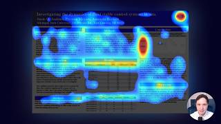
extra figures and table here but the problem that people do and this is what we always we ruin it for ourselves our scientists because look that was the idea and then look what happened look what they did to his beautiful idea they've destroyed it with what scientists and researchers love the most which is too many words on the page look at this look and also look if i'm not be i'm not able to scan this on the way through autistic young adults had fewer examination passes employment roles and less clear plans for the few blah
blah okay okay i have to i have to really try try to cut that down cut that down to like a simple sentence and then you would have done perfectly well i do think that they've tried their best to kind of follow the the outline of the better poster idea and then their supervisor's probably gone in and being like oh needs more words needs more words definitely needs more words put more words in make the title and conclusions really really confusing that is a good science poster no it's not professor it's not so there we
have it there's everything you need to know about creating a perfect research poster and the pitfalls that i think a lot of researchers find themselves falling into let me know in the comments what you would add to that and also go check out academiainsider.com that's my new project where i've got my ebook the ultimate academic writing toolkit as well as the phd survival guide where they're available for a bundle price at the moment and i'll see you in the next video you
Related Videos

19:32
How to create a better research poster in ...
Mike Morrison, PhD
1,217,065 views
![Things you don't say out loud in academia [9 open secrets]](https://img.youtube.com/vi/sgAlFPMugWw/mqdefault.jpg)
13:15
Things you don't say out loud in academia ...
Andy Stapleton
606,223 views
22:18
How to DESIGN an ACADEMIC POSTER in Micros...
Dr. Michael Okereke - CM Videos
46,464 views
13:34
Conference presentation tips and MISTAKES
Andy Stapleton
85,971 views
15:59
What do people look at on your research po...
Mike Morrison, PhD
1,684 views
6:50
How To Create Academic Poster in PowerPoin...
Mind Feeder
893,254 views
![How to identify a research gap EASILY [Sanity-saving tools]](https://img.youtube.com/vi/Mvj1Q5WoGb8/mqdefault.jpg)
8:23
How to identify a research gap EASILY [San...
Andy Stapleton
92,583 views

11:56
Giving an Effective Poster Presentation
georgerhess
803,655 views

17:01
How To Write A Great Story (Decades Of Wis...
Film Courage
445,441 views
3:19
2014 Three Minute Thesis winning presentat...
University of South Australia
5,575,725 views
![Craftiest ways to answer tough questions after your presentation [8 easy options]](https://img.youtube.com/vi/IVNVd-Rp0rg/mqdefault.jpg)
11:11
Craftiest ways to answer tough questions a...
Andy Stapleton
8,150 views

14:37
Forget PowerPoint! The BEST AI Tool for Ma...
Kevin Stratvert
172,352 views
11:39
How to Write a Paper in a Weekend (By Prof...
Surviving and Thriving in Higher Education
2,305,985 views
1:00:38
PhD: How to write a great research paper
Microsoft Research
201,443 views

18:01
How to Create a Research Poster in PowerPoint
SmithInstituteJCSU
120,159 views

19:19
The PERFECT PhD daily schedule and clever ...
Andy Stapleton
179,581 views

10:53
Poster Judging : Cal NERDS' Faculty Centri...
UC Berkeley Events
81,966 views

11:16
Read a research paper effectively | Little...
Andy Stapleton
139,373 views

31:05
5 Insanely Useful AI Tools for Research (B...
Academic English Now
66,140 views