Top 21 Thumbnail Formats To Grow Fast On YouTube
201.4k views2810 WordsCopy TextShare
Tyler Fleischman
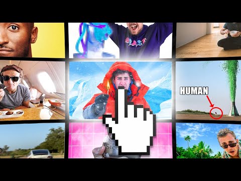
A comprehensive list of all 21 different clickable thumbnail formats I've found through my research!...
Video Transcript:
as a Creator the endless variety of thumbnails on the homepage can be overwhelming I knew there had to be a Common Thread so I've spent weeks compiling the most clickable thumbnails I come across to my surprise I found that nearly all of them fall under one of 21 categories of course you can't talk about thumbnails without mentioning Mr Beast because he's one of the best in the world at packaging videos but he's not alone within the shock and OD genre he popularized other creators like AR have found massive success part of the reason a know
like this works so well is because of how extreme it is and like it or not the YouTube homepage often resembles an amusement park the fastest and scariest ride gets all the attention to show you what I mean let's reference two nearly identical examples they're both videos about being buried alive and actually the smaller Channel posted theirs a month earlier already you might have noticed the biggest difference Jimmy's face is bigger and much easier to read his expression the green grass also pops out a lot more on dark mode which 80% of viewers have enabled
subtle differences can lead to substantial results often the shock value can come from a large amount of something like millions of Orbeez or an object's high cost these thumbnails Place big numbers front and center betting on them to get your attention not surprisingly they're pretty common in the finance Niche but they work in other places too here in a tour of the country's most expensive home you'll notice the currency symbol and commas quickly communicate the insane price tag another common feature of these thumbnails is still avoid void perfectly round numbers because it's easy to lose
the sense of scale when there are too many zeros an extra benefit of large numbers is there an easy thing to react to reaction videos despite their Rocky history on YouTube are still extremely popular and you'll see their thumbnails on the trending tab nearly every day the most commonly used layout for these thumbnails is to show what's being reacted to and put the Creator's face on the left or right some channels use a genuine screenshot from the video While others use a photo they took separately Mr Beast doesn't even bother switching the photo most of
the time a really interesting phenomenon I've noticed is what streamers are doing with the react to genre and no I'm not talking about those getting in trouble for watching TV live on Twitch I'm more talking about personality streamers like lwig who will react to things live only to edit a highlight video later the two birds one stone thing these streamers can pull off is cool but reaction thumbnails aren't limited to any specific genre creators all around YouTube will react to just about anything KSI is another big example and here's a thumbnail that stood out to
me one thing you'll notice about it is the quotes which I found to be an underrated thumbnail trick when you highlight an important moment from the video with a quote in the thumbnail viewers immediately know what to look forward to and have to click to see more other times quotes are just trying to be funny or give more context to the image like this Corridor crew video I expect quote thumbnails to get a lot of attention this year so next time you're on your homepage see if you can spot one then click one of my
videos similar to quotes are the question thumbnails and if you want the perfect example but you visited YouTube in mid 2021 chances are it's already been recommended to you introducing what pretending to be crazy looks like with packaging this good 55 million views isn't a coincidence now I never had an interest in True Crime but after this video was uploaded it found its way onto my homepage over and over again the text is just a question but it becomes planted in a potential viewer's head and it can only be answered by watching the video seems
easy but if you've been a creator for a while you've probably realized there's more to Great packaging than some text question thumbnails are far more effective when the title further encourages curiosity and the hook closes the loop but leaves you wanting more after clicking on this thumbnail I watched the whole video and then I binged a few more I know I wasn't the only one look at how many streamers watch this video but what if your thumbnail is the answer and the title is the question I like to call this format a Jeopardy thumbnail if
the question seems controversial or surprising then you're really on to something there are a lot of people out there who believe salt lamps provide unbelievable health benefits but veritasium directly counters that opinion and he doesn't hide it either the title asks if salt lamps even work and the thumbnail responds with a resounding no another popular example is from quaz act who asks if you can fix climate change and the thumbnail responds no but with an asterisk of course the asterisk is the entire video and you have to watch it if you want them to elaborate
kind of Genius there are other conversational thumbnails out there like those popularized by Beluga you'll see these on channels all over YouTube including small ant lwig disguised toast and more they're based on Discord and there's a few reasons why they stand out so well firstly the layout font and colors are instantly recognizable to the target audience if you've spent any time on Discord you'll know what the screenshot is from another reason is simply about how different they are from other thumbnails in an ocean of over-the-top thumbnails and red arrows something new yet recognizable is perfect
for standing out and that's what the homepage is made for when standing out is the goal following the crowd is one of the biggest mistakes you can make props to Beluga for pioneering an entirely new format of YouTube thumbnail part of the reason this strategy works so well for Beluga is because it was a unique way for him to develop a brand on YouTube as a full-time Creator you're an entrepreneur and when you're building a business you can't be successful without strong branding because that's what will turn new viewers into return viewers while everyone should
consider the brand When developing their thumbnails I'll point out a few of my favorite examples and why they work first up is W over Productions whose custom 3D renders and highquality Photoshop work impresses me every time they upload but it's what they all have in common that we're focusing on here the bottom right corner contains these lines that are the wover brand colors unless the thumbnail takes on a new color scheme in that case both the lines and the logo in the top left will change color to suit other creators will use a border around
their thumbnails to distinguish themselves from copycats and channels like yes Theory keep it simple with the logo at the bottom left Colin and Samir is a channel you must be familiar with and by now I'm sure you've started to recognize their signature yellow and helvetica font I wonder if they chose that font after Casey neistat started using it anyway speaking of Colin and Samir they're one of the best on the platform taking advantage of social hacking don't underestimate the power of a recognizable face simply put social hacking is utilizing the likeness of someone your audience
would be familiar with in their case it's creators like Emma Chamberlain Marquez brownley the CEO of patreon and of course Mr Beast while Colin and Samir make great use of social hacking they're not alone in 2020 arak became the king in this format after managing to collaborate with some of the biggest creators on the platform when he had less than 20,000 subscribers you don't need to make videos with David dbck to find success on YouTube though coincidentally arak recently took advantage of the next thumbnail format which is the high contrast thumbnail or what I like
to call the orange jumpsuit these thumbnails use drastically different values to easily distinguish the subject from the background here he's done it again with the desaturated icebergs in the background and the neon orange jacket I downloaded this thumbnail on the day it was uploaded and look at the difference in today's thumbnail it's nearly red now they already have had a bright orange but they increased the saturation even more about 12 hours after uploading he didn't come up with this concept on his own though these arac thumbnails were directly inspired by Ryan Tran's iconic video world's
quietest room besides the high contrast another thing worth noting is the subtle expression on his face he isn't exaggerating the emotion he wants to portray and it feels very authentic because of that the text at the top of this thumbnail acts like a header which brings us to our next thumbnail format the uh you guessed it header thumbnail you might try this out for a thumbnail that needs more context in the form of text but there's nothing in particular to point out a channel commonly using header thumbnails is quartz Gaz act usually their illustrations do
a great job standing out but the flat Vector style often needs text to explain the meaning of the image a little quicker even Mark Rober will use a header thumbnail though he'll usually add an arrow or a circle sometimes even both here's a thumbnail that you've probably already seen and if not you've definitely seen thumbnails inspired from it creators like Matthew beam have made a plethora of videos with the same basic thumbnail format there's a large main element and somewhere small in the frame is the creator you might not see them at first but the
text and arrow guide your eyes to what you should look at next a derivative of this format is similar but instead of a large structure it's a large amount of people wearing roughly the same thing and standing out in the center of frame is the creator these are all subtypes of the same thumbnail format that uses arrows and circles to guide your eyes it's funny how many thumbnails you see these days with the text me and an arrow don't think I didn't forget about gaming thumbnails either the biggest game on YouTube might be Minecraft but
the biggest thumbnail format dominating the game right now has to be 100 days time-laps thumbnails like these are extremely common in gaming but you don't have to be a gaming channel to learn from this format the basic idea is that time or some sort of progress is shown to the viewer and they'll want to click to see how you got there a great example outside of gaming is from better ideas in a video where he talks about his experience with losing hair other side-by-side formats will directly compare two things showing something cheap and something expensive
is what you'll typically see and it's a good excuse to add large numbers a big reason a thumbnail like this can work so well is about who they're able to bring in comparing two competing products like iPhone versus Android or Playstation versus Xbox and you'll encourage fans on both sides to watch and voice their opinions in the comments with the right comparison thumbnail you're essentially doubling your potential audience you might choose a similar thumbnail to Showcase a transformation you know those videos living in the satisfying corner of YouTube while they're often a side-by-side format they
don't have to be my favorite thumbnail in this category is from a channel called Bonsai relief where he transforms neglected bonsai trees I really like the attention to detail here the before photo is taken on a white background and the after is taken on a dark background with the artist the these three elements guide your eye and create a really strong thumbnail sometimes creators will conceal what the video is about by blurring the thumbnail I call these ambiguity thumbnails and I noticed that Fiverr videos will often use them they're even set up just like comparison
thumbnails cheap versus expensive though if you're going to pixelate your thumbnail you have to make sure you don't punish viewers by showing them something lame you need to close the Curiosity Loop in the hook of the video and actually deliver on something interesting ideally not just at the end but throughout the video as well with the right video ambiguity thumbnails can result in some pretty high click-through rates this thumbnail about Mr Beast is doing the same thing but it's also taking advantage of another thumbnail category the video is about the recreation of a 3D render
the Creator made but in real life Recreation thumbnails are really popular because with the Right audience creators can take advantage of a pop culture reference to create a really clickable thumbnail fans of the Fallout series might have thought to themselves before wouldn't it be cool if I had a real pit boy and this Creator capitalized on Minecraft despite not being a channel centered around the game and I think we all know how the Rabid crypto crowd might react to this thumbnail a lot of thumbnails showing you an object will intentionally contain one so weird you
have to click to find out more about it veritasium has made good use of this format and Leon Hendrick achieved nearly 2 million views on this video with a thumbnail he said was inspired directly by the Science Channel the weird object format works with niches of all sizes here's a coffee channel that found great success with this thumbnail about a weird coffee brewer not all thumbnails are about an object though other times it's about the activity a Creator is doing that will attract an audience these are known as bringalong thumbnails sometimes it's a personality based
Creator like Emma Chamberlain with the video is more about them and what they're doing rather than some sort of spectacle creators like her can entertain her audience and tell an entertaining story even when it's something mundane like cutting her hair I was surprised to find out that Casey neistat's most viewed video is a bringalong vlog that racked up almost 80 million views so far a thumbnail like this kind of speaks for itself but when you need more context why not just throw in a bunch of pngs successful thumbnails in this category walk a fine line
between busy mess and understandable at a glance a common mistake I see on YouTube subreddits are busy thumbnails that are just confusing so the key here is that the cutouts are quickly recognizable by the target audience and ideally there's one central element you're meant to focus on here Drew Gooden put a stroke around him but none of the other elements separating him from the rest of the background naturally the opposite of cutout thumbnails would be popular as well and those would be the single photo thumbnails while they may look simple at first the amount of
planning and preparation needed to pull them off well is absurd Matt dellaa pioneered this format with his excellent thumbnails that effectively communicated the video Topic in one image he doesn't need text when there's a laptop pen paper headphones and a coffee cup to convey the concept of productivity this format goes a layer deeper though for example the better ideas channel has a thorough understanding of what his audience is looking for when Minecraft was surging in popularity again in 2019 he took the chance to make a video about procrastination and used this thumbnail the school year
had just started and he knew that his audience of mostly High School to college aged males were probably procrastinating more than they wanted to admit this is a Creator who is acutely aware of what his community is thinking the reason this thumbnail is so powerful isn't just because of its Simplicity but it's the laser focus relatability that's so effective you might have noticed I talked about more than just thumbnails in this video while thumbnails are incredibly important other things like titles Hooks and most importantly your video Concepts need to be carefully thought about watch this
video to see how arak develops his highly effective hooks
Related Videos

30:07
how to make a killer thumbnail (for the 20...
Aprilynne Alter
382,043 views

53:38
Write Better YouTube Titles In 54 Minutes ...
Jay Clouse
119,127 views

15:33
Thumbnail Hacks YouTubers Use To Hook You
Film Booth
205,459 views

15:29
Doctor Reacts To Mind-Blowing Medical TikToks
Doctor Mike
920,523 views

45:46
YouTube Strategist Reveals Viral Thumbnail...
Making It Podcast
943 views

28:25
World’s Deadliest Obstacle Course!
MrBeast
248,644,656 views

15:25
Reacting To YouTubers Thumbnail Mistakes
Film Booth
129,350 views

11:28
Editing Hacks YouTubers Use To Hook You
Film Booth
870,512 views

13:44
I Updated This OLD Thumbnail and got 900% ...
JackSucksAtLife
1,281,282 views

18:07
Asking Big YouTubers How To Reach 1000 Subs
Marcus Jones
59,528 views

8:53
How A Pro YouTuber ACTUALLY Makes Thumbnails
Tyler Fleischman
1,893,644 views

11:22
Top 20 Viral Video Titles Explained in 11 ...
Tyler Fleischman
21,540 views

8:01
Design a MagnatesMedia THUMBNAIL!
Badis Designs
39,438 views
35:48
Meet YouTube's Secret Title Guru (100 Mill...
Jay Clouse
69,178 views

3:14
What makes a great YouTube thumbnail
Lex Clips
47,981 views
5:51
5 MORE Editing Mistakes YouTubers Do That ...
HillierSmith
1,777,302 views
13:15
If I Started a YouTube Channel in 2025, I'...
Ali Abdaal
4,023,697 views

6:29
How To Create THE BEST Thumbnails!
fraziel
4,325 views

1:06:06
Meet the Man Who Solved YouTube (Paddy Gal...
Jay Clouse
234,516 views

33:43
How I Make Thumbnails For Youtube Videos
jacksepticeye
671,694 views