From now on all Elementor websites will have the container as the default building block for layouts instead of the sections and columns we were so used to for many years. This means that we need to relearn how we built our websites with Elementor. Learning this will take some time because there are many more options right now, but this container will make our websites a lot faster and gives us much more design options.
I was able to create these kinds of designs with Elementor which were simply not possible before with sections and columns. I've already spent a lot of time in the container so I'm pretty sure that after watching this video you will have a good understanding of the basics, and at the end of the video I will also show you what you can do with your old websites that are still using sections and columns. So let's get started because we have quite a few things to cover.
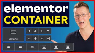
In order to understand the container you have to think of the web as a bunch of boxes that build up the layout of a website. Some of these boxes are in a horizontal Direction like a row and other boxes are vertical like a column. The big difference with what we're used to with sections and columns is that before sections or inner-sections were always stacked vertically and columns horizontally but now there's no separation anymore everything is a container and you decide the direction with the Direction feature over here.
Horizontal or vertical. The fact that we can now choose the direction over here means that we don't need the inner-section anymore, because right now you can just keep dragging containers into containers until infinity. This new feature alone already gives us much more design options because we can simply go much deeper than we could before.
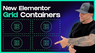
It's like having a new girlfriend. The new container actually has two versions: the "flexbox" and the "grid". Some of you in a newer version will maybe even see the options right here.
These are both containers but this is the grid version and this is the flexbox version of the container. Not everybody has this great option yet because it's still on the development. This also means that it's not stable enough to use yet, so in this video we will just be focusing on the normal flexbox container and then when the grid is stable enough I will also make a tutorial about that.
Okay! Inside of the container you can choose for a "boxed" container or a "full-width" container. By default it's on "boxed" but this is not the best option for most of your containers, so let's dive into this concept a little bit.
As you know most websites have a box where most of the content sits in. This box makes sure that the content doesn't touch the sides of the screen because that just wouldn't look good. The outsides of the box (so the dark areas over here) they do scale according to how big your screen or browser window is.
And this is what you want in most cases otherwise this box becomes too wide and the text becomes uncomfortable to read. We already had something similar with the old system with sections, because when you would create a simple section like this it would automatically give you that inner column where the content would stick to. As you can see so Elementor automatically creates that inner box so that you don't have to add an extra container inside of it to center align the main content.
This is a good thing because it's one less container that you have to add for every single section, and when your container is on boxed the width slider changes the width of the inner box as you can see and not the width of the actual container. Changing the width of the inner box can be useful when you want to create a design that is a little bit more narrow like this. You can even go lower if you change the number over here for example to 400, so then all the content you add will stay within the width of this box.
On tablet and mobile this feature is also very useful to create some space on the left and on the right, but every tablet and phone is a little different so that's why when you go to tablet and mobile I recommend to switch to percentages For example if you put tablet on 80 % then it will create some nice white space on the left and on the right. And on mobile I use 90 or 85 percent which looks good as you can see. And then if the phone is a little bit bigger or smaller it still looks good.
This of course is a lot easier than what we had to do before with sections and columns, where we only had pixels to work with so then what you have to do is go to Advanced and add padding left and right in order to create some space Now you don't have to do that anymore, you just put the container on "boxed", make sure it's on % on tablet and mobile and then it will create that space on the left and on the right And on desktop you can just leave your background container on pixels which is the default anyways. You can even set this up on a global level if you want to which makes your life a lot easier by going to the "Site Settings" and then going to "Layout" and here you can set it up. And then you just go to tablet mode, and then you put it on whatever you want.
Again: 80% on tablet And 85% or 90% on mobile. Setting this up on a global level in the Site Settings wasn't possible before, so this video that I made earlier where I used classes in order to do that is not relevant anymore When you put the container on "Full Width" then the content will become full width and then the width slider will actually change the width of the container itself. This of course is not what you want for the background containers but for all of your containers that you drag inside of the container you want to put them on full width, because then you can manipulate its width Because if you don't do that and you leave it at boxed then you have another box inside of your box Which is what you don't want in most cases.
So for all of the containers inside of the background container almost always "Full width" is what you want. And how does it work with Widget width? Widgets also have width settings.
So let's drag in a widget, for example an Image You can also change the width of the widget by going to Advanced and then playing with the width settings over here. If you put it on custom then you can change the width. You can use Pixels, %, REM and some other values But I would try to use percentages as much as possible because that's better for responsive.
So this slider in the Advanced tab is similar to the full width slider setting in the container. So now you know how to change the width of widgets and containers so now let's talk about alignment because how do we align everything? The first big difference with sections and columns is that now in the container widgets can more easily move around with the new "Align Items" and "Justify Content".
In the old system this was kind of hard, because if you would drag a few widgets inside of a column. . .
and you would try to for example Center align these items then nothing happened because the widgets stayed 100% wide as you can see, even a small button like this. You could if you want to go to Advanced as well and then change the width over here to a smaller size and then they would move but then you had to do that for every single widget. But with containers the items are also 100% wide by default but once you start playing with the Align items then you will see that they actually move around and that is because the widgets go back to their most minimum size, as you can see, they're not 100% wide anymore.
And this is great but it's only the case if the widget doesn't have a lot of content because once you add a lot of content for example with a text layer which has multiple rows then you will see that the text is actually not middle aligned at all even though I put this container on Center align. Then you can do the same thing go to Advanced and then change the width in the same as the old system and then you will see that it's still middle aligned, but as you can see the text is still left aligned. So don't get fooled.
. . because it's not always the case that when things look middle aligned or right aligned or left aligned that it's actually aligned the way you expect.
I've seen this in a few other tutorials already where people just use the Align items feature to Middle align text but as you already saw when the text becomes bigger you will see that it's not middle aligned. You will see that more clearly when you switch to mobile for example. Here the widgets are wider than the screen and there you can see that we still have the same problem.
So what is happening here? The Align items feature doesn't actually align the text. .
. it just aligns the widgets. So these texts on desktop are still are still left aligned but you just don't see it because they're not long enough.
That's why you do see it on mobile. This button is small and that's why it can push it to the middle. So the Align items features do work, but they only align the widgets, not the content itself.
That's why in most cases you still need to use the text alignment features over here and put them on Center. You don't see a difference over here Let's also do that for this layer: I'm gonna put it on Center. But you do see a change when you switch to mobile.
Now the texts are actually Center aligned So for text layers I would recommend to also already use text align, even on desktop so that it automatically applies for tablet and mobile. Another place where this difference between widget width and content width is very visible is with the image widget. So with the image widget you have the image size options over here you have width settings over here and you have to width setting over here.
So how do they work together? I just told you that the width setting over here (I should actually use percentages. .
. ) changes how much space this widget takes up inside of this container. The width settings in the style tab actually change the content as you can see.
The widget it still takes up 50% of the width, but now the content over here just takes up 80% of the width. And then you can also combine that with using the alignment features to for example right align this image. And then the image size in the content tab just defines which version of the image it loads in.
WordPress automatically creates a few sizes for the image to keep your website fast, so that you don't always have to use the full size image. So just only pick a high resolution when you actually need a super sharp image. So for now just remember that the widget width is not the same as the content width.
Sometimes you need to look in the Style Tab and the Content Tab to actually change the content itself. Another thing you should know is that sometimes it looks like the Align items feature doesn't work. But that is probably because the widgets have no space to move, even though it looks like it.
In this container I have used minimum height to create height within the container. that creates some free space for the items to move But in this container I didn't use minimum height I used padding. As you can see: 120 on the top and 120 on the bottom.
But padding only creates visual space for our eyes but it doesn't create space for the widgets to move. So the space that the widgets have to move is still this box therefore the Align items feature doesn't do anything. So then you might think well then let's just use min.
height for all of our background containers but that is not really best practice because once you start adding widgets it messes up your design is not good for responsive. So I still recommend to use padding on top and bottom but then also remember that the Align items feature only works if there is space for them to move. This is btw the same for "Justify Content".
Here I do have some free space on the right, that's why this still works. But in this layout for example it doesn't do anything because these items are already touching the sides. We will talk about a few more differences between "Justify Content" and "Align items" in a minute But first I want to show you one more trick that align items can do And that is: Align Self So in the container the Align items option is over here but a little brother of "Align items" is "Align Self".
It's very similar to "Align items" but then it's just for individual widgets or containers. So let's say that you have a situation like this, where you have these boxes. I put "Align Items" at the start to make sure that they go back to their most min.
size which is useful over here, otherwise these boxes would have the same height which is not what I want for this design. But let's say that . .
. this container I want to stick that to the bottom. I can do that, by clicking over here so I'm just aligning this individual container to the bottom even though this whole container is set to: top.
So the "Align self" overwrites what the container is set to, which sometimes is useful. Also inside of these boxes because these items I want them to be aligned on the left but maybe I want to have this arrow on the right, so I click on the Arrow I go to Advanced and I align that to the right. Pretty cool right?
Okay! Let's now talk about the differences between "Justify Content" and "Align Items". As you can see "Align Items" has the power to bring items back to their most minimum size.
"Justify content" doesn't have that. It will just move things around. Here: left, center, right, but it has three more options: "Space between", "Space around" and "Space evenly".
"Space between" creates the maximum amount of space between objects. "Space around" keeps the same space around, and "Space between" will divide it evenly. These all sounds great because you have more options but honestly I have never used these two options on an actual website, because I think using the Gap feature to create some space between the objects is much better (which we will cover in a bit) but I do use "Space between" sometimes.
Not for a situation like this, but for some other situations. For example this design. It's a little complex.
Don't worry about it for now. But I have a container on the right over here and I have a container on the left over here. So that when I close this window these containers will stick to the sides.
That's where I've used space between because it creates as much space as possible between the objects The "Grow" feature that you can find in the Advanced tab makes a widget or a container as big as it can be inside of the container it's in. So let's say that you want to push these two things to the right. You can just go to this widget over here then go to Advanced and put the Size on "Grow".
This will then increase the widget width (again not the actual content, that's what you set up over here as you can see) . . .
but the widget will grow as much as possible pushing these two items to the right. And another great example is in a situation like this which will happen quite a lot. .
. You have 3 boxes, but the content is not the same but you want all the buttons to be at the bottom. So then you can go to this widget and then go to Advanced and then put it on "Grow" therefore pushing this button to the bottom.
But just know that the grow feature will grow in the direction the container is set to. So if you put it on horizontal then they will grow horizontally If it's on vertical then they will grow vertically. Using this feature is a lot better than adding an extra container and then using "Space between" because it's one less container you have to add which keeps your website fast.
And by the way the grow feature is available on containers and on widgets. The last big feature which you're going to use a lot to align items is the: "Gap between elements" feature. This is such a great feature compared to what we had before with sections and columns, because now we can just create space between objects by putting in a number over here, or by using this slider depending on the version of Elementor you have.
Before the container with columns if you wanted to create some space between these boxes you had to go into advanced and then mess around with margin left and right to create some space. But now we can just put in a number over here which makes our life a lot easier. If you want to you can also change the default Gap in the Site Settings, so if you go to your Site Settings and then go to "Layout" you can change the default Gap over here.
And then that will change for all of the containers where you did not change the Gap manually. Okay, so far I've shown you multiple ways to align things inside of the container but did you notice that I didn't really make a difference between aligning containers and aligning widgets? As you can see here, we have a container and some widgets over here and when I change the settings of the container, not only the widgets move but also the container.
This wasn't the case before because with columns, widgets always had to be inside of a column. A column was always next to another column, so a widget could not live next to a column. So here the column was always superior to the widget itself.
But the container it doesn't care what you drag into it: other containers or widgets. . .
it all treats them with the same level of importance. Actually containers are widgets now. Before you could not drag a column here, a column was not a widget, it was something different that you could only see in the layout, but now everything is a widget.
This means that containers can live next to widgets, as you can see right here. So in this background container we have one container with a few widgets and we have a floating image widget without a container around it. So if you want to create a layout like this which is very common by the way and you click on the plus over here and you pick one of their pre-made templates, for example this one, because that will seem the most logical way to do it, let me style it a little bit.
. . padding on the top and the bottom, add some widgets.
So this seems like the most logical way to do it because Elementor even gives you that starting template, but you don't need this container. You can just drag this image widget outside of that container, you can delete this container, just like that and then you just change the width of this image widget by going to the advanced tab and then playing around with custom. For example 50% and then you have the exact same layout but you just removed one container, which is great.
So use this to your advantage to use less containers on your website. Okay, let's now talk about "Rows". Adding widgets to a container that is in vertical position is easy because it will just become longer once you start adding more widgets to it.
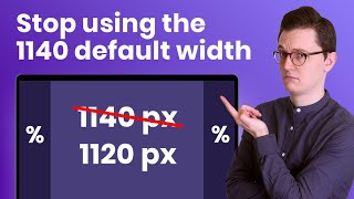
And this of course is because websites scroll vertically so you can go on forever. But once you start working with horizontal then you don't have enough space, because the boxed container doesn't go on until infinity. It's only 1140 pixels.
Therefore I found that working with row is a lot more challenging than working with the vertical option, but hey, you will need it a lot of the times, so let's talk about it. Okay so by default when the container is in horizontal mode the container will try to squeeze everything into one row no matter how many items you add or remove as you can see they grow and Shrink automatically. This is all great for desktop but it's not always what you want on tablet and mobile.
So let's say that I have a four column layout here on my desktop and then I want to switch to mobile well and here you can see that it will still try to squeeze everything into one row This doesn't look that good. Now I want these widgets to be wider so I can try to change them over here with custom, but as you can see (let me try to put it back on percentages) 100% is not 100% at all it actually becomes smaller and that is because it's still trying to squeeze everything into one row, so we need another solution here. What we need is "wrapping".
So in horizontal mode if you apply the "wrapping" then the width of the items will change and this is because they will go back to their original size, the size that they actually need. This widget has too much content and therefore it will become 100% wide. You can of course change that if you want to by manipulating it like this and let's for example put it on 40%.
Let's copy this style, let's paste it to the other one and then you will see that this one will also stay on one row. So what wrapping does. .
. is that it will create a new row if it doesn't fit on one row, but that means that you need to know how wide your widget should be. Here I've used 40%, but what if I want to align these two boxes to the size of my boxed container?
What I found is that if you use a combination between "Percentages" and "Grow" then it will work. So now this first one is on grow. .
. We're going to copy that to the other one as well Okay, and let's do that, and as you can see now we have a two column layout on tablet And if we go back to desktop it's still four columns on a desktop which is what I want in this case. So again: what the wrapping does it just checks like: Okay 40% x 3.
That is of course more 100% so that means that this one is going to go on the next row and then if you add grow . . .
which is not added to the calculation, then it will grow to the sides of the boxed container which is what you want. As you can see it scales beautifully. But let's say that this is still too wide for you You want three columns on a tablet: You would think that using 33% would work.
. . But let's try that copy that to the other ones.
. . This still doesn't work.
Why is that? Well that is because the Gap in between is also added into the calculation. So 33% + 33% + 33% = 99%, but then the 20 pixels in between is more than 1% of the full width of this box, therefore not fitting 3 on 1 row, therefore still creating a 2 column layout.
And this then leaves you up for the math: Like what kind of numbers do you use? But I've already done all the preparation work for you. You can just go to this link.
When you want to have 3 columns on a desktop you use 25%. 25% suggests that 4 will fit but the Gap as well is added to the calculations, that's why 25% will create 3 columns not 4. That's why 20% will not create 5 columns but 4.
I hope that this makes sense. So you can use this page. I will link it below as well, and then just use these numbers + grow if you want to have a perfectly aligned design I really hope this workflow becomes better when Elementor finally releases the CSS grid or the container grid, because right now this is a little bit of a hassle but it's the best way that I found to do it.
Another benefit of using "wrap" is that you can continue on multiple rows so let's say that you want an 8 column layout like this you can just start duplicating like that it will then create a layout like this but if you duplicate it two more times then it will create a layout like this If you only have 7 boxes sometimes that happens, you don't have place for 8. then you can just add an empty container over here give it the same settings so put it on full width. In this example 20% + grow and there you can see.
Now if you close this panel as you can see that perfectly works and that's the same on tablet. I hope that that made sense because this was the hardest part, the most difficult part in this tutorial. And for now let's move on.
Another great reason why you would want to use wrapping is to reduce the amount of containers you use In this situation we have a vertical column or container over here and a horizontal over here, with some widgets in it. But if you use wrap you can remove these two containers as you can see right here. Exact same layouts as you can see.
There's no container used only the background container. So let's try to do that together. I'm gonna drag everything outside of these containers if that's a little bit hard to do then make sure to open the Navigator (or structure) and just drag them outside of it like that.
Okay, now we can delete these two empty containers over here Okay, and now we're gonna put this container on horizontal. That of course will squeeze everything on to one row, and then we use wrap. What happens right now?
Well this container has a small boxed container, that's why it's so narrow and I did use minimum height. I do not recommend that like I said so I'm gonna delete that I'm just gonna add some padding on the top and on the bottom, just like that. And now you can see that this already works.
Why is that? Well that is because these widgets are not so wide. This widget is 100% wide because it has a lot of text and therefore after this widget it will create a new row, and these will just go on, just like that.
So now I've saved myself from using two containers in here. Isn't that great? Maybe you also remember this design that I showed in my sections and columns video two years ago I have now recreated that with the container and it's actually just one background container.
Look at this! I've only used widgets inside of it. This is a background image and this is just one row.
It starts over here it goes to a new row over here and then there's 1,2,3 widgets over here. And then I just added some negative margin on this image to drag this row into this row. This layout looks like it requires a lot of containers but it's just one background container.
How cool is that? So we have already talked about a lot of things with the container but if after watching this video you still don't feel confident using the container or maybe other Elementor features like the "Site Settings" or "Dynamic Content" or you're just tired watching multiple videos until you finally have the answer. .
. then my Elementor Pro Mastery course might be interesting for you. .
. A big benefit of a video course is that I can update the videos That is not possible with a video like this. And Elementor keeps changing all the time so that's why I thought it was a good idea to have a course.
I have linked the course page below so you can check it out. All the information is on there. And just see if it's something for you.
So I hope that this will be a good solution for some people I already have a lot of people who are happy with the course. For now that was my little promo Let's go do a few more features in the container which I think you should know. Some easier features Order.
Order is a very useful feature for responsive mode because it allows you to switch up the position on different devices. For example a very common situation is where you have an image on the right and then text on the left but on tablet you probably want the picture to be on the top so then you can just click on the layer, go to advanced, and then you just put it at the start, and there it is. And if you go to mobile then it will also save that setting.
I've also found myself using this feature a lot in headers so if you have a situation like this a normal menu and maybe some social media icons and you go to tablet mode, you probably want the hamburger icon to be on the right. So you could add another container and then change the position but then you're adding another container. So what you can do is you just click on the widget you go to Advanced.
and you click on "End". Boom, there it is. You might want to change the width of the widget a little bit, like this, but now your hamburger icon is on the right.
And on mobile it also saves it I need to style this because now it doesn't look good but you get the point. So that is what "Start" and "End" does, but you can also use the number field over here. This is useful when you for example have a zigzag design which is quite common, you have a situation where you have text over image right, and then the opposite direction, and then again.
But on tablet that doesn't look that good On tablet you want for example first text, then image, text, image, but you don't want two images to be next to each other, because that happens when you don't change the order and you just put this layout to tablet mode because this image is next to this image in terms of the layers panel, so then you just go over here and you just say this layer needs to be number one this layer needs to be number two, and this needs to be number three, etc. And you just give it the exact number that you want. So that's also a great feature which you should know Another thing that you should know is that you can now make full containers clickable.
This also wasn't possible with the columns system before, so if you scroll down and you go to: "Additional options" then you can go to HTML tag and then put this one on a link. You can just paste a link over here or search for it dynamically, and then link this whole container to another page. Just make sure that then you delete all of the links inside of it, so if this button also contains a link then your Elementor can crash.
So if you decide to link a whole container to a page then make sure that there are no other items that are also linking to something. Okey, Auto Padding Auto padding by default is on that means that every container you drag in already has a little bit of space as you can see on all of the sides I find this annoying and many people do because that means that your design is never fully aligned to the boxed container. And if you're a designer like me and you like to work in Figma, then you want a Pixel Perfect Design.
So the default 10 pixels padding is kind of annoying. You can (if you want to) go to the Site Settings, then go to Layout and then unlink this value, so that these numbers are on 0 to delete the default padding for the whole website. A disadvantage to turning off that padding is that it becomes harder to click on the right container because these containers are now on top of each other, so this container that contains all of these boxes, and this small container are now exactly on top of each other.
But of course you can always open the Navigator, and then just click on the actual container you want to edit. Okay, you're done now with this tutorial but I promised to give you one more thing and that is what you can do with your old websites that are still built with sections and columns. There is a chance that Elementor will force all the old websites to use containers and they will just convert it.
But I don't think that that's gonna happen to be honest because that will probably create like a million support tickets for them because their automatic converter is not that good So let's talk about the situation what you can do. The first option is that you can just keep the old websites in sections and columns. This will not create a lot of problems with Elementor itself but maybe with some add-ons because the new add-ons will probably be built on the new container.
So if it creates problems that you might want to switch to Containers anyways. So then you have two other options. .
. One is to use their converter. So let's say that your old section website creates problems and you now want to convert it, so the first option you have is to click on each container and then click on "Convert", and then it will automatically convert it into a new container with subcontainers in it and for this section it did work.
But it's not perfect all the time. sometimes it creates too many containers. Sometimes it even messes up your design.
So you can just go through your whole website and convert all the containers, but there is a big chance that you still have to fix some things manually. The third option that you can do is to rebuild all of those old websites. Yes, I know, this is a lot of work but you can offer this as a service to your clients.
You can say like: "Hey, the software that I used to build your website now has a new version "the old website is going to be outdated, it's going to cause problems and that means I constantly have to fix things. So you can just go that route and just pay me whenever something is broken or I can just rebuild your whole website it will become faster. It will be better responsive but you do have to pay something then.
" Well some clients might want that. They want their websites to be fast, right? So you can offer that as a service I personally, I'm just gonna rebuild a few websites, I'm not going to do all of them because some of my clients are just happy.
And if Elementor forces all websites to use the containers and they're gonna push everything to the converter then I will just go in and fix a few things. And yeah to some clients which I think they love speed I will just offer it "I will rebuild your whole website" It's a good practice for yourself as well. So it really depends on the situation guys.
I don't exactly know what's gonna happen. So use the converter or rebuild it or just keep it in the way it was. So as you can see using Elementor is not the most easy thing there is in the world, even though their marketing is always like: "Well anyone can do it".
Ah not really. . .
Already the container is a lot of work and I haven't even explained everything to you in this tutorial, so again: If you want to have the full package and you don't want to watch a million YouTube videos you just want one course where everything is in: Containers, Site Settings, Responsive, and learning a good workflow, then check out my course. There's a link in the description Subscribers will get a nice discount. So make sure you use the discount if it's still available and then I really hope that you like this video.
I have prepared many tutorials for the container I've actually been waiting one and a half years to release this tutorial because I wanted to wait for the moment where Elementor puts it out in default to all websites, so I hope that you liked it and stay tuned for all the cool container tutorials coming up, and let me know what you thought of this tutorial, because this one took me a lot of time. Okay guys, see you next time!