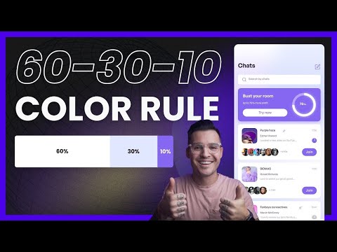
60-30-10 Color Rule
1.95M views1287 WordsCopy TextShare
Jesse Showalter
How do you apply color in mobile UI design projects? Here's a little tip, the 60-30-10 color rule(it...
Video Transcript:
how can you use color inside of your mobile ui design projects that come out looking really mature and really seamless and really well thought out and not obnoxious and loud and really the worst thing that it could be is distracting well you might want to use a little rule or guideline called the 60 30 10 rule which is going to help you to understand how to use color how to implement color and when to break that rule we're going to talk all about that coming up next [Music] all right before we get too far into
the 60 30 10 rule make sure you like and subscribe to this channel hit that little bell notification icon so you know when other videos like this one come out let's jump over to figma so we can talk a little bit about the 60 30 10 rule i have a an image that i pulled from a great blog post that i'll leave a link in the description by designer who's talking about the 60 30 10 rule and she has a really great contrast and comparison a before and after i thought it'd be a great use
case or case study for us but i've taken that initial ui design that she shows in her post and it's man it looks like a yard sale it is really immature the usage of color is just distracting it's overbearing i don't know where i'm supposed to look or where i'm supposed to go let's make a little bit of sense with this in our 60 30 10 rule i have three blocks of color up here and each rectangle is a thousand pixels wide which represents our 100 percent of color usage in our 60 30 10 rule
we want to make sure that we're using 60 of our neutral or our base color it's gonna be a neutral color could be a creamy color a white color if you're doing a dark interface it's gonna be some sort of dark color now later on we'll talk about how you can flip this around and do really bright interfaces and use 60 of a brighter color but for now let's stick with the more neutralized version 60 is going to be this color so let's just take this really quickly and type 600 pixels that represents our 60
then you're gonna have some sort of primary color right this might be a brand color this primary color is important but it's not going to be as important as our call to action color our secondary color this one we want to be 30 so let's do 300 here and we'll just pop this up into place and then you guessed it our call to action it should be used sparingly our secondary color this is the thing that says click me look at me i'm active do something with me we want that to only be 10 so
let's take it down to 100 and now we have a color palette that we can use for 60 30 and 10. and you can see this 60 30 10 is not well represented in this version of the design but i would say it is much more represented in this next this iterated updated version of her design where she's now she's really like done away with a lot of the excess use of color she's stripped it down she's kind of neutralized thing now yes there's some other fixes here some copy fixes some iconography fixes but even
if you kept all the other little mistakes in this previous design the color is just heads and shoulders heads and tails whatever you want to say a much better version of color implementation here much more neutralized here right our primary colors being used for important areas and our call to action color is only in very important areas click me do something with me pay attention to me this is for you user these call to action areas and so that's the 60 30 10 rule let's really quickly take a look at some other implementations of the
60 30 10 but keep in mind it's just a guideline i'm going to show you some great kind of uses of 60 30 10 but they're breaking it a little bit and that's okay with me it should be okay with you as well i pulled some figma community files in here now you might say that this neutral color is whatever this kind of like grayish color is that works oh it looks kind of like white but it's not really but maybe it is white that's fine and then you might say that your secondary color right
and they're breaking it a little bit here is maybe kind of like this bluish color and then your excuse me your primary and then your call to action color is definitely this kind of purpley color but that's still kind of 60 30 10. they're throwing some fun gradients in the top and playing with it but i'd say this is more of a two color design and they're just kind of utilizing some hues of that color let's do this one over here by mo heat designs we got a really similar thing happening we got white right
and then you're going to see throughout over like kind of a a span of multiple screens that maybe our primary color is kind of this gray but that call to action color is really this kind of warm kind of burnt orange color we can see a really beautiful color palette so it's just a good usage of the rule in ui design let's look at a couple more examples online here's some great examples on dribble this one by gulen razoo this is an example of kind of the reverse of it where your bright color is 60
right and then you can see we have 30 percent is a lighter hue but look still 10 on the actionable colors we're still doing the 60 30 10 we're just using color instead of a neutral that's okay i'm down with that here's another one by the same designer he's just kind of like flipped it to a dark interface look same kind of like guidelines even in a dark interface 60 is going to be this real dark color 30 is going to be these lighter colors he's bringing some gradients into him that's fine with me but
only 10 is being used for that accent color let's do another one by euro art 93 again we zoom in we see 60 right 30 10 and last one just to drive the idea home one more time this one is by sub 1. this beautiful little bit of ui design here even when you have images that's fine images are doing their own thing but 60 being kind of like this grayish neutralized color 30 for the white cards 10 for the call to action buttons and there you have it your 60 30 10 rule i hope
you enjoyed that video if you did make sure you leave a thumbs up subscribe to the channel all that stuff because i make videos like this all the time about ui design about graphic design about web design so make sure that you stick around for more videos when they come out if you have any questions leave those down in the comments i hope you're having an amazing week using color in a really beautiful and mature way we'll see you in the next one
Related Videos

7:27
Tools for New Designers
Jesse Showalter
51,926 views

8:51
How I make UI color palettes
UX Tools
404,346 views

41:27
How To Select Colors: Step By Step
Flux Academy
185,291 views
![I Replaced ALL my ADOBE APPS with these [free or cheaper] Alternatives!](https://img.youtube.com/vi/5EfqHg49kMk/mqdefault.jpg)
10:18
I Replaced ALL my ADOBE APPS with these [f...
Joris Hermans
312,703 views

10:23
Master Spacing in UI Design 💪
Jesse Showalter
43,273 views

7:53
Why Great Movies use the 60-30-10 Percent ...
wolfcrow
2,135,421 views

13:42
11 Section layouts to make your website ul...
Payton Clark Smith
482,194 views

17:59
Easily Improve Your Web Design (With Example)
Flux Academy
75,325 views

11:05
5 levels of UI skill. Only 4+ gets you hired.
Malewicz
431,565 views
7:14
ADVANCED Colour Theory Makes Designs SUPER...
Satori Graphics
1,115,887 views

8:15
60-30-10 Colors - Design Masterclass
Malewicz
60,306 views

20:46
Amateur vs Pro UI Design | with examples
Jesse Showalter
95,600 views

14:53
Give Your Website a Perfect Color Scheme, ...
Wes McDowell
16,646 views

16:29
9 incredible AI apps that changed my life ...
Silicon Valley Girl
176,861 views

13:21
Color Theory in UI Design
Jesse Showalter
19,876 views

7:01
Top 5 UX/UI Design Tips and Tricks Every D...
uxpeak
52,263 views

13:41
How to Apply a Color Palette to Your Desig...
The Futur Academy
1,220,094 views

2:43:48
Complete Web Design Course for Beginners |...
Jesse Showalter
34,578 views

24:08
Super Practical Guide to Color Theory, Col...
DesignerUp
542,269 views
14:03
Choosing and Applying UI Colors | 60-30-10...
UX Tshili
10,608 views