16 FAMOUS LOGOS WITH A HIDDEN MEANING (That We Never Even Noticed)
31.47M views860 WordsCopy TextShare
BRIGHT SIDE
How to design a successful logo? How to build a famous brand for your business? Some of the most wel...
Video Transcript:
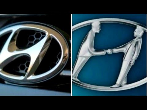
adidas apple bmw coca-cola toyota we see these famous brands everywhere but never consider what their logos mean exactly but every line curve and color has meaning behind it most of them were designed to indicate something much more than simple beauty curious to know watch the 16 famous logos with a hidden meaning you've never noticed number 16 hyundai many people think that the logo of the south korean company hyundai is simply the first letter of its name in fact the letter h symbolizes two people a client and a representative of the company shaking hands that's very
thoughtful number 15 adidas the name adidas is derived from that of its founder adolf dassler the company's logo has changed over time but it has always included three stripes the current logo is three stripes at an angle which together form a triangle this symbolizes a mountain which in turn represents the challenges that all sportsmen have to overcome day after day number 14. apple rob janoff the designer who came up with a world famous apple company logo explained his idea in one of his interviews he bought a bag of apples placed them in a bowl and
spent time drawing them for a week trying to break the image down into something simple taking a bite out of an apple was part of the experiment completely by coincidence he realized that bite sounded exactly the same as the computer term bite isn't this guy top of his field [Music] number 13 vaio the first two letters of the vaio logo symbolize an analog wave the last two are similar to the numbers one and zero that is symbols of a digital signal number 12 amazon at first glance amazon's logo appears to be nothing special however it
was designed with a company's philosophy in mind the orange arrow is similar to a smile because the company wants its customers to be satisfied the arrow is also stretched between the letters a and z in a hint that the company sells absolutely every product you can imagine number 11 baskin robbins the pink colored parts of the br section make up the number 31 which is how many ice cream flavors baskin robbins used to famously sell have you tried them all number 10. toyota many people compare the logo of this japanese car producer to an image
of a cowboy wearing a hat in fact it represents a stylized image of a needle eye with a thread passing through it this is a hint at the company's past they used to produce weaving machines however the individual parts of the logo also spell out the letters of the company's name number 9 continental continental a famous car tire producer has a logo in which the first two letters depict a car wheel yeah everything genial is simple [Music] number eight formula one if you look carefully at the white space between the letter f and the red
stripes you can see the number one the red stripes are also meant to be a graphical representation of the high speed of formula 1 cars number 7 pinterest on pinterest people collect images they like from across the internet and pin them to their online boards that's why the image of a pin is hidden in the letter p simple and clear number six beats beats an audio equipment producer based in the usa uses a logo in which the letter b looks like headphones on a person's head less definitely means more number five toblerone [Music] toblerone the
famous chocolate company based in burns switzerland has a silhouette of a bear in its logo that's because burn is sometimes called a city of bears you can see a lot of these animal figures throughout the town in fountains at the clock tower and even on buildings number 4 bmw they say that the central part of the logo symbolizes the rotating blades of an airplane which is linked to the company's early history of aviation technology in fact it is simply a part of the bavarian flag the area of germany where the company originated number 3 lg
the logo of this south korean electronics company is a stylized image of a person's face according to the company this represents its aspiration to have ordinary human relations with our customers number two evernote we all know that elephants have impressive memories they can remember both faces and events that's why evernote a note-taking application uses this animal as part of the logo the corner of the elephant's ear is folded over in a similar way how people fold the corner of a page to make notes number one coca-cola in the coca-cola logo in the space between the
letters o and l you can clearly see the danish flag it's purely a coincidence nevertheless coca-cola has used this as part of its marketing campaigns in the scandinavian country thanks for watching if you've enjoyed this video hit the thumbs up button if you're visiting our channel for the first time click subscribe to stay with us on brightside
Related Videos
10:41
29 Things That Exist Only in Japan
BRIGHT SIDE
14,803,821 views
17:03
Top 50 Satisfying BRAND LOGO Art | Best of...
Quantastic
5,313,640 views
11:01
Your Brain Will Be Grateful For These 18 R...
BRIGHT SIDE
8,796,142 views

26:12
Famous Logos With HIDDEN Meanings!
BE AMAZED
5,700,074 views
7:53
Guess the Hidden CAR LOGO by ILLUSION | LO...
Tiger Quiz
497,943 views
13:14
11 Optical Illusions That Will Trick Your ...
BRIGHT SIDE
29,947,418 views
8:25
10 Mistakes and Secrets You Never Knew Abo...
BRIGHT SIDE
8,540,998 views
16:22
Guess Car Brand By Illusion 🚗✅ I Car Logo...
Quiz Bot
402,475 views

30:15
Destroy The Unbreakable Cube, Win $1,000!
Stay Wild
25,714,583 views

10:06
Best 21 Science Experiments Compilation Fr...
VisioNil
10,199,712 views

19:26
If You Know These Essential Tips, You Can ...
BRIGHT SIDE
578,364 views

10:08
Hidden Meanings in Logos
Sambucha
765,727 views

24:38
Genius Inventions That Should Be Implement...
BE AMAZED
3,194,153 views

20:41
Next-Level Door Protection That Will Blow ...
Fresh Tech
570,583 views

29:39
I Exposed the World’s Most EVIL 10 Year Old!
Brent Rivera
30,019,989 views

32:56
Break This Ball in 1 Minute, Win $1,000!
Stay Wild
28,348,514 views

8:10
THIS VIDEO WILL MAKE YOU FORGET EVERYTHING
Adventure
921,877 views
24:49
I Simulated a US State BATTLE ROYALE
Geo Facts
2,300,047 views

9:26
27 Hidden Secrets of Famous Logos Revealed
BRIGHT SIDE
258,265 views

26:16
Guess the Logo in 3 Seconds | 200 Famous L...
Quiz Plug
8,442,864 views