Why Beautiful Websites Don’t Convert
62.09k views2119 WordsCopy TextShare
Malewicz
❤️ Subscribe and I'll do PART 3 of this. View part 1: https://youtu.be/aGTqFp7GAKE
Why do beautiful...
Video Transcript:
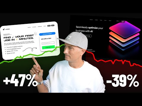
cuz every time you talk it sound like blah blah blah blah blah blah blah blah blah I'm just hear it blah blah [Music] blah impressive paralu animations and beautiful Graphics are often like the best way to decrease your sales and have a poorly performing website distracted annoyed and not willing to click ugly websites seem to perform better let's find out why there's this misconcep among startups and designers and people building products that they need a beautiful website in order to make good sales this style of a website where you have a parallax animated background multiple
layers scrolling in and out and everything is animating and transitioning and moving may work for Apple because everybody knows apple and when people go to their website they already know what they want to buy they're already interested so by seeing a couple of animations about headphones or the new Macbook it doesn't really deter people from actually purchasing them for most people however it doesn't work like that for most companies you need a website that primarily [Music] communicates and there are a couple of issues with those fancy visuals so how to make a website actually perform
better what is the reason for a website to exist in most cases the reason is to get people to click on the button as quickly as possible the button usually leads to somebody buying something so yes as a business owner I want as many people as possible to buy from me let's find out why this website is a lot better than this website on a couple of simple examples that you can make your websites better I created a little diagram that shows how a website actually works and what are the elements along the path including
the best possible path the user can take you can use this guide as a reference when making your own websites the best path is always when a user actually already wants your product goes to your website and clicks on the buy button in the first few seconds this is the golden route and this is something that can also mess up your analytics because you might think that people are so excited by your product that they're buying it in 5 seconds that's never the case they knew about it previously a more typical route is a little
bit longer it takes a little bit of convincing on the website to make it work the convincing happens on a couple of different levels the most important one is Clarity when they enter the website they need to be able to understand why your tool or your product or your app is the best out there for their needs and they need to do it in the first four or 5 Seconds which means that your copy has to be extremely clear very to the point and potentially also taking care of all the little doubts they have that's
why some of the better performing websites actually have quite a lot of copy they have one big slogun at the top and then they have a couple of smaller points right above the bottom this is cluttered looks a little bit clunky it doesn't look as aesthetically pleasing but it seems to perform better and that's the whole reason a landing page exists now if you have a convincing copy the next thing you need is social proof and that can come in a couple of different forms the most obvious is testimonials from your previous clients practically every
website needs that because nobody wants to be the first to the party they all say they do they want to kind of go the New Paths but nobody really does they want others to try your product first to be sure it works let others take all the risk so when you have a lot of testimonials and reviews and they're all positive it is convincing people to jump onto that group as well another thing is that if you have any reach or are pretty well known in any circles then adding who made your product and who
made the website can be a good idea because it shows that there is a serious team of people behind it another thing is Awards and different kinds of scores so if you've been rated five stars by some blog that is rating products in your category write about it show it if your customer average score is 4.9 also add this and the last thing and something many people kind of forget is sheer numbers this is what we do in the header of our platform we basically show how many projects and how many people are on there
right in that SL them that gives people the social proof so they know that the platform is alive and has a lot of people a lot of projects so it's worth registering if your website is unclear in any way you should upgrade the copy first this is what people are actually reading if they are going to spend money and there are billions of ways to do it and likely asking AI to do it for you is not going to be the best way chances it's going to be converting better and performing better are quite low
it's really best to listen to your users and to listen to your own thoughts as the person that made the product because you should actually have the perfect copy somewhere in your head you just have to dig through to get it and once you find it test it see how it performs then tweak it or make an AB test with a different kind of copy and constantly test it because you never know what's going to work sometimes something completely unexpected does another problem with those overly beautiful websites is that they take forever to load people
don't have the time hey nobody get if I have to wait 40 or 30 seconds for a website to load chances are I'm going to actually switch it off and go to a different website and I'm not even going to see your fancy beautiful parallx animations at all the next thing on the list is cognitive overload if everything is moving and animated and flashing and kind of jumping right in your face we get overloaded our brain has a pretty limited processing power and the more stimuli come from the outside the less we want to be
in that situation many people will go out of a website if it's too overwhelming if everything is moving and distracting you from the main action you're not going to take that action this is why the best performing websites have barely any animation look at linear a very popular example they went from really crazy animations in the header into just a simple isometric platform view just kind of showing up there are no micro animations happening in there that's because they want you to focus on what the platform can do for you and click the button but
of course there is a level of aesthetic that is necessary to achieve yes it was a little misleading it's not that landing pages need to be ugly to perform better they need to be made with the proper focus and the focus should never be on fancy animations and Transitions and everything moving all those things will contribute to lower clicks and lower conversion obviously the website has to be beautiful and it can be beautiful even with extra information above the fold and even if there isn't really enough white space you just need to plan for everything
use consistent typography and use all the psychological principles that will aware of you can use the case principle I talked about in the previous video in the series you can have the characters pointing at something and potentially looking at it or looking at you and pointing at something and that way your eyes will draw the attention but then it will shift to the hand and the Gaze will follow the pointed finger you know what to do you can point at the CDA button another thing those ugly websites do well is they make the CTA button
a single color meaning it's a color that only exists in the button on the website nowhere else especially nowhere else in the header and it's the most visible most standing out color of them all that leads to your eyes instantly focusing on the button and that is also a factor that can increase conversion the problem with our rocket landing page is that it takes 8 seconds for the header to completely load and show everything if we put it online it would take an extra 20 or even 30 seconds to load everything because these are all
beautiful bitm up images and the copy is completely unclear plus the button is so vague it doesn't truly tell you why you should click it all of that fancy animation and all those beautiful Graphics don't bring any value to the users don't tell them what problems they're solving and how and it's basically not convincing while it may look good it just won't work all of the problems that I mentioned today can be fixed and once you fix them by either making your website more aesthetic loading faster removing animations removing cognitive load making clearer copy which
is the most important one always remember to test deploy the website make an AB test or just test it live on production see what happens see how many people click and then tweak something change the copy change the bottom color see how many people click them it's a NeverEnding journey of modifying and changing and seeing what performs and what works it's a lot easier to modify and change a rather simple website than removing or tweaking animations every single time in every little piece of the header A good rule of thumb is to use a single
little animation in the header so it's not distracting and make it into an animation that actually guides the eye of the user so it has to move in the right direction in many cases the animations are vertical and we already talked about it in the previous video how vertical animation follows your gaze up and down and we should be going left and right to read the copy and get to the button by going up and down we're just getting away from it distracted annoyed and not willing to click and one last thing that's also really
important with landing pages I'm going to show you an example you need to know your audience because all the audiences are different sure most people have 8sec attention spans they want their problem explained and a solution provided and all that shoved right into their face as quickly as possible that means you need to simplify simplify and simplify some more but there are some specific Industries and some specific products especially more expensive products products that are business oriented that don't follow the same rule we worked on a rebranding and a redesign for a medical startup and
in that case the target audience is the directors of hospitals these are people that don't take these decisions slightly because jumping onto a new system can be a pretty daunting step so in cases like that the landing page can actually be pretty complex you can have multiple sections where you have subsection and even menus that show different reasons for it so it doesn't have to be all front and center it doesn't have to be super simple and it can even have sub pages that are landing pages in their own right because for a difficult decision
like that those people want to be 100% sure so they're all going to read everything you put on that website sure you still need to use the right principles to guide them make it visually appealing and most of all you need to make it convincing focus on getting the aesthetic usability effect in place but don't overwhelm your users with fancy visuals which are one of the most popular kinds of tutorials that they make online and you know what they're completely useless thanks for watching this long if you're not subscribed yet click that button and subscribe
liking the video and leaving a comment always helps and as always I wish you all a beautiful day
Related Videos
10:06
Master Web Design 101
Malewicz
14,017 views

9:40
The Secret Science of Perfect Spacing
Chainlift
417,530 views

19:38
Here's an overview of all my revenue gener...
Web Dev Cody
32,155 views

12:57
The Weird Rise Of Anti-Startups
Enrico Tartarotti
249,525 views
20:21
UX / UI Design Portfolio Review (2024). GO...
Gytis Mark
10,560 views
![I Replaced ALL my ADOBE APPS with these [free or cheaper] Alternatives!](https://img.youtube.com/vi/5EfqHg49kMk/mqdefault.jpg)
10:18
I Replaced ALL my ADOBE APPS with these [f...
Joris Hermans
452,227 views

12:08
ALL Design Tools I Use Working for Clients
Malewicz
12,864 views

19:18
How to Get Web Design Clients on Instagram...
Patrick Spiegel
18,328 views

3:43
Front-end web development is changing, qui...
Fireship
991,323 views

8:15
The jobs are ... GONE?!
Malewicz
13,253 views

42:03
Death of the Follower & the Future of Crea...
JackConteExtras
339,836 views
9:58
My Top 5 Techniques for Web Animation
Olivier Larose
86,150 views

8:44
Asking for feedback is WEAK
Malewicz
9,396 views
5:32
Top 2024 Web Design Trends
Codex Community
591,056 views

13:15
If I Started UX in 2024, I'd Do This.
Aliena Cai
309,844 views
15:14
This might change how we build UI forever
Theo - t3․gg
91,069 views
17:57
Web Designers only need these 18 typefaces...
BONT
15,976 views
19:31
I tried every website builder. This is the...
Steve Builds Websites
89,898 views
15:18
Please stop using px for font-size.
Coder Coder
155,440 views

8:11
9 Portfolio Websites for Dark Mode Maniacs
Andres The Designer
15,827 views