Why 3D Logos Fell Out of Favor Overnight - Cheddar Explains
3.03M views823 WordsCopy TextShare
Cheddar
In the early 2000s, 3D logos and skeuomorphic designs were all the rage. But overnight, the whole wo...
Video Transcript:
In 1997, Google introduced their first logo and it looked like this, yts. But after a few redesigns at the turn of the century, they landed on this 3D logo. 3D logos were all the rage in the early 2000s.
But fast forward 10 years, and logos started to look like this. Everybody was changing to 2D design. Before we knew it, 3D logos were a thing of the past.
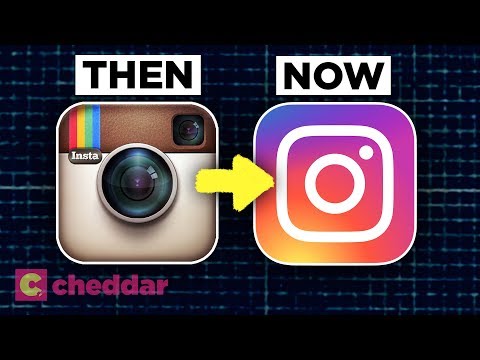
But, did you ever wonder why we had the sudden change to flat design? When you're searching the Internet today, you'll scroll past a lot of the same logos over and over again. Head to Google and you see this guy, open Instagram and you have to click this, YouTube, Netflix.
The thing these logos all have in common, they're all 2D. In the mid 1900s, the logos were for the most part all flat design. They were simple, clean, and 2D.
Rather than just trying to get the names out there, companies realized how impactful symbols were. They started to put a lot more thought into the design process. With the 1970s came CGI, and from there, logo started to come to life.
But the real change came at the turn of the century. Adobe developed in design and Photoshop, and digital graphic design tools were at everybody's fingertips. Logos were going 3D.
In the early days of the worldwide web, people started to use the Internet for every little thing. Designers wanted to help people easily navigate these new devices. They used what's called Skeuomorphism, which when we're talking about user interface design means making digital features resemble real life objects.
The Save icon is skeuomorphic. But after we stopped using the floppy disk in real life, it became less so. People wanted technology, specifically touch screen technology to be intuitive and easy to use, and dragging a file to the trashcan on your screen felt instinctive.
Skeuomorphism was brought to life by using gradients, drop shadows, and fake textures to mimic depth. The iPhone and iTouch were the first big time Capacitive Touch Screens. They had no buttons and no feedback, unlike the resistive touch screens you use at grocery stores or ATMs.
The 3D designs combined with vibrations and clicking sounds made users feel like they were pressing real buttons. 3D logo designs were vital to make people feel comfortable in the new developing age. As the world got more comfortable using these technologies, skeuomorphism and 3D design became less important and designers started to shift back towards 2D.
Critics of skeuomorphism argued that it was cluttered and harder to use because of the excessive gradients, beveled edges, and reflections. Flat design conserved space in a limited user interface, and provided a cleaner feel. Skeuomorphism can also constrain design.
When you go flat, you are no longer tied to the physical world, and ideas and interfaces can take on a more abstract form. Take the hamburger menu scene a lot in flat design. It is the opposite of skeuomorphism because there are no hamburger menus in real life.
But the menu design was sleeker and incredibly easy to use while saving space on the screen. People were teetering between flat and skeuomorphic designs for a little bit before the world changed overnight literally. On September 18th, 2013, Apples iOS updated overnight to iOS 7, and we woke up to a flat world.
At first, people were not happy with the new operating system. They didn't know what was clickable and what wasn't. More than anything, who likes change?
The glossy textures from the operating systems before it were gone. All the apps had 2D designed icons. That meant logos needed to switch to 2D to keep up with the times.
Logos everywhere started to change from 3D to flat design over the next few years. Not only was 2D perceived to be easier for users, but it was also a lot easier on the designers too. They can create logos that are high quality but required less time to make, and a simple vector design can be expanded and shrunk for any device or medium easier than 3D logos ever could be.
Today, almost everything we see around the Internet has a flat design. Like all branches of design, logos are cyclical. 2D was in, then it was out, and now it's in again, but don't count skeuomorphism out just yet.
With the rise of augmented and virtual reality, skeuomorphism has to stay alive so that we can touch and feel digital objects in a very real way. What will these logos look like in the future? It's hard to tell, but for now, I'm just hoping I don't wake up with a whole new interface on my phone.
Thank you for watching. Please be sure to like, comment, and subscribe to our channel, and ring the bell below. That way, you're notified whenever we post a new video.
Related Videos
3:04
Why Companies Are 'Debranding'
Bloomberg Quicktake
2,500,445 views
8:15
Why We'll Never Have the Perfect Controlle...
Cheddar
833,840 views
6:50
The world is poorly designed. But copying ...
Vox
8,512,392 views

13:14
UK’s 100 Year Economic Decline - No 1 to F...
Economics Help UK
17,248 views

5:36
The Human Foot Is a Design Disaster - Ched...
Cheddar
2,437,406 views

10:21
Why this font is everywhere
Vox
2,391,135 views

5:15
Why So Many Young Men Are Leaving Democrat...
The Wall Street Journal
34,397 views

8:23
Three Reasons McDonalds is in Trouble.
TLDR Business
143,267 views

5:22
Why we say “OK”
Vox
9,660,342 views

7:26
The Font That Makes Everyone Read Faster -...
Cheddar
476,047 views

4:15
The design tricks that keep skyscrapers fr...
Vox
2,368,337 views

6:32
Beginning Graphic Design: Color
LearnFree
6,251,778 views

25:38
Revisiting Where the Wild Things Are as an...
Roughest Drafts
9,052 views

5:44
Why safe playgrounds aren't great for kids
Vox
5,748,437 views

3:32
The Intentionally Poor Design Of Phone Pad...
Cheddar
512,582 views
11:25
6 Golden Rules Of Layout Design You MUST OBEY
Satori Graphics
1,232,911 views

6:18
The origin of the '80s aesthetic
Vox
2,556,351 views
8:45
5 GOLDEN Rules Of MINIMAL Graphic Design *...
Satori Graphics
800,001 views

8:29
Why All Fast Food Chains Look The Same Tod...
Cheddar
1,565,496 views

7:51
How The Microphone Changed The Way We Sing...
Cheddar
1,011,722 views