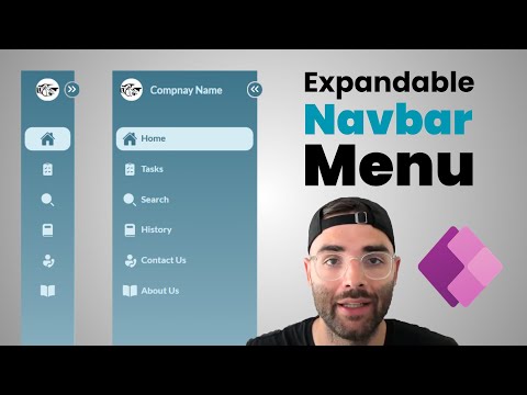
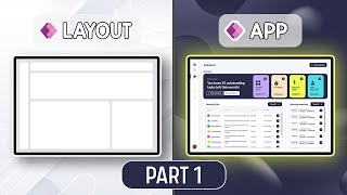
Expandable Navigation Menu in Power Apps
7.78k views3337 WordsCopy TextShare
The Analyst Nik
Create a modern and functional left navigation component, which is expandable and easily customizabl...
Video Transcript:
impress your colleagues by adding this leftand navigation menu into your canvas power apps it can shrink and expand with an animated button it navigates Pages it has custom icons and it has a gradient background to make it really stand out I'll show you how to build this from scratch and you can use this as inspiration to build your own modern left navigation menus so here we go so let's create a new blank canvas app I'll just call it left nav and first we're going to set up the data that our navigation menu will use so we're going to do this by clicking on app and going to the formulas property we're going to expand this and we're going to set up our menu items so I'm going to just call it menu items I'll set it equals to and we're going to set it equal to a table and with squiggly brackets we're going to set a few properties we're going to have ID I'm going to set it the first one equal to one we're going to have a name I'll call the first one home we're going to have an icon for now I'm just going to leave it in empty quotation marks and we're going to have screen and I'm going to set it to the app. active screen for now and I'm going to close off the squiggly bracket so we're just going to paste them in and you're going to see I have six total uh with various names but all with blank icons and for now they're all just going to the apps active screen and if you want to use the default icons included in power apps you can but I want to have full control over which icons I use so I'm going to bring in free custom SVG icons so to set this up I'm going to set a menu icons equal to squiggly brackets and I'm just going to call the icons home for now I'm going to have empty quotation marks I'm going to say tasks search history contact us and about us so this is where I'm going to put my SVG code that I'm then going to plug into each of my icons so where do you get these SVG codes I'm going to go to icon-set do iconify dodes here there's a lot of free icons that you can search for so let's search for the first one I'm just going to search home and you can pick whatever one you like I like this one for now so I'm just going to click it and copy to clipboard now one thing to mention you might have seen in my other videos you have to take this code and remove the double quotations so you can do this with any notepad you just paste it in you can click contrl H replace double quotes with single quotes and then once you have that you can go back to your power app and paste it within the quotation marks you'll notice there are no double quotations anywhere they're all replaced with singles and here I've gone ahead and added all the other icons using that same method and now that we've defined our menu icons that we want to use we can go back up into our menu items and rep place these double quotes with menu icons do home menu icons. tasks search history contact us and about us I'm also going to establish our theme colors as this will make things easier if we want to update our theme in the future without rewriting all our code so I'm going to set up my theme equals and within squiggly brackets I'm going to have a dark color and a light color uh and this is going to make it a lot easier for us to Interchange colors if we want to in the future now something I do in all my apps is store my current users information like their name job title email inside of a named formula so that I can easily reference it where needed you can just use the user function but in my case I want to get the job title and that isn't available in the basic user function so what we have to do is add a data source and it's called Office 365 users and now we can say current user equals Office 365 user profile V2 in bracket we're going to call on the user do email close the bracket and end with a semicolon so this is going to allow us to dynamically pull the the first name and the job title which is our intent within this navigation menu we also want to define the company name and Company logo so company name equals I'll just say company name and I also want the company logo to equal and I'm just going to add a Bia image I'll just upload a car logo.
png and I'll call on that image and end with a semicolon now before we start building out our component we want to do one more thing we want to go back into our app and update the on start prop property with a couple variables we're going to set VAR menu selected equal to one we'll use this to set the default navigation item selected which we will always want to be the first page we also want to set a variable that will control the state of our navigation menu so either open or closed and by default I want it to be closed so I'm setting it equal to false now that we've laid down the foundation let's start building our left navigation menu we'll go to the components Tab and click new component and I'm going to rename this left nav and this is very important make sure to turn on access app scope this will allow the variables within your app to pass through your component and we're also going to set its width to if the VAR menu open is equal to true then it's going to be 200 otherwise 80 and we're going to set the height to app. design height now let's build a toggle icon that will change the width of our component insert a container and name it Con toggle and update the following properties we're going to set it's x equal to parent. width minus self.
width minus 2 that minus two is to account for the Border width we're going to set its y property to 15 Phil is going to be the color value of our theme. dark color border is going to be equal to two border radius is 10 drop shadow none the Border color you can set it to White width is going to be 20 and height is going to be 20 and within this container let's insert a button and call it BTN toggle select this is going to be an invisible button that sits over top of our icon on update the following properties text is going to be blank X and Y is zero width and height is going to be parent. width and parent.
height border is going to be zero border radius is zero and here the fill is going to be color. transparent hover fill is going to be 100 100 100 0. 1 transparency pressed fill is going to be a color fade so a darker shade of self.
hover fill disabled fill is going to be self. fill and we're going to set two variables in the on Select Property the VAR menu timestamp is going to Output the text of the current date and time this is going to be important for our animation in our SVG icon and we're also going to set a variable called VAR menu open to the opposite of its current state so by default it starts at false so when this button is clicked it's going to be true when it's clicked again it's going to be false and so on now within the con within our toggle container let's insert an image called IMG toggle icon and let's move it to the back it's going to have the following properties X and Y set to zero width and height to that of its parent and the image property is going to have the following code which is going to be an animated Arrow going left and right and it's going to incorporate some of our variables for our menu Tim stamp in order to reactivate that animation every time it's clicked and it's going to change the direction based on if our menu is open or closed and you can see the animation is working with the width of our menu changing as expected and now let's build out the rest of our menu we'll sort another container and we'll call it Con root it's going to be our root container and we're going to reorder send to back and it's going to have its X and Y properties set to zero width and height to that of its parent border zero border radius zero and drop shadow none and within our root container we're going to insert html text in order to do our grad in background and let's rename it HTML background and it'll have the following properties X and Y set to zero width and height to that of its parent the padding is going to be all zero and then the HTML text property is going to be the following code it's going to have elements of its own width and our theme colors using our light color as the bottom and dark color as our top within our root container we're going to insert a new vertical container and call it Con menu it's justify or vertical property is going to be start the Align is going to be stretch Gap will be 20 and its X and Y properties will be zero width and height are going to be that of its parent the Border radius is going to be zero and the drop shot sh will be none now within our con menu we're going to create a company section so we're going to insert a horizontal container called con company we're going to have the justify at Center and Al line at Center the minimum width will be zero a line in container is going to be stretch flexible height is going to be turned off with a height property of 50 and a border radius of zero and drop shadow none now within the con company container we're going to insert a horizontal container called con company logo and for this we're going to justify Center align Center the minimum height will be zero align and container will be stretch flexible width is going to be off the width is going to be 50 border radius is at zero and drop shadow none now within this container we're going to insert our image and let's call it IMG company logo and it'll have the following proper properties image is going to be company logo which we defined in our app under the formulas section image Position will be fill the height will set to 30 align and container will be Center flexible width will be off the width is going to be 30 and Border radius of 15 now we're also going to add a section for the company name so we're going to select our con company container and we're going to insert a text LB and we're going to call this lbl company name and it's going to have the following properties the text is going to be our variable company name which we established in the formulas bar the font will be lato font size 10 font weight semi- bold padding left will be zero minimum height zero align and container will be stretch flexible width is on fill portions one of one minimum width is going to be zero color is going to be our color value of our theme which is going to have our light color and visible will be VAR menu open so it's only going to be visible when the menu is actually open and it'll hide it when it's closed and you can test this out by holding the ALT key and you can click your button here and you can see it will show the company name the logo when we close it the logo will just be centered within our container so that's it for our company section now we want to create our user section where it's going to display the user's name and job title and to save some time let's copy the whole company section by selecting con company and copying it and then we can select our con menu and paste under there I'm going to update all the names the first one will be con user the second will be con user image IMG user image and lbl user name for our user image I'm just going to write user Open Bracket close bracket. image and for our lbl username I'm going to call on our current user that we established earlier in the video we're going to use this display name which is going to be the first and last name we're going to add a charart 10 which is just going to set this next line on a new row and we're going to again use the current users job title so now when I hold alt and expand you'll be able to see now we have the name and the job title and it all functions the way it should and for the label username I am going to upd its color value to the Dark theme it doesn't look good now but it will look good when it moves to the bottom later on I'm also going to set the font size to make it a little bit smaller and that's it so now we're going to actually add our menu items into our container so we're going to go back up to the con menu and we're going to insert a blank vertical G gallery and I'm going to rename it gal menu I'm also going to reorder it and move it up so it sits between the company details and the user details its items property is going to be the menu items which we've established earlier in the video we're going to have the minimum width set to zero a line and container will be stretch flexible height is going to be on the minimum height will will be zero template size is going to be 40 template padding is zero transition will be pop delay item loading will be equal to false this will speed things up when the Navar loads and show scroll bar will be turned off now with our Gallery selected we're going to click this edit gallery and we're going to insert a container and we'll call this Con menu items in order to Center these icons we're going to set it to parent.
width minus self. width all divided by two the Y property will be parent. template height minus self.
height / two and the width is going to be parent. width minus 10 and height will be parent. template height minus 10 The Fill property is going to be a condition so if this item ID is equal to our variable for the menu selected then it's going to be our light color otherwise it's going to be transparent and our border radius will be 10 and drop shadow will be none now we need to add another invisible button so we can pull this from the button toggle select so let's copy this and under con menu items we're going to paste and let's rename this to BTN select item set its X and Y properties to zero and let's update its on Select Property to navigate to this item do screen and set VAR menu selected to this item.
ID and under con menu items insert a horizontal container called con menu details and let's reorder this to the back we're going to justify an align in the center X and Y will be set to zero and width and height will be parent. width and parent. height and within this container let's insert an image and let's title this IMG menu icon on we're going to set its height to 20 a line in container is going to be Center flexible width will be off the width will be set to 20 and the image property will paste in this code so here we're calling on the icons that we already set and we're updating its color based on if that icon is selected so if the menu item is selected then give us the dark color otherwise set the color to a light color and if you hold the ALT key again and click through you'll be able to see it inverts the colors and it makes it very clear which item you've selected now under the con menu details we want to insert a label and let's rename this lbl menu text and we're going to set the text property to this item.
name font we're going to use lato size 9 we're going to make it bold the visible property will be VAR menu open so it's only visible if the EXP if the menu is expanded minimum height will be zero align and container is going to be stretch flexible width is off the width will be parent.
Related Videos
18:01
Glassmorphism in Power Platform Canvas Apps
Colin Kelly-Cook (Novalogix)
4,571 views

13:41
Named Formulas & User Defined Functions in...
Reza Dorrani
37,227 views
38:45
|| Playwright Java || Session_02__Part_02 ...
QA Shastra OnlineTraining
2 views

20:50
Your Personal AI-Powered Research Assistan...
Dave Swift
5,869 views
40:42
PowerApps Left Navigation Component
Reza Dorrani
195,761 views
22:50
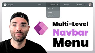
Multi-Level Navbar Menu in Power Apps
The Analyst Nik
5,535 views
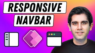
14:00
How to build a Responsive Navigation Menu ...
Reza Dorrani
43,260 views

3:36:25
OneNote Tutorial: Getting Started with Mic...
Simon Sez IT
592,195 views

20:27
Export Data to Excel from Power Automate |...
Reza Dorrani
10,367 views
8:31
Power Apps: Reusable Popup Component
The Analyst Nik
2,187 views

25:28
Why Appointment Booking SUCKS | Voice AI B...
Jannis Moore | AI Automation
2,928 views

3:49:50
Build a Realtime Chat App in React Native ...
notJust․dev
1,720,893 views
17:44
How to Create Left Navigation Component in...
Lernen Tech
15,782 views

13:56
5 brand new Flutterflow features to level-...
John Kealy
343 views
21:33
The Ultimate Guide to PowerApps Containers...
Tolu Victor
22,601 views

33:41
How to get clearer vocals and audio in Sun...
Zanzibar's AI Music
2,155 views

29:46
15 AWESOME OneNote Tips for Better Note Ta...
Jonathan Edwards
21,594 views

29:57
Wait! Solve Delegation Easily! In Power Ap...
Andrew Hess
6,421 views
30:55
Power Apps Dynamic Navigation Menu Compone...
Deepak Shrivastava
30,895 views
27:48
Error Handling In Power Apps
Power Platform Simplified
288 views