The 5 Most Popular Consulting Slides (and how to build them)
505.29k views2568 WordsCopy TextShare
Analyst Academy
⬇️ Sources used in this video ⬇️
“McKinsey Technology Trends Outlook 2022” McKinsey 2022
“Port of L...
Video Transcript:
in the next 10 minutes I'm going to teach you how to build 90% of the PowerPoint slides you're ever going to need to build especially if you work in a PowerPoint heavy career like Consulting Finance or strategy one of our most requested video topics is how to build popular PowerPoint slides so to prep for that I recently went through as many presentations as I could get my hands on mostly from bigname consulting firms like McKenzie Bane and BCG and I found something really interesting most of these consulting firms tend to use the same slide layouts
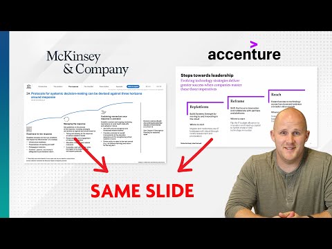
over and over for example take a close look at this Mackenzie slide notice how it looks very similar to to this BCG slide and this deoe slide and this Oliver Wyman slide and it makes sense if you think about it some of these consulting firms are turning out 100 200 Page decks for their clients so whatever they can do to streamline this process they're going to do it so after a lot of searching I've narrowed it down to five slides that you can realistically use over and over again and save yourself a ton of time
I'll show you what these slide theys are when to use them and how to build them really quickly coming up hey everybody Paul here from analyst Academy where we teach PowerPoint presentation design and data visualization training to individuals and teams all around the world if that sounds like something you're interested in make sure you check out our full courses over at the analyst academy.com also got a lot of great free stuff over there including a blog post where I list out all the presentations that I went through in order to prep for this video there's
over a hundred there they're all free make sure you check it out I'll leave a link down below first slide on our list is what I call the table slide and just like it sounds it's just a table on the slide this is actually a really obvious example I'll show you some less obvious examples here in a second but a slide like this is really good for showing categories Or List here's a slide from Mackenzie and if you look closely it's the exact same layout just a table you got your main categories over here on
the left and some supporting text on the right here's one from Oliver Wyman again categories on the left supporting details on the right this is actually very common you'll see icons on the left to kind of bring those categories to life a little bit more and then bullet points on the right and sometimes you'll see it split into mulp columns but in this case you've just got the category and the bullet points here's another one from Mackenzie this time you don't have three rows you only have two but it's the same layout these also tend
to be good when you have a mix of information mostly qualitative sometimes a little bit of quantitative information but you can't quite put that quantitative information in a chart so table layouts like this are really good very flexible and really easy to build just start with a box copy it over and then change the fill outline left Aline it bullet points give it some black text add some filler text here and then just copy this one over and you can copy this down as many times as you want so if you're on a PC hold
the control and shift key put it let's say right there and then hit F4 to copy it again the spacing will be the same and now you have your basic table slide if you want you can kind of add these column labels right here I'll remove the bullet points fold the text make it one F size bigger and there you go next slide on our list is a chart slide and really it's just a title on the top and a chart taking up the bulk of the space on the slide it sounds really simple but
it actually can be really effective here's one from Oliver Wyman it's just a basic multiple line chart but it supports the key message of the slide which is in the title then this one from McKenzie same idea stacked column chart takes up the bulk of the space on the slide and then a title on the top slides like this are actually really good when you're trying to make a very convincing point and when you have the data to do that and it makes sense that these would be popular consulting firms because a lot of what
they're doing is trying to convince their clients to make a decision and charts are a good way to do that here's one from Roland Berger notice how they put these supporting details on the right this is very common you'll see a chart taking up most of the space on the slide with some key insights or supporting details in the form of bullet points over on the right here's another one this one is from lek chart takes up most of the space but you've got these supporting details on the right and then this last one is
a little funny looking but it's the exact same layout column chart on the left supporting detail on the right obviously building this slide is really easy you just got your title right here make sure the key message goes there and then just add a simple chart of course you can also add bullet points over here to support the details of the chart but you don't necessarily have to the key is make sure the message in the title is actually supported by the chart You' be surprised how often people don't do that the other really important
thing with the chart slide is you want to make sure the chart type matches the message this is something we talk about a lot in our data visualization for Consultants course but let me just give you a quick summary if you're trying to emphasize a TR Trend or a pattern use a line chart if you're trying to compare categories against each other use a bar chart if you're trying to compare categories over time use a column chart if you're trying to show the relationship between two variables use a scatter plot and if you're trying to
show what percentage one category makes up of a total use a pie chart but usually you're better off skipping pie charts all right before I get to the next slide layout let me take 30 seconds to tell you about the sponsor of this video which is ampler ampler is a great tool that I've been using for a really long time but let me show you this really awesome feature that I pr is going to blow your mind here I am in the Imp tab if I just go into this insert section right here and choose
insert from library I can choose the slide layout that I want to add to my presentation so for example let's say I go to header horizontal and I just choose this one right here here we go I've got a subtitle slide already put together I just need to fill in the details I can build any type of slide look at this giant library of slide layouts that they have and of course they have their ampler charts feature which makes chart building incredibly easy pick the chart I want Dragon drop it here and I'm good to
go anyone who signs up for one of our Advanced courses gets a 6-month subscription to ampler but if you just want to try it out for a month see if you like it then I'll include a link down below try for a month it's absolutely free there's no credit card required so make sure you check it out the next slide type on our list is actually one of my favorites and it's what I call the subtitle slide basically it's a slide with a title on top but then subtitles that support that title and sections for
each of those subtitles let me show you what I mean so here's a slide from lek the main title is on top which has the main main message of the slide but then that's split into these two subtitles and underneath each of these subtitles is content to support that subtitle slides like this are really good for showing structure like when you need to show your audience how you reach a certain conclusion you can show them the main conclusion in the title and then show them how that conclusion breaks down in this BCG slide for example
you've got the main title on top with these two subtitles the chart supports this subtitle and then these different sections the bullet points supports this subtitle sometimes one subtitle flows into the like in this BCG example greatest demand exists for personalization Services as supported by this chart on the left and then continued with the statement through both digital and physical Avenues which is supported by this chart on the right and by the way notice how they're using a bar chart to compare categories against each other of course it doesn't just have to be two columns
it can also be three or four like in this example from Roland Berger the main difference between this and a table layout slide is how the information flows from top to bottom versus a table layout slide where it flows from left to right and is a little bit more categorical and there's less of a logical connection so building this slide is obviously very easy so you just start with a box right here this can be your subtitle copy this over make sure it's in the middle of the slide of course and then just copy these
three down so I'm holding control and shift as I drag this down then moving these then just change remove the fill remove the outline left align this line it to the top change the text to Black maybe put some bullet points in here and there you go these are our subtitles of course this is supporting text or if you're not doing text you can put a chart here so I'm just going to delete this go to my charts let's start with a cluster column chart and we'll put it right here easy peasy next slide on
our list is what I call the framework slide it's kind of like a chart slide but instead of a chart you just have a big framework right in the middle this is really good when you're trying to bring some organization to your deck and you're trying to lay out a frame frw workk for the next few slides or when you're trying to represent an idea or a concept and you need some sort of visual representation of that idea here's an example from Oliver wman on the topic of addressing Rising credit risk it's just the main
framework in the Middle with text to support the details of that framework and then you have more classic examples like this one from LA and this one from PWC my main advice with these slides is to only include details that actually contribute to the message it's really tempting to put a whole lot of text and data and numbers and pictures and cool fancy graph on slides like this make sure you stay focused and only put the information that's actually going to impact your message the best way to build a slide is actually probably just to
find a template either at your company or somewhere on the Internet or use a tool like ampler where you can go in and find a template but if you don't have any of that Microsoft actually makes it really easy go to insert then to Smart art and choose what best fits your message now usually I wouldn't recommend using smart art looks a little cliche but if you absolutely have to you can make it look worthwhile so after I've inserted it right here I'm just going to make it smaller move to the center and the key
here is to change the color so just go to change colors find something that makes a little bit more sense next thing you'll do while you're in this smart art design tab go over to convert and then convert to shapes and now it's just a group of different shapes that you can move around and change however you need the fifth and final slide is what I call a visual slide it's basically when you need to explain the details of something that exists in real life a lot of times this might be a map where you're
highlighting sections but it can also be a picture of something complicated or a diagram of a piece of Machinery that you need to explain a lot of times these slides end up in the appendix but they are really common not so much in marketing slides but in realistic client presentations you see a lot of these so here's one from Mackenzie that highlights different areas around the globe another one from Mackenzie a little bit older same idea it's a map and a picture of one of the Cities this one that explains the mining process a little
bit better or this one from strategy an that looks a whole lot better but again it's a map pointing to different places on the map and finally this one from BCG that explains the details of an animal safety officer's data day operations these slides tend to be the ugliest of the bunch and actually are probably the easiest to make but they do play a key role the important part with these slides is put the main visual in the middle and then just have these little call out boxes highlight different parts of that visual so whether
that's a map or a photo a diagram something else don't overthink these slides they don't need to be pretty they just need to actually explain the details of what's in your image image so make that your main focus with these text boxes all I did was just change the shape fill to White include an outline and then I just went to the shape effects right here Shadow and did this one on the top left that way it sticks out from the picture just a little bit more it's a little bit easier to read all right
that's going to do it for today's video I really hope you found it helpful let me know what other topics you want us to cover and if you have any suggestions make sure you leave those down in the comments make sure you check out your free one month subscription of ampler and of course our courses over at the analyst academy.com thanks for watch watch it
Related Videos

17:27
How I redesigned 3 McKinsey slides (and ma...
Analyst Academy
384,561 views
13:58
How to Fix a Bad PowerPoint Slide
Analyst Academy
134,643 views

6:44
The one rule EVERY slide must follow
Dan Galletta
21,650 views

9:24
How to Think Fast Before You Speak: Framew...
Vicky Zhao [BEEAMP]
1,714,491 views

2:26
How To Sell Consulting Services To Fortune...
Consulting Leap | Faheem Moosa
5,507 views
10:22
Use Strategic Thinking to Create the Life ...
Harvard Business Review
1,001,068 views

25:57
Data Visualization Crash Course | Consulti...
Analyst Academy
171,441 views
10:50
Storytelling in PowerPoint: Learn McKinsey...
Dan Galletta
491,037 views
10:24
5 Rules for Communicating Effectively with...
Dr. Grace Lee
1,116,695 views
![3 Ways to Create PowerPoint Presentations with ChatGPT [for Teachers]](https://img.youtube.com/vi/JmVWz2PFVA0/mqdefault.jpg)
9:50
3 Ways to Create PowerPoint Presentations ...
ClassPoint
996,402 views

9:18
The ongoing Crisis at McKinsey, BCG & Bain...
Case Interview Hub
237,188 views

14:56
Data Visualization for Slide Presentations...
Firm Learning
217,496 views

14:04
How to Build PowerPoint Slides Like a Grap...
Analyst Academy
51,032 views

10:54
Build your own “McKinsey Style” Presentati...
Analyst Academy
103,776 views

20:32
How to avoid death By PowerPoint | David J...
TEDx Talks
5,207,727 views

5:48
2 Genius Ways To Use ChatGPT To Create A P...
IncrediSkill PowerPoint
927,228 views
8:15
PowerPoint Storytelling: How McKinsey, Bai...
Analyst Academy
1,015,677 views

11:38
Top 8 PowerPoint Hacks for Consultants
Analyst Academy
169,093 views

8:35
3 Strategies to Ace Your Presentations to ...
Dr. Grace Lee
12,438 views

9:15
5 Small Changes to Improve Your Presentati...
Jeff Su
125,559 views