How to Use a Color Checker Passport Photo | Mark Wallace | Exploring Photography
26.02k views6062 WordsCopy TextShare
Mark Wallace
The ColorChecker Passport Photo 2 is an indispensable tool that helps you to capture the colors of t...
Video Transcript:
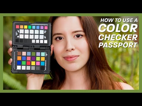
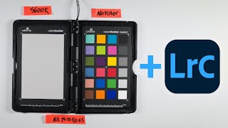
[Music] [Applause] hi everybody welcome to another episode of exploring photography I'm Mark Wallace hanging out with Sarah hi today's episode has brought to you by airt image enhancement software it's really spectacular stuff I'll be getting to that in a little bit today's episode is all about this thing this is a color Checker passport what the heck is this and why do you use it well this is for accurate color you can use it to create color profiles you can use it to set your white balance you can use it to tune things in make them
a little bit warmer or cooler based on what you're shooting skin tones or Scenic tones you can see what's changing in your image there's a bunch of stuff you can do with this and so we're going to take a couple of quick pictures and then I'm going to hop over into Lightroom and show you how I use this now this has a couple of different things it's got all the colors on here those little uh color palettes and also has a little mini white and gray card so we can use this not only for color
but to set our white balance and to make sure our exposure is correct a lot of stuff so what we're going to do is I'm going to have Sarah hop over here we're going to take a photo and she is going to hold this right next to her face like this and the reason for that is you want this to be where you're taking the photo as close as possible so if I'm working with models I always have them hold it right next to their face or right in front but usually right next that way
I can see the colors and I can see what it's doing to their skin and so the other thing to mention is when you're holding this you should not touch these colors because your the oil on your hands can mess up the color over time so that's why I'm holding it like this okay Sarah knows all this there you go alista okay okay what we're going to do is I've already metered everything set this up we are going to take a really uh fast photo and so right there see Perfecto I'm going to zoom in
all the way take a shot perfecta and then the other thing I'm going to do is we are going to change this so we have our white balance so we can set that really fast if we need to gracias one more photo okay perfect good good good good I'm G get as close as possible great perfecta all right now that we have that what we need to do is to hop into post- production and start using this we can use our color Checker passport for a lot of different things but at a very basic level
the things we would use it for most is setting our white balance and checking our exposure we also have a bunch of different little things on this uh color Checker to check our uh color at the top our basic color sliders uh warm or cool our white balance check our sh shadows midtones and highlights down here and then this is for doing color profiles some really interesting things and so we're going to go from the very basic stuff to the most advanced things we're going to start with white balance warming and cooling doing that intelligently
checking our exposure midtones uh highlights Shadows all of that kind of stuff and then we'll talk a little bit about how we can use the color Checker passport for a complete workflow of calibration color calibration making sure that our camera is Cali for correct color making sure that our screen is calibrated correctly and also making sure that the output our printer or working with a lab that complete workflow now we're not going to do an an in-depth dive on color profiling and ICC profiles and all that stuff that deserves a different video we're going to
stick to the basics of what the color Checker passport is used for starting with white balance and exposure so to do this we are going to hop over here into Lightroom Classic this is what I use most of the time to do my post- production but the principles that I'm going to show you today can be applied to capture one dxo photol lab Lightroom classic Lightroom uh Adobe camera raw whatever you're using for your post- production you can do the same things they all work basically the same with the color Checker passport um and so
let's hop into Lightroom classic right now and what we're going to do is we're going to look at this photo shoot that I just did with Sarah so these are the photos that I just took you can see that we have our color Checker here we have our white balance our gray and white card here but you also notice that I'm just going to show you that this is not something that I've just done one time this is a photo shoot that I did uh a few years ago and you can see that I've got
for every different lighting setup I have a color Checker passport so this this portfolio or this Pro uh portrait right here I've got a color Checker this one I've got a color checker for this one I have a color Checker basically for anything that I'm shooting any different lighting setup I am using uh a shot of that color Checker so that's an important thing we want to do is every time we change our light if if it's a modifier if it's a different um maybe a scrim or something like that if we're shooting a natural
light anytime we change the light we need to make sure that we uh capture a nice color Checker image the other thing to note is when you're capturing this I'll see if I can get this to focus notice that we can get a glare if I point this in the wrong direction so you need to be sort of cognizant of that when you're shooting to try to make sure you get the model to hold this where it's nice and flat toward the camera with no glare on that to get the best results and so just
be aware of that when you're taking your photos Okay back over here into Lightroom classic we can see that I have all of these different profiles you can even see just to make my point um if I go up here to uh this right here we have and Don Berger she is just a hoot she got so tired of taking pictures with the color Checker she was making funny faces but notice we have a uh we have her doing this where she's doing the check and then right after that we have another uh image and
the reason for that is if you look closely you can see that up here the lighting has changed so this doesn't have those um those kicker lights this does so as soon as we change the lighting setup we also made sure to capture another shot of that color Checker okay we're going to work with the stuff that we just shot with Sarah so let's hop over here into that photo shoot that we just did with Sarah beginning with the most basic thing and that is to change the or to check the white balance and to
check the exposure now we have in here we have a white card and we have a gray card the middle gray card will help us with exposure in fact if you look up here uh you'll see that there are values that change when I go to the develop module so I'm going to go over here to the develop module and then when I hover over this with my magnifying glass whatever tool you're in notice over here we get a readout for red green and blue notice that right now they all show 50% so red 50.6
green 50.6 blue 50% 6 uh 50 6 so it's middle gray it is a middle gray if those values showed me something that was different than 50% I would know that I'm either underexposed or Overexposed and I can make an adjustment we can even look on our histogram and see that we have this Spike right here showing that this is the correct exposure in fact if I crop this to only show that middle gray so I'll show that so I'm just getting the gray card look at this Spike right here it is absolutely spoton so
I know I have a correct exposure if I change this and I take it down one stop or up one stop you can see that Spike on the histogram is changing it should be dead center for this gray uh this gray area of the top of the card so I'm going to reset my crop so we know just by looking at that that we have a correct exposure if we did the same thing if I just crop here on the white part of this and I'll close that you can see that the spike is over
here to the right it's not absolutely white but that's okay we don't want it to be totally blown out we can check that we can also check to see um I'll reset this when I hover over this with my magnifying glass you can see that those values are the same 91 91 91 so that helps us with our exposure we can also go in here choose our white balance tool so I'll click on that bring it over here click and then our white balance is set I could do that again on the white click our
white balance is set so these we can just use if nothing else you can use these two things to set your white balance and to check your exposure so at the very basic if you just want to use a gray card you can use that that panel but we really want to control things in a more intelligent way and really see what's happening that's where the other uh cards really come into play let's take a moment to learn about the sponsor of this episode air air is an amazing image enhancement tool and with aart you
can effortlessly improve the quality of your photos by removing blur noise and pixelation with three distinct AI models for super resolution it only takes one click to enhance blurry grainy pixelated and soft images while generating more details using AI this is great for storing compressed or highly pixelated files use deep learning algorithms to remove noise and reconstruct your images you can fix issues caused by high ISO underexposure or noise from highly compressed files improve the clarity sharpness and overall visual quality of your work use air to preserve and generate image details it's perfect for generating
skin hair textures lines and other fine details the lower the quality of the image the greater the potential for improvement make your images more detailed and natural by emphasizing edges and fine details without creating artifacts a big thank you to aart for sponsoring this episode for more information about a and to download the software click the link in the description of this video all right let's get back to it so let's go to the next uh exposure this one right here this is the next thing and let me make sure I reset everything so I
don't have any adjustments being made everything is as shot or white balance everything is as it uh came out of the camera looking at this I can see just with my naked eye that there's this reddish cast to this image so there's a lot of red in this her hair looks red if we look really closely to her skin tones these Shadows are Reddish and so we shouldn't have all that red you can see even right here this is a red shadow that shouldn't be red it should be a gray you know or skin tone
so we shouldn't have that red color cast there so we got to figure out what's going on so the first thing I want to do is I want to set my color temperature my white balance and to do this notice we have these two rows on the top of the card the top one notice we have these two different people here we have one with a little sun and one with a big sun notice it said has got a little Sun here this has a notch out of it and then this this has a plus
and another plus and another plus and then this is a big sun right there so what this is doing for us is it is allowing us to set the correct white balance so that's the little square with a notch out of it we can click on that with our color correction tool with our our white balance Color Picker and that will set the color temperature correctly our white balance will be set correctly but if we want to warm things up a little bit we can click either the first or second or third or fourth of
those little pluses to make things a little bit warmer maybe give somebody a tan that's a little bit pasty we can do that and what that's doing with that top row here this top row here it's going to warm and cool things in a way that's pleasing for skin tones the other row right below that is this right here notice it's got a mountain range whoops notice it's got a u mountain range set to it whoops I'm doing the wrong doing the wrong thing here it has there we go it's got a little mountain range
with a an iicle on it if I go over here it's got a mountain range with a sun on it and so what this row does is it allows us to set the correct color temperature another square with a notch out of it and we can cool things off or warm things up so this top one is for portraits for setting color temperature this one is for setting color temperature for Scenic photos so it will warm and cool things uh with the colors uh biased toward greens and uh Blues things that are in nature so
the Reds and those tones are for portraits and greens and blues are for uh Scenic photos so those two different rows help us set and adjust in an intelligent way the white balance for portraits or Scenic photos now I'm a portrait photographer so so I'm almost always going to be using that top row let's see how that works so the reason that I like to take a photo right next to the model's face is I can see really uh quickly what's happening to the skin tones so I'm going to go over here I'm going to
choose my color temperature my white balance selector I'll choose that I'm going to go over here I'm going to click on the Square that's got the notch in it click and you can see immediately things changed so before after before after before after if we look uh I'll try I don't know if on YouTube this is going to show up but on my screen you can see a huge difference before after of those Reds in the skin so the reds are really changing can also look at this before and after to see how things are
changing you can see things changing here these two squares by the way represent skin tones and so light skin and darker skin we can see if those are correct and these squares right here represent colors in nature so Sky water uh plants Etc so these are for skin tones these help us understand what's happening in nature so we can see pretty quickly what's happening there so we've got that the other thing we have is this row right here on our color Checker and these aren't by accident these colors right here these colors correspond to the
colors in our color mixer over here so notice we have red orange yellow green aqua blue purple magenta that corresponds exactly to this red orange yellow green aqua blue purple and magenta in fact we can go over here we can choose our Color Picker and notice it's picking on the right hand side the correct color that corresponds with that so there's the red there is the orange and the yellow and so we can see exactly what's happening when we uh move color sliders here what's happening up here we can see it so I'm going to
go ahead and reset all this because I don't want to mess up all my color so those are back to zero okay so that's what these are up here these correspond to the Hue saturation luminance all of those sliders correspond to this so we can see what's happening in a profile on a Target when we adjust this it really helps us out so one of my favorite things okay so we have uh We've set our color temperature let me just show you what happens when I warm this up so plus one plus two plus three
plus 4 you can see that's getting much rder and this is cooler cooler cooler and then technically correct and so the color Checker passport allows you to choose something that is technical technically correct so academically it's the correct color temperature but it also has patches on there that you can click to change the color temperature to be more artistically warmer or cooler it's fantastic it really will save you a lot of time so there are a number of other things that we can do here on this uh row right here what we have there is
we have our blacks and Shadows on this side and then here we have our highlights and whites and so if we want to adjust things things here our tone Shadows highlights blacks Etc when we adjust them we can see what's happening on our Target right here we can actually see if it's Black is Black or if the Shadows are opened up and we get different graduations of different tones there and so that helps us do things in an intelligent way so that we're not messing things up and we can also go in and we can
uh crop so that our histogram is only showing those things things so we can see exactly where the blackest black is and where the brightest uh High U Shadow is so we can see if it's in the right place which in this instance we don't have anything that's absolutely black here we only have shadows so we might have to go in here and change our blacks just a little bit to bring that in we might want to do that it's up to you that stuff is subjective but this allows you to see what's happening in
a real way so we can see exactly what's going on there okay that is fantastic so just with that tool we can really quickly go in set our white balance change our shadows mid midtones and highlights to see what's happening but there is one more thing that we should do when it comes to color in fact we should do it first and that is choosing our color profiles these are called different things in different cameras so they might be picture style or film look or color profile depending on what brand of camera you have it's
called something different but it's essentially the same thing for all cameras you're saying you want to emulate a different look a different film look and that tells the camera how to interpret the colors that we're seeing do we want it to be more contrasty we want it to be more saturated Le less saturated do we want it to be biased more toward skin tones or toward nature how do we want to see that so let me show you what that looks like in Lightroom classic when we go back over here I'm going to zoom out
on this on the right hand side we have this color uh profile so right now it's set to camera portrait and the reason it's set to camera portrait is that's what I had my camera set to when I took those photos and so we can change that we can change it to whatever we want it to be so we can have it to be Adobe color or adobe landscape or adobe portrait or Vivid or whatever we've got all of these different things and in Lightroom classic we have this little Explorer here so we can hover
over these different color profiles and see what things look like so Watch What Happens over here on this area of the color Checker when I change the profile you can see the colors shifting pretty dramatically so if I go to camera neutral to Portrait you can see over here in fact I'll zoom in on it just a little bit so you can see this look what's happening in the Blues we can see things shifting as look at that the red boink toink so we can see things oh look at that that's a big shift as
well so we can see what's happening when we change profiles look at that blue look at this blue right here when I go from faithful to landscape faithful to landscape notice that the blues are getting much more saturated the greens are getting much more saturated that top row is changing as opposed to going from faithful to Portrait so we can see what's happening in that it's really really wonderful so we can choose something that is uh appropriate for our photo and it works great but so that's all the artistic stuff we set the white balance
we set the Shadows the midtones the highlights we use our color Checker to see what's happening in that image we're seeing where colors are shifting when we're changing the sliders and it gives us an intelligent view but what if we need accurate color for example over here in uh this photo shoot here in my uh sample photos what if I'm taking a photo of uh for example this blue dress so I've got this blue dress and perhaps this is something that's going to be sold and so a client comes to you and says hey can
you take a photo of uh this blue dress and this red dress and this outfit this bag this product whatever it is and then that has to be accurate because you don't want somebody going online and buying a blue dress and then it shows up and it's a different color they'd be upset especially if it's in a print catalog or on a billboard or on a sign people want to see like if that's the color of the thing I'm ordering that's what I'm getting in the mail and so what we need to do is we
need to make sure that the colors that we see with our eyes if the red that we see with our eyes is captured correctly in the camera so that the camera is seeing the red the same way that we're seeing the red and then when we bring it into the computer the computer screen is showing that red the same way so the red that we see is the same red that the camera captures and when we bring it into the computer the computer screen is showing the exact same red and then when we print that
dress or whatever the product is that red is the same how do we make sure that the red comes in the camera as red shows up on screen as the same red and prints out the same red what we have to do in that instance is we have to profile our camera we have to profile our screen we have to profile our printer the entire thing has to be profiled and so that's what we have these targets for and so these are accurate colors that's why you don't touch them with your fingers because we want
the colors to be as accurate as possible so this red needs to show up on the computer screen the exact same way you should be able to hold this next to your computer screen the red should be red and when you make a print that red should be exactly the same thing so what we can do is we can take our color Checker passport and say hey camera this focuses Focus if this will focus there we go we can say hey camera this red is red that is what I'm saying is red this is blue
this is green this is the uh the standard to measure that by and what we can do is we can create a color profile and to do that with the color Checker passport what we want to do is we want to use this thing over here so we can go over to calbrite who makes the color Checker passport and we need to download this which is the color Checker display in fact I can go in here and say color Checker camera calibration and it's this software that opens up so this software can allows you to
go through a few different ways to create profiles accurate profiles but when you install this software and by the way this this link here uh I'll put this in the description of the video um or you can look on the screen here not only is it the software for creating uh uh display calibrations but camera calibrations print calibrations all that stuff these profiles are here that's where you download all of this stuff when you install that something happens in Lightroom classic and so let's go back over here to Sarah and so we want to tell
the uh Lightroom that this is the accurate color this stuff that we just captured here this is the accurate color and we want to create a profile for that what I can do is I can say file and then I can go to export with preset and then I have a preset down here called camera uh color Checker camera calibration that happens when you install that software it installs this plugin for Lightroom classic if I click on that I can then name this profile so I'm going to name this Sarah um in Plants Sarah plants
we'll do that now you have to do this with the correct uh photo so you have to have a photo of the color Checker to do this so I've got that selected I'm exporting this as a dng profile I'm naming it Sarah plants I will say save now what's happening is this is going to export this file it is going to open the camera calibration software it's going to bounce around it and do its thing it takes about 10 or 15 seconds something like that and then just in a second here this is going to
pop up with a message that says everything is done so it takes about 15 or 20 seconds so we'll just wait for this to zip around it's still doing its thing so we're waiting we're waiting here and then once this is done I can apply that color profile okay so it's done it's saying hey the color Checker camera calibration is done but Lightroom must be restarted to activate the profile okay so what I'm going to do is I'm going to quit Lightroom yes I'm going to quit it's going to do all my backups all that
kind of stuff so Lightroom is closing the reason you have to do that is the when Lightroom launches there's a directory on your hard drive that stores all of those different profiles and so it loads them in when it launches and so what I'm going to do now is I'm going to go over here I'm going to relaunch Lightroom classic and so I'm relaunching Lightroom classic here it's going to open up and it'll resume from where we left off there it is now over in the develop module something new is happening if I go over
to my uh profiles here if I click on this notice now I have S plants this right there that's the one we just created I can click on that and now um I will also set my white balance so now I have a correct color temperature and correct color profile remember we had this Shadow here that was red now look at that and notice it is the correct skin tone so I'm going to show you before after look at how much red came out of that we can see that her skin tone is now accurate
it's not all that weirdness and we can see how much has changed in our color profile look at that a ton so that's before that's after before after so a lot changed in that profile specifically with the blues and the purples wow lots before after before after okay now that we have that we have a technically correct uh color all of our colors are technically correct we can still adjust the contrast we can still adjust things to taste but we know if we applied that to a blue dress that now the blue that came from
The Real World came into our camera we know that because we have calibrated that camera it's showing up correctly on our screen what we need to do is we need to calibrate our screen um for those of you who are wondering I use this guy right here if I can get a focus this is a calibrate display uh plus HL it allows me to calibrate the screen using this little thing and then also this allows us if I can open this to uh you can calibrate projectors it can also look at ambient light to make
sure that the screen is calibrated for changes in the ambient light all kinds of stuff I absolutely love this if you're interested in all that cam camera calibration and screen calibration I highly recommend you zip over here calibrate does not sponsor any of this but I recommend that you go over here and take a look at this I highly recommend the display plus HL that is for newer displays so those HDR displays the really bright displays the newer Apple displays you need something that can get the entire dynamic range so the the pro and plus
HL are made for that and then also I use the color Checker studio for my more advanced commercial work and then you can see we've got uh calibration targets and all kinds of stuff so I'll leave links to all this calibrate is not paying me for any of this stuff but I use their gear all the time for color accurate work so the bottom line for all of this is you will use the color Checker to calibrate uh and create a camera profile you bring that into Lightroom classic so that the C the colors are
correct you would calibrate your monitor to make sure that the colors showing on your monitor match that profile to make sure that red is red that's what you're seeing everything is correct and then you would also calibrate your printer or use the labs profiles to make sure that when you print everything is consistent across again this is not a color profile video but we had to dip our toes into that so you could understand why you would use the color Checker passport for that okay so the bottom line is this the color Checker passport is
something I absolutely love you can use it for exposure for white balance that's what I use for most of my photo shoots just to uh quickly make sure everything is good and you can also create profiles to make sure you have the most accurate color the last thing is what do you do once you have all of that stuff in your photos so so let's say we have this done let's say we've gone in and we've changed our our blacks to make sure that we've got a nice contrast there and we've got our highlights set
we uh have set everything the way we want it to be set how then do we apply that to everything else that's really easy we just take our first image the one that we did all of our calibration to then shift click to all the other ones and then we can click sync settings and then for this you can just say hey I want to do the basic treatment and profile and the basic white balance exposure all that and so this is uh choosing process version which is good and then calibration we want to choose
that okay so all of that's there if you've done some color mixture stuff color grading of course you would choose that as well so you choose whatever is necessary but by default you need to choose treatment and profile and these basic adjustments and the calibration and the process version so those need to be selected to apply all the colors and then you just say synchronize and boom it's going to synchronize all the colors across all of the different images and now all of the images have the correct color the correct saturation everything so we can
see if I go in here to this one to the develop module before after look at the difference in the Reds that is crazy let's see if we can show this side by side yeah look at how much more red the one on the left has than the one on the right that's crazy especially look at this even in the the pants we can see the pants have a red color cast and the correct profile pants are set so you wouldn't even see that I don't think if you hadn't uh done a calibration it's really
really amazing all right well now we know all about the color Checker passport how we can use that to set our white balance and change colors and create profiles and all those good things gracias she's fantastic if you want to see more of Sarah's work check out her Instagram Prof profile I have set a link in the description of this video also make sure you subscribe if you haven't subscribed already and turn on the Bell why not do that also thank you to airt for sponsoring this video it wouldn't be possible without them and our
channel members if you're not a member if you're not part of the snap family check that out there's a link in the description of this video long form classes for those who want more indepth uh teaching so you might want to check that out thanks so much for joining us gracias and I will see you again next time [Music]
Related Videos
23:33
Speedlight Portraits Explained | Mark Wall...
Mark Wallace
36,899 views
13:33
Perfect Color in Your Photos - with the Co...
Joe Brady
13,576 views
18:37
My Tethering Setup - So Many Options! | Ma...
Mark Wallace
11,005 views
18:38
How to Create and Apply Camera Profiles in...
Calibrite
18,875 views
33:22
X-Rite (Calibrite) ColorChecker Video Tuto...
Korro Films
30,925 views
11:22
White Balance vs Color Checker: Ask David ...
Adorama
97,845 views
11:53
Soft Beauty Lighting - The Easy Way | Mark...
Mark Wallace
19,242 views
15:20
How The Position of Light Can Make or Brea...
Mark Wallace
20,003 views

31:26
The 15 Elements of Composition in Photography
Peter Evans
111,700 views

9:42
BETTER THAN LIGHTROOM! DxO Photolab 8 is t...
Tony & Chelsea Northrup
146,552 views
36:36
Perfect Color in Portraits and Landscapes
Calibrite
229,261 views
18:09
BEST FEATURE in Darktable that your NOT using
Nick Long
5,306 views
16:38
Balance Ambient Light With a Flash | Mark ...
Mark Wallace
14,685 views
1:10:18
How to Color Grade Skin Tones Like A Pro |...
George.Colorist
10,250 views
10:12
MEGAPIXELS Don't Matter. Here is why.
PhotographyExplained
106,614 views
17:41
5 Photo Myths BUSTED
Tony & Chelsea Northrup
55,676 views
13:39
Get Perfect Color and Skin Tones With This...
DSLR Video Shooter
378,250 views
16:48
TTL vs Manual Flash Explained | Mark Walla...
Mark Wallace
13,164 views
24:00
Color Correction Using Spyder Checkr Photo
Sal Cincotta
46,396 views
7:32
How to get accurate colours out of your ca...
PIXEL VIILAGE
390,222 views