How We 3X this Website's Conversion
32.01k views1781 WordsCopy TextShare
Malewicz
Work with us at https://squareblack.com
After this redesign client's startup greww 3x!
This is a ca...
Video Transcript:
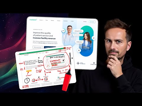
[Music] they came to us with this and ended up with this for the last 25 years I've been designing websites for both startups and Fortune 500 companies the website is not just supposed to look good it's supposed to convert today I'm going to take you behind the scenes of a medical startup that we worked on last year medes is a startup that helps Hospitals and Clinics improve their registrations it gets patients to register it gets their customer support to get in touch with patients and so on it simplifies and streamlines the communication this is a
redesign because the startup was already established and had clients I'm going to show you how we used research to First figure out which direction to push it and then how we modify some of the key elements to make it convert better there are some controversial takes here but they have proven to work because since then the startup has tripled the revenue and from what I've heard the entire industry is complimenting their website what many designers do is that they take their previous website and they apply the newest design trend on it so make some glass
transparent panels on it or some dark mode gradients and call it a day there is no thought put into it this is not how we do it the first thing we do is put it through our internal tool called Web review that we're actually going to release to the public pretty soon you can find the link in the description and it uses all my books and my courses to spot all the possible problems with the previous website and lists them from top to bottom it checks everything from how friendly the colors are the spacing the
typography it also goes through all the marketing slogans all the headings basically of the website and finds out whether they can be shorter or improved in any way to be more convincing the second step is our manual heuristic analysis and now don't be afraid heuristics just mean stuff that we all collectively know from the past so this is based on our experience we took what web review gave us and then on top of that we created a ton of annotations however we are not from the medical industry obviously we're designers so the first thing that
we always do in such cases is that if we're not sure about something on the website we ask questions because the client obviously knows their business so we need to figure out whether some of the design choices that we might think are bad are actually good in this particular industry and there were some surprises stick around around to hear what they are there is this notion among people who make websites and this is mostly true but not in this case the notion is that you need to simplify the less sections and text and content and
elements the better because people are cognitively overloaded already so they don't want to be bombarded by information and that generally is the truth but not in this case because this comes back to who is the product for most products are typical b2c which means it's business to Consumer and most consumers have the attention span of a goldfish 8 seconds so you need them to focus on the right things at the right time and the best approach to this is substraction anything that is not necessary or not beneficial it just goes out the window in case
of metadesk the decision maker the person who is actually paying them the client is the direct of a hospital so it's not a typical consumer and the app itself is not your typical $10 per month it's a lot more expensive so it is a decision that those companies need to make to streamline their processes to make them better but it's not a light decision a hospital is a complex set of different moving parts and switching it to a completely new system is always risky this is why in this case the ideal customer customer actually wants
as much information as possible and it's not even about just testimonials it's about the functionality and how that functionality fits within that specific niche of the medical industry of course there are also different kinds of medical establishments there are dentist clinics there are Beauty clinics and there are regular hospitals and all of those different specialized kinds in between how do you make an informational l page that caters to all of them well you need to improvise and you need to create various different clickable sections that will allow them to read how medes solves their particular
problem and if they don't find their own problem on the list they might not be inclined to purchase and this is a tip for you if you have a business that is B2B complex and rather expensive then you need to figure out all the potential questions your customers might have and then give them sometimes more than one answer to each of them and try to make it visual in some cases complexity is actually good overall this landing page is pretty huge it has multiple sub pages that give you more context and more information but it
also has clickable elements that gives you new copy for a specific Niche that you're in click on one of the options and then on the right side you see the description of that you click on the next option and you see a description of that on a normal landing page that would not stand it would be too much clicking and too much doing stuff for the customer to actually care for it but in this case knowing that the customer wants as much information as possible we are completely fine with that and that actually helped to
increase the conversions because it answers a lot of the questions up front one thing that we noticed right away that making a modern beautiful and semi minimalist web design for this brand was going to be a little bit more difficult because of the colors they chose they went with a green and with a very dark shade of purple that looks kind of almost black first thing that web review returned to us is that those colors are kind of sad because of the saturation levels and the overall Darkness so we figured out that we should start
by recoloring the brand and suggesting a different set of colors we didn't want to go the full route of a typical medical startup which is just using blue it took a while of tweaking to get the colors just right and after that the only thing to do was to slightly tweak the logo the logo Mark was a little bit too thin compared to the modern standards where we use quite a lot of thicker fonts for headings so it would naturally stand out and not in a good way we made it thicker applied the colors and
instantly the website came to life there are some subtle animations in the header but nothing too overwhelming and they're more to highlight certain features of the app while designing this we try to avoid the animation Paradox in which many companies go with every section sliding in either from the sides or from the bottom or from the top so as you scroll you have a complete slide Fest of Animation all over that is cognitively taxing and it's not really great if you have a lot of content on the website that is text based it turns out
that mesk also has an option or a version of their app that's dedicated to veterinary clinics so we used all we knew from this approach and created their second startup website based on that called fesk the resemblance of the Styles is there and it's on purpose because that allows you to see that this is a family or a suite of apps that belong together that were created by the same team but at the same time the veterinary one has slightly younger audience in general so we were able to do a little bit of those cute
little elements like the paws of the dog and the cat sticking out and some more little animations and P prints on the website obviously all of these changes were thoroughly tested we tested it both manually using curis stics we asked the users and the client asked the user users multiple times they tracked conversion every single step of the way and there were some changes and adjustments done to the copy because obviously it's never fully done but their redesign started their phenomenal growth to be three times more profitable and we applaud them for it this is
a really great tool done by an amazing team of people and we were happy to be able to contribute and help them along the way with an awesome website so This Is How We Do websites we don't just jump in and apply a new style or a new trend we ask questions a lot of them we try to figure out who is the website for and how will it benefit them we carefully craft every little part of the copy and all of that combined becomes a great website and due to the constant testing and tweaking
and improvements it's only getting better with time this is how we do websites at Square black and if you want to work with us go to square black.com we are accepting new clients at the moment but there's also one other thing cuz I've been training a lot of designers in the last few years and I found a couple of gems they don't have the 25 years of experience but they have some of my experience ingrained into them through learning so when they decided to start a subscription agency I went on board and helped with the
whole recruitment process and choosing the right people for the right job so if working with me or Square Block in general is a little bit too expensive for you this is probably the best alternative because I personally trained these people so yay if you want an awesome website you now have two options Square black or three dot design and if you want more videos like this let me know in the comments and obviously have a beautiful day
Related Videos
11:49
You won’t believe their official websites…
Malewicz
19,921 views
11:41
THIS is why most Websites are BAD
Malewicz
15,194 views

14:57
These NEW Website Layouts Can Instantly Tr...
Wes McDowell
53,665 views
10:57
BEST Mobile Sites ALL do this
Malewicz
27,538 views
12:06
Web Design is over. We lost.
Malewicz
30,877 views

3:51
I fixed Iman Gadzhi's SaaS website design
Wize Design
8,450 views

10:44
Website Traffic Will Disappear in 2025. Pr...
Wes McDowell
184,880 views

12:57
Why Beautiful Websites Don’t Convert
Malewicz
266,806 views

14:52
Design Better Than 99% of UI Designers
Tim Gabe
226,503 views

11:05
Your brain HATES these websites
Malewicz
187,492 views

12:54
Make content pages NOT boring again
Malewicz
15,741 views

10:54
My 9 Sources of Income at Age 32
Nischa
956,213 views

22:12
The ONLY Sales Page You Need To Make $10k/...
Wes McDowell
171,025 views
10:57
Are You At Least at Level 4 of UI?
Malewicz
112,466 views

28:51
FRAMER IS DEAD - (framer pricing update go...
Loic Reco
3,875 views

16:42
This Video Will Take You From Junior to Se...
uxpeak
136,976 views

20:44
I redesigned YOUR websites
DesignSpo
128,809 views

16:33
9 Web Design Trends 2025 to Spruce Up Your...
Showit
102,305 views
10:06
How websites convert into sales?
Malewicz
38,016 views
19:07
How To Build A $10,000 Website In 30 Minut...
Christian Peverelli - WeAreNoCode
525,138 views