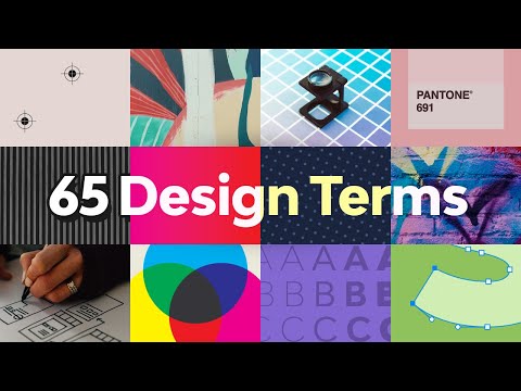
65 Design Terms You Should Know | FREE COURSE
1.57M views3020 WordsCopy TextShare
Envato Tuts
Design has its own language, and understanding key design terms will help you communicate your ideas...
Video Transcript:
[Music] hi there and welcome to this course 65 graphic design terms you should know my name is laura kyung and i have been in the design field for 12 years in all of these years i have learned that design has its own language if you're a designer knowing the right words and concepts will help you explain your visual work and your ideas clearly in this course we'll take a look at some of the most basic complex and often misused design terms we will look at essential words like composition and balance to technical terms like dpi
and ppi and important topographic terms that will help you position yourself as the expert in the design field so let's get started [Music] in this lesson we will talk about the 10 essential design principle terms these fundamental principles of design are rules designers must follow to create an effective and attractive composition by creating designs that are based on functional rules we make sure that the message is successfully conveyed while it is encouraged to experiment visually we believe that learning the basics first will help us create visually balanced graphics so let's take a look at the
first term composition composition is also called layout is a visual arrangement of design elements that create a complete image within a composition you may use different principles of design to create visually pleasing work to deliver a functional layout next up we have balance balance is any element placed on a page that has a visual weight that can be affected by form size color and texture in order to make a layout balance some elements might need to have a certain scale alignment refers to the position of the element on the layout the way the visual elements
are arranged so that they line up the alignment can be left right justified or centered repetition in design repetition creates consistency by repeating the same element within a layout multiple times for example page numbers contrast contrast is the level of differentiation between different design elements to create visual hierarchies the variation may be in form color texture and size negative space negative space is the blank area around a design element it is used to emphasize certain parts of a layout and to zone into a specific element hierarchy in graphic design you will quickly learn to arrange
elements by the level of importance in order to create hierarchy you need to have contrast in your design if one image is larger than the other this will place the emphasis on the larger image and the reader will look at it first symmetry versus asymmetry symmetry refers to the equal amount of elements reflected on a page if you were to draw a vertical line through its center the elements can sometimes be mirrored or the visual weight can be the same from one half to the other the opposite of symmetry is asymmetry the elements of both
sides of the center line are equal and can create an unbalanced design grid grids are a group of intersecting vertical and horizontal lines that can help you structure content on a page there are many types of grids for different uses but the common denominator is that they help keep the content organized and clean design principles are very important rules for graphic designers it will help you understand the basics of creating a layout so you can eventually break the rules in the next lesson we will take a look at 10 important color definitions you should know
we'll see you there hi there and welcome back to this course 65 design terms you should know in this lesson we will take a look at 11 important color definitions you should know color is a big area in graphic design and if you don't know the right terms it can turn complicated very easily so let's take a look what is the difference between cmyk and rgb cmyk stands for cyan magenta yellow and k for key or black these are the four most basic colors you can use for printing you will notice cmyk colors aren't as
vibrant as rgb and this is because cmyk is subtractive this means that the colors work with the reflected light rgb colors are used on screen only it stands for red green and blue and this color mode is additive meaning that by mixing these primary colors in different combinations we can simulate a bigger range of colors grayscale grayscale is a monochromatic palette using different shades of gray in an image a single image is composed of up to 256 combinations of shades of grey what is opacity opacity refers to the level of transparency on an element the
lower the opacity the more transparent the element is if the opacity is set to 100 percent it means the object is solid saturation saturation refers to the intensity of a color you will notice saturated images appear brighter and punchier the saturated images are dull and almost colorless hue hue is a way to describe a pure color without tint or shade that means added white or black for instance any color on the color wheel is a hue blue yellow red tone refers to a hue with added gray the tone will lower the intensity of color and
it can become dull tint refers to a hue with added white to lighten it and make it paler the tint can range anywhere from a slightly lighter color all the way to completely white with barely any color shade refers to black added to a color this is the opposite of tint instead of making the color lighter shade will darken it what is a color palette a color palette is a group of colors that can be used for a specific design project this color palette usually represents a brand and should be chosen to work in harmony
with each other what is pantone system pms or pantone matching system is the most widely used system for blending colors that aren't cmyk every hue is identified by a number that is easy for designers to reference and reproduce when printing those are the 10 important color definitions you should know in the next lesson we will take a look at important technical terms hi and welcome back to this course 65 design terms you should know explaining technical terms to your clients can be daunting especially if they don't have a design background or a basic understanding of
how design files work in this lesson we will talk about eight important technical terms you should know what is resolution in graphic design the resolution of an image determines the file quality a high resolution image will be crisp and wherever the focus is it will have defined edges the higher the resolution the higher the quality a low resolution image will be pixelated and blurry what are pixels a pixel is the smallest basic unit of color on a computer that makes up images depending on the amount of these tiny squares you can have a high or
low resolution image what is the difference between ppi and dpi ppi stands for pixels per inch it is a measurement used to define the resolution of a screen most commonly monitors cameras and scanners dpi is similar to ppi but is used for printing and it stands four dots per inch printers produce images composed of small dots that affect the printing quality of an image what is the difference between crop and closed crop cropping refers to illuminating unnecessary parts of an image by doing this you will change entirely the direction emphasis and even composition of an
image close copy not trim size available guided by the crop marks that are on a printed sheet rule of thirds imagine a three by three grid on top of an image or a design the four spots where the lines intersect indicate the focal point and these areas are where the most important elements should be placed these are eight important technical terms you should know in the next lesson we will take a look at typography [Music] hi and welcome back to 65 design terms you should know in the world of typography there are many terms that
are necessary for beginner designers to understand a few of these terms are widely confused and misused in this lesson we will touch on 18 typography terms you should know what is the difference between serif and sans serif a serif is a small extra stroke at the end of each character a font family using serifs is called a serif type this typeface are usually easier to read because the extra stroke allows our eyes to follow the characters more easily serif typefaces are widely used for body copy as they are deemed elegant and highly legible depending on
the size a sans-serif character is a character that doesn't have the small strokes at the end of each character sound serves are also used as body copy but most predominantly on screen as they don't have small details that can be difficult to render what is the script font script typefaces are based on handwriting and they can be either historical or modern they possess a fluidity compared to other traditional typefaces these fonts are usually used as display what is the slab serif font slab serves are characterized by thicker and heavier serves compared to regular serif fonts
slab serves can be square angular or rounded depending on the typeface what is mono space in typeface design mono space fonts have a fixed width meaning each character occupies the same amount of horizontal space you tend to see these in typewriters or when setting computer codes what is the difference between kerning and tracking kerning is the space between two specific characters certain pairs of letters can create awkward spaces and by kerning them you can adjust the space between them by adjusting the space you can improve the legibility similar to kerning tracking applies to a group
of letters what is lighting in graphic design leading determines the distance between multiple lines of text this ensures that the lines aren't touching and that there is enough space to read the lines comfortably what is weight in font design weight refers to the thickness of a character relative to its height a typeface may come in many different weights and most usually come with a normal and bold weight it isn't unusual to see fonts with anywhere from four to a dozen weights what is point size a font is measured in point size and it dictates the
height of the character there are 72 points in one inch or 2.54 centimeters what is the difference between uppercase and lowercase uppercase characters are used at the beginning of sentences or the first letter of proper names they're also called capitals or caps the name uppercase comes from the old school type setting printing process printers kept capitals in the upper drawer of a desk lowercase glyphs are the non-capital letters that make up the rest of a text block the name lowercase comes from the old way of setting type with printing presses printers kept the lowercase letters
in the lower drawer of a desk what are small caps in design small caps are uppercase characters that are shorter than regular uppercase given in a font some typefaces come with small caps while others don't they will usually be the same height as lowercase characters or just slightly taller what is lauren ipsum lorem ipsum is placeholder text that can help you show your design without meaningful content it is mostly used at the beginning of a design project to mock up the design until the final copy is available readability versus legibility readability refers to the way
blocks of text are arranged on the page legibility refers to how well one character can be distinguished from another what are widows and orphans widows and orphans are seen when type setting text a widow is a short line of a word at the end of a paragraph or a column causing too much white space between paragraphs at the bottom of a page an orphan is a short line or a single word at the beginning of a column or page and those are 18 typography terms you should know in the next lesson we will take a
look at the different logo design styles hi there and welcome back to this course 65 design terms you should know there are several different styles of logos each with its own purpose and strength in this lesson we will go through the eight logo design styles you need to know let's take a look letter mark or monogram a letter mark is a type based logo made of a few letters it is often used if a company's name is made of two or more words a letter mark will shorten the company name by using only its initials
resulting in simplicity word mark a word mark focuses on the business name alone rather than reducing it to a single letter mark pictorial mark also known as a brand mark a pictorial mark refers to a graphic based logo it is usually an icon that has been simplified and stylized to represent a brand abstract mark this is the opposite of a pictorial mark an abstract mark is not based on a real object instead it is an abstract geometric representation that represents a business emblem an emblem logo is a mark in which the name of a business
is contained within a single shape an emblem is not necessarily just for the corporate world you will see emblems representing schools or sports teams these days you can find them in gaming channels mascots mascot logos include stylized illustrator characters that can be animated and become a brand spokesperson combination mark a combination mark is a mix of a word mark and an abstract or pictorial mark or a mascot the layout of this mark can vary depending on the elements favicon favicon is a shortcut icon a distilled logo based on a primary logo that's used on a
website for branding purposes sometimes favicons can also be used as profile pictures on social media and these are some of the examples of the a logo design styles you need to know in the next lesson we will talk about image file formats we'll see you there hi there and welcome back to this course 65 design terms you should know if you're new to design file formats can be confusing each has its own purpose and application in this lesson we will dive into the definition of 10 must-know image file formats let's get started what is a
raster image raster images are made up of a set of grid pixels that together make an entire image there are some limitations to these files if you want to stretch a raster image it will get pixelated and blurry what is gif gif stands for graphic interchange format this file format supports animation and transparency it can only display up to 256 colors which allows you to have small files perfect for the web what is a jpeg image jpeg is the most widely known raster file jpeg stands for joint photographic experts group anywhere from images on an
email to photos and anything you find online jpeg doesn't have the ability to be transparent it's suitable for web and print what is png if you're looking to maintain some quality when an image is compressed png is for you png stands for portable network graphics and it was created to improve the quality of gif what is a tiff image tiff images are mostly used in layout design and indesign it stands for tagged image file format and the format produces a higher quality image compared to the formats mentioned before what is a psd file adobe photoshop's
document format is psd or photoshop document what is a vector vector graphics are made out of small graphics like points lines and curves the shapes within a vector use a mathematical equation that allows the vector to be resized without compromising the quality vectors won't get blurry unlike the raster image format what is an ai file ai stands for adobe illustrator this format was developed by adobe to represent single page vector drawings in eps and pdf what is an eps file eps stands for encapsulated postscript and it is a resizable format that contains vectors mostly used
for logos so they can be scaled as needed in any type of project what is a pdf pdf stands for portable document format and was developed by adobe this format is the most used format to be downloaded and viewed on any computer from the vector standpoint adobe illustrator can embed pgf data that's illustrator's native format onto a pdf so it can be used as a vector format and those are the 10 must-know image file formats in the next video we will do a roundup of this course 65 design terms you should know we'll see you
there hi there and welcome back to the last lesson of 65 design terms you should know in this course we looked at the most essential concepts in design this type of terminology can help you translate your compelling artwork into verbal conversations we looked at some of the most basic design principles like symmetry color definitions like the difference between cmyk and rgb all through to important image file formats these terms can help you explain your visual artwork to potential clients and establish yourself as the expert in the field my name is laura kyung and from all
of us at envato we hope you enjoyed this course and we'll see you on the next one [Music] you
Related Videos

24:46
Color Theory for Beginners | FREE COURSE
Envato Tuts+
256,988 views

18:49
The Basic Elements of Design | FREE COURSE
Envato Tuts+
213,149 views
40:26
How Brands Use Design & Marketing to Contr...
Design Theory
2,710,971 views

34:24
15 Tips & Tricks All InDesign Users Should...
Envato Tuts+
153,369 views
18:58
2025 Graphic Design Trends You Should Know
Kittl
577,898 views
40:57
Abstract: The Art of Design | Paula Scher:...
Netflix
2,899,423 views
39:03
The Ultimate Guide to Typography | FREE CO...
Envato Tuts+
523,812 views

21:47
The Principles of Design | FREE COURSE
Envato Tuts+
1,379,471 views

9:02
Trump HUMILIATES himself with OFF THE RAIL...
Brian Tyler Cohen
615,800 views

31:46
🔸 The ONLY Colour Theory Video You Ever N...
Satori Graphics
689,430 views

33:19
Design Styles Across the Decades | Short C...
Envato Tuts+
72,623 views

14:42
Designing a Brand Identity for a REAL Client!
Abi Connick
144,142 views

35:05
The Basic Principles Of Graphic Design | F...
Kittl
54,111 views

33:15
Rules of Composition | FREE COURSE
Envato Tuts+
172,761 views

16:42
The first secret of great design | Tony Fa...
TED
2,100,493 views

12:34
Canada UNLEASHES on Trump and MAKES HIM PAY
MeidasTouch
410,025 views

29:37
Master 5 Design Principles With This Cours...
Satori Graphics
271,501 views
5:18:44
Web Design for Beginners | FREE COURSE
Envato Tuts+
3,756,727 views

17:29
Elon Musk exposes why Democrats don’t want...
Fox Business
6,910,554 views

20:09
How to become a Graphic Designer?
Anik Jain
32,351 views