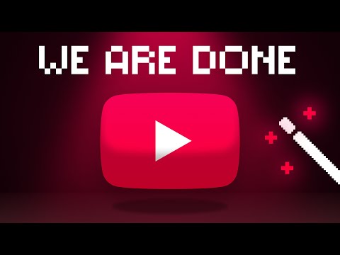
I Redesigned the ENTIRE YouTube UI from Scratch
1.09M views4091 WordsCopy TextShare
Juxtopposed
💫 Try Brilliant for free for a full 30 days: https://brilliant.org/Juxtopposed/ You’ll also get 20%...
Video Transcript:
YouTube the world's most popular platform for sharing videos like this one Home to some of the best content on the internet YouTube used to have a unique design style throughout the years for example sharp corners and lots of red everywhere with a memorable layout but recently it's more rounded out. become more gray, and added a bit of pink we often forget what the "You" in YouTube means it means YOU You guys are the users so I asked you guys about your problems with YouTube and oh my God guys what have they done to you? rest
assured I read all your messages and put my own experience as something of a YouTube user on top of it so here's my redesign of YouTube let me know what you think about it in the comments YouTube's branding was always so simple and elegant Red for the main color and Roboto for the font but recently they made a teeny tiny change to this red and made it a bit pinkish they also put more pink in different places which is fine and I'm not going to change that because we've got way bigger things to worry about
like the icons Every god-forsaken set of icons on this website has a different style some are sharp, some are rounded. there are different icons for the same thing, and the same icon for different things then the icon size doesn't make sense or the icons don't align with each other let's just use these beautiful Google Icons perfectly engineered for all use cases on YouTube the inconsistencies go from icons to entire Pages what if I told you that both the old Channel design and the new one exist on YouTube at this very moment yeah seriously just go
to an explore category like gaming and click on an autogenerated Channel this needs to be fixed so we'll just use one style for everything on any layout and device I find it funny that YouTube used to have a got tier layout and at some point it just went downhill like how about we don't put the trending and stuff all the way down here and instead bring all the explore options to the top because everyone uses this all the time and instead of having these duplicates just make it easier to find something as important as settings
but putting it out here then we have a list of subscription taking so much space and being so useless you know what's useful seeing a list of all my subscriptions well where's that oh it's like right here you just got to expand this list and uh scroll and scroll and uh just about now yeah yeah yeah just a little more huh it's here and congratulations while you were busy looking for a list of your subscriptions you saw a list of all your subscriptions look at this mess subscriptions here is a feed that could literally just
be a filter on the homepage subscriptions here is a long list and subscriptions here is a useless button to another featur less page Why Don't We Just merge them all together into a proper dropdown and an actually useful page that we'll get to in a bit and look I don't know what this blue thing means okay bring back the numbers and since there are these Channel profile cards in the comment section of videos allow us to get them all across YouTube including the sidebar on mobile there's home shorts subscriptions you and this annoying little upload
icon as if the average YouTube user needs to see and misclick it every second just like desktop we need a homepage a quick swipe to reveal the explore options a shorts page if you insist subscriptions and instead of a u page with all the account settings mixed with the activities on YouTube let's have a library page with your activities and an icon for your account stuff on the top to match other Google products finally I want to make it easier to search so I'll replace the upload icon with it and yeah I might take some
time to get used to it but at least the hitbox would be bigger and it would be much closer to your thumb now that we have the basics in let's start our exploration by merging all these categories in the sidebar into one explore page I'm getting two birds with one click one you get to the trending and explore faster and two these other categories get some exposure too by having a preview of them in different rows now let's put the trending videos all the way on the top with more than just one row this way
you'd get a good sense of what's happening everywhere and if you'd like to explore more you can view all when I was looking at the explore options I felt the empty space of one category that would really be cool and I wonder why it doesn't exist technology duh like where are all these Tech news and stuff supposed to go think about it YouTube the issue with the YouTube homepage is more than just design the homepage is a sanctuary for all of our own interests one of the most personal things about a human and look you
watch one video and your feet gets swarmed with that topic you might tell YouTube what you like and what you dislike and there's no way to know if YouTube is actually updating it for you to fix these problems YouTube could simply leave it to you to build your feet only if there was a little icon in here that opened your eyes to the magical world of choice so you normally go about your exploration on YouTube and YouTube adds these tags for you based on your interests and you can filter out the content on your feed
by clicking on them normal stuff but if you ever want to modify a tag that YouTube chose for you you can use this just enter a tag that you want to watch these tags could be topics content types channels and so on so here are all the posts from your subscriptions it goes the other way around too you don't ever want to hear of something just mute it don't like shorts on your homepage completely exclude it if YouTube has any suggestions it can show them here at the end of the list and if you'd like
it you can confirm it now to increase engagement there would be these types of boxes like here are some videos you might have missed from your subscriptions or here are some videos based on what you've been watching recently and it could choose to show more of them and accept them as a defining tag on your feed or let YouTube know that just because you watched something once it doesn't mean that now your interest switched 180° to that topic now let's watch this video yeah literally this video this is the most important page of YouTube I
mean this is YouTube and we're all used to this layout more or less videos up here comments down here and suggestions on the side as someone who designs I'd say this layout is pretty inefficient cuz if you want to read the comments you scroll completely out of the videos so by that logic it would make sense why YouTube decided to test this design a while back but as a human and someone who uses the the site I'd say it looked bad and kind of introduced more problems than it was trying to solve for example comons
had less space to grow so we had to scroll more and related videos has so little space and that's why it made everyone mad so let's stick with this familiar face and fix its problems instead like whatever kind of abomination this is why is channel name repeated here the view count and publish date are written so close to the style of the description that makes them harder to see and this isn't even the actual date why don't we bring them up next to the main info about the video and free up more space and while
we're here can we talk about how misunderstood YouTube is about watch later it's not a playlist it's me saying I don't have time now and I want to remember to watch it later so don't give me this ppup instead let me do it with one click so later when I finish watching the video I'd see this huge reminder so I could remove it if I don't want it piling up in my watch later list and finally about dislikes I say bring it back but bring it back for everyone including the comments have you noticed that
the comments never had a dislike counter it's because back in the early days YouTube integrated Google's social media site called Google+ and on Google+ there was only a like button or plus one and no dislikes so the YouTube dislike for comments was just a shell of a button I think it's time to change that but guys try to love each other life is just too short listen I love the YouTube comment section so much I just can't wait to not be able to follow who's replying to who to fix that let's make each comment a
thread of replies and make it easy easier to open and close each reply and instead of this icon that shows the content creator has replied to a comment and make it harder to find where the comment is make the content Creator's first reply visible right underneath but the comment section itself is so deprived of features like instead of a whole new layout how about we just add some filters like top comments based on interactions and replies most like comments newest timed and topic comments and definitely a search box because a browser search doesn't search all
the replies it just search is the stuff that's already loaded on the page up here you can see that this video has a live chat box and video suggestions clicking the live chat box opens this up this Box gives so little space to the chat and makes it so annoyingly hard to follow so if YouTube wants to compete here it has to make the chat take the whole page and add these tabs up here to switch to suggestions or transcripts then the chat itself is very crowded especially with all the profile pictures and there's not
enough contrast between the users and their message and if you tag someone it's the same color and font style how about we grab the color of each user's profile and put it on their username then delete the profile pictures and put some contrast in here another frustrating thing is that you can't watch the live stream in full screen while reading the live chat like the chat is half the fun instead there are these three buttons in full screen that well one of them doesn't even work and then surprisingly there is a oneclick watch later here
as you've dedicated your whole screen to watching this video right now and not when you're passing by this video casually make it make sense YouTube then this share button doesn't even use the YouTube Share popup it's just the operating system one instead what if we put a chat icon while in full screen that open the sidebar with the chat and if you want the suggestions too so you wouldn't have to get out of full screen mode when you're just casually watching your recommendations but now that we're on the video let's talk about it controls this
is extremely cramped and the Order of options is pretty bad like the video quality is much more important than these others it's kind of something you want to keep an eye on as well so let's bring it out here then let's merge all all these extra options up here and open them in a new overlay now we can add any more cool settings like how about an audio Channel selector or a setting that makes the video sticky so when you scroll down to the comment section you can both read the comments and keep an eye
on the video I mean let's be fair I can't watch the video while reading the comments but when I leave the video for the homepage it brings up the mini player anyway to continue watching the video speaking of this Min player especially on mobile YouTube excuse you but what the hell is this there is not a single reason I can think of that this needed to be done has it ever occurred to you that maybe the mini player is just one of the ways for us to close the video and I know you want us
to keep engaging and not close the video by making the hitbox smaller than what it used to be but just because you want us to stay on the video it doesn't mean that you should make it harder for us to leave it cuz if I want to leave it I will but this is just going to make me annoyed just revert this Min player to what it was before and please don't change for the sake of change huh the way she removed the comment section what really why would you allow the video to be spoiled
for me either these timed comments shouldn't be there before you open the comment section or the comments should just be an icon which might actually hurt engagement and you might not see an important comment that you wouldn't want to miss you decide which one would you prefer now since I really like this rant from this Creator I'm going to subscribe and for notifications I'm going to uh what does personalized even mean if I'm not the person personalizing it let me choose which type of content I want to get notified about all of them only some
of them or or none Now That's What I Call personalized personalization wait what take a break from YouTube fine I guess now's a good time to introduce you guys to brilliant today's a sponsor so what is brilliant brilliant is where you learn math programming and Science by doing things okay so what is brilliant about brilliant well the fact that you can just solve problems get points and do it every day to build a good habit or the fact that it has a mobile application so you can literally learn anything like a new math lesson anywhere
you are on the go brilliant I've been practicing my computer science skills on it for a few minutes every day for a while now and it just makes me feel so productive you two can try BR in for free for a full 30 days and get 20% off an annual premium subscription wo now ain't that brilliant just visit brilliant.org toost by scanning this QR code or clicking on the link in the description now back to YouTube a YouTube channel is probably the second most important part of YouTube and it's also the second worst thing about
it especially since they changed this flawless layout to the this new one where they made the banner a bit smaller wasted more space on the page and hid information behind popups like a Creator's links used to be up here now there's only one Link in this tasteless style of a full URL I understand that they removed the links from the banner to make it harder for people to leave YouTube but believe me that is not the reason people might leave YouTube then this entire info section is just so crapped pull the profile picture up organize
the text a little better bring the Subscribe button to the right and that's it now we can pull the rest of the page higher on here let's bring back two important tabs that had no reason to be removed channels tab which showed featured channels and the about page I mean there's so much space here in the full page and we don't even need to scroll as often and to be honest Channel views being up here and more visible made people care about it and creators celebrated it more now YouTube you want engagement don't you so
on the Home tab add two sections in case you missed including both videos and posts that you might have missed from a Creator and because posts don't get as much attention allow YouTubers to add a section to their homepage for posts and posts don't have to be linear necessarily they can be a grid or they can have some sorting options by the latest popular or the oldest or the Creator can pin a post finally we should be able to search everything on a channel from videos to posts and playlists and hey can we have a
way to search channels on mobile too cuz that'll be like the bare minimum thanks after you subscribe to a channel it takes a lot of commitment and dedication to make sure that's not the last time you see the channel one of the reasons is YouTube's algorithm and the other is design we made subscriptions a bit easier to access on the sidebar before but now it's time for the page this page should definitely be something manageable in every aspect like you should be able to see how many channels you're subscribed to or have a list of
your subscriptions in both a grid and a list that expands to see the latest content from every channel you should also be able to see all their content in a feed kind of like the homepage this feed could be random like this or in the shape of a timeline so that's why up here you can have all the V modes filters and seting options now I want to make subscriptions even more manageable so I suggest putting channels into collections for yourself like a gaming collection design collection Tech collection and so on on the sidebar you
get a collections drop down and if you click on any collection you can view it as a feed of only gaming content oh I wish everything else was this manageable say library you're like library has your history watch later liked videos playlists downloads clips and so on on mobile it's kind of a mess cuz watch later and liked videos are treated like a playlist and therefore not as easy to access watch later and liked videos should be their own rows on desktop you have this library page that really is just a bad version of the
current mobile page cuz why is there another Switch Account thing here was this page even necessary if I already have all the options in the sidebar these sections themselves lack the most basic sorting or filtering like look at my history okay maybe don't look too carefully once I want to see what the oldest video I watched or a certain video on a certain date I'm literally cooked it's as simple as adding a bunch of filters and giving it a grid view so it's easier to go through the timeline now just take this recipe and apply
it on watch later liked videos playlists and so on and out of all these playlists deserve to be drop downs in the sidebar so you can click on one and instead of taking half the page on this side for nothing just turn it into a box up here here with full info about the playlist like total video duration more filters and the search bar plus it would be amazing to select videos and take bulk actions on them oh look we have a notification actually I think one of my friends would be interested in this video
so let me share it I wish there was a way to send YouTube videos to my friends directly on YouTube itself YouTube is not a social media sure but one of the things that hurts YouTube is the fact that you cannot share things with your friends on it there was a private messaging feature but they removed it for a lot of reasons so considering the fact that they're probably not bringing it back what if we just used an existing functionality so we know that there are no friends on YouTube you have an account privately and
you have a channel publicly so you can follow your friend and send them videos but what if you could both subscribe to each other and turn each other's notification bells on this way when you want to share a video a couple of friend profiles come up alongside other sharing methods and you can send them a video which will appear in their notifications and that's about it now let's check out this short my friend seny YouTube shorts is a weird place they kind of care about it too much and they kind of don't cuz if they
did they would make the shorts page more like the homepage with tags and shorts in a grid so you could pick out whatever you like they would let you go back and forth in a video using the arrow keys or there would at least be an autoplay option I get that YouTube is trying to make shorts a thing like Tik Tok or Instagram reals but it just feels kind of forced and filled with 10 shocking facts that will shock you the game theorist has a really cool video about this so make sure to check it
out YouTube search is used way too frequently to be this bad like there's a few results and the rest is just recommendations just show the search results jeez and then if you want to filter through the results they take one click to show up every time and the popup disappears after selecting every filter what if we put all the filters out here and added enough options like a certain date range or videos below 1 minute and so on the fact that there aren't enough date filters is actually funny cuz a while back someone shared on
Twitter that you can use operators in your search exactly like on Google for example mall before 2006 and suddenly everyone started using this method making these videos surface again so yeah give us some good filters YouTube but mostly stop hiding the filters on mobile in more options in what world is the screencasting more useful in the search page than filters bring them out here and make them more accessible all this redesign made me hungry let's grab a bite and watch some YouTube hm now what do I watch wait you know what would be like really
cool if there was a TV mode that just played videos for you back to back in different TV like channels like tech gaming Vlogs cooking and basically every other topic there are websites that let you do that but I want it to be on YouTube and I want to see the channel name and everything maybe I'll randomly find a Creator I like I mean the best content is found here on YouTube so I hope they give it the design all these amazing people deserve both users and creators putting these all together together meet YouTube videos
from around the world in a home built by you explore all the latest trends in one page watch YouTube in an all new clean layout like the video send it to your friend like the Creator subscribe organize and build your own collections boarded well don't be watch something new on TV mode oh look it's rewind time your rewind your experience your tube well that's all for this video if you liked it make sure to do your magic down below and and see you on the next one
Related Videos

19:27
I Redesigned the ENTIRE Spotify UI from Sc...
Juxtopposed
1,925,226 views

27:50
I Trained an AI for 2 Years on Trackmania....
Linesight
1,591,583 views

25:54
The Satisfying Downfall of OnlyJayus
Internet Anarchist
2,965,383 views

14:34
I Redesigned the ENTIRE Instagram UI… But ...
Juxtopposed
762,844 views

15:54
Why Dumb Ways to Die is a Masterpiece
Fort Collins Productions
744,153 views
22:04
The Genius Way Computers Multiply Big Numbers
PurpleMind
293,815 views

26:09
Stromae n'a pas retenu la leçon.
VinuVita
772,950 views
22:14
i made the same design in every program ever
elliotisacoolguy
2,329,708 views

11:17
I Redesigned Wikipedia JUST to MAKE IT MONEY
Juxtopposed
404,933 views
33:03
Why Some Designs Are Impossible to Improve...
Design Theory
2,350,506 views

20:34
I Redesigned the ENTIRE Steam UI from Scratch
Juxtopposed
901,389 views

24:28
How I made a 3D Level in a 2D Game
Spu7Nix
5,311,141 views
12:19
I Redesigned the ENTIRE IMDb UI from Scratch
Juxtopposed
213,294 views

21:45
Why You Can't Bring Checkerboards to Math ...
Wrath of Math
485,866 views

29:13
Critics Don't Understand Video Games
Just1n
197,458 views
35:46
What Happened to the World's Largest Tube TV?
Shank Mods
2,572,810 views

24:12
I did Duolingo for 2000 days. Can I speak ...
Evan Edinger
2,174,982 views
12:02
viens, on teste des manipulations débiles
overfl0w
181,599 views

28:08
the Rise and Fall of Adobe
Jazza
661,091 views

19:32
I paid 5 designers on Fiverr to create a c...
Mel Torrefranca
858,053 views