Principles of Graphic Design
350.38k views5590 WordsCopy TextShare
Mark Simpson
UCLA Luskin School of Public Affairs
Video Transcript:
[Music] hello there my name is Mark Simpson and today we're going to be talking about principles of graphic design in introduction to strategies of visual communication this presentation is broken up into three broad sections the first is an overview of the theories and principles of graphic design in the second section we'll look at some digital workflows and the information that you're going to need to know when working with graphic design in a digital environment and the third and final section will be a quick tutorial in Microsoft PowerPoint on strategies for improving the readability of charts
and graphs so design theories and principles the first question we should ask is what is graphic design and graphic design is broadly defined as the art of visual communication through the use of text images and symbols but what does that really mean there are generally thought of to be three major aspects to graphic design the first is layout uh or in other words how text images and photographs are arranged on a page uh the second is color uh color can do a lot to communicate uh the overall tone or mood of some graphic design project
and the third and often overlooked part is typography which is the selection of type faces um um so not only if it's siif sand serif but how chunky it is how light it is uh it's also something that can sort of very subtly communicate a a a mood of a project and so just some things to keep in mind uh first and foremost whenever you're starting a graphic design project it's really important to know your audience and the goal of what the piece is um there's a big difference of if a project is going to
be on a poster or a postcard or on a billboard or a pamphlet or a slideshow at a you know academic conference before you start anything you need to know who you're going to be delivering this message to and how it's going to be represented secondly good graphic design is all about good communication and as a graphic designer you're going to be using order and Clarity to make information that can be really complicated really simple to understand and finally one thing that I think uh for novice designers is the feeling that you don't know what
looks good or when it does look good and I'm here to say that you can build a kind of design intelligence or intuition through practice so it's always a good idea just to work on some projects to try things out and uh over time you'll start to develop um you know a real sense of taste of what looks good and what doesn't I've broken down the key rules in Concepts into six uh broad categories uh balance proximity alignment contrast white space and keeping it simple and I I think if you adhere to these six principles
as I'm about to explain them you'll have great success in your graphic design projects so the first thing we're going to talk about today is balance which is the visual waiting of objects on a field uh the first type of balance is symmetrical balance and so here we have three rectangles uh organized vertically and you can see that they're centered they're equally spaced uh it has a a real sense of um yeah overall uh balance and order that is can be uh thought of as very pleasing to the eye you have to be careful sometimes
with symmetrical balance because if you do it too much sometimes it can come across as being kind of Bol and boring but it's a really good starting off point is just to keep everything symmetrical asymmetrical balance uh is also a viable strategy and in this case we have these two vertical rectangles with three little horizontal rectangles and so while it's obviously weighted to the left side it creates this kind of tension it's important to keep in mind that actually the three triangles or I'm sorry rectangles on the right side are still adhering to the overall
proportions of the other rectangles so even though uh they're different they're still working within an existing framework uh and so it's important to keep in mind that if something's asymmetrical it's not necessarily chaotic you're just creating a bit of tension by uh distorting or modifying the relationship between objects on a page but it's not just it's not utter chaos finally radial balance is another great strategy when you're designing or uh create working on a project uh you can order things radially around a Center Point um it can be quite distinct from a a balanced or
an asymmetrical organization and and can be really eye-catching so keep that in mind proximity so proximity is the grouping of and shaping of objects on a page and keeping like things together and unlike things separate and so what that looks like is um here are just some like abstracted forms on the page but you can see that by putting the lines next to the lines and putting these hexagons next to the hexagons and in get the concentric circles within each other it becomes very uh clear uh that there are three different groupings uh and and
they're like that because they're next to each other and and this would be reading much differently if uh everything was just spread out over the page and there was no overarching order so when you working with any uh graphic design project you're going to want to keep similar things together and and different things apart or at least to be conscious of it alignment is a really key key concept to good design it's about all about keeping objects in line with one another and so here we have some objects on a page and and they're kind
of just strewn about um kind of lazily there wasn't a lot of attention to detail there's no real order uh none of the edges are aligning and you can see that the center uh vertical rectangle is there's different spacing between the horizontal elements to the left and to the right um so it's just uh it's just kind of all over the place and looks really disordered so the easiest way to bring order to a layout on a page is to put a grid on it and then to snap all of the objects to the grid
and so what that does is it aligns all of the edges and keeps everything equidistant in spaced and so what's really nice about this is that even after we take away the grid lines it just looks much more ordered much more contr controlled there's a sense of uh uniformity uh in this arrangement of objects that wasn't there before and I think that in any design project any graphics project you want to avoid the appearance of having made arbitrary decisions and so anytime you can uh put order onto a thing you should and one of the
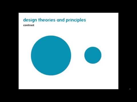
quickest and easiest ways to do that is just to use a grid to keep everything organized in line contrast is the next concept and that's the concept of creating distinction by highlighting differences and these differences can be in many different forms you can have different weights of text between a bold and a light you can have different shaped objects a big object versus a little object or even a a color you can have something that's full or something that's empty and by using contrast it allows you to create uh distinctions between objects so if you're
organizing things on a page by uh by creating these differences um they become highlighted and our our our eye just really snaps to it and immediately recognize that these two things are different and you don't even have to use any words or any text to communicate that idea whites space which is also known as The Art of nothing uh is the idea that not everything on the page needs to be filled up it's okay to have some void spaces to have some empty spaces to give some breathing room to your work um so and here's
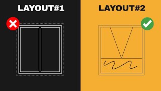
another example where our eye reads the triangle on the page even though the triangle doesn't actually exist like there is not a triangle that's drawn on the page but by seeing the three points and because they're in line with each other off the center points of these circles our eye jumps to make the assumption that that there is a triangle there and so this is important to keep in mind when you're laying out things like charts or graphs um or text boxes they're probably isn't a need to put everything in a distinct box I think
that the often there's a this impulse to just uh give everything a thick heavy Border in order to delineate sections and I think that there are opportunities for other strategies and how you arrange objects on the page so that the edges and borders implied you don't necessarily have to to draw them in order to communicate them and then I I like to show this as an example of a really successful use of Whit space this is a a Volkswagen ad from the' 60s and you can see that they're they're really using all of that white
space to their advantage to to highlight how small the car is so you have this one object drifting in this sea of void uh and it's it's really effective and and I think it reinforces this notion that to have a good graphic design project you don't necessarily have to fill up the page uh with content it's it's perfectly acceptable and and sometimes preferable to have some breathing room so it becomes very very very clear and uncluttered and just not not busy so so don't be afraid if there's if you're laying something out and there's an
empty space and you don't know what to do with it sometimes it's okay just to leave it blank uh leave some breathing room and finally keep it simple uh this could be the Mantra to live by in any graphics design project you want to avoid overwhelming amounts of colors or objects give some breathing room on the space or G some breathing room on the page and you should always be asking yourself what am I representing and how am I representing it uh who is my audience and how are they going to receive or infer what
I am suggesting to them um and so sometimes this means that you can simplify the data or the objects that you're representing to to just what really matters to your audience you don't necessarily have to include all the details if including all the details means that your main items become uh inscrutable and unrecognizable and finally that's a related point is you should winow away Superfluous information in details particularly if you're working in a poster or printed Media or a slideshow where you have a li amount of time you have a limited amount of space you
really need to think about the being a good editor and pairing down your information distilling it so it becomes very clear and very concise okay let's move on to digital workflows we're going to be talking about some of the tools that that we use and the and the rules that apply to working in a in a digital workspace so the first thing we'll talk about about our software Suites uh there there's two main software Suites we're going to talk about today the first is Adobe Creative Suite which is the industry standard for pretty much all
design work graphic design work uh the three we're going to be covering here today are Adobe Illustrator in design and Photoshop uh these programs are they really set the bar for uh graphic design projects and anyone who does any kind of graphic works is is very well versed in these programs so if you're interested in doing this kind of stuff you should really invest the the time to learn it I'm also going to talk a little bit about Microsoft PowerPoint only because it's the most ubiquitous Graphics program out there on the on the market uh
it's the default slideshow presentation in Microsoft Office and it can be used not only for slideshows but also for printed materials as well um the interface tends to be a little bit clunky the options are limited but because it has that wide uh acceptance and uh usage you're much more likely to find uh other professionals on your team who know how to use PowerPoint but don't know how to use Creative Suite so it's a good idea to really know how to work with that program and uh get the most out of it so let's talk
about these different programs Adobe in in design is a program that is for layout of print doc documents and presentations so it's it's perfect for things like booklets posters slideshows um anything where you're laying out objects art text photographs on a page and you're trying to arrange it into a file format that you know the dimensions of so if you know that you're working with a letter size page or a screen size uh in design is probably the pro program for you this is in contrast to a program like Adobe Illustrator which is a vector
graphics and illustration program uh this is much more versatile for working with Graphics projects where you don't know the final format of the thing you're working on or the thing that you're working on is going to go into a a report or a booklet or on a poster um so things like Maps uh logos charts and graphs uh any kind of like plans or architectural drawings are going to be in a vector format uh because they're very versatile they're infinitely scalable and can be transferred easily from one one program to another and finally the the
last one we're going to talk about is Adobe Photoshop um this is probably the most popular of the programs with in the Creative Suite and as the name implies it's for manipulating and editing photos it's good for renderings mockups uh enhancing images changing images so if you take a a a photograph uh and you need to enhance it or improve it edit it in any way Photoshop is your program and finally Microsoft PowerPoint as I said probably the most popular layout program in the world and it has a limited options and kind of a clunky
interface and a lot of the default settings are just totally bogged down um so it can be kind of frustrating to work with sometimes if you're looking to do really simple layout and design but as I said before because it's so quitous it's a good idea to know how to work with this program because it's highly likely that other people you're going to be working on uh projects with are going to know how to use PowerPoint but they won't know how to use Adobe so it really behooves you as the as a a graphic designer
to know know how to work with these programs okay so file management might not be the most uh exciting topic but it's important to understand I think of files in two broadcast broad categories working files and finalized files uh your working files are native to the program that you're working with and these are the files that store all of the necessary workflow information like uh the metadata uh text photos your document properties things of that nature and then your finalized files are what are exported from the working file so when you're working with a program
like an IND designer illustrator you're going to have your working file that that you you are going to be editing and you are going to be working with and then when you're done working with that project and you need to export it you're going to you're going to convert it into a finalized file and that will allow you to send it off to anyone with a computer and they'll be able to to see your work as you've intended to display it so here are the different programs with their different working files and their finalized files
uh with InDesign it's intd uh or indl which is for um templates uh and you you'll export as a finalized file as a PDF uh and then illustrator has AI uh and that gets exported in many many different ways jpeg PDF sfg EPS just to name a few uh Photoshop is a PSD and you can export into uh uh many different types of finalized files like a JPEG or a tiff or a PNG and then finally PowerPoint has a working file of PPT or pptx and you want to export that as a PDF or a
JPEG and and the reason particularly with PowerPoint why you want to be exporting it uh in a finalized file format is because if you send a working file to someone not only can those files become really big and unwieldy in terms of size but also in order for all of the information in your PowerPoint file to be just displayed correctly the person who's opening your file has to have all of the same type faces all the same settings and if anything changes it can change what your what your uh type faces look like what your
alignment looks like everything can go Haywire versus when you export something into a finalized file format it sort of becomes like fixed and Frozen in time and universally viewable regardless of the program that the person is the that you sent it to is viewing it in so always always always what ever program you're working with always send and uh work with finalized files when you're when you're exporting them to someone else colors are really important when you're working in a digital environment there there are two main color profiles that are used in most graphic design
projects cmk and RGB uh cmk is generally used for print projects and RGB is used for anything that's on a screen or on the Internet that just doesn't get uh printed into the real world uh and it's important to keep your color profiles consistent in order to avoid any nasty surprises and what that means is if you're working with a cmk file like something that you're going to be Printing and you bring in something from an RGB color space that RGB color might translate differently and so when you print the thing it's going to look
different than how it looks on your screen because your screen can display both but when it in that translation into a a cm y k uh it might change dramatically so it's always a good idea if you're working in cmk to keep everything in cmk and then conversely if you're an RGB just keep everything RGB so here we have CMYK cyan magenta yellow black used primarily in print projects versus RGB which stands for red green blue which is used primarily in screen projects so any like digital if it lives on the web if it's just
going to live in email it's not going to be printed just stick with RGB there are two types of digital artwork uh Vector artwork and raster artwork uh Vector artwork is infinitely scalable and is used mostly in in things like logos and Architectural drawings uh it's very handy because it is infinitely scalable you can take it and it will look the same if it's on a business card or if it's on a billboard and then by by contrast raster artwork is pixel-based and it's used primarily in photographs so let's look at these two so here
we have an example of a vector and so you can see it's all smooth edges with fills uh there's no Jagged edges um or saw too a Sawtooth look at any any of any of the divisions between colors and that's because vectors are consist of points and paths that have a proportional relationship and so what that means is when you draw a curve in a vector the actual distance between the points isn't as important as the relative distance between the points and the curvature of the path so what that means is that the the the
line that you draw because it's like a proportional mathematical relationship if you double the size it just doubles the distance between everything so it's infinitely scalable very flexible uh and it's primarily used an illustrator a little bit in InDesign and then put this in contrast with a raster which is a flattened image consisting of pixels and so you can see here how there's a jagged uh sort of Saw tooth look around all of those edges and that's because when you're working with rasters uh it's effectively a grid of pixels where each little square has its
own color value and that color value is fixed in space so what that means is is as you scale uh that pixel grid up and down the the size of the pixels will change but not their relationship to each other uh and so if you zoom in too much you're going to get this like real pixelization um so it's it's used primarily for photos any any print program once you move away from a digital environment into a a printed format it will convert your vector artwork into a raster um so just keep that in mind
when you're when you're working with print if you're working with low reses images it can get you in trouble so let's talk about that now image resolution it is incredibly essential that any image you use in any project has the necessary resolution to be crisp and clear what that mean that means that for a print project you want a 270 DPI which stands for Dots per inch or sometimes you'll see it as PPI which is points per inch or 72 DPI for screen the final size of a image in a print media will be dictated
by the number of pixels in the image so let's take this adorable photo of this kitten as an example here it is really crisp clean you can see everything looks great but as it gets pixelated you see it gets really muddied uh it becomes hard to see you lose a lot of the lines it just it just looks really bad and if you put this on your website or a print document it just looks really amateurish like you don't care so we want to avoid this at all costs so how you compute the necessary pixels
is by thinking about or deciding on the final size that you want the image to be so if I was designing let's say a poster and I wanted to include this image and have it be four inches wide by three inches tall I would just multiply those numbers by 270 DPI and that's going to give me the minimum number of pixels necessary in order to print a high resolution image so for the 4in edge If I multiply that by 270 DPI it would have to be at least 1080 pixels and then by contrast on the
3-in side If I multiply that by 270 it' have to be 810 pixels so in order to have a crisp and clean image that's 3x4 in in a printed format I would have to have no less than 1080 by 2 1080 by 810 pixels you can always have more pixels but if you have fewer pixels what's going to happen is you'll get that pixelization those Sawtooth edges that muddy appearance that just looks really amateurish and like you don't care so always find images that are big enough to fit the format you're looking for okay and
so now we're gonna transition to a quick tutorial in Photoshop uh about improving the readability of graphs okay so now that we've reviewed the theories and principles of good graphic design let's put some of that to work I made this chart uh and basically broke every rule that I just explained in the last half hour um so we could see what it would take to pair this graph down and to get it uh to a place where it's would be more attractive and would fit in a report or presentation or what have you so first
thing is never ever ever put a background on the graph it sort of creates this artificial border around uh the graph and the thing to keep in mind is that this uh data set is going to be included in whatever report you're working with and you're going to want it to blend with the document and if you have some weird background um it's not going to fit so just double click on the background and then in the solid in the fill just put no fill um and then also get rid of any other extraneous backgrounds
uh a lot of default in so the next thing is a lot of the defaults in Excel have these drop shadows and these color effects I think these are super distracting and it sometimes makes it hard to read the data if these get like really extreme so uh I would definitely get rid of those so you can just click it and go up here to format and then with these effects like that shadow just say no Shadow and uh it's a bevel right now no bevel just get it to be like a simple simple chart
so I'm going to come in here no Shadow and get rid of that bevel so the data is just very clear where it sits on the graph there's no like gwiz wow anything that you're trying to do you just want simple presentation of data let it speak for itself uh the next thing is you don't need two legends uh your colleagues and anyone looking at this graph uh will be smart enough to know that what's on the x-axis corresponds with the color bar and you don't need this this is totally Superfluous it takes a bunch
of space so just get rid of it the next thing I would say is the vertical and horizontal lines on the graph can be really distracting and tend to be wholly unnecessary cuz I don't need these vertical lines to separate These Bars because the bars are already plenty separated with enough white space so you can just like click on those give it a double click and turn those off um yeah the minor grid lines you definitely do not need any minor grid lines uh I'm going to get rid of these little guys and again I'm
just double clicking and then going to the fill menu now now these you might want uh I think you could get away without them so we'll see what that looks like if I select these guys and double click no line like you can still see where these bars are relative to this axis so it's not entirely necessary um but maybe you do want to have them so if you double click I would just say dial down the the brightness of it so pick a really really light gray just so it sort of like melts into
the background uh that's looks much better already when you have an access uh like on these ver this vertical axis with these values we don't need this level of specificity it's two decimal places is too many so just double click on that guy and go to your number options over here we'll let this load and what we're going to want to do is just crank down the decimal places to zero cuz you really don't need that and again with this uh these tick marks on the X and the Y AIS I'm just going to really
want to dial down that line right now it's a it's a dark gray I'm going to make it a very very light gray so it's there but it really starts to recede into the background so it's not distracting from your data which is the thing that you really want not to show off and even for um even for these values I might come in here and uh see if I can't make those lighter gray just so they start to they just start to to melt away into the background because the thing that I really want
to emphasize is the data points and not necessarily these lines when working with any any data or any labels like get rid of your bold have them be all consistent there's no reason to have bold text one other the other um and then finally with the colors uh this is Too Many Colors there are four different colors uh if my survey response was uh Pizza is the best what I might do instead of having four different colors is I might uh select each of these guys and fill it with uh maybe like a dark gray
color and then when I click on my pizza one I might give that a a pizza color so that way it really pops and then I'm just going to dial this back because it's still even that full black sometimes I find myself oops excuse me sometimes I find myself using um just Grays just a lot of Grays and I I won't even use a black except for the label so now we can see it's very clear at this point I might even get rid of these lines just because it's pretty clear what's happening uh I
don't need to tell the difference if like this is like 29 or 28 versus like 34 or 33 it's just clear that pizza is number one uh and you can actually get rid of this axis entirely if you apply labels directly to uh the charts so if you come in here and make a word box uh you can Define this as let's say 34% and then just put that directly directly on the label and so then if I did this for everyone maybe just for clarity sake because it's kind of hard to read that black
on the red I might make this a white and then I'm just going to hold down the ALT key to make a copy of these guys and then you can just sort of enter the values for these and again this is really quick and dirty if I was really preparing this for a presentation I would take a lot of time to ensure that all of these were in line with each other that they were centered where they needed to be centered and there you go so now we've taken off all the Superfluous information uh depending
on the color palette that I was using in the larger document you know maybe this would be like my main color and then these gray bars could be my secondary colors my type faces would match the other type faces I was using to figure out the document uh and so we see it's like it's a huge change and it looks way better and we can compare it to what we were given which was just like which was just a mess uh really hard to read really super distracting and whereas this is like very clear tells
the story Pizza is number one one uh it would fit really well in a uh presentation format this is really chaotic there's just a lot going on uh it's kind of glaring on the eyes and just like isn't isn't really easy to read um I would even go into here and say delete and just get rid of that and then shift all these labels over to even further further make a minimalist chart uh but there's no reason to include lots of information if you don't need it so as we said at the at the at
the beginning of the presentation keep it super simple only include the information that you need to include and just know that a clear simple presentation of data is going to tell a much more convincing story than one that's weighed down by Superfluous amounts of information so hope this was helpful uh there's lots of other resources available online if you do a quick Google search or log on to linda.com they have a lot of great graphic design tutorials uh thanks for watching I hope this was helpful
Related Videos

Autumn Porch Vibes 🍂 Enchanting Jazz Play...
Cozy Jazz Ambience

October Jazz: Sweet Jazz & Elegant Bossa N...
Cozy Jazz Music

21:47
The Principles of Design | FREE COURSE
Envato Tuts+
1,253,474 views

35:05
The Basic Principles Of Graphic Design | F...
Kittl
37,442 views
8:25
The ONLY Layout Design Workflows You Need!
Satori Graphics
19,095 views
40:57
Abstract: The Art of Design | Paula Scher:...
Netflix
2,691,260 views
9:55
10 MIND BLOWING Logo Design Tips ✍️ 2024
Will Paterson
184,899 views

21:04
Complete Course On Layout Design (MASTER L...
Satori Graphics
709,777 views

19:37
65 Design Terms You Should Know | FREE COURSE
Envato Tuts+
1,513,431 views
11:59
Complete Layout Guide
Flux Academy
798,748 views

9:23
grids intro
George Kopec
111,769 views
8:09
The ONLY Advanced Layout Tutorial Designer...
Satori Graphics
38,419 views

13:29
Level Up Your Designs with Aligned Grids 🚀
Will Paterson
29,698 views
38:28
BECOME A GRAPHIC DESIGNER in 2024 Everythi...
HanSelah
89,786 views

50:30
Crash Course on InDesign CS6
Mark Simpson
465,579 views

16:00
So You Want To Be A Graphic Designer? 2024...
Will Paterson
48,796 views

8:28
Where Do You Start as a Graphic Designer?
Will Paterson
222,609 views

2:51:41
Graphic Design Essentials: Free Course
Flux Academy
169,870 views

10:01
Learn the Most Common Design Mistakes by N...
Visme
780,306 views
6:26
Beginning Graphic Design: Fundamentals
LearnFree
6,168,480 views