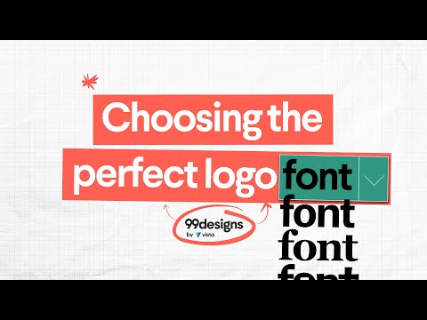
Choosing the perfect logo font | How to find your typographical soulmate
21.56k views503 WordsCopy TextShare
99designs
When it comes to choosing a font for your logo design, it can be tempting to go with something safe ...
Video Transcript:
Finding the one is so hard, especially when you've got really high standards. There are so many out there it can be tempting to settle for something safe and conventional, something your friends and family will approve of. Like Arial or Times New Roman.
I'm talking about fonts, obviously. They can make or break your logo design. But, how do you find the perfect font for your brand?
Your typographical soulmate, if you will. We'll talk through some of the basics of choosing a logo font, and then go over a few fun ones to try. OK, let's get started.
First, determine your brand personality. That's how your brand sounds and feels to your audience. Are you modern and minimal?
Traditional and classic? Powerful and adventurous? How about groovy baby?
Your logo font should evoke those same characteristics. Even if you're attracted to a dazzling new typeface, only use it if you feel like it will help you tell your brand story. It's easy to be overwhelmed by the sheer number of amazing and not so amazing typefaces to choose from.
But narrowing down your focus to specific font families can definitely help. Serif fonts have decorative extensions or feet at the end of each letter,= stroke or stem. They're considered polished and classic.
Slab serif fonts are bolder and louder with large letter forms designed to be seen from a long distance. Script fonts have loops and flourishes like cursive handwriting, and they can be formal, like a wedding invitation, or casual, like a quickly scribbled Post-it note. Sans serif fonts don't have feet and are considered more modern than their serif counterparts.
Can you combine logo fonts? Yes! But make sure they complement each other.
And less is more Folks! Use a maximum of 2 or 3 fonts, otherwise your logo design will start to look busy and inconsistent. Pick the most eye catching font for your brand name, while any additional funds should be more subtle.
You can also use different versions of the same font think italics, bold, or all caps. Need a little inspiration? Let's take a closer look at three fun logo fonts.
Proxima Nova. It sounds like the name of an intergalactic opera singer, but it's actually just a typeface that balances classic geometry with modern proportions. You might have seen it used by companies like Spotify and Twitter, and it works really well with businesses connected to social media.
Bobwlby One SC is a utilitarian font inspired by early 20th century design aesthetics. It works well for brands that want to look ambitious, brave, and even slightly rough around the edges. Do you like vintage posters, twirly moustaches, and Antiques Roadshow?
You might also like Modesta, which stems from the hand-painted signage of the 19th and 20th century circuses. We hope this video has given you some font-tastic inspiration for your logo design. But if you don't think your perfect type is out there, a professional designer can help you make your own.
Oh, fancy.
Related Videos

8:02
What your logo colors say about your busin...
99designs
39,232 views

4:06
How to choose the perfect logo font | Find...
Vistaprint
952 views

6:50
Choosing The Right Font For Your Logo
Graphic Hunters
1,706 views

4:23
The 7 types of logos you need to know (and...
99designs
39,800 views

14:41
Why Your Font Choice Matters: How to Pick ...
Jacqui Naunton // White Deer
8,730 views

7:00
How To Pair Fonts Together | Tutorial
Kittl
8,799 views

4:19
Don’t settle for a bad logo | Learn the 5 ...
99designs
11,147 views

29:35
I promise this story about fonts is intere...
struthless
1,731,436 views

13:56
Font Pairing Tips for Graphic Designers
Megan Weeks
3,169 views
8:26
6 GOLDEN Rules Of Logo Design (Logotype) —...
Satori Graphics
533,127 views

9:42
How To Choose Fonts
Flux Academy
342,410 views

9:42
Typography Guide - How to Choose Fonts
Kayla
6,940 views

8:12
How To Choose The Right FONT For Your Logo...
Will Paterson
78,434 views

10:42
The ONLY 8 Fonts UI Designers Need. Forget...
Mizko
122,504 views
11:25
The 5 RULES Of Logotype Design - Advanced 👌
Will Paterson
45,369 views

5:52
Choose the right font for your brand | Bra...
Canva
21,193 views

13:35
Redesigning Your Logos! (Most Common Mista...
Will Paterson
135,993 views

9:56
Essential Font List for Graphic Designers
Jesse Nyberg
81,066 views

4:48
Stop Wasting Hours Font Pairing - Use Thes...
Satori Graphics
75,814 views
6:01
3 Tools to Help You Choose Fonts for Your ...
Flux Academy
91,847 views