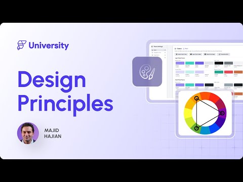
4. Design Principles | FlutterFlow University Expert Training
3.54k views3352 WordsCopy TextShare
FlutterFlow
Mastering Design Principles in App Development: A Complete Guide
Welcome to the Design Principles m...
Video Transcript:
Welcome to the Design Principles in App Development module. Good design is important for the success of any app. It enhances the user experience, and increases engagement and satisfaction.
In this module, we will cover essential topics such as color theory, typography, layout, user interface components, and accessibility, to help you create apps that are not only functional, but also beautiful and accessible. Let's review what you will learn in this module. We're going to go through the Design Principles introduction.
And then we will review color theory in app design. Then we will go through the typography and how to select the best one for your applications. Then we talk about different composition and layout principles.
And then we go through the user interface components and the consistency that matters. We will review the user experience (UX) fundamentals. And we also talk about animations and micro interactions and how important they are to make your applications alive.
We will also go through the principles of accessibility. And at the end we talk about testing, design and how you can make your design to be more effective. And at the end, we're going to talk about testing your design and see how effective it is.
In fact, we're going to talk about A/B testing and other methods that you will learn in this module. Without further ado, let's get started. All right, let's review the fundamental design principles.
Several design principles exist, but let's focus on the top six. Contrast. Balance.
Alignment. Repetition. Proximity, and hierarchy.
Let's break them down. Contrast is a powerful design principle that uses differences in color, size, shape, or other elements to create visual interest and draw attention to key areas. For example, a call to action button in a bold color can make it stand out and encourage user interaction.
Contrast helps distinguish different elements, making the design more accessible and understandable. Balance refers to the distribution of visual elements in a design. There are two main types of balance: symmetrical and asymmetrical.
Symmetrical balance involves arranging elements evenly on both sides of a central axis, creating a formal and organized look. On the other hand, asymmetrical balance uses different elements on each side, but still achieves a sense of harmony. Both types of balance are important for creating a stable and visually pleasing design.
Alignment ensures that elements are arranged in a straight line or grid, creating a clean and ordered appearance. Proper alignment helps to build connections between different elements and makes the design more cohesive. It is essential for maintaining consistency and improving the readability of your app's interface.
Repetition involves using the same or similar elements throughout your design to create a sense of unity and consistency. This could include repeating colors, fonts, shapes, or patterns. Repetition helps reinforce the app's overall look and feel, making it more memorable and accessible for users to navigate.
Proximity refers to the spatial relationship between elements. Grouping and separating related items helps create a clear and organized layout. Proximity helps user quickly understand the structure of your app and find the information they need without confusion.
Hierarchy involves arranging elements in a way that signifies their importance. Using different sizes, colors, scales, and placements, you can guide users attention to the most important parts of your app. A clear hierarchy ensures that users can easily understand what actions to take and where to focus their attention.
Understanding how to use colors effectively can significantly enhance the usability of your app. Colors play a key role in how users perceive and interact with your application. They can evoke emotions, convey messages, and influence behaviors and human emotions.
For instance, blue is often associated with trust and calmness, while red can evoke excitement and urgency. Green is often associated with growth and health, while yellow can invoke feelings of happiness and energy. Understanding these associations can help you choose colors that align with your app's purpose and target audiences.
In the upcoming module, you will learn how to set color palettes in FlutterFlow in Design system. So stay tuned! Basic color theory involves understanding the color wheel, which includes: Primary colors: red, blue, yellow.
Secondary colors: green, orange, purple. and tertiary colors. Complementary colors are opposite on the wheel and provide high contrast, while analogous colors are the next to each other and create a harmonious look.
There are various color schemes you can choose from, including monochromatic: using different shades of a single color, analogous: using colors next to each other on the color wheel, complementary: using colors that are opposite each other on the color wheel, triadic: using three colors evenly spaced around the color wheel. Accessibility is a critical aspect of colors usage in app design. Ensure that your color choices provide sufficient contrast to be readable by users with visual impairments.
Tools like contrast checkers can help you determine if your color combination is meeting accessibility standards. Consider color blindness by using patterns or textures alongside colors to differentiate elements. Here are some tips for using color effectively in your app design.
Limit your palette to a few key colors to avoid overwhelming users. Use color to highlight important elements and you guide user actions. Test your design in grayscale to ensure that it remains usable without color.
Consider cultural differences in color, meaning if your app targets a global audience or local audiences. Typography is a key element that significantly affects readability and user experience. Typography involves more than just choosing pretty fonts.
It includes typefaces, Fonts and readability. Typefaces are the design of the letters, while fonts are the variation within a typeface such as bold or italic. Readability refers to how easily the text can be read, which is crucial for user engagement.
Choosing the right typeface depends on your app's purpose and target audience. Serif typefaces, which have small lines at the end of the characters, are often used in print for their readability in long text. Sans serif typefaces without those lines are preferred for digital screens due to their clean and modern look.
Font selection and pairing are essential for creating a cohesive design. Use up to 2 or 3 different fonts to maintain a clean look. Pair contrasting fonts like a bold header font with a simple body font to create visual interest while ensuring readability.
Readability and legibility are critical for a good user experience. Let me give you a few tips here. Ensure text size is appropriate for different screen sizes.
Use sufficient line spacing to avoid clutter and maintain high contrast between text and background. These factors help users read content easily without strain. Responsive typography adapts to different screen sizes and resolutions.
Use relative units usually and avoid fixed unit like pixels. This ensures your text remains readable across various devices from smartphones to tablets. Accessibility is crucial in typography as well.
Choose fonts that are easy to read for users with dyslexia, avoiding overlay, decorative or script fonts. Ensure text can be resized without breaking the layout, and provide sufficient contrast between text and background for visually impaired users. Here are some tips for effective typography.
Use a consistent typographic hierarchy to guide users. Avoid using ALL-CAPS excessively, as it can be harder to read. Use italic sparingly to emphasize text without overwhelming the reader.
Regularly test your typography on different devices to ensure consistency and readability. Layout and composition are part of creating fluid and cohesive app designs that adapt seamlessly to various devices. Fluid layouts are essential for modern app design.
They allow your app to adapt to different screen sizes and orientations. Unlike fixed layouts with set dimensions, fluid layouts use relative units and flexible grids to ensure your app looks great on any device. The mobile-first design prioritizes the mobile user experience.
By designing for a smaller device first, you ensure that your app is usable and accessible on mobile devices - often the primary means of accessing digital content today, Once the mobile experience is optimized, you can expand the design to larger screens. Grids are the backbone of well-structured layout. They help you organize content in a visually appealing and easy to navigate way.
Using a grid system, you can create a consistent structure that aligns elements neatly and maintains balance throughout your app. We have explored design principles in previous videos, but let's mention the top three layout for your application. Proper alignment and spacing are crucial for creating a clean and organized layout.
Ensure elements are aligned to a common grid or axis and use consistent spacing to separate different sections. This is not only enhances the visual appeal, but also improves readability and usability. Consistency in layout helps users navigate your app with ease by maintaining consistent placement of navigation elements.
Buttons, and other UI components. You can create a familiar and intuitive user experience. Consistency builds trust that makes your app more predictable and user friendly.
Visual hierarchy is about arranging elements to guide users attention to the most important parts of your app. Use size, colors, and placements to create a clear hierarchy. For example, larger and bolder elements can be used for headings, while smaller and lighter elements can be used for secondary information.
Let me give you a few tips for effective layout and composition. Start with a grid system to create a solid foundation. Ensure alignment and spacing are consistent throughout your application.
Test your layout on different devices to ensure it remains functional and practically pleasing. \ User interface features are \ the building blocks of your app's design. \ \ Standard Widgets include buttons, sliders, \ \ form fields, icons and navigation \ bars, and many more.
\ \ These elements are essential \ \ for user interaction \ and should be designed with usability. \ \ Consistency in your UI design helps users \ \ learn how to interact with your app \ quickly and efficiently. \ \ You enhance user \ \ familiarity and trust by maintaining a uniform \ \ look and behavior for similar elements \ across screens.
\ \ Inconsistent UI can confuse users \ \ and degrade the overall experience. \ \ Visual consistency involves \ using the same colors, \ \ fonts, and styles throughout your app. \ \ This includes \ maintaining a consistent color schemes, \ \ typography, iconography, and spacing.
\ \ Visual consistency makes your app \ look polished and reinforces \ \ your brand identity. \ \ Functional consistency ensures \ \ that similar actions produce \ the same result across your app. \ \ For example, all buttons that perform \ the same functions should look \ \ and behave identically.
\ \ The predictability \ \ helps users feel more confident \ in navigating your application. \ \ Design systems are comprehensive guides \ \ defining your app's visual \ and functional aspects. \ \ They include rules for typography, \ \ color spacing, and component behavior.
\ \ Implementing a design system ensure \ \ consistency and speeds up a design process \ \ by providing a reusable set of guidelines \ and components. \ \ FlutterFlow can help you to incorporate \ your design system \ \ simply, which we will do \ in the upcoming modules. \ \ Creating reusable components involves \ designing elements \ \ that can be used across multiple screens \ and context.
\ \ This approach ensures consistency \ and makes your development process \ \ more efficient. \ \ Reusable components can be easily updated, \ \ ensuring changes are reflected \ throughout your app. \ \ One good practice is to create \ small components.
\ \ Compose them together and create a new set \ of components that can be reused. \ \ Here are some \ \ tips for maintaining consistency \ in your UI design. \ \ Develop a design system and stick to it.
\ \ Use style guides to ensure uniformity \ \ in colors, fonts and components. \ \ Regularly review your app's design \ \ to identify and fix inconsistencies, \ \ and involve designers and developers \ in maintaining consistency \ \ throughout the design \ and development process. \ } User experience - or UX design, is about creating an app that is easy to use, efficient and enjoyable.
Designing with user in mind involves understanding their needs, behaviors, and goals and ensuring that your app meets these criteria. Accessibility and inclusivity are key components of UI design. This means designing your app so that it can be used by as many people as possible, including those with disabilities.
Considerations include: providing text alternatives for images, ensuring your app is navigable via keyboard, and designing for screen readers. Minimizing cognitive load involves reducing the mental effort required to use your app. This can be achieved by simplifying the interface, avoiding unnecessary information, and providing clear instructions.
The goal is to make the app intuitive and easy to navigate. Optimizing task flows means designing your app so users can complete their tasks with minimal effort. This involves understanding the user's journey, simplifying processes, and reducing the steps required to complete the task.
Practical task flows improve user satisfaction and efficiency. Animations and transitions can enhance the user experience by providing feedback and making the interface more engaging. However, they should be used purposefully.
Effective animations guide users in the use process and provide visual feedback without causing distraction. User feedback is invaluable for improving your app's UX. Methods for gathering feedback include surveys, usability testing, and direct user interviews.
Analyzing this feedback helps you understand user pain points and areas for improvement, allowing you to make informed design decisions. The iterative design process involves continuously refining your app based on user feedback and data. This means regularly testing your design, gathering user input, making adjustments, and repeating the process.
Iterative design ensures that your app evolves to meet user needs effectively. Animations can significantly enhance the user experience by providing visual feedback, guiding users, and making the interface more engaging When used effectively, animations can indicate actions, show progress, and draw attention to essential elements without overwhelming users. You can use various animations in your app, including transitions, loading animations, and hover effects.
Transitions help users understand changes in the app, such as moving from one screen to another. Loading animations indicate that a process is ongoing, keeping users informed. Hover effects provide immediate feedback when users interact with elements.
We will have a comprehensive module about animations in FlutterFlow later in this course. Stay tuned! Here are some of the best practices for using animations in your app.
Use animations purposefully, to avoid overwhelming users. Ensure animations are smooth and natural to enhance the user experience. Use consistent animation patterns to create a cohesive feel.
Avoid using animations that could cause motion sickness and discomfort. This is very important. Please pay attention to that.
Micro interactions are small, subtle animations that provide feedback and enhance user interactions. Examples include button presses, toggles, and notifications. These interactions make the app feel more responsive and intuitive by giving users immediate feedback on their actions.
In fact, micro interactions can enhance user experience by making the app more interactive and engaging. They help users understand the result of their actions, improve usability, and a layer of delight to the overall experience. For example, a light button that briefly changes color or shakes when pressed provides immediate feedback that the action was successful.
Implementing animations and micro interactions requires careful planning and the right tools. Let me give you a few tips. Use prototyping tools to design and test animations before development.
During implementation, ensure animations are optimized for performance, to avoid slowing down the app. Regularly test animations to ensure they work seamlessly across different devices and screen sizes. Throughout this module, I've talked about accessibility several times.
Accessibility is about designing your app so that it can be used by as many people as possible, including those with disabilities. Ensuring accessibility broadens your app's user base and improves everyone's overall experience. Accessibility standards, such as the Web Content Accessibility Guidelines (WCAG) or Mobile Accessibility for W3C, provides a set of criteria to help make your app accessible.
These guidelines cover various aspects of accessibility, including text alternatives for images, keyboard accessibility, and color contrast. Designing for users with visual impairments ensures your app is navigable for those relying on screen readers or magnifications. This includes providing text alternatives for images, using high contrast colors, and ensuring that text can be sized without losing functionality.
Users with auditory impairments may rely on visual signal and text alternatives, provide captions for videos, transcriptions for audio content, and visual notifications for alerts. This ensures that all users can access your app's content and features. Designing for users with motor impairments involves ensuring your app can be navigated using a keyboard or assistive devices.
Make interactive elements like button and links large enough to be easily clickable, and ensure that your app supports keyboard navigation. Cognitive accessibility involves making your app easy to understand and use for users with cognitive disabilities. This includes using clear, straightforward language, providing concise instructions, and designing an intuitive and predictable user interface.
Avoid overly complex layouts and minimize distractions. And finally, testing your app for accessibility is crucial to ensure it meets the necessary standards. Automate tools check for common accessibility issues, and user testing is conducted with individuals with disabilities.
Gathering feedback from real users helps identify and address specific accessibility challenges. Just like testing in development, testing in design process is also important. It allows you to evaluate how well your design meets user needs and identify areas for improvement.
Effective testing leads to a better user experience and a more successful app. Several methods exist for testing design effectiveness, including AB testing and user feedback sessions. Each method provides valuable insights into how users interact with your app and how you can enhance their experience.
But let's break them down and talk more about them. A/B testing involves comparing two design versions to see which performs better. You create two variations, A and B, and show them to different users group.
By analyzing which version achieves better results, you can make data driven decisions to optimize your design. Typically, to conduct an A/B test, you can use and follow these steps. Identify the elements you want to test.
Create two versions A and B, A is control and B is variation. Divide your audience into two groups. Present each group with one version.
Collect and analyze data to determine which version. Perform better. Best practices for A/B testing includes testing one element at a time, ensuring a large enough sample size and running tests for a sufficient duration to gather meaningful data.
User feedback sessions involve gathering direct input from users about their experiences with your app. This can be done through interviews, surveys, or usability testing sessions where users perform task while you observe. To conduct user feedback sessions, you can follow these steps: Define your objective and what you want to learn.
Recruit participants who represent your target audience. Prepare a question or task for participants. Conduct the session observing and taking notes.
Analyze the feedback to identify common themes and area for improvement. Best practices include creating a comfortable environment for participants. Asking open ended questions, and focusing on a specific aspects of the design.
And finally, the iterative design process. The iterative design process involves continuously refining your design based on testing and feedback. This means regularly testing your design, gathering user input, making adjustments, and repeating the process.
Iterative design ensures that your app evolves to meet user needs effectively. After collecting data from A/B test and user feedback sessions, analyze the results to identify patterns and areas for improvement. Use this information to make informed design changes.
Remember, the goal is to enhance the user experience based on real user interaction and feedback.
Related Videos
30:05
5. Collaborative Development | FlutterFlow...
FlutterFlow
1,846 views

6:53
world's shortest UI/UX design course
Juxtopposed
1,386,526 views
37:11
6. Kickstarting Your Projects | FlutterFlo...
FlutterFlow
3,180 views

1:14:37
#flutterflow News And Updates - With The A...
SamZen | سام زين
107 views

7:01
Top 5 UX/UI Design Tips and Tricks Every D...
uxpeak
156,840 views
1:18:04
7. Mastering Layout | FlutterFlow Universi...
FlutterFlow
3,367 views
51:19
11. Animation | FlutterFlow University Exp...
FlutterFlow
1,645 views

1:20:23
10. State Management | FlutterFlow Univers...
FlutterFlow
2,285 views

35:01
Make Your RAG Agents Actually Work! (No Mo...
Leon van Zyl
18,742 views

19:54
These LESSER Known FlutterFlow Techniques ...
James NoCode
1,763 views
31:09
Make with Notion 2024: Notion as a curiosi...
Notion
5,039 views

8:21
1. Introduction to FlutterFlow | FlutterFl...
FlutterFlow
6,072 views
1:08:59
13. Custom Code | FlutterFlow University E...
FlutterFlow
1,569 views

1:01:06
Make with Notion 2024: Product Launch Keyn...
Notion
7,782 views

22:46
Buildship + FlutterFlow - THE ONLY 2 NO-C...
Ambitious Alim
289,430 views

48:39
Config 2024: Design systems best practices...
Figma
88,317 views

28:25
BuildShip 2.0 Is FINALLY OUT: The Best Too...
James NoCode
2,814 views
50:04
8. Actions & Triggers | FlutterFlow Univer...
FlutterFlow
2,450 views

17:06
Embracing AI for UI/UX - Full Creative Con...
AI Tooltip
4,184 views