ALL Design Tools I Use Working for Clients
16.79k views2042 WordsCopy TextShare
Malewicz
Using a real app project I'll guide you through the design process with all the apps and design tool...
Video Transcript:
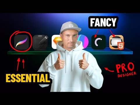
if I got to do it I'mma do the since they pay to see a show got the Overflow yeah today I'm going to share a technique that's going to make your work a lot better stop stop all right all right okay fine I'm going to tell you about the tools that I use to design stuff I'm going to use an example of an app that I wanted to build for a while now and I decided to finally start doing it so it's a bit of a case study of a process but at the same time
we'll showcase what I used in what order exactly to achieve the results that I want I use most of the same tools when I'm working with clients as well at the end of the video I'm going to share the hardware I use because most people think that for a professional designer working with Fortune 500 clients as we often do you need like the most most insane technology that you can imagine and you'll be surprised by the specs of that laptop okay let's talk about the app I run quite a lot and I use the Apple
watch to track my runs it goes into Apple health and then if you really want to know how much you run in a year there isn't really a way to do that in the native fitness app you need to go through every workout and just manually add the distances obviously there are apps and I use one of those that kind of do this automatically for you but this is just like a simple statistic a list of numbers and a lot of different numbers and I wanted a little bit more context like in relation to the
planet how far have I run like overall total all of my runs I was thinking and this is where we're getting to the first tool it's this one design happens right here in your brain before it gets into any software or paper or anywhere else so I was thinking maybe I could make an app that calculates your total distance the same way those other apps do but displays it in a way where you kind of see how many circles around the world you've traveled so far a full circle is 40,000 km so it's quite far
not many people run that much except for some Ultra Runners for most people it's going to be some fractional number so maybe you ran from your hometown all the way to the US and that's still something it still shows a little bit of that context of your Journey Through Time and Space so once I have an idea the first thing I do is to sketch it out I take out my notebook and a pen not a pencil and I try to sketch out the initial concept of it like what features should should it have how
would you filter the exercises and then how would you display the planet itself how interactive it would be I annotate it I try to make like a lot of different options of it if possible and I use the pen because I don't want to be able to erase stuff if I come up with a bad idea then it stays but at least I know that this bad idea is of the table now I like keeping my bad ideas crossed out obviously so I won't make them by accident but but I like keeping them because they
remind me that I exhausted all the options or most of the options then on the iPad Mini I used the app called procreate to use the apple pencil and kind of sketch out that exact same thing all over again and this is great because first of all it kind of solidifies the idea I can skip all the bad ideas from that initial sketch in the notebook and just kind of move only the good ones then I airdrop it to my MacBook and then I can continue working on it once it's on my computer I put
it into sketch yeah I don't use figma I use sketch and none of our clients ever had a problem with this I just much prefer a native app to a web app and besides a native app allows you to drag and drop images from the export window between all the other windows so for example I can drag and drop an exported image into rotation to create a nice little animated 3D mockup and this is also how I make those YouTube videos because I prepare all the assets first in sketch and then I just drag and
drop them onto the timeline and something can appear right here okay now let's get back to the app itself as you can see I made it pretty minimal but then I started thinking okay but what about dark mode or maybe light mode is actually going to be better so I create a lot of different versions of everything just to be sure that even in the higher Fidelity UI I also exhausted all the options and for this app I believe I'm going to actually go with both both the dark mode and the light mode but with
the light mode being the default here to quickly mock up the planet I use mid Journey obviously this is going to be done in 3D later on with real textures and it's going to look way better but it's really good to get a quick mockup so I make a prompt of like a clay line very light or very dark for dark mode planet and even if it's not 100% precise continents it's fine I paste it in mask it with a circle and then I can create an app that actually starts looking like the real thing
then I can go into spline and recreate parts of it as a really really quick mockup and I'm not really that great at 3D this is more of a way to kind of understand how this planet would rotate exactly how would the line be drawing around it like a general idea of how it works now let's animate the interface a little bit because as you enter it the planet will show up somehow it will rotate a little bit the line will draw but I also want the icons to appear in some way and for that
I use a tool called hype which is an HTML 5 animation editor that's timeline based it's actually quite powerful it has physics and a lot of different plugins and things I've been using it for a long time now for years literally I'm actually considering switching to R I have R installed and I'm exploring it a little bit because it's also a really powerful tool for now though I'm more familiar with hype so I'm using hype for this project as well now because I'm not that great at 3D I have to ask my colleague Adam to
help me with that and as always he delivered an amazing result with a 3D animated Earth that looks like this in the end I put everything together in Final Cut Pro combining the hype animation with the 3D animation that's semi-transparent into a movie file now that movie file I drag to the last app on that list today which is rotato this is a 3D mockup tool that allows you to drag and drop movies or images into phones tablets computers and whatever you want and then basically make a frame based animation on how that phone can
move in space you can make very complex and multi step animations in it or something really simple I started sketching up an idea in my notebook on the beach and now you know a while later and going through a couple different tools we arrive at this High Fidelity design in a nice 3D animated mockup this is a great starting point and obviously we're going to code the app later but for now I'm really happy with the result I'm going to start off the hardware with like the cheapest possible notebook that you can get in Tiger
stores in Europe it's not a mle skin it's not anything fancy because I go through one of these every week or two so it's really not worth it to buy expensive ones paper is paper you're just going to have a good experience writing on it anyway all right now this this is an iPad Mini with an apple pencil it kind of sticks like this and it's quite magical really it's like a very small drawing tablet this is kind of my starting point for most designs and for a lot of the annotations including ones that we
do for clients now this part here this computer is an M1 Pro MacBook Pro with 32 gigs of RAM and one 1 tab of storage it's an M1 Pro not an M3 it's not like the top-of-the-line highest end computer it was pretty topof the line when I got it but the thing is that it's been a couple years and I'm editing 4K video multiple streams and doing pretty complex 3D stuff and animations transitions coding a little bit in xcode and this just works it's perfect for what I do and it's completely enough I've always been
a fan of Apple displays I used the old Thunderbolt display for years and this one is the studio display it's not as bright and not as super high rest as the pro xdr but it's also like three times cheaper and it's completely fine for design now the mouse is the Logitech MX vertical and the reason for that is that I've been working for 20 plus years on a mouse with this position and once you kind of realize that your arm is not in a natural position when it's lying on the table like that because it's
slightly rotated it should be like that then you get a mouse that actually matches that and problem solved or sort of it's actually requires a lot of rehab to rotate my arm back the right way and now this is currently my favorite keyboard from Key Chrome this is the key Chrome K3 Pro and I got it in white and KRON was so nice to send this to me alongside those two red Keys which is a custom thing and this is like a very low profile mechanical keyboard so it has this nice little sound when you're
typing that can be annoying The Neighbors Bar what do I care I'm a designer I just can do anything I want yeah and that's basically it you really need to remember to not get obsessed with figma or sketch or penp or lunacy or whatever just use whatever works for you but always be sure to start right here because design happens in your head even if you don't have any design tools you can still design and you know what I've been actually solving problems for a couple clients without ever launching anything not even on paper like
we go onto a conversation and they show me some stuff some flows and some ideas and we discussed them and in some case say I actually solved their problem on that call or on that meeting by just talking this is what design is about the tool is just the extension of your brain so just pick one that works best for you and also let me know if you want to see me code that up I will be using some AI coding help for that I'm not that great at coding but I really want to build
that little thing and then see how far have I gone around the earth that's a pretty interesting question well anyway thanks for sticking around I really appreciate everybody watching till the end and obviously I wish you all a beautiful day
Related Videos
12:54
Make content pages NOT boring again
Malewicz
10,833 views

12:57
Why Beautiful Websites Don’t Convert
Malewicz
210,158 views
15:37
7 Free AI Productivity Tools I Use Every Day
Futurepedia
406,151 views

9:48
Designers are ANTI-FIGMA now?
Malewicz
30,491 views
1:07:58
Mastering Component on Figma (Raw Version)
TimX Design
2,689 views
3:09:58
Photoshop Advanced Tutorial
Learnit Training
1,119,169 views

17:14
Designing a Brand Identity In 8 HOURS. How...
Will Paterson
175,168 views
2:57:40
Free Figma UX Design UI Essentials Course
Bring Your Own Laptop
2,178,442 views

25:19
23 AI Tools You Won't Believe are Free
Futurepedia
2,129,542 views

12:27
my secret for a successful graphic design ...
Jesse Nyberg
42,319 views
12:14
How I Made a Client's App Awesome
Malewicz
20,710 views

1:00:39
Free Figma Tutorial: Designing Wireframes ...
Butter Academy
772,072 views

22:51
How I build Apps that PRINT ($30k/month Mi...
Steven Cravotta
379,465 views
14:17
ONLY Levels 4 and 5 Get you Hired
Malewicz
44,082 views

16:45
9 AI TOOLS You Must Know In 2024
Silicon Valley Girl
16,169 views

26:42
Top Free AI Model Generators Tested for 3D...
3D Revolution
116,115 views

10:51
How We 3X this Website's Conversion
Malewicz
19,627 views

25:00
POV: Just finished a real UX research and ...
Mizko
60,012 views

57:46
FULL 1 Hour Logo Design Course (Everything...
Satori Graphics
196,604 views

3:55:02
Free Figma Course: Design a Video Game App...
Jesse Showalter
476,605 views