How to Take Your Landing Pages to the Next Level
5.62k views4516 WordsCopy TextShare
Exposure Ninja
How To Get Qualified B2B Leads using PPC 👉 https://www.youtube.com/watch?v=82X3cSmazdM
Request a F...
Video Transcript:
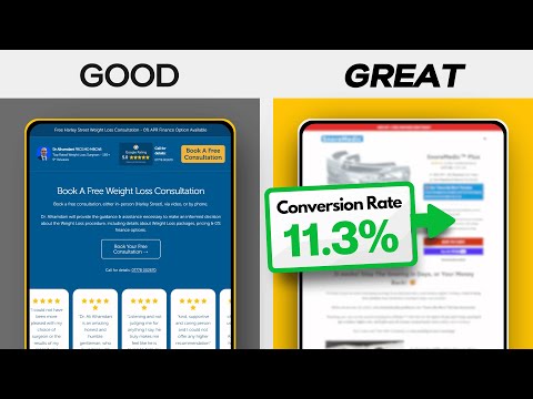
landing pages are designed to do one job and one job only turn paid traffic into money via conversions whether that's sales or leads and killer landing pages are worth their weight in gold because they mean that you can scale your paid marketing efforts through channels like Google and meta meanwhile of course bad landing pages and we're going to see some today can turn even a great ad campaign into a dead loser in this video we're going to compare some good landing pages and some bad landing pages to take the lessons from the best the website team here at exposure ninja build landing pages and websites for our clients that convert as much as 7 to 28 times more traffic into leads and sales than their previous landing pages and websites did so we know a thing or two about how to create a great landing page and at the end we're going to be sharing our tips on exactly how to do that so we're going to be looking at Healthcare examples but across software service and e-commerce but it doesn't really matter what industry you're in or what type of business you are the exact same learning page principles apply so don't worry there are lessons to be learned for you as well let's start with the consumer e-commerce search in healthcare so let's imagine that you're searching for a device to help stop snoring I'm going to show you three landing pages that came up in this search landing page number one this at sleeppro tocom now this is actually a website's homepage and sometimes it does make sense to use one of the pages on your site even your home homepage as your landing page if it has been designed with that intent in mind and in fact we do this at exposure ninja when we build a website for our clients our goal really is to make the entire website function like a landing page so you can drive paid traffic to any page on that site one example of a business that we did this for recently we managed to help their pay-per-click conversion rate go from 0. 5% before we took it over and rebuilt our website to over 14% once we'd rebuilt our website and this is is sending paid traffic to their main website not even to their landing page so this strategy can work well so let's take a look at the good and bad aspects of this page well typically with a landing page you have one primary goal the thing that you want people to do the action that you want them to take and it's relatively clear from this that the goal is shop now now at this point do I have enough information to shop now do I know what this thing is about so we've gotten above the fold section that sort of sets the scene nicely we've got this text here although it is in image form so actually on mobile which is a shame cuz I'd lose all the context of what this page is about now it looks like this business manufactures different solutions so immediately there we've got a challenge because they're not necessarily pushing us towards one solution they're saying browse our product range which is actually usually a less effective way of converting paid traffic than saying hey you want to buy this specific thing this thing is the key to all of your problems so what we've basically got here is a bit of a summary of their different products and then it looks like we can go into different product categories to have a bit more of a look and then we're into a sort of e-commerce site now I would say that this landing page is pretty average there are some fundamental things missing from this page mainly credibility devices like testimonials case studies and reviews it's really important that you give your paid traffic a very quick intro to what your business does and why they should trust you as soon as they land on the page and although we've got some text copy here that wouldn't be visible on mobile and they've sort of buried it in these bullet points when I'd like to see them much more visible the next issue we have with this page is a lack of a single goal meaning that the conversion rate is going to drop because any visitor then has to do a bit of hunting so if I had to guess the conversion rate on this page I would say it's probably low and given what I'd guess to be the average order value I would say there's every chance that this page doesn't wash its face when it's run as a PPC landing page let's look at the next example now remember we've searched for devices to stop snoring and what I've got here is I've got a medical e-commerce site now straight away I can tell you a couple of things about this page that I do like the first of that is it looks professional it looks nice clean professional and trustworthy they've also got some review Stars up at the top here which is an immediate credibility trigger then we've got the fact that there is a phone number I can call again that removes one of the objections I might have is how do I talk to someone but onto the downside this page seems way too technical for the typical visitor making this search we're immediately using the phrase a CPAP which is a technical term and will mean nothing to people who are searching for such a basic search term I'm then into a bunch of product categories that I don't recognize at all now if I know what I'm buying I've probably made a more technical surch than devices to stop snoring worse there is no other CTA if I don't know what I'm supposed to be buying there's no offer of help in reality for most Searchers this landing page is going to make them feel like they are in the wrong place whereas what we really want is for Searchers to land on a page and go ah perfect the solution to my problem on to our third landing page for this search and I think that this one is the best by far now it doesn't look great I have to be honest I'd say this page could probably do with a bit of a redesign but from a purely conversion perspective this page ticks almost all of the boxes so why is it so good well first up we've got a really clear headline sick and tired of restless nights then we've got some amazing credibility the UK's number one ATI in mouth guard tells you everything you need to know about this product we've got a limited time offer which is great at incentivizing a conversion now don't wait and we've got the same thing echoed above the header as well the product is priced low enough to be an impulse purchase we've got more credibility here with the roor Frid reviews and then we've got the call to action buttons this page doesn't Force the visitor to hunt for the thing it wants them to do more credibility here designed to Echo Instagram stories it's a different format and it's super cool then we've got some fantastic Ben benefits copy here comparing it against other Solutions we've got even more credibility we've got personal stories addressing the key pain points that potential customers of this product are going to have we've got objections being handled throughout the page all the images make sense it explains the process and notice how the CTA sticks to the bottom so it's always visible you are never in doubt what you are supposed to do next they've got a money back guarantee yes it looks terrible but I would bet that if the ads are taret targeted properly this page might convert over 10% let's be clear this is a huge amount of work this isn't the sort of thing that you can knock out in a day it takes time to build all of this stuff to collect these stories they've likely built email automation systems to collect all of these verified reviews like all the best learning Pages it looks simple but there's an incredible amount of work here and they deserve all the success that they get and of course once you've got a template of a page like this that you know works for one of your products you can then spread it to other products that's exactly what we're doing with one of our clients where we've built a landing page template for them that converts over 7% from the paid traffic we're driving for one of their products well we know that this template works with their Target customers so now what we can do is take that template and apply it to different products that they sell knowing that we're not having to start from scratch each time okay let's look at a different space this is one that we know very well at exposure ninja having had clients in this area for many years years bariatric clinics so I've gone on to Google and I've searched for bariatric clinics let's have a look and see some of the landing pages that are coming up now the first one again is a homepage but I don't mind that at all because this homepage has been fantastically set up to get cold traffic and turn it into leads so what do I absolutely love about this it's doing almost everything right we got a phone number visible in the head of the page this means that those people who want to get in contact by phone don't have to hunt around but even those people who don't want to get in contact by phone still get the reassurance of knowing that they can talk to someone if they need to we have a book of free consultation CTA in the menu and it's highlighted so we don't miss it then we've got some credibility with the trust pilot reviews love love love they could probably get it up here to avoid having so much white space above the fold but hey then this main hero section is great tells us exactly what this thing is about it tells us what they're doing clear benefit statements we've got a testimonial with some credibility here we got more credibility with the places that they featured now look we've got three different ctas above the fold we've got book a free consultation get your free quote and start your weight loss Journey now start your weight loss journey is slightly ambiguous but I don't mind it because we've also got these other secondary ctas as well this is a business that understands their Target customers and what they really want so they're talking directly to the pain points here they tell us exactly what they offer and we've got an echoed CTA we've got more credibility here with stories and videos really really comp compelling way of communicating client case studies we've got an introduction to someone in the business this can be great to make the website seem more personal and to build that sort of trust that you can't get without a picture of people really this is a form of objection handling like who am I going to be talking to well I can meet the entire team if I want to now here's one of their key USPS this Aftercare and support which is great we've got a calculator as well to help me work out whether or need their help we've got information about their locations and then finally we've got an echoed CTA at the bottom of the page but remember I can still see the top menu CTA and this sidebar CTA as well now let's contrast this with the Ramsey Healthcare page that they're running paid ads to for bariatric surgery now straight away you'd say that the design standard of this page looks pretty poor honestly this website looks about 10 years old now they're communicating price straight away above the fold but they don't mention any payment terms or anything like that so if they're doing this they might be trying to disqualify people who aren't ready for the price it's interesting how that's the complete opposite to what tonic does where they're just looking to generate as many leads as possible if you click on start your weight loss Journey you just go into a contact page where there's no indication of how much this thing's going to cost their sales team are happy to have that conversation with you whereas Ramsey seems to be trying to disqualify people on the page neither option is necessarily better or worse it depends on the team that you've got taking these inquiries and their capacity but I would say that above the fold really there's not a huge amount of credibility being built with ramsy here yes we've got the phone number above the folder I've got no stars no reviews we've got no personal case studies this looks like a generic stock image it doesn't look like one of their patients necessarily and then Elsewhere on the page although we've got a video the layout of this page is incredibly boring and honestly this feels more like a page where you do research on rather than where you convert now the downside of that is of course every page on your site even the ones that people are doing research on should be designed to convert but I've lost the call to action I can't remember what I was supposed to be doing here they talk about your healthc care pathway with us and they even mention the consultation but there's no link to book it here we have the flexible payment options to suit you which means that that initial price might feel much more affordable but they don't mention it up at the top when they're looking to disqualify people they only mention it at the bottom meaning that those people for whom price might be the biggest blocker have likely already bounced off this page before even learning about the payment options now if they were asking for Our advice we would likely say you need to build a dedicated landing page to have this pay-per-click traffic come in because honestly this website page is unlikely to convert but once we've built that dedicated landing page and we've built a good conversion rate we can then apply those principles throughout the rest of the website knowing the devices that we need on that page to get those conversions up one of the main misconceptions about landing pages is that how they look is kind of everything thing and you just need something that looks really good well of course whilst how a landing page looks is important because it demonstrates credibility actually the devices used on that page are far more important in the end let's take a look at an example which illustrates this perfectly this is Bariatrics surgery. co.
uk now I don't think anyone would say this page looks particularly good it looks a little bit homemade but all of the elements on this page are really well thought out we've got the Google rating we've got the mobile phone number here we've got the book of consultation CTA explains exactly what's going to happen in that consultation which is great we've got more reviews being pulled through we've got the book of free consultation being sticky as you scroll down the page we've got information about the surgeon we've got credibility here and we've got what look like personalized stories if we click on any of these we go through to the booking CTA notice how this CTA uses one of my favorite techniques which is to show a before and after some credibility and objection handling as they're asking for your trust remember anytime you're asking people to trust you give them a reason to trust you so look at this fantastic credibility so if you're going through this form and you think ah you know what I'm not sure this is quite right for me yeah but look it's showing you the benefits of what you're going to get if you go through this form another thing I really like on this page is the fact that there is a secondary CTA a lower commitment call to action in this case download a brocher so if you're not ready to book a free consultation you can click on download the brochure it still captures your name and email address so they can follow up with you they can put you in an email automation sequence but this is a much lower commitment CTA that you can research and you can have a look through in your own time now of course they've got your name and email address and they know that you're interested in bariatric surgery so they can build an email automation sequence that educates you about their process answer some of your most common queries so that when you're ready to make a purchase they're right there although this thing looks a bit weird I would bet that the conversion rate on this is pretty high and by the way way to show you another page that has a pretty high conversion rate if you go on exposure ninja. com and click this button to request your free review this learning page also has a fantastic conversion rate one of the main reasons it has a fantastic conversion rate is because this free website and marketing review is such an incredible service if you fill in this form which only takes a few minutes one of our team will analyze your website your digital marketing including your landing pages and your paid ad channels and we'll make some recommendations on how you can improve the profitability of those campaigns we'll also have a look at what your competitors are doing and any lessons that you might want to take from them or mistakes that you might want to exploit to help you hit your marketing goals over the next 12 to 18 months this service is completely free of charge another reason why this page has such a fantastic conversion rate so to request your free website and marketing review you need to go to exposure ninja. com revie not everyone is eligible so you do need to fill in the form to request it but whilst you're there have a look at some of the reviews for this service and for exposure ninja or sign up for the latest marketing news direct to your inbox which is our secondary CTA okay let's look at some examples in medical software let's say that you and I we just bought our first dental practice and we get through the door and realize the whole thing's being run on paper what's going on we need some dental practice management software so we start searching on Google and we find a couple of landing pages now first one we're looking at here this is power diary.
Related Videos
15:47
How To Disrupt a $273 Billion Industry...w...
Exposure Ninja
1,934 views

24:05
How to Optimise Each Page of Your Website
Exposure Ninja
13,786 views

17:09
THIS Is Why Your LANDING PAGES Don’t Convert
Exposure Ninja
53,250 views
15:04
Watch This Video If Your Website Converts ...
Exposure Ninja
2,083 views

38:02
ChatGPT-4o with Canvas Will Change Content...
Exposure Ninja
1,647 views
24:54
Your Mobile Site is KILLING Your Conversio...
Exposure Ninja
2,975 views

24:42
How To Create Landing Pages That Convert a...
Exposure Ninja
134,417 views

13:17
Create a Call-to-Action that NEVER FAILS
Exposure Ninja
33,831 views

9:28
Why Is THIS the PERFECT Website Layout?
Wes McDowell
79,345 views
38:54
Copy This PERFECT Email Marketing Strategy...
Exposure Ninja
6,663 views
9:55
How to Do A/B Testing: 15 Steps for the Pe...
HubSpot Marketing
10,213 views
20:22
3 Landing Page Examples You Can Steal to D...
Alisha Conlin-Hurd
13,017 views
11:05
From 3% to 9% CTR: How I Optimized My Main...
My Amazon Guy
2,981 views

12:34
Why is THIS the PERFECT Landing Page?
Wes McDowell
176,666 views
10:31
How to create a landing page in 5 minutes ...
Kit (formerly ConvertKit)
6,631 views
15:13
How to Outrank 99% of Local Businesses on ...
Wes McDowell
191,687 views
11:47
Why Your Landing Page Isn't Converting
Sabri Suby
38,920 views
28:50
10 Marketing Strategies Guaranteed to Grow...
Adam Erhart
717,756 views
11:03
Does The Design of Your Website Matter? (C...
The Website Architect
15,307 views

14:08
The Multipreneur: He Makes $10M/Year With ...
Starter Story
168,782 views