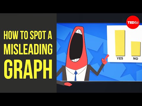
How to spot a misleading graph - Lea Gaslowitz
2.98M views630 WordsCopy TextShare

TED-Ed
View full lesson: http://ed.ted.com/lessons/how-to-spot-a-misleading-graph-lea-gaslowitz
When they’...
Video Transcript:
A toothpaste brand claims their product will destroy more plaque than any product ever made. A politician tells you their plan will create the most jobs. We're so used to hearing these kinds of exaggerations in advertising and politics that we might not even bat an eye.
But what about when the claim is accompanied by a graph? Afterall, a graph isn't an opinion. It represents cold, hard numbers, and who can argue with those?
Yet, as it turns out, there are plenty of ways graphs can mislead and outright manipulate. Here are some things to look out for. In this 1992 ad, Chevy claimed to make the most reliable trucks in America using this graph.
Not only does it show that 98% of all Chevy trucks sold in the last ten years are still on the road, but it looks like they're twice as dependable as Toyota trucks. That is, until you take a closer look at the numbers on the left and see that the figure for Toyota is about 96. 5%.
The scale only goes between 95 and 100%. If it went from 0 to 100, it would look like this. This is one of the most common ways graphs misrepresent data, by distorting the scale.
Zooming in on a small portion of the y-axis exaggerates a barely detectable difference between the things being compared. And it's especially misleading with bar graphs since we assume the difference in the size of the bars is proportional to the values. But the scale can also be distorted along the x-axis, usually in line graphs showing something changing over time.
This chart showing the rise in American unemployment from 2008 to 2010 manipulates the x-axis in two ways. First of all, the scale is inconsistent, compressing the 15-month span after March 2009 to look shorter than the preceding six months. Using more consistent data points gives a different picture with job losses tapering off by the end of 2009.
And if you wonder why they were increasing in the first place, the timeline starts immediately after the U. S. 's biggest financial collapse since the Great Depression.
These techniques are known as cherry picking. A time range can be carefully chosen to exclude the impact of a major event right outside it. And picking specific data points can hide important changes in between.
Even when there's nothing wrong with the graph itself, leaving out relevant data can give a misleading impression. This chart of how many people watch the Super Bowl each year makes it look like the event's popularity is exploding. But it's not accounting for population growth.
The ratings have actually held steady because while the number of football fans has increased, their share of overall viewership has not. Finally, a graph can't tell you much if you don't know the full significance of what's being presented. Both of the following graphs use the same ocean temperature data from the National Centers for Environmental Information.
So why do they seem to give opposite impressions? The first graph plots the average annual ocean temperature from 1880 to 2016, making the change look insignificant. But in fact, a rise of even half a degree Celsius can cause massive ecological disruption.
This is why the second graph, which show the average temperature variation each year, is far more significant. When they're used well, graphs can help us intuitively grasp complex data. But as visual software has enabled more usage of graphs throughout all media, it's also made them easier to use in a careless or dishonest way.
So the next time you see a graph, don't be swayed by the lines and curves. Look at the labels, the numbers, the scale, and the context, and ask what story the picture is trying to tell.
Related Videos

5:02
How to spot a pyramid scheme - Stacie Bosley
TED-Ed
5,985,230 views

7:31
Why can’t prices just stay the same?
Vox
1,578,792 views

18:55
This is How Easy It Is to Lie With Statistics
Zach Star
6,225,045 views

5:14
What are warts — and how do you get rid of...
TED-Ed
329,043 views

3:12
What we miss when we focus on the average ...
TED
97,413 views

18:05
Light sucking flames look like magic
Steve Mould
2,880,274 views

10:36
Who Is Responsible For Climate Change? – W...
Kurzgesagt – In a Nutshell
10,609,144 views

5:38
What does appendix pain feel like? - David...
TED-Ed
222,388 views

5:48
Can you outsmart the apples and oranges fa...
TED-Ed
1,103,678 views

4:47
Why is it so dangerous to step on a rusty ...
TED-Ed
2,556,101 views

7:38
How We’re Fooled By Statistics
Veritasium
3,647,701 views

11:45
Neil deGrasse Tyson Explains The Three-Bod...
StarTalk
6,189,786 views

6:07
How the rich avoid paying taxes
Vox
3,372,477 views

6:06
Ethical dilemma: Whose life is more valuab...
TED-Ed
821,912 views

12:55
How to Make Learning as Addictive as Socia...
TED
7,327,102 views

5:20
The paradox at the heart of mathematics: G...
TED-Ed
3,766,448 views

2:34
Shut up about the y-axis. It shouldn’t alw...
Vox
1,016,809 views

4:19
How statistics can be misleading - Mark Li...
TED-Ed
1,403,686 views

14:48
The Big Misconception About Electricity
Veritasium
22,900,960 views

5:00
What Earth in 2050 could look like - Shann...
TED-Ed
660,107 views