The Ultimate Guide to PowerApps Containers and Layouts | Beginner to Advanced
9.48k views3427 WordsCopy TextShare
Tolu Victor
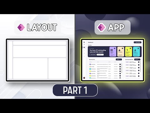
This video is the first in my new series on PowerApps Containers, Layouts and Responsive Design. In ...
Video Transcript:
this is a responsive power app that can be viewed on a desktop tablet and mobile device and in this video series I will show you how to build yours this video is the first in my new series on power apps containers layouts and responsive design in the first video we will learn the basics of the container control in the second video we will then go through how to use the container control to create modern app layouts and the tips and tricks in using it to create modern uis in power apps in the third video we
will learn how to take new or existing PowerUp designs and make it responsive to fit whichever device is being used be it a desktop tablet or mobile device anyway with that being said let's get into the [Music] video if you've watched some of my previous videos you will know that I sometimes use containers container container container container container container container container okay maybe a little more than sometimes I'm even getting called out in the comments but all of this is because the container control makes p development a whole lot easier so before we get into
how to use the container control you first need to answer this one question why should I use containers Microsoft release power apps sometime in 2017 and for the next 3 to four years developers build what I will classify as first generation canvas apps these apps were generally simple apps mostly set up with a busy gallery form and some unnecessarily huge icons yeah I was also guilty of that anyway since there were very few controls on the screen there wasn't a practical need to group your app controls into sections as time went on developers not only
needed a simple way to build responsive apps but also static layout apps that contain more controls then Microsoft release the container control which will then bring the second generation of canvas apps the second generation canvas apps utilize the classic controls and containers to build modern looking apps with well defined sections and content groups whose size and position could be static partially responsive or fully responsive now on to the next question what is a powerups container the powerups container control is many things and can do many things but it's B basic function is to group controls
is as simple as that every other trick or tip to using containers is all based on the fact that they can group controls these child controls can be anything from a simple text label to a form to a gallery or even other containers since the container is also a control we can place containers inside of a container then Place containers inside that child container then Place containers inside that child container of the child containers then also Place containers inside that child container of the child container of the boy that escalated quickly anyway you get the
point containers can group controls including other containers and once they are grouped the position and size of all child items can be controlled using the parent container now we know what containers are the next step is to learn the types of containers and how to use them if you set container in the inide panel there are three three types to choose from we have container horizontal container and vertical container and though there are three options here containers are basically divided into two categories for those who have watched some of my previous videos you will have
heard me classify um the horizontal container and vertical container as responsive containers and then classify the container as a non-responsive container but apparently that is not the actual category name so let's check that out I've added one of each container type to this screen and I've also added a black fill with 30% opacity to each of them so using the yamu code Vil um let's check the actual names of this controls the horizontal container and the vertical container is classified as Auto layout containers and the container is classified as a manual layout container why am
I pointing this out this will help us understand the basic function of each container type so let's check it out but before that it has come to my attention that 82% of viewers are not subscribed to the channel come on now do come on man if you've learned something in this video or this series please like the video and subscribe to the channel to get notified when I release new content so let's get back to our video starting with the manual layout container I've added three labels as child items within the container and as the
name implies it is a manual layout container and this means that you have full control over the positions of all the child items for example you can move this label however you want move any of them however you want you can Tice them however you want there's basically no restriction to the position of items or child items inside the container and also you can select the container and move the container around you know with the child items and the child items move around with the parent container so that is the manual layout manual layout container
as name implies the layout of each of the cloud items can be set manually and you have full control for the auto layout containers I've also added three child items into each of them and the position of these child items can only be in One Direction so if it's the horizontal container by default the direction is also horizontal so he moves he adds the um child items from left to right so a a b c add them from left to right for the vertical container the default direction is vertical so it adds them from top
to bottom so a b and c so the reason why I said the vertical container and the horizontal container fall under the same categories because you can always switch between directions for each of them so it's basically just one control with the same settings however they have different default uh default values for the direction now since it is auto layout you can't move the child items in the same way we moving the um manual layout items if you try to move it it will always be in the same um direction that has been set aside
on the P container see you can't just move it however you want same thing for this one you can't also move it however you want it always has to be in the um based on the settings you've added for the parent container so now let's go to let me just move this now let's go to the actual um settings for each of the container so depending on whichever direction you've set it gives a primary access and a secondary access so if it's if the direction is vertical the primary access is vertical however the secondary axis
is then horizontal but for the horizontal if you select the the direction as horizontal the primary axis then becomes horizontal and secondary axis is now vertical so for the primary axis you can set the alignment to either make it be at the start at the middle at the end or space between so at the start is like this at the middle it moves it to the middle at the end takes it to the end and space between will have space between and it's the same thing for the vertical container it's just in a different Direction
since direction is horizontal so I've done start middle end and this is space between and then for the horizontal um sorry for the um what's it called now for the secondary axis in this case the secondary axis is the horizontal axis it also has similar alignment properties it has starts moving into the start it has um in the middle it has at the end and it has stretch which basically stretch it stretches it on the um hor Al axis sorry on yeah on the horizontal axis which is the secondary axis for the horizontal container the
secondary axis is the vertical axis so we can move it to the start the middle um the middle the end or stretched on the um vertical axis which is the what's it called now the secondary axis so that is alignment you can always play around with all of this dependent on depending on what kind of Vis you're trying to achieve with a container the next um um one is Gap and this one is for anything apart from space routin basically so if you set start or middle all items by default have no G between each
other but then if you set a particular Gap that gives it you know this Gap you can always reduce it increase it however you want the next setting I'll talk about is the padding and the padding is basically self-explanatory it gives in a padding around the container so if you sets let's say 40 at the top 40 at the bottom that gives it a padding all around it so you can also move put some padding on the left also it's basically works the same way padding Works um in labels for instance and the other one
so the size just basically determines you know whatever um actual size of the container that one is straightforward then color border border radius drop shadow all those ones are you can find them on other control and basically they work the same way I will just clear the padding again and then we can move forward horizontal and vertical overflow is used to determine what happens when the content of a container exceed the size of that container so there are two options hide and scroll to test this I've added a couple more labels into the Container so
when the selected option is hide the extra controls are hidden I however when the selected option is scroll the container automatically adds a scroll bar so we can see the hidden items this is very useful for cases where you need to add a higher number of controls to a screen and I use this technique in one of my previous videos where I wanted to add more filter options to my gallery without being constrained to the size of the screen and by adding a scroll bar I was able to add as many filters as needed to
that screen not bad not bad as for the WRA property this is used to position controls on the next line when the container is smaller than the content this setting is mostly used um when building responsive apps and as I've said earlier in this video we are just treating the basics of the container control however in part three of this series we will be covering respons design and then I will show you how this property Works in app development now we understand all of this the next part is to tackle the sizing of individual child
items so this is the part where a lot of people have issues but I'll try to break it down as much as possible so you can understand it easily we would use the horizontal container for this example starting with the secondary access you can set a static size to the child item when the Align inment is Start Center or end and when the alignment is stretched what you can set is a minimum size and in this case that will be the minimum height if I set the minimum height to 500 and I try to reduce
the height of the container you can see the label reducing in size to match the container but once it gets to a height of 500 it doesn't reduce any further this works the exact same way for the vertical container however the secondary axis is the horizontal axis so what you will be setting is the width of child items as you probably as you've probably noticed um positioning and sizing on the secondary axis doesn't have to be the same for all child items while you can set it as a while you can set it as a
group on the parent container you can also set it for the individual child item so you can set it for them one by one lastly as for the positioning and sizing on the primary AIS we only have two options we either set a static size or a flexible size in the case of the horizontal container you can set a static width or a flexible width static width is pretty self-explanatory you just need to make sure that flexible width is turned off and then you can set whatever static WID WID you want in the width property
as for flexible width what this does is to take whatever space is left after the static width child items have taken their own space and then divides this remaining space among the child items that have flexible width turned on for instance if I set the width of label a to 100 and I said B and C to flexible width you can see that label B and label C stretch to fill the remaining space inside of the container if I also turn on flexible width for label a since there are no child items with static width
the container just goes ahead to divide the available space between the three child items by default the container would always divide the available space equally among the child items with flexible WID but in most cases you would want custom sizes for each of your child items and that is where the FI portion property comes into play what this property does is to take the total flexible space available and divide it by the total number of field portions then assign it to the individual child items depending on their field portions for instance the total fuel portions
here is three with label a label B and label C having one field portion each what this means is that the total available space will be divided into three parts and one part is assigned to each child item with this logic you can do whatever sizing you want for instance if I want label a to take 50% of the width and then label B and C should take the remaining 25% each I would set the field portion of label a to two and then leave label B and C as one if I wanted label B
to take 60% of the width and then label a and label C to take 20% each I will set the few portion of label a to one set the FI portion of label B to three and set the fu portion of label C to one so it's basically like a game of maths and fractions so 50 ratio 25 ra 5 is the same thing as 2 ra 1 ra 1 20 ra 60 ra 20 is the same thing as 1 Rao 3 ratio 1 and if you have issues understanding fractions a simple trick is to
just apply the percentages as is so you can add 20 for label a 60 for label B and 20 for label C and you'll notice it is the same size as when we applied um 1 ra3 ra1 for the FI portions one thing to note is that for child items with flexible width there is a property called minimum width and as the name implies it is basically telling the system that though this child item size should be flexible based on the fuel portion ratio its size must not be smaller than this size that I've set
in the minimum wave to show how this works I've set the container width to 1,000 and I've changed the labels to show the width of each child item so I set it to self dowi the field portion ratio is 1 ra3 ra1 so the first and the last child item should always have the same size regardless of the parent container size but if I set the minimum width of the first child item to 400 let's see what happens item a that should have been 200 is now 400 I mean that one was pretty obvious we
just set it to have a minimum WID of 400 like 2 seconds ago however it gets interesting for the other two child items the size of B and C is 450 and 150 respectively and if you guess correctly what the system is doing is to take is to take item a a static width of 400 right and then divid the remaining space among the child item based on their field portion ratio in this case the remaining width is 600 and if we divide that based on a three ratio three um 3:1 ratio right we get
a um size of 450 to 150 so label B takes 450 label C takes 150 understanding how field portion work and minimum width and minimum height work in power development is very very important especially for those building um responsive apps and as I've said this video is just basics in part three of this series we will be covering responsive design in detail and I'll will show you how all of this I've just explained Works in app development so make sure you subscribe to know when that video is released all I've just explained is the same
for the vertical Auto layout container the only difference is that the layout is vertical and we deal with flexible height and minimum height instead of flexible width and minimum width I don't want to have to explain the whole thing again it's pretty much the same thing to be honest and yeah that is that as regards Auto layout containers however some of you are most likely wondering what about cases where we need to place items on top of each other for example if I want to add a background image for child item C the liel C
if I simply add in an image control it will add the image control as a child item in line with other child items which is not what we want we want the label C to have a background image that I just um added so in cases like this what you need to do is to utilize the manual layout container since the manual layout container gives you full control over size and um position of his items all you need to do is to first add in that manual layout container as a child item and then size
it however you want then add in whatever items you want placed on top of each other inside that container in our case I will first add in that image control and make sure the image um control FS the print container by setting X and Y to zero and then I'll set the width and the height to parent. width and parent. height respectively then I would add the label inside of that container also I'll make sure to fill in the make the label F the container also then I would size it as needed and style it
as needed and this way you can add items on top of each other nice that brings us to the end of the first video in this series and as I've said this first video was just handling the basics of the container control in the second video of this series we would go through how to implement these Basics we've just learned and use that to create more UI designs in power apps so make sure to subscribe and turn on post notifications to get notified when I release the next video anyway if you've enjoy this video or
at least learn something please hit the like button and follow me on LinkedIn thanks for watching and I'll catch you in the next one [Music] oh
Related Videos
43:24
How to Design a Modern Filter UI in Power ...
Tolu Victor
19,486 views

17:24
Top 10 Power BI Features You Should Be Usi...
How to Power BI
25,862 views

23:54
How to create a Modern Compact Side Menu i...
Tolu Victor
39,877 views

16:38
AI Built My App and It's INSANE! (Galileo,...
AI in practice
33,587 views

8:34
Coding Was HARD Until I Learned These 5 Th...
Elsa Scola
325,802 views

20:46
Amateur vs Pro UI Design | with examples
Jesse Showalter
98,108 views
15:07
Power Apps New Modern Toolbar Control
Reza Dorrani
15,060 views

36:24
How to use Copilot AI to design UNIQUE Pow...
Tolu Victor
30,583 views

1:22:00
Modern PowerApps Gallery UI Design Tutoria...
Tolu Victor
94,331 views

32:32
OneNote as a Second Brain (What You're Mis...
Tiago Forte
113,996 views
40:48
Modern PowerApps UI Design Tutorial: Card ...
Tolu Victor
27,367 views
31:56
How to Design MODERN looking PowerApps for...
Tolu Victor
66,108 views
9:27
5 Design Patterns That Are ACTUALLY Used B...
Alex Hyett
259,751 views
51:32
Modern PowerApps Screen/UI Design- Beginne...
Tolu Victor
73,779 views

25:58
My 3 SECRETS for Power BI Parameters You M...
How to Power BI
19,436 views
22:14
How to use the New Icon Button to create M...
Tolu Victor
12,443 views

10:24
7 Exciting NEW Updates in Microsoft Teams!
Scott Brant
15,985 views
1:05:48
How to Design a Multi-view Gallery in Powe...
Tolu Victor
21,290 views

7:58
I tried every FREE website builder. This i...
Steve Builds Websites
83,492 views