The power of typography | Mia Cinelli | TEDxUofM
213.2k views2011 WordsCopy TextShare

TEDx Talks
What do the Empire State Building, the iPhone, and Times New Roman have in common? They were all des...
Video Transcript:
something incredible happens when you become a designer that I liken to gaining a superpower most people are walking around the world thinking about what they want to eat for lunch or what they're doing at work but designers are walking around the world looking at everything and asking why does it look the way it does and work the way it does and who designed it and the great part about this ability is that as a designer I can do something about it the obnoxious part about this ability is that it's happening all the time I can
never shut it off and for me this is happening particularly with typography typography is the visual arrangement of designed letters or type in space and type exists everywhere even if you find yourself in the middle of the Upper Peninsula of Michigan where I'm from at fet historic town site and park where I found myself in the summer of 2012 I was there on a whim and what fet is is it used to be a town where they smelted iron ore that was Min what that means is it's made into a more refined version before it
gets shipped off to be made into steel and so this was a company Town it was a really cool cool bustling place where they did this for about 20 years at the end of the 1800s until it proved unprofitable and the whole town kind of trickled out and now it's a ghost town it's been really well preserved as this architectural kind of framework uh that now you can go visit and they have a cool Museum there that has artifacts from the town you can see how people used to live there and in this Museum they
have these white framed pieces of paper that were kind of up against a wall which from a distance looked entirely unremarkable but as I got closer to them I was totally floored this was the most beautiful handwriting I had ever seen in my entire life it was graceful and it was swooping and it was Swift and it was fantastic and suddenly like a ton of bricks my design superpower caught up with me and I knew in my heart of hearts that I needed to make this into a type face the problem was I had never
actually done this before I had worked as a graphic designer and used a lot of type but hadn't made a lot of type and so I knew there were a couple things that I was going to have to consider moving forward if this is a project I wanted to do so the first thing to know I needed to know is that a type face is different than a font now most people use these interchangeably but there actually is a difference a type face is a series of letters that are designed to belong together so bedoni
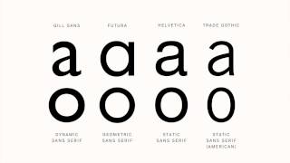
is a type face now bedoni bold italic is a font which is a specific group of letters within a type face so fonts make up type faces in the same way that chapters make up a book all type faces are made up of letter forms letter forms is the individ ual design of any one letter and when you're designing these letters you have to consider if you want it to be a serf or a sand serif type face so what seraps are are these like great little feet that exist on the bottom of letter forms
like you can see on the Century F and Sans serif type uh San from the French word meaning without uh doesn't have these little wings or feet and so they read a bit more like table legs then there is script type faces which is made to look a bit like cursive and so when you design the letter forms you have to add this cool little tail onto what you're designing so that they can connect with each other and read like cursive and I knew because I was working from cursive handwriting that I needed to design
a script so I thought I've got this right I'm just going to trace the letters and it's G to work it really didn't so I had this and this would have worked really well for historical preservation but what went on is that these letters weren't even enough to actually work as a type face and so then I was kind of back to the drawing board going all right uh how am I going to actually do this and so I thought about how other type designers had done this before me and many of them start with
the letter A now I have to preface I absolutely love lowercase A's which is like a little weird and obsessive I realized saying this in front of a very large group of people but lowercase A's are fun they're humble they're in just about everything and so I started by tracing this a which looked really funky and the second a looked really funky and probably somewhere until like the 39th a also looked really funky but when I finally got to this a that I loved I knew it was a really great place to start and I
knew why other people started there because once you have that letter form you can use that to make an o and a g and a p and a Q and A D and A B because they all sh share that same basee shape similarly once you design an N the m and the U come really quickly as does the w and an H because they borrow each other's forms now once you've designed these letters it's important to space them correctly that's just as important and so kerning is the space between any two letters and letters
uh that are close together are tightly kerned and letters that are far apart are widely kerned and for fet which is what I call the tight face Super Creative name I know these have to be properly cured so that it maintains this illusion of cursive and that it reads really nicely because if things are too tightly cerned then it turns into this crunchy mess and if it's too widely cerned then you've completely uh ruin the illusion of cursive and kerning is important not just for believability or legibility but because it can actually change what it
is you're trying to say and my first lesson in bad kerning was not in art school but was actually in the seventh grade with Mr Stewart this guy Loved Bird Watching so he got up and he wanted to share this with us so he got up on the board and he wrote down the name of a bird called the yellow bellied flicker but he wrote it really quickly and his letter spacing was just slightly off and this completely changed the message this is a true story other things to consider is about letting and letting is
the space between any two lines of typed text and it's called letting because when type was made of like movable metal they' literally put chunks of lead between to designate that space and for fet this was really important because I had to deal with ascenders and descenders so what an Ascender is is it's the part of the letter form that comes up and over the x height which is the top of lowercase letters and then there's the uh descenders which come down below What's called the Baseline which is where lowercase letters sit and so if
something is too tightly Leed then you end up with these like sword fighting ascenders and descenders and that's generally Bad News Bears other things to consider is that when you're designing a type face it's not just 26 letters and 10 numbers you have to deal with things called glyphs which are all of the symbols that you have to have in a typ face like the at sign and number sign and and parentheses right so that your typ face is actually usable so there's at least like one person in this audience right now who's like good
for you lady you made a tight face what's the point there's one of you I know it what's the point the point is that typography is important not just for designers and type nerds like myself but for everyone in this audience because everything you ever read is in some kind of type face and all tight faces are designed to say something specific and so when something is typed in a type face then what is said is influenced by how it is set and I call this a kind of visual inflection so just like when we
speak our tone of voice gives meaning to the words we're trying to say so does type so if I were to say I hope you all have a great time today at tedex you know I mean that because of the tone of my voice right but if I were to say I hope you have a great time at tedex you know that I don't actually mean that because of the inflection of my voice and type works really similarly type can be authoritative it can be honest it can be organic type can say I'm friendly or
I'm childlike and if you're still not buying this let's imagine that you're going out on a date and you need to get a babysitter for your child so you go online and you look up babysitter and this shows up okay set in Baskerville it's cool it's calm it's professional it's collected this is probably a person that you'd give a call and say hey can you watch my kid tonight but let's say that this situation has changed slightly so you get online you look up babysitters and this shows up this is probably not the person you
want to leave your kid with so in this way type should never be an afterthought because it can persuade and evoke and help us make choices consciously or unconsciously and soet is a nice type face and I'm obviously like a tiny bit biased but it's not for everything it works really well for things like historical fiction or Museum design or love letters or wedding invites because it speaks of time of precision and a Time Gone by but it's not what you'd write like your Master's thesis in and that truthfully that wasn't the point right I
didn't design it to be the end all be all of tight faces I designed it to say something about a place that used to exist and doesn't anymore and a person who had a voice and doesn't anymore and that swiftness and that beauty and some way trying to preserve that and carry a tiny bit of that from the past to the present and hopefully into the future and so for all of you now having heard this talk you now absorbed a little bit of this design superpower which which means when you leave you're going to
go look at all of the type around you and you're going to wonder who made it and why it looks the way it does and what it means and you're also going to see bad kerning Now everywhere I'm so sorry but you're all going to be able to go into your chosen professions and handle type A little better than you could before because you can think about what you want to say and how you want to say it and you can make cont ious deliberate decisions about the medium of your message not just from the
words you choose but from the type you choose thanks [Music]
Related Videos
14:27
Wake up & smell the fonts | Sarah Hyndman ...
TEDx Talks
122,139 views

16:36
The power of design | JD Hooge | TEDxPort...
TEDx Talks
77,200 views

18:59
Visual Identities: More Than Just A Logo |...
TEDx Talks
146,826 views

16:20
Graphic design and the making of meaning: ...
TEDx Talks
51,888 views
10:46
A Revelation of Space | David Korins | TED...
TEDx Talks
43,286 views
17:03
Making it in the little leagues: Aaron Dra...
TEDx Talks
323,324 views
13:32
How do I develop a typeface? | Peter Brugg...
TEDx Talks
41,238 views
19:37
TEDxUofM - AJ Holmes, Ali Gordon, and Carl...
TEDx Talks
38,330 views

13:19
There's Nothing Magical About Monday | Mel...
TEDx Talks
350 views
7:02
The Importance of High School Journalism |...
TEDx Talks
11,173 views
17:58
Selfish Joy of Giving | Aaron Dworkin | TE...
TEDx Talks
1,473 views

14:33
TEDxUofM - Ann Marie-Sastry - SAKTI3
TEDx Talks
8,316 views
16:05
How open-source hardware is changing our f...
TEDx Talks
184 views

13:03
Community placemaking with creative spaces...
TEDx Talks
318 views
14:55
TEDxUofM - Parag Patil - Communication
TEDx Talks
2,820 views
13:20
How to find your self-confidence | Faith R...
TEDx Talks
284 views

18:14
Traumatic Connection: Women and Health Ca...
TEDx Talks
1,429 views

12:03
The Art of Giving: Growing Through Generos...
TEDx Talks
83 views
14:41
Self-Image and Success: The Power of Self-...
TEDx Talks
78 views
17:57
Community and Development | Brian Turnbull...
TEDx Talks
1,380 views