The ONLY Technical Analysis Guide You'll Ever Need!
229.86k views19894 WordsCopy TextShare

Ross Cameron - Warrior Trading
Get Instant Access to my Free PDF Resources including the 5 Pillars of Stock Selection, my Small Acc...
Video Transcript:
welcome to today's Deep dive into the world of technical analysis in today's episode I'm going to teach you how to read Candlestick charts so you can make accurate predictions about which direction the price is going to go in and I'm going to use some of my trades today as a case study of the strategies and the techniques that I use personally in my own trading I am sitting up right now $34,000 on the day and I'm telling you this would not be possible if I had not become a m at performing technical analysis so for
those of you who are already subscribed to the channel welcome back you know that we're about to jump into a fulllength episode for those of you guys who are brand new do me a favor hit that thumbs up subscribe to the channel for more episodes just like this and let's go ahead and dive into the screen share I've got a whiteboard for today we've got a slide deck and we have a lot to cover this will be the ultimate guide to performing technical analysis the right way let's begin this episode with with a quiz let's
level set and see where we're all at at the very beginning of this class I think by the end of this class you're going to know a whole lot more about how to perform technical analysis than you do right now so let me ask you this question is this right here a safe entry now you're probably looking at this chart and you're thinking look this stock clearly has been moving up it's pulled back it's moved up it's pulled back it's moved up it's pulled back it's moved up it's pulled back right here it's probably going
to move up the answer is yes this is definitely a safe entry wrong wow not even close but that's okay that's why you're here this failed right here why did it fail it was doing so well and then all of a sudden we finally get in and it rolls over well technical analysis would tell us that there was an indicator right down here telling us and indicating this was likely to fail the macd this indicator had crossed over that crossover is a strong indicator that the trend is beginning to reverse so let's look at another
one right here okay so now the first thing you're probably noticing is the macd has crossed over so even though this has made a nice move up and it's on a pullback you're probably thinking it's not going to work and you would be correct although it popped up just for a moment ultimately the trend is coming back down look at that macd before you take a trade that's one of our technical indicators now you're going to look at this chart and you're probably going to think okay macd is open this is easy I'm going to
be a millionaire before the end of the week no wrong again macd is open you're right about that but there was another problem here which is that the volume Bars were higher on the selling so we had more selling than we had buying let's go back and look at that again for a second so high volume on the buying candle but just as high equally high on the selling and there was more red volume bars which means in total there was more selling than buying so that overrides a positive macd that tells us not to
take the trade okay we can do this next one all right here we go we've got a macd that's open we've got a good volume profile this surely is a good setup am I right buy the dip yes we are right we've got light volume selling a positive macd and the entry is right here as this first candle makes a new high now some of you guys are saying Ross I don't even understand the anatomy of candlesticks you're at the very beginning of your learning curve and that's no problem I've been doing this for a
long time and my job here is to send the ladder back down to you and to help you better on understand how to perform technical analysis so you're going to understand what all of this is on these charts by the end of today's episode let's look at another one all right here we go looking good nice volume coming up little pullback another squeeze back up macd is open no issue with the volume this should work just fine and in fact it does a nice squeeze higher now a little bit later it rolls over but we're
not in the trade over here the macds crossed over it's coming back down so we're not taking that trade we're trading it right in this area these are the small little places that we want to trade so when it comes to the financial markets there are really two forms of analysis on the one hand you have fundamental analysis which is what long-term value investors use to try to understand the fundamentals of a company how much is the company worth how much money do they make what are their assets what are their liabilities you can learn
all this information in the quarterly filings that all publicly trade companies produce to shareholders through the SEC database now active Traders like myself we don't really rely on fundamental analysis because in the short term the price can get extremely disconnected from the fundamentals due to the emotions in the market of fear and greed as active Traders our job is to capitalize on those emotions without falling victim to them ourselves we do this by performing technical analysis so technical analysis is the universal language of the financial markets and it's displayed in the actual Candlestick charts that
we use every single day now it doesn't matter if you're trading Futures Forex if you're trading a different Financial Market or you're trading the US Stock Market like I do this truly is a universal language that you're about to learn now I didn't introduce myself yet my name is Ross Cameron I'm a full-time Trader I funded my first account in 2011 more than 20 years ago so I've been doing this for a long time in 2017 I set out on a challenge actually you guys right here on YouTube challenged me you said Ross I don't
think you would make money if you traded in a small account I said you know what I'm going to put my money where my mouth is and I'm going to try it I funded an account with $583 in January of 2017 I have now grown that account to over $12.5 million in gross profit so not only do I post my broker statements at the end of each month right here on my website you can see them going all the way back to January 1st 2017 I actually have a thirdparty independent accountants audit their report of
my trading performance and they verify that on January 1st 2017 I started with $583 in my account and as of December 2023 I produced $10.7 million of profit after my 2024 year which that audit will be available the updated audit in q1 of 2025 I'm at uh just over 12.5 million in gross profit now I say this not to brag but so you know beyond a shadow of a doubt that the person that you're learning from today that you're going to spend time consuming information from is credible is qualified and is actually putting the techniques
that you're going to learn into practice every single day I'm not an armchair quarterback just teaching general theory of the market but not putting my money where my mouth is I trade every day of course you could see today's trades as an example of that we will recap those trades later on in this class but let's go ahead and start here with chapter one which is the anatomy of candlesticks by the way don't let me forget to tell you trading is risky and my results are not typical so please manage your risk and practice these
new strategies that you're about to learn today in a safe simulated environment before putting real money on the line all right so let's get back into the anatomy of a Candlestick uh candlesticks are actually the most popular type of chart that is available there are other types of charts that some people use but to a much lesser extent the reason Candlestick chart charts are so popular is because the individual shape the individual Candlestick provides more information about the price action of that stock or that Financial instrument and that information is used to help Traders interpret
Market strength or Market weakness Market sentiment so this chart right here is a one minute chart and what that means is that every single one of these candlesticks right down here these are all candlesticks represent 1 minute of time so the Market opens at 4:00 a.m. eastern standard time for pre-market trading so starting at 4:00 a.m. exactly on the dot that first candle opens so it's 4:00 a.m. we're going to say 4:00 a.m. right here and the first candle of the day begins it has its opening price and that right there creates a line so
that's our first piece of information the open let's just say for a moment that the price dips down for a second and then it squeezes up and then it closes right here so now we have the close we have the high and we have the low those are the four pieces of information we have the open and the close are connected to create the body of the candle and the high and the low stay just as candle wicks just as these lines right here so this would be the first candle now this candle with these
four pieces of information happen to take this shape this is a shape that communicates sentiment so other Traders would look at this candle and draw a conclusion what conclusion would you draw if you saw this candle on a chart H the stock seems strong it's moving up it looks really good but what if let's say it had taken a different shape let's say for instance that we had the open it dipped down here for a second it squeezed up just for a moment goes higher and then comes all the way back down and closes right
here so now we connect the open and the close that's our high that's our low now this sends a little bit of a different signal than the previous candle we just looked at right this tells us that yes the price did Squeeze up but obviously it came all the way back down so the individual shapes of these candles are sending signals to Market participants so a green candle opens at the bottom and closes at the top so this is a green candle open at the bottom closes at is at the top uh of the body
this is the body of the candle these are the candle wicks also called the Shadows so lower Shadow upper Shadow lower candle wick upper candle wick and a red candle opens at the top and closes at the bottom which signifies that it's red that the price had declined so it is important that the color of the candle is distinguished between candles that are green and going up and candles that are red and going down some people who have color blindness uh will use colors will use colors that are easier to see like a a hollow
or a solid fill so it's one of the other or even like a hatched fill just to create a better um easier to distinguish but whatever however you do it it is important to be able to distinguish between a green candle and a red candle because the they actually mean different things based on the position of the open and the close so when it comes to the candle body size the size of the candle body communicates sentiment the larger the candle body the stronger the sentiment so again back here on the Whiteboard let's just say
we had 4 a.m. we open we don't drop at all we just go straight up here and we close at the very top so that's our big candle it's a longbody candle that's very bullish on the other hand let's say we opened and we just go straight down right we open here we close here this is also the high this is also the low we opened at the high we closed at the low this is very bearish this is very weak so these are longbody candles longbody communicates strong sentiment in the market so if we
look at the stock that I traded today just as an example we're going to use this as a case study we're going to keep coming back to it um if we pull up the one minute chart this right here is a one minute chart and there's some things on here that you may not understand yet because we haven't gotten to it like technical indicators and um some of these different uh lines uh but what you can see here are longbody candles so see how you have those two longbody candles right there those communicate a lot
of strength in the market in fact we're seeing a lot more longbody green candles than we are seeing longbody red candles so what that's telling us is that the sentiment and the momentum is really to the buy side there's more buying strength than selling strength and we can see that in the volume profile as well the volume is actually an an indicator that tells us the number number of shares that traded hands during each one of these Candlestick periods so again this is a one minute chart which means each one of these candlesticks represents one
minute of time so from 4:00 a.m. to 4:01 401 to 402 now we could look at a different time frame and then each Candlestick would represent a different period of time in fact a a long-term investor might instead just use a DA chart like this right here where each one of these candlesticks represents one whole day of time which is fine and useful and it has its purpose even for active Traders like ourselves but when it comes to jumping in and out of positions we're not going to use daily charts we're going to use primarily
our one minute time frame all right so I'll move this up here for a second now what the Candlewick tells us so if the body tells us sentiment the candle wick also communicates a message and it communicates a bit of a battle a large upper candle wick is bearish it's bearish because it shows that the sellers were stronger they pulled the price back down right although we had the squeeze up so let's say we've got the open right here we get the squeeze up all the way to here to the high but then the sellers
came in and pulled the price all the way back down imagine if it came all the way to Red so that means this was the open this was the close this was the low and this was the high what does that what kind of message does that send that candle is like an exclamation point and and I do want to think about this in a way that each one of these individual candlesticks are like letters in the alphabet and as they combine they form sentences and some of the sentences are going to say buy me
right now and some are going to say sell me don't get near me don't touch me the shorts are in control so you got to be able to read those signals which are right here on the charts now I'm telling you that I've gotten to a point where I can read them very well no I'm not right 100% of the time I have my losses just like anyone else but I'm right more often than I'm not and it's thanks to this um this ability to really fully understand the language of the markets so the large
upper candle wicks are bearish just take note of that they show that the sellers were stronger and pulled the price back down so then inversely the lower candle wicks are bullish because they show that the buyers were stronger and they pulled the price back up so let's say for instance we have a stock that has been selling off so let's just say it moved up for a little bit and let's just pretend those are full longbody candles and then the price pulls back and then right here we have this candle wick all right see how
we have that lower candle wick what that tells us is that although the price dropped the buyers came in and bought it back up so this could indicate the beginning of a reversal and maybe the next candle makes a new high which confirms it so the early signal right here that this may be about to change directions would in fact be this Candlestick shape in this context context is incredibly important in fact charts essentially are giving us historical context that's really what they're doing they're not telling us with certainty what's going to happen next but
they're telling us everything that has already happened now when we really understand the context of what's happened we're going to recognize certain patterns so being a successful Trader means being pretty good at patter recognition we start to realize this relationship that when this happens a bottoming tail candle like this this green three bar candle follows these these three bar candles so you start to recognize that okay right now in real time I see this and now I'm predicting that this is what's going to happen and this is how we're actually able to see into the
future and maybe we're only doing it with 65 70% accuracy but that can be enough to make millions of dollars in the market okay so the candle wicks uh do communicate incision they tell us that although the price dropped or spiked there was a battle and it brought it back in so the larger the candle wick the bigger the battle now what I want to get into now is analyzing the individual Candlestick shapes so now that you understand the anatomy of a single Candlestick the body with the candle wick we're going to look at the
different Candlestick shapes that are the most common in the market because the shape of the Candlestick sends a signal that communicates a message about sentiment right so here's a Candlestick chart this is just for snti a stock um from a couple weeks ago and every single one of those candles you could read into them about the sentiment that they create the high volume green candle the red candle with a large topping tail up here so some people will over complicate their trading by adding a lot of technical indicators and unfortunately by doing that sometimes you
muddy the water to the point where you can barely even see the actual Candlestick themselves you're not even seeing the candlesticks because now you're just looking at all of these different indicators that are overlaid on top of it and so I'm a big advocate of keeping it simple I like to use level two in my trading we'll talk about that a little bit more later in this class but level two shows us the depth of the market so this is showing us all of the orders that are currently live in the market for this stock
people that want to buy it and people that want to sell it so this is very important in a in order for me to be able to make a prediction about which direction the stock is going to go if I see a really big seller that's going to be a problem if I think the Stock's going to go higher if I see a really big buyer then that's probably supporting the stock at this level and indicates that we may go higher so level two is very important that's sort of looking forward but the chart is
equally important for understanding cont context and and the price action is what creates each one of these Candlestick shapes so if you're missing out on the candlesticks because you've had so many indicators you're sort of losing your true um your source of Truth the data the actual price action is the source of Truth indicators are just complex formulas that can be used as kind of an aid to help you interpret price action but they shouldn't be used to replace looking at the Candlestick charts so if we look at the individual Candlestick shapes there are a
few that are very important now you've already learned one of them so far a longbody Candlestick so longbody candlesticks are exactly as they sound a candle that has a long body these are candles that communicate very powerful emotion in the market strong sentiment big green candles super bullish big red candles super bearish so we've got our long Body candles those are important and then we have our short Body candles so short Body candles communicate obviously less strength but let's imagine something what if we had a stock that started to squeeze up you had a nice
green candle like this and it's a long body candle then you have another one that's a little shorter another one that's a little shorter another one that's a little shorter another one that's a little shorter and another one that's a little shorter what is this me what is the message that we're receiving now of course if you just saw one candle by itself it's out of context so you wouldn't have any real context and in fact maybe I'm getting ahead of myself because this would be considered a multi Candlestick pattern but nonetheless these smaller Body
candles in the context of having just been next to large Body candles or long Body candles indicate that the trend is exhausting and what's likely to happen is a reversal coming back down and often those will be formed by longbody candles now what if on the flip side the move started with small Body candles but the candles start getting bigger and bigger now that indicates some real strength in the market now of course that's not going to last forever and so how do we know when this is going to reverse well we look at the
actual shape of the candle so once we start to get that topping tail candle with uh sort of the open and close around the same price or maybe we get a candle that looks kind of like uh kind of like this with little body and that topping tail that's when we start to notice okay we're starting to have a little battle that's forming up here so that's the place to get out before this happens so generally speaking these big red candles are usually somewhat predictable the problem is most beginner Traders don't see them coming because
they haven't learned to pick up on the subtle cues that they're about to happen and so they wait for them to actually start to happen and then you're Panic selling in the middle of the red candle when no one is buying and so then you get a bad fill in your order you get filled as the price is dropping and you might even take a loss on the trade or you give back profit that was unnecessary if you had been better at picking up on these subtle hints right here that a trend shift was about
to take place so it so short Body candles are important and they're most important when they take place or form in the context of a trending price this this is an important thing to understand context is critical so if you have the price going sideways then you're not typically going to see a longbody candle but a short body candle when the price is already going sideways doesn't really carry as much weight the fact that the price is going sideways already communicates that there's some indecision there's sort of a battle between buyers and sellers or is
there's just indifference no one really cares about the stock so the small Body candles don't mean much but a small body candle means a lot if you've just had 10 longbody candles in a row so context really is important to be able to sort of read into is this significant in the current position um so now the next type of candle is called a dogee candle now Candlestick charts are Japanese and so some of the names uh for some of these uh chart these Candlestick patterns are Japanese and origin so the dogee is a candle
that opens and closes at the same price so this is the open and it's also the close however it's very rare that you have a candle that looks like that in fact the only time you really have a candle that looks like that is if nobody is trading the stock so just kind of like a minute passes where the price didn't change because there was no trading volume if there's actual volume in the stock then you're not usually going to see that but what you might see is that it opens the price pops up to
a high drops down to a low and then comes back up and closes more or less at the same price and this is is called a dogee now there's a couple different types of dogee this is a typical dogee this would be a long legged dogee what's different between these two is that the upper and the lower candle wicks are longer and this communicates a real battle between buyers and sellers this is called a gravestone dogee the open and the Clos are the same more or less and it could be a small body but it's
more or less the same and it has a larger upper candle wick and no lower candle wick so again context is everything so in the context of a stock that's been squeezing up here right so just imagine the Stock's been squeezing up and then this candle forms this is indicating a reversal is coming the price squeezed up got pulled back down the reversal is already starting in fact as the price dropped back down the reversal began and Confirmation will be the next candle making a new low so that's a gravestone dogee now there's also a
dragonfly dogee a dragonfly Doge looks like this so a dragonfly dogee has the lower candle wick or the lower Shadow but no upper Shadow so these are the different types of dois that we see and typically this is what we see the most often and it definitely communicates a battle so remember if the price is going sideways seeing dois not really that significant the price going sideways already indicates indecision the dogee is a candle of indecision it's up it's down it opens and closes to the same it's a battle but when this price is already
going sideways the battle is not surprising it's significant when at the at the top of an uptrend you see a battle because that's when it's like uhoh the people that were really bullish on this suddenly are not in as much of control as they were before because now rather than seeing another longbody green candle we're seeing a dogee form we're seeing the whip so some sellers are getting stronger the long biased Traders are getting a little more cautious and that's being communicated right on the chart now the actual orders that are going through the market
that create these shapes are visible on your level two data so it's actually in your trading data uh right here on your time and sales on your level two where you can actually see each individual order that goes through that ultimately create these Candlestick shapes so the Candlestick shapes in a sense are historical because they're documenting price action that has just occurred and this is documenting the actual orders that are taking place which create the candles and it's displaying the orders that are currently on the on the book to buy or sell which is potentially
going to create future candles so a combination of so most day Traders use a combination of level two and time in sales and looking back at charts now the next type of candle I want to show you we've got the longbody candle the short body candle the dogee candle and now we're going to look at the hammer candle so a hammer candle again I'm going to say it again all about context it's a hammer in the right context so we're going to we're going to have a stock that's been um selling off a little bit
and it's it's fine if this is a stock that's at low of day it's also okay if this is a stock that you know just made a big move up but is currently on a pullback a hammer is a candle with a small body and a large lower candle wick that larger lower candle wick shows that although the price sold off it rallied back up before the close of that candle and this is called a hammer because we're hammering out a base this is considered the low and potentially support the confirmation is when the next
candle opens so if we actually get kind of really zoomed in here and I'll I'll just make this even bigger so we can get zoomed in on this Hammer so we've got a red candle another red candle and then right here we have our Hammer so the next candle the close of this candle so this was the open and this was the close so typically the next candle and actually I should draw just a little bit lower like well actually I'll leave that like that I'm going to make this one like this so remember that
each one of these candles are one minute of price action if we're doing a one minute chart and we are so let's just say this is 4 a this is 401 this is 4:02 a.m. just for example all right so when this candle closes at exactly 401 this new candle opens and so the close in the open will generally be at about the same price right it's only 1 second so it's possible that you could open just a smidge higher or a smidge lower but generally this is the way it is you have a candle
that closes and then the next candle opens about the same price and then it closes and the next candle opens at about the same price as the previous close and so in this case it opens it sells off down here has the body and then we have our lower candle wick all right so right here is our lower candle wi so now this candle opens right here at about the close of the previous one and let's just say it starts to move up so now the candle is green it's beginning to form right there's no
low it just opened right here and it's moving up now the high of this candle let's just say just for the sake of argument the high of this candle is uh I said three but I wrote a five so we'll just call it 550 so the high is 550 so if this candle breaks over 550 something important has happened we have a shift in Trend we have now just had our first candle that made a new high and that is the confirmation that this is a reversal pattern and then the next candle is going to
open and likely continue that moving up and then the next candle opens and likely continues moving up until you have a first candle that does the trend the opposite way where it breaks the low of this previous candle so we often move in waves in the market so a hammer candle is a candle with a small body and a bottoming tail and it occurs at the bottom of a pullback now it doesn't have to be a stock that's at low of day it's okay if it's a on a stock where we had let's just say
for example we had a nice move up 3 four five green candles we had a little bit of a pullback and then right here we have a little hammer and then boom that's the reversal for a move back up that would be fine that's still a hammer candle it's at the bottom of a little bit of a pullback doesn't have to be at low of day it can just be a little dip like that but this communicates with that lower Wick remember what those lower Wicks communicate that buyers are coming in buyers are stepping in
so the places that I want you to get really focused are on these PL these points where price is changing so we're wanting to buy basically at these uh wave points this is where we want to be buying and selling we want to sell here we want to buy here we want to sell you know up here if let's just say this was you know about to be another pullback and then we want to buy you know down here for the next leg up that's what we're trying to do we're trying to make accurate predictions
about where to buy and where to sell so the next Candlestick shape is called a shooting star a shooting star again context being everything takes place at the top of a squeeze up a shooting star is essentially an inverted Hammer it's a small body candle but instead of a lower Wick it's inverted so it has an upper Wick and what this candle is telling us is that long body nice squeeze up and then all of a sudden we're seeing this reversal so we've got the topping tail here and it's pushing the price back down so
now this candle closed right here it's a small green candle this candle opens right here and goes lower that's your spot definitely to be out if you're not already out right then we let it pull back we get maybe the same exact shape except inverted and then this is where we buy right here we're back in and then we're looking for that move back up so these are our important places that we're watching when we have these changes in Trend so this is an inverted Hammer but it's called a shooting star the next candle is
called a hanging man candle now a hanging man candle um is is a bit ominous and this also occurs at the top of an uptrend so a hanging man uh is also the same shape as a dragonfly dogee so remember we said this is a gravestone dogee a hanging man dogee looks like this that's a hanging man candle so we've got a hanging man right there and and and in fact you can even put a small body on it and that's still valid so this is a bearish indicator it even though the problem here with
this it's not as bearish as a gravestone dogee but it's also not great a gravestone dogee is worse that's worse but the bottoming tail while typically bullish unfortunately at the top of this uh position here still indicates that there were sellers that came in now it's good the buyers came back up but this is this is a little ominous so we have to be careful because now we've got a little bit of a battle that has coming into play here the last two candles are bullish and bearish engulfing candles so a bearish engulfing candle would
look like this uh you've got this small green candle the next one opens just a little higher it gaps just a smidge higher and then fully engulfs it going red so the open is slightly higher and the close is lower it pulls back and then you get a small candle here and then this candle opens down here it has to Gap just slightly lower and then it completely engulfs it going back up so engulfing candles are not as common because they do require a a slight gap down to fully engulf the previous candle but they
can happen and they're quite strong in sentiment uh whether it's bearish or bullish depends on whether it's green or red but they are a pretty powerful candles okay so now you understand these uh individual Candlestick shapes we've got 2 four six eight of them but of course we had a couple of different dogee candles as well so each of these individual Candlestick shapes form of course our our individual letters in the alphabet so to speak that help form our signals in the market so as we look at this chart right here we can see that
there's a few longbody candles right very big long Body candles that communicates really strong sentiment that's something that we can get excited about this right here look at that top so this is when you see it now it's like wow that makes sense so I would have sold as soon as this red dogee was forming and that would have saved me a lot because look at how far this came down following that candle so as this was squeezing up right here it moved higher and then we had a little pullback right here just a brief
one now that was acceptable a small pullback and it pushes higher you do have a small dogee right here and in spite of that it pushes higher you have another small dogee right here but in spite of that it pushes higher but after these really big huge longbody candles we know that a reversal is coming they don't just go up like this forever so when you start getting longbody candles on the one hand you want to ride that momentum as long as possible but on the other hand you've got to keep your eyes open for
potential reversal indicators and that dogee is a picture perfect one dogee at the top of a move this right here is a shooting oops that right there is a shooting star candle at the top of a move so you've got this nice squeeze up long Body candles trend is starting to get a little exhausted you've got a dogee it pushes a little higher anyways and then squeezes up and reverses because it's a red candle it indicates the reversal has actually already begun because this candle closed red so at this point you would I would be
getting out as soon as we had this top and this dogee is forming so the kind of cool thing is that you can watch candlesticks forming in real time so if I pull up um a chart here I don't know if there's anything really um moving a whole heck of a lot right now it's in after hours but um but we'll just pull this up this is a 10-second chart so every 10 seconds a new candle's going to open so do you see how right now this candle is sort of changing shapes it's changing shapes
because of actual orders that are going through so there it became a long body candle now it this is a 10-second chart which I really use more as a teaching tool than actually for executing trades because the candle's open and close so quickly uh sometimes I'll use this to go back and show someone like a very small pullback that I noticed in the middle of a move but nonetheless this is a good opportunity for you to kind of see how you can watch candlesticks as they're forming so this is your 10c chart now if we
jump back over here to the one minute chart right we have a little bit of what's this C stick shape right here a little bit of a gravestone dogee and then what followed was a small uh standard dogee so you could see you got a couple long Body candles here then a little pullback sort of gradual rise back up a little bit of a battle anytime we see these topping Tails it shows that although the price squeezes up it gets pushed back down I do not like seeing topping Tails sounds like a Doctor Seuss book
but I really don't uh I do not like them not one bit uh it's nice to see this is rallying back up but generally speaking topping tails are are not a good signal um it it just communicates that there's too much of a struggle as you could see sort of back here so but in real time you can kind of see how these candles are moving around so all of a sudden it's like okay there's another topping tail forming and how much time is left on this candle let's look at our time stamp right down
here so 6 5 4 3 2 1 and you know what so it actually my clock might be slightly out of sync something that you can do um and this is actually just as a this is totally a side note but I'll just share it with you anyways so you can go into your clock and um if you go click on your settings you can click right here so it's actually been about a day since my clock last synced so I'm going to click sync now and it sometimes will adjust your clock just by like
a even just a second but that'll make a difference so make sure you're syncing your your clock from time to time uh anyways okay so that was just a good little tip in the as a side note all right so now we're going to jump back out of here um now our Hammer Candlestick there we've got a good example of that a squeeze up then dipping down bottoming tail what's the bottoming tail it's bullish the buyers bought it back up so then we get a a big rally look at those big long Body candles from
660 to 760 to 860 it's amazing but candle sticks are only significant on the right financial instruments so when you're looking at candlesticks you should only be looking at the right financial instruments to trade candlesticks form on every stock ETF mutual fund currency cryptocurrency commodity but the patterns that we look for are only valid when we have high relative volume the high relative volume indicates that many Traders are actively watching the stock and that the patterns that are forming are not just kind of like you know look I mean everyone is seeing you know a
grilled cheese sandwich that looks like the mo you know the Mother Teresa or Jerry Garcia right that you while you might genuinely believe that that's a message um from somewhere else it's just sort of a coincidence you know it just sort of happens and so you can have patterns at form on charts that just sort of happen just through the randomness of a couple people placed orders and you know all of a sudden you've got a pattern but do other people see that pattern do other people respect that pattern and the answer is yes when
the stock is obvious the answer is no when it's a stock that doesn't have high relative volume so it's very important that we're focusing on the right types of stocks to trade and again it doesn't have to be stocks it could be a cryptocurrency it could be a Futures uh a Forex pair or a Futures commodity but if you're trading the wrong type of stocks you're going to see charts like this they don't make sense and the signals they're they're going to be essentially meaningless so what I'm going to do for you guys um is
I'm actually going to put a link in the description where you can download a set of PDF resources these are totally free you can download them and one of the ones in this um in this Suite of resources that you'll have access to is my stock selection PDF this will share with you my five criteria for how I evaluate every single day whether or not a stock is worth trading now if we look at my trades from today you'll see that I traded how many different stocks 2 four six 7 now I have a couple
that I'm red on no big deal they're relatively small losses and I have a number of stocks that I'm green pretty nicely on all of these stocks share the five common denominators that you'll be able to learn in the stock selection PDF it's it's really important one of the best things you can do to mitigate your risk is to make sure you're trading the right type of stocks each day okay so part three or chapter three multi Candlestick patterns so think of individual candlesticks as letters of the alphabet combined they form sentences these multi Candlestick
patterns communicate buy and sell signals I see them plain as day on the charts and I want you to be able to see them just the same so the simple and by the way for warrior Pro members these are for my students at Warrior trading you'll learn all of my favorite Candlestick patterns in detail with live trading archives and each of these patterns will include your entry your exit your max risk your profit targets and how to find the setup in real time so there are more than a dozen different patterns that I trade on
well I don't trade all of them every single day but but on you know basically a daily basis I'm pulling out any one of these patterns when I see it in fact more important than the perfect pattern is making sure you're trading the perfect stock but naturally a pattern is what gives us the conviction to take the trade because the pattern is what stipulating this is how much we're willing to risk and this is how much we stand to gain so this is really the basis of uh of trading in terms of technical analysis so
the simplest pattern is called candle over candle what is candle over candle candle over candle is when you have a candle that makes a new High versus the previous candle so I'm just going to demonstrate this for you I I'll do it right here on the Whiteboard super simple candle the simplest the simplest pattern that exists you have one candle right here and well actually let's do it the other way around so we've got this candle right here red candle that's your first candle and then this right here is your candle over candle so what
happened here is this candle closed and actually this isn't the the absolute best example so it opens here it closes here this candle opens around the same price and breaks the previous high so right here as it breaks the previous high this is what we call a candle over candle formation this candle broke the previous high so inversely candle under candle is going to happen when you have a stock that squeezes up like this this opens at about that same price and then drops back down candle under candle this is the simplest pattern but what
these patterns are communicating is the change in Trend so remember if we look at a chart pattern and some of them are going to be uh a little bit more clear than others but we'll just pull up um I mean we could we could pull this one up here so this one's the one we were just looking at before that had these couple of dois at the top or topping Tails so what are areas that we get interested in the reverse veral points so the highs the lows the highs the lows the highs and the
lows so C A Curr the stock I traded this morning this one we could look back at this and ultimately the places that you want to buy if possible are on the lows and the places you want to sell are at the tops so these are the areas we're paying extra close attention what are the Candlestick shapes that are forming on these dips or at these Peaks that indicate that the trend is going to shift so if we go back here Candlestick shape there what was that that's a shooting star see that topping tail with
the small body that's a shooting star Candlestick and then what happened following that well the price reversed the price came back down now I knew that was going to happen it's pretty obvious when you see that Candlestick shape but not all beginner Traders did what about here you've got nice pullback right there and a squeeze higher and in fact on this stock I took my first entry on this one this was Curr and I bought my first position on this at um let's see this morning let me just go back to this um so this
is actually my trades are out of order here uh so first trade on this was at $261 so that was on this micro pullback that occurred um no sorry it was just a little bit higher it was must have been on this pullback right here so as this squeezed up we got a little bit of a dip down to the bottom of those tails and then we got this squeeze back up so I was actually buying this dip now on the 10-second chart it'd be a little bit more clear because on that 10-second chart you'd
be able to see oh yeah this did pull back right in that area so right here get zoomed in so that right in this area you get this little dip right here so I like to buy these dips these little dips right here so I actually took a couple trades on this I had a trade in this area I had trades in this area right here for the break through the high I had trades on this pullback this pullback I had trades this pullback looking for the squeeze through the high these topping Tails did give
me cause um for being a little bit more cautious and the price did pull back but then we put in another rally micro pull back and a squeeze up to 460 and then we kind of rolled back over a little bit all right so let's jump back onto our slide deck so candle over candle is the simplest pattern this is the next one that I want to teach you this is a multi- Candlestick pattern and it's one that I use in my trading pretty much every day stock is squeezing up so when the stock is
squeezing up like this I'm going to see it on my scanners so I use these scanners right here to search the market in real time for stocks that are moving so FP just hit the scanner uh just a moment ago laes was the one that hit the scanner a few minutes before that when we were looking so as the stock is squeezing up I'm looking for that pullback which is going to be my first entry so right here this squeeze up a nice little pullback that takes the form for my first entry so what we
look for in this context right here is pullback base first candle to make a new high right there is your entry your max loss is the low of the pullback your profit Target is a move back to the high of day so we'll go back onto our slide deck here we got the red candle forming pulling back and right here we're bottoming out we're looking for what first candle to make a new high so the next candle makes a new high right here boom squeezes up and that would be I mean of course it's awesome
when it goes all the way back to the high one candle sometimes it does that sometimes it's a little more gradual but nonetheless that's the setup that we're looking for so the squeeze up the pull back the first candle to make a new high now I hear some of you guys saying wait a second Ross do what time frame do I trade this on should I be trading this look and look at your charts you've got one minute you've got five minute what is all this so when I see a stock moving quickly as an
active day trader I'm primarily using the one minute time frame yes I have others up that I look at and I have the screen real estate space to do that but I'm primarily executing my trades on the one minute time frame the one minute chart so it's the one minute chart where I'm looking for that pattern right there now sometimes we'll have a stock that's moving really really fast and it might not even give us a proper one minute pullback all we get is what's called a micro pullback and that occurs on the 10-second chart
and I'm okay with trading that and of course every time when I'm trading in the morning I'm giving you guys my live commentary so members at Warrior trading you already know that but those of you guys who haven't joined or haven't done a twoe trial before uh when you do the twoe trial you could listen over my shoulder while I'm trading so you get to benefit and piggyback off all of my years of educated intuition you get to hear that real-time commentary as I'm saying okay this is the pullback I'm looking for the first C
to make a new high I'm in looking for the break of five or whatever the case may be so oop so we'll go back into the slide deck here all right so so now next slide oh we go through this again that's fine so that's that pattern and it it this is the thing where right here you have to be able to kind of make the prediction of visualizing what's going to happen next now if this candle went red we wouldn't take the trade because it didn't break the high so in fact this candle right
here becomes a trigger candle if the price breaks the high it's confirming a a candle over candle reversal right we're getting that two candle reversal pattern so that's what we're looking for and if we don't get it we don't take the trade we just keep waiting so maybe another candle pulls back and then it goes and then we take the trade there so a lot of the time I'm just sitting here waiting sort of sitting waiting for that setup and then as soon as I see it boom I strike I jump in and I I
jump in with conviction now the psychology behind this pattern the reason why it works is that a rapid move up attracts Traders so we got the rapid move up in the first place right here that attracted Traders right that got Traders excited then you get uh that's AAL true when the move is driven by a breaking news catalyst so it's 8: a.m. we've got breaking news coming out of the company that you know all of a sudden whatever the case may be they've got some new drug they've just released or clinical trials now we often
like trading pharmaceutical and biotech stocks because these are stocks that can go up 200% in a single day with good news I mean they can even go up higher than that it's really incredible so for Traders with relatively small accounts that's the type of stuff that we really like to trade and even for Traders with slightly larger accounts like mine I still like those stocks because I can get such great risk to reward ratios on them where I can get really nice winners so the first pullback is formed by profit taking from people that were
holding before the news came out and possibly some early short selling some early short sellers who are like you know what I think this is up more than it should be I'm going to short it but if the stock holds at least 50% of that first leg up so that first leg up is created so right here we've got the first leg up boom right there so when this pulls back our 50% line is right down here so it's okay if it pulls back a little bit it's okay if it pulls back a little bit
we don't want to see it go like that that's not good it can pull back to about the 50% line and then about there I say I'd really like to see this thing bottoming out so green candle and then that first candle make a new High second candle pushes higher right now again you got to make sure the open and the close are about the same but you get you get the idea so that's the spot we're looking for now maybe it doesn't pull back three candles it just pulls back two candles that's fine when
it's ready to move higher we'll watch the price coming up to this level and when I see other Traders buying and I see that the price is about to break this high and we're going to get that candle over candle formation that's when I'm jumping in and pressing the buy button that's when I'm executing the trade now it doesn't matter if you trade with Weeble you trade with thick or Swim trade with Robin Hood it makes sense if you're using a desktop platform for executing these trades and the reason is because you want to be
able to look at your level two data and really see the stock kind of moving in real time but but nonetheless um it it's as long as you're able to see it right in front of you and and you've got the buttons to click that buy button the the actual broker doesn't make a huge difference so I will typically buy the first pullback and the second pullback so a stock squeezes up I buy the first pullback squeezes up and I buy the second pullback by the time we're getting the third pullback I usually don't like
to trade up there I feel like it's too extended so first and second pullback and then I don't want to overstay my welcome I continue to trade first and second pullback on the one minute chart and then I'll also consider the first and second pullback on the five minute chart now we'll talk more about that in a second I don't want to get ahead of myself all right so let's look at this pattern all right so is this something that we should be buying right here what do you think yay or nay well the volume
profile looks pretty good to me we've got green volume bars lighter volume red macd is open so I would say this looks like a yes and you've got that nice bottoming tail right there and the rally back up I want you to get to the point where you could see this in real time and you could look at this and say this is a no-brainer I if I'm not buying this I've got to be some kind of really some kind of special stupid because this is a clear as day setup now I sometimes say that
to myself I'm like Ross you've got to be kidding me you if you didn't just buy that you're an idiot this is it doesn't get simpler than that so what I did early on is I would print out charts like this so for those of you guys who download my PDF resources you'll be able to have PDFs that you can just print so print out those PDFs put them around your desk and I want you to surround yourself with just like you want to surround yourself with the type of people you want to become that's
good you you want to surround yourself with the type of people you want to become they they rub off on you surround yourself with the type of charts you want to trade because when you're looking around your desk and you're seeing that then when you start to see it forming in real time you know what you're looking at it's really cool when that kind of transformation happens of I've got all these charts printed out and now I'm seeing this right here now this hasn't happened yet but I can tell the stock meets all five criteria
of stock selection the pattern is there it's time it's game time here we go and boom you get the trade what about this nice rally up pullback rally up pullback high volume we move in the right direction that looks like a nice setup so we take that trade what about this nice rally up light volume pullback yes that's a nice entry so I want you to print out these charts put them around your desk and in real time as you start seeing these setups forming test yourself practice in the simulator and see if you can
have the courage to actually press the buy button all right number four popular charting time frames so I why I didn't want to get ahead of myself before because now we're going to show you these different time frames so most a Traders most active Traders are going to use one minute time frames we use one minute time frames because these stocks are moving so quickly that if we wait for a 5 minute setup we're going to end up just completely missing it and and that's not we don't want to miss setups so the way I
have my charts laid out is I have four charts for one stock but each of them are a different time frame so I've got my one minute I've got my five minute I've got my daily chart and I've got my 10-second chart I'm primarily using this one right here and sometimes I'll adjust these to kind of make this one smaller and you know to make the the one minute the biggest one since the one I'm focusing on so on my one minute chart this is where I'm primarily looking for trades but if I've already gotten
the first pullback and the second pullback on the one minute chart and the one minute's getting extended I may say all right now I've got to wait for a 5 minute setup to form so what I'm looking for there is for that same pattern to form on the 5- minute chart where you've got a big green candle and then a couple of red candles so think about this for second so each each 5minute candle like this that contains five one minute candles so if we actually broke it down it would probably look something like this
right so that 5minute candle has five one minute candles that obviously opened and closed to create this shape now it's possible that you could have had a huge green one and then a red one and then it goes back to green but at the end of the day this 5 minute is telling us we opened here and we closed here so now the next candle pushes higher so again you get five more green candles so 1 2 3 four five and then you finally get a red candle that forms so now you get your red
candle that forms so you got 1 2 3 four five so now maybe in all of this let's just say let's just say for the sake of argument that it actually popped up nicely here and then it pulled back right here for two candles and then it pushed higher so we were actually able to get get our first trade right there and then it squeezed up again and then it pulled back for Just Two candles and then it squeezed up one more time so we actually let's just say we already got our first pullback right
here and our second pullback right here so we've already trade it twice on the one minute chart but this is what the five minute chart is now looking like so now it pops up here but the five minutes a little extended it drops back down and it pulls back so is the is the stock dead well now in the 5 minutes it's pulled back for two red candles in a row but then all of a sudden we start to Rally back up here we pull back again let's just say and now we get our first
candle on the five minute that goes green so sort of hide that for a second so now all of a sudden your five minute is giving you that same pattern so it's like this pattern that we just traded right down here this pattern is now repeating on the 5 minute chart and yes there is a corresponding one minute pattern that's occurring inside it but a lot of Traders will trade 5 minute patterns so it's kind of interesting here because you can trade the same stock multiple times trading even the same pattern you're just trading it
on different time frames so how do you decide between the one minute the 5 minute how do you flip back and forth I primarily use the one minute in fact I could live without the 5 minute I use the one minute so much but I don't want to completely disregard the 5-minute because sometimes there are nice setups that occur on the 5-minute chart so if if I see a 5-minute pattern forming and it's a nice pullback I'll look at the chart I'll consider it and if the one minute isn't giving me a big red flag
I'll take the trade but if the one minute has a negative macd which we'll talk about in a second or a really high volume red candle that could be a warning sign that's telling me don't trust it the F minute looks good but buried inside the 5 minute is a red flag Don't trade it so I always pretty much always need the one minute to look good and if the one minute doesn't look good it pretty much negates the trade but if the one minute looks good and the 5 minute looks good then I may
get another opportunity so I usually end up trading on the one minute and then taking maybe a couple of final trades on the five minute before being done trading that stock for the day number five let's talk about those technical indicators I'm a big advocate of keeping it simple therefore I only use a small handful of technical indicators on my chart the first indicator I use on my charts are moving averages moving averages are a uh are a technical indicator they're a mathematical formula that give you context so what they do is they just tell
you the average price of a stock so over the course of a period of time so let's just say you've got this stock right here and we're using a nine moving average so I'll just do this so a nine moving average right here nine EMA it's an exponential moving average is going to be the right now on at this candle right here it's the average price of the last nine candles so add all nine candles together add all those prices divide by nine and boom that's your average so your 9 EMA exponential moving average is
always going to Trail a little bit behind the price it's you can't have the 9 em be right at the current price unless of course the price has been just going sideways so if the price has been moving up then the 90 ma is going to be slightly below the price because it Trails based on the average of the last nine Candles now the significance of the 9 EMA is that it's a well-respected technical indicator and so as the price comes down we often expect that we'll find support at the 9 EMA before making another
move up so if we have the 9 EMA on our charts then when we see it coming down if we notice that bottoming tail corresponding with this well-respected level of support that's going to give us additional confirmation that we should be taking this trade so the 9 EMA is an indicator that's helping support and help us basically decide whether or not this is a pattern and in a current position where we should take the trade so I use three moving averages I use the nine exponential moving average and then I use the 20 exponential moving
average so the 20 is always going to be a little further down from the nine CU it's averaging the last 20 candles so it goes further back and then I use the 200 way down here now the 200 EMA truthfully is almost like not applicable on intraday charts like one minute and five minute you you almost the stock is always going to be so far above it it doesn't matter however I leave it on all my time frames but it's really significant on the daily chart and I'll show you that in the second so these
are the the three moving averages I use the nine the 20 and the 200 I color them where my nine is gray my 20 is blue and my uh 200 is in magenta so these are uh very easy to set up on your charts doesn't really matter what platform you offer or you're using uh all platforms will have a little area where you can add indicators uh they'll sometimes be like thinker swims platform um on their charts shows a little picture of a um little like um I don't know Beaker like like a science Beaker
something chemistry lab and you can go to the studies here and you can add a moving average and then you just scroll down to exponential moving average um where is it right down here so you can add that to your chart and then when you add it you could choose your color and your time frame so I set the S the length as uh 20 and the source as close now over on day trade Dash which is the software that I use FX there just go moving average and then add exponential and then once it's
added you can change the the settings so change the color ch change the style Etc all right so that um so the the moving averages are are really very simple um they're they're not complicated it's easy to set up and now it gives you context in fact when I look at charts without moving averages I sometimes feel like it's it's kind of incredible so let me show you what this looks like so we're going to turn off all the moving averages here I'm going to turn them all off I look at this and I I
I feel like it's floating I don't have context I'm like whoa what something is wrong with this chart and what's wrong is all of a sudden I put on that that 20 EMA and it's like oh okay now I get that there's the 200 EMA okay yep I get that there's the nine okay yep and then there's the volume weight average price which I'm going to teach you about in just a moment all right so uh the 200 EMA is very well respected on the daily chart stocks below the 200 EMA when they come up
to it almost always have resistance at that level so 200 EMA is a level of resistance when the stock is below it when the stock is above it it can be a level of support the volume weighted average price is vwap is the acronym so we say vwap volume weight average price it's like a moving average average except that it includes the amount of volume that traded at these different prices so it's a more detailed type of moving average in that sense now um I really like it because it actually shows us the equilibrium price
of the stock over the course of the day the exact average price over the whole day so the vwap is an intraday indicator it doesn't work on daily charts and it's factoring in all of the volume starting at 400 a.m. so it's a running average of the price so it is showing you the exact average price of the stock why is that important well if the stock is below that it's bearish if it's above it it's bullish and often we'll see that if the stock is above it and comes down to it it'll hold that
level as support so we could take an entry off support potentially we also notice that when we have a break over a crossover where the price was below vwap and then suddenly crosses above it it signals a shift in control from sellers to buyers and likewise or inversely when the stock shifts from above vwap to below it's a shifting control from the buyers back to the sellers so I keep the vwap on all my charts intraday and I find it very helpful the next indicator is macd again this is an acronym for moving average convergence
Divergence indicator and it's an oscillating indicator right down here it oscillates between positive and negative and and what it does is it actually is comparing the relationship to these of these moving averages so moving average convergence means the moving averages are converging they're moving together and Divergence is when they're moving apart so when a stock is moving up quickly the 9 EMA Trails the price closer than the 20 so now these moving averages are actually moving apart the price is moving away and so we're having this Divergence that's when we're usually going to have the
best trades and then you'll have a point where the price starts to consolidate and when it consolidates the 90 ma starts going sideways but the 20 continues moving higher and so now you get this convergence so it's okay to have the oscillations of diverging converging moving apart moving together but when we notice the crossover where the moving averages have actually come so close together right here that this um signifies a cross that indicates the front side of the move may be over and now we're going to see a more sustained selloff coming back down so
this is an indicator that I do use in my trading but I only use it on the one minute time frame I find that the signals that it produces on the 5 minute are too slow and the signals it produces on the 10sec are too fast so I'm only using it on the one minute time frame number six support and resistance so in addition to technical indicators which help us understand potential areas of support and resistance the 9em the vwap I also draw support and resistance trend lines based on historical price action this helps me
understand potential future price action and areas where we might see resistance so notice here how we have this ascending trend line so this trend line was drawn by connecting these lows and I just draw it and it extends both to the left and the right so it goes both ways so then the price breaks below it but then it comes back up and now this actually what was previously support has now become resistance and that is a common theme so previous support becomes resistance horizontal support and resistance trend lines are the easiest to visualize and
therefore the most popular and the most well respected and what's very interesting is that these typically occur around half dollars and whole dollars why is that well in fact if you looked at a chart if you looked at the the order the order book of a stock what you would notice is that we'll draw lines here around half dollars and whole dollars so we're going to do right here we're going to do right here I'm going to do right here and we'll do one more right up here all right so let's say this is three
this is 350 this is 4 and this is 450 all right so what we would typically see is as a stock starts squeezing up here we squeeze up we squeeze up we're going to hit resistance at the whole dollar and pull back and then we rally back up boom rally back up right here we hit resistance at the half dollar we pull back we rally back up here we break through that level we come up to the whole dollar and we pull back why does this happen this happens because a lot of people put their
orders right around these levels so people put orders to take profit around half dollars in whole dollars so if you looked at all the orders on the book you would notice that the orders are clustered around half dollars and whole dollars and there are fewer orders in between so these are sell orders that are already on the book for people to take profit so as we approach these areas with a high degree of selling we're going to see resistance it's going to pull back and then if it can break through that level if it can
hold over it then we've got the breakout so we often see at these half dollars and whole dollars that we tap it a couple of times before breaking that is very common so here you could see we tap 650 we tap 650 we tap 650 and then finally we break 650 now this can also be in the form of a daily resistance so a double top here just under $15 very common so a high here now when the stock comes back up a lot of Traders are looking to the left and up to ask themselves
where's nearby resistance how high can this stock go before it runs into resistance and so naturally you end up looking at a candle just like this now this candle was a high volume day where the stock squeezed up and sold off some people would say well if the stock is squeezing up what about this area here wouldn't this be resistance no this would not be resistance because the resistance that was created here was broken on this day anyone who is still holding here who wanted to sell would have been able to sell on this day
so they're not going to be creating resistance as the price moves up here all right so this is a basically a a clear window on the chart where there's no resistance till the top of that candle so this uh then casts sort of a shadow backwards right here and then it moves up to the next candle so you got a little high there and then you move up to the next candle and then a little high there and you move up to the next candle and a little high here and then you move up and
so forth so this double top right here right around half dollar and now if it comes back up to this level again a third time it's going to be resistance because now it's been tested twice it's going to be an issue again in the future so this is very common now the way I draw trend lines on my chart is um is pretty straightforward I can pull this uh right here from the toolbar I could just grab a trend line like this and I could just click it just like that and boom I've got a
trend line on the chart so that's how I usually do it um we can see see RR from today so this one I drew this trend line right at the top the high of this candle so that was the pre-market High we came down we came back up 450 retested it pulled back came back up broke through that level came down retested it previous resistance became support and then we got to squeeze up to seven right up to the whole dollar lots of sellers up there couldn't break that level and it sold off and so
you know we ended up getting this nice squeeze but then it pulled back and dropped back down all right so now ascending and descending resistance levels these can be a little bit more abstract because different Traders will draw them differently so and they can this is a daily chart for Tesla these lines can be well respected over the course of years so this is a descending resistance line so when the price comes up to it you know you've got that very well-respected level on the chart so this is where we see uh the stock holding
holding holding and then resistance as it comes back up right here that is very common so I'll just uh just before we jump on to number seven I'll just jump over here for one more second I'll just demonstrate drawing some trend lines for a second here so let's do a trend line right here let's connect these two right there interesting right that's probably not a coincidence right you end up having this ascending resistance line that's very common so I usually connect the highs of candles the high of candle wicks um when I'm doing an ascending
support line down here I'll connect the lows to the candle wicks now sometimes you'll you'll draw it and you'll be like yeah that seems valid other times you'll draw you'll be like hm well I don't know if that is valid that doesn't seem like too many people really cared about that level and you realize okay you know maybe I'm not maybe I'm the only one that Drew the the trend line in that area and that's why the ascending and descending lines are a little bit trickier because another Trader that Drew it just slightly differently see
how how dramatically it could it could change the line so I try to always connect the highs of candles but also just ask myself does this feel valid trend lines that have been tested multiple times are going to gain validity just by the fact that they've been tested and now it's given other Traders the opportunity to draw what is is now probably a similar trend line number seven daily charts versus intraday charts so part of my process of due diligence each day is EV is evaluation of both daily and intraday charts for a stock so
yes I'm a day trader so I'm focusing primarily on intraday time frames but I don't want to completely disregard daily levels so daily resistance areas what's a good daily chart look like the 200 EMA is such a significant area of support and resistance on a daily chart I want to see that the stock has a lot of room to squeeze up to the 200 if it's below it or if it's above it then that's fine but if it's below it it needs a lot of room to get up to it before it hits that resistance
level I also look at gaps and windows on daily charts to create areas of support and resistance which I'll show you in a second and I draw ascending and descending trend lines that can also create support and resistance so this is an example of a gap on a chart you see how this stock all of a sudden this day is way up here the previous day was down here so overnight it jumps up like 200% or no not quite that much but no nonetheless it has this big gap this is the result of the company
putting out breaking news overnight and by the next morning people are already bidding the stock higher and then it opens higher and it continues so this is a gap on the chart when you have this big gap on the chart what can happen is as the stock starts to dip back down if it gets into this Gap where do you find support there's kind of no support so you can run into a little bit of a freef fall coming back down and that can be that can create what's called Gap fill where the Gap gets
filled by the price action selling off um this is an example of a gap down so this stock you know doing fine and the next day it's at a dollar a share so bad news comes out and now in the future as it starts to come back up you can get Gap fill going back up cuz there's really no resistance in this huge area so you've got this big gap on the chart where if the price starts to come back up you're not going to run into resistance until way back up here now could you
look to the left and over right here you could but most people are going to look at the bottom of this Gap right here most people are going to look at that area there now windows are a little bit different a window is not created by a gap but it's created by a large Candlestick so this large red Candlestick here creates this this window where now is the stock is coming back up if we break over the high of this level here we look to the left and we look up and the next resistance is
at 1950 so we have room from 877 all the way to 1950 with no resistance because that candle kind of sweeped down broke it all down and now as it comes back up we've got a clean shot coming back up so that is a window on the chart and anything that happened prior to that window is negated because this broke through all of those levels so they've already been broken so now this is a chart where we've got a big window and I would say there's a trigger at 8.77 if we can break that price
we've got a clear shot up to 1950 now in order for us to go from 877 all the way to 1950 we would need some pretty serious volume and a pretty strong catalyst so it might not happen but it's always better to have a chart that has no resistance than to have one that has a lot of resistance now let's look at another example here we have a stock that had a gap so it it closed here and it opened way lower but on this on right here it opened here and then it sold off
even more so it actually created a window now it sold off more and then suddenly has good news it opens right here at about 249 on this day with high volume and it squeezes up first to the top of the window which was 381 and then that began the beginning of a gap that led us up to 655 and this filled the Gap it broke the window and filled the Gap that is picture perfect that's what you like to see so on a nice daily chart we're going to have a lot of room up to
the 200 moving average which is that magenta line so this is fine this can this is at 241 has room to 750 no problem if this goes to 750 we'll be thrilled so that's no problem but if the 200 moving average was at three that would be too close 50 cents away 10% away 20% away that's too close that's not going to work so we need that the stock can make a big move now if there was ever a Time the stock could break the 200 it would be on a day that it has news
that something exciting is happening so it's not impossible that you could break the 200 and if you can break it and hold above it then that's game time for the next leg up and so that is something that we definitely will pay attention to um here's another strong daily chart in this case we're above the 200 so we're above that level so we're all good it's not an issue we're above the 200 it's all set now number eight finding strong stocks to trade so everything we've gone over so far is about technical analysis understanding the
language of the financial markets but in order to have technical analysis work for you you've got to make sure you're focusing on the right stocks to trade so as I already mentioned in the PD in the PDF resources you can download my five uh my five criteria for stock selection and I'm going to break down these in summary for you here today you should download the PDF that way you can have it as a resource and it also EXP expans upon these criteria in short right now in this market we need to have an imbalance
between supply and demand the imbalance between supply and demand is what allows a stock to make a big move so every stock has a fixed level of Supply that Supply is known as the float it's the number of shares available to trade and a float was created when a company did its initial public offering so if we jump onto the Whiteboard here let's do a little scenario so a company decides to do do an IPO and they decide to sell let's just say 10 million shares and they pric the IPO at $7 a share so
that means they raise 7 time 10 $70 million now don't forget they're going to have to pay the underwriter which is the bank could be Goldman Sachs one of these big Banks they're going to have to pay that bank the fee for bringing their stock to the public markets so they pay a fee but the company gets to keep the rest of that money that money goes onto the balance sheet of the company and the company now takes that money and typically invests in growing the company so something like McDonald's doing an IPO they take
that money and they go buy more land so they can build more McDonald's expand the company then the company makes more money because they've got more uh you know more more restaurants right so that's the idea and all the investors that bought into the company get to share in the profit so from this point forward there are 10 million million shares available to trade now let's just say for the sake of argument that this is a stock that ipoed at $7 a share and as soon as it ipoed it it kind of went sideways for
about 90 days and then starts to sell off quickly why would that happen insiders usually have a 90-day lockout period where they cannot sell shares so after the lockout period is ended these people sell and I mean think about people early investors in Twitter or Facebook they are just at a certain point happy to get out they're in at such a great price they just sell they just they just get out so you have this period of selling off and this is true with a lot of IPOs so it sells off let's say it goes
down to $3.50 a share so now a couple things could happen here if the company is not doing very well they may say you know this is not good um investors are not happy with our price and we're because we're not performing well we're in a position where we need to raise more money so what will happen is the company will sell more shares now they don't want to sell more shares at a lower price but they have no choice so they sell another 5 million shares and they sell them at three $3 a share
so now they raised 15 million so they'd already raised 70 million on the 10 million shares they sold another what was it 5 million we did they sold another 5 million at 3 million so or $3 so they raised another 15 million so now they're at $85 million total raise and they've sold 15 million shares on the open market now people here they're selling more shares and they're like well this isn't good because imagine if you bought all 10 million shares and then you find out that the company has just sold another 5 million shares
they've now diluted your ownership you owned the whole Pi now you own only 2third of the pi diluting the value of a company is not good it's a good decrease the price now the price goes down let's say all the way to 50 cents a share this is catastrophic this is not good at all now in fact the company gets a letter from NASDAQ and NASDAQ says hey we're not a penny stock exchange you got to get your stock price above a dollar and you've got 90 days to do it or we're going to delist
you and move you to the OTC market with all the other penny stocks now the company files an appeal they get an extra 90 days and so over the period of several months the company realizes shoot we're in a real situation here our stock is below 50 cents a share or below a dollar a share and we need to turn things around but we're doing everything we can and we're not making more money what do we do so there's a mechanism called a stock split now you may have heard of this before Apple has historically
done stock splits so as the price has gone up it got too expensive at 1. $700 a share so then Apple did a 7 to1 stock split the next day the stock price opened at $100 a share and if you owned 1,000 shares here at 700 the next day you logged in and you own 7,000 shares at 100 so the market cap doesn't change but theice price does and the float does so what's very common is right now we've got a 15 million share float stock it's at 50 cents a share they do a 10
to One reverse split the next day the stock is at $5 a share so now all of a sudden it's at $5 a share now the chart still looks the same but it now looks like it ipoed at 70 so all of a sudden everything kind of backs up and the float went down by the ratio of the split so if you're holding in a th000 shares of this uh or sorry if you were holding 10,000 shares of this at 50 the next day you log in it's at $5 a share you're like oh my
gosh I'm up you know a ton but now you realize you're only holding a thousand shares so the float has just gone from 15 million shares divid by 10 1.5 million shares and then the stock is at $5 now what often happens is the stock will be at $5 for a period of time and the company will put out some good news so it goes from here and it actually spikes up maybe to seven or eight or n gives maybe even to 10 gives you a nice squeeze but then eventually it kind of comes back
down makes its way back down to 50 cents and they have to do another secondary another reverse split so now they do another 10 to One reverse split and boom the stock is back to a $5 stock so it's back to $5 and the float is now gone from uh 1.5 million down to like 150,000 shares just for example uh and then they do another offering and they sell more shares so this is the cycle that we see a lot of companies uh go through it sounds kind of depressing because essentially they make it so
the stock can never reach zero it just keeps going lower but what is important here is that these stocks can become uh a target for short Sellers as Gamestop did and when short sellers get heavy short these types of stocks and all of a sudden the company does put out good news these stocks can squeeze up 100 200 300% or more in a matter of hours as short sellers are forced to cover in the case of GameStop that resulted in some short sellers losing billions of dollars and every single day I'm trading small cap stocks
they're squeezing up on breaking news and these are typically stocks have been beating up for a long time and so what's great about these stocks is that they're it's kind of like buying something off the low I mean they're so low that I'm buying off these lows and then we catch this nice squeeze back up so a critical component to these five criteria is that the level of Supply is generally less than 10 million shares lower is better so that's the float that's the supply we need that part of the equation for an imbalance between
supply and demand but where's the demand come in the demand is that the stock is already up 30% on the day at least why is it up 30% on the day it's because there's news breaking news now if there was news but the stock wasn't moving it wouldn't be worth trading the stock has to be up if there was news and the stock is down it's not worth trading either so first the stock has to be up 30% but what happens if we're thinking about the chicken or the egg it doesn't go up 30% and
then news comes out the first thing that happens is there's a news event so if we actually want to really get serious about this let's back this up for a second so let's just let's just put this in order so the first thing that happens is we get the breaking news event and if the price is between 3 and 20 then what's most likely to happen is Traders like the news and all of a sudden the price starts to squeeze up as the price squeezes up 230% it experiences five times relative volume which is much
higher volume than is average for that stock on high relative volume that that essentially attracts even more Traders and this is where you get these really epic moves so if you look at crr today the stock that I made the most on this had a float of 4.8 million shares the relative volume was 157 times higher than normal relative volume is a measurement of the volume today relative to what's normal or average for that stock so when a stock trades on five times higher volume why would a stock trade on five times higher volume it's
because there's breaking news there's a catalyst there's something happening so that's critical and in fact this traded nearly 300 million shares of volume that's insane it gapped up 94 4% so that was the Gap from the previous day's close and it peaked at gosh it must have been 350% or something like that it closed right now at 144% and it had breaking news that was driving this move if it weren't for the breaking news we wouldn't have had this squeeze so now your job is to find stocks that meet these five criteria in real time
it's not enough to see it after the fact you've got to find it in real time and that's where scanners come into play so I have a development team team that I hired in 2017 to build out these scanners that I still use and every single day we've been building them out and Contin to expand them and they get better and better so these scanners are actually searching the market in real time for stocks that meet my criteria for stock selection it filters it and in this scan we're just looking at the top leading percentage
gainers in the market this is sort of the first filter where we just look big picture what is moving in the market today generally I like to be trading the stock that is the number one leading gainer in the entire Market because that's the stock that's the most obvious so that's what I'm always paying close attention to so these are the scanners that you see in the background right here and these these scanners by the way I used all of my his my own personal historical trading data to give me the insight about the type
of stocks that I should be looking for so if I pull up my data right here when we talk about the five criteria we talk about price and we'll just search for for a larger uh set of data so this is $12.8 million of profit right here that we're looking at and this is my performance by price so I know that I do the best on stocks between 2 and 20 I just know that now generally 5 and 10 is the place I make the most but this is sort of my sweet spot right so
now I know that now what else what else can I learn if I look at the volume of the stocks I trade I could scroll down on this tab and then I can sort by how much relative volume these stocks have so I do better on stocks with high volume I do better on stocks that have um 500 times relative volume which is five times higher than average so it's not just opinion that created these five criteria it's actually uh derived from my historical trading data so I I think if that's important to understand because
to me at least to me it adds a lot of validity to what these scanners are looking for all right so now so your job each day is to find these types of stocks in real time and then of course you've got to execute on your trading plan so here's what I'm going to do I'm going to give you as part of the links in the resources a link to download a simple trading plan this trading plan and my small account worksheet is going to walk you through not only the type of stocks I like
to trade but the strategy that I use of where to buy where to sell and it's also going to dictate the time a day the share size and the strategy of how to scale in and how to start trading my goal for you is that you're able to start practicing following this trading plan in a safe simulated environment so I'm going to give you the rules all you have to do is follow the rules but I'm going to tell you it takes time to build educated intuition that's what requires you to come to the table
and and spend the time gaining that experience so you could do that in a simulated environment you can do it trading real money with one share if you're with a commission free broker like thinker swim or Weeble if you're a member at Warrior trading of course you can use our simulator that we make available for warrior Pro members but however you want to do it I want you to practice following this plan in a safe environment the goal is that during phase one of following this plan that you're going to download phase one looks like
this so phase one is about gaining a lot of experience so when you're gaining a lot of experience you will lose money and that is totally okay because this is just about trading as much as possible all of the stocks are on the top 10 list of the biggest gainers you want to pull up the level two you want to be actively trading them you just want to get a feel for how these stocks are moving and then what you're going to notice is through this phase you're going to realize oh now I'm starting to
get the hang of like this is how I make money so you're going to start catching a couple winners phase two is when you implement the rules of the trading plan and actually make a concerted effort to try to make money on every single trade you take now I I just did an interview it was actually earlier today with a student at Warrior trading his name is Justin he's our penny stock uh veteran penny stock Trader in the community Comm many of you guys know him as Jor so Justin is uh he's a Trader from
Minnesota and his focus is trading penny stocks he started with a daily goal of $5 a day back in 2022 this last year he had his best year he's ever had over $200,000 in trading profits he scaled his way up so he started with this simple goal of following the plan $5 per day all right so he was consistently making money slow and steady and then what did he do phase so this is all this is all Sim and this is Sim until you've proven you can have 10 days where you're maintaining the metrics that
I'll lay out for you that verify that you're ready to go live so then phase three is continuing with real money with this $5 daily goal really small size phase four is now scaling up your share size so going from $5 a day daily goal to 10 to 20 to 40 to 80 to 160 next thing you know you've got $300 $400 daily goal you got $1,000 daily goal $1,000 a day that's $250,000 a year quar million dollar so Justin just earned his $250,000 badge and he did it as a warrior Pro member following this
trading plan now I'll tell you I'm going to put it on the table I'm going to give you the strategy I'm going give you the set the rules but it is on you to have the discipline to follow the rules because here are the two leading causes of failure and it's why I'm always going to tell you the trading is risky my results aren't typical and there's no guarantee you'll find success the number one leading cause of failure is Traders that come in and don't even have a strategy they're shooting from the hip they're doing
a little of this a little of that and they lose money that was me when I was got when I was getting started may maybe you as well so I understand that that's not going to be you after today's episode because now you learn you've learned at least the outline of technical analysis and you have the resources available to learn the outline of a strategy that I'm trading with real money every single day now the second group of traders who fail they've got the strategy but they still fail so why is this and this is
because they lack the discipline to follow the rules of the strategy this one's on you all right so we're going to get in real tight I'm going to give you the rules but you have to follow them that's it it's as simple as that so can you commit to me that you will be disciplined in following these rules now maybe you're going to say yes but what I'm going to do is I'm going to hold you to it and I'm going to tell you that every single day when you're trading I want you to look
at the rules that I've laid out these are your guard rails now listen you're not going to win the torto France with guard rails with training wheels but you need them as you're getting started so you can pre prevent having a big blowup mistake that ends your career because you know what happens to most beginner Traders I'm going to be real with you I'm going to break it down right now this is what happens to most beginner Traders when they're getting started they fund their account real money I need a new new pen they fund
their account with real money and they take a loss they lose money doesn't matter if it's 10,000 if it's 50,000 a th000 they take a loss and what does that trigger immed immediately it triggers emotion sad face the tears are streaming down I'm not too much of a man despite my obvious physical advantages and physique to admit that trading has led me to shed a couple of tears from my eye from this area right here that area and it wasn't just dust it can be very frustrating you take a big loss and it can be
disheartening and that feeling is so bad that it'll lead you to do anything thing to feel better so if you're down $10,000 what's the best way to feel better is to make 10 grand right now make that loss go away that's a problem because that's going to result in Emotion seeking Behavior so now you're emotion seeking you're seeking to feel better and the action you take is reckless trading so now you're trading basically we're going to draw a little football you're doing a Hail Mary pass so you're swinging for the fences you with with poor
accuracy emotionally fueled and what's that going to what's that going to do let's be real it's going to result in more losses which makes you more emotionally impulsive which leads to more trading and uhoh you see where we're going with this this is a downward spiral this is a fate that many Traders before you have experienced I want you to learn from those mistakes now the the the failure here is that a lot of Traders are uneducated they come into the market with real money they lose money they got emotionally fueled they don't even realize
how emotional trading can be and then they're gone before they hardly even got started in fact they might have actually had the chance to become successful Traders had they slowed down and laid a solid foundation first so this is how we lay a solid foundation even if this has already happened to you we can break this cycle right here and I'm going to show you how so whether this has happened to you or not this is how we start a positive feedback loop we start by focusing on a plus quality stocks these are stocks that
meet all five criteria 1 2 3 4 five of stock selection we only trade those stocks by only trading those stocks and only doing it in a simulator if on your first trades you lose money sadness minimal tear not there because you didn't lose real money so you might feel a little like man this is a little harder than I thought but it's not a big emotional experience that's important because now you can continue to focus on trading a quality setups you continue to gain experience and then you realize oh actually I can have some
winners I just have to figure out a little bit better how to you know get in and get out so now you start building some track record and this is where you're now building in the simulator a track record of consistency so now you're like okay I'm starting to build some momentum when you build momentum this increases your self-confidence so now you're feeling better about yourself and you feel confident trading more and now you're you you have this track record you're like okay I'm ready to fund my account with real money so now you fund
the account with real money you continue doing exactly what you're doing you have even if it's not a great start you have a decent start because what you know is that you've got this track record of consistency you've already proven that you know what you're doing so even if you have a little setback you go back to this is your source of truth I know what I'm doing and I can rally back up so this is how we create a positive feedback loop the positive feedback loop Begins by focusing on high quality setups right there
I don't want to see you on this negative feedback loop that results in blowups I want to see you on the positive feedback loop that means you understand how to manage your risk how to never take trades where you don't have the potential to double whatever you're risking you risk a th000 to make 2,000 you risk $10 to make $20 the ratio is the same it's always 2 to1 because here's the deal if you can trade with a 2:1 profit to loss ratio if you're one: one right here your winners and losers are equal 50%
is your break even if you're 2 to one your break even is only 30 uh 33% 33% right there if you're 1 to two where your losers are twice the size of your winners you need to be right 66% of the time in order just to break even and that's not sustainable for a beginner Trader so you can set the bar Lower and make it easier for you to be successful by focusing on the strongest stocks and only trading when you have the potential to double whatever you're risking that's how you create the positive feedback
loop in your trading The Three core components of profitability are accuracy your profit to loss ratio which your average winners compared to your average losers and then your consistency so the first element in risk management is trading a quality setups and that's how you create a positive feedback loop now I'll tell you guys there is a lot to learn when it comes to trading you have now learned and gone through the Ultimate Guide to technical analysis but now you got to learn how to read level two data and how to execute your trades so if
you want to continue learning I'm going to put some links in the description you can do twoe trial over at Warrior trading watch over my shoulder for two weeks you can use our software our scanners our charts our news feed the chat room and you begin to go through some of the more advanced classes that are part of my warrior Pro curriculum so if you're ready to take the leap we'd love to have you guys join and hey if you want to keep learning here on YouTube please check out more episodes I'll put some links
to some right here that I think you'll enjoy and I look forward to seeing you for the next one real soon if you've enjoyed this deep dive into the world of technical analysis please hit that thumbs up and I hope you subscribe to the channel for more episodes about trading strategy just like this thank you guys as always for tuning in and reminder trading is risky my results aren't typical so please manage your risk take it slow and I'll see you guys back here for the next upload real soon
Related Videos

28:53
I'm BACK!
Ross Cameron - Warrior Trading
10,587 views

21:58
How I Nailed Trading with the MACD Indicat...
Ross Cameron - Warrior Trading
657,074 views
1:43:15
MrBeast: If You Want To Be Liked, Don't He...
The Diary Of A CEO
1,894,090 views
24:52
The Most Useful Thing AI Has Ever Done
Veritasium
6,933,728 views

1:10:44
Hitler in Colour
Best Documentary
17,071,878 views

55:11
Master This ONE Candlestick Pattern TODAY ...
Ross Cameron - Warrior Trading
1,317,918 views

16:59
Inside Europe's $1BN Abandoned Mega-Build
The B1M
4,107,951 views

13:36
Lawrence: Trump humiliated on the world st...
MSNBC
4,553,995 views

48:02
How Sociopaths Actually Work | Authorized ...
Insider
1,467,933 views

33:08
How to Start Coding | Programming for Begi...
Intellipaat
9,843,813 views

27:15
The Most Misunderstood Concept in Physics
Veritasium
19,374,656 views

1:04:29
How to WIN at Day Trading as a BEGINNER in...
Ross Cameron - Warrior Trading
655,232 views

32:44
The Closest We’ve Come to a Theory of Ever...
Veritasium
10,290,995 views

3:06:12
The Ultimate Day Trading Guide for 2025 (F...
Ross Cameron - Warrior Trading
301,777 views

11:49
Trump Clears Up Musk's Ultimatum Email, Ma...
Jimmy Kimmel Live
1,312,652 views

48:15
Reading Candlestick Charts Was HARD Until ...
Ross Cameron - Warrior Trading
1,286,566 views

14:09
Former MI6 boss on Trump, Putin and a 'new...
BBC Newsnight
1,004,722 views

25:54
How Traders (Legally) Pay ZERO in Taxes
Ross Cameron - Warrior Trading
724,373 views

53:42
How Jess Scaled a Small Account to over $1...
Ross Cameron - Warrior Trading
63,146 views
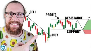
55:18
How to Read Candlestick Charts (with ZERO ...
Ross Cameron - Warrior Trading
3,152,905 views