The ULTIMATE Guide To Typography For Beginners
364.04k views2955 WordsCopy TextShare

DesignSpo
Launch & Grow Your Web Design Career: https://designspo.co
Understanding typography is important if...
Video Transcript:
typography is way more complicated than most people think you think something we've been doing since grade school would be intuitive but it turns out there are millions of ways you can manipulate letters and Tiny changes can have huge effects so in this design class typography 101 you'll learn the fundamentals of fonts so you can be an expert typographer for your personal life or your business and I guarantee you by the end of this video you'll never look at any website billboard or logo the same way again so what is typography typography is the Art and
Science of arranging text to be both legible and appeal feeling the fundamental building blocks of typography are characters and designers manipulate different parts of them to create different type faces when we use a certain combination of characters inside of a type face that's called a font and choosing the right font is essential because we commit most of our visual attention in any design to text now different fonts are like different tones of voice a silly font might be great for a clown but not a lawyer and a fancy font might be perfect for a wedding
photographer but not an eye doctor so just like you want to speak in the right tone of voice you want to pick a font that matches the energy of the project you're working on so we're going to go through every different kind of font and when you should use them starting with sarap fonts they're called that because they have little decorative lines hanging around them called seraps when Gutenberg invented the printing press he modeled the letters after handwritten and very fancy calligraphy the only problem was that this took up a huge amount of space on
the page and wasn't really legible so in 1470 Nicholas Jensen invented the first serif type face by chopping the flourishes off the calligraphy he called this the Roman type face based on Italian humanist script which at the time was the modernist alternative to calligraphy Jensen thought calligraphy was too fancy especially for the new modern industrial printing press and it caught on eventually the Roman type face became the standard in print for the next 200 years and it was the basis for fonts like Times New Roman which is now on every computer funnily enough the times
British not American actually created Times New Roman because they wanted to see more traditional even though the Roman type face was originally invented to be anti-traditional but today tradition stability and enduring value is exactly what people associate sarif fonts with that's why Banks Jewelers and lawyers typically use serif type faces in their logos and Designs these fonts are perfect if you want your design to seem Timeless you should avoid these fonts though if you're designing something contemporary or playful for a modern look and feel we turn to sand serif type faces Sans means without in
French and sand serif literally means without serifs now interestingly Sans serifs are actually older than serif fonts just because it's way easier to write simply than it is to write fancy but sand serfs typically feel more modern because modern culture is often trying to remove ostentation fancy decoration or anything that doesn't serve a direct purpose so like sarant that were invented as a simpler version of calligraphy Sans Sant were invented to remove every bit of decoration from a typ face the disadvantage of sans seront is that they can look a little boring and homogeneous a
lot of fashion brands recently ditched their striking and creative typography for sort of sterile and similar typ faces which made them all kind of look the same but sanss have a couple of major advantages over every other kind of type face first they're extremely versatile because they lack a distinct personality they can be used pretty much anywhere so the same font can work for a construction company dentist or e-commerce store the other big Advantage is that there's a lot of variability within each type face usually a serif font will have two options bold and normal
but there are thousands of sand serif type faces which are variable meaning you can adjust the sizing and thickness to create millions of different combinations within the same typee face that means you can use one type face for your entire brand sand serifs also tend to be more legible than serif fonts that's why they're the preferred choice for packaging road signs license plates key caps Billboards and roughly 90% of consumer products so if you have a modern brand or you're looking for more versatility or you're optimizing for legibility a sand serif type face is a
great choice now if you're looking for a type face that's specifically for Logos headings or titles that's called a display type face display type faces can be serif sand serif made out of weird symbols or anything you want they get their own category because display type faces are designed to be unique they don't make good paragraphs buttons or labels but if you want a small chunk of text to really stand out use a display type face what if you're looking for refined subtle Elegance then you're looking for a script type face a script type face
is designed to look like old school calligraphy the kind our hard-headed friend Nicholas Jensen didn't care for script fonts are designed to be beautiful classy and Timeless now script type faces are not to be confused with handwritten type faces handwritten type faces are created by the designer printing out letters in their own handwriting so usually this comes out as more playful and less elegant every type face we've seen so far has been proportional meaning different letters take up more or less space that's true everywhere except for monospace type faces where each character takes up exactly
the same amount of space and in the computer World monospace fonts are used all the time for coding it's a lot easier to navigate through thousands of lines of code arranged more like rows in a spreadsheet and less like paragraphs when every letter takes up the same amount of space now you can change way more about a piece of text than just the font and what you change and how you change it has huge implications for the legibility and personality of your text so I'm going to show you the 10 most important variables to be
aware of when creating the topography for your next project the fundamental building block of typography is a character but the fundamental building block of a character is called a point the point is the default unit of measurement in typography and it translates in the physical world to 1 12th of an inch so it's a unit of size 12 points equals 1 in now if you're designing for a screen you'll likely use pixels instead of points now these pixels are not literal pixels on the screen but rather another sizing convention they aren't literal pixels because if
you had a 64 pixel title that would be half as small on a 4K screen because the 4K screen has twice as many pixels so instead designers agreed that a pixel should be worth 75 points so 1 in in the physical world is 16 pixels which is the same as 12 points but if you're just designing digitally the most important size convention you need to know is em and RM or M and RAM m stands for no one's really sure people have different ideas about it originating from the size of the letter M in the
printing press I personally think it stands for equal measurement because it's a unit of measurement that sets the size of a character equal to the size of the font on the web the default size of a font is 16 pixels so if I wanted a heading to be 32 pixels I would set it to 2m the great advantage of Designing this way is that it lets users increase or decrease the size of your typography by changing their M this sounds like would be hard to do but it's actually as easy as zooming in or zooming
out on a website if you want to change the default size of M to something other than 16 pixels you can use REM Ram stands for root em because when designing websites in CSS there's this thing called root which defines stylistic variables for your website so if I set my root em to something bigger than 16 pixels every part of my design that uses REM gets bigger and it's still responsive if someone wants to zoom in or out on my website roughly 90% of websites are built using this m REM model so it's super super
important to understand so size is the first major component of typography and it's really useful for differentiating between titles subtitles and paragraphs but to further increase that contrast you can also manipulate a type Face's weight which is the boldness or thinness of a font generally the Bolder fonts command more visual attention and are more likely to be used for titles and buttons whereas thinner fonts are easier to read at smaller sizes so they're preferable for paragraphs and labels weight plays a huge role in the legibility of your font a large and extremely thin headline is
usually harder to read than a bolder one likewise a bold paragraph is too dense to differentiate between individual characters and leads to visual strain now if you're using a serif handwritten or script font you're not likely to have a huge amount of options when it comes to weight most of these fonts come in normal or bold where sander of typ faces are often designed with at least nine different choices for weight ranging from thin all the way up to Black now size and weight both affect each individual character of a font but there are other
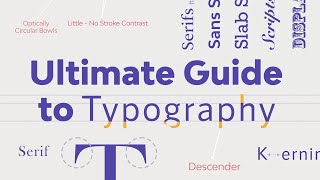
variables which affect the font as a whole the most important of which is called the Baseline the Baseline is the invisible line upon which your font rests if you've ever had to write on a line paper in school you were writing on the Baseline in the other direction characters extend above the Baseline and their Max height is determined by the cap line the cap line is a ceiling that stops the uppercase letters of a font fonts with large differences between the Baseline and the cap line often feel very fancy or luxurious and they're often used
for fashion magazines or high-end articles of clothing now if you look at any font you can also see that the lowercase letters have their own invisible line constraining their size this line is called the x height and some type faces even let you manipulate the x height to get even more variability in your design going back to our grade school handwriting books this dotted line in the center is the x height so the Baseline cap line and x height make up our measurements for a single line of text what about the space between lines of
text in print typography that's known as leading and in digital design it's called the line height leading and line height are measured from Baseline to Baseline and you can manipulate the line height to increase the legibility of your text at different sizes generally speaking the default line height doesn't look very good it's about 125% of the font size and it's the default on most design softwares to look okay at a lot of different sizes but it doesn't fit one size perfectly the rule of thumb for line height is that it's inversely proportional to the size
of your font so your biggest headline might have a line height that's exactly equal to the size of your text while the smallest paragraph might have a line height that's 1 and 1 half times bigger than your paragraph these aren't hard and fast rules and they'll change depending on the font you're working with but it's important to be aware of line height because it plays a huge role in legibility there's another component of spacing that also plays a huge role in legibility that's the spacing between characters in a font which in physical print is called
tracking and in digital design is called letter spacing letter spacing is also inversely proportional to size the bigger the text the more the eye has to move to read each letter to minimize this visual strain putting letters one or two pixels closer together can dramatically improve legibility and the Aesthetics of your design at smaller sizes the space between letters should be increased slightly so you can more easily make out individual characters there's nothing worse than trying to read a paragraph for the letters are bleeding into each other and you can't tell where one letter stops
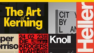
and another begins now every font that is it monospaced comes with its own default character spacing instead of uniformly setting spaces between letters most fonts have more space between certain letters or letter combinations this is called kerning letter combinations like w and a have more space between them so you can tell the Slants in each letter apart if you're working in a design software like Adobe Illustrator you can manipulate the curing of individual characters to achieve a certain effect for example the designer Jessica hish redesigned the Southern Living logo to very subtly change the curring
between letters to make it more legible without dramatically changing the look and feel of the logo so now we've adjusted our size weight line height letter spacing and curring to look more visually appealing but there's still one more important variable that can make or break the legibility of your text that variable is called accessible contrast and it's the color difference between your typography and the background back in the day of flash websites a lot of the text on the internet was notoriously difficult to read so in 1999 the worldwide web can sorted published guidelines for
accessibility on the web they use a formula to calculate a ratio between darkness and lightness for typography generally text is accessible if you have a contrast ratio of 7 to1 or greater web aim.org actually has a great contrast calculator that you can use to make sure your text is legible at small and large sizes so now we have all the tools to make an individual block of text look good our next question is how do we combine different text Styles together to create a cohesive look and feel across our entire Design This is called a
typography system building one makes our whole design look clean consistent and makes creating new text sections as easy as putting together Lego pieces the basis of our system is typographical hierarchy the idea is to create rules for each text type in our design so that our design is easy to read and navigate this hierarchy is generally divided into four categories headings paragraphs buttons and labels in web design we have six heading options H1 through H6 we don't have to use all six options often two or three are enough to build our heading hierarchy we start
by defining the largest heading style we'll set the size weight line height and letter spacing to something that looks good for our project and then adjust those parameters to get smaller thinner and more spaced out the smaller we go after we design our headings it's time to design our paragraphs buttons and labels in general we follow the same rules as our headings the smaller the text the thinner and more space dat it'll be an important exception is the button which is often Bolder than the paragraph So visitors to a website know where to click to
compensate for this increased weight will increase the letter spacing slightly to avoid squishing the characters finally labels are often designed to be smaller than paragraphs with less color contrast designers use them for annotations above images or as pop-ups inside paragraphs now that we have a hierarchy in place the last thing to Define is the spacing between text elements in our Design This is called designing around a grid because we use grid boxes to Define how far text can go before wrapping in web design you want to use 12 columns because it's a very divisible number
your headline might take up all 12 columns whereas a paragraph might only take up six and a button takes up just one in print you usually have two columns on each page most paragraphs take up both columns but you can include information boxes in one column and wrap the paragraph around it if you so choose newspapers generally follow a six column grid magazines use a three column grid and posters are often designed around the golden ratio whatever spacing system you use it's important to maintain consistency for a clean and professional design if you want to
learn more about how spacing can make or break your design and how to implement it easily on your website check this video out I made on the 4 pixel Rule and if you found this video helpful let me know in the comments or by sending me a message by email or social media
Related Videos

16:50
20 Graphic Design Hacks You Need To Know
DesignSpo
15,187 views

19:16
Color Theory For Complete Beginners
DesignSpo
2,812 views
39:03
The Ultimate Guide to Typography | FREE CO...
Envato Tuts+
534,727 views

10:27
What Makes Your Handwriting Messy?
Re: Design
149,772 views

21:55
How to Design a Logo in Adobe Illustrator ...
Artflow
240 views

18:58
2025 Graphic Design Trends You Should Know
Kittl
658,063 views
9:46
Learn To Kern — The Art of Kerning Typography
Design The Scenes
25,736 views

27:14
Typography Masterclass: The Evolution Of L...
Kittl
7,727 views

9:28
The ONLY Logo Design Guide You’ll EVER Nee...
Satori Graphics
81,699 views

27:40
The Biggest Misconception in Physics
Veritasium
6,323,286 views

12:24
The 80% of UI Design - Typography
Sajid
202,472 views

9:56
Understanding the Principles of Design | G...
Canva
479,372 views

15:39
5 MIND BLOWING Typography Tips For Designe...
Will Paterson
34,747 views

10:16
Typography Skills to Instantly Improve You...
Satori Graphics
28,920 views

11:04
TYPOGRAPHY | Everything I know about Type ...
Jesse Showalter
65,117 views
40:57
Abstract: The Art of Design | Paula Scher:...
Netflix
2,941,289 views

9:42
Typography Guide - How to Choose Fonts
Kayla
12,318 views

17:13
How to Be a Graphic Designer (All You Need...
Ania
318,288 views
40:26
How Brands Use Design & Marketing to Contr...
Design Theory
2,763,524 views

11:14
The ONLY Typography Video Graphic Designer...
Satori Graphics
45,490 views