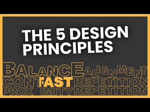
The 5 Design Principles (But in Web Design)
83.69k views1992 WordsCopy TextShare
The Website Architect
CONTRAST***
Text Alignment Video: https://youtu.be/aKXoKHj-EMo
50 Website Mistakes: https://youtu.b...
Video Transcript:
foreign so there's these things you were probably taught in your high school graphic design class called the five design principles if you're like me then when you learn them you didn't give a about them well now that I do what I do I use these five design principles every day and as I use them I can see how other people aren't using them because these are basically the most fundamental thing in design and in this case we're talking about web design I think we should go back to the basics and talk about them but in
a lot more of an interesting way than the way I learned in high school I'm going to use a mix of my drawings plus some real world examples of websites either doing each of the principles wrong or correctly hopefully by the end of this video you'll be able to identify the different types of design principles and more importantly how to use them to make your websites better the five principles of design are balance alignment proximity repetition and contrast you may have also been taught the acronym crap which stands for contrast repetition alignment and proximity but
this leaves out balance and I think balance is pretty important so the hell with crap there are other lists of specific design principles like Rhythm white space hierarchy or scale but all these other ones are just more specific examples of the five I have listed now with these design principles you'll be using some more often than others when designing a website but all of them are important in their own way all have the goal of trying to make your website design better more usable and more impactful one interesting thing is that depending on how you
use these design principles this can affect both UI and ux so how good your design looks and the experience users have with it so this can subjectively and objectively impact how good your design is depending on how you use the design principles let's start off with the first principle balance good balance is all about trying to create a visual Harmony on your website like trying to avoid one side of your website from having all the information when the other side has almost nothing balance can be measured symmetrically asymmetrically and radially here's an example of a
wireframe of a design having good balance particularly asymmetrically so here's an image on the left and on the right is a heading and a paragraph that together make both sides have an equal visual weight so good balance here's a page designed with bad balance there's a heading and a button on the left and on the right is an image with a lot of text this creates a visual imbalance and ends up making it look a bit strange the purpose of good balance in your website's design is for sections to be easier for users to scan
the page and consume the content and overall just make your website look better there's almost a subconscious effect going on when you can clearly tell the difference between a site with good balance or bad balance looking at some actual sites here's zoom's website if we go down to their media section they have this heading with the text button on the left and a lot of logos on the right so in my opinion the balance is a little off here making the layout look a little awkward and if you scroll down a little more zoom has
a good example of balance where there's three reviews in the left column and three Awards in the right column here's an example of what I think is some bad balance going on you can see in this testimonial section there's a small logo on the left with a big quote on the right this section looks a little off at a first glance now these small examples of bad balance aren't going to make or break your design but when you can see when balance can be improved you're going towards a better website design and here's the most
interesting example of balance I've ever seen this website has a two column layout with a large image on the right and only a little bit of text in the left column but because this image is simple with the majority of it being Sky both sides balance each other out with the visual weight that's going on I think this image perfectly describes balance and it's probably what the designer had going on in his head when he made this however one thing to know is that when it comes to balance is that certain designs can be objectively
or subjectively better or worse so there are some designs out there that can clearly have bad balance going on but in other cases it looks completely okay in a subjective way which again is completely okay you just need to figure out when there's too much imbalance going on in your design to make it as good as you can next up is alignment alignment is all about how elements are placed on your website the most obvious use of alignment is with text alignment making it left center right or Justified I did a video on text alignment
which you can check out if you want Link in the description but alignment is more than just about text alignment can also be used to add interest into your design designers use alignment to add creativity to their designs like this here's a site that used alignment to better place these images in a more interesting layout than a typical four column grid and they did this a little further down as well here's an example of some strange alignment this is the text list of all their clients but there isn't much going on for Lyman here because
of the way they did it it's harder to read and consume the content and honestly it hurts my brain to look at here's what it looks like with all the text left aligned it's not a good use for space but because of the better alignment in this example it's now a lot easier to read and for users to scan here's another great example of alignment this website uses it to create a very interesting layout by aligning decorational images all around they use alignment wonderfully here because the text content arguably the most important part of the
page is aligned in a very clean unobstructive way in the middle and a center column if they put the paragraphs around the page like where they have these paint decorations the readability of the site would suffer and it would hurt the user experience so it's good that they used alignment with these added decorations but didn't use alignment when messing around with the actual important content of the site overall with alignment you'll want to stick to using it uncreatively with important text content if your plan is to add some design flavor to your paragraph content make
sure that flavor is vanilla alignment is much better put to creative use with decorative elements on your website all right now for proximity proximity is all about how close elements are to other elements the primary use of proximity Is for creating relationships between elements like objects go together and distantly related objects are further away from each other proximity is also the design principle people are really referring to when they speak about white space in your design so proximity like white space helps your elements breathe and make sections distinct from one another bad proximity can have
negative effects on your website you can see in this example proximity wasn't thought about too much here where these headings don't have relationships with the respective paragraphs underneath if they wanted to improve the design they would use proximity or specifically margin in this case on the headings so that the paragraph cohesion makes more intuitive sense like this and now you can see the content is a lot more readable intuitive and organized all because of proximity but here's a good example of proximity going on here's Columns of different companies it's very easy to tell what content
goes with what company because of the good proximity with the elements to each other elements that are connected ideas are grouped together and that's it for proximity and now for repetition so repetition is all about the consistency and the unity of your design in trying to create a cohesion between all the elements and rarely using repetition to create an impact repetition is probably the most used in naturally intuitive design principle extremely unlikely a website doesn't even have the modest amount of repetition going on the biggest and most obvious example of repetition is with your typography
think about it every paragraph is designed the same every H1 well should look like every other H1 and every H2 should look like every other H2 and so on this ends up creating that cohesion I was talking about but also a brand style consistency a better user experience and of course repetition repetition should be consistent throughout a website's typography sets of buttons stylings spacings and very importantly header and footer here's an example of some bad repetition going on here's a four-page web portfolio of a ux designer ironic I know where his sub Pages have some
awesome title sections for his about and contact page but on his projects page he decides to make it unique if you wanted to improve the repetition of his website he would use the same title section for the projects page as he did the other ones as I mentioned before repetition can also be used to create impact this is more common with graphic design rather than web design but you can see an example of how they repeated their logo here overall repetition is very important it should basically be used overwhelmingly throughout any website when you vary
too many different sizes shapes and colors it can be harder for the user to process and take it in and lastly contrast contrast is all about the difference or importance of other things versus other things on a website one of the most prominent examples of contrast is again with typography a website's typography usually has visually distinct styles for all the different types of HTML headings and paragraph text the difference in contrast between these headings and paragraphs make for a very intuitive hierarchy making it very easy for users to consume and understand the text content contrast
is found in a lot of places like the color of this text versus the background the contrast is what actually makes the text readable against the animated background a lot of people make this mistake which I mentioned in my 50 web design mistakes video if you want to check it out as you can see here not everyone understands the importance of contrast contrast is important in web design because the reality is everything has a different level of importance and not everything on a web page is important and contrast allows you to tell users what to
look at what the value and what's worth their time looking at and that's contrast which concludes all the five principles when it comes to the five design principles I find that every website usually hits at least one or two of these really well but they fall short on one of them a great website uses the design principles effectively to create the best possible user experience and great looking designs thank you for watching if you want to be a better web designer or developer check out my other videos
Related Videos
14:50
How to Properly Layout A Website (For Begi...
The Website Architect
682,965 views

19:12
Web Design Basics: 4 Principles Every Begi...
Flux Academy
19,092 views

16:20
Everything About Website Navigations
The Website Architect
109,855 views

14:52
Design Better Than 99% of UI Designers
Tim Gabe
222,996 views

21:47
The Principles of Design | FREE COURSE
Envato Tuts+
1,319,456 views

16:33
9 Web Design Trends 2025 to Spruce Up Your...
Showit
61,942 views

9:16
4 Foundational UI Design Principles | C.R....
Jesse Showalter
225,238 views

21:04
Complete Course On Layout Design (MASTER L...
Satori Graphics
739,975 views

9:56
Understanding the Principles of Design | G...
Canva
411,370 views
8:24
50 Website Design Mistakes (And Why)
The Website Architect
107,081 views

17:04
Everything About Above The Folds
The Website Architect
55,655 views
3:07:31
Learn Web Design For Beginners - Full Cour...
Flux Academy
2,822,330 views

10:04
The Laws of UX - 19 Psychological Design P...
Joseph Todaro
295,509 views

25:15
How to start a website layout (for complet...
Flux Academy
42,993 views

17:59
Easily Improve Your Web Design (With Example)
Flux Academy
151,418 views

7:01
5 laws of design layout & composition *gol...
Shapes By Sean
581,123 views

14:17
The 7 laws of good Web Design
BONT
50,629 views

9:25
A Practical Guide To Website Page Layouts ...
The Website Architect
36,120 views
23:13
A practical guide to responsive web design
Kevin Powell
255,736 views
11:59
Complete Layout Guide
Flux Academy
834,522 views