Logo Design Process with a Client – Building A Brand, Ep 6
1.09M views4371 WordsCopy TextShare
The Futur
What is logo design? How do you design a logo for your company? What is the logo design process? How...
Video Transcript:
Josh finally responded to the logo and website we posted last week yeah he sent us some some feedback in its own it's a lot this is blind brand strategy design consultancy based in Santa Monica California since 1995 blind has used the power of design to help diverse clients reach their customers and stand out in the marketplace in this series you'll get a rare glimpse behind closed doors and see the process of rebranding a company from start to finish this is building a brand in our last episode Ben and Mathieu traveled out to Hamilton family brewery
to present and get feedback on the style escapes from Josh and Kristen Hamilton after going over the four directions and having a lengthy discussion about what Josh and Kristen like and don't like then in Matthew returned a blind to relay that information to the designers who will work on the logo Emily and min will continue on with the logo work and a new designer Emmanuelle Ricci will join the team Emmanuelle is a lettering artist who is classically trained in calligraphy since the Hamiltons have expressed interest in a more hand-drawn look for their logo Matthew and
Ben will utilize Emmanuelle's talents to accomplish this Emily will work on logos with a focus on typography and men will create a variety of marks to anchor the logo before the designers begin though they will refine the final style scape by combining elements of Emily's work or innate heritage with men's work merit badge the final version now does what a style scape is designed to do be a curated reference to determine the direction of the brand with the client seal of approval blind and Hamilton are now on the same page let's talk about the logo
design process you see up until this point we've basically been helping the Hamiltons refine their vision for what they want to see in a logo we've also been trying to uncover insights that would help us along the way in our creative process a logos job is to identify not explain so we don't want to explain what the business does inside the actual logo we just want to make sure that the brand is identifiable now it's time for us to start make things so we've given the designers a creative brief to work inside of and their
job is to go away and create as many logo options as they can think of in the time allotted our job as creative directors is to help them refine those concepts into things that are ready to present to the client now we're only going to be presenting three or four logo options to the Hamiltons so we have a lot of refinement to do as a hand lettering artist emanuelle is uniquely suited for this job originally from Italy he has studied typography in calligraphy in Rome Milan and Barcelona with experts in the field based out of
London he is in Los Angeles to work with blind on the Hamilton rebrand as well as other projects having been given a few days to work on their first drafts the designers are now ready to present their work usually when we have these projects Emily and min create just hundreds of different options and it's great as a creative director to be able to see the breadth and the depth of their thought process our first presenter is Emily whose job was to focus on refined typography she was challenged to create both boxy and circular layouts knowing
that the logo would have to play well on both flat surfaces as well as cans and bottles I think those iterations they're kind of scattered mm-hmm I think I tried to make some type of crust or kind of Lego not a complete circle but kind of still in that circular motion but just with some arches and I like those I like 15 a lot me too family breweries kind of odd the way it is above and below but I feel like there's a nice balance to that we're put so much emphasis and weight on agent
Hamilton mm-hmm so I feel like out of everything we've seen so far that hierarchy is working best in this version and I could see us as a circular thing I could see this on the tall can like I feel like the application on this particular logo because we still haven't seen this what this would look like in different forms like this one feels quite versatile in that sense all right I do like that one a lot yeah because it feels like what you could do is literally drop family brewery California in 2014 and just have
the H in Hamilton for a small lockup can we scroll up to like number five so it's kind of similar to number two the two the four and five that we said we liked but the the hierarchy is way better on that but I wonder if you took family brewery and stacked it underneath Hamilton and then put love people love beer as the top and a lot of her thing like that I think it'd be good I like that up next is men whose job was the monogram the monogram what we found out is that
we're using the word monogram wrong this entire time so I just googled it right now sorry we thought we knew what it meant but we didn't what we thought it was it was just like a decorative letter but a monogram technically is two or more letters that are combined together with some kind of decorative flourish so clients with long names are very difficult to work with Hamilton family brewery it's a it's a mouthful but also how do we represent that in a mark that's gonna represent them so with Emmanuel like we've tried to figure out
some interesting lockup where that's really tight and same with Emily but at the center of it all we're looking to abbreviate all of that with another mark that might identify them so for men we had her explore just the letter H to represent the whole brand and we're thinking about how those two things relates to the whole lock up and then reduce down to one letter I do like that the asymmetrical feeling where one leg is longer but because it's tied in at the top that it makes a P the P is more legible to
me than the H so I'm wondering if if you just disconnect it right or if instead of an asymmetrical thing where it's one is bigger maybe maybe one can just like down and then you connect it with the line instead of having it lard like longer so that make sense yeah I was thinking for that one because they as you were talking I like that word the eh like the left side could be a little bit lower and then you do that kind of thing mm-hmm cuz it like something like that could be cool mm-hmm
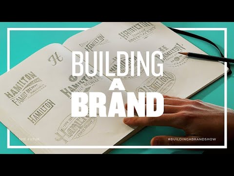
where it's just it feels like it shifted finally Emmanuelle will present his work Ben in Matthew along with the other designers will have to look over his shoulders as he presents his hand-drawn designs directly out of his notebook I would say the high point for me was when emmanuel open his sketchbook because i had been kind of eyeballing like peeking at mins and Emily's screen throughout the week and giving them little pieces of advice here and there I literally have not seen anything Emanuel had done and his skill with the pen and paper and the
way that he constructs his lockups it's just awesome and so as soon as he opened his book of like hey this is pretty cool there's a nice lock up this gives a nice interesting way to frame this the the H right there there's I think these are competing a little bit as far as the size so I wonder if the age could be much smaller it's at a circle or vice versa like the H is really big and then the other things are more secondary to that but this is pretty cool I like this like
I like that it feels closed up it looks a little different than what we've seen yeah you know I didn't want to go too crazy with flourishes and as wishes mm-hmm so when I did I wanted to keep his symmetry in order to like maintain the balance you know mm-hmm yeah totally yeah that's why I like those ones where it feels closed up they they feel like for this one right here like I like the angle the only thing I feel like the letter forms right now because they're rounded it doesn't carry that rich heritage
to for me at least on first class yeah I'm not saying that it can't get there but that's just my initial feel when I look at this especially they're rounded eight right there yeah right there's something about that letter form that I don't know I don't read heritage when I see that but there's something something cool like there's a different kind of like an old American style that there might be something there just I don't haven't collected my thoughts on that thing kind of all of them these two are my two favorites I like this
lock up I'm concerned that this might be a it kind of makes it a little bit too busy yeah so I'm wondering if we could lose the lower part of that circle and instead bring our CJ and just do kind of like a two dot there and then also the bow the bulge on these two it's a little extreme so I'm wondering if we could rein it back a little bit yeah you see the camp chimney Bluffs yeah it's just slight yeah you know so I would probably want to emulate that just a little bit
and in your iterations I would kind of explore I really like the multi typeface design but I would also explore pulling this in in the same typeface so once we're looking at I want to say probably 10 to 12 really really good concepts we'll cut that down to probably four options and then start doing mock-ups and this is where we'll take the logo and we'll actually put it in real-life situations so the client can see how it performs in the world so we'll mock it up on a on a beer bottle or a beer can
we'll put it on the side of the building so that you can see them really you know huge scale we'll put it on a bottle cap so they can see at a very small scale they'll be able to see it in black and white white on black and we just want to be able to walk the client through how each concept will live and breathe if they choose that one after the initial presentations Matthew and Ben decide to put extra focus on a Manuel's hand-drawn version of the logo that was the one redeeming thing that
they like from the daring artisan direction does the only thing they liked about it which is it's handcrafted and they love the idea of that so I think when we got emmanuel on board and he started do these things I was like wow okay that's that's perfect we got it we've got a double down on that we got to chase that even further and maybe even recommend that because it the results are so beautiful the accident lines may be a little bit busy here in these like corners okay so maybe lose the one in the
middle there in there yeah I don't know that you need them though yeah that's not the more I look at it I think these are good because it continues this you know to the edge of the lockup but I think that this one you might not need lines so when you vectorize it let's play around with it okay regarding the the monogram at the top to H there's something cool about this is that diagonal I know we were looking at some immense stuff last week but there's something kind of cool about this angle so it
might be worthwhile to see once you do a more cleaned up version of that like explore what that H looks like I like what you're doing like cutting the H at the bottom right there I don't know if the slope and that crossbar is working the best so that's why I might be nice to see what that looks like I know it might break some of the symmetry you know it might be interesting to see one thing too that I'm starting to see what the H under which is a media I'm just imposing so much
of a meeting in there but it looks like a bridge to me which is kind of cool there's there's something there like I know last week I brought up with mean stuff psycho I'm starting to see some imagery and I'm composing that but there could be something cool about you know bridging people with beer yeah right like we can we can make up something kind of cute or something kind of interesting there yeah with the work of the designers were find then in Matthew take another trip out to Rancho Cucamonga to present the work to
Josh and Kristen so the way we'll go through this is you'll see the logo you'll see the way that we've implemented it in a couple of different sizes and then you're also gonna see mock-ups and the mock-ups are purely mock-ups we just want to demonstrate how the logo looks in real-life situations there's nothing designed for your brand so if you see something that you like we can obviously pursue that but we're not pitching this as you know a final implementation of the logo that comes later the first logo Matthew and Ben present is stamp of
approval it uses industrial typography combined with over printed colored elements to achieve a vintage utilitarian design aesthetic the goal of this direction was to create a heritage look and feel for the Hamilton family brewery brand the good luck horseshoe ii logo design presented was the hand lettered direction from Emmanuelle this approach embraces the DIY qualities that represent Josh and the Hamilton brand the chunky and rounded features of the logo are meant to feel warm and welcoming to reflect the experience one might have at the brewery the third logo bridging the gap gives contrast to the
previous direction this logo was created by Emily and is more refined in its approach its circular shape visually puts Hamilton at the center between people and beer the last direction been in Matthew presented was another hand letter designed by Emmanuelle called cornerstone this logo was inspired by the Hamilton story of building a brewery based on the foundation of a great customer experience paired with great tasting beer the bowtie shaped design was meant to be visually dynamic and captured the sense of adventurous flavours found in their beers after going over the four logos they've been presented
Josh and Kristen have narrowed it down to two that they liked I mean our logo currently doesn't have anything about it it would say it's a beer logo other than the word brewery and I actually like that about these two as well because yeah oh you mean like it's not it's not like there's not like a hop somewhere because it's like that's the easy thing to go there's only so many ways you can draw a hop yeah with identity design we never want to explain we always want to identify Ben and Matthew had all four
logos printed out so that they can look at them side-by-side but since Josh and Kristen are leaning towards the hand-drawn one's the most Ben brings those out for them to look at and give reactions to I'm torn I'm not that because I feel like we're okay I feel like we if we pick this it's like there's a thing I like about that horseshoe one maybe it's hearing it as a horseshoe but it just it's like calming and like a slow day on a ranch or something and you could brand a horse with it and it
could be like a family farm which I love that but like that one makes me want to get up and do things like that the other one which is fun and exciting and see I and those are I don't know how but I like those two things I don't think they can coexist I sent our company or who we want to become more I think it's both you know yeah I know that's yeah because I think you enjoy beer in multiple settings like you go out hiking fishing go to the beach adventure but then also
you drink it on the front porch or in the backyard if you could picture this painted on the wall in the brewery maybe behind the bar which one would look better there which one will feel more at home probably the circle one yeah yeah maybe tweaking the H so that that that random thing I get where it looks like a tattoo or something or Z it might it might just be that the density of slope are no fun even that steep but maybe it's just the chunkiness of the two legs like their closeness with the
direction chosen Emmanuelle's hand-drawn rounded logo the next step is finalizing colors these colors won't just be used for the logo on a beer can they'll also be utilized through all of Hamilton's Design & Merchandising for me it's kind of like so there's some practical stuff like okay there's probably only have one wall on the brewery maybe two that we could put a big logo on do we really want it to be dark blue well that'd make you feel too dark there so like there's those things that like maybe as it like my brain goes to
as a business owner or like do we have to buy new chairs or do can I get like you know seafoam green bottle openers the other like those you know so there's a practical side that like I think really can stifle the creative side you know that I just I have to have any as a business owner so to have someone who can just design with all none of the other strings attached it's cool it's helped me to think about things in a different way or to have someone else who can see beyond the practicalness
and just the actual design is fun so yeah when I think about colors my first instinct is like oh that's going to be easy to order you know you know great yeah I like the yellow and the blue yeah I felt like last time like we need more blue what's the color and then now we're like this is like a it's not a navy yeah was there a navy in any of you guys oh okay yes I do because this is more like it's very vibrating your bakit blind matthew is working with Emmanuelle to tweak
the logo small changes in a logo can make a big impact and Matthew is hoping to perfect it before sending it back to Josh and Kristen we're still trying to balance the letters right here I think looking at this like this feels very balanced as H a.m. because of this counter space that the a is creating we need to tighten that up a little bit relative to this so either that checks out a little bit or maybe we need to make the a a little bit wider out as far as the angle of that and
the 8 right here even though I know it's probably straight across so at the end it feels optically like this is a little bit smaller than the end so I think there's a little bit of space to open that up make that a little bit taller there a little bit wider just so that we can close up the counter space that that is making the seraphs feel mostly good like the B and the top of the are here and some of it if you like in some areas like the a right there feels like it
gets a little skinny like too skinny so I just want to fix some of the inconsistencies as far as the the smallest a serif can be I want to make sure that those are fairly consistent because right now it feels like of a pretty big range of thicker serifs and then the inner surface but it doesn't seem consistent across okay the money well has worked to get the logo as tight as possible and Ben has sent off this revision to Josh and Kristen while feedback is rarely instantaneous Matthew and Ben Wade over a week to
hear back from the Hamiltons a long wait time with no communication is one of the most difficult things a Project Lead can go through it's not a quick you've done excellent work nor is it a thoughtful we'd like to see some changes the longer one has to wait the higher the chances are of more work or even starting over the moment that I got the email from Josh I opened it expecting it to be an approval letter like hey Ben we love this we're ready to move forward I got the exact opposite let's start with
the logo because logo when we last presented to them we went to their office yeah we thought it was in a great spot they had chosen one that they felt really good about yeah and that they wanted us just to do a little cleanup and tweaks to the monogram at the center so we were under the impression that we're good referring to finalized thing I think the feedback was you you nailed it mm-hmm except the monogram looks a little bit like a zero too great so we need to tweak that and that's what we did
that turns out Josh had this deep down buried idea that he wants to bring the tree back just as a you know I seem a change to the age to make it look a lot less like a zr2 but now it's only in age and he says his main concern is that a cool-looking age has no meeting behind it other than it's the first letter for a company name mm-hmm so he's looking for that meaning behind the logo mm-hmm just something that we've talked about mmm-hmm so and he's also sent a couple sketches so he
has he's proposing his tree again that he had before like a simplified version of his tree that he said also that he doesn't want to leave the sense of his former identity behind with the change okay so that's pretty common right we've experienced this before we're rebranding something and the client gets cold feet like you know I'm not ready you're not lying yeah I'm not ready to leave behind our old identity because I'm attached to it oh we've had clients spend a quarter million dollars with us and then decide to retain their their logo so
for me I feel like we need to hop on a call with with them and figure out where this is coming from yeah because if it is it's like hey you know I just like I can't see our brand without this tree or you know I just really dislike the monogram you guys decide like I just want to know what's fueling that because he kept everything else intact yeah so we're still you know 80 out there you know he has some other thoughts on it because it looking as a monogram here to another page did
he justify what that Hey yes says the arch forms a lowercase H and looks like a door and then this looks like a roof this angle mm-hmm so he's looking for for a double meaning in either way I see so let me just illustrate something with that yeah so I think we just need to unpack his motivation behind this a little bit more before we proceed with anything right I think that's essential because we've also taken this logo and applied it in the whole system mmm so when we presented the second round we actually executed
the whole system now if the whole system doesn't work because of this icon that's gonna change a lot of our approach on our next episode Ben and Matthew will have to take a step back and rethink the design of the logo with only one revision left there's a significant pressure to get this right so that Josh and Kristen don't have to go outside of the contract they have a blind with Josh wanting to bring meaning back into the logo how will they proceed find out next time on building a brand did you enjoy this episode
did you like one logo design over the other did you agree with all the decisions we made let us know in the comments section below if you want to learn how to level up your logo design check out the links in the description as always don't forget to like comment and subscribe because it really helps us out we'll see you on the next episode of building a brand
Related Videos

25:35
When Clients Change Their Mind – Building ...
The Futur
430,015 views
17:14
Designing a Brand Identity In 8 HOURS. How...
Will Paterson
161,912 views

18:36
9 Types Of Logos For Brand Design & Strate...
Brand Master Academy
145,862 views

16:20
Logo Design Process With a Client | From S...
LogoFarmer's Studio
1,499,893 views

8:51
Don't Justify Your Prices. Do This Instead.
The Futur
910,373 views
11:44
How to design a Brand, using A.I.
Shantanu Kumar
68,183 views
8:41
Quit Lying Saying You Create Brand Identities
The Futur
102,638 views
9:55
10 MIND BLOWING Logo Design Tips ✍️ 2024
Will Paterson
124,463 views

11:01
Starting The Branding Process – Building A...
The Futur
709,055 views
3:04
Why Companies Are 'Debranding'
Bloomberg Quicktake
2,501,142 views
8:26
6 GOLDEN Rules Of Logo Design (Logotype) —...
Satori Graphics
532,825 views

6:45
The 6 LAWS of Logo Design (Don't Ignore Th...
Abi Connick
35,399 views

54:26
Designing a brand identity for a real client
Flux Academy
22,741 views
1:08:11
He Made 8000 CRORES In JUST 6 Months - Uni...
Raj Shamani
326,611 views

6:52
How to Generate Design Ideas!
Abi Connick
181,410 views

33:17
Top 100 Startup Ideas from Top 100 Entrepr...
Breakdown
142,856 views
13:35
Redesigning Your Logos! (Most Common Mista...
Will Paterson
135,809 views

14:09
Revealing My Full Brand Identity Design Pr...
Abi Connick
29,823 views

22:34
I hired 3 Graphic Designers to Design the ...
Anik Jain
103,778 views
13:54
I Paid 5 Designers On Fiverr To Design The...
Will Paterson
3,591,140 views