How a Pro YouTuber Actually Makes Thumbnails
79.09k views5587 WordsCopy TextShare
Think Media
In this video, Nolan and David Altizer discuss pro thumbnail design and strategies.
⭐️ Reimagine con...
Video Transcript:
what makes a good thumbnail that gets clicked composition is King baby when I'm talking to creators we'll talk about the title we'll talk about the thumbnail and then I'll say Okay now what's your first 5 seconds I made a thumbnail with Max it's an image of him with a cow with a police officer and then you click the video and right away you're confirmed he's literally walking around the Streets of London with a cow with a beer in his hand and it is an immediate payoff and that video I think has like 5 million 6
million or something like that making sure those first 5 to 10 seconds have some sort of payoff to the thumbnail you got to just press record David altiser is on the think media channel today and I'm excited because dude you've worked for a lot of different YouTube channels now you have this next transition to thumbnail design yeah first of all tell us like what kind of YouTube channels are you working on and then are you tell us your thumbnail design process how are these big YouTubers like you know how do they do it and you
know break down that process sure yeah so I'm I'm currently working pretty much full-time with Curtis Connor folks he's a a comedian commentary Channel and he and I have really developed a great kind of design language based off of what he was already doing but I've kind of simplified it down and kind of elevated it is what I told him I was like I've been a fan of your work for years and you know you've he kind of created this like yellow uh helvetica font style on top of him like giving a crazy reaction with
a bunch of messy stuff behind it I call it the Scrapbook uh style uh because it looks like a scrapbook it looks like somebody took pictures and cut them out and then pasted them on a picture and so he kind of actually humbly said yeah I think I created this style but now almost every commentary channel does that format so I want to highlight that like he has the ability to kind of own that style cuz he literally pioneered it but we needed to elevate it and that simply meant simplifying it cleaning it up and
thankfully with Curtis I'm given a really you know high quality uh video file of him giving me faces so usually he'll have the title in mind he'll maybe even have most of the video shot and then we'll get on the phone and maybe discuss you know the thumbnail and he because he's so intuitive and he's been a YouTuber for so many years he kind of just knows what what it should be and so he'll tell me like hey here's what I'm thinking and then I'll spitball some ideas then he'll give me like you know a
10 or 20 second clip of him giving me like three or four different faces and you know he has a nice camera and nice lighting and so I'm able to just pull that out and stick it on and then almost everything else though is like generated either with AI or from the assets that he's referring to one of the things that has been really helpful with my career is AI upscaling so I work with Cody CO as well and uh Curtis Connor those both those guys do reaction content and often the things they're reacting to
are Tik Tok or like really lowquality images and so in the past their thumbnails would almost look a little uh kind of low quality because like they're just reacting to this really you know blurry object maybe they even scale up to it or whatever like scale into it there's some tools like uh topaz and another tool that I use called magnific AI which is extremely expensive I don't necessarily want to recommend this to everybody but if it's something that it's $40 a month it's extremely pricey but okay it is but because I'm doing this full-time
I'm making you know two to four thumbnails a day and I use it every day it's become you know part of my budget part of my workflow they also have a free trial so if you want to try it out you could try it out but what it does is it uses some of the same technology that you see in mid Journey but it takes like an image that you import into it and it creates AI on top of like from from a pixel for Pixel basis it replicates what it's seeing underneath the AI that
makes sense so like when I input it it's going to Output a really sharp crisp representation of what I inputed uh using AI so like if it's somebody that if if I have a photo of a person that's not recognizable it's not a famous person I can just put it in there and it'll spit out a sharper cleaner image essentially uh so I use that all all the time now so that's kind of been my like little secret sauce uh but with Max give us all the secret sauce what other what other AI tools or
you know give give us all of it this is awesome I'm loving it the thing that I love to use for mockups uh right now is actually chat GPT 4 with Dolly so dolly is their like version of mid Journey which is an AI art uh creation tool and it's not as advanced as mid Journey it's not even as advanced as some of the other tools that are out there but what is so great about the chat GPT AI art uh creation is that you can talk to it like a human and so I will
actually just start talking to it and I'll just say hello my name is David altiser I am a YouTuber who makes content about cameras and I'm doing a review on a new Sony camera that's brand new it does this this and this like I give it all the the context of like what that video is and then you say I want a thumbnail where I'm off center and the camera is focused with leading lines leading into the camera so that the viewer can see that camera and uh like their eyes go to that but I
still want to be in the image you know give me a mockup and then it just will spit out a mockup and I'm like okay cool now can we do it a little darker and blah blah blah and so then I'll maybe have four or five mockups of a thumbnail and I could even input like a photo of my face and be like okay here's here's my face make sure that the subject kind of looks like me and so then it'll kind of create you know a subject that sort of looks like that and if
you're watching the think media video right now you can see some of the examples that I've done this one specifically is with Hayden hiler Smith he was doing a video where he was talking about a film that he made and he wanted to have kind of like the before and after he wanted to have leading lines going into the center of the frame and we had a bunch of mock-ups and we landed on this one as our format and I was able to take that mockup and basically just plug in the actual assets into that
and I didn't really even use any of the AI stuff but it was such a wonderful way to collaborate with AI to spit out something that we wouldn't have even thought of just kind of that collaboration you might hear all the time with Mr Beast and Ryan Tran and many others talking about how you need to have uh YouTuber friends you need to have people to work with and I I don't think this rep uh replaces that but if you are just getting started using this is a great way to collaborate with something it is
just a robot but but it's so uh amazing how how how great this is and and just seeing something at least for me I'm such a visual learner when I see something I'm like oh that makes me think of this can you add this to it and then it just does it and I might have again like five or six mockups that I can then show the client we then dial it down to like one or two and then I just use that as a way to kind of get started so that we kind of
know where we're going with it I think that's a hard part for a lot of people is they don't know where to start so the fact I mean you're giving away the secrets here which is amazing and I actually I've experimented a little bit with chat gbt 4 but like you're encouraging me to go do that more so this is this is really really cool are there any other prompts that you do because you're really just using this to get ideas right that's the ultimate goal is you're trying to you're trying to spark inspiration on
how to actually you know compose and set up the thumbnail is that right correct yeah and and every once in a while I will create backgrounds uh using AI mid journey is better but you know what's funny about mid journey is it's so Advanced uh now that it looks very photo and it starts to do what you were talking about earlier about how like the so many little details that you have to remove so like mid Journey looks so photo real that like I'll receive a background that that looks like a real photo but like
there's wires in the background there's like a blue trash can over here and like I need to clean it all up whereas chat chbt is not as advanced so some would argue that it doesn't look as realistic but it's more simple and minimalistic because it's not not as advanced so like I find chat gbt's Dolly image creation definitely good enough for thumbnails if anything I kind of like how simple it is because it usually spits out uh an AI image that's pretty simple and minimalistic and then what I'll do is I'll actually take that Dolly
image which again isn't as advanced as what mid Journey does but then I'll input it into magnific which is what I was talking about earlier and it then takes that AI generated image and makes it look photo real so I have this very simple clean AI image that I then input into magnific which then converts it to looking realistic and sharp and then I pull that into Photoshop and use that as an asset that's super cool I love that hey real quick I want to shout out to day sponsor video. video. is a tool where
you can upload your long form videos or podcast and it will automatically chop it up for you to repurpose into shorts and clips with customizable animated captions and brand kits my favorite way to use this tool is for finding podcast clips that we can upload to our YouTube channel I simply upload a video and then it breaks down the entire conversation so that I can skim through the topics to find something that would make a great clip this saves me a ton of time so I don't have to rewatch the entire podcast looking for good
clips from here all I need to do is edit it how I would like export it and then upload it to our YouTube channel now if you want to give it a try check out the link in the description of this video I do want to talk about what makes a good thumbnail and and uh you know and even people too they might hear this and they assume in order to make good thumbnails they they need AI tools and they need Photoshop and you really don't great a great example is I saw on your just
like personal Channel it has like half a million views and it's the 4K forget ssds iPhone 15 Pro records SD cards and the thumbnail is so simple and there's just a little bit of text and did you click the video watch the intro did you see the intro yeah so that's what I was gonna mention too is that's a great example and I'm I'm curious if you if you did this on purpose and if you see other because I noticed Ryan will do this sometimes and other YouTubers but when you click on that video there's
a direct payoff because it's actually it looks like a screenshot of the opening frame so tell me is that a strategy that you use and and uh 100% okay yes yeah uh in fact I'd say the the greatest success in that conversation with my work uh is with Max I think the title is I broke in front of the police it's an image of him with a cow with a police officer and then you click the video and right away you're you're confirmed he's literally walking around the Streets of London with a cow with a
beer in his hand and it is an immediate payoff and that video I think has like 5 million 6 million views or something like that I also tried it with Curtis Curtis is a different he has a very dedicated very strong following loyal fan base so he could sort of like rant for 2 minutes at the beginning and people will still watch it he'll still get 2 million views even if he took 3 minutes to get to the point but I I have been encouraging him to uh have intros that match the thumbnail or maybe
like a teaser at the beginning and he's been seeing success with that as well so yes this is 100% a strategy and one of the things I forgot to bring up when I'm talking to creators is we'll talk about the title we'll talk about the thumbnail and then I'll say Okay now what's your first 5 seconds and like literally that is part of the discussion when we're talking about thumbnails is like making sure those first 5 to 10 seconds have some sort of payoff to the thumbnail because we do live in a unfortunately in a
day and age on YouTube where people will maybe put something that would be considered clickbait on the thumbnail and you click it and it's completely different you know it's just it's not what the thumbnail is they were just trying to get you to click on it and so I think simply telling the truth uh goes a long way with all things you know in life uh but in particular with videos if you are really you can kind of enhance the thumbnail make it cleaner make it pop make it look better to like get get somebody's
attention but it still needs to have a baseline truth telling aspect to it that you are paying off as quickly as possible especially if you're a a new Creator I think a lot of bigger creators that you may watch you could maybe have an argument with me on it's like well they don't do it it's like well yeah they have 6 million subscribers and they're averaging 1 million views per video if you remember if any of you were Casey neistat fans during the Vlog era did you care what title or thumbnail was on that video
no you just clicked it and watched it because you became a fan of Casey iat's daily Vlogs and anytime he would post you would watch it the thumbnail and title was almost irrelevant you know for the most part so I think those are two different models and Curtis definitely has that a little bit too but anyways the intro and the thumbnail need to kind of match in my opinion I think that's kind of a secret uh secret trick that you you can do and I've done it with my own videos like you said that was
just a video took me 2 hours to make it but I had that intention of like shooting the thumbnail and I actually edit the thumbnail before I edit my video so when I'm doing my own videos I'll actually get my thumbnail finished before I even start my thumb my my actual Video Edit and then that kind of can almost dictate the video in a way at least the intro yeah that's really good what are other tips you have on what makes a good thumbnail that gets clicked composition is King baby so composition is is King
for all things when it comes to cinematography when it comes to photography when it comes to Fine Art and the same is true with thumbnails any form of art composition is King you may have heard that in other uh niches can you explain what composition is yes the the easiest way to look at it and again I would recommend everybody go outside of the YouTube box or the YouTube bubble that we live in and and study art study Fine Art study why certain paintings are actually good study why certain films and filmmakers are great at
storytelling and I think that's such a great way to have a rich kind of understanding and Baseline of like what actually looks good that's how you develop your taste and that's how you you were asking earlier like you don't want to just copy other YouTubers if you have all these input sources from other uh genres of film making photography and Fine Art those things are going to come into play when you make your thumbnails so that your thumbnails actually look completely unique Technic Tech Al but you're actually pulling from all these other sources anyways the
way that I get started and you can download my asset for free plug plug on learn Bo in that Tic Tac Toe grid as its own image in of itself and having an understanding of of image balance is really important too so for example if I had a bunch of the weight of the image I'm saying that in air quotes but if I had like the subject on the right hand side of the image and I had like a car on the right but then there was just a big sky on the left and it
was just empty the image would feel lops side it would feel like all the weight of the image is on the right and so you can you want to balance that out almost as if all the objects in your frame are on a scale you balance that out by maybe putting a big piece of text on the left that that can then be a size that sort of matches what's on the right hand side and that starts to balance the frame or you move your subject into the middle you move all the objects on the
right and then you have text on the top left or something like that the asset pack that I'm giving away for free too also includes the time code uh in the right scaling and the rounded edges that YouTube has as well so if if you haven't noticed right now YouTube rounds all the corners of your thumbnail on the home screen and on the Subscribe feed and it's different on mobile and it's different on desktop the roundedness is actually more round on a mobile device and it's less round on a desktop the time code is also
larger on a phone and the time code is smaller on desktop and what I mean by that is on the bottom right hand side of the thumbnail you'll see the length of the video uh that is always taken into account when I'm making my thumbnails you never want to have text or anything important on that bottom right side so you can basically put text or things top left top right bottom left but never touch the bottom right and I almost treat that time code as part of my composition so if that big chunky 10 minute
and 16sec time code is on the bottom right I kind of want to balance that somehow by putting something on the left hand side of that rule of thirds to then balance that time code because again people are are not viewing the thumbnail as just an image especially on a you know 27inch monitor which is what I have at my desk here they're viewing it mostly on a phone and certainly now on TVs as well which has been really exciting as well because of the TV model if your creator or if you're a Creator who
has a lot of TV viewership you could have a little bit more detail going on in the image and I've seen that work really well Mark Rober for example has had some successful thumbnails I mean he's very successful in general but he's had some that were very highly detailed but still very simple in idea so I think that's where the confusion can be you you can have detail like if it's a big explosion with like fire and stuff but it's still just an explosion there's not wires there's not different colors mixing and matching but there
is details within that so if you're a TV viewer you can do that and we're able to get away with that with the editing podcast for example which has a large TV viewership audience so anyways composition we could go on a tangent with that for a long time I personally really like having the subject on the left hand side of the image because of that time code but I also do a lot where the subject is just dead center with leading lines going into the middle but again do some research outside of YouTube and study
composition some of the best painters and some of the best artists in the world have some of the best compositions that you can learn from and I would highly encourage you to go outside of YouTube to learn that to be honest it's funny because I've heard people say the opposite of they enjoy putting or prefer putting the the face on the right hand side like you SE the Mr Beast reacts videos because the time code just kind of covers like maybe like the neck or the shirt or something yeah that works too yeah that totally
works I've done that with Curtis just depends but yeah there's never one answer that fits right for every single thumbnail right depending on your audience you know we read left to right so in America and in the English-speaking in most countries read left to right right it just depends on like what you want them to see first so in the Beast reacts you can sort of on your peripheral see that it's Beast so you know exactly what it is it's the same face every time too so like there's nothing there but for Curtis like his
audience is so dedicated to Curtis that like I kind of want people to just see Curtis's face first because as soon as they see it they'll probably just click on it but but if he's reacting to something wacky and crazy that is like going to get a a click then maybe I'll put that off to the you know so that's how I'm thinking about it is like what do you want them to see first because we read left to right they may actually see that leftand rule of third first so if it's the game that
you want the focus to be on then put that on the left if it's the Creator then put them on the left you know with Cody Co he's always on the left for the most part what what do you think about text on a thumbnail when should people use text or arrows or certain circles elements like that and when should they not text on on a thumbnail so I think you and I would would be in agreeance on keeping things as simple and uh minimal as possible so uh Jerry Seinfeld has this famous quote where
he says that when he's writing a joke he takes one word out at a time until the joke doesn't make any sense anymore and then he puts that last word back in so I think that should be the same philosophy when you're creating a thumbnail and especially with text how many words can you remove before it doesn't make sense anymore so like even if you you can just have one word that would be great you know why is a good one with a question mark or how or uh you know those are are good because
they can they can play off of whatever title you have to create some sort of open loop that makes people want to click so I would just keep it simple you know find a font that you really like that is clean and bold but maybe even something that that not many creators are using so that you can start to kind of own that font in a way you know tryan has kind of owned that like very simple helvetica font style and many others are are using it I would I would have just encouraged other creators
to yeah you can be inspired by tryan but maybe find a different font that looks a little different that way you can start to kind of use that as part of your branding but I would keep it to like a minimum of you know or a maximum of like three to four words if you can again Curtis has done more words because sometimes they'll have like a whole sentence there I don't know if how effective that is to be completely honest it's just what Hees I usually do the whole edit for Curtis and then he'll
actually do the text himself because we found we were going back and forth a lot where he'd be like put this no put this move it over to the left I was like how about this I'll just give you the clean image you do the you do the text so that's our working relationship so you can get away with more it just depends on the context but I say good rule of thumb is keep it like under four words and as far as arrows and circles I don't use those as much as I used to
I think that might be again it depends dep on the niche I think for you with your basketball stuff like the arrows and circles make a lot of sense cuz you could almost not even have any text it's just pointing to something or circling something so just depends on the niche really but I don't use a lot of arrows in circles one thing too I think most people get wrong in the beginning is they just put the title for text in their thumbnail and what you need to realize is I like to think of my
title and my thumbnail as like a union or like a combo punch a com attack and so usually most people look at the thumbnail first it catches their eye and then they read the title which gives more context to what they're looking at and so that's how I kind of like to approach things and I'm curious your thoughts too because we'll see you know people in our community a lot of times are just putting the same exact title in text and if you actually add something that is completely different and can spark curiosity make them
look at the image and then when they read the title now they have maybe the context of what they're clicking but how do you is there any you know tips like that on how you approach just that combination yeah I would actually add to that and say that the first 5 to 10 seconds is also part of that same Union because if you if you're successful and having a good title and thumbnail and they're like looking at it on their phone for a second it's going to start autop playing as well and so you've even
noticed if you look at even the most recent Mr Beast videos he's removed all of the uh kind of big bold uh text at the beginning where it's like captioning because the autoc captioning kicks in on the autop play and if you have a bunch of text going on on the video with the closed captioning as well it kind of is disorienting so I've even noticed he'll actually turn off the captioning when he does go to the Bold text on the frame and then it'll kick back in when he stops using that so you can
actually finagle that and kind of tweak it if you do have text on like embedded in the video itself that being said that's you know that's beast in that style but I would keep all three of those things in mind uh as part of your strategy but um absolutely you don't want to repeat the uh the title in the thumbnail just like if if this is the first time you're hearing that from this point forward don't ever do that like just just don't okay so uh and just like use your imagination on like what I
can add to this whether it's a question that you can ask that can play off of that title whether it's um you know how many days you tried it or like I don't know it's just when you're coming up with your titles and thumbnails think about both of them together and when I'm writing out my ideas in Apple notes I'll like I'll type the title out and then in parenthesis I'll put whatever two or three word text that I'm going to put there in like a parenthesis so on the thumbnail so it's like you really
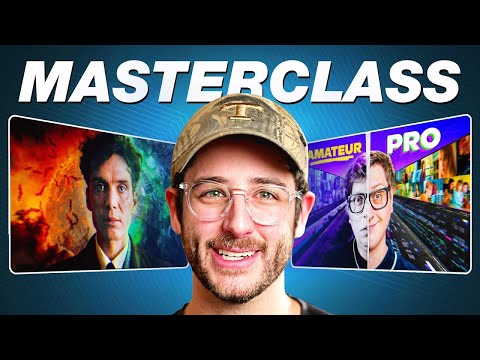
want to think of both and it's to be honest I think it takes a lot of courage and a lot of boldness to not put text and I would encourage you to maybe even consider trying that because one of the things that can really make you stand out is by simply doing what everybody else isn't doing and I've seen success on a couple of thumbnails that I've done where it was very focused very simple the one I'm thinking of right now is uh I did a thumbnail for frame Voyager where it was uh Killian Murphy
and he was just in the middle uh I had like some Inception stuff going on behind him and I had some cool uh like atomic bomb stuff from Oppenheimer behind him but it was really focused really simple and you could have put text there asking a question but it really would have thrown off the kind of Artistic integrity of it and because his channel is a video essay Channel it works really well for that so I would encourage you to almost like don't use text if you don't have to so good this was a master
class on YouTube thumbnails you gave us a all the secrets thanks for coming on David where can people find you and learn more about thumbnails and hang out with you yeah well I started a new channel called learn thumbnails where I'm going to be going over all of these things and more uh some of the work that I've done and and I'm I'm starting that up uh I feel encouraged by uh the support of Nolan and many others so I'm building a whole business around thumbnails and it's all based around learn artists join us every
Thursday we have a thing called thumbnail Thursday on Twitter spaces and you can jump in and uh be a part of that conversation we've got some amazing thumbnail artists who work for arak trean many others who are on the speaker panel and we'll we'll talk each week about thumbnails about the work that we're doing and then we open it up to roasting at the end where you we roast your thumbnails and give tips and tricks so follow me on Twitter at DVD altiser
Related Videos

30:04
Genius YouTube Advice for 30 Minutes Strai...
Think Media
417,596 views
![I Replaced ALL my ADOBE APPS with these [free or cheaper] Alternatives!](https://img.youtube.com/vi/5EfqHg49kMk/mqdefault.jpg)
10:18
I Replaced ALL my ADOBE APPS with these [f...
Joris Hermans
803,650 views

15:33
Thumbnail Hacks YouTubers Use To Hook You
Film Booth
201,805 views

19:27
MrBeast Shares His Best YouTube Advice
Think Media
2,349,247 views

4:12
Get Clients as a Thumbnail Designer Fast!
Adil Azaz
4,988 views
44:28
They Make MILLIONS on YouTube Without Crea...
Think Media
182,242 views

30:07
how to make a killer thumbnail (for the 20...
Aprilynne Alter
349,117 views

30:20
My YouTube views exploded after fixing thi...
Think Media
28,974 views
16:53
9 Things I Wish I Knew When I Started YouTube
Ali Abdaal
1,301,085 views
35:15
10 Editing Mistakes Small Channels Don’t K...
Think Media
46,312 views
11:43
Try This YouTube Thumbnail Generator AI Sy...
AI Andy
10,997 views

24:21
How to Make VIRAL THUMBNAILS like celebrit...
Nour Art
288,967 views
18:03
I Made 700 Monetizable YouTube Shorts for ...
AI Genesis
4,163,610 views

28:08
the Rise and Fall of Adobe
Jazza
471,862 views
38:55
15 YEARS OF YOUTUBE ADVICE IN 38 MINUTES
Prince Ea
203,888 views
31:02
Things I Learned as a YouTube Thumbnail Ar...
MaximumPanic
6,187 views

23:47
Genius Advice for Small Channels
Think Media
420,498 views
![How to Make YouTube Thumbnails in Canva [2024]](https://img.youtube.com/vi/b_UJZ00-pX4/mqdefault.jpg)
19:53
How to Make YouTube Thumbnails in Canva [2...
Technically Trent
3,391 views

42:41
How to Get Discovered on YouTube With Zero...
Think Media
65,456 views
13:23
How I Turned YouTube into a Six-Figure Income
Qroo Paul & Linda
64,177 views