Top 15 Most Common Thumbnail Questions ANSWERED
9.19k views3963 WordsCopy TextShare
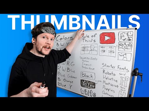
vidIQ
I turned your YouTube Thumbnail questions into a 20 minute masterclass.
vidIQ's Thumbnail Generator...
Video Transcript:
I went back through every one of our live streams to find the most common thumbnail related questions and in this video we're going to answer them now Pro tip there are a lot of pro tips in this video so I'd recommend grabbing a notebook question number one what are the key features to making a successful thumbnail I.E what makes a thumbnail good now I've thought a lot about this so I decided to make a really really simple checklist to remember and if you don't check all the boxes then your thumbnail sucks I call these the
three C's to get the click and click starts with a C too but that's just a coincidence okay so number one is catch the I and we'll go into a couple techniques on how to do that here in just a second number two is convey the idea of the video this can mean the difference between a viral video and a waste of time and number three is create curiosity which arguably is the most important thing that a thumbnail should do because without curiosity why why am I clicking right Pro tip a lot of things can
catch your eye but I find the easiest way to figure out what catches eyes is to do something I call the feed test now the feed test is when you open up YouTube on your desktop and then take note of the very first thumbnail you see try to figure out why it caught your eye it could be bright colors it could be a recognizable face it could be big text that catches your attention it could even be the contrast to the feed itself like a bright green thumbnail in a sea of yellow and black thumbnails
want you to take note of it that is one tactic you can use in your thumbnails there's also one other eye-catching tactic that really works on me but I have to save it for another question we'll get to it the most important Pro tip for question number one and it comes from this question do you think the first seconds of the video have to match the thumbnail yeah I do with the way that YouTube's designed today it's so easy for somebody to just hover over a video and realize that this thumbnail matches the video or
this thumbnail doesn't match the video you set an expectation with the thumbnail and you might meet it somewhere in the video but if you don't meet it at the beginning why give it the benefit of the doubt when I have so many more to pick from that's that's YouTube and uh that reminds [Music] me question number two let's talk color what is the best color there's really no good answer to this but I'm going to give you an answer anyway at least for a starting point okay so here are the color combinations that I notice
all right little underline there let's start with black white and yellow that one I use a lot black white green black white red black white red and green B red white and blue speaking of blue blue and green green grass blue sky and maybe an accent color it works for a lot of entertainment channels black white red R and yellow I see that a lot um I know black and orange was really popular for a while uh blue and yellow The Simpsons recently I saw green and purple when somebody asks what color is best is
this the answer they're looking for cuz like this is only just a tiny little bit these are the color combinations that I noticed the most you don't have to write this list down all you got to do is just look on YouTube and and see what works just see what is working for others and then like there's your starting point for your colors okay but I didn't want to leave you without an answer so there you go oh oh wait uh there's a pro tip here if you're not sure what color to make your text
I always fall back on white so you've got white text all right but what if you have a white background well uh you could do a drop shadow could also do a stroke or an outline so this little technique is what you'll see on like Netflix subtitles because Netflix doesn't know what its text is going to be in front of so to play it safe they just put a little bit of a drop shadow a little bit of an outline around it and um something called an outer glow which is sort of like uh a
fuzzy drop shadow but all the way around so it's like a combination of the two but there is an easier way that works in every single case what if this was over a dark background it wouldn't stick out it would blend in you wouldn't be able to see the text but if you added a white box behind it it wouldn't matter matter so you've got white text with an outline or a drop shadow you could do black text with a white box behind it or you could do uh White text with a black box behind
it or what really pops off lately that I've seen is a yellow box with black text I drew it backwards but you get the idea I wouldn't put this much effort into explaining because I know you already understand but I am thinking with my thumbnail brain right now I really think that this is probably going to be included in the thumbnail so I just want to make sure that people know that there's there's some effort that's gone onto this board there are plenty of other combinations you can use but if you're ever questioning it then
there you go question number three is text good or bad for thumbnails text isn't good or bad it it just it's another tool to help you get the click Text can catch the eye uh if it's a word you recognize or if it's big if it's got a certain color um it can help convey the idea by adding more context it can even be the sole element that creates curiosity some niches do have more text than others like uh Let's Talk podcast for instance you've got um super important man over here saying something um it's
a little more zoomed out typically and then you have the box like I talked about before with uh quote so like without text what would it be it just wouldn't make it just be a dude sitting there as long as your text has a purpose go nuts but not two nuts because question number four how many words should I put in my thumbnail one 2 3 4 5 six there's no right answer here but uh I do try to keep it as short as I can because somebody scrolling through YouTube they're only going to give
your thumbnail like two seconds and then they're just going to move on so if you happen to write a paragraph they'll probably just ignore it but uh they might ignore your thumbnail anyway if your text isn't readable which brings us to question number five what is the best font to use any Sans sarap font usually works okay Sans is Latin for uh without or whatever now a serif is these little tail things you know on some on some fancy text like Times New Roman or whatever this is a serf now Sans is without Sam serif
none of that crap so uh basically what you want is is any Sans Sarah font that you can make super bold cuz it's really really easy to read you don't always have to go bold but it does help sometimes another Pro tip is to go to fonts. goole.com and then scroll down and select Sans serif on the filter and then you'll just get a ton okay now I could be naming fonts all day but I will give you a few that are like good starter fonts the one that gets used a ton is Roto you
can use helvetic Mont s e r r a t Poppins is okay Gotham L is pretty good Arial open SL Source Sands those are some good starter ones uh I got another Pro tip so when I'm trying to get a lot of text in such a small area these sometimes don't sometimes they can't fit the letters in right so I'll use something I call Squeezy fonts which uh the two fonts that I usually go to are an on that's squeezy font number one and then impact is another they're a little bit taller and they get
a little more letters into uh your space so those I I'll use sometimes starter fonts yeah I think this is pretty good question number six what are the major elements that you use when designing thumbnails which ones do you use over and over okay so elements are points of focus in your thumbnails text is one Element like we just discussed people are another one objects are pretty popular backgrounds sometimes imagine a real estate thumbnail where it's uh the real estate agent standing on the left and then in the background there's a house that he's talking
about that would be considered an the element just remember that if the background doesn't need Focus like if it's blurred out or something if it's just like one solid color then I wouldn't count that as an element text people objects backgrounds graphics for sure elements are points of focus in the thumbnail and these are probably the main five that I could really think of just a few examples here let's um let's do a let's play thumbnail where we've got crazy game explosions happening over here and then you've got the dude over here reacting to it
who that would be one element one and then two elements here and then if you want you could write text on it if it was like really important if it was going to add to the thumbnail number three there and yeah let's do another example real quick so we've got one guy talking here and then we've got a graphic over here and then maybe the word before and then we've got one over here after and then a graphic under that okay so we've got text graphic are those two elements no because really the point of
focus is just right here okay and then you've got a point of focus here and then you got a point of focus here so a cluster of elements can count as one element because it's one thing to focus on one two three points of focus and yeah that makes a good thumbnail so the pro tip here is keep your elements to three or under sometimes you can have four but it's a little bit risky any more than three elements might take more than two seconds to understand at which point viewers might just scroll right by
okay now on the topic of elements I can't believe how many times this has been asked question number seven is it important to use the rule of thirds how do you use the rule of thirds what is the rule of thirds let me break it down for you you've got your thumbnail this is the rule of thirds you cut it into threes and then you cut it into threes horizontally and so the way that people use these in thumbnails is in the rule of thirds Let's uh let's use podcasting for instance on on the right
third you've got Mr professional famous guy and he's saying something okay now the thing that he's saying is on the left third and then we've got text and uh continued text just on the left third you don't have to use the top or bottom thirds for text but that's how a lot of people separate the uh the elements in their thumbnails it gives order to the composition so it makes it less cluttered let's do another example here okay we're going to do um a half and half all right so let's let's say before this video
you had zero views and then after 1,000 all right so on the right third you have these and on the left third you have these so you get the idea a lot of creators use the rule of thirds as just a starting point and uh if you scroll through YouTube You're Going to see a lot of thumbnails where elements are separated on the on the left and right using the rule of thirds question number eight should I be in my thumbnail it's a tough question it really is um I always kind of think about it
like are you adding value to the image you kind of have to ask yourself who is the star who is the star of the show in this thumbnail is it you let's talk about let's play thumbnails for example um if you're in a let's play thumbnail who's the star of the show is it the game that you're playing or is it the person that you watch because of their reaction in their commentary so in Let's Plays you'll see a lot of people because they are the start of the show The Packaging of the game was
full playthrough no commentary or whatever then obviously don't put yourself in the thumbnail all right what's the difference between um Marquez brownley and you if you both talk about cell phones well at the moment Marquez is an authority figure because uh he's widely recognizable whereas if you're a new YouTuber then maybe not so much so it would be more beneficial for you to focus on the product itself maybe a feature or something and that would give you the edge you are offering some value that he might not via the thumbnail and that that might give
you a little boost and then eventually you do that so many times that at some point you start putting your face because people start recognizing you when I first started with vid IQ I wouldn't put my face in the thumbnails because I was a new guy people really hadn't connected that I was a part of the part of the crew and event ually um people started responding to the thumbnails with my faceing them better so that's that's just how it works that's that's how the uh the authority thing goes faceless channels why why would you
put yourself in in the thumbnail if you're not in the video don't put yourself in the thumbnail easy uh if the video is a talking head video I I I'd recommend putting yourself in there like the pro tip I talked about originally you're immediately matching the expectations set by the thumbnail um but there are some channels where it's kind of in the middle if your video is about woodworking it can kind of go either way if your Channel's about gardening your thumbnail might be more powerful if you're showing some specific planting technique or your raised
garden or or whatever at some point people want to start seeing you in the thumbnails because once they see your face they know to click it because they're it's it's called familiarity bias so um yeah this this question got away from me question number nine is branding important should I have my logo in my thumbnail there are correct ways to Brand on YouTube and there are very incorrect ways to Brand on YouTube and so you are a travel channel okay Lindsay's Travel Channel Lindsay's Travel Channel and then it's a big diamond right here there's my
logo then we have Bali here in the background with nice beautiful waves and an ocean and a sunset or whatever there's Lindsay's Travel Channel and then here is another thumbnail with basically the exact same thing maybe a little bit of words down here like Bali which one am I clicking I'm not clicking Lindsay's Travel Channel because that is ridiculous why why does it why do people do this where did they get this idea maybe from advertising okay advertising it makes sense but for YouTube this stop it quit it you know what I'm breaking out the
red marker no bad bad bad bad green marker green means good attention is too fleeting to take up space with something that nobody cares about but you so when it comes to branding I would say don't throw your logo in your thumbnail I don't know if I made that clear occasionally you will come across a channel that does a little bit of branding and I thought cordor crew always had their logo in their thumbnails but I was wrong I went and I looked at their Channel they do it on a couple but they brand in
a different way and this is the correct way to brand at the top of their thumbnails you'll see some yellow text and it's like it's a very specific look that only they use really when you are scrolling through YouTube and you see that big yellow text at the top you kind of know that that's Corridor crew Dark Net diaries for instance that's a very specific look so here are correct ways to Brand on YouTube okay same font same colors whatever face when face when recognized face when you you've kind of built an authority there same
composition so for instance in podcast you'll see the right third being the person and the the left third being the quote you'll see that for most podcasts honestly you'll you'll see it for Colin and Samir you'll see it for Diary of a CEO you'll see it for world class you'll see it for the Nathan Barry show but they all have their separate colors their separate fonts and they all have their separate branding they try not to throw a big ass logo in the way your logo is probably in your profile picture people will see it
there you can even put it in the bottom right of your video you just you don't need to like force it everywhere because seriously people don't care all right now we're on to question 10 the one that has been asked the most and actually you know what right before we get to question 10 let me answer like five more questions just cuz uh how much time do I spend on thumbnails I've spent anywhere from 2 hours to um four or five days on a thumbnail before honestly there's there's no right amount of time to work
on a thumbnail it's more important to focus on the idea and can I convey this idea well what is my favorite thumbnail this one is it okay to make simple thumbnails can I use solid colors as my background if I'm not very good at thumbnails can I still do everything that a thumbnail is supposed to do yeah yeah you can I had mentioned like right at the beginning of this video that there's one technique that always catches my eye when I do the feed test let me show you so you could have everything on the
thirds and blah blah blah and people can clutter up their thumbnails a bit but if there's like One Singular element that I'm looking at um like a peanut apparently and then the rest of the feed has like super busy thumbnails guess which one's going to catch my eye it's the one with the most negative space and uh here are a few more examples another question should I go back and change my thumbnails is it necessary to change thumbnails that have bad clickthrough rates you can videos continue to get impressions no matter how old they are
I mean they might get L impressions as they get older but they still get impressions so um if your video is not performing the way that you thought it should if it's not getting clicked it doesn't hurt to go and change the thumbnail for it um eventually it might get another impression and then somebody clicks it and then YouTube's like wait hold on somebody finally clicked that video I better show it to another person just in case and then it works like that so it's okay to go back and change them if you have time
but I tell everybody this your time is better spent making another piece of content rather than focusing on Old pieces of content that that really aren't helping you question 14 now shorts thumbnails are they important I don't know really I mean they only show up on the homepage occasionally but that's only if they are massive shorts and um they show up on your actual page on the shorts shelf I don't know how many people are seeing the shorts thumbnails really if you're a small Channel and your shorts aren't doing like amazing millions of views I
don't think they're very important that's all I'm saying all right now finally question 15 now what software is best for making thumbnails I'm going to give you my top three and they're all free okay so software number one we have canva canva is the most popular one it does have a paid tier that offers more AI type tools and stuff like that I made a tutorial on it um it it was pretty intuitive for a beginner and and that's that's cool and allll I personally use Photoshop by the way uh so that doesn't really I
don't include that in the list and then is one that a lot of people love it is an open-source software it has a lot of advanced tools it's just got a really steep learning curve and if you learn then you should probably stick with I used to use it back in high school uh I know it's grown a lot since then and then um the last is photo which I used to call it photopia and then people started yelling at me in the live stream so thanks guys but it is basically Photoshop on the browser
so you just go to photo.com I believe and uh it's like Photoshop the only downside is it's like it's a little bit less intuitive and there's ads on it which is kind of a pain but uh I'm pretty sure you can pay to remove them if I'm not mistaken uh all that said there is one software Affinity is a paid software that isn't subscription based right so you only pay the onetime fee and uh it is is also pretty Advanced there's a lot you can do with it so that one isn't free let's just break
that up so yeah these are the options that I usually tell people when they they ask me about software in the live streams but there is another one coming up the ranks and it was developed by vid IQ so if you need an impressive quick thumbnail tailor made to your video specifically then check this video out check it out okay
Related Videos

15:57
7 YouTube Hacks To Help You go Viral
vidIQ
23,627 views
16:44
How to Get 1000 Subscribers in THREE Steps
vidIQ
24,284 views
1:08:54
How to Create a YouTube Channel for Beginn...
vidIQ
36,458 views
18:58
2025 Graphic Design Trends You Should Know
Kittl
110,753 views

55:55
Ep005 - Dom Dwight, Bettys and Taylors | S...
Swim Against The Tide
1,258 views

15:48
I Edited The Same Video on Every FREE Soft...
finzar
431,047 views

15:39
Horrible YouTube Advice that's KILLING Sma...
vidIQ
652,796 views

25:04
7 Years of Brutally Honest YouTube Advice ...
Ali Abdaal
29,286 views

20:19
"Bill Maher DESTROYED Him" - Neil deGrasse...
Valuetainment
667,687 views
33:04
The ULTIMATE Small Channel Guide to YouTube
vidIQ
273,552 views

3:08:46
Joe Rogan Experience #2234 - Marc Andreessen
PowerfulJRE
636,021 views

19:32
Small Channels: Do THIS and the Algorithm ...
Marcus Jones
69,439 views

2:38:57
Trevor Noah: My Depression Was Linked To A...
The Diary Of A CEO
5,551,261 views
1:30:00
How to Get More Subscribers on YouTube - F...
vidIQ
7,183 views

15:33
16 YouTube Settings EVERYONE Should CHANGE...
vidIQ
263,275 views

16:33
7 key things to do AFTER uploading your Yo...
Kevin Kolbe
193,894 views

2:58:50
Joe Rogan Experience #2219 - Donald Trump
PowerfulJRE
51,945,252 views
11:12
Why Does it Feel Like You NEVER Get Views?
vidIQ
12,325 views

17:14
8 KEY things you MUST do after uploading a...
Dan the creator
50,303 views

11:40
Watching a Rocket Launch at SpaceX with El...
Kai Trump
1,326,452 views