POWER BI Full PROJECT for Data Analysis with Practical Guide | End to End Power BI Dashboard Project
288.31k views27514 WordsCopy TextShare

Rishabh Mishra
POWER BI Full PROJECT for Data Analysis with Practical Guide End to End Power BI Dashboard Project
...
Video Transcript:
Hello everyone I am Rishabh and today's video We'll make a professional dashboard in Power BI and for which we have divided this video into 5 steps, the first one is the project overview, here we will see what problem statement will solve And what do we do inside this project? Second is Data extraction Here we will connect power bi to a SQL Database After that we Will import inside Power Bi and then will create a dashboard. Third step will be Data processing and dax query, here We perform some calculations inside Power Bi. will process the data
and some Will use the formula or functions To create columns charts and tables. Fourth step will be dashboard and insights So here we actually have two dashboards Will create and also share its insights Will do and also share some points Which you will also add in your resume You can do this after the last of fifth point Our export and share comes here Here we got this dashboard We will export after that we will upload this project on GitHub and share same link on Linkedin And you can add this link in your resume so that
a recruiter can check your projects And to cover all these points in a single video, this is the first video on YouTube So take full advantage of it and update your skills. On this channel we have already Uploaded three Power Bi projects and this is the fourth project whose name is Credit Card Financial Dashboard. So Come On First see the overview of this project Let's take a look what we will do in this project So you can see on the screen which We will create 2 dashboard, The dashboard will be Credit Card Customer Report and
The second dashboard is your credit Card Transaction Report and Right Side Here you can see our data which We will work on that credit card above. Detail second customer detail then both of these Report We made a weekly report If it has happened then you can see it here right The tab on the side shows week level pay data. It's okay like the first week is ours It will be a whole week on the first of January. January second week will become 15th January third. Week and by doing this in the last place which is
the last one Its week of this entire year will be 24. December is ok so weekly if I tell whom I select the filter and it's all mine. Data will come at weekly level which will be weekly Report if my client needs to see it So he will look like this ok he is only 17 7th day will be visible for the entire week of December Such data for the entire week of 20 4 December It will seem that he is fine, now I am not aware of him. I am selecting it and then here
We have decided on the basis of male and female gender. If I select mail I want all my data to be filtered out. This is fine for the mail category. By the way, I have added some more filters here. If you set it as medium high then it will be in the income range. It is based on income and this is mine. If the type of card is then which company is it? Gives kind of cards, we have become one passed blue card second became silver and Then comes our gold and then platinum Ok then
on that basis complete data will be collected. So based on that you can apply filters and All these things you see here These filters are done on the basis of tree map. Okay, tree map is a kind of chart. is and this is a filter of q1 q2 then if If you want to see only the data of q1 then in this Only the data of q1 will come. If you want to see the data of q2 then q2 q1 q2 means quarter There are three months inside a quarter So there were three months from
Jain to March. it's called quarter one just like that quarter two quarter three and quarter Four is fine, after that there are some of us here. Joe Main KPR put it in the cards It's like the total revenue for me is What is important is the interest rate. Let me know how much interest has been generated How important is that API? How much transaction has the customer made? Transactions done and how many times That transaction is done ok after that Here Card Category Hum Log Card Revenue interest on category basis and How much does the
annual fee card cost here? Highlighted which is again an important There is API, after that here we have Some column charts have been created which are Revenue based on different metrics Pay compares like most Customers use credit cards. use in bill ok to pay bill If used for then in education Look, he is a graduate If we look at customer jobs, then the most credit card are our users or They are customers, they are self employed, ok This is how customer acquisition is done here. There is cost and this is the usage chip, so all
these KPR people will move forward in the video, all these If we discuss then financial Another benefit you get from working with data sets You will find that your work in the financial domain is There is knowledge, that will also increase with this. which is our second which is our weekly report A which is credit card A customer The report is again at weekly level only. So here's the whole week's filter here And all the filters that we have Seen in the beginning like q1 q2 Then it was done on income basis and Card type
is here which is main The entire dashboard is part of the customer dashboard. The theme is that of male and female category. On that basis we gave the female a golden Color is given and the mail is given a blue color or You can say tort is color, that is a given. Okay and we have done all this stuff It is divided into two categories for The example which is most important in this The chart for us is Revenue vs. Gender is at the weekly level because Our data is at weekly level and this There
is a weekly report so you can see it here How is your performance week on week? The category is fine on genre basis and this The best thing after creating the dashboard The thing is that you only have to complete it once. When we have to design a dashboard Even in office people do it only once You can call this entire template. You can talk about the design once it is finalized. Happens when stakeholders are also on board If it's ok then we will Next week it just has to be refreshed. ok its like new
next in this Week's data will come, add it to it and If you refresh this then all KPR will also like it. There are tables, all are updated automatically. That thing is also in this video and I end it. I will show you how to update it If we do, this gun will be very important Whenever you work on real world dashboards If you do okay then we will be here again too. have put the cards here Revenue is included in important API. of interest and this is total income Because this is on customer base
then I I want to show that our total income How many customers do we have and CSS is customer satisfied If we check the category it is 3.17. Sorry is female and male is 3.21 so male More than a little happy with my card and If we look at the rest of the cards like If I look at platinum, I see 2.72. Customer Satisfactory [music] What I have created is for customer job. It is made on the basis, okay so here Now this butt is sorted by revenue if you If you want, do it like
I do on the basis of income. If you want to sort then you income If you click on it then it will now be short of income. If it happens then whoever has the highest income He is a businessman, he is fine here. Some more we have metrics like Education Level Marital Status Dependent Count Salary Group and Top Five States These are the places where most of our More customers belong to Texas New York California Florida and New If the jersey is ok then I made it basic again. Now what has happened inside here is
that I have a lot of The biggest thing is that less colors have been used. The reason is that it is a professional dashboard Had to be made because a lot of people Comments were coming that you have such a dashboard. Make the one you use in office, ok So actually even more in the office Simple dashboard use is so colorful Its biggest reason is that it does not happen Stakeholders are the clients They only care about the inside, it's okay Adding too much color would destroy it. Yes, that's why I made a little middle
Tried not to give too colorful Kept the same color and made it a little simpler You take care of the thing that I have done a lot Have seen people who are working on their project It's okay to apply too much color. means it is very dark in color Because of that you can't read KPR like Suppose I move the entire background behind If I make it black then these black numbers It is written to be highlighted, isn't it? Problems arise, okay, that's a little bit. If the issue of color contrast arises then you Keep
the colors simple, ok, whatever. The background color you use is your main The focus should be on reading the numbers. These numbers which are written, these values It is written that the main focus should be second. Whatever you create should be your color theme. If you want, now we can completely serialize it. tell you the objective of the project If you ask what's in the project If you do then you can see to develop a Comprehensive Credit Card Weekly Dashboard That Provides Real Time Insights into two key performance metrics and trends enabling stakeholders to Monitor
Analyze Credit Card Operations Efficiently and effectively I mean, I told him a little bit better. Overall, we need to do this Create a dashboard which is Weekly Dashboard Will happen and this will affect our weekly performance If you track then proceed to the next step. The first people who came this far in this video Please like this video and channel subscribe and yes you can watch the video If you like it I will know about it that you liked the video and i like If I can create more content then let's move on. Import data
from in your second step SQL Database So you can see the data on the screen To import, inside a power bay For that first of all we need people inside AL The data must be there only then it will be imported. When you work on a real time project So you have data inside SQL Data exists because data pipelines Through multiple challenges, we People bring in SQL databases But right now you are not working in the real world. If you are doing it then we are three for this. We will work on the steps first
We will prepare the CSP file second. People will create tables inside the database and Then we put it inside the AL database. Will import and finally once our Data will come inside SQL database Then we connect it to a power bank. Directly We Log Charts and Reports Can create and all this data which is available in this I will use all that in the video. Find the link in the description of the video If you go then you can download from there And this is the CSV file I am showing. You can also download and
this time I I am giving you two links, one will be for Getup. You can download the link from there also yes there will be another one google3 will be credit card finance The dashboard is fine now I have a link to it. I will put it in the description so if you If you come inside the repository, you will get all the data. You will get it and then you can also download it from there. You can and I have both those links in the video. I will give it in the description so you
can ask for any Download files using a link If you can, you can see it on the screen. We will use total four files. Will be done through which we will make the data our own. Which will be two main files, one will be yours There will be a credit card file and another If your customer file is correct then credit card From the file we get credit card Create a transaction dashboard and customer to credit card customer It is okay to create a dashboard and these customers This is an ad and this CC ad
is this additional data. is what I told you if we People like to refresh next week's data. Because the dashboard is created only once Every week we collect data again and again If you refresh then how will they do that too? I will tell you at the end of the video ok So first of all we will take our credit View card data to give you an overview I give the data first. If you increase it a little, you can see on the screen You see, inside this we have total 18 Columns are inside a
credit card table yes here that's why I speak whenever You can work on any skill, on any tool If you do then you should know the basic first. After that you come ok if you have power be Do not know the basics of SQL If you do not know or do not know the basics of Excel If you have difficulty in doing the project Don't take shortcuts, first learn the basics. Come on okay and like before this video I Would recommend Jo Madhav Sales Dashboard Which is my first find BE dashboard Here is the video,
you can watch it, it is basic. Complete power started at level B Basic explained, after that you can watch this video. You can come directly, ok yes this one There is no problem with the column, it is simple for you The length of this column is the width. increase if you increase Dates will be visible here because There was less width here so those dates I was showing this so you can understand the basics. To be clear, here is the most The first column we have is the client. Number Client number means the customer You
understand the number, understand the customer ID and the second one. If card category is card category then card category means We have four types of cards so if If I show you the filter then you can see. Like blue card became gold platinum Silver ok annual fee which is annual fee means that each card has a fee If there is an annual charge, it is here The activation fee charged is 30 days. It means that when you get a credit card Did you give it within 30 days? Whether activated or not, that one The metric
is here again customer acquisition If there is cost then to bring any customer There is a service team to talk to on call. If someone goes to any of his places, he When giving credit card or providing service If yes, then it costs some money, doesn't it? Here you are given the acquisition cost If this week's start date becomes In which week did the customer come to us? Exactly from which week did they start? Did take service with us and this week The number is sorry based on this here Week number is ok so every
week has a number. Now how is this week number given? So let me tell you that if like My week one is on 1st January so we People move first in January 1st 2023 So this is my one from Sunday to Saturday It's a week, so one from here to here. From Seven to Seven came Week One which became Week Two He will be mine from 8 to 14 and week It will come on 3.15, ok so take a look. let's take week one ho It's been week two, if you look, it starts from eight.
It's okay and my week is done from 1 to 1. And then from eight to whatever happens in the next seven days Week two will be like this, week three week four If it's ok then all the data will be my weekly. At level because we have to pay weekly Have to create dashboard then quarter here I have inserted q1 q2 then this is ours Current year which is now 2023 but as Our current year's data will also be added in this 24 And the remaining years will also be added to it. ok this is
our credit limit har There is a limit on the card as to how much you can use on it. You can spend money, lots of it There are reasons and there are factors. Credit limit is decided on the basis Yours is fine, after that this is your total. Revolve Balance Total Revolve Balance It means that in the last month if you Payment was to be made in this month. If it is going forward then it is called Total Revolve. Balance says next comes yours What is the total transaction amount? You did the transaction with your
credit card. Ok so within this week the total in week one How much did you do and how many times did you do it? If it has happened then the next one here is yours. is the total transaction volume i.e. in 111 times ₹ 10 or ₹ 1 49 spent, its reason is this It's like if I paid a bill. Was there a ₹100 bill or something? I am going to eat in restaurants If you paid on the bill then all the accounts should be here. I have said this in total 111 times Pay money
with your credit card Inside the forest ok after that next our The metric that comes closest is average. Utilization ratio means average utilization. The ratio is derived from two things, first of all What is your credit limit and second What is your revolve balance ok? If I divide these two So this is the value, once you see it It's total as I speak Divide Evolving Balance Credit If it is fine than the limit then you can see 0.46 This is the same value, it is ok now. I am deleting it because of this Our average
utilization value comes out to be The lower the average utilization ratio The better you are, the better you will be considered a customer. If it is good for the bank then you should pay attention to this thing. Keep if you have a credit card and Then this is your use chip, then what is the meaning of use chip? How did you use your credit card? Used like if you swiped somewhere Or done online transaction of card Enter details or chip then your expenditure Type Where did you spend the money Bills It's all inside Entertainment Travel
If there is interest earned then how much does it go to the bank? Money earned, next comes yours. Meaning of delinquent account delinquent it happens that If the default account is fine then this is a good thing. No, these people have defaulted. Unable to pay credit card amount If it is then it goes to default then this Our credit card details are complete. Now let's close it inside. Next we will see the customer First cross this table from here Do this and increase it a little bit. Will be the same customer ID or client number
So that we can join both tables Then our customer's age and gender. Dependent means dependent or So their parents could be either Can have children, education level is ok What is marital status, what is status, what does it mean? If you belong to the state then all this data Whatever you want is actually in dollars. You will see things about money because it is from US If you stand firm, then this is also the code of the states. You see, you are from the US, this is the zip code. Then if you are the car
owner then he is the car owner. no yes or no it is given here Home owner if he has taken a personal loan yes or no contact here cellular How can you contact by telephone? Yes, it is a customer job, what do they do and He has income and the customer is the last one. satisfactorily Is this from your bank between 1 to 5? Will happen once we check then you You can see between one and five Value is given ok so this is our Customer data has become simple so if it has Let's see
the total columns we have 15 So this is our total data on which We will work now our next step Will be inside a SQL database We are here to import files. Here we are the first ones in SQL. Let's go inside the database so I have a new There are two ways to create a database, one is here But simple right click on database Another way I can query It's okay if I go to the tool and create it because There will be many people who are different Using a database such as a MySQL
database If you are there then the same format will be there for you. will you write create database and whatever name the database If you have to give, I will give you a credit card. db db credit card database ok I will do it You can see the run is a successful run. Gya means this database of ours has been created if given If you want to see then refresh here on the right. If I do then you can see what CB DB means. Database is created ok if I If I open it, I go
here and do I will give the query so now my query is this One thing I would run is a query to the database. Before writing let me show you that if I go into the schema and then if If you look at the tables, they are blank right now. There is no table but when we look at the table once Once created, you will see the tables here Okay, and everyone knows how to make the table. Would create a create table and whatever If there is a name for the table we are making now
They are making CC Mander Score name. I am giving details, credit card details. It's short, you can use any name. After this you have to give the names of the columns. are ok with data types so if You will have to give the names of the columns. These will be things like client number and Card category and annual fee are the same name Must be you can't change the spelling It's ok to import it the other way Will be issued and there are 18 columns inside it So you have to create 18 columns here Okay,
so all these details, don't worry. I will give you all the details in the description. I will give it to you in whatever folder you want. whether you will go to the grave or Which is Google's database? I entered my credit card details and After that these are the names of all my columns and Data Types One thing to pay attention to here The colon at the end of 'Rakhna' is this. So you have the option to choose it. And the second thing here is the brackets. It should be closed then if it is showing
red This means do not put brackets here We are ok so open bracket here and this bracket will be closed here Okay, now let's run it. You can see if the query returns successful. Our table is ready, so if I go now If I refresh it you can see. CC details have arrived which we have just posted here I made the same exact beans the second time. I quickly prepare my table which There will be customer detail table, so here I will see that. I am pasting the query of customer details. So here I have
named the table cust Detail customer detail and then its columns Okay, which is inside the cs file. Run and here we will simplify this also If we refresh and see this Both tables have arrived, CC details and KS details. So our first step is done, now next The step comes with the data inside this table. It's okay if I show you right now. everything will be empty select everything From CC Detail If I run this then You see, the columns here are empty. You have the name but you don't have the data. If you import
data then import data Simple way to do it is whenever csv If you have to import from file then The simplest function I think here is That is copy, so what is this copy function? Will do all the values inside this table will copy that inside the csu file If so, I will have to copy it. Here I will select the name of this table and I will paste it ok and then copy it. From where to do it, from and wherever If your file is in the location then inside it First of all we
will write codes that Dot csv file will come inside your is ok And where did you save the file? Location is like I made things simple To keep your D drive in My PC If it is saved inside then the first one We are doing credit card details. It is this file, so if you in properties If you go, you can see the details here So if you go to properties then Here you can see the location given Yes, it's ok, I'll copy it. I will take it and simply paste it here Okay, after this
you have to do the file. If you want to paste the name then also paste the name of the file. I will copy from here and here Go paste ok and paste the csv and Remember all this to be within codes Wanted if you are looking at starting is codes and at the end means inside codes Everything is there, after this comes yours. Daily meter will be there daily meter and Daily meter means your file. How are we separated like our commas If separated then again codes inside codes Comma because the CSV file is If
there is a comma separated file then it is here The comma has come, after that my next one will come. csv header is ok so which is our file If you want the header of the CSV then it is I will pick it up and do it here, so you You can see how successful it was It has happened 100 108 ok total so many days All those files will be inside this file. All the data has arrived if you want to check. If the data has arrived then you will go to this If you
do a simple run then you can see here Successful has arrived, run is done here It's okay if you read this post inside the sequel This will work if you are doing my sequel If yes, then another way to import it you will have youtube4 and same method i found it simple I am copying and pasting the same way. Sorry for the credit card person also If you have to do another table for the customer also We have it here, you can see its details. And I will pick this up and put it here too.
What details will I give to whatever CSU file? His name is Customer, I am fine with him. I am simply copying, the location is the same. So the location will not change, it is DD If I have a drive, I put it here. Delimiter is in customer dcav ddrive will remain the same and your CSV header will also be the same If it's still there, I'll copy it too. Meaning run and now if you see customer details So you can see inside customer details The data has also arrived, okay so both of us The table
is now ready, our next step is Go to Pa Bai Pe and connect it. Power off the database and then the file. Import this same table inside We went inside Pa Bai, if you ever do this It happens that if you come inside Pa Bai An email ID from you to sign in with you If someone asks for something like that then you can put the cross button in it. Silently cross out if you email in that If you enter ID then it will ask for credentials. And then that tree will get screwed Service is
a different thing which we use. are using the free one That you can get many desktops if you are in the top If you look, Pa Bai Desktop is written correctly. Do you want any email? Email us now The first step is to get the data which If we have to import that data then I I will go peacock There are different options for data in and here OK to import if single file So you can do if you have csv If you have the file then you can do it from here, right? So here
you get an option of database. If you come to the database then here SQL Server is a different database is the database that This is post gray sequel and here is my AL So if you have my AL database So you can connect by clicking on my account. If you give me the post is gray then I will post I will do it on gray, it's okay if I do it on yellow. If I do, it will give an error because my If it is not installed in the system then Like we post's L database
Will connect and there will be similar goods It won't make even a penny's difference, right? Which will be a little difference, I will tell you I will tell you, don't worry about it right now. i do The first thing to do is to connect. Be it mail or posts, it is equal. Server will ask for name and database will ask ok If yes then the server name is mine if you want to read the post If you are using then you should close your eyes and use local host can write Yes, it's okay because that's
our server. Installed on local system so local I am writing the host and the database which is We created remember create database let me tell you if you If you come here, see that we have created a database. Created this CCDB means Credit Card The database was from there so if you write on it You will click and go to its properties So you can see the name of the database here This is the same name, same thing which is visible there. You have more same to same if you come to this You are right
on the SQL of the post and on this If you click here you will be in the connection If you go here you will get the host name. will go ok which is localhost which We are putting it here in the server right and the database is our credit card Meaning CC and DB so whatever database you want You name it, it should be the same, okay? If made in MSL then it is of database The name will come and what I have written in the sequel of the post. Made it will come same name
should come if Anything of one word or one character in this Even if there is a change, it will not connect, ok Right now I am importing directly Run queries when your data is live You are on the cloud, anyone wants to change it? Want to write query specific set of data If you want to pick from that entire database then you Do you use direct query now? I am simply importing it I will click this ok so you can see which is my database Both the tables have been imported here. Credit is coming inside
local host card db and inside it both which is my There are tables showing both which we People created credit card details and Simply load customer details here and click. I will import it but before that It may happen that when you first time Connect to SQL Database Even if it is AL post C, in that case He will ask you for credentials, yours are ok Will ask for user name and password and that too Let me tell you when he asks you for the username. If asked, you will be posted on the database. Right
click on it on sequel Go to properties and you will see here. If you can go to connections here If you come, you will get the host name local. The host that we just used and The one who asks you for your username is me I am telling in the second step, not now That's what's showing, that's your username. POST GES OK PO ST GRS SO YOU You can see this by going inside the properties. So this is postgres, this is your user name. It will be done and the password will be yours when you
Installed Gus Equals for the first time If yes, then you must have setup a password. which is called master password Password you have to enter and if you forget If yes, then you will have to reinstall the password. There is no other option, ok That password and this username basis Pay you put there in the credentials When you connect it, you will see the same You will come to the page on navigator, ok now I Let me clear one more thing if you my If you are using AL then like if I I'll show you
again when you After that you can also go to ALL. After going to all you will come post equal I am here, I will click connect. So if let's say instead of post sequel You would have been in my sequel and here you would have been If the server asks, what are you doing for the server? If you do then you will have to create local for the server here. You have to enter the host address, that's ok This is the address, if you want, then click here. You can search or I am in the
description will give 12 70.0.1 ok this address will be with this You have to enter the number followed by a colon which is It is 3360, it is fixed, if not then it is ok. if it happens then you youtube1 7.0.1 After that I will put colon and colon after applying 3306 So this will be mine after that I The name of the database as we created it. CCDB, put that here and you simply ok. If you do this, your database will also be connected. ok i'm putting mine here again I am that which is
Local host and our data is CB db tha ccdb s do Ok it's here, I select both the tables. I am doing it and loading it ok, it will take a few seconds and the data is ours It will be loaded inside the power bank, after this you Simple things like you do inside Power BE By the way you can create a dashboard Normally it is fine if it has been imported. You can see public CC on the right side Details have arrived if you click on it So all the columns have come and like
this CC If you have customer details, you can see them here also. Can it be okay if you like this now we Inside report view we go In table view, you are comfortable in table view. can see the table from yes ok here if any you functions any If you want to perform the operation then do that too Can you clear one thing here? I am please suggest if from any region Well this should not happen because many It is easy to connect the database if You are not able to connect to any region be
it to SQL database or upload file Can't do it in SQL database So in that case what will you do with the file? You will go to data and here you will see the csv file. It is okay that we import With the help of file we created L database You can import it even if you have made it. You will come to the same page, ok with you Both files will arrive and then we will can work together on this project and With this we now move on to our third At the step which
will be data processing and dex Queries then start the third step If we save it first then you You can press simple control A or You can also save it by going to file. If you are asking for the name of the file then its name is I will give credit You should save this card report because If it closes then you will get the data again. You will have to setup the connection using SQL. It's good with a database so that you can save Take this, I am saving it. Downloads Credit Card Analysis a
folder inside I am saving inside it I am fine, so this is our folder, save it. Our file is saved above your name. You can see his table now let's go Inside view and inside data processing The first and most basic thing is that you You check the null values inside the data. If you clean it then if there is anything inside it But they check with duplicate values. It would be better if you data Cleaning and data processing you power b Inside Eye or any data visualization tool Don't enter it into the AL database
first. put it inside because it is more there It will be fine if you are here you will do things and apply more filters If you use more formless functions then your Dashboard will be slow ok because when If you open the dashboard then first all those The formula will run all the functions and then Will populate values means update In the form of charts and tables, they are slow Your dashboard will be done as it is now. This is our data too, it is completely clean Because we can do this on SQL database People
have uploaded excel files Through that all the data was clean but you a Check bar high level like edge If there are any numeric values inside then its Gender should not contain any alphabetical values. It is okay to check whatever columns are there. If you check then all these are related to data processing. Next comes the part, next comes the deck. Queries depend on who you functions from which formulas or which Matrix will be made on its basis such as one On the basis of customer edge, I Not creating charts based on Customer A I
want this, so I will give you an example once. I will show you the customer table and suggest it. I'm going to increase it a little first. Let's do please come here for a bit Brother, ok, the customer has come to the customer table. If I select Edge and any other Let's get a beautiful chart Do let's take the stack chart and and its After this I want to show it to the customer Now see how the chart looks on the basis of income. Stayed okay this is edge and this is chart so this It's
very complicated, it makes no sense It is being understood that between Midges are the ones who have the most Credit card customers are ours but this If I am not able to get any insight then I I want the customer edge which is in numbers Also one two means like 23 is in 24 numbers. I want them in a group bucket So the charts look at me a bit May I become more insightful It's okay if it becomes meaningful and the same thing remains the same. I will do something with the income also because Same
income, so many different numbers. I would like to make her into a group If you want then we can do dex query for that. and want to create a new column If you want, you can also create a new major. Yes, I am creating a new column for now. If I am here, you will see a new column. is the table above which you select Now I am selecting customer details above the table and then going to new column I am fine and he is asking for the name of the column. We give the name
of the column as Group. ok and now we are using What is switch function? does that whenever you have multiple If conditions arise then this is how to handle them. I work better ok So first of all the expression is saying so Here I am writing the truest thing The first expression I gave was true whenever If the condition is met then these values will be Will execute these ok this a little And we write beautifully, so I am here I am breaking it in the line below And then here we are under the tree
We will be the first to write whatever happens. You can see it here above It's OK. What does the switch function do? Returns different values Depending on the value expression and its Here value one value two is given So, our first value will be What will happen if customer is the name of the table? I am writing the customer details are correct and we Whatever values people want now, we have them. If you want customer edge above edge column then this is This is my column, I am raising it and I I want to be
valued like I am now If you want to make different buckets then the first one That song will be made of 20 to 30 amps or you can tell. Ho less day 30 whatever is ok so here I will tell you within 30 days and after that. You see here as soon as I put a comma So it is asking if result one value If this happens then what will be its result? I am writing the result inside the codes ok If the result is then you have to write it inside the code. Result I
am writing 202 30 so this age The group will be 20-30 or you can make it less than 30. You can write whatever you like about my data The minimum value of itch in the set is probably 20. so i am writing 20 30 ok you If you want, put it in less than 30 age group also. You can now as soon as you put the comma. Asking you value to same in this way If you have to do it then now again we Will write to select customer age You use the tab and this
time it's less. 30 If everything is included in this then it will be here Greater than and equals to because above we If I wrote less then here I am equal to Including 30 and when with it a And if we have to impose a condition then we will double it. If you use And then this one is A&D. The AND operator becomes OK and over here me again I will write customer Age and this time I will say less than 40 is ok If yes then a group of 30 to 40 will be formed
and As soon as you put a comma in it, you will Will ask result, here you can see top If the result is two then the result will be two. My 32 40 So this one became my second group Or became an age category Similarly sorry I pressed enter so there is a full run Gaya don't press enter shift enter Press Similar to other groups If I have to make it, what will I do every time? I would rather copy and paste this than write it. Okay, now we will do it here. paste and paste
one more time and again Let's see, now our 30 to 40 have become one. Whatever happens to us will happen 4250 I will update here also 42 50 That's How I Got Here If I give then it will be 40 to 50, now it will be 50 to 60 ok I will update here also I 52 60 and the last one is my group Sorry again, entered the last one. It will happen on the basis of public age. greater than So we wrote the lesson here on 60 So here greater than equal to 60 is
okay, whatever value comes within it Everyone will come and I will name it 60 Plus ok so we have become total fav groups Gone 20 to 30 30 to 40 40 50 50 60 and 60 Plus here I wrote Greater Than Sorry here But the lesson will not come greater than the lesson will come greater. E 60 After this, I and Val are the last ones. I am adding that if any of these conditions Meaning this is best practice and it is needed It won't happen because in greater than 60 days Everyone will come in
less than 30 days. Will go but still I am a best I am adding it for practice that if By chance if any mistake happens then there Will print one last value which is Unknown ok now you can run it If yes then you see it will not give any error and this A group of customers have come to us ok if you want you can watch it We had as many as five groups Said they came in groups of five In the same way, the bean to bean method By using the function we create
another group Will make money on the basis of income and also Same region because we group the data If you can try it, I have already done it. Have you checked your I saw that you can form groups accordingly. That a group between 35 to 70000 A group will be formed with less than Rs 35000 and its Those who earn above Rs 70000 There is a separate group of those who have good income So use the same function, same formula. First I would click on this table am and then here we go new of the
column and this time we will name it income Group Income Group and the formula after that we will use Simple Switch After that we are in this Will say condition should be true if true If it happens, then we will take rest of the conditions. If you apply then the value here will be the highest. first we use Will do income table income income where is this If so, this is the income, I should save it. I am staying because using it again and again If it happens then the income should be ours instead 35000
then again this is the category as per your choice. If you can decide from then it is not necessary 35000 You can create whatever category you want based on A little data on how to be insightful If you want this then give this name to this one. I am of low income or low category. You can also give name accordingly, its ok After I am pressing shift enter again now If the value comes then I will say the same again. I am pasting it and this time I am saying I am greater than and equal
to I am applying 35000 and end operator and same I will paste it again and this time I will say less than [music] 70000 ok and this time the name of the category I am giving it to him. medium and again put a comma shift Enter and this time again giving a value Now I will give it if it is above 700. There we had a lesson on equal to There was no sign of, so now I am equal to If I include the signature here then it should be greater than 70000 is ok and
hence we call this category people will speak If any of these conditions is in high and last If you are not satisfied, it won't happen anyway. If there is no bye chance then you can give us the output. Give unknown and close the bracket What does unknown mean when you enter? There is something wrong with the formula yes here It's a mess, both laces can't be here Actually We Are Greater Than Symbols Had to use ok let's enter again Now you can see that it is done right, so give it a Let's verify it first.
Aaya medium so its range 37000 means it is between 35 to 70. If it comes in then it is medium if you look at it So this is 1200 then this is low and if we If we see high then it is high then if it is If you see then it is more than 70000, ok That means if our formula is correct then this Our age and income group is now over. The function we used is fine After this, next we use the function Will do it for the sake of revenue Simple I want
to create a new column which Give me revenue, okay now? Revenue actually depends on How do you calculate revenue? The revenue I am calculating For representation purpose only I am calculating so it is not that Because many people say in the comments that If the revenue formula is like this then you will You can see my business accordingly. Understanding this particular data set According to above I from basic I am creating a column called Revenue on which I'll make some charts okay so I Let's go to this table which is our main The table is
the credit card table and in this I I am going to do a new column right now and I name the new column Revenue. And for revenue I simply think three Or if you look at the four columns once I want to add simple few columns for revenue I will add like how much is the L fee then that One will be my revenue so if I use it walks Where is Hoon Public Credit Card Annual Fee? But there is one, this will be the revenue, simple add to it I will check the total transaction
amount again. Let's go to where the total transaction amount is. This is the total transaction amount simple plus I will go from plus one second to plus see here before I have interest earned, so this is also mine. If it goes to revenue then interest and if you will see It's ok, I'll just enter a new one become a column What will he do if he gets the revenue? Must have done this which is our interest Must have copied this means added it What will be the amount and what we have done together put first
tha n fee is ok by equating these three He gave us a separate column If the revenue is good then I will use it for you. I'll show you if I come here and If you look at this the revenue has come My revenue comes from card category If I can divide on that basis then you see. A chart has been created here with the highest Our revenue is coming from blue card Okay, so this one will be used. Here like I just used matriculation Has been done using one of the columns which is for
card category revenue Apart from this I can use any metric On the basis of which we can generate revenue Okay, now we can see Before I proceed further, I will tell you one more thing. Let me show you which is very important Because this dashboard is there week on week. So for this I made a table I want to make that week on week If I can do comparison then it is ok for that. What will I do? First of all suppose I select If I do week number then week number is ours. Actually week
one is like this then week two is like this If it is done then it doesn't actually sort it. able to do ok if you see i Even if I try to sort it It is not sorting, increase its size. am one come to second value value Okay here so if you see this short This is not happening directly after the forest, is it? 10 is coming but why is it not coming? We will do another one and here I will do a new one. I am creating a column that will show me the week
number. If you give, I will come back to you here. So that you can clearly understand that the week How can you become a number like I am already one? If I have a week number then I click on stable. I will do it first and I will go here New Column Pay and I am giving the name of this column week week number two okay week number two because Already we have week number one okay And there is a simple formula for this Weak Nam's function is ok if you like it. Gives week number,
now asking for date simple i I will say that the date we have is Start date column so if you come The last column is the start date, ok do it. I will give you simple enter so you can see here If it has generated week numbers then it is here But two is given, it means week number will be two. let's cross check once week number two is okay and if you If you sort it, our week will also be sorted. Let's take a look, I will tell you this. Ascending, this forest has come,
so now we have it. Week one should be at the top. Week one should be. It's okay, it means it's getting short, so now Look at its benefits, can I tell you? Will be week number two where is this one if i add this You don't have to do it simply, you do it here. Here you don't worry, it's okay as you do. Don't worry, it comes in simple numbers. Now if you sort it then you will see. Here 1 2 3 4 will come ok and our If the week is also sorted then this
is the week number. It was being used, it means a simple function. I feel like I have done it and why this? Why did I do it, I will tell you further, just like now If I add revenue in this where Revenue is on Brother, get added so this revenue can be seen here. Okay, the first thing I need is revenue. If you don't want decimal then go here We are here now and we have given it to him People make it zero then that decimal is removed. What should I do now as if right
now I Have to calculate revenue week on week So that I can find the difference, okay? Now I need to get the revenue of the current week. For this we will use a function or a If you want to use formula then here for it I am clicking here and I will go here. In the new major and here I speak Am current week Revenue is fine and use formula for it I will calculate ok so its basic You can see the definition of this expression Evaluates based on modified by If the filters are fine
then you can use filters in it. Evaluating an expression with help Can you get it right inside? You can also add filters so first of all Here I am pressing shift enter and I will do it here so we all need it Revenue is the most important thing for me right now. If there is important revenue then I am here I will go public and the column I made I will get the revenue in CC t revenue ok and let's do this with close comma Here I will use the filter first So you can see
the filter Returns a Table That has been filtered ok so this is total Whatever above a table and or column of Mila You can select the basis of expression or whatever condition On the basis of which you will filter the returns will do ok so here is what I used After filter filter I will say all like this Because I want all the values So look now asking table name or column name i want table The name will be the table name, our credit card will be Details on which we are currently working am doing
this bracket close comma shift enter now you see what it is asking filter expression then what condition do you need? If we want to filter it on the basis then we Have to filter on the basis of week number ok so whatever revenue we need And if it is needed for the week number then its ok I will do the first column here will call And here I would like the week number. If you see this is week number two. Selecting is equals to iso hum people will filter After Max and Max it is asking
that You have to give column name ok so column We filter name same column Will it be okay, where will it be on week number two? It's fine and simple, you close the bracket. Two, one bracket closed, then another and this The third one is ok, all three brackets are closed. If you simply press enter then one of our If I become a new major then I will show you. If I click on it here then if you If you look, there is no change, it's ok. I am removing this zero from here now Look
there is no change in this but right now What difference will you see, that too will take some time. I will understand wait I will do a little of this and increase the size dude ttt Value is fine now what will be the difference You will understand that also in some time ok and we don't want total here If the pay total is slightly different then you will Don't worry because there is no need for it I will remove the total from here. If I give you, this is our current week. How would I like
it from the previous week? So that by differentiating between them, we can spend the week If you can find on week change then it is ok then previous If the same formula is used for the week then this I am copying it completely Control C and clicking on the table here I am again a new major Will do and the complete formula of Same Pura Control v Now here instead of current week I I will do the previous Week is ok previous week revenue same sub We still have to calculate whose sum of revenue and
for that we Have to filter customer table sorry On what basis is the credit card table calculated? Maximum has to be taken on the basis of number. After counting the number, a condition will come in it that I will tell you to take one less than the maximum. Like here I took -1 and its What is the region, how do you enter it? If you do, you will immediately see that I am doing it. Now you see why I took -1 for this. first remove its decimal Now you see what he did -1 take Cause
it did an offset and a shift If given then the first value which was week For one, now he shifts to week two. All such value is gone for a week Will shift ok like it was 103 which 103 value is here 105 its 114 came to the next line I have come, all values will shift. This is the last week we have till the end 52 weeks its value which is this second last The value shifted here like this Why did I do it so that I could find the difference? Now simple we know
week on week percentage If we want to calculate change then for that we Basic formula of what people do What is my current value? Final value minus previous value. Divide by previous value This is why we divide by the previous value. So that we can know how much has changed If increase according to previous value It has happened or it has been decreed so it is okay If the previous value appears in the denominator then For this simple we are the first ones here We will click on this table and go again New Major Pay
and we will name this column People week over week revenue is ok and its The function we will use for this will be Divide because we have to divide And who has to divide first, you? Look at the numeration being asked in the formula. ok then my current will be nummat This is the current week and my revenue. minus Do previous revenue OK and brackets close comma ask now The denominator is the denominator of the previous It will be fine to select the previous one accordingly. let's close the bracket Enter, it's simple week over week
isko Let us add where this came from. So here it is, week after week, I I am changing percentage and decimal. There are two, not just one. Okay, let's make things a little more clear. To do this I picked up the previous week I am putting it first, then I am putting the current week. so that we can compare here We will pick up the current from the previous week Will bring things before the week, ok now Will be cleared first see 103 something The value was now 105 meaning from 1.7 There has been an
increase, earlier it was 105, now it has become 114. It has increased from 9, earlier it was 114, now It became 107 which was decreased from 6 onwards. So this is our week on week comparison and This is very important data if you It's okay if you make a report. We can show the client the best I don't need a week number first I am removing this and the sum of revenue If it is not needed then I am removing this also I So this is our final table ready. it is gone You can format
it as per your requirement. can you do one more thing i want which The week number is at the top if it is the latest week. I will shorten it so that whenever If the data is refreshed then whatever of my last It is top five weeks, he will come on top, ok Because it is sorted by week number. Here you can see which is 52 weeks Our decree has been last since 12.8. Week it was 107, now it's 93, okay so this Ways you can do week on week comparisons Which is a very important
thing if you Create dashboard Create weekly dashboard yes and this was asked many times in interviews also And one more thing in this video also dex query we have used functions and formless all that pdf You will find it in Gab and googlethalli.com [music] And what do we do first of all? I give a name to the dashboard and then I I am giving name and credit card transaction The report is correct in spelling if any If something goes wrong then take a look Take it and increase its size I am doing it 32 and
bold so there will be some formatting that you I am fine to see it as per your wish. It looks good, we are our first This one will make the chart which is line and Combination of stack column chart and in that we People would like to see on quarter basis So I am picking it up and inserting it On axis and I have to see the revenue which Is it our main parameter or KPR Want to see transaction in venue OK with count how many transactions Seeing the revenue on that basis. I want it,
okay, there's just one thing wrong with it which many people doubt That too should be clear to you here. joke will go if you see q1 q2 q4 which is This order means it is not sorted, right? So to sort these three dots It is visible, go into it and here you If I get short access then I want you Now you can sort on the basis of quarter. You can see it is sorted on q1 q2 q3 q4 If you feel like sorting then If you do ascending then q1 will come first and then
q2. then q3 then q4 ok so it's sorted So now it seems ok now there is something in it You can do basic formatting like this If you want to change the color then come to the columns. There is blue color in the columns, you can replace it with something You can get more colors, go to peacock color Whatever color you like from here is fine Like it feels a little bit right or A little like this to select this color After that you simply say OK, it's ok then this I selected the color and
this It will depend on the transparency level. It's fine depending on your background I'm keeping it a five for now Let's do one more thing using this canvas Let's set the color okay so that we differentiable What do you need for that to come in the background? This has to be done anywhere on the screen. The entire canvas is white outside. click don't click on any chart Click somewhere outside and here you will get You will get the option of format, click on this Do it here and you will get canvas. If the background is
fine then I can choose its color. I am this one in grayish color and its You have to reduce the transparency to zero. Only then you will see the background color Ok now it looks correct and in this You can do some more formatting like this If you want to change the color of the line, you can Come in line and you will get color here Queue ka da Colors and you as I take Orange is ok, that little color contrast will remain And this is already written q1 q2 so I If you don't want
this then write quarter below it. If we remove people then I will come here x in axis and here x axis title If you remove this then the quarter will be removed. Similarly, if you want in Access You can remove revenue but I am leaving it Because there are two accesses here or there Is there one here or here or two accesses so I am leaving it and the legend is also important Because what is this line here about? so that address It seems okay and I will tell you one more thing. I am giving
you this title by turning it on. Will give like if you see this title here If pay off then turn on the title I will center align this and here You can keep the title as your own. yes ok if you can change it then I I write revenue here If the total transaction is fine then you can You can also change the name. Apart from this, if You have to do some more formatting like That I want this value here which You should find out what is the value then you can do this Click
on the chart again to format and Here you will get the data labels right for you Turn it on, turn it on brother, then you will see. You can see everyone's values here. Ok and you can format these too According to you, you can see it like Sorry, you can increase its size. Decrease or increase the size If you want to be bold, you can do it, that's fine. All things are here, if you want color then change the color. You can do everything here you can do it one more thing i want to do
x and y Axis Well Is it or the values in the axis? I want to bold, I am fine with this The values should be bold so that you can see a little. I am fine If you like this then our chart will be ready. So it is enough to make charts inside PBE. It's easy, you just make a chart. Do proper formatting with his help. You can create all the other charts just fine. I am saying this as if I believe that Here I take the stack bar chart and this I add to this
first the revenue and I want to see how the revenue When I spend, it is expenditure type. right as per So this is my chart now look How easy is it to format it? I will go and click on the first one. I will select, this should be selected After this you come to the format printer and Click now and see all the settings here If you are looking to apply then this is enough for you. I get great benefits here This was not wanted again I will go format I will turn off all the
other Value this off here sum off revenue Will not show and will turn off the title also Well his reason is that already If the chart is based on revenue then I Don't want revenue to be written separately below. That and you can change its title. As That revenue by expense type is ours Another chart was prepared and in this Let me tell you some basic settings Like when you reduce the size of these charts If you do, you will see this entertainment. It's okay if you don't fit in. You get the option here again
You go in the format, what kind of access is this? So you come or you look here in Access Maximum width is written if you read it If you increase it then you can watch entertainment. fitting in here is ok but you try Do as much minimum width as you can. It would be nice to have a complete chart from other wise. one of ours will shift to the right side Now the chart has become Revenue by Expenditure Similarly we use the rest of the metrics By doing this you can create more charts like now
I want to make it on the basis of education if you If you look at education, I will get customers. inside the table And will also build on customer jobs first If we make education then I will take it up I will put this in place of job expenditure If you want education then here you will get education. You will get a similar copy and paste basis. Title: Take care of one thing at a time It's okay to change it the other way, it's wrong. It will be done and next I want a customer job
According to this, the place for education here is If you blow job education then you will get this job. Ok, reduce their size a little. If you give this alignment then you You can see it in your own way, in a way Once the design is done and the template is done, that's it. Whatever you feel comfortable with You can create a region, you just mean it One thing you should keep in mind while making You can easily understand the insights, what does this mean? It should be a little easier to see so that your
The main focus should be on what insights emerge. It's okay from the dashboard, just pay attention to this point All that remains is to create the template as you wish. If you can, you can see the format as per your convenience. You can and here if you see both Values here in education and job This is not looking proper for you either. Like I told you earlier, you will go or In access and here it increases the value You can do as much as you are comfortable with. Yes, I think everything is coming in this
time. It is ok and similarly you can also increase this can do Okay, high school is here and graduation is here. Next now we will create customer acquisition Cost is ok, I copied and pasted it again. done and customer acquisition cost we We will see if it is ok depending on the type of card. So first click on this chart card Type of: You look first where is the card Here is the category, I will pick it and put it If you remove more jobs here, now you It will be seen that most of our
That blue card is generating revenue It's ok after that then silver again Lowest revenue from gold and platinum being generated And with this I control it again I am controlling and now we We will see how our card is used. So here we have another field Will use chip ok so I will pick it up I will put it here and the card category If you remove it you can see most The revenue we are generating is Everything is happening with a swipe. Everything is happening with a swipe. It's happening after that with your chip
Then it is becoming online so this also became this be also I am reducing its size a bit. And you can adjust it as per your choice Yes, next what is important is the table ok so here i am coming to the table And the most important column inside the table That would be the card for me. type to card category ok then we'll have to see Revenue will add revenue I would like to see after adding revenue Who is the total interest coming from and so how much is it coming? Also enter total transaction
amount first Where is interest and total interest? arn okay so this is three kp i'm taking and you can see it as per your convenience Okay, so the total transaction was this much. Interest came and so much revenue came now You can also format this as per your requirement If yes, then you can format it again. Select the table and go to format now. There are different styles here, okay Like if you just took the default if you If you don't do it then some background will not be plain. If you do it minimally then
it will come in this type and If you bold like this then it will come in this type and Different options and alternatives in this This is what I am taking, minimalist is this It looks a bit simple but okay It seems that I have taken it and its Height is width, you can calculate it as per your requirement. You can adjust from such as in basic Let me tell you like there is a grid so if you If you want to increase the width of the grid then click here If you can do it
then I will do five. So you see the width is increasing like this You can also increase the values using this method If yes, then first you come here and kill the ass. Delete the values in aa values i I am doing it 11 ok so this looks a little Looks comfortable and just the way you want it You can sort if you want revenue. If you can sort it by revenue then this Our table is ready, okay now? I have some important KPR on this So for that we use cards. So if you come
here then you will be here Look, you will get cards, click on the cards. And whatever important you want inside the card KP eyes are there, you can add them So like I need revenue okay so this Your revenue has arrived And you can format it as per your choice The easiest way is to read any chart Select Format and click on it If you give it then it will be formatted as per your requirement. But the revenue got a little messed up. If the size becomes too small then we will come back Pay call
out value and increase it ok I think 30 will be enough and its height and width are You can adjust as per your requirement Okay, I will control this also. And if you also want a total transaction then come here We are the first and the total transaction has increased. I will put it or the total will come. Control C Control V Aise of Transaction Total interest to interest un here If I put it then this is the total interest and one want last This will happen to show transaction count So the amount is the
total count. of the transaction which is here Okay, so he has become our KP. Are ready and these categories Now let me reduce it a bit. You have two options, one is you You can keep the category title if you like it If you don't want to keep it then remove it and come here. Here you can add your own title ok as i say If your revenue is ok then you can also do this Yes, plus some basic formatting If you come again in the visual, then here Like if you want decimal values then
From here you can increase like 55 P A3 will come ok so if you think If you need it, you can write to me. Do not want and if there is sum of interest then I also did this first with Format Painter. I will try and reduce its size first. am a format Painter is fine, work is getting done here for me If you need a decimal place, put one here. I am giving and will come here in general If you add the title then this is mine interest so this e total Interest is good
and also a little height reduce tax Ok, and format it similarly we will do it Next and this too The format is fine, now you can have all these headings in your I can adjust accordingly quickly I am quickly adding the amount here. That will be the transaction amount, you add it and Its count is transaction count. add on four kpr Given formatting very important role play What does it look like? That their width and height will be four The box must be the same as all four boxes. ok so he looks a little better
It would be nice and he would check you out The easiest way is to select any box Do this, go to Properties, go to General You will find good properties here. Here you are given its height and width. Everyone will have the same height and width. Okay, you keep a common height and width. The one who adjusts like the biggest one If someone has a number, then his is the biggest number. So if I check its minimum width how much can I keep I think I can keep the minimum at 120. I have to keep
everyone 120 ok and height So you can keep the beans, everyone has 70 like this. 70 will also do, it's okay for you A little formatting would be nice to see And in the same way you can also make this table Will have to adjust, it's okay a little Kind of a 1920's difference but I think it's enough It seems correct to some extent now and the title of this also adjust within the same length If I want, I will make it 24 and For a little compensator I If I add extra space here Here
our title is also completed ok now to change its complete theme To set the meaning of this text I want to keep the color also which is this color ok then we will go here for this Here I have this color, select it If I do this, it will be the same color, okay? Same thing will happen in sight and the second thing now What I haven't done yet is the border. Ok, I haven't added a border to it yet. I have done this before and hide it in the same way. Let me tell you
it's done and add the border. For simple you have to go in the format After going to format you will go to general In Effects In Effects You can find here There is a background, the background is fine Here you turn on the visual border and You can add some rounds here Like I think 12 would be fine and border I am keeping the color black, it will work fine. The black one, now enter it in the format I will give it so that that thing applies to everyone. go but there will be a mess
right here I am coming, I don't want X access. turn off x access turn off x access turn off the title ok now format painter I will do it, I have also included it in its format. Painter will be applicable in this also Will be applied and also apply in this Just keep a few things in mind like Here again this or that of Axis If there is distance, if it decreases then you can You can adjust accordingly, ok one thing And the background is as simple as it is The better you keep it, the
more professional it will be. Looks butt if you any color or any if you Do you want to add wallpaper? You can go here before going anywhere else. Click on canvas again and go to Format. Me and here you come again background And here you see there is an image option. So you browse the image and whatever system Whatever you want to put your image in You can select it if you want, ok So like I selected an image and I want it to fit, it's okay So if you also see this image very much
It's dark and doesn't look good So to reduce this I want transparency If I increase it then you will adjust it in this way You can do it now let's come next Our filters are ok and simple for that. You have to go, you will come to the slicers In slicer and the first one in slicer which Our weekly report is so me weekly If you want a filter then I have a week here start date yes ra ok i will do it Select and many will come here. There are different ways how you can
select If you can then follow the format for that. Slicer settings can be found in and here You come in slicer style and here you You can take the title before it's done. gone here i want drop down ok And I will make its size a little smaller and If I have to change it again then I am simple format printer will take format Pinter format to format it You can apply basic filters for Like if you find it in values then here If you want, you can bold it, then this The values are inside
it, all of them should be in bold. Will be a little comfortable to look at Apart from this, if you come in the background So I am adding the background color. I am this one, this is his background. The color will change, it's ok now These color values in the background are not correct Now I can see the color of its values too. If I change it then write this in white. It's okay so you can do all this as per your wish. You can adjust it by lifting it again If I put a corner
here then this is Our week number is done, after this we Will use that tree map is ok Tree map is a kind of chart and it is based It takes different shapes on the area Like now I need quarter basis So here in this category we have Selected quarter now give me value If you want something then we will help you in value. Let's take the client number which is ours is the customer ID, after that we will call it a first in line ok and the first thing is I don't want a title
for this so I I will come in general format, not title. If you want, I will turn off the title and it will be next. Its color is a bit of hard work You come to Colors and the colors that are here You can select that, okay, your You can see the colors accordingly Think it's the same color man So okay this is a little light and the most light this Okay, so choose these colors as per your choice. You can see, right now I feel fine like this And here are the category levels. You
can increase its size by doing this q1 q2 Its size will increase and a And things like these don't come in sorted order So what will I do? I will go here and According to whatever value you have taken You can adjust it like I count If I take average instead of then you see this Sorting is q1 q2 q3 q4 and you color Change what you actually want to sort by color You should have changed later, so if you come You can change most of the colors We give it to the dark color to
the light q3 again q2 and lastly q1 so this is our Chart is ready which is tree map On the basis of and it will work as a filter If I explain to you the meaning of filter if If you click on this, you will see my complete chart. This will be filtered for q1 and this for q2 It will be okay if you press control If you keep then you will select q1 and q2 together You can also select q3, ok And now let's see next Next I want that on the basis of gender
Which is important then male and female This is the gender I will get in the customer table I will pick it up and put it in a category If I remove quantity then it will be on the basis of gender. Okay, the color will come again as per your choice. can see from a also me Next we will need control si control v According to the type of card, the card Here is the category, I will pick it and put it If you remove gender here then card come by category Brother, how much space does
Gaya Platinum require? If you have to reduce the text size a little Call out value in you format i think 10 is right ok, similar, as much as you want Here you can put a tree map which is acting as a filter and depends how many filters you have to apply right in my dashboard like i do another I'll put it in the card category. I will settle it on the basis of income group. So where did we create the income group? Here it is and removing the card category So take medium high and we
have this income. Once the group has arrived, this is how you You can create a dashboard and here is our The first dashboard has been created which is Credit Card transaction report is ok in this Basic formatting is still needed e.g. You have to align it I think it You can also increase the size so that a You can read it in other wise format. You can increase like from here I can increase it and have the same size As I told him, you For beans you have to go and like cards I told you
about the cards You will have to go to format or properties. And you try to have the same height as everyone else. The beans should be ok if I measure its height If I am keeping 185 then everyone's height is 18 285. have to keep sorry ok this will also happen 285 and similarly everything else will be fine 284 I am making it 285 and you can make it your You can adjust accordingly because here There are two charts here but only one single There are two charts in the line, so this You can adjust
as per your requirement. Looks good like it has low values There are only three days in this, so I I can shorten it a little every day If it is more then it should be slightly increased in size. I can increase it ok and the second one is I can change the title because If you are losing a little space due to weight I will go to General and here its title title i do revenue by Expenditure is ok no need type So he will come in one line oh sorry this This is not an
expense, this is a card category. So this will be revenue by card category Again, I told everyone to keep one thing in mind. Don't change the title because we Had you simply copy pasted the title It's okay to change it, otherwise it's wrong. It will be done and you can do it as per your choice here One thing you can adjust is the gap in If it is more then you can increase the width of all these. You can do it as you like and Similarly if you have to change their color then Color: Remember
that whatever color you use in this You select the same palette. Needed Or it should be of same color contrast e.g. If you look here, it is almost the same Color contrast is ok so what about that? It might look a little nicer though So if you take red then it is the darkest. red then light red then light and then more If low light is ok then it looks a little right Okay, so in this way we can get this color. Will go and you can use this same color in other places also can
use because once if If you had used colours, they would have come in response. I'll go here like I show you Look in colors you will find same colors So you simply use those colors here Sorry you have to select color again and again No need to do that, all three are fine The colors have come like this, you can do the same in these also. If you are okay then you can see it in one color. looks a little nicer Similarly you can send this mail to the female category You can also change the
color accordingly you come here format color And any color you can see, that color Contrast is ok so I'll take one like this If I am here then this color of ours will be complete. It is ready and again I am speaking You can use any color for Example: If you want any other color contrast If you want to use it then you simply complete it. If you want to use same in dashboard then that It would be better if Suppose you choose another color contrast Suppose I have to pick up this one, then I
I selected this darkest example. I am giving it, you can take any of it Selected after that then this and then that After that it's okay, you see all four colors have become Now the background will be colored accordingly Mine is red so this is the background I will not use any other background One more thing I will add is the background image. You can put it as per your choice. Whichever color you are using? Yes, it should match it, it should be okay, it should be in contrast to it. The match is fine, now
the last thing left is That's the formatting, you can do it as per your choice. If you can adjust it accordingly Our first dashboard is credit Card transaction report should be complete So now you must have understood that we How people are making charts and reports How are you making which chart when? If you doubt that I am using That's why we used stack here If someone used it then why didn't he use it? You can use any for example Like if I show you then use this ok but things are clear in this It
was not coming. If you want, you can use this. yes but what did I do in this Below were the charts, I kept them the same Okay vertical this is the stack chart and this What we have selected is yours Clustered chart becomes ok then Both become different, whatever you like The chart to be used should be of the same type as ours. Formatting should be such that it does not destroy Do it like now from all these charts It looks different so it's a little Will distract so I made the same chart used if
you use it then you Then use this everywhere Do it okay, whatever feels right to me. This one seemed right which is the first one. So I used the same thing everywhere instead. You can use any chart, chart which is giving you some correct information Hu Insights to better understand I am helping, you have to use the same chart. Ok, we have no borders in this Yes, I made one thing and added a border to it. Let us just add a simple border We will go here and there in the effects You will get visual
in effects Border, turn it on once and color it. Check it is ok and add round to it also. We will give okay because everywhere we People have added round which is 12 Now if you look, its border has come. And here comes the round Sharp Edges No, it's okay, we've rounded up everywhere. Have used it, will format it the same The format and format are fine now in this Decimals have been removed so you can do that as per your calculations. You can adjust it similarly I want a background like this Same will be
selected for this also. We, the people in the effects, will help you in the effects. You will get visual border, turn it on and you give this also 12 Okay, so be ready to become ours. Now you can control whatever you do. Do something and everything will be saved and here If I had changed the name of the page, it would have been here Rename it and I say it credit card If the transaction is ok then this is one of our The dashboard is ready and its color is ready. I am changing it again
because I will use it in the next slide also Let's go to the format first And I think this is the darkest thing I have and Then this became our format. As I say it again and again You have to align it completely center, right? If all this looks fine then this Our dashboard is ready and credit is ready. Card Transaction Report Now Next As this is a table, it is very small Compare to other charts So it's a little bit smaller in size too. If we increase then for this we Let's go, first select
this table. Then go to the format and you will come here Its values have one size I increase it to 11, it looks fine and I will also increase it a bit It's too much and the second thing is like now If there is white space left here, cover it. You get an option to do this: Grid is the width of the grid just above the values. you can increase it ok so if i I think I should increase it to maximum 10. If it is then I am paying 10 accordingly. Looks ok and the
other thing like here What you are looking at is decimal values. I don't want decimal values so this is If you are interested then you will look here When I click on interest, this decimal If there are two places now or if there will be an auto then you can zero tax two hey ho Brother, okay, now these decimal places are zero. It's done, just a little more to see If it seems right then this can also become our table. It's ready again I'm saying it You can do basic formatting as per your convenience. It's
okay, now let's go. on the second type because our credit Card transaction report completed So one dashboard has become ours and the other Whatever the dashboard is, it will be our credit. card customer report ok and when you If you edit it completely then you will get It will look something like this, okay here's what I did I have also arranged this in some detail. All the cards are in, everything is the same Just formatted it here for everyone's sake. The sizes have been made the same and these charts I have also maintained it, its
size is fine. It looks fine and is somewhat readable. I can read insights easily now we People move on to their next report. Here you are looking at the plus page. I have made a sign and am adding a new page to it. And you can name it Customer then CC If the customer is ok then this was our CC Transaction and this customer is now working in this The first thing to do before starting is background so you can use this for background Click anywhere outside and let's format In the page and here you
come in the background And select one of its colors if you If you want, it is obvious that you can select the image also. You can do it, that's up to you. I am reducing transparency to zero. Now we have the background in this It is better to work hard from the beginning and People have read the complete report card here. We have created this dashboard. Can be used there also because our The format is the same as well as what we Have to keep the template and that too have to be the same. Okay,
so for that case I am from here. Things are repeating, I will take them Like this weekly date will be the same Okay because on the same data we Working in the condition of a male female Different types of cards will be here We have their filter, this income will remain If it passes the filter, then this bean also passes. If it remains then what will I do with it? Let me copy this a bit first. would have left aligned it I am fine because I am directly there. If you copy and paste it, it's
like formatting. If the beans remain here then I would have told you. What do I need to do to copy it? First you select any one chart After that you hold control and You can also copy the remaining charts. If you can then it's okay, like right now I can do all this. I am clicking till now I have control I have held it down and I want this too cards ok taking all four cards I also need a table and one more I'll pick up the chart. Okay, so this one. If I am taking
the chart, I have written all the values. has been selected, now I will control C and here in the new tab come new Coming to the page, control v is asking ok Everyone has to sync, of course brother sync. You have to control s, that means sync. Once it's two, all our charts are there. But whatever was there will be replicated here. Okay, so that's half of our work. It will be a little easier, I am just removing the table. I will look at the table later first. The thing is this card even before this
card Updating Heading Credit Card This will now happen instead of transaction Customer is fine and again we will check its size. people match it I will give one space and I will put it ok This is a credit card customer report. Our age will remain like this so it will be a little I am lifting it up a bit and now look at it We are the revenue people, I am keeping the same. Revenue is important and interest rate is important. You can see if you want to keep it or someone else I have to
keep the value as well as the interest rate. I am leaving two things I will change This transaction amount and which amount and Both of them had to change the transaction account. So here I will enter the transaction amount. I will take income instead of income because it is mine Customer dashboard is ok now which is metric Many people ask how to decide. If you want to know what to put here then it is yours. depends on and depends on Which metric is important for you? You want to see the total like above ok Highest
for entire dashboard What is important is how much revenue is generated How much interest is being generated? How much amount is being transferred and how much How often are people transferring amounts? And when I talk about customers, I want to see how much his income is Or what is their age group? I select all fields from here So now I click on amount and I will put income instead if that's ok. If you look at income here income pick this up If I put it here then this will be the sum of income will show
you less which is 576 million and Will run in sorry format, will run in general I am changing this I am paying income tax, so be it. Gone is our income sum of income comes next Now here you can enter the age if you want. Yes if you want to see average age like judge Where is Customer Edge? Pick it up here. If I am putting it, it is not the sum of sum of ages. I want average age so this is average age 46 is showing and you don't know the age in decimal. Keep
because just some basic formatting because edge is not in decimal Writes 46.1 No one writes like this so Your hole number should be in the butt edge. What will be the problem like if I select q1 If I do, you will see that there is not much flux. It is happening even though I am setting q2, it is not happening. Not happening in Q3, not happening in Q4 either It's okay because the average age I think is a Most of the customers are around 46 points. If it is revolving then it will not change This
is why I want to keep such a field The second thing I want to change is I am not using Customer Edge anywhere else. If you remember, in the dex query we Category was created for customer age 20 to 30 30 If she is 40 then I am ready for her. I will make a chart but what should I do with it? Here I put something else in field A Here we put a field Customer Satisfactory I will change because now I need decimal If you want then the value will come in the format I
will go here you have decimal this I am increasing it to two points. If I am in decimal then it means I am a customer. satisfactorily The spelling is wrong, here's the interest. I will change it a little bit I am having trouble with the size, so for now. I am 13 but you are all the same size. Okay keep it and it's done now we guys Next let's see what we see here If you want to create different charts then first of all Since this is a weekly report, it The first chart I want
is the weekly one. If you want chart then check weekly performance For this I am using pay line chart here. ok select the line chart here Did I made it a little, you can see its size. If you want to see week on week performance then The column I want will be the week. If the start date is fine then it will come for me. You can see it on X Access page and here If you look, the value will pop up automatically. Makes category easy makes year On quarter month and day basis now you
I will add revenue in this to be cleared. I will do it, the revenue has come now. Revenue is showing in dot because if If you look, it is showing total revenue. Is for a whole year of 2023 because here He has fucked her on the ear We will fix it too, don't worry about it. You and then there is the legend here so I This entire data has been divided into female and male categories. Want to break because customer level If you want to see the data then you can see it on legend page.
I am putting it, okay, so now this is the main And break it into male and female categories. Now it will seem as if it will give me the data of the entire year. I don't want it, I have to break it. Like if I remove the ear then now this There will be a break at the quarter level, okay butt I don't want a quarter level, I don't want a week. If I want to level up, what will I do for it? If he doesn't understand this then I will bring this from here, week
number The week number which we had created in the field I am bringing him here putting on top I am fine, this week number will come now. You can see our complete data by week number According to this, I will leave from here. Joe Field I made it and added it here, ok butt if you look too much clattered It has been done right and we will give it the data. scroll to see here If I have to, I don't feel right about it. I am removing this and also removing this date. And now I'm
back to the start date I will bring it and put it in one axis. You will see this yourself because we Earlier the week number was given as week number two. So it will automatically convert that data into week number. It's okay if you're the last one If you go then this is showing our December 24th So this is our last day Isn't it the week of December 10th and before that If you come then it is third week of December, ok December It is the sixth week, so all this data is showing You have
this filter at ear level and here It is also important to remain engaged. If you want, you If you can remove the quarter then I will remove the quarter What will happen if I remove it? If you add data in future then Will tell you that this is the date of July 16th. What year is this then he is 23 years old if Suppose I move forward into the future now If January comes after December then those 24 It will also be the day of January and he will show you otherwise. Here also January if
you are starting You will see, that's why you keep listening. It is important that you do not remove the ear and some people A comment comes that this category is here How does the year month date come, if you You must have seen that I simply dragged this on my You are generated because this Let me show you the date format if Clicking outside and if start date If I click on it, you will see its date. It's type, it's date, it's fine and that's why That by default as soon as I enter this chart
If I drag it to the Here it automatically aggregates it. On the basis of year, month, quarter and day Okay so if if your data type If there is no match then aggregate here Will not be possible and how to create the data type Will happen when we inside SQL If the table was created then it should be in date format. That's why the pay date is not matching here. So if the date is matching in your case If it is not happening then you will have to update it. Date this particular column in date
format If the data type is correct then this is another one of ours. The chart has been created, now you can do something else inside it. You can do the formatting first. I make it this size like That's the first formatting I can think of. I don't need an ear here, it's okay because Dates are already written here so we People will walk in format and x axis I don't want the title of X Axis So I will turn it off and the second thing is this This is the color of gender, I keep the
color the same If I want this color, what will I do for it? First of all I would like to fix a I am creating a tree map inside which mail and We will separate the female category in a separate box. and apply the same color throughout the chart Will use it in entire dashboard if it's ok First of all, here I select the tree map. I do and then inside this we I want gender first, so I want gender. I will pick it up and put it in, you can select it and tick it.
On whose basis will gender be taken by default? But if you want it on the basis of revenue then Here I will select Revenue Okay, so this is my male and female category. I have made it a little smaller here I will do something much bigger and I don't need a title for this, ok then we will do. Simply turn off the title in General in Format. Two because here it is written simply male female If it has happened then do you know whether this and this If we format the color then For this you
will have to come here in visual color If so, I am taking its color for mail. This one is for color and female as I Told me golden color is ok so mail and Female color will come and now same color I use it throughout the chart in the dashboard. I will do it here also if you see. Male Female because on the basis of gender Our revenue means we divided done ok Distributor female, this is the category used I will do some more formatting before that. I will take it, I will come here, its
size. I increase the data levels which are categories. levels increase it 11 ok And I am doing it boldly because Is it important or do not bold it otherwise Because here all the values are in bold. I am not bolding this either. I add the data levels for this And I increase the size of the data levels. 11 Ok so in F mail category 30000 30 Revenue of Rs. million has been generated and female I am fine with 25 million, so this becomes ours. Now I am using the same color in this also. I want
it in this chart, I want it in this chart When you come, the first thing you do is close the legend. I can write this gender male female was because here we told What is male and female and what else The next thing that comes in this is its Where will you find color in lines and lines? Here's it. Okay, so let's mail it. Will give golden color to female and golden color to female. Okay, so this becomes our another chart. It is ready, now you can learn some basic things in it. Settings, formatting and
you can do things like That for the title of this chart we Will go to general title will become title revenue Bye Week is fine and I want this central If there is a line then you will come down here. Here is the alignment central line so this Now our chart is also ready. In this again we need something basic Formatting will have to be done, I am saying again and again because it has no borders yet We have to make it round If the borders are fine then I will go Effects If you want
to see the visual border in Effects If you see, I am turning it on and here You will get rounded corners so that we People keep fixed value 12 same color It will remain and I think it's okay, so be it. This chart is finalized, now we are in it Let's see what other charts OK, you can create it in the customer table. Let's go because our focus is right now If customer is above the table then in the customer table As Like if you are a car owner then this is also something are the
metrics that I started with If you want, make these ok if you want to see that How many car owners do you have and in this I am entering the count, tat or access I and the count will come here, okay? You can see how many car owners there are Yes and this one yes and this one no which is ok Our customers are also like this. You can build a car owner's home in it. This one will be the owner's and the other one will be yours. Here's what I think about personal loan: So
you can make a chart on top of this also if If you need then ok I use them If you are not doing it then you have become an income group. So we need an income group, so I I select what to do and Here I put income instead of expense. gives and if I remove the expense then this Our chart is a readymade chart. In which on the basis of high medium and low income This chart has been made, ok so this happened again It is okay for you to change its title and Chart
I Same Control C Control v I will do the formatting, it is readymade. Nothing has to be changed and this time we Age group will take age instead of income here If I remove group and income then this edge Now again it is done according to the group If you see the data is not sorted first. 40 is coming 50 is coming so again for this You will go here in three dots and here You will get short access on Can do as per age group, it is fine I have taken it to maximum to
minimum I will tell you to do ascending to descending now. Our chart is sorted first 20 A 30 40 50 and 60 plus ok so which is our Maximum customer from where revenue What is being generated is our 40 to 50 more 50 to 60 means between 40 and 60. Majority of our customer group brings If yes then this will be an insight, now a task First I will reduce it a little size. I do it because there is something else here Charts will come again under control tomorrow v And here this time we will
take customers The group is done, the age group is now the customer. If we do it on job basis then I Pick up the customer job and put it here And if I remove the age group then here But I did it on the basis of customer job and Let's make it and what we have in it Let's see if there is education level then I want education. If I am also putting the education level This will come on the basis of education level. It is understood that the majority of us who Customers are 22
million and 1 million is this Come graduates and high school graduates Using too many credit cards At this time and if we according to this Let's see, according to the job, He is a businessman and has a white color job. Those who are using it the most come after that. If you are self employed then these three are who are using us the most It is okay if the credit card saves state. This is also very important so control it I'm doing C control v and this a little bit You shift it or I place
it here I will put the state in xx wa access So here is our state code picked up here Okay, so this has become our state. So if you are watching, our The entire revenue is from only a few states. Contributing is ok I think The starting five-six states are the same Contributing majority of revenue So what will I do with it? I can't show the value because last If I go to this then only this constant value should go. We are at the top of the starting list, aren't we? What will we do if
we show five? People will walk in filters, they are here now which has been hidden to get into the filters After that you have to apply filters on the status. So if you click on this then here Pei is asking how you want to apply the filter. Filter Type Basic Filtering to be applied How to put it, you will go to the drop down I want top end, top five states How many tops do you want? You are asking, tell me. So I say five for what value? If I want top five on basis then
I want it. It is fine on the basis of revenue because here We will see that you have entered the revenue. If it has happened, here's where the revenue is. I will pick this up and put it with added value. Now the revenue basis is fine in this one. Got top five, I will apply Filter, you see, here are the top five. Okay, you can go as many top six as you want. Hide as much as you can see So this is also a chart of ours, ready. gone and you will have to change the
title of all this Remember I am saying it again and again Because if you don't change the title then it will be a mess Everything will happen without you realizing it It's okay to change only when you make it as you want. You can say top five states Okay, you title all of them at the same time like If you are making it then keep changing it. It would be better if we had this The charts are done, now there is one thing I would like to see in it. As if now this is a
table, then we are in the table. what data people enter is ok because we People used all the data in charts. If the customer is from the table then I am the table. I am thinking that this job we have done Was put because customers like us very much It is important which job you do We can target them accordingly Have to sell your credit card to them So job is a very important role play If it does then I will create this table above the job. Okay, I will give it and we will type
the card. Already the previous ones have made it in this If the transaction is our dashboard then this I will divide or I will update it I will give it to the customer if it suits the job. After taking the job, I am putting it on the table. Blowing up more card categories I am fine and here I feel We will have to reduce its size a little and the value. People will have to 11 reduce its width We have increased its width a lot. Last time it was the one with this grade. I am
giving half five and here The interest is the same and in the same amount. Don't want to show here the previous one When we showed it in the slide, If we change then we will come back Will come in this in our data and here Revenue is needed because it is main important I can remove the transaction amount. I am interested, interest is running now Give or if you want, remove the interest also I give it to you friend and I put it here Direct income that is important to me Apart from this, is there
any field which we can enter? I can find something else here if that's okay. If not then let's do one thing again Let's add interest to it Ok, interest earned and income have arrived. Okay I think it's right now and pick it up Let's keep the size here a little If we can reduce it then this can become our table. It's gone, I'm formatting it a bit. If you look at it like this, it's the same customer job. Here's the chart we made So I am lifting it up and I can create another chart instead
Okay, so if we enter the customer table Let's see a dependent count one our pass option is ok i can access it If I put it in and give it to the customer job then This will tell according to the dependent count How many dependents does a customer have? that their parents and children may also So it starts from zero and it goes up to Okay, so get their data too. It also has a decent API Let's add this and the group with the edge I will have this one and I will have it here.
I am putting it here, it is important for me. Because I didn't put a here remember I was telling you customer You can enter a satisfaction score or You can put average A so I put it here But I am keeping the customer's edge as one for me. It is an important API and now we What will we do? We will break the mail. And in the female category, for that we People have to do this simple chart. Click on and there will be a legend here. You quietly pick up the gender and put it
in there. And now this data is our aggregate Meaning it will be divided on the basis of gender. Okay, and we will edit some things in it. Like I don't want a legend Because I've been telling you over and over again that Male Female We have already declared If it is then I remove it and the rest Its color is that of us together all charts I will change it okay and I I am changing the title quickly I am paying tax revenue by age GROUP AND SIMILARLY THIS IS WHAT IS OURS THIS IS Let's
go to your title, this will be ours Income Group then Revenue by Income Group and Just like this, this is our dependent count. So revenue by dependent and then This is our revenue by education. Okay and this is our status so In the beginning I showed you the dashboard It was shown that the status came first. So first let's get A status After that came our marital status is ok. I am removing this from marital status. If you copy anyone then this is it. I'm copying control C control and And here we put marital status
So here is your marital status one second here Let's look at marital status and dependent count. Remove If it's okay then it's married, single and unknown. This is his basis Category will be done and education will be done and Income group is done, okay so we guys Made everything a little bit better I am increasing because it has less space and it Let us also take it till the end as much as possible. He will go here, he has become dependent. keep this income group ok what was this marital status Let's change its name on
the basis of First let's look at the title and format revenue by If marital status is fine then this is also done And I am doing it here I am going to post the text status after that. You put the income group and then it will come. Now you can see the size of all the dependents. It will be okay which I keep saying again and again I am you and you remember I told you If the values are not set previous I told you about it in the charts. You know what to do in
that case First of all you select this In Format In Format In Visual Here On Y axis here you get maximum Width will be given if you increase it This will increase, okay a little more I will do it, it's okay if I graduate. All the charts have been created here. You should take care of basic formatting again The space between them and the height is the width. Take care of that thing which you now tell us The next step is their color change. Karna and more males complete in female category. Distributor OK to charts
like Here we have done so I select this I am doing this, let's change the color first Let's go to format and format We will go to the bars, colors to the bars So it's good when inside the bars If you come here then apply settings to It is written that don't do everything, do only this. You also have to change the settings like I do If you want to mail then you can find the color of the mail here. Will show and then you can take the green here Yes or Blue, you can take
it similarly, you are female. Then select and then you can do yellow Okay, so this is our chart. After that we took off its legend first. So maybe you should turn it off from the legend. No need because here male and female First it was right, now it's simple and I I am formatting it like here I want these bold values ok rest of the values will work now simple you Do this, format painter and touch this So this will also be our format A and with it being formatted as well as You come here
and add gender to the legends. Okay then the same color will come in the same way In this also you add gender in the legends. You can add it here also and in this also in the states It's okay, I have added it to everything, now it's simple. Select a chart here If space is less then first I will expand it. am I increasing it or adding it to the access? Okay, I am making it 30 now. Will format patter and touch this Will give format painter and touch it Format Painter and touch it Okay,
so all this is done, one more You are left with Format Painter and this If you touch us then our whole being will be complete. Charts are now synchronized in the same color Which color has it become? What two colors have it become? From the beginning I am telling you male and female. Ok now you have to do some settings here You have to update like this lo medium No need for high in my opinion because Pass Income Group is already here. I am removing it from here. Delete and I think blow away everything else.
Right now pick up this chart table I will fit it, the rest is fine We can reduce height by properties I go and make it height The male female above is actually a male female. There is no need because here we are If you have already written male and female then this I remove some more filters here can take If you want to add then use I'll take the chip, this time it's okay I am simplifying it to tomorrow c tomorrow v and Here we take used cheap category and remove it again We will format
its color then let's go. He has the darkest color among the colors. Light is the lightest and this is also ours. Once formatted, our complete dashboard Customer report is ready and In this you can do basic check like if I select q1 then my whole Data being filtered for q1 a if I select q4 and q3 then complete Data is getting delayed q4 q3 if you have two If you have to select filters together then you Hold down the control and do as many as you want You can apply as many filters as you like
and When you want to deselect everything, you can Also press a cell twice and everything is removed. If we go, this will be our report ready. I am increasing its height a bit. I am formatting it as per your convenience. If you can do it, then finally both of us The dashboard is now ready. The next step comes to generate insights. Before I want to show you that Within this, if we get the data of the new week Upload like we do inside the office Let's do that once the dashboard template Who are the stakeholders
is finalized Or the client can see the dashboard once. Let's say yes, the format is correct, everything is correct. Some points which we should come to KP Everything we need is here, after that we will We update what we do weekly. and share insights with them weekly So to update weekly we have to If you need data then like if I tell you right now Show me the week number here, we have it now. The last week number will be 24th December. So if we look at it in date So 24th December 2023 will be
24th December. Next week is ok from 24th to 30th Now the week that comes after this will start from 31st. Sith will be till Jain, ok that means 31st one When its next week comes, I will show you. Now if we have data of 31 weeks Will update first in SQL database And then the charts here will update automatically. Okay, I'll show you that too So whenever you make some progress, you Make sure to press control s and do everything. Once saved, let's move on to SQL. First of all we have a new week's data
update. Let's do week number 31 of 31st December. If you refresh these charts later, Now that we are in SQL, this is our The database that we ran first was was so if you can see still 10 108 means there are 10000 108 days inside it right So now we will update the new file. Also, I will add a new file to you. If I show you, we still have two. The file was updated earlier by customers and Credit Card Now what we add will be CC Add Additional Data and Customer Additional The data will
also be in the same format. Let me open it once and show you the beans. The format is fine, there are 18 days inside it too. There are 18 columns and it's all the same data. In which week additional customers have come? If you come here you can see this week It's December 31st, which is what we need right now. Next week which is ours and till 52 weeks The data was in it that it would be 53 weeks and the remaining All columns will be the same. One more thing to note. Keep, if possible,
the order of the columns. If that too is kept the same then I have included this in the same data Had added if you again real time real If you worked on World, you would have uploaded like this You don't have to do it and the data gets refreshed. Because we create data pipelines SQL to refresh log data Well inside the database there are beans like this This is a file, I am doing it same to same. Customer Additional is similar to Customer Ad. Data in that also includes first client number and Then there are
all the remaining details of the customer which are Both these tables were in the same format. And we will add it in the same way Like I added it earlier, just here If the name changes then it will be like the previous one here. Once we had entered Customer CAV Credit card tales will be savi this time We will CC add CAV and D copy Same file is ok, same as CC details If I am copying to a file then I will do this You can see the run which is 185 days. I have become
an additional ad, just like that I am a customer. I will add custom in the description and this also If you run here then you can see here Ho total 185 days exactly 185 days here The previous one has also been updated to 185 Updated daily, ok, same daily in both. If it is necessary then I will show it to you once. I will give it quickly select everything from from kas The details are ok if you run it then you You can see there are 10293 days and if this also If you run then
it is 10293 per day, both are ok. I have the same number of days, okay? Here again we updated our data Now let's go inside the database. See more data refresh in Power BE Updates when it happens Otherwise I am here in Power BI. If you look in Power BI right now, you will see most The one who gives the last one and it is of 24th December only. Ok it's showing, I'll leave now I do Refresh so you can see my chart Automatic update happened, earlier it was 55 million 57 million reached and here
you see it It will happen on 31st December ok so you can see Maybe you don't have to put in even a single penny of extra effort. If you have made your connection with this We have setup the get data I did it from SQL database so that Automatic update happens, you just need to This is why you have to press refresh when the week is on. We work every week, so we work every week. We do not make new reports in the same week. People refresh after this inside Generate for example if you You
will see a lot of sales this week It's okay compared to last few weeks and Most of the matches have come from the category which is 7 lakh is something and females are around 5 lakh Revenue generated from sales around Rs. If it has happened, then why is it happening now? People will have to see, okay then for that We analyze on the basis of Then when we share our insights, our The dashboard is ready in this You can do basic formatting as per your choice Yes and like here we have it Background in previous
solid dashboard You had put the same background in this also You can change it, we have already made a change If you apply simple color then any other color if you want. You can use color or any image. Like I am using images in this which that I did before so I am a I am using this as a background image. I do fit and its transparency you You can set it as per your convenience How much back do you want to keep transparent? According to that, it means as much as you want in the
dashboard. It's okay if it looks a little better around I feel fine around 35-36 If everything is ok then in this way you can access the dashboard. If you can make it then that too looks a little better. Again color seems comfortable, think a little Understand that the background image you will take is Take a little look to decide whether to destroy too much no ok ok i'm removing it for now I don't need it so it's like our normal It is fine as it is, I will reduce it to zero. So this finally becomes
our dashboard. It's ready, I told you this How to make dashboard and which ones? how to use charts how to use them What is formatting like? How to format KPR dashboard Let's do how to design, so basic Everything must have been clear to you at the level As well as the data inside the power bank We also wrote processing and dex queries So now the next step is Sharing Insights Okay, So Insights We People, because this is a weekly report, most First we share insight on weekly level Now let's see what the scene is like
week after week. Which is our latest week going on That will happen on December 31st, that will happen. week number 53 ok if we scroll down people come last so you see You can do it on December 31st which is the last one. It's a good week this year and if you If you see it increased week on week Okay, now how much has it increased? Again you will remember us This was a sorry chart in the beginning Had made a table in which we week on Week comparison saw a dex query With help, you
can see here yourself 53 The week which is latest has been updated and Right now we are at 28.8 week on week growth. If we have money then what will we do? Insights We Share PPT Or you can send it through mail or in any other way. You can send it in document form. Here I can write that revenue has increased Our revenue is 28.8 okay week on week. This much has increased in this way you Transaction amount and transaction type Account can also increase by how much? How much has the customer account increased? If
there has been an increase, you can write that also here. Pay as we took out revenue change Is it the same way you transact? Change in amount Change in transaction count A change in income of the customer and also With the week of change in customer count Customers are increasing in our bank every week Are you not valuing them too? You can extract and also your insights I can share if it's ok then I Let me show you a basic example Like here I pick up this line chart And in this I see first start
Starting the week I am posting in access and i want to see which Transaction amount is week on week Has it been increased or not? I would have put it in I don't want an ear after this remove it you don't want quarters ok so still don't understand Neither is the week number in this. Where is the week number? If I put it here you can see it Out of your 52, our count was 74 something. Was and 10 something has happened here okay Which is a very good increase, so this You can also check
the remaining values using this method Yes and this is our week on! Week Also I Share Year To Date What have we done so far? Progress is for all our customers and If the credit card is fine then I did it like this I figured it out if you show me an example. Like you come first Transactions in transaction reports The first thing you see in the report is revenue. Our total revenue so far is 57 million is 8 million interest is amount 46 Million and whatever is our account is here I have given the
same value here It is written that the overall revenue since There is revenue of 57 million and interest. This is the transaction amount here now I also added some customer related insights It is written that the mail customers are Contributing more compared to Female after that our blue and silver That card is around 93 overall. Contributing transactions now How to find out, you can see here Ho card category mail jo hamara blue And the one who contributes the most is silver Doing better than gold and platinum too I wrote more of these insights here Along
with this, I have also written here that the states which have the most Those three states are contributing So if you see here that customer will meet in You can see here the top five states. Texas New York and California ok So I have written the same three here. Contributing at 68, after that this I have taken out the food Overall Activation Rate is at 57 which is quite good and it is dilly The quantity is 6, but both of these Let me explain to you quickly before we People come to the blank page, some
The matrix is such that we have not touched it yet If not then you can use them also It's okay and important inside the insights. Matrix is of financial dashboard Inside like this dill quin rate is ok so If you come to this and then I Before picking the same value, I would like to do this I take the table and add the same value to it I will pick it up and put it in the column as well. It's ok to give values and I want You count it so you can see. Total amount
of data we have in one second increase its size If so, you will get value here. So actually Delon Quinn in the middle of 1 The rate tells the bank that How many customers do we have who Could not return credit card money Okay, he has depth on him, so he is here. Let's show them, okay, like now The value here is showing me that 10000 This is how many total customers we have It means the den from inside which is the forest. Now I feel that this comes under Quinn category. If you want value
in percentage then for that what will i do come here simple again In the format and the count is here There is an option to show value as Percentage of Grand Total to Grand Total Meaning this one will come, select it. You can see it is around 6.06 which is Here you can return your money It's okay if the credit card company fails. So I did the same thing in these sites also. Look it was written at 6.6 and the second one is the activation rate and which is the second activation If there is a
price then that bean will also be made in the same manner. So let me show you that quickly A activation rate if you look here Activation 30 days and I want this too I want you to come in table format and I will post the activation rate only. values I am ok activation rate come daily So this will also come on the basis of 0 and here. Let's go first, if even is given now then I don't want even, I want count first So give this count and show more counts here. After I want the
value to show Age Grund Total Ok So Again You Are Here You can see that the one which is 57, then this which Activation count means that How many such customers do we have who Activated our card within a month When he gave the card to the company When did they activate it with in 30 days he did it at 57 which This is a good number for any bank Okay, so in this way you can get more insights. You can extract those insights from your depends on the matrix There are many and many metrics.
You can also extract insights by relating ho ok like dellon quint you see Which category of customers would you like? is the most default for example let me tell you what he is saying as we walk customer table I and here we all take customer jobs. Let's take it, okay, I'm going to put it in. One level and deeper insights will be found in the column If you look in this, most of the forest This means that most defaults are fine. So this 8599 is the highest I can get. It is visible that it is
at 1.66 which is self Okay, which comes inside the 'A' of 'Employed' People are working who are self employed If it comes inside them then the most who Customer fails to return our money He is self employed at 1.66 Okay, so all these types come from the category You can get insights from and as much as you can You will work on it as much as you can and more If you can extract deep insights then this Finally our insides are here and You can see all this on the screen. As Project Inside becomes week
number 53 And our date is 31st December and All these insights are written in Next Hum People see this project you How will I add it to my resume? I recommend that whenever you You write the project and there are three points in it. Just write, that much is enough, okay? I will give it the project heading credit card financial dashboard usage If you want then weekly report can also be forwarded. Now you can write three points inside it. Given that developed and integrated Dashboard Using Transaction Customer Data For SQL From SQL Database To Provide
Real Time Insights Okay Real time because if you look, Our database was being refreshed so here Our charts were also being refreshed on And here again it is written below that the data Wrote processing and monitor kpr ends Shared scalable insights after what happened So all the insights I just showed you Okay, this is Project Insight, we have Share with clients and stakeholders Well done, three points have been written for this. Some technical terms are also written inside I interacted as if it had developed. Gone is the dashboard, Gone is the SQL database. Gone streamlined,
ok analysis. KPR is done so it's all technical Points that should get your resume shortlisted If it helps in happening then let's go now Step number five on your last step Export and Share is ok so now this Export the dashboard we created Will do it in Power PDF format If we share it later then share it For this, first of all we will upload it on Git Hub. Will prop up this project there I will show you how to upload it after you him [music] You can get the PDF generated here. This was our
first slide on which We were doing some analysis, this is our The remaining two main slides are the dashboard So far we have made it okay Will do a little more formatting for you This basic will look good so far There is a dashboard, now you have to save it. It is a very easy way, go here and save the button. Me and save as soon as you come here The PDF will be here inside the printer. If you want to save the page number then let me do it is page number to save ok
that is You will do the credit card transaction. After saving it will ask you for the name of the file. So you can give your name to it. my transaction report It's ok and you can save it. This is one of our PDFs which has been saved. In this way you go to the save button again and Once we have our third slide which is our There was a customer report, we saved this also will do and this time I will say it credit card report customer ok and I will save both of us again
The dashboard is saved in separate PDF. Done, now let's do one thing, propose if This was the first page you got, this is page one. If you don't want anything in export then you No right click here There is a hide option so you can hide it. Look here an eye icon will be created meaning He got hidden now you are only this only this Export both your pages. And once your PDF is saved then After that you can convert it Image format OK in JPG format Its still here if you want then come back
I set the height and width of this page Well, this also got fixed, you again on this. You can work now let's go to the gate And upload whatever file we saved. Let's do this by creating a repository and then If we generate a link then we will come here But here we go to the repository Pay and here you get plus sign Will go here get new ok so you Click on this and here the repository If I have to give a name, I am giving a name. I am entering the credit card underscore.
Credit Card Financial dashboard is our name You can change the name of the repository to whatever you want. You can keep the description accordingly here It will be ok then you can write like power bee The dashboard is fine and should be public So that everyone can read me in the file. I suggest you add it but it is necessary. If not, then you will create the repository. Okay, this will take a few seconds, you see. Your repository has been created. So here you have to upload simple files. If it is then you will click
add for that. Here in files you will go to upload file and Here you will click choose your files OK and after that you have to select I wonder where your files are? I have saved all my files. Credit Card Dashboard within Downloads I have all these files inside the project. If you want to upload then select all. So you see what we have done in our Create reports transaction and customer Reports and this is my weekly insights So the one who was showing you the PPT I have converted to PDF and this If we
have all four data sets then you will do this Control A and you will do it open ok here you can see Uploading One of Seven Files Again Something Took seconds and uploaded all your files When it is done, you can see all our All the files have been uploaded, now it is simple You will have to go and commit changes. Now you see here all our things. Was also a depository means has become a repository. It is okay if all the files are inside it. If you want to see any files like first we
If people see this PDF then you You can see credit card weekly status The report is ok in this video we have We had talked about these five topics, these three These projects have already been made The objective of the project is data import way to do Ok, here you will click more Pages and more pages will be loaded dex These project's insights became queries Done add to resume and this again Yes it is ok to connect then all this Your insights will come in this By the way, if someone here on the left side
You see click on PDF which If you have a report then you can get that report here. You can see if the PDF is ok then you can see your You can share its link in your resume So any recruiter or whoever your resume I see he came here and yours Project can check with the data set You will also get all four data sets ok I will come back now how to share its link You will come to this page like here Your name will be written as your user name, this is simple. Click
on the name of your dashboard is given and after that you have to But you will get the name, just copy it. It's ok to give the link to anyone else like I'm going to a blank slide I will paste that link on the same page. Our credit card will come ok The financial that we just created you You will come to the same page, okay, in this way You can share the report and a little To make the repository better and To make you insightful, you are here Some of our insights inside the repository
and What did you do in the project? You can write the objective here. Here you see there is a pencil icon. By the way, I told all these things to my gatekeeper. I told you in the video but here again I am telling you here first Write the name of the project then you can click here You can write project objective on And whatever is A B C A B C this is yours The project has become objective then you What steps were taken in this project? What insights were generated inside and when you If
you do everything here then you commit. Now you can see the changes committed. There's one coming under okay and here you It's ok if you can write in proper detail. This will become a repository of your props. Because when it comes to this repository Give complete details of your project here Can come without touching any file Hope things are clear now Let's move on to our final step. We will share our repository So this is what I have come to my account on Lin. here i am I will come create a post ok you on
this Click and here you can see your project If you can write about then like I Now I will write, after this you will learn the basic things in it. You can write what I told you in the repository As I told you about the project What was the objective and what did you do? Steps taken as you did with dex queries What are the functions to use? What are the functions to use? Curry IF Data Processing Data Cleaning If you know anything, include it here. After that you can write insights Yes, after this the
insights are done, if you have If there are any next steps, you can write them. Yes or do you want to give any recommendation? Is it based on data analysis? If you can add here then this is your complete The project will be created and when you have everything here But if you do it, you will be the last one. will you put git hub Project link is ok and give yours here You can write the link if you want then write another. Wise remove you and here you repository Remember the link I told you
about? The link given at the top will be available here. When you click on this credit card You will find this link on the financial dashboard You will get it, copy it and come here. quietly paste one thing and whenever you If you create a project, you can add me to it. You can tag me or whatever. People Already Like Dashboards and Insights Create dashboards and tutorials for you What will happen with it? Your reach will increase with it. If I like or comment on your post If I am there then all the subscribers of
mine The number of followers can you tag me That's how people write guided by, isn't it? Guided by and you will place the symbol at the rate After that you will write here Rishabh. Rishabh Mishra will also write to you somewhere. So it will come somewhere, okay? Like Rishabh happens quite often, not in Rishabh If it comes then you write in full Rishabh Mishra here You will get senior data analyst on If you select this one then you Look, its meaning will appear in bold letters. The tag of Rishabh Mishra is correct. This is how
you can write, after this you have to Simple, nothing has to be done, just go here and post One thing has to be done and you can do it like It looks like this here, so if you like this If you don't want then cross here and You can also add your project here. You can go to more option here You will get add a document choose a file and Here we come with our downloads which We created a project from which you You can also add that dashboard if you want. Like I want customer
report because It's a little nice to look at here you can write that credit [music] card transaction The report is fine, I will do it then you. Look here, it is attached to my post. Ok, now you just share it here If you want, you can add hashtags in it. You can also add it last here You come here and write the hash as you like. You use Instagram in the same way. If you get power from this then you can do something else in this way. Find relevant hashtags You can and as soon as
you click post I hope you will like when your post goes live. Here you have understood how to share Have to do and this is the same link which we People copied the link of Git Up You can also add this link in your resume. You can do it right in the resume where There is also your project and it can be seen as a If you can add hyper link then Also this video is completed here I hope you learn something from this video Found and this video was helpful for you Yes please like
this video and Subscribe to the channel and see you Bye-bye till next video
Related Videos

26:51
Power BI DAX Tutorial | How to use DAX fun...
Rishabh Mishra
195,076 views

1:01:52
End-to-End Data Analysis Project 2024 | SQ...
Absent Data
126,979 views
![Business Analyst Full Course [2024] | Business Analyst Tutorial For Beginners | Edureka](https://img.youtube.com/vi/czymrnQV2p4/mqdefault.jpg)
3:23:32
Business Analyst Full Course [2024] | Busi...
edureka!
113,473 views

35:04
Creating custom visuals in Power BI with DAX
SQLBI
7,360 views

32:12
Power BI DAX Tutorial for Beginners | Lear...
The Analyst Mind
426 views

13:41
Storytelling with Data | Dashboard Build Demo
Maven Analytics
95,618 views

3:50:19
Data Analytics for Beginners | Data Analyt...
Intellipaat
1,584,353 views

26:04
Data analyst reveals the hidden truth abou...
Chandoo
7,039 views

1:06:26
Power BI Project End to End Dashboard Deve...
Pivotalstats
316,674 views

44:59
Power Bi tutorial for Beginners | Power BI...
Rishabh Mishra
2,239,369 views

16:07
7 Advanced PivotTable Techniques That Feel...
MyOnlineTrainingHub
28,443 views
![Hands-On Power BI Tutorial 📊 Beginner to Pro [Full Course] 2023 Edition⚡](https://img.youtube.com/vi/77jIzgvCIYY/mqdefault.jpg)
3:02:18
Hands-On Power BI Tutorial 📊 Beginner to ...
Pragmatic Works
2,838,525 views

46:52
End to End Data Analytics Project (Python ...
Ankit Bansal
153,172 views

17:11
🚨 YOU'RE VISUALIZING YOUR DATA WRONG. And...
Adam Finer - Learn BI Online
167,492 views

1:23:06
Power BI Dashboard Project | Power BI Tuto...
Data Tutorials
43,976 views
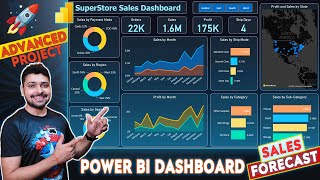
53:05
Power BI Dashboard | Power Bi Project - Sa...
Rishabh Mishra
482,106 views

1:37:25
End to End Data Analytics Project | Power ...
codebasics
352,219 views

17:24
Top 10 Power BI Features You Should Be Usi...
How to Power BI
53,389 views

1:36:04
End to End Data Analysis Project | HR Anal...
codebasics
105,107 views

42:37
Full Power BI Guided Project | Microsoft P...
Alex The Analyst
429,998 views