SECRETS TO ✨PERFECT LINE-ART✨ | Beginner Line Art Tutorial #procreate #arttutorial
578.33k views1351 WordsCopy TextShare

artsytsaa
Hey Artlings! 🧋here’s my beginners lineart tutorial in which I teach you how to draw Perfect line a...
Video Transcript:
I once had a conversation with a friend that even if you trace your sketch to the perfect tea it still looks ugly when you take off the sketch and it wasn't until years later that I realized the problem you're not supposed to trace it's called line art and to treat it as art here are some basic techniques don't do this this is why your line art is bad all right in this Mission I'll show you good line art setup classic line technique customization and even explain why your line art looks so bad when you turn
off the sketch this is how you make the perfect line art so let's start this Mission before we begin keep in mind a higher resolution canvas can make a difference in the pixelization of your lines I will be working in a 300 DPI canvas which is often enough for professional projects just try to go above at least 75 DPI sketch stage in the sketch stage you want to make sure that your details are as fleshed out as possible having a sketch with gray or non-clear areas will make you have to realign a lot in the
line art stage as I had to do with this braid so pull up your reference and deal with those details if you don't want your sketch stage to come back in the lighting stage trust me it's really annoying also try to make your sketch extra Dynamic but accurate so that your extra liveliness can also spill into your line art so a summary for sketches would be to get all of your gesture in and get all of your guesswork Out secret number one this is how you make your line art actually look like your sketch lower
the opacity of your sketch I mean low opacity like three to fifteen percent as in you can barely see that thing then when you have to zoom in and have no idea what the lines look like from afar just compensate by using a reference window to be able to view the whole artwork and don't just lower the opacity of your drawing also try changing it to a different color to make it easier to see your line art why because with the low opacity you already know what your line art actually looks like you aren't just
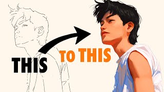
tracing and you aren't looking at your line art and your sketch simultaneously this is literally what saved my line arts from looking like this to this lastly don't forget to lock this layer so you don't end up drawing on it you clown [Music] okay dearlings you have to keep in mind that the goal is smooth long strokes you want your hand gliding across the canvas and here is the optimal setup to get that if you find that your sweaty hand is having some trouble moving across the screen Less in friction with an artist's glove and
turn on Palm rejection on your tablet if you don't have an artist gloves don't worry just use anything that covers your side Palm to your pinky choose a brush with streamline and is sensitive to weight pressure streamline basically course corrects and smoothens your brush Strokes so they don't wiggle just keep in mind these settings can stabilize or course correct too much making it difficult to create accurate nice curves you can toggle the setting to how you wish or switch back and forth to your sketch brush for lining things with a lot of Curves such as
hair hatching or circles weight pressure allows for you to press down easily on your brushes to add thickness to your Stroke by adding more pressure to your downstrokes or where there would be Shadow you can easily add a little spice and the classic tapering look to your line art and light weight this often gives the line art a finish and aesthetic look just think of calligraphy and brush pens which is basically weight sensitivity on steroids there is also a pressure curve setting that you can toggle in procreate you can try using this graph which is
good especially if you struggle with light pressure thickening lines helps you to imply a lot of things it helps you to imply shading it helps you to also imply perspective that's why I made the hand lines generally thicker than the rest of the painting since it is closer to the viewer next I have your non-drowing hand in position to quickly undo mistakes zoom in and rotate the canvas for the best angles secret number two have enough room for your drawing arm in position to Pivot from at least the elbow do not use your wrist as
much as possible unless for small movements like hatching you need to Pivot from your elbow for at least three reasons one it makes your Strokes longer and more efficient this also makes you avoid Chicken Scratch because you won't be picking up your hand every time you went to make the next stroke to the heavier weight of your arm also makes it much more stable and three lastly but most importantly it will be better for you in the long run your arms are much stronger than your delicate wrists that is why when you're working in even
bigger canvases you will always hear people saying to draw from your shoulder take note this makes the best type of circles [Music] now that you have all the players in position all you gotta do is zoom in and I'll do the line the classic way in one long smooth motion draw the line pivoting from your arm keep in mind that a faster speed means that the stroke will be more smooth but a slower speed means more accuracy so a medium speed with a streamline setting should be enough to get you the best of both worlds
zooming in and making the target line utilize the whole Space of the screen also does wonders for smooth and long lines then rinse repeat line and Ctrl Z until you make it while in this stage consider adding line weight simultaneously by pressing down on the downstrokes in the middle of Curves and where there are shadows if you don't have streamlined settings or stabilization settings for your brushes consider a technique called overshooting This is where your brushes are deliberately fast and go beyond the target sketch lines then you can just erase the overshoot and find yourself
with a clean sharp and tapered look [Music] bonus you can customize y'all there are literally so many ways to customize your line art a lot of them also go directly against what I just taught you about smooth long lines there's broken lines there's Wiggly lines there's thick lines with no line weight at all my favorite line weight customization is when there would be ambient occlusion and hatching the very simple it looks really good and these are some of the ways that you can do them I also like coloring my line art so that when I
render it it has a more natural look lastly clean that up Pro tip you can use liquify tools to easily nudge your liner as well as this Edge tool to make sure that your lines are sharper and thinner without you having to redraw it even if you follow everything in this guide you may find that there are places that still look bad don't fret just duplicate the line art color the spots that need cleaning lower opacity and realign until you're satisfied merge the layers together and tada you have gorgeous line art good job anyways I
hope this helped you our links out this workflow has a lot of best practices so as you can see liner is just about good setup technique and practice if you enjoyed please check out the other art Ventures that you can join and much love and bubble tea to you
Related Videos
15:48
How to COLOUR Your Art (Beginner Friendly)
SamDoesArts
800,460 views
39:15
How I Draw LINEART Tutorial and Process in...
ChrissaBug
336,771 views
8:10
How NOT to suck at Lineart | DrawlikeaSir
Draw like a Sir
2,028,780 views
22:15
I Tested Every FREE Drawing App
viyaura
1,986,732 views
16:03
Learning How to Draw Faces and Heads!?
Vitrimity
17,167 views
21:44
How To Make Digital Art | Full Tutorial Fo...
Arnav Chan
121,698 views
![HOW TO: Making Lineart ✨ My 8 Favourite Tips [Clip Studio Paint]](https://img.youtube.com/vi/7g9UTbqZGiU/mqdefault.jpg)
10:05
HOW TO: Making Lineart ✨ My 8 Favourite Ti...
kuroshiro
193,074 views
8:22
This Brush SAVES MY LINEART | How I Linear...
Fungzau
63,813 views
7:26
HOW TO EYE
shuen_art
397,060 views

6:51
How to COLOR // 4 steps
natsume__san
815,094 views
5:29
How I IMPROVED my Drawing in just 9 days!!
BokuCanDraw
531,518 views
13:57
How I Practice Drawing FACES (Beginner Fri...
SamDoesArts
944,295 views
9:23
Procreate 2024! How To Pencil/Sketch On Th...
Dr. Rocke ART
159,110 views

10:54
If You’re A Beginner Artist, WATCH THIS VIDEO
parako ♡
407,255 views

8:54
Color Theory for Noobs | Beginner Guide
Flow Studio
6,954,336 views
11:17
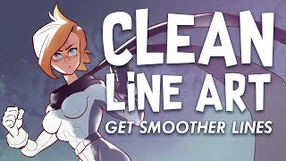
Clean Line Art! Digital Inking Tips
BaM Animation
4,309,712 views
11:22
HOW TO INK DIGITAL ART
Lucas Peinador
233,353 views
12:39
How I DRAW FACES step by step | Mistakes &...
Bobbo Andonova
2,815,266 views
5:16
Draw Better LINEART.
Winged Canvas
150,034 views

9:06
How I Color Characters In 4 Steps
Angel Ganev
186,885 views