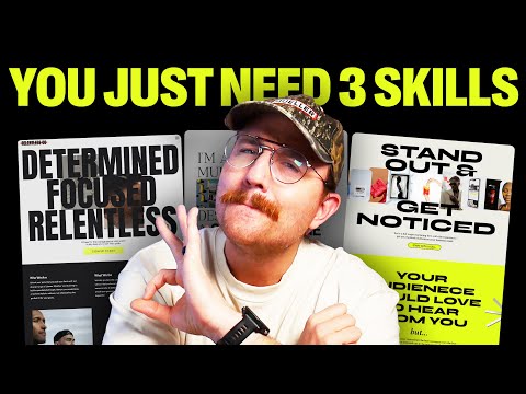
Give Me 7 Minutes & Your Web Design Skills Will Take Off
24.16k views1293 WordsCopy TextShare
Self-Made Web Designer
It was tough but I fit 10 years of web design expertise in a 7 minute video. Turns out you know just...
Video Transcript:
I'm going to give you over 10 years of web design knowledge in just 7 minutes. No fluff, just the good stuff. Are you ready?
Let's go. You can basically boil all the design knowledge that you need to build great websites down to just three things. websites in somewhat of an F pattern.
So they start reading at the top left and then they go right, they come back, they go down on the left, they go right, they come back. And they go down on the left until they're done. But here's the truth.
That's actually bogus. It's outdated information that web designers just kind of keep repeating. And so everybody thinks it's true.
I might have been one of those web designers. And for that, I. Apologize.
The truth is, is that people engage with websites and all sorts of different patterns and forcing them to pay attention in an F pattern might actually cause them to miss important information. So what do you do instead? You use something called Visual hierarchy.
You've probably seen an image before where there's this big, bold line of text that says you're going to read this first and the smaller line underneath it that says, then you'll read it next. And then this really tiny line that's all the way in the left hand corner that says, and you'll read this last. That is visual hierarchy.
You make the most important elements of a section, the biggest and the boldest. And then for each other element that isn't maybe as important, you turn down the volume, you make it more inconspicuous for your call to action or buttons. You want to make sure that they have a high degree of contrast from everything else around them.
Why? Because the main thing we want people to do on a website is click. A button.
If it doesn't stand out, it's going to make it harder to do that. And please, I beg of you, stop using ghost buttons. What are ghost buttons?
They're buttons that just have an outline without a solid background. The problem is that people don't see them and they don't click on them. For colors, every website should have a color palette that matches the brand of the website owner.
Here's a few important things to consider when it comes to color. The first thing is accessibility. If you pick colors that make it difficult to read text or tough to see elements clearly, it's going to be hard for users to engage.
You want to pick colors that have a high enough contrast that even users with visual impairments are still going to be able to see things clearly. How do you know if a contrast is high enough? Something that I like using is a website called coolers.
co. You can actually take all of the brand colors from a website. Input it into the dashboard, click on the color contrast teller, and it will instantly tell you which colors pass and which don't.
Super helpful tool. Another good rule of thumb for colors is that you want to use a guideline called the 60 30 10 Rule. Basically what this means is that about 60 percent of your website should use your dominant colors.
Things like grays or blacks and whites, 30 percent you should reserve for your brand colors and then another 10 percent you want to use something for an accent. So helping things really stand out. That's a great thing to use for like your calls to actions or your buttons.
Is this a hard and fast rule that you absolutely have to use every single time? No, but it's a good principle to stick with, especially when you're first getting started. Then there's typography.
Typography is one of the most underrated design elements of a website, but it has a massive impact on the readability and user experience. Thankfully, there's a ton of great options when it comes to fonts. You've got serifs, you've got sans serifs, you've got handwritten fonts, you've got scripts, you've got.
display, you've got monospace and it goes on and on. There are three main text elements to consider for your website. You've got your H ones or your main headers, and this should be the biggest, most prominent text on the page.
This is going to describe what the entire page is all about. Then you've got your H2 or your subheadings. These act as ways to divvy up the rest of the page and guide a user's attention.
Then finally, you've got your paragraph text or your P tags. You don't want to use really decorative text for this. It might look cool, but it kills readability.
But here's the thing. Good design without good conversion practices doesn't actually help your clients. I designed a website a while back for a client and the result was way better than their old website.
It was clean. It was modern. It was chef's kiss.
The problem was when we launched it, sales plummeted. Why did that happen? It's because I tried to make it look pretty instead of focusing on good conversion practices.
If your design doesn't consider conversion. It's useless to your clients. So what are good conversion practices?
Good conversion is all about reducing friction for users. You want to make it stupid easy for the users to find what they're looking for and to go through and either buy a product. or sign up for a service.
And that's done through clarity. You want to be crystal clear about who the company is or the person is who owns the website and what the user is supposed to do next, why they should even care. You also do it through scannability.
People aren't reading websites, they're scanning through it. So you need to set things out in such a way that people can bounce around and make decisions. And then finally, You want the website to be motivating.
It's not just enough to be pretty. You actually need to speak to the heart of the user. Speak to the thing that's driving them to say yes or no, but overall, you want to design for the right audience, not for yourself and not for your client.
It doesn't matter if you love the design. It doesn't even matter if your client loves the design. Who does it matter for?
the website visitors. So do a little research. Who's actually using this website?
Fonts, colors, layout. Choose them based on the target audience and not personal preference. Finally, make sure that you never stop learning.
Web designers don't age like fine wine, okay? We age like a loaf of bread left on the counter. We go stale unless we keep learning.
The web design industry is changing fast and it's going to continue to do so. What works. Just five years ago might not work today.
It might not work in the next five years. And if you don't challenge yourself and stay updated, you're going to fall behind. Will AI take all of our jobs?
Probably not. But will AI take lazy web designer jobs? Absolutely.
The only way to stay valuable is to keep learning, keep adjusting, and keep leveling up. And you might be asking yourself, that's all well and good, but what do I need to do if I'm getting started today? Thankfully, I've got another video that I'm going to link to that's going to answer just those questions.
Make sure that you like this video if it was helpful and be sure to subscribe so that you don't miss another episode. And don't forget, if you don't quit, you win.
Related Videos

16:33
9 Web Design Trends 2025 to Spruce Up Your...
Showit
130,524 views

8:59
Give me 9min, and I'll improve your storyt...
Philipp Humm
567,800 views

12:33
If Had to Start a Web Design Business in 2...
Self-Made Web Designer
2,987 views

13:48
How To Learn Any Skill So Fast It Feels Il...
Justin Sung
1,267,534 views

11:23
How I’d find clients as a web designer if ...
Wize Design
4,426 views
17:16
I Designed a Full Brand Identity Using ONL...
Will Paterson
17,369 views

18:58
2025 Graphic Design Trends You Should Know
Kittl
504,933 views
![My Full Web Design Process [Step By Step]](https://img.youtube.com/vi/T5JglDcd54A/mqdefault.jpg)
12:48
My Full Web Design Process [Step By Step]
Self-Made Web Designer
1,192 views
19:01
Websites worth waking up to: Forging a fut...
It's Nice That
21,013 views

12:06
Web Design is over. We lost.
Malewicz
59,437 views
9:20
7 Portfolio Websites That Will Make You Je...
Andres The Designer
4,511 views
24:38
Typography in Web Design: What You Need to...
Self-Made Web Designer
316 views

8:25
Master Layout Design In 8 Minutes! (IMPORT...
Satori Graphics
58,114 views

17:22
Top 2025 Web Design Trends
Codex Community
76,397 views

16:42
This Video Will Take You From Junior to Se...
uxpeak
146,433 views

16:50
Impressive 2025 Website Design Inspiration
Codex Community
41,216 views

11:00
Are Foldables Cooked?
Marques Brownlee
2,514,397 views
7:36
25 Years of Web Design Knowledge in 7 Minutes
Steve @ Savvy Rooster
35,150 views

7:58
I tried every FREE website builder. This i...
Steve Builds Websites
506,129 views

21:11
$10 UI Design Vs $100,000 UI Design Will B...
Punit Chawla
7,791 views